
이 Codelab 정보
1. 시작하기 전에
Material Design 레이아웃 및 적응형 디자인 원칙을 살펴보고 여러 화면 크기에서 응집력 있는 경험을 만드세요.
적응형 디자인이란 무엇이고 왜 사용해야 하나요?
적응형 디자인은 특정 중단점과 기기에 맞게 적응하는 레이아웃을 디자인하는 원칙입니다. 레이아웃이 변경되어야 하는(적응해야 하는) 지점을 정할 때는 보통 기기의 너비를 고려합니다.
모든 앱을 모든 화면 크기에서 사용할 수 있어야 하는 것은 아니지만, 적응형 디자인을 사용하면 사용자가 인체 공학, 사용성, 앱의 품질 측면에서 향상된 경험을 만끽할 수 있습니다.
디자이너가 앱의 주요 화면을 보다 큰 형식에 적응하도록 설계하면 개발자가 앱의 나머지 부분을 더 많은 컨텍스트에 맞게 변환하는 데 도움이 됩니다.
학습할 내용
- Material Design'의 새로운 적응형 디자인 원칙을 사용하여 대형 화면에 맞게 디자인하는 방법
- 모바일의 주요 화면 디자인을 대형 화면에 맞게 만드는 방법
- 자체 디자인에 적용하는 데 사용할 수 있는 적응형 개념
- 새로운 표준 레이아웃을 사용하여 디자인하는 방법
기본 요건
이 랩에서는 기본적인 디자인 개념을 사용합니다.
- 기본적인 디자인 개념에 관한 지식: 그리드, 서체 스케일, Material 구성요소
- Figma에 관한 지식
필요한 항목
2. 시작하기
설정
다음으로, 디자인 환경을 설정해야 합니다.
시작하려면 Adaptive Designlab Figma 파일에 액세스해야 합니다. 실습에 필요한 모든 항목은 Figma 파일에 있습니다. 파일을 다운로드하여 가져오거나 Figma 커뮤니티에서 복제할 수 있습니다.
Figma 커뮤니티에서 복제
Design an Adaptive Layout with Material Design(Material Design을 사용하여 적응형 레이아웃 디자인)으로 이동하거나 Figma 커뮤니티에서 Design an Adaptive Layout with Material Design으로 검색합니다. Figma에서 열기를 클릭하여 검색한 파일을 내 파일에 복사합니다.
파일 레이아웃
파일을 살펴봅니다. 파일에는 소개를 비롯해 필요한 항목이 모두 포함되어 있는 것을 볼 수 있습니다. 각 섹션은 연결된 여러 개의 아트보드로 나뉘며, 섹션에 대한 몇 가지 핵심 개념과 연습이 이어집니다. 섹션과 연습은 앞의 내용을 바탕으로 진행되므로 순서대로 완료해야 합니다.
이 Codelab에서는 해당 개념과 연습을 보다 자세히 살펴봅니다. 적응형 디자인 또는 Material Design을 처음 접하는 사용자는 Codelab을 차근차근 따라 하세요.
소개 아트보드에서 시작하세요. 아트보드에 순서대로 연결되는 버튼이 있습니다. 버튼을 클릭하여 링크에 액세스하세요.
3. 레이아웃 이해
Material 3에서는 M2와 같이 반응형 그리드를 사용하는 대신, 표준 레이아웃 및 간격 설정 방법으로 앱의 레이아웃을 여러 중단점(창 크기 클래스)에 맞게 적응시킵니다.
레이아웃을 각 중단점에서 고정된 크기로 잠그지 마세요. 여러 기기에서 양질의 경험을 제공하려면 서로 다른 크기 클래스 간에 레이아웃이 달라질 수 있어야 합니다.
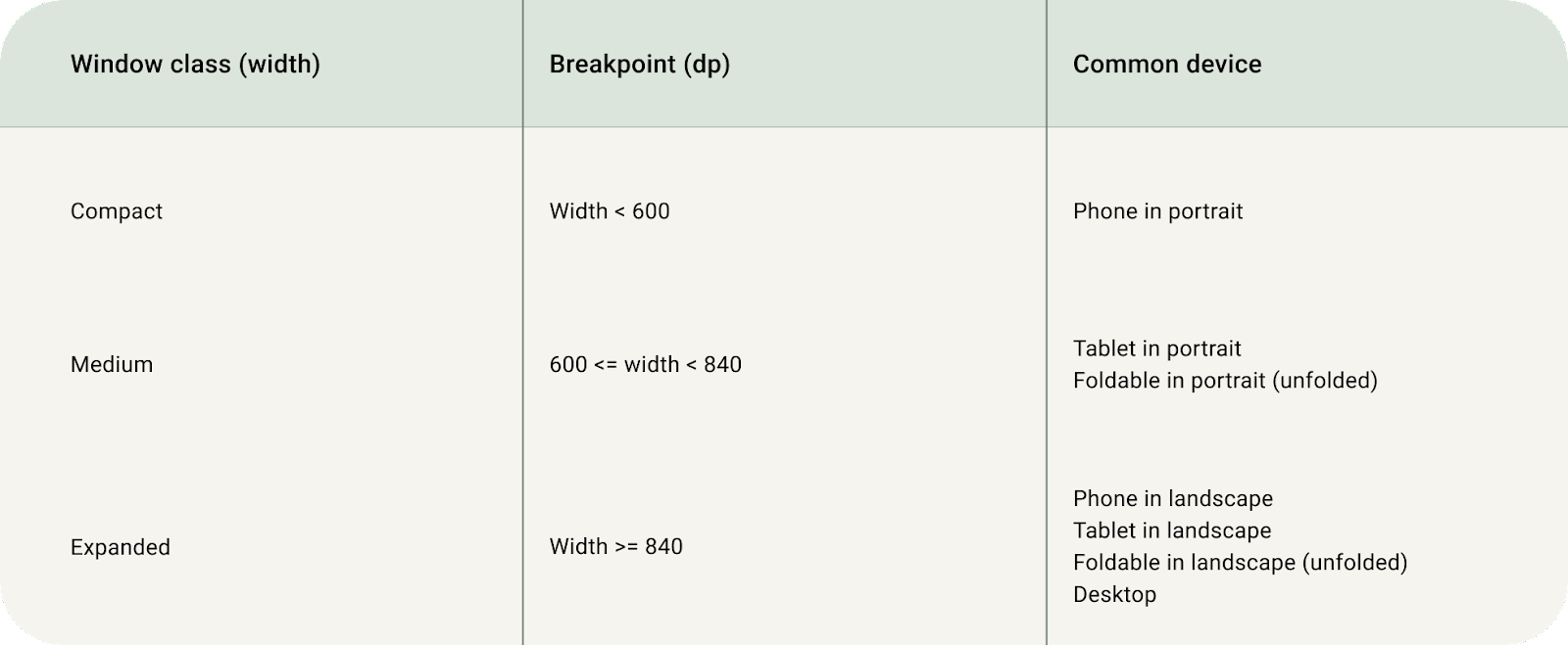
창 크기 클래스
창 크기 클래스는 레이아웃이 사용 가능한 공간, 기기 규칙, 인체 공학에 맞게 변경되어야 하는 창 크기인 '독선적인'(opinionated) 중단점입니다.
모든 기기는 3가지 Material Design 창 크기인 compact, medium, expanded 중 하나에 속합니다.
레이아웃 영역
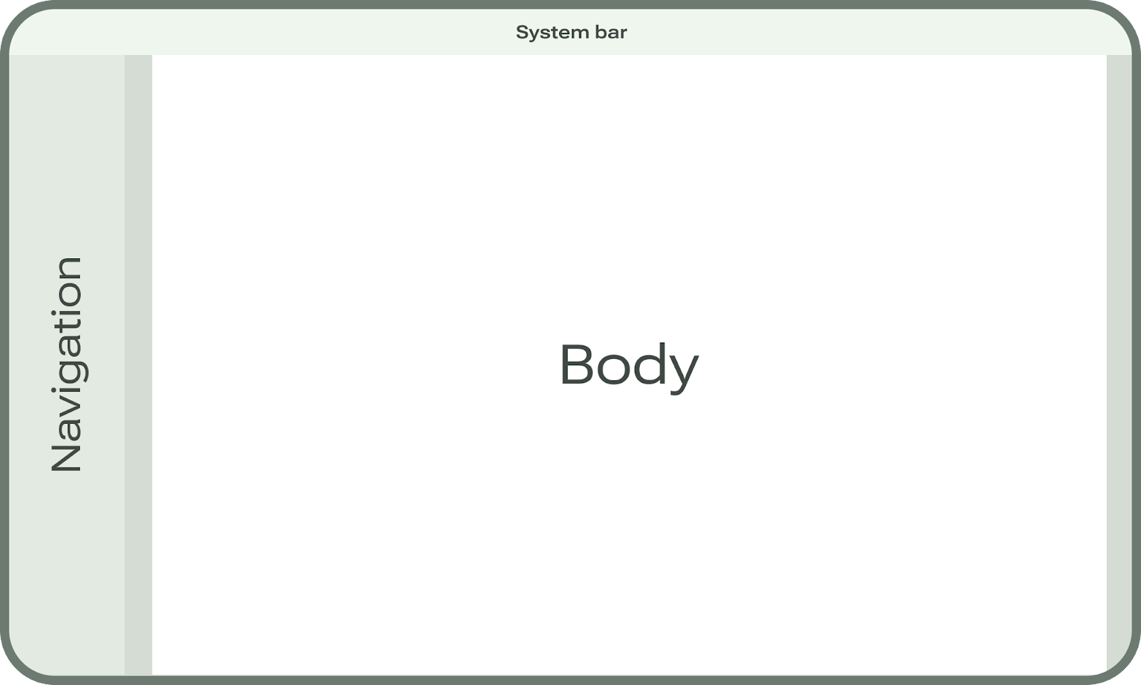
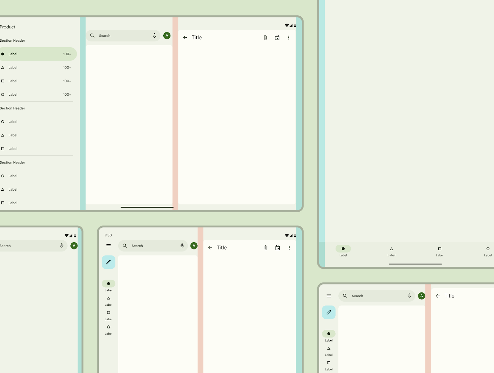
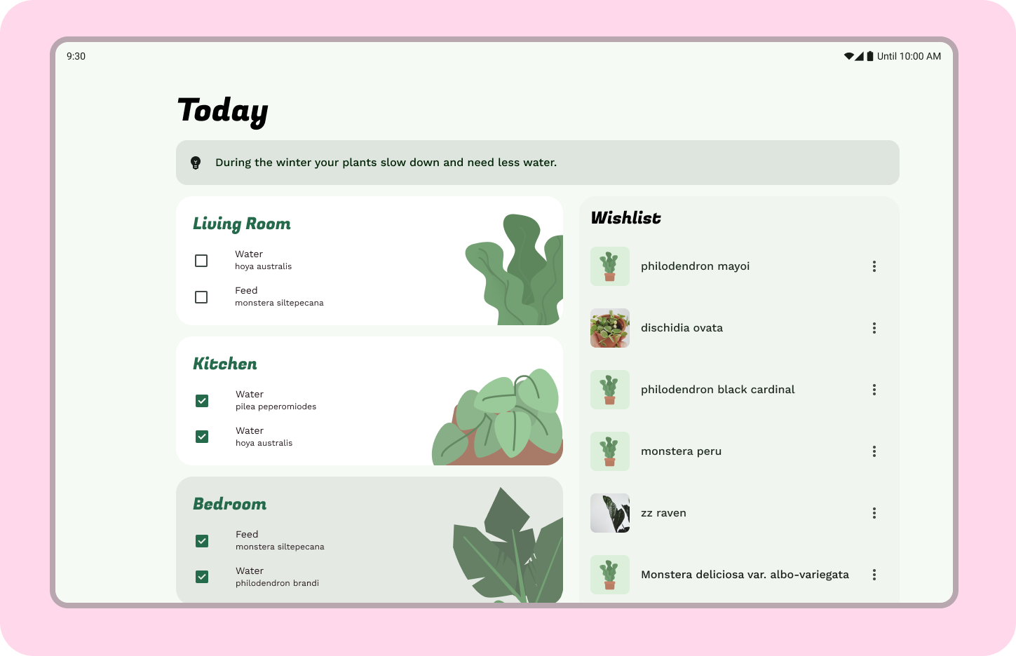
대부분의 Android 앱은 시스템 표시줄, 탐색 영역, 본문으로 칭해지는 여러 영역으로 구성됩니다.
시스템 표시줄은 기기 인터페이스의 중요한 부분으로, 모든 앱 디자인에 포함되어야 하며 앱의 레이아웃이 시스템 UI와 상호작용하는 방식을 가장 잘 나타낼 수 있고 정확한 구현을 지원할 수 있도록 여러 기기에서 올바른 컨텍스트로 표시되어야 합니다.
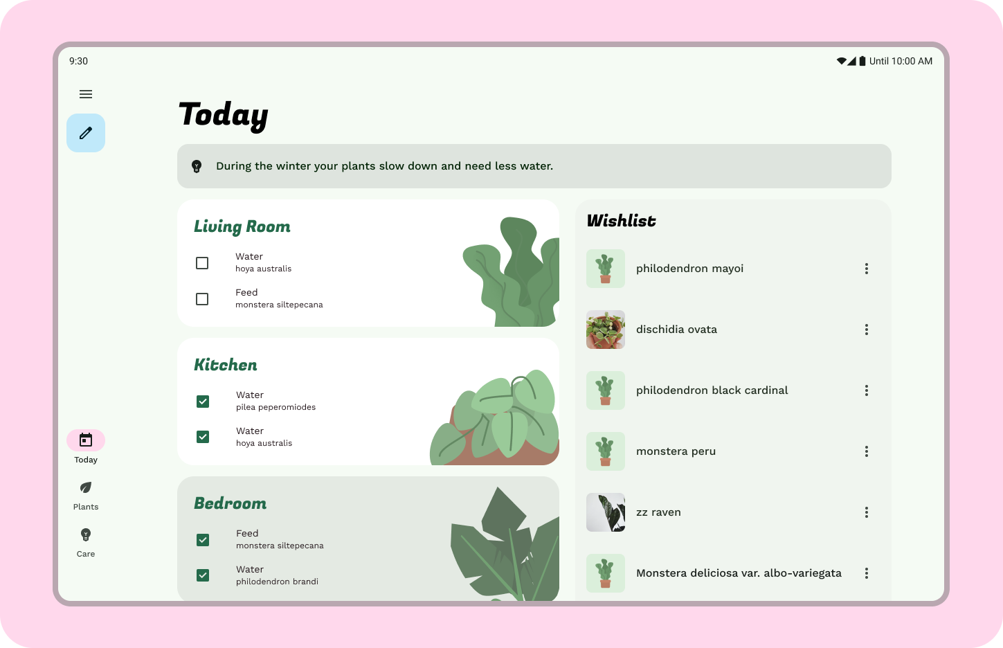
탐색 영역은 사용자가 앱에서 이동하고, 중요한 작업에 액세스하고, Android 플랫폼의 여러 곳을 이동할 수 있도록 지원하는 각종 어포던스를 나타냅니다. 탐색 영역에는 탐색 창, 레일, 막대와 같은 여러 구성요소가 들어 있을 수 있습니다.
본문 영역에는 앱 콘텐츠의 대다수가 포함됩니다. 본문 콘텐츠는 추가적인 그룹 및 레이아웃 파라미터 또는 창으로 구성됩니다. 본문은 탐색 영역과 시스템 표시줄 영역 하단에서 이어져야 합니다.
여백
여백은 왼쪽 및 오른쪽 가장자리에 있는 공간입니다. 여백은 고정된 크기를 가질 수도 있고 화면 크기에 따라 조정될 수도 있습니다.
4. 창 클래스 크기
먼저 제공된 목업의 창 클래스 크기를 medium 창 클래스 크기로 조정하겠습니다.
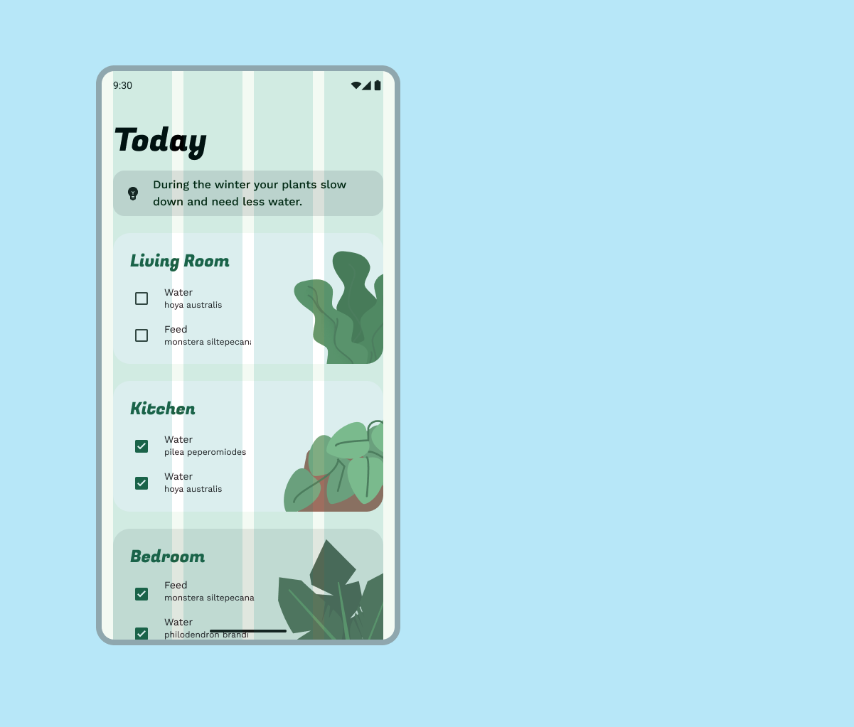
- 오른쪽의 'Exercise Layout 1' 프레임을 Compact(모바일)에서 Expanded(태블릿)용 1440dp로 확장합니다.
- 그리드 스타일 드롭다운에서 small을 Large로 변경합니다(본문 영역은 '끔'으로 설정).
- 기기 크기와 그리드를 조정한 후에는 본문 영역의 콘텐츠 영역을 필요에 따라 조정합니다.
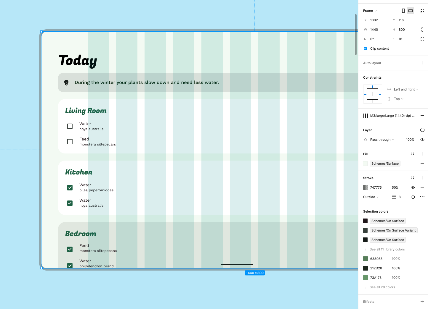
이제 그리드가 대형 화면 기기에 맞게 설정되어 레이아웃을 적응시킬 수 있습니다. 이번에는 크기 조정으로 넘어가서 콘텐츠가 대형 화면 크기에서 어떻게 반응할지 살펴보겠습니다.
5. 구성 적응 개요
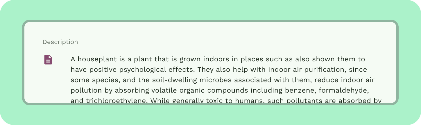
연습 레이아웃에서 콘텐츠와 요소들이 너비에 맞도록 유연하게 확대되는 것을 볼 수 있습니다. 대형 화면에 맞게 유연하게 크기가 조정되면 사용할 수 없는 레이아웃이 생길 수 있습니다. 일례로 이 레이아웃에서는 라인 길이가 너무 길어서 읽을 수 없게 되는 것을 볼 수 있습니다.
비주얼 그룹화 및 격리 원칙은 큰 공간에서 요소를 재배열할 방법에 관한 가이드를 제공합니다. 화면이 클수록 표시되는 콘텐츠가 늘어나기 때문에 비주얼 노이즈가 증가할 수 있습니다. 최대 라인 길이를 60자로 설정하면 가독성을 높이는 데 도움이 됩니다.
간격
비슷한 항목을 화이트 스페이스나 눈에 보이는 구분자로 그룹화하면 사용자가 콘텐츠를 소화하는 데 도움을 줄 수 있습니다. 암시적 격리는 화이트 스페이스를 사용하여 콘텐츠를 시각적으로 그룹화함으로써 컨테이너 경계를 만드는 방법이고, 명시적 격리는 구분선과 카드와 같은 객체를 사용하여 콘텐츠를 하나로 그룹화하는 방법입니다. 여백은 왼쪽과 오른쪽 가장자리에 사용되는 공간입니다. 그 밖에 다음과 같은 간격 설정 기법이 있습니다.
창은 본문 영역 안쪽의 그룹화입니다.
열은 중단점에서 값이 변경되는 유연한 그룹화입니다.
열 그리드는 표준 레이아웃 창 내에서 또는 초기 구조를 빌드하는 용도로 레이아웃에서 중요한 역할을 담당합니다.
스페이서는 여백과 비슷하나, 별도의 창을 갖습니다.
패딩은 구성요소 내부의 작은 간격입니다.
6. 크기 조정
대형 화면에서 세부 레이아웃이 유연하게 확대되어 큰 화면 크기를 사용하지 않는 레이아웃이 만들어졌습니다. 열 그리드의 비주얼 그룹을 사용하여 요소를 더 효과적으로 배열할 수 있습니다. 레이아웃에 대해 열 그리드가 이미 설정되어 있습니다.
- 콘텐츠를 열 그리드 위에 정렬하고 구성합니다.
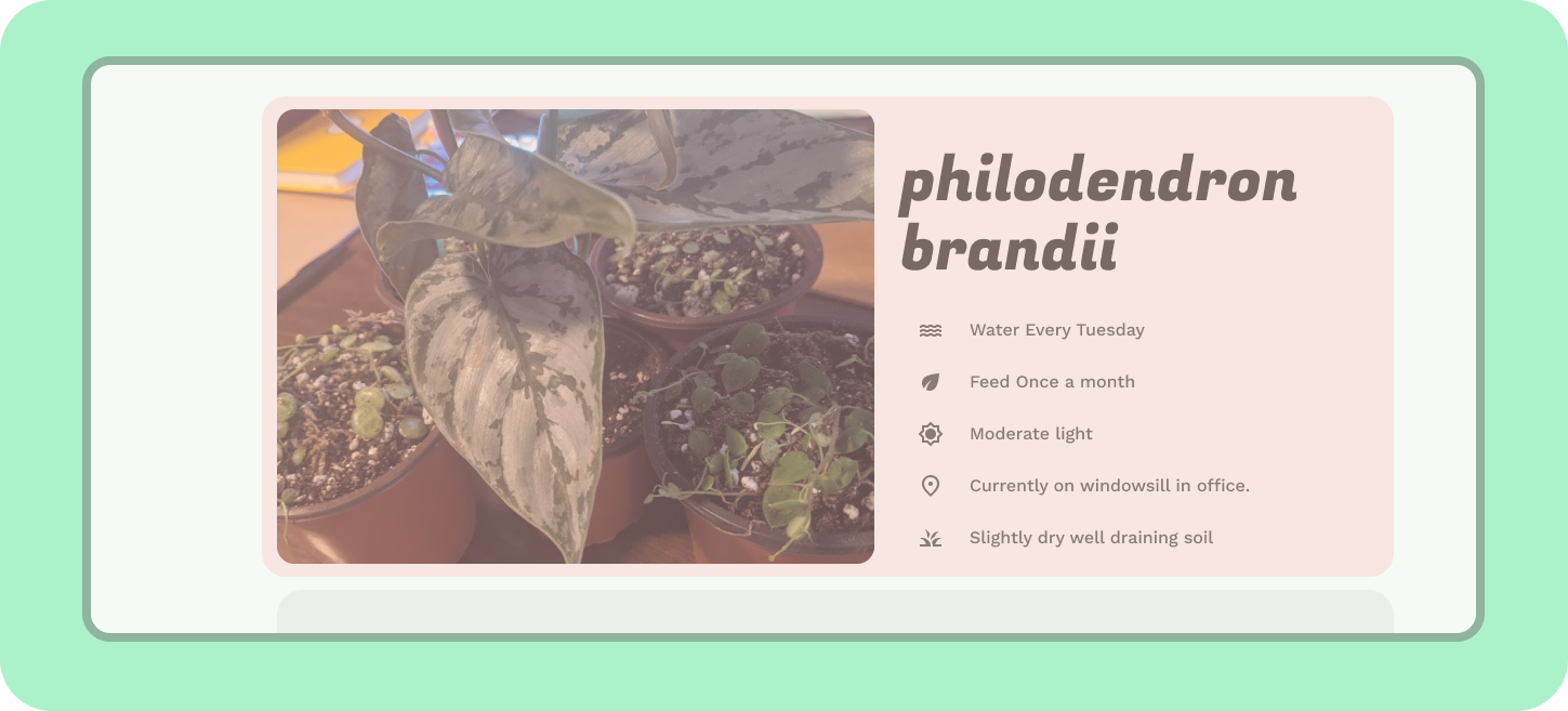
- 큰 기기에 맞게 요소를 확대해야 합니다. 대형 화면에서 높은 가독성을 갖도록 서체 스케일을 조정합니다. 제목을 디스플레이 대형으로 조정하고, 설명 본문 문구를 24sp로 조정하고, 다른 모든 텍스트를 본문 대형으로 조정합니다.
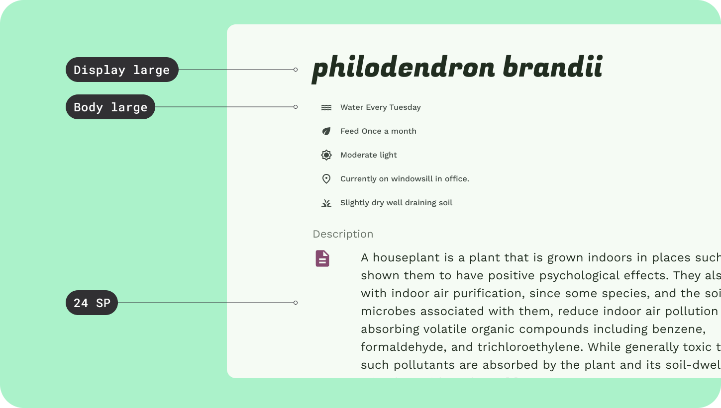
- 새 레이아웃에서 설명 아이콘이 작게 느껴지니 이 공간에 맞게 40x40dp로 확대합니다.
7. 그룹화 및 격리
이제 레이아웃의 가독성이 향상되었고 구성이 열 그리드에 맞게 확대 및 정렬되었습니다. 여기에 더해 그룹화와 격리를 사용하면 화면 크기를 십분 활용하는 데 도움이 될 것입니다.
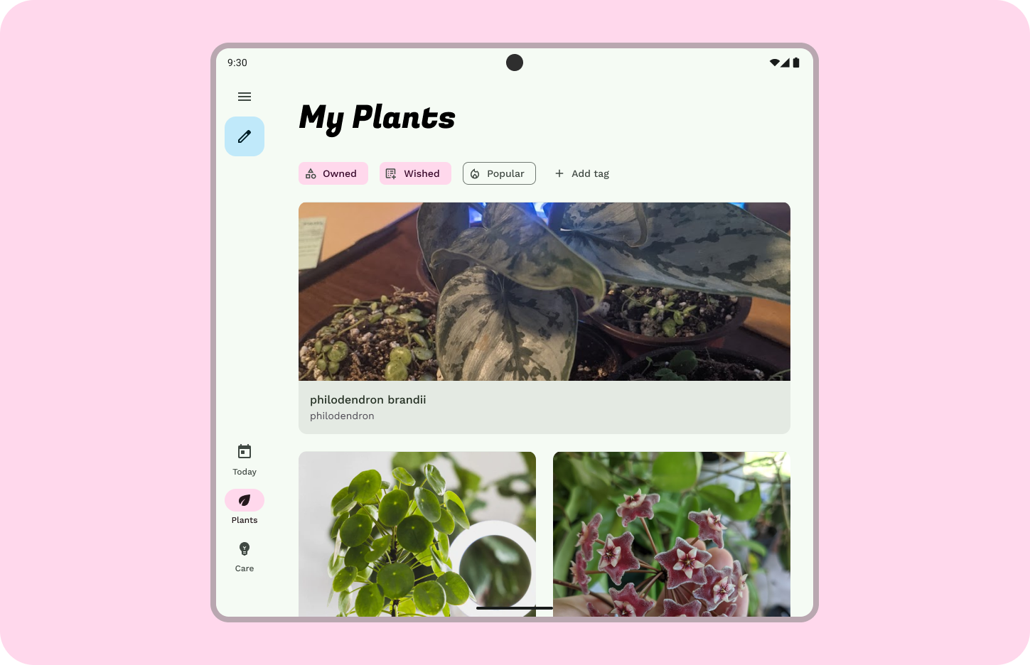
- 이미지를 6개 열로 확대하고 왼쪽에 정렬합니다.
- 제목과 식물 관리 팁을 이미지 오른쪽에 5개 열에 걸쳐 그룹화합니다. 그리드 정렬은 유지합니다. 헤더 그룹 아래쪽에 24DP 간격을 남겨서 암시적 경계를 만듭니다.
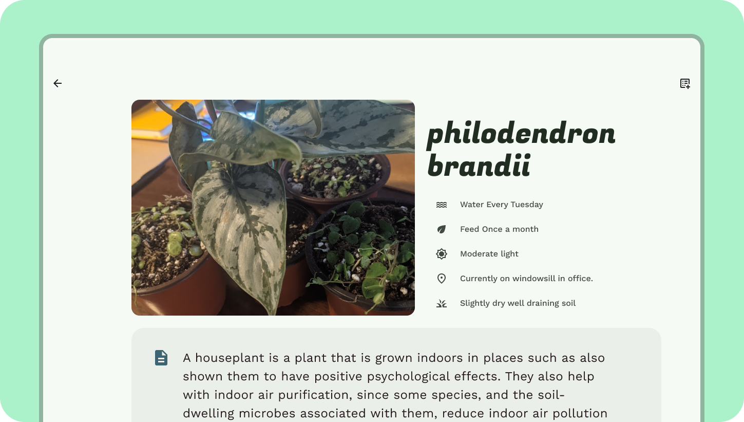
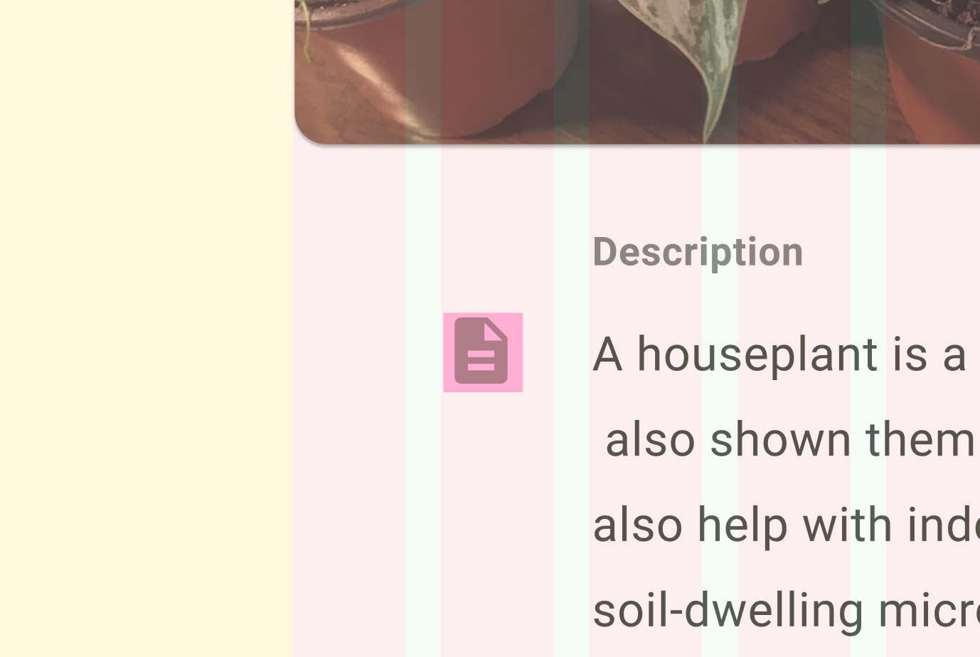
- 설명 콘텐츠에는 60자 라인 길이를 사용하여 열 길이(11개 열)를 정합니다. 그 앞쪽에 화이트 스페이스 열 1개를 추가합니다. 표면 컨테이너 색상 역할을 갖는 비주얼 컨테이너를 만듭니다.
8. 구성요소 행동 개요
구성요소는 서로 다른 중단점에서 너비, 가시성, 이벤트 전환 구성요소를 변경하여 서로 다른 행동을 가질 수 있습니다.
버튼과 같은 일부 구성요소는 12개 열 레이아웃에서 많은 공간을 처리하기 어려울 수 있기 때문에 고정된 너비를 유지하거나 가독성과 사용성이 유지되도록 전환해야 할 수 있습니다. 예를 들어, 이 버튼은 유연하게 적응하도록 하는 대신 큰 화면 크기와 관계없이 특정 너비로 고정해야 합니다.
반응형 패턴은 구성요소가 공간에 맞게 적응하도록 도와주는 일반적인 방법입니다.
위치 조정은 이러한 패턴 중 하나로, 요소가 화면에서 추가적인 화면 공간을 활용하도록 리플로우됩니다.
위치 조정의 예로 카드를 세로 방향에서 리플로우하거나, FAB를 탐색 레일로 이동하거나, 탭으로 구성된 콘텐츠를 하나의 공간으로 분할하는 것을 들 수 있습니다.
구성요소는 동일한 기능을 가지며 대형 화면에 더 적합한 구성요소로 전환하는 방식으로 적응할 수 있습니다.
모바일에서 문제없이 작동하는 구성요소라 하더라도 대형 포맷에서는 인체 공학적 문제를 유발할 수 있습니다.
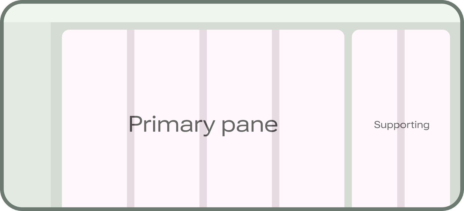
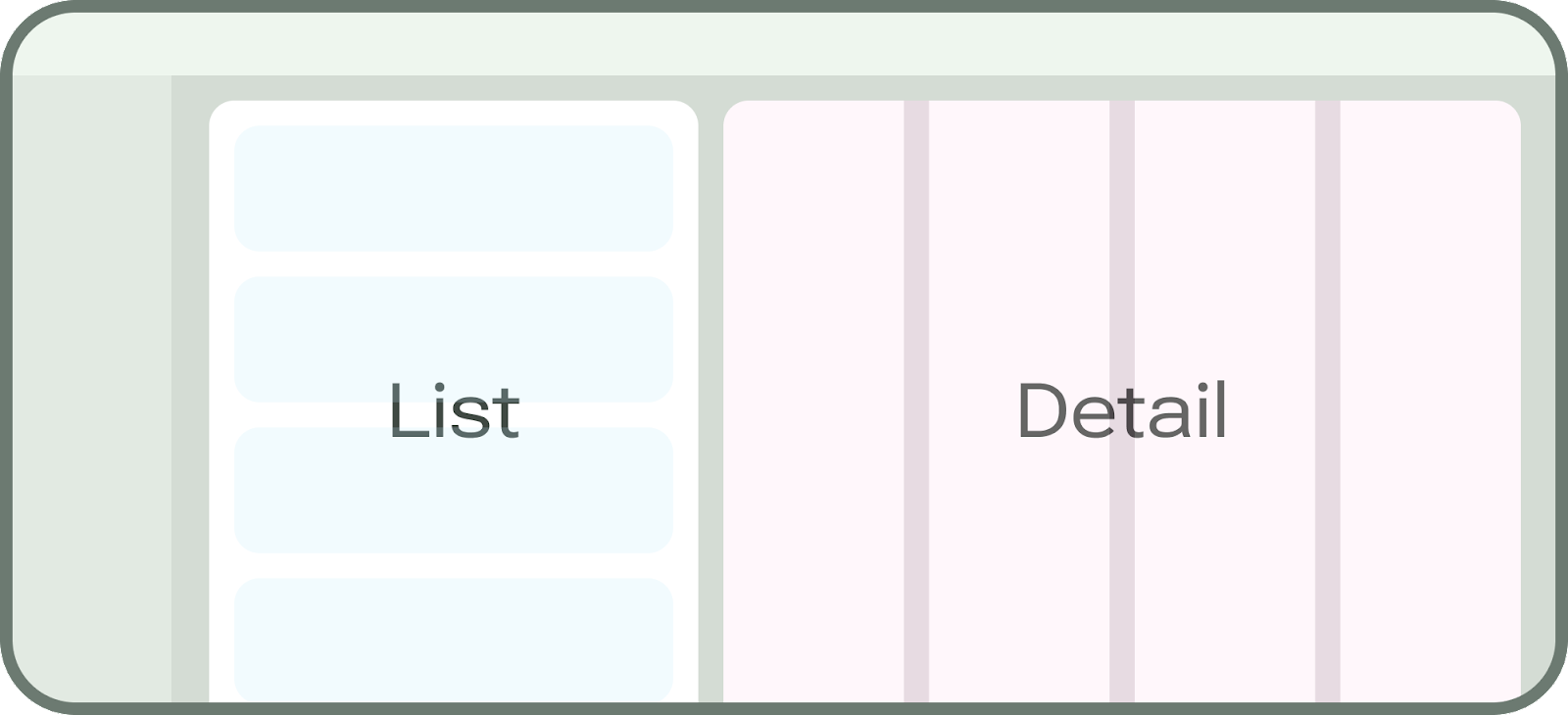
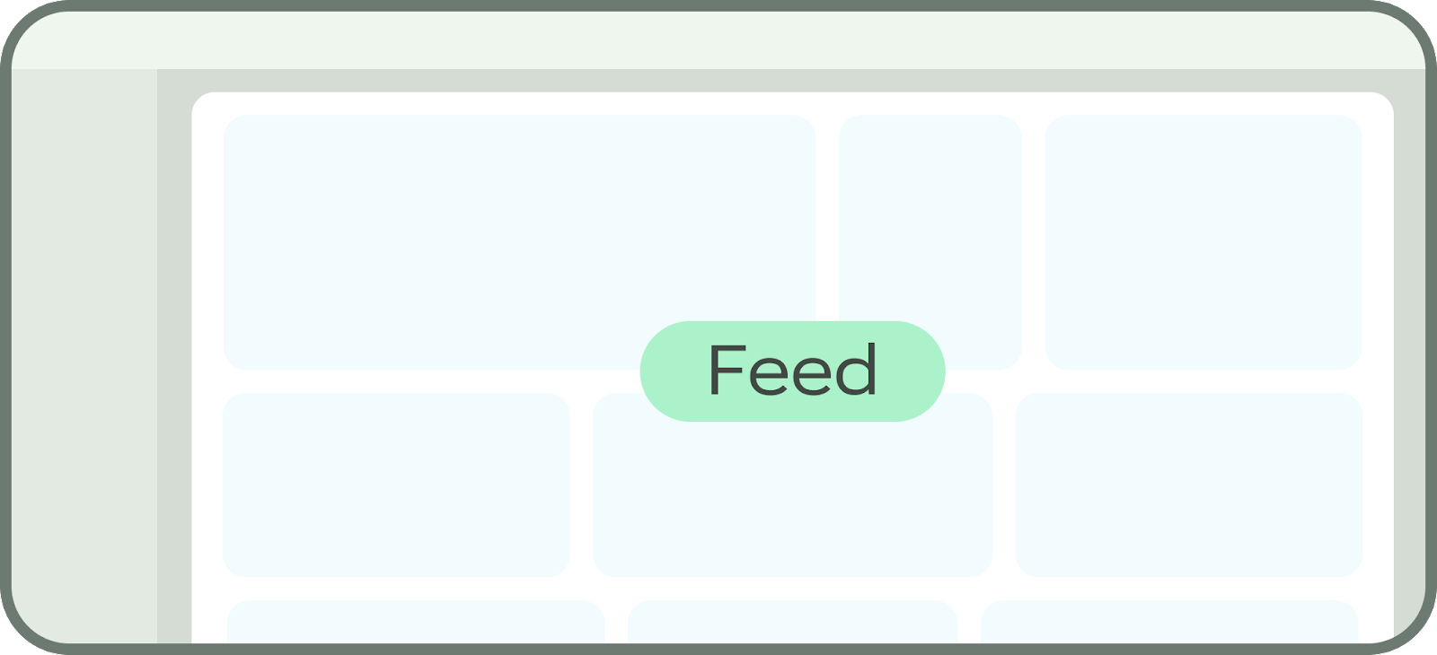
표준 레이아웃
표준 레이아웃은 모든 창 크기 클래스에 공통적인 화면 레이아웃을 위한 디자인입니다. 표준 레이아웃의 예로 피드, 목록 세부정보, 지원 창을 들 수 있습니다. 이러한 레이아웃은 여러 창 클래스 크기에 사용할 이상적인 시작점이 됩니다.
9. 반응형 패턴
지금은 모든 구성요소가 유연하게 확대되어 공간을 채웁니다. 이제 위치 조정 패턴과 그룹화를 사용하여 큰 공간에 맞게 콘텐츠를 적응시켜 보겠습니다. 오늘 화면에서 가로 방향 공간을 활용하도록 카드의 위치를 조정하겠습니다.
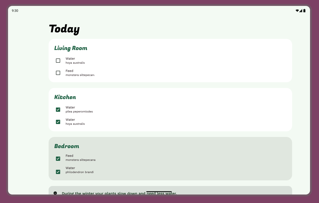
- 식물 관리 팁 카드를 태스크와 위시리스트 위로 이동합니다.
- 태스크와 위시리스트가 세로 방향으로 여러 비율로 확대되는 방식을 고려했을 때, 가로 방향으로 6개 열과 5개 열로 변경하면 공간이 더 효율적으로 사용됩니다. 위시리스트는 이미 하나의 창 안에 시각적으로 격리되어 있습니다.
10. 적응형 탐색
이 디자인에는 하단 탐색 영역이 있으므로 이 디자인 랩에서는 탐색 모델은 그대로 유지하고 탐색 레일을 추가하겠습니다.
- 하단 탐색 메뉴를 제거합니다.
- 애셋 창에서 탐색 레일 구성요소를 찾아서 탐색 공간으로 끌어서 놓습니다.
- 하단 탐색과 일치하도록 라벨과 아이콘을 업데이트합니다.
- 레이아웃의 나머지 부분과 일치하도록 스타일을 조정합니다.
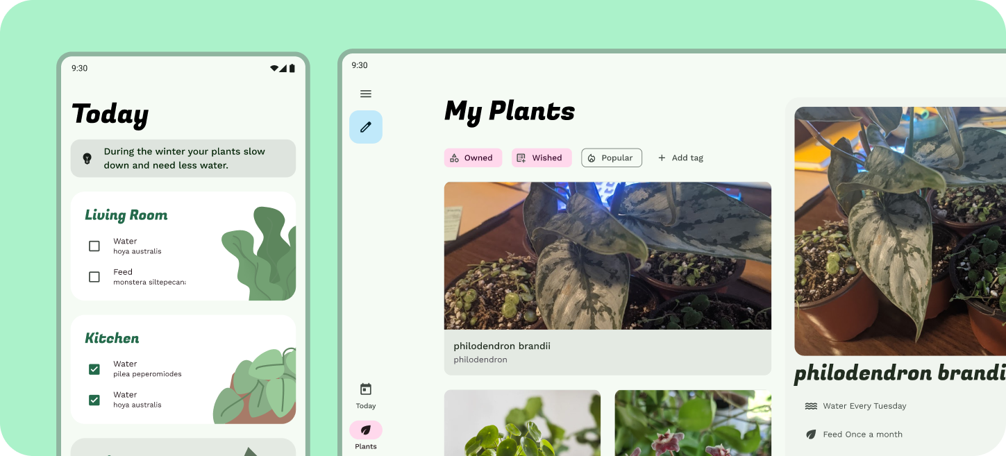
11. 표준 레이아웃 피드
현재 이 레이아웃은 유연하게 하나의 목록을 표시하고 있지만, 더 보기 좋은 표준 피드 레이아웃을 표시할 충분한 가로 방향 화면 공간이 있습니다.
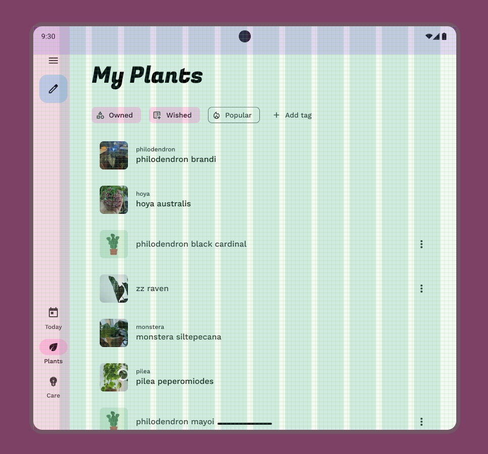
- 탐색 메뉴와 상단 막대는 이미 중간 크기로 조정되었으므로 본문 콘텐츠에 집중하겠습니다. 피드 레이아웃은 그리드 구성을 사용합니다. 목록 항목을 스택 카드로 업데이트합니다.
- 카드는 피드 내에서 균일해야 할 필요가 없습니다. 첫 번째 카드를 11개 열에 걸쳐 표시되는 대표 카드로 만듭니다. 나머지 카드는 24dp 간격을 갖고 5개 열에 걸쳐 표시되도록 합니다. (자동 레이아웃 래핑을 사용하면 됩니다.)
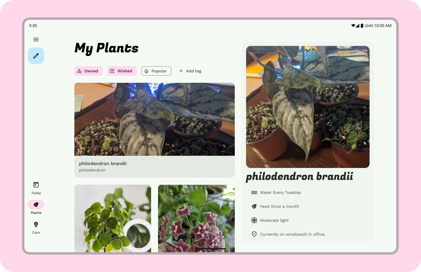
12. 표준 목록/세부정보
이 레이아웃은 이제 대형 기기에 표시되므로 확장된 레이아웃이 표시될 때마다 한 가지 식물에 대해 세부정보 뷰를 표시하기에 충분한 공간이 있습니다.
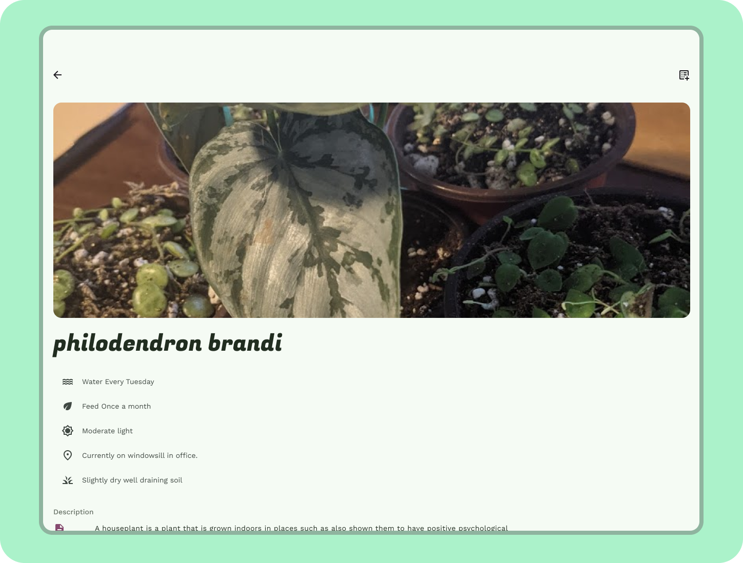
- 세부정보를 표시할 창을 만듭니다. 여백 내부에 5개 열 컨테이너를 만듭니다. 이 컨테이너를 표면 컨테이너 또는 그 이상으로 설정합니다.
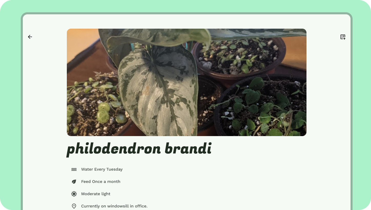
- 위의 크기 조정 연습에서 필로덴드론 콘텐츠를 복사하여 창에 붙여넣습니다. 창에 16dp 패딩을 추가합니다.
- 식물 제목을 디스플레이 소형으로 업데이트하고 나머지를 본문 중간 또는 대형으로 업데이트합니다.
- 콘텐츠가 세로 방향으로 표시되고, 대표 사진이 공간을 가로 방향으로 채웁니다.
13. 축하합니다
Material Design 적응형 원칙을 사용하여 디자인을 소형 화면에서 대형 화면으로 적응시켰습니다.
궁금한 사항은 언제든지 Twitter의 @MaterialDesign으로 문의해 주세요.
youtube.com/MaterialDesign에서 더 많은 디자인 콘텐츠 및 튜토리얼을 기대해 주세요.