1. Before you begin
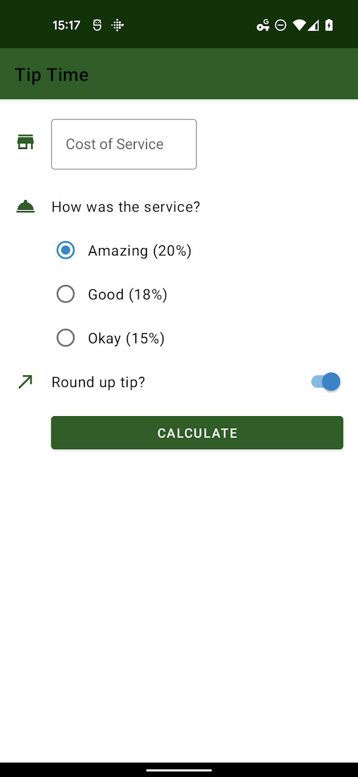
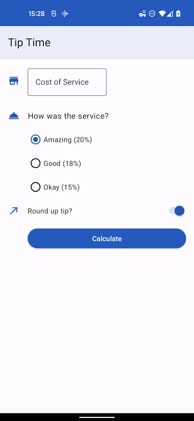
In this codelab, you will update the starter app, a tip calculator app to use the new features in Material Design 3 allowing an application's user interface to be themed dynamically based on the user's wallpaper. Below are a couple Screenshots of the application with dynamic color applied. You'll also examine some additional scenarios allowing you to control how colors are applied.
Prerequisites
Developers should be
- Familiar with basic theming concepts in Android
- Comfortable with modifying an app's theme
What you'll learn
- How to differentiate between existing Material Components and Material 3 themes
- How to update a theme to Material 3
- How to create themes using our tooling and apply them
- How theme attributes relate to each other
What you'll need
- A computer with Android Studio installed.
- Code for the Tip Time application. https://github.com/google-developer-training/android-basics-kotlin-tip-calculator-app-solution
2. Starter App Overview
The Tip Time app is a tip calculator app with options to customize the tip. It is one of the sample apps from our Android Basics in Kotlin training course.
3. Updating Gradle Dependencies
Before we update the actual theme and apply dynamic color, there are a few changes that need to be made in the build.gradle file for your application.
In the dependencies section, make sure the material library is 1.5.0-alpha04 or later:
dependencies {
    // ...
    implementation 'com.google.android.material:material:<version>'
}
In the android section, change the compileSdkVersion and targetSdkVersion
to 31 or later:
android {
    compileSdkVersion 31
    // ...

    defaultConfig {
        // ...
        targetSdkVersion 31
    }
}
These instructions assume an app with relatively recent dependencies. For an app not already using Material or a less recent version, please check the instructions in the Getting Started documentation of the Material Design Components for Android.
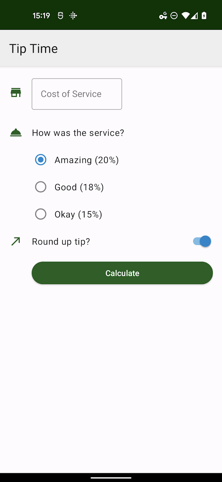
Wherever you have created your themes, change references of Theme.MaterialComponents.* to Theme.Material3.*. Some styles do not yet have a new style in the Material3 namespace but most components will still inherit the new styling once the parent theme is updated to Theme.Material3.*. We can see below that buttons now take on the new rounded theming.
In the themes file below, the only thing that has been changed is the parent theme. We'll be completely replacing this theme in a moment. Some of the color attributes have been obsoleted and some of the custom styles we've created are now standard in Material3 but we wanted you to have
themes.xml
<style name="Theme.TipTime" parent="Theme.Material3.Light">
   <!-- Primary brand color. -->
   <item name="colorPrimary">@color/green</item>
   <item name="colorPrimaryVariant">@color/green_dark</item>
   <item name="colorOnPrimary">@color/white</item>
   <!-- Secondary brand color. -->
   <item name="colorSecondary">@color/blue</item>
   <item name="colorSecondaryVariant">@color/blue_dark</item>
   <item name="colorOnSecondary">@color/black</item>
   <!-- Status bar color. -->
   <item name="android:statusBarColor" tools:targetApi="l">?attr/colorPrimaryVariant</item>
   <!-- For text input fields -->
   <item name="textInputStyle">@style/Widget.MaterialComponents.TextInputLayout.OutlinedBox</item>
   <!-- For radio buttons -->
   <item name="radioButtonStyle">@style/Widget.TipTime.CompoundButton.RadioButton</item>
   <!-- For switches -->
   <item name="switchStyle">@style/Widget.TipTime.CompoundButton.Switch</item>
</style>
4. Understanding Color Theming and Color Roles
The Material 3 color system uses an organized approach to apply colors to your UI. A number of attributes from Theme.AppCompat are still in use. However, more attributes were added in Theme.MaterialComponents.* and even more in Theme.Material3.* so it's important to examine all screens of your app to make sure no unimplemented properties are bleeding through from the base theme.
Understanding color roles
There are over twenty attributes related to color in a Material 3 theme. This may seem daunting at first but there are really a few key colors that combine with the same 4-5 color roles to create derivative colors.
Those color groups are:
- Primary, the primary color of your app
- Secondary, the secondary color of your app
- Tertiary, either a third color that is complementary to Primary and Secondary
- Error, used for error text and dialogs
- Background
- Surface, SurfaceVariant, Surface Inverse
The roles are as follows for Primary, Secondary, Tertiary, and Error:
<base color> | The base color |
on<base color> | the color of icons and text that appear on the base color |
<base color>Container | derived from the base, color, used for buttons, dialogs, etc |
on<base color>Container | the color of icons and text on the container |
For example, a Floating Action Button with default styling in Material 3 uses Primary as its base color, so it uses primaryContainer for the background color of the button and onPrimaryContainer for its contents.
When customizing a theme by hand, you should at minimum verify that the on<base color> attribute for every base color you change is still legible.
Best practices would be to adjust all the roles in a color group at the same time to ensure no artifacts from the base through to your app.
Background and the Surface base colors generally have two roles, for the base color itself and on<base color> for icons or text appearing upon it.
5. Creating a Material 3 theme with Material Theme Builder
Material Theme Builder makes it easy to build a custom color scheme, use its built-in code export to migrate to the M3 color system and take advantage of dynamic color. Learn more material.io/material-theme-builder
The Tip Time app theme contains several styles for components however most of the styles are defaults in Material 3 themes. The only two key colors we need to be concerned with are Primary and Secondary.
Those correspond to a green primary color (#1B5E20) and a blue Secondary color (#0288D1).
You can input those colors into the Material Theme Builder and export a full theme (assuming a link out to a full overview elsewhere).
Be advised that the colors you input may shift in tone to fit the color generation algorithm and ensure complementary and readable colors.
Below is a subset of the values generated when you input custom colors.

6. Working with Material Theme Builder Export Files
The export archive contains values and values-night/ directories with their own themes.xml file, corresponding to light and dark themes. All colors are defined in values/colors.xml.
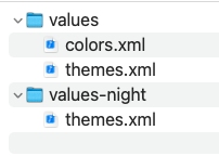
The files can be copied over as is but you will have to change your theme name AndroidManifest.xml or in the theme files to match each other. The default name from tooling is AppTheme.
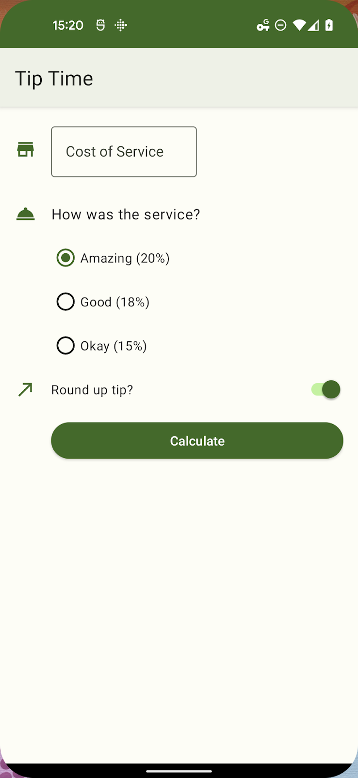
Restart the app and it looks almost exactly the same. One notable change is the Switch and RadioButtons, whose selected states are now themed with tones from the primary color versus secondary colors. In larger applications, you may have to revisit some designs.
<manifest xmlns:android="http://schemas.android.com/apk/res/android"
   package="com.example.tiptime">

   <application ...>
       <activity android:name=".MainActivity"
           android:exported="true">
           <intent-filter>
               <action android:name="android.intent.action.MAIN" />

               <category android:name="android.intent.category.LAUNCHER" />
           </intent-filter>
       </activity>
   </application>

</manifest>
7. Adding dynamic color
With a proper Material 3 theme in use, we can make the UI dynamic with a couple small additions.
The Dynamic Colors API allows you to apply dynamic color to all Activities
in an app, individual activities, or to individual Views or Fragments. For
this app, we'll be applying dynamic color globally.
Create an Application class file
class TipTimeApplication: Application() {
    override fun onCreate() {
        // Apply dynamic color
        DynamicColors.applyToActivitiesIfAvailable(this)
    }
}
We need to reference this newly created file in the Android manifest:
AndroidManifest.xml
< application android name=".TipTimeApplication
<!--- Other existing attributes –>

</application >
On Android 12+ systems, the user's wall paper for default scheme) is examined to generate several tonal palettes. Values from these palettes are used to create a ThemeOverlay.
The DynamicColors class registers an ActivityLifecycleCallbacks that intercepts on ActivityPreCreated to apply the system created dynamic theme overlay or one you have provided.
8. Applying a custom theme overlay
Our tooling can export theme overlays but you can also create them manually if you are overriding a small number of attributes.
A theme overlay is meant to be used in conjunction with another theme and only provides the values that will be changed on top of the base theme.
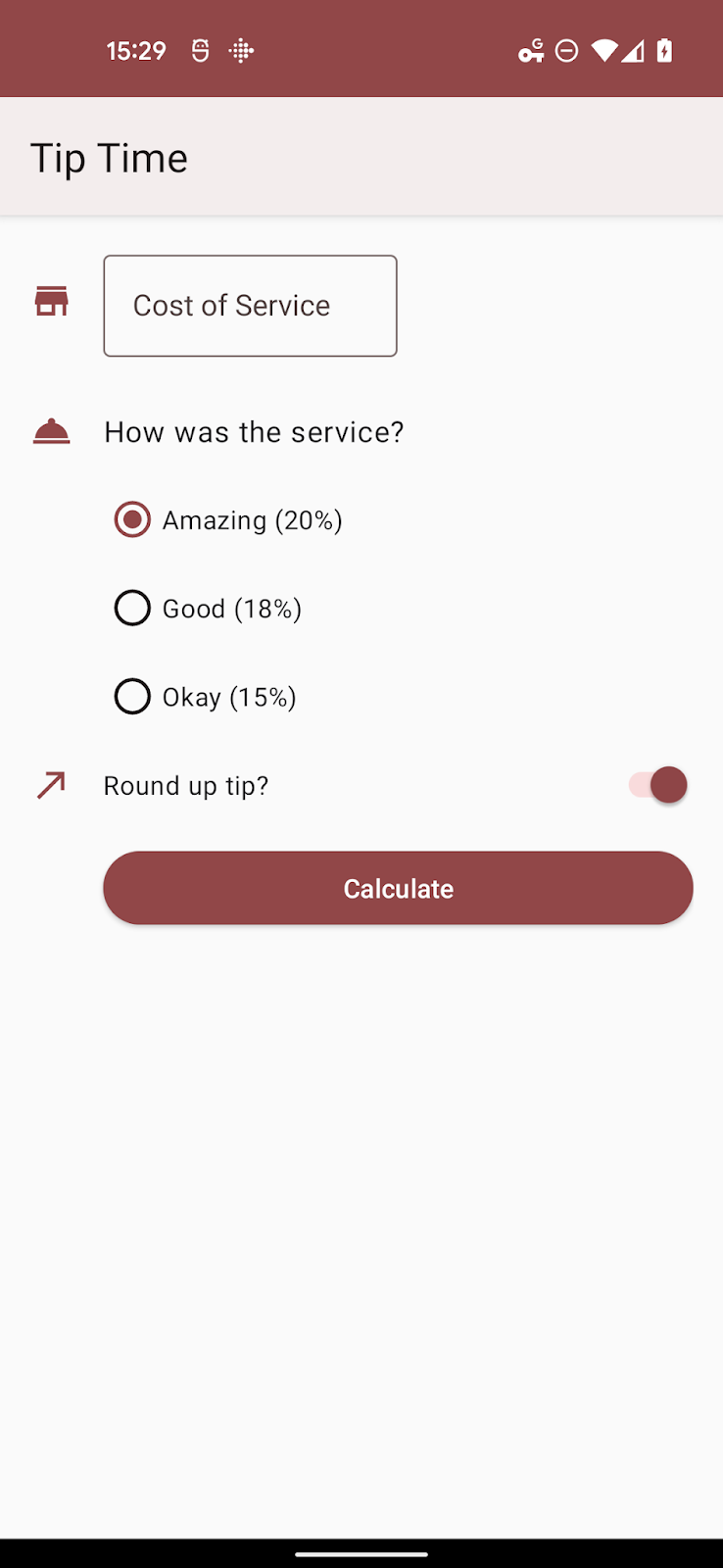
Let's assume that for some reason, perhaps branding, we need the primary color tones to be shades of red. We could do that with the following files and attributes.
colors.xml
<resources>
    <color name="overlay_light_primary">#9C4146</color>
    <color name="overlay_light_onPrimary">#FFFFFF</color>
    <color name= "overlay_light_primaryContainer">#FFDADB</color>
    <color name="overlay_light_onPrimaryContainer">#400008</color>
</resources >
themes_overlays.xml
<style name="AppTheme.Overlay" parent="ThemeOverlay.Material3.DynamicColors.Light">
    <item name="colorPrimary">@color/overlay_light_primary</item>
    <item name="colorOnPrimary">@color/overlay_light_onPrimary</item>
    <item name="colorPrimaryContainer">@color/overlay_light_primaryContainer</item>
    <item name="colorOnPrimaryContainer">@color/overlay_light_onPrimaryContainer<item>
</style>
For the above code, Android 12 will apply a dynamic light theme and overlay your changes on top of that. Alternatively you can use any valid ThemeOverlay as a parent including any one of the following:
ThemeOverlay.Material3.Light
ThemeOverlay.Material3.Dark
ThemeOverlay.Material3.DayNight ThemeOverlay.Material3.DynamicColors.Dark
ThemeOverlay.Material3.DynamicColors.DayNight
To use this Theme Overlay instead of the Material default, change the call to DynamicColors.applyToActivitiesIfAvailable to:
DynamicColors.applyToActivitiesIfAvailable(this, R.style.AppTheme_Overlay)
9. Adding dynamic color to custom attributes
So far we have overridden properties that already exist in a Material 3 theme. We have another possible case in dynamic color where we may have one or more custom attributes that need to be allocated.
When an app opts into dynamic color, it gets access to 5 tonal palettes - three accent palettes and two neutral palettes with the following approximate roles:
system_accent1 | Primary color tones |
system_accent2 | Secondary color tones |
system_accent3 | Tertiary color tones |
system_neutral1 | Neutral backgrounds and surfaces |
system_neutral2 | Neutral surfaces and outlines |
Each palette has a number of tonal steps ranging from white
to black: 0, 10, 50, 100, 200, 300, 400, 500, 600, 700, 800, 900, 1000.
When designing a UI for dynamic color, you should think less about the specific color and more about the relationship of that component's tone and luminance to others in the design system.
Let's say you wanted icons to be themed using the secondary accent palette and you added an attribute to tint icons with the following entry in attrs.xml.
attrs.xml
<resources>
    <attr name="iconColor" format="color" />
</resources>
Your theme overlay might look something like this:
<style name="AppTheme.Overlay" parent="ThemeOverlay.Material3.DynamicColors.DayNight">
<item name="iconColor">@android:color/system_accent2_600</item>
</style>
When you reinstall the app and change your wallpaper, the app will pick up that secondary palette.
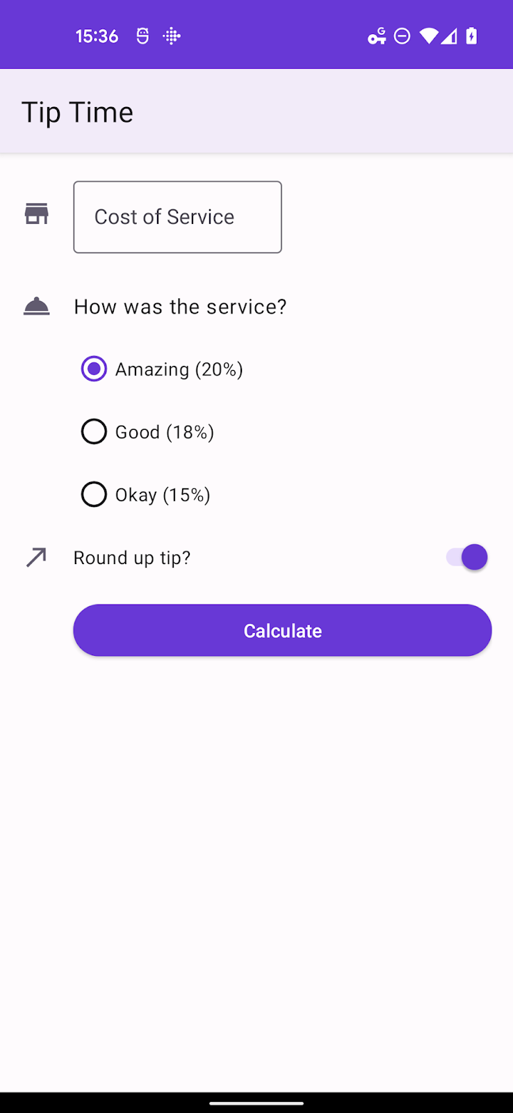
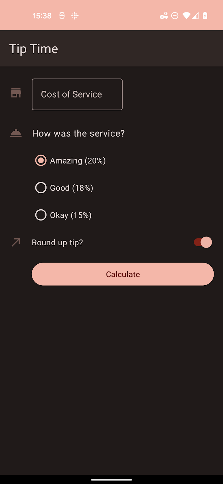
These palettes are specific to Android 12 (API 31) so you will need to place relevant files in folders with a -v31 suffix unless your app has a minimum SDK set to 31 or higher.
10. Summary
In this codelab, you've been able to:
- Add dependencies to upgrade your theme to Material 3.
- Understand the new color groups and roles.
- Understand how to migrate from a static theme to dynamic color.
- Understand how to use theme overlays and use dynamic color for custom theme attributes.
