
1. Introduction
Data Studio and BigQuery together form a powerful combination that allows you to create dashboards that empower users to understand the information and insights in your data. These dashboards can easily be shared using the familiar interface of Google Drive, and embedded in sites for even broader distribution.
What is Data Studio?
Data Studio is Google's free data visualization tool that allows you to:
- Visualize your data through highly configurable charts and tables.
- Connect to a variety of data sources quickly and easily.
- Share your insights with your team or with the world.
- Collaborate on reports with your team.
- Create reports even faster with built-in sample reports and community visualizations
This codelab will walk you through connecting BigQuery and Data Studio to create dashboards and reports that can help you make better sense of your data. We will use public datasets from the Cloud Public Datasets Program to demonstrate how this can be done.
What you will build
In this codelab, you're going to build a Data Studio dashboard. Your dashboard will visualize a BigQuery Public Dataset by connecting BigQuery to Data Studio and determining the best visualization types for the dataset. |
|
What you'll learn
- How to connect BigQuery and Data Studio
- How to visualize your data in Data Studio
What you'll need
- A Google Cloud account. If you don't already have one, you can sign up for the BigQuery sandbox quickly without a credit card.
- A basic knowledge of SQL is helpful, but not required
- A basic understanding of data visualization best practices
2. Getting set up
Accessing BigQuery Public Datasets
For this codelab, you will visualize 311 requests from the City of San Francisco. This dataset, along with more than 150 others, are available through the BigQuery Public Datasets Program. Explore the entire catalog of available datasets to find other datasets. The 311 requests dataset we are using is a good proxy for the type of customer service requests that many companies need to manage.
Setting up your Google Cloud Project
In the Cloud Console, on the project selector page, select or create a Cloud project. This option is available in a drop down menu in the top left portion of the screen. Make sure that billing is enabled for your Google Cloud project. Learn how to confirm billing is enabled for your project.
3. Connecting Data Studio and BigQuery
What is Data Studio?
Data Studio is Google's free data visualization tool that helps users unlock the power of their data with interactive dashboards and engaging reports that inspire smarter business decisions. You can connect to 500+ datasets from over 200 connectors built directly into Data Studio. These include connectors to Google products such as Google Analytics, BigQuery and Sheets, as well as external data sources.
What is BigQuery?
BigQuery is Google Cloud's fully-managed, highly scalable, and cost-effective cloud data warehouse designed for business agility. BigQuery enables you to analyze petabytes of data using ANSI SQL at blazing-fast speeds, gain insights with real-time and predictive analytics, and access data and share insights with ease. All with zero operational overhead.
Create a data source
The first step in creating a report in Data Studio is to create a data source for the report. A report may contain one or more data sources. When you create a BigQuery data source, Data Studio uses the BigQuery connector.
You must have the appropriate permissions in order to add a BigQuery data source to a Data Studio report. In addition, the permissions applied to BigQuery datasets will apply to the reports, charts, and dashboards you create in Data Studio. When a Data Studio report is shared, the report components are visible only to users who have appropriate permissions.
To create a data source:
- Open Data Studio.
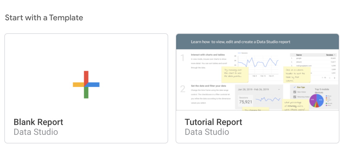
- On the Reports page, in the Start with a Template, click the Blank template. This creates a new untitled report.
- If prompted, complete the Marketing Preferences and the Account and Privacy settings and then click Save. You may need to click the Blank template again after saving your settings.
- In the Add a data to report window, view the Connect to data section and select BigQuery by clicking
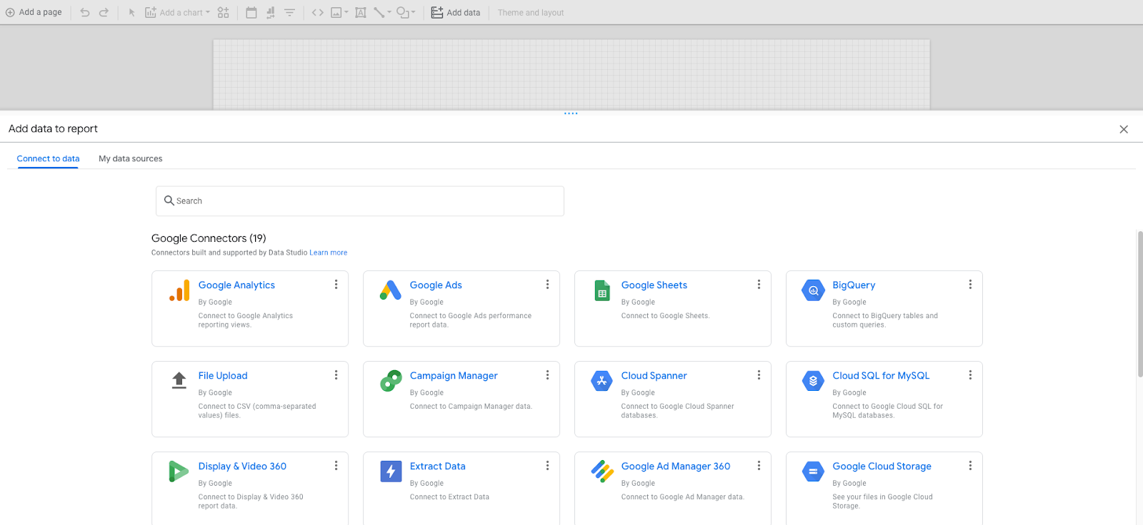
- For Authorization, click Authorize. This allows Google Data Studio access to your GCP projects.
- In the Request for permission dialog, click Allow to give Google Data Studio the ability to view data in BigQuery. You may not receive this prompt if you previously used Google Data Studio.
- In the left hand navigation, you will see My Projects is selected by default. Change your selection to Public Datasets.
- For Billing Project, click the name of the GCP project you created previously.
- Under Public Datasets, click san_francisco_311.
- For table, click 311_service_requests.
- In the lower right corner of the window, click Add. If you get a dialog box saying "You are about to add data to this report," click on "ADD TO REPORT" to proceed.
- Click Manage added data sources under Resources in the Data Studio menu
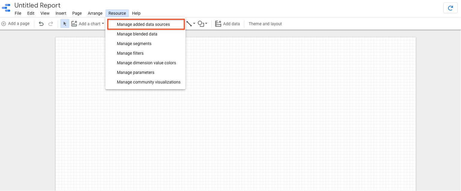
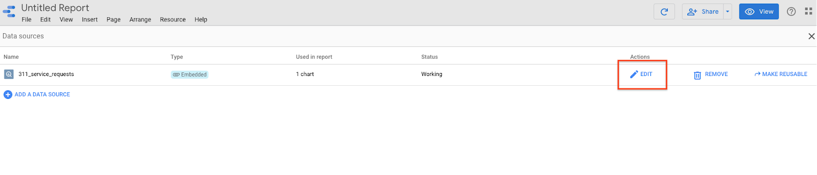
- Click Edit next to the 311_service_requests on the Data Sources page to view the fields of the table and their data types. You can use this page to adjust the field properties or create new calculated fields.
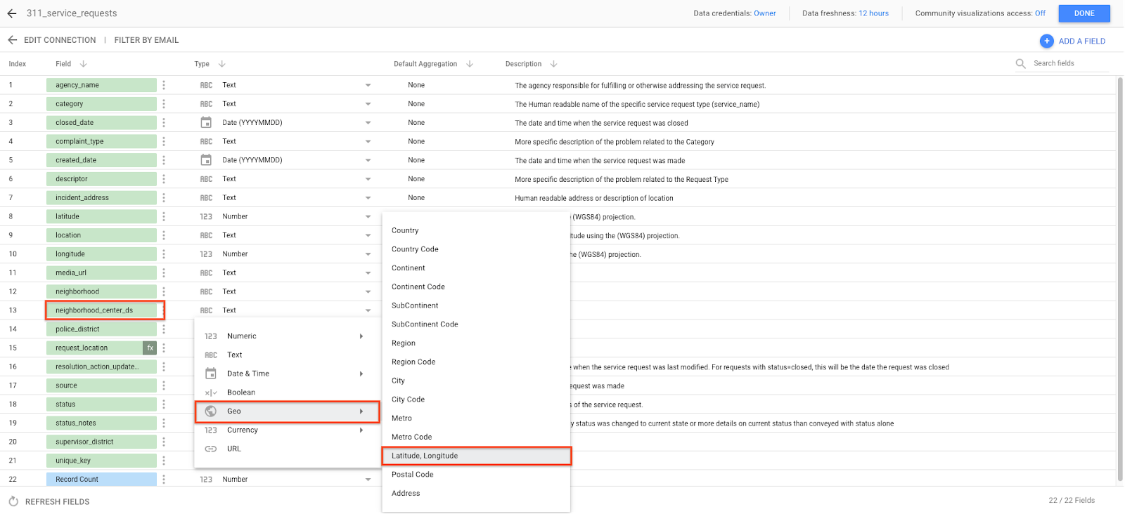
- This dataset includes the internal geographic point of each neighborhood represented in a way that Data Studio can natively use it. Next to the neighborhood_center_ds field, change the data type by clicking text, then selecting Latitude, Longitude from the Geo drop down field. This tells Data Studio that our data field should be represented geographically.
You have now connected your BigQuery dataset to Data Studio!
4. Creating your visualizations
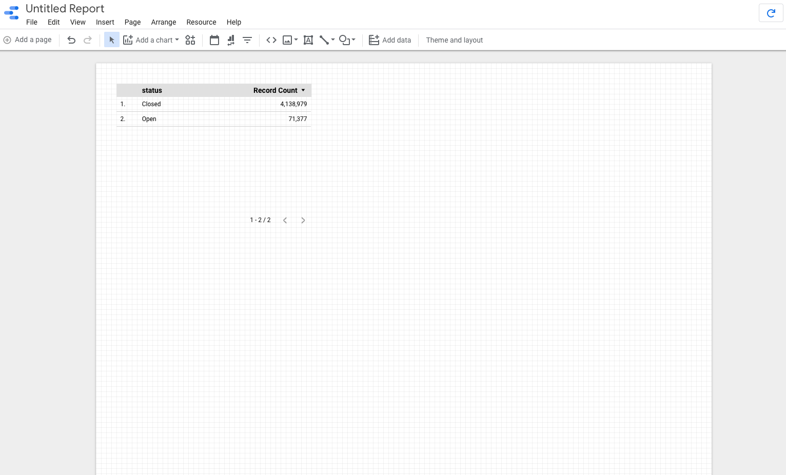
Now that you have successfully connected your BigQuery dataset (in this case, the BigQuery Public Dataset San Francisco 311 requests), you can start visualizing the data. Data Studio will automatically create your first visualization based on your data. You can delete this for now to create a blank template.
Creating a treemap
We will start by creating a treemap to visualize what type of 311 request is most frequently made. This will give us a starting point for other visualizations by telling us which types of requests we might want to focus on.
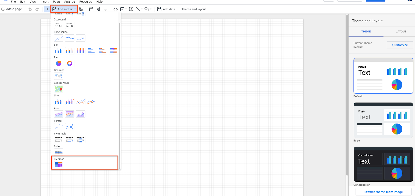
- Click Add a chart from the Data Studio menu, then select Treemap at the bottom. You may have to scroll down to find it.
 2. Data Studio will allow you to either click or drag an area within the canvas to create your visualization. Start by placing it in the bottom left corner of the dashboard. Data Studio will automatically create a treemap by guessing which fields you would like to include.
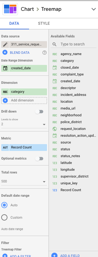
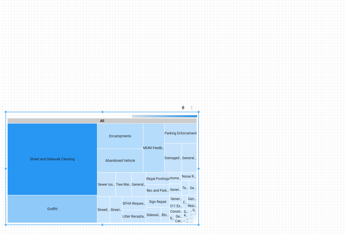
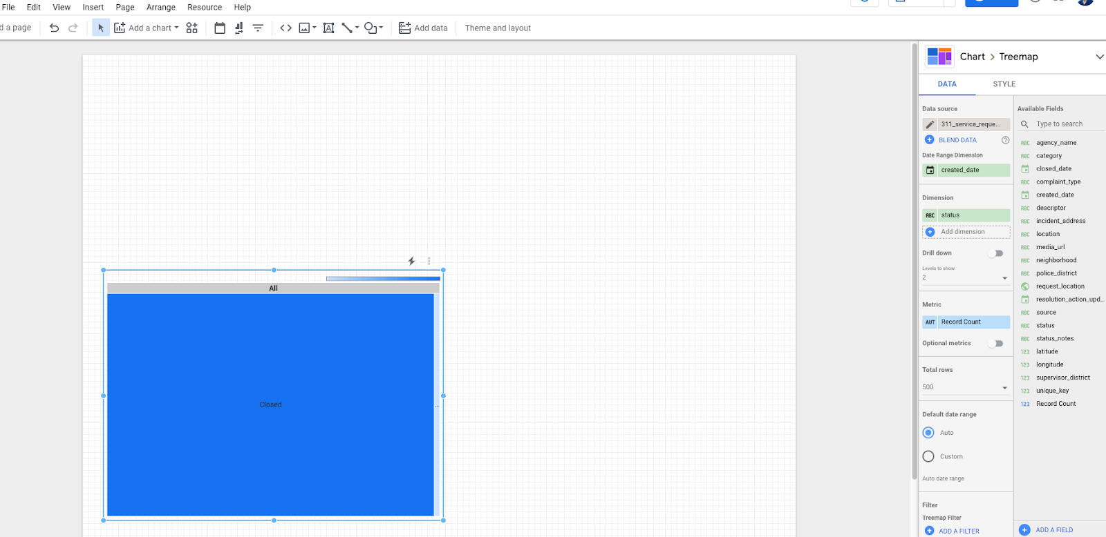 3. Click on the treemap to make changes to the data visualized. In the panel on the right side of the screen, change the parameters to match the visualization below.
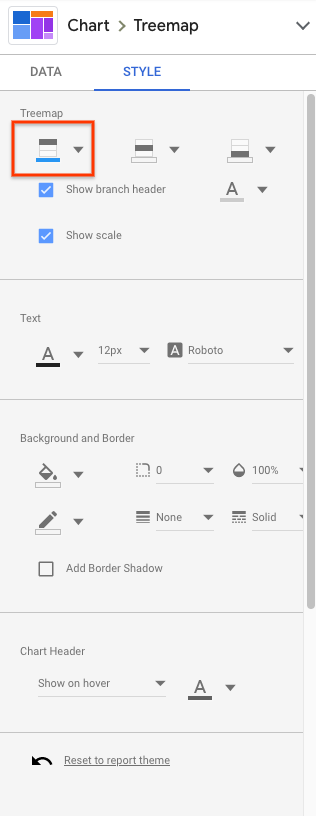
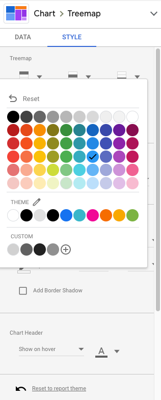
- Click Style at the top of the panel. We will use this to make some minor changes to make the treemap more easily readable. Let's change the color of the request types with the most values. Click the button highlighted below and select the shade of blue with the check in it. This gives us a better contrast to the text in the treemap.
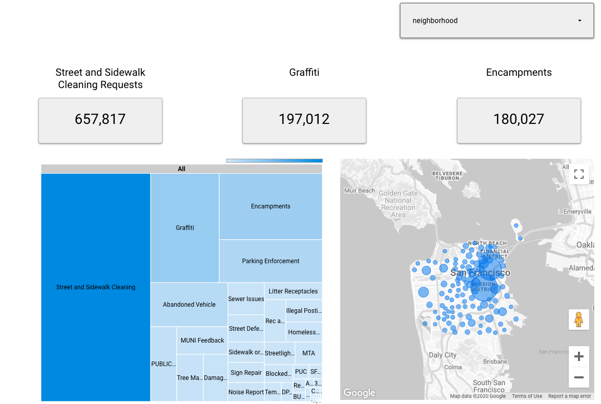
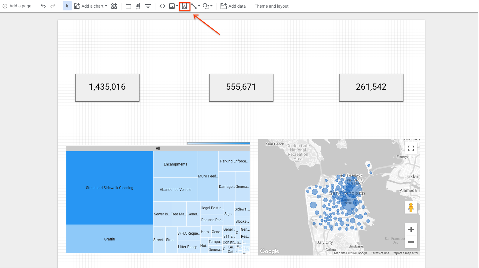
 5. Once complete, your dashboard should look something like this:
5. Building a dashboard
One of the primary purposes of a dashboard is to enable easy reporting of metrics on a more scalable basis to support decision making. We do this by including the data and metrics necessary to provide the proper context for a dataset in an easily digestible format.
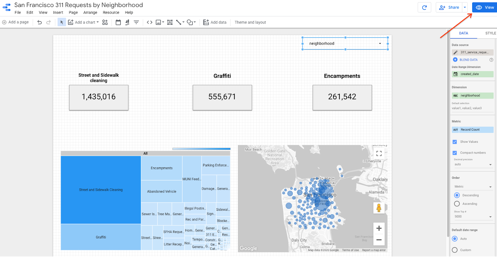
Let's keep building our dashboard by adding a few elements to make this information easier to understand and interpret. Let's start by adding a map that highlights which neighborhoods have the most overall requests and scorecards that tell us the total number of requests for the top 3 types of requests.
Adding a map to your dashboard
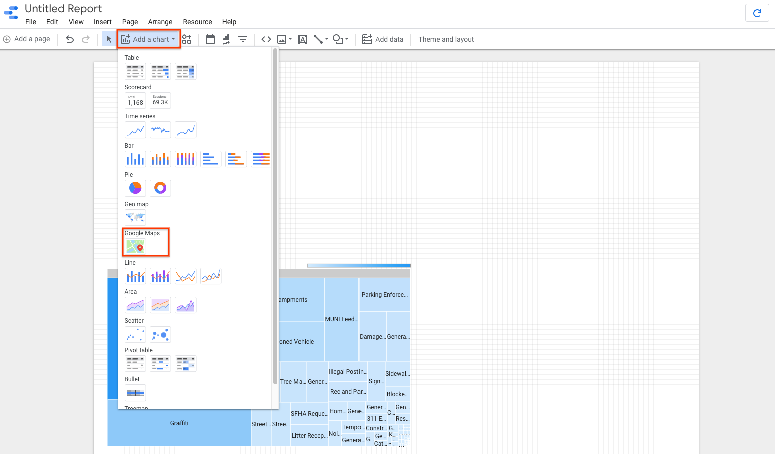
- Click on Add a chart in the menu, then select Google Maps in the dropdown. You could also use Geo Map, but the Google Maps visualizations provide more context that makes it a better fit for this use case.
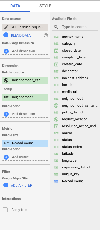
 2. Add the chart to the bottom right portion of the dashboard in the same way you did the treemap. 3. Select the map on the dashboard to change its parameters. Then modify the options under the Data tab to match the selections below. To do so, add the "neighborhood" field to the Tooltip dimension and "record count" to the Bubble size under metric.
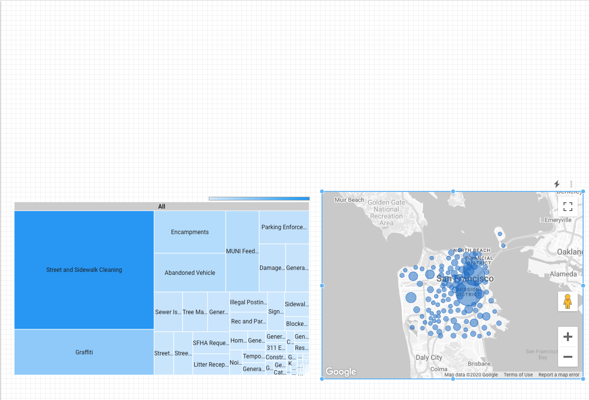
 4. Once complete, your dashboard should look similar to this:
Adding scorecards to your dashboard
Next we'll add three scorecards to the dashboard. Scorecards allow you to show the value for a filtered variable, which helps the users of the dashboard focus on the metrics that are most important. We will create three filters, then apply to the scorecards. This will create 3 scorecards that show users the number service requests with a type of "Street and Sidewalk Cleaning", "Graffiti", and "Encampments". These are the three most commonly requested service types, as determined by the treemap built earlier.
- Click on Add a chart in the menu, then select Scorecard in the dropdown. You will see two options: Scorecard and Scorecard with Compact Numbers. Either of these will work for the intended use case.
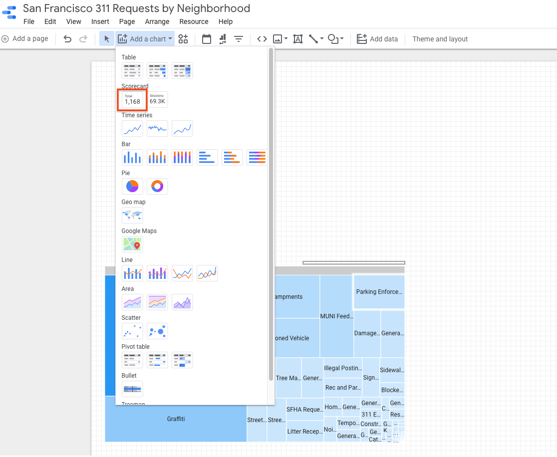 2. Add the scorecard above the tree map in the dashboard, and make sure the "record count" field is selected as the metric. Copy and paste it to create two others spaced across the dashboard.
 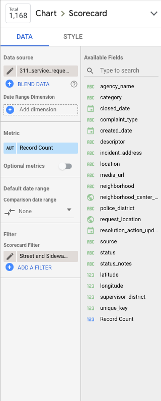 3. Select the leftmost scorecard. In the Data panel on the right, select Add a filter and create a filter that matches the parameters below. The scorecard will automatically update to filter the record count to include service requests that meet the filters criteria.
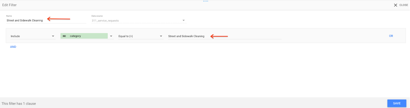 4. Do the same for the middle and rightmost scorecard to create scorecards that show the number of requests with the categories of "Graffiti" and "Encampments". Clicking Add a filter will show the "Filter picker", which shows all the filters already created. Click Create a filter at the bottom to create new filters. After you have created the filters, you should notice the values automatically updated to reflect the new parameters for the scorecard. 5. Select all three of the scorecard objects at once by holding down the shift key and clicking them, then click Styles in the panel to modify the style of the scorecards. The modifications you make now will be made across all three scorecards at once. Update the style of the scorecards to match the panel settings below, but don't worry if your colors are slightly off. We will choose to "Hide Metric Name" (currently showing as "Record Count" on the dashboard) so that we can put our own text in its place and make the meaning of these metrics more understandable to the dashboard viewers.
 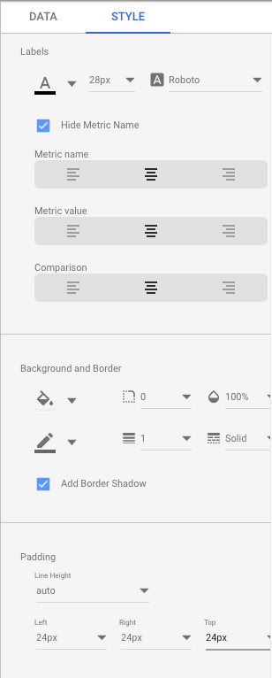 6. Add text above the scorecards so users know what the metrics represent. In the toolbar, click the Text icon. Draw a box on the canvas and then enter your text in the box.
Your dashboard should look like this: 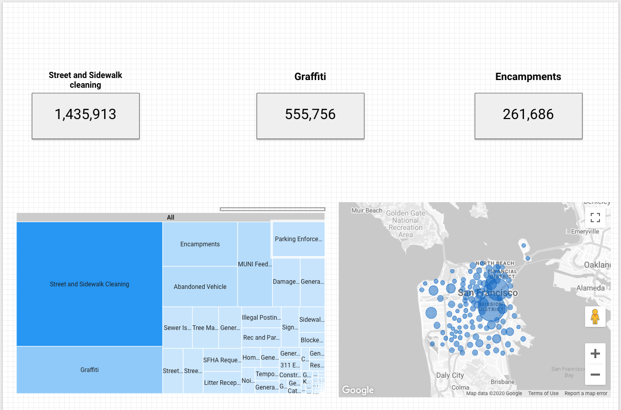
6. Creating filters
Filters in Data Studio allow you to refine or reduce the data reflected in a chart. You define a filter by setting criteria, similar to a WHERE statement in SQL. Filters can target a particular range of values for one or more of your dataset's dimensions, such as limiting data to a specific date range You can apply filters across various levels::
- Chart-level: The filter is applied only to one specific chart.
- Group-level: The filter is applied to a grouping of selected charts.
- Page-level: All charts on that page are filtered.
- Report-level: All charts in the report are filtered.
Now that we have the bulk of the dashboard in place, let's add a filter control that will allow viewers the option to interactively choose one or more neighborhoods they would like reflected in the report visuals as they review them.
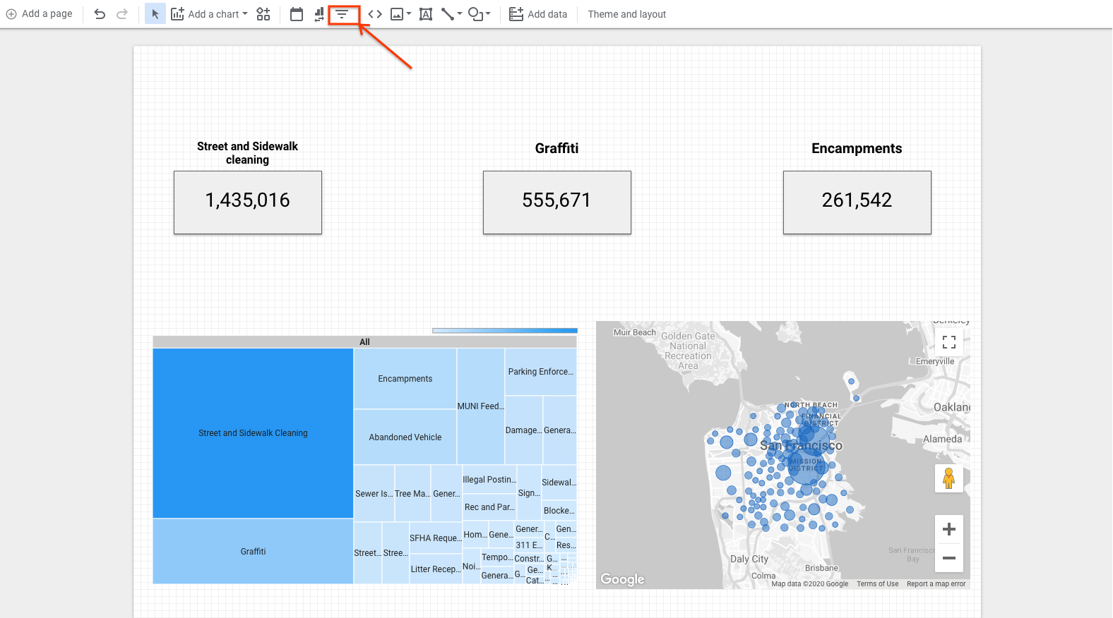
- Click the Filter Control in the Data Studio menu
 2. Click within the canvas of the dashboard to place the filter control, just like you have previously when adding charts. 3. Make sure the filter dimension is set to "neighborhood" in the Data panel if it isn't already. 4. Select the filter by clicking it in the dashboard. Then click Arrange in the top menu bar and select Make page-level. If that option is unavailable to be selected, then the filter is already set to page-level and will filter all the charts on that page when modified.
With that, you have a proper dashboard built for use!
7. Test it and share it
Testing your dashboard
Now that the dashboard is complete, let's take a look at it from the viewer perspective to ensure everything works as expected.
Click View in the top right corner, and you will be able to view the dashboard from the perspective of your viewers.
Sharing your dashboard
Once everything looks the way you want it to, you are ready to share your dashboard. Data Studio makes sharing dashboards simple by using the familiar interface of sharing that is used in Google Sheets, Docs, and other G Suite products.
Start by changing the name of your dashboard so users can more easily discover it. Click on the report name ("Untitled") in the top left corner and change it to "San Francisco 311 Requests by Neighborhood".
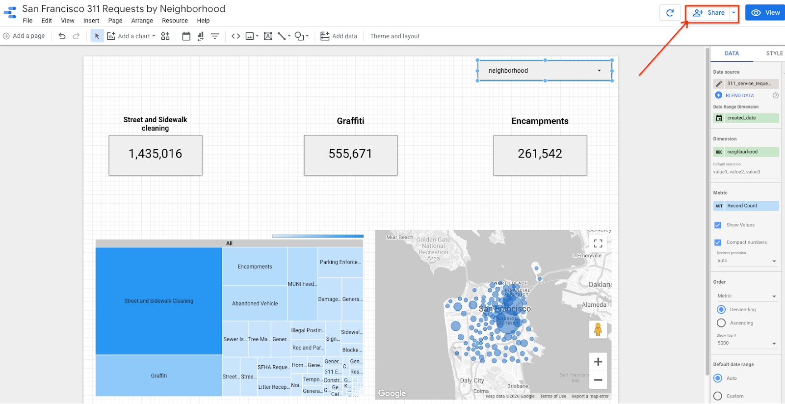
Clicking the Share button in the top right corner will open the sharing interface with a number of options, including sharing with individual users by email, sharing by domain, or making it publicly available to all users. This last setting is particularly useful if you wish to embed the report on a public website.
Next steps
Check out additional codelabs by searching "Data Studio" at the top of the page to learn more about how Google Cloud's business intelligence tools can support your needs. Keep an eye out for future Codelabs that explore Google Cloud's newest BI tool, Looker!
You can also speed up your dashboards by utilizing up to 100 GB of in-memory storage using BigQuery BI Engine. BI Engine is a fast, in-memory analysis service that allows users to interactively explore complex data sets inside BigQuery with sub-second query response time and with high concurrency. It seamlessly integrates with Data Studio to accelerate data exploration and analysis, making your dashboards even more powerful for your viewers.