1. Introduction
Flutter is Google's UI toolkit for building beautiful, natively compiled applications for mobile, web, and desktop from a single codebase. Flutter works with existing code, is used by developers and organizations around the world, and is free and open source.
In this codelab, you enhance a Flutter music application, taking it from boring to beautiful. To accomplish this, this codelab uses tools and APIs introduced in Material 3.
What you'll learn
- How to write a Flutter app that is usable and beautiful across platforms.
- How to design text in your app to make sure that it's adding to the user experience.
- How to pick the right colors, customize widgets, build your own theme, and quickly and easily implement dark mode.
- How to build cross-platform adaptive apps.
- How to build apps that look good on any screen.
- How to add movement to your Flutter app to make it really pop.
Prerequisites:
This codelab assumes that you have some Flutter experience. If not, you might want to first learn the basics. The following links are helpful:
- Take a Tour of the Flutter Widget Framework
- Try the Write Your First Flutter App, part 1 codelab
What you'll build
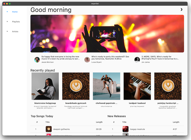
This codelab guides you through building the home screen for an application called MyArtist, a music player app where fans can keep up to date with their favorite artists. It discusses how you can modify your app design to look beautiful across platforms.
The following videos show how the app works at the completion of this codelab:
What would you like to learn from this codelab?
2. Set up your Flutter development environment
You need two pieces of software to complete this lab—the Flutter SDK and an editor.
You can run the codelab using any of these devices:
- A physical Android or iOS device connected to your computer and set to Developer mode.
- The iOS simulator (requires installing Xcode tools).
- The Android Emulator (requires setup in Android Studio).
- A browser (Chrome is required for debugging).
- As a Windows, Linux, or macOS desktop application. You must develop on the platform where you plan to deploy. So, if you want to develop a Windows desktop app, you must develop on Windows to access the appropriate build chain. There are operating system-specific requirements that are covered in detail on docs.flutter.dev/desktop.
3. Get the codelab starter app
Clone it from GitHub
To clone this codelab from GitHub, run the following commands:
git clone https://github.com/flutter/codelabs.git
cd codelabs/boring_to_beautiful/step_01/
To make sure everything is working, run the Flutter application as a desktop application as shown below. Alternatively, open this project in your IDE, and use its tooling to run the application.
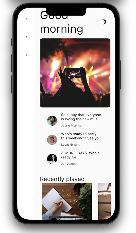
Success! The starter code for MyArtist's home screen should be running. You should see the MyArtist home screen. It looks fine on desktop, but mobile is... Not great. For one thing, it doesn't honor the notch. Don't worry, you'll fix this!
Tour the code
Next, take a tour of the code.
Open lib/src/features/home/view/home_screen.dart, which contains the following:
lib/src/features/home/view/home_screen.dart
import 'package:adaptive_components/adaptive_components.dart';
import 'package:flutter/material.dart';

import '../../../shared/classes/classes.dart';
import '../../../shared/extensions.dart';
import '../../../shared/providers/providers.dart';
import '../../../shared/views/views.dart';
import '../../playlists/view/playlist_songs.dart';
import 'view.dart';

class HomeScreen extends StatefulWidget {
  const HomeScreen({super.key});

  @override
  State<HomeScreen> createState() => _HomeScreenState();
}

class _HomeScreenState extends State<HomeScreen> {
  @override
  Widget build(BuildContext context) {
    final PlaylistsProvider playlistProvider = PlaylistsProvider();
    final List<Playlist> playlists = playlistProvider.playlists;
    final Playlist topSongs = playlistProvider.topSongs;
    final Playlist newReleases = playlistProvider.newReleases;
    final ArtistsProvider artistsProvider = ArtistsProvider();
    final List<Artist> artists = artistsProvider.artists;
    return LayoutBuilder(
      builder: (context, constraints) {
        // Add conditional mobile layout

        return Scaffold(
          body: SingleChildScrollView(
            child: AdaptiveColumn(
              children: [
                AdaptiveContainer(
                  columnSpan: 12,
                  child: Padding(
                    padding: const EdgeInsets.all(2), // Modify this line
                    child: Row(
                      mainAxisAlignment: MainAxisAlignment.spaceBetween,
                      children: [
                        Expanded(
                          child: Text(
                            'Good morning',
                            style: context.displaySmall,
                          ),
                        ),
                        const SizedBox(width: 20),
                        const BrightnessToggle(),
                      ],
                    ),
                  ),
                ),
                AdaptiveContainer(
                  columnSpan: 12,
                  child: Column(
                    children: [
                      const HomeHighlight(),
                      LayoutBuilder(
                        builder: (context, constraints) => HomeArtists(
                          artists: artists,
                          constraints: constraints,
                        ),
                      ),
                    ],
                  ),
                ),
                AdaptiveContainer(
                  columnSpan: 12,
                  child: Column(
                    crossAxisAlignment: CrossAxisAlignment.start,
                    children: [
                      Padding(
                        padding: const EdgeInsets.all(2), // Modify this line
                        child: Text(
                          'Recently played',
                          style: context.headlineSmall,
                        ),
                      ),
                      HomeRecent(
                        playlists: playlists,
                      ),
                    ],
                  ),
                ),
                AdaptiveContainer(
                  columnSpan: 12,
                  child: Padding(
                    padding: const EdgeInsets.all(2), // Modify this line
                    child: Row(
                      crossAxisAlignment: CrossAxisAlignment.start,
                      children: [
                        Flexible(
                          flex: 10,
                          child: Column(
                            mainAxisAlignment: MainAxisAlignment.start,
                            crossAxisAlignment: CrossAxisAlignment.start,
                            children: [
                              Padding(
                                padding:
                                    const EdgeInsets.all(2), // Modify this line
                                child: Text(
                                  'Top Songs Today',
                                  style: context.titleLarge,
                                ),
                              ),
                              LayoutBuilder(
                                builder: (context, constraints) =>
                                    PlaylistSongs(
                                  playlist: topSongs,
                                  constraints: constraints,
                                ),
                              ),
                            ],
                          ),
                        ),
                        // Add spacer between tables
                        Flexible(
                          flex: 10,
                          child: Column(
                            mainAxisAlignment: MainAxisAlignment.start,
                            crossAxisAlignment: CrossAxisAlignment.start,
                            children: [
                              Padding(
                                padding:
                                    const EdgeInsets.all(2), // Modify this line
                                child: Text(
                                  'New Releases',
                                  style: context.titleLarge,
                                ),
                              ),
                              LayoutBuilder(
                                builder: (context, constraints) =>
                                    PlaylistSongs(
                                  playlist: newReleases,
                                  constraints: constraints,
                                ),
                              ),
                            ],
                          ),
                        ),
                      ],
                    ),
                  ),
                ),
              ],
            ),
          ),
        );
      },
    );
  }
}
This file imports material.dart and implements a stateful widget using two classes:
- The
importstatement makes the Material Components available. - The
HomeScreenclass represents the entire page that is displayed. - The
_HomeScreenStateclass'sbuild()method creates the root of the widget tree, which affects how all of the widgets in the UI are created.
4. Take advantage of typography
Text is everywhere. Text is a useful way to communicate with the user. Is your app intended to be friendly and fun, or perhaps trustworthy and professional? There's a reason why your favorite banking app doesn't use Comic Sans. How text is presented shapes a user's first impression of your app. Here are some ways to use text more thoughtfully.
Show, don't tell
Wherever possible, "show" instead of "tell". For example, the NavigationRail in the starter app has tabs for each main route, but the leading icons are identical:
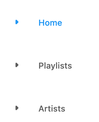
This isn't helpful because the user still has to read the text of each tab. Begin by adding visual cues so that the user can quickly glance at the leading icons to find the desired tab. This also helps with localization and accessibility.
 In
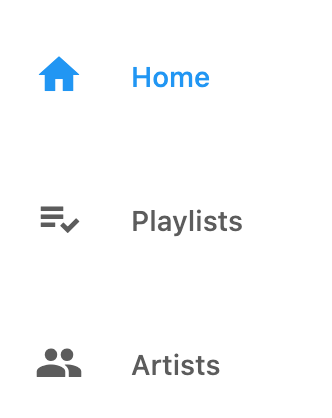
In lib/src/shared/router.dart, add distinct leading icons for each navigation destination (home, playlist, and people):
lib/src/shared/router.dart
const List<NavigationDestination> destinations = [
  NavigationDestination(
    label: 'Home',
    icon: Icon(Icons.home), // Modify this line
    route: '/',
  ),
  NavigationDestination(
    label: 'Playlists',
    icon: Icon(Icons.playlist_add_check), // Modify this line
    route: '/playlists',
  ),
  NavigationDestination(
    label: 'Artists',
    icon: Icon(Icons.people), // Modify this line
    route: '/artists',
  ),
];
Problems?
If your app isn't running correctly, look for typos. If needed, use the code at the following links to get back on track.
Choose fonts thoughtfully
Fonts set the personality of your application, so choosing the right font is crucial. When selecting a font, here are a few things to consider:
- Sans-serif or serif: Serif fonts have decorative strokes or "tails" at the end of letters and are perceived as more formal. Sans-serif fonts don't have the decorative strokes and tend to be perceived as more informal.
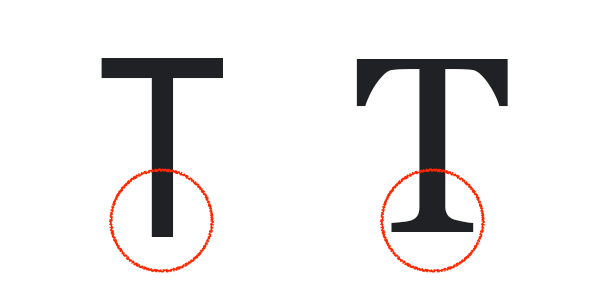 A sans serif capital T and a serif capital T
 - All caps fonts: Using all caps is appropriate for calling attention to small amounts of text (think headlines), but when overused, it can be perceived as shouting causing the user to ignore it entirely.
- Title case or sentence case: When adding titles or labels, consider how you use capital letters: title case, where the first letter of each word is capitalized ("This Is a Title Case Title"), is more formal. Sentence case, which only capitalizes proper nouns and the first word in the text ("This is a sentence case title"), is more conversational and informal.
- Kerning (spacing between each letter), line length (width of the full text across the screen), and line height (how tall each line of text is): Too much or too little of any of these makes your app less readable. For example, it's easy to lose your place when reading a large, unbroken block of text.
With this in mind, head over to Google Fonts and choose a sans-serif font, like Montserrat, since the music app is intended to be playful and fun.
 From the command line, pull in the
 google_fonts package. This also updates the pubspec file to add the fonts as an app dependency.
$ flutter pub add google_fonts
macos/Runner/DebugProfile.entitlements
<?xml version="1.0" encoding="UTF-8"?>
<!DOCTYPE plist PUBLIC "-//Apple//DTD PLIST 1.0//EN" "http://www.apple.com/DTDs/PropertyList-1.0.dtd">
<plist version="1.0">
<dict>
        <key>com.apple.security.app-sandbox</key>
        <true/>
        <key>com.apple.security.cs.allow-jit</key>
        <true/>
        <!-- Make sure these lines are present from here... -->
        <key>com.apple.security.network.client</key>
        <true/>
        <!-- To here. -->
        <key>com.apple.security.network.server</key>
        <true/>
</dict>
</plist>
 In
In lib/src/shared/extensions.dart, import the new package:
lib/src/shared/extensions.dart
import 'package:google_fonts/google_fonts.dart'; // Add this line.
 Set the Montserrat
 TextTheme:
TextTheme get textTheme => GoogleFonts.montserratTextTheme(theme.textTheme); // Modify this line
 Hot reload
  to activate the changes. (Use the button in your IDE or, from the command line, enter
 r to hot reload.):

You should see the new NavigationRail icons along with text displayed in the Montserrat font.
Problems?
If your app isn't running correctly, look for typos. If needed, use the code at the following links to get back on track.
5. Set the theme
Themes help bring a structured design and uniformity to an app by specifying a set system of colors and text styles. Themes enable you to quickly implement a UI without having to stress over minor details like specifying the exact color for every single widget.
Flutter developers typically create custom-themed components in one of two ways:
- Create individual custom widgets, each with its own theme.
- Create scoped themes for default widgets.
This example uses a theme provider located in lib/src/shared/providers/theme.dart to create consistently-themed widgets and colors throughout the app:
lib/src/shared/providers/theme.dart
import 'dart:math';

import 'package:flutter/material.dart';
import 'package:material_color_utilities/material_color_utilities.dart';

class NoAnimationPageTransitionsBuilder extends PageTransitionsBuilder {
 const NoAnimationPageTransitionsBuilder();

 @override
 Widget buildTransitions<T>(
   PageRoute<T> route,
   BuildContext context,
   Animation<double> animation,
   Animation<double> secondaryAnimation,
   Widget child,
 ) {
   return child;
 }
}

class ThemeSettingChange extends Notification {
 ThemeSettingChange({required this.settings});
 final ThemeSettings settings;
}

class ThemeProvider extends InheritedWidget {
 const ThemeProvider(
     {super.key,
     required this.settings,
     required this.lightDynamic,
     required this.darkDynamic,
     required super.child});

 final ValueNotifier<ThemeSettings> settings;
 final ColorScheme? lightDynamic;
 final ColorScheme? darkDynamic;

 final pageTransitionsTheme = const PageTransitionsTheme(
   builders: <TargetPlatform, PageTransitionsBuilder>{
     TargetPlatform.android: FadeUpwardsPageTransitionsBuilder(),
     TargetPlatform.iOS: CupertinoPageTransitionsBuilder(),
     TargetPlatform.linux: NoAnimationPageTransitionsBuilder(),
     TargetPlatform.macOS: NoAnimationPageTransitionsBuilder(),
     TargetPlatform.windows: NoAnimationPageTransitionsBuilder(),
   },
 );

 Color custom(CustomColor custom) {
   if (custom.blend) {
     return blend(custom.color);
   } else {
     return custom.color;
   }
 }

 Color blend(Color targetColor) {
   return Color(
       Blend.harmonize(targetColor.value, settings.value.sourceColor.value));
 }

 Color source(Color? target) {
   Color source = settings.value.sourceColor;
   if (target != null) {
     source = blend(target);
   }
   return source;
 }

 ColorScheme colors(Brightness brightness, Color? targetColor) {
   final dynamicPrimary = brightness == Brightness.light
       ? lightDynamic?.primary
       : darkDynamic?.primary;
   return ColorScheme.fromSeed(
     seedColor: dynamicPrimary ?? source(targetColor),
     brightness: brightness,
   );
 }

 ShapeBorder get shapeMedium => RoundedRectangleBorder(
       borderRadius: BorderRadius.circular(8),
     );

 CardTheme cardTheme() {
   return CardTheme(
     elevation: 0,
     shape: shapeMedium,
     clipBehavior: Clip.antiAlias,
   );
 }

 ListTileThemeData listTileTheme(ColorScheme colors) {
   return ListTileThemeData(
     shape: shapeMedium,
     selectedColor: colors.secondary,
   );
 }

 AppBarTheme appBarTheme(ColorScheme colors) {
   return AppBarTheme(
     elevation: 0,
     backgroundColor: colors.surface,
     foregroundColor: colors.onSurface,
   );
 }

 TabBarTheme tabBarTheme(ColorScheme colors) {
   return TabBarTheme(
     labelColor: colors.secondary,
     unselectedLabelColor: colors.onSurfaceVariant,
     indicator: BoxDecoration(
       border: Border(
         bottom: BorderSide(
           color: colors.secondary,
           width: 2,
         ),
       ),
     ),
   );
 }

 BottomAppBarTheme bottomAppBarTheme(ColorScheme colors) {
   return BottomAppBarTheme(
     color: colors.surface,
     elevation: 0,
   );
 }

 BottomNavigationBarThemeData bottomNavigationBarTheme(ColorScheme colors) {
   return BottomNavigationBarThemeData(
     type: BottomNavigationBarType.fixed,
     backgroundColor: colors.surfaceContainerHighest,
     selectedItemColor: colors.onSurface,
     unselectedItemColor: colors.onSurfaceVariant,
     elevation: 0,
     landscapeLayout: BottomNavigationBarLandscapeLayout.centered,
   );
 }

 NavigationRailThemeData navigationRailTheme(ColorScheme colors) {
   return const NavigationRailThemeData();
 }

 DrawerThemeData drawerTheme(ColorScheme colors) {
   return DrawerThemeData(
     backgroundColor: colors.surface,
   );
 }

 ThemeData light([Color? targetColor]) {
   final _colors = colors(Brightness.light, targetColor);
   return ThemeData.light().copyWith(
     pageTransitionsTheme: pageTransitionsTheme,
     colorScheme: _colors,
     appBarTheme: appBarTheme(_colors),
     cardTheme: cardTheme(),
     listTileTheme: listTileTheme(_colors),
     bottomAppBarTheme: bottomAppBarTheme(_colors),
     bottomNavigationBarTheme: bottomNavigationBarTheme(_colors),
     navigationRailTheme: navigationRailTheme(_colors),
     tabBarTheme: tabBarTheme(_colors),
     drawerTheme: drawerTheme(_colors),
     scaffoldBackgroundColor: _colors.background,
     useMaterial3: true,
   );
 }

 ThemeData dark([Color? targetColor]) {
   final _colors = colors(Brightness.dark, targetColor);
   return ThemeData.dark().copyWith(
     pageTransitionsTheme: pageTransitionsTheme,
     colorScheme: _colors,
     appBarTheme: appBarTheme(_colors),
     cardTheme: cardTheme(),
     listTileTheme: listTileTheme(_colors),
     bottomAppBarTheme: bottomAppBarTheme(_colors),
     bottomNavigationBarTheme: bottomNavigationBarTheme(_colors),
     navigationRailTheme: navigationRailTheme(_colors),
     tabBarTheme: tabBarTheme(_colors),
     drawerTheme: drawerTheme(_colors),
     scaffoldBackgroundColor: _colors.background,
     useMaterial3: true,
   );
 }

 ThemeMode themeMode() {
   return settings.value.themeMode;
 }

 ThemeData theme(BuildContext context, [Color? targetColor]) {
   final brightness = MediaQuery.of(context).platformBrightness;
   return brightness == Brightness.light
       ? light(targetColor)
       : dark(targetColor);
 }

 static ThemeProvider of(BuildContext context) {
   return context.dependOnInheritedWidgetOfExactType<ThemeProvider>()!;
 }

 @override
 bool updateShouldNotify(covariant ThemeProvider oldWidget) {
   return oldWidget.settings != settings;
 }
}

class ThemeSettings {
 ThemeSettings({
   required this.sourceColor,
   required this.themeMode,
 });

 final Color sourceColor;
 final ThemeMode themeMode;
}

Color randomColor() {
 return Color(Random().nextInt(0xFFFFFFFF));
}

// Custom Colors
const linkColor = CustomColor(
 name: 'Link Color',
 color: Color(0xFF00B0FF),
);

class CustomColor {
 const CustomColor({
   required this.name,
   required this.color,
   this.blend = true,
 });

 final String name;
 final Color color;
 final bool blend;

 Color value(ThemeProvider provider) {
   return provider.custom(this);
 }
}
 To use the provider, create an instance and pass it to the scoped theme object in
 MaterialApp, located in lib/src/shared/app.dart. It will be inherited by any nested Theme objects:
lib/src/shared/app.dart
import 'package:dynamic_color/dynamic_color.dart';
import 'package:flutter/material.dart';
import 'package:flutter_bloc/flutter_bloc.dart';

import 'playback/bloc/bloc.dart';
import 'providers/theme.dart';
import 'router.dart';

class MyApp extends StatefulWidget {
 const MyApp({super.key});

 @override
 State<MyApp> createState() => _MyAppState();
}

class _MyAppState extends State<MyApp> {
 final settings = ValueNotifier(ThemeSettings(
   sourceColor:  Colors.pink,
   themeMode: ThemeMode.system,
 ));
 @override
 Widget build(BuildContext context) {
   return BlocProvider<PlaybackBloc>(
     create: (context) => PlaybackBloc(),
     child: DynamicColorBuilder(
       builder: (lightDynamic, darkDynamic) => ThemeProvider(
           lightDynamic: lightDynamic,
           darkDynamic: darkDynamic,
           settings: settings,
           child: NotificationListener<ThemeSettingChange>(
             onNotification: (notification) {
               settings.value = notification.settings;
               return true;
             },
             child: ValueListenableBuilder<ThemeSettings>(
               valueListenable: settings,
               builder: (context, value, _) {
                 final theme = ThemeProvider.of(context); // Add this line
                 return MaterialApp.router(
                   debugShowCheckedModeBanner: false,
                   title: 'Flutter Demo',
                   theme: theme.light(settings.value.sourceColor), // Add this line
                   routeInformationParser: appRouter.routeInformationParser,
                   routerDelegate: appRouter.routerDelegate,
                 );
               },
             ),
           )),
     ),
   );
 }
}
Now that the theme is set up, choose colors for the application.
Choosing the right set of colors isn't always easy. You might have an idea of the primary color, but odds are you want your app to have more than just one color. What color should the text be? Title? Content? Links? What about the background color? The Material Theme Builder is a web-based tool (introduced in Material 3), that helps you select a set of complementary colors for your app.
 To choose a source color for the application, open the Material Theme Builder and explore different colors for the UI. It's important to select a color that fits the brand aesthetic and/or your personal preference.
After creating a theme, right-click the Primary color bubble—this opens a dialog containing the hex value of the primary color. Copy this value. (You can also set the color using this dialog.)
 Pass the primary color's hex value to the theme provider. For example, the hex color
 #00cbe6 is specified as Color(0xff00cbe6). The ThemeProvider generates a ThemeData that contains the set of complementary colors that you previewed in Material Theme Builder:
final settings = ValueNotifier(ThemeSettings(
   sourceColor:  Color(0xff00cbe6), // Replace this color
   themeMode: ThemeMode.system,
 ));
Hot restart the app. With the primary color in place, the app starts to feel more expressive. Access all of the new colors by referencing the theme in the context and grabbing the ColorScheme:
final colors = Theme.of(context).colorScheme;
 To use a particular color, access a color role on the
 colorScheme. Go to lib/src/shared/views/outlined_card.dart and give the OutlinedCard a border:
lib/src/shared/views/outlined_card.dart
class _OutlinedCardState extends State<OutlinedCard> {
  @override
  Widget build(BuildContext context) {
    return MouseRegion(
      cursor: widget.clickable
          ? SystemMouseCursors.click
          : SystemMouseCursors.basic,
      child: Container(
        child: widget.child,
        // Add from here...
        decoration: BoxDecoration(
          border: Border.all(
            color: Theme.of(context).colorScheme.outline,
            width: 1,
          ),
        ),
        // ... To here.
      ),
    );
  }
}
Material 3 introduces nuanced color roles that complement each other and can be used throughout the UI to add new layers of expression. These new color roles include:
Primary,OnPrimary,PrimaryContainer,OnPrimaryContainerSecondary,OnSecondary,SecondaryContainer,OnSecondaryContainerTertiary,OnTertiary,TertiaryContainer,OnTertiaryContainerError,OnError,ErrorContainer,OnErrorContainerBackground,OnBackgroundSurface,OnSurface,SurfaceVariant,OnSurfaceVariantShadow,Outline,InversePrimary
In addition, new design tokens support both the light and dark themes:
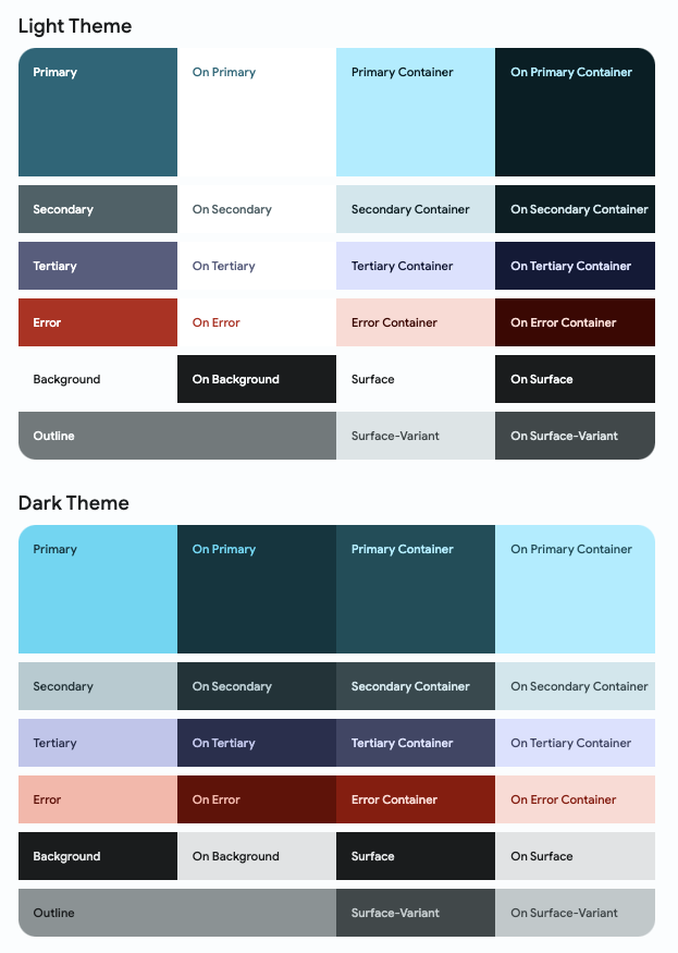
These color roles can be used to assign meaning and emphasis to different parts of the UI. Even if a component is not prominent, it can still take advantage of dynamic color.
 The user can set the app brightness in the device's system settings. In
 lib/src/shared/app.dart, when the device is set to dark mode, return a dark theme and theme mode to the MaterialApp.
lib/src/shared/app.dart
return MaterialApp.router(
  debugShowCheckedModeBanner: false,
  title: 'Flutter Demo',
  theme: theme.light(settings.value.sourceColor),
  darkTheme: theme.dark(settings.value.sourceColor), // Add this line
  themeMode: theme.themeMode(), // Add this line
  routeInformationParser: appRouter.routeInformationParser,
  routerDelegate: appRouter.routerDelegate,
);
Click the moon icon in the top right corner to enable dark mode.
Problems?
If your app isn't running correctly, use the code at the following link to get back on track.
6. Add adaptive design
With Flutter, you can build apps that run almost anywhere, but that's not to say that every app is expected to behave the same everywhere. Users have come to expect different behaviors and features from different platforms.
Material offers packages to make working with adaptive layouts easier—you can find these Flutter packages on GitHub.
Keep the following platform differences in mind when building a cross-platform, adaptive application:
- Input method: mouse, touch, or gamepad
- Font size, device orientation, and viewing distance
- Screen size and form factor: phone, tablet, foldable, desktop, web
 The
The lib/src/shared/views/adaptive_navigation.dart file contains a navigation class where you can provide a list of destinations and content to render the body. Since you use this layout on multiple screens, there's a shared base layout to pass into each child. Navigation rails are good for desktop and large screens, but make the layout mobile friendly by showing a bottom navigation bar on mobile instead.
lib/src/shared/views/adaptive_navigation.dart
import 'package:flutter/material.dart';

class AdaptiveNavigation extends StatelessWidget {
  const AdaptiveNavigation({
    super.key,
    required this.destinations,
    required this.selectedIndex,
    required this.onDestinationSelected,
    required super.child,
  });

  final List<NavigationDestination> destinations;
  final int selectedIndex;
  final void Function(int index) onDestinationSelected;
  final Widget child;

  @override
  Widget build(BuildContext context) {
    return LayoutBuilder(
      builder: (context, dimens) {
        // Tablet Layout
        if (dimens.maxWidth >= 600) { // Add this line
          return Scaffold(
            body: Row(
              children: [
                NavigationRail(
                  extended: dimens.maxWidth >= 800,
                  minExtendedWidth: 180,
                  destinations: destinations
                      .map((e) => NavigationRailDestination(
                            icon: e.icon,
                            label: Text(e.label),
                          ))
                      .toList(),
                  selectedIndex: selectedIndex,
                  onDestinationSelected: onDestinationSelected,
                ),
                Expanded(child: child),
              ],
            ),
          );
        } // Add this line

        // Mobile Layout
        // Add from here...
        return Scaffold(
          body: child,
          bottomNavigationBar: NavigationBar(
            destinations: destinations,
            selectedIndex: selectedIndex,
            onDestinationSelected: onDestinationSelected,
          ),
        );
        // ... To here.
      },
    );
  }
}
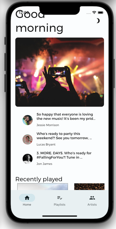
Not all screens are the same size. If you tried to display the desktop version of your app on your phone, you would have to do some combination of squinting and zooming to see everything. You want your app to change how it looks based on the screen where it's displayed. With responsive design, you ensure that your app looks great on screens of all sizes.
To make your app responsive, introduce a few adaptive breakpoints (not to be confused with debugging breakpoints). These breakpoints specify the screen sizes where your app should change its layout.
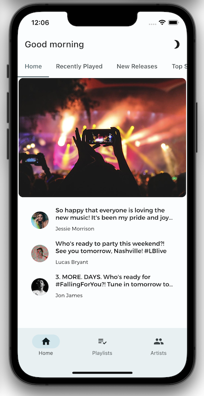
Smaller screens can't display as much as larger screens without shrinking the content. To prevent the app from looking like a desktop app that's been shrunken down, create a separate layout for mobile that uses tabs to break up the content. This gives the app a more native feel on mobile.
The following extension methods (defined in the MyArtist project in lib/src/shared/extensions.dart), are a good place to start when designing optimized layouts for different targets.
lib/src/shared/extensions.dart
extension BreakpointUtils on BoxConstraints {
  bool get isTablet => maxWidth > 730;
  bool get isDesktop => maxWidth > 1200;
  bool get isMobile => !isTablet && !isDesktop;
}
A screen larger than 730 pixels (in the longest direction), but smaller than 1200 pixels, is considered a tablet. Anything larger than 1200 pixels is considered a desktop. If a device is neither a tablet nor a desktop, then it's considered mobile. You can learn more about adaptive breakpoints on material.io. You might consider using the adaptive_breakpoints package.
The home screen's responsive layout uses AdaptiveContainer and AdaptiveColumn based on the 12-column grid using the adaptive_components and adaptive_breakpoints packages to implement a responsive grid layout in Material Design.
return LayoutBuilder(
      builder: (context, constraints) {
        return Scaffold(
          body: SingleChildScrollView(
            child: AdaptiveColumn(
              children: [
                AdaptiveContainer(
                  columnSpan: 12,
                  child: Padding(
                    padding: const EdgeInsets.symmetric(
                      horizontal: 20,
                      vertical: 40,
                    ),
                    child: Row(
                      mainAxisAlignment: MainAxisAlignment.spaceBetween,
                      children: [
                        Expanded(
                          child: Text(
                            'Good morning',
                            style: context.displaySmall,
                          ),
                        ),
                        const SizedBox(width: 20),
                        const BrightnessToggle(),
                      ],
                    ),
                  ),
                ),
                AdaptiveContainer(
                  columnSpan: 12,
                  child: Column(
                    children: [
                      const HomeHighlight(),
                      LayoutBuilder(
                        builder: (context, constraints) => HomeArtists(
                          artists: artists,
                          constraints: constraints,
                        ),
                      ),
                    ],
                  ),
                ),
                AdaptiveContainer(
                  columnSpan: 12,
                  child: Column(
                    crossAxisAlignment: CrossAxisAlignment.start,
                    children: [
                      Padding(
                        padding: const EdgeInsets.symmetric(
                          horizontal: 15,
                          vertical: 20,
                        ),
                        child: Text(
                          'Recently played',
                          style: context.headlineSmall,
                        ),
                      ),
                      HomeRecent(
                        playlists: playlists,
                      ),
                    ],
                  ),
                ),
                AdaptiveContainer(
                  columnSpan: 12,
                  child: Padding(
                    padding: const EdgeInsets.all(15),
                    child: Row(
                      crossAxisAlignment: CrossAxisAlignment.start,
                      children: [
                        Flexible(
                          flex: 10,
                          child: Column(
                            mainAxisAlignment: MainAxisAlignment.start,
                            crossAxisAlignment: CrossAxisAlignment.start,
                            children: [
                              Padding(
                                padding:
                                    const EdgeInsets.only(left: 8, bottom: 8),
                                child: Text(
                                  'Top Songs Today',
                                  style: context.titleLarge,
                                ),
                              ),
                              LayoutBuilder(
                                builder: (context, constraints) =>
                                    PlaylistSongs(
                                  playlist: topSongs,
                                  constraints: constraints,
                                ),
                              ),
                            ],
                          ),
                        ),
                        const SizedBox(width: 25),
                        Flexible(
                          flex: 10,
                          child: Column(
                            mainAxisAlignment: MainAxisAlignment.start,
                            crossAxisAlignment: CrossAxisAlignment.start,
                            children: [
                              Padding(
                                padding:
                                    const EdgeInsets.only(left: 8, bottom: 8),
                                child: Text(
                                  'New Releases',
                                  style: context.titleLarge,
                                ),
                              ),
                              LayoutBuilder(
                                builder: (context, constraints) =>
                                    PlaylistSongs(
                                  playlist: newReleases,
                                  constraints: constraints,
                                ),
                              ),
                            ],
                          ),
                        ),
                      ],
                    ),
                  ),
                ),
              ],
            ),
          ),
        );
      },
    );
 An adaptive layout needs two layouts: one for mobile, and a responsive layout for larger screens. The
 LayoutBuilder currently returns only a desktop layout. In lib/src/features/home/view/home_screen.dart build the mobile layout as a TabBar and TabBarView with 4 tabs.
lib/src/features/home/view/home_screen.dart
import 'package:adaptive_components/adaptive_components.dart';
import 'package:flutter/material.dart';

import '../../../shared/classes/classes.dart';
import '../../../shared/extensions.dart';
import '../../../shared/providers/providers.dart';
import '../../../shared/views/views.dart';
import '../../playlists/view/playlist_songs.dart';
import 'view.dart';

class HomeScreen extends StatefulWidget {
 const HomeScreen({super.key});

 @override
 State<HomeScreen> createState() => _HomeScreenState();
}

class _HomeScreenState extends State<HomeScreen> {
 @override
 Widget build(BuildContext context) {
   final PlaylistsProvider playlistProvider = PlaylistsProvider();
   final List<Playlist> playlists = playlistProvider.playlists;
   final Playlist topSongs = playlistProvider.topSongs;
   final Playlist newReleases = playlistProvider.newReleases;
   final ArtistsProvider artistsProvider = ArtistsProvider();
   final List<Artist> artists = artistsProvider.artists;
   return LayoutBuilder(
     builder: (context, constraints) {
       // Add from here...
       if (constraints.isMobile) {
          return DefaultTabController(
            length: 4,
            child: Scaffold(
              appBar: AppBar(
                centerTitle: false,
                title: const Text('Good morning'),
                actions: const [BrightnessToggle()],
                bottom: const TabBar(
                  isScrollable: true,
                  tabs: [
                    Tab(text: 'Home'),
                    Tab(text: 'Recently Played'),
                    Tab(text: 'New Releases'),
                    Tab(text: 'Top Songs'),
                  ],
                ),
              ),
              body: LayoutBuilder(
                builder: (context, constraints) => TabBarView(
                  children: [
                    SingleChildScrollView(
                      child: Column(
                        children: [
                          const HomeHighlight(),
                          HomeArtists(
                            artists: artists,
                            constraints: constraints,
                          ),
                        ],
                      ),
                    ),
                    HomeRecent(
                      playlists: playlists,
                      axis: Axis.vertical,
                    ),
                    PlaylistSongs(
                      playlist: topSongs,
                      constraints: constraints,
                    ),
                    PlaylistSongs(
                      playlist: newReleases,
                      constraints: constraints,
                    ),
                  ],
                ),
              ),
            ),
          );
        }
       // ... To here.

       return Scaffold(
          body: SingleChildScrollView(
            child: AdaptiveColumn(
              children: [
                AdaptiveContainer(
                  columnSpan: 12,
                  child: Padding(
                    padding: const EdgeInsets.symmetric(
                      horizontal: 20,
                      vertical: 40,
                    ),
                    child: Row(
                      mainAxisAlignment: MainAxisAlignment.spaceBetween,
                      children: [
                        Expanded(
                          child: Text(
                            'Good morning',
                            style: context.displaySmall,
                          ),
                        ),
                        const SizedBox(width: 20),
                        const BrightnessToggle(),
                      ],
                    ),
                  ),
                ),
                AdaptiveContainer(
                  columnSpan: 12,
                  child: Column(
                    children: [
                      const HomeHighlight(),
                      LayoutBuilder(
                        builder: (context, constraints) => HomeArtists(
                          artists: artists,
                          constraints: constraints,
                        ),
                      ),
                    ],
                  ),
                ),
                AdaptiveContainer(
                  columnSpan: 12,
                  child: Column(
                    crossAxisAlignment: CrossAxisAlignment.start,
                    children: [
                      Padding(
                        padding: const EdgeInsets.symmetric(
                          horizontal: 15,
                          vertical: 20,
                        ),
                        child: Text(
                          'Recently played',
                          style: context.headlineSmall,
                        ),
                      ),
                      HomeRecent(
                        playlists: playlists,
                      ),
                    ],
                  ),
                ),
                AdaptiveContainer(
                  columnSpan: 12,
                  child: Padding(
                    padding: const EdgeInsets.all(15),
                    child: Row(
                      crossAxisAlignment: CrossAxisAlignment.start,
                      children: [
                        Flexible(
                          flex: 10,
                          child: Column(
                            mainAxisAlignment: MainAxisAlignment.start,
                            crossAxisAlignment: CrossAxisAlignment.start,
                            children: [
                              Padding(
                                padding:
                                    const EdgeInsets.only(left: 8, bottom: 8),
                                child: Text(
                                  'Top Songs Today',
                                  style: context.titleLarge,
                                ),
                              ),
                              LayoutBuilder(
                                builder: (context, constraints) =>
                                    PlaylistSongs(
                                  playlist: topSongs,
                                  constraints: constraints,
                                ),
                              ),
                            ],
                          ),
                        ),
                        const SizedBox(width: 25),
                        Flexible(
                          flex: 10,
                          child: Column(
                            mainAxisAlignment: MainAxisAlignment.start,
                            crossAxisAlignment: CrossAxisAlignment.start,
                            children: [
                              Padding(
                                padding:
                                    const EdgeInsets.only(left: 8, bottom: 8),
                                child: Text(
                                  'New Releases',
                                  style: context.titleLarge,
                                ),
                              ),
                              LayoutBuilder(
                                builder: (context, constraints) =>
                                    PlaylistSongs(
                                  playlist: newReleases,
                                  constraints: constraints,
                                ),
                              ),
                            ],
                          ),
                        ),
                      ],
                    ),
                  ),
                ),
              ],
            ),
          ),
        );
     },
   );
 }
}
Problems?
If your app isn't running correctly, use the code at the following link to get back on track.
Use whitespace
Whitespace is an important visual tool for your app, creating an organizational break between sections.
It's better to have too much whitespace than not enough. Adding more whitespace is preferable to decreasing the size of your font or visual elements to fit more into the space.
A lack of whitespace can be a hardship for those with vision issues. Too much whitespace can lack cohesion and make your UI look poorly organized. For example, see the following screenshots:
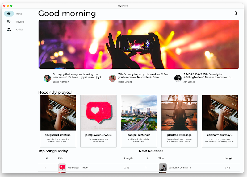
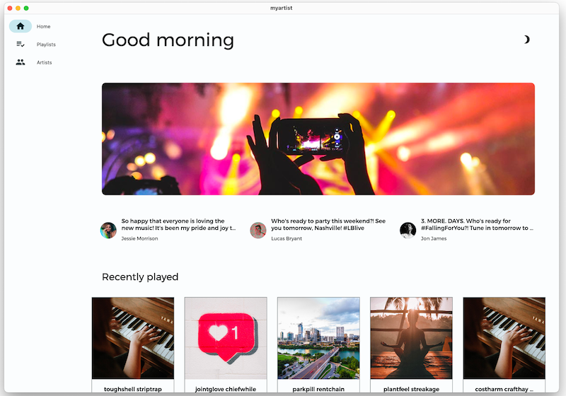
Next, you'll add whitespace to the home screen to give it more room. You will then further tweak the layout to fine tune the spacing.
 Wrap a widget with a
 Padding object to add whitespace around that widget. Increase all of the padding values currently in lib/src/features/home/view/home_screen.dart to 35:
lib/src/features/home/view/home_screen.dart
Scaffold(
      body: SingleChildScrollView(
        child: AdaptiveColumn(
          children: [
            AdaptiveContainer(
              columnSpan: 12,
              child: Padding(
                padding: const EdgeInsets.all(35), // Modify this line
                child: Row(
                  mainAxisAlignment: MainAxisAlignment.spaceBetween,
                  children: [
                    Expanded(
                      child: Text(
                        'Good morning',
                        style: context.displaySmall,
                      ),
                    ),
                    const SizedBox(width: 20),
                    const BrightnessToggle(),
                  ],
                ),
              ),
            ),
            AdaptiveContainer(
              columnSpan: 12,
              child: Column(
                children: [
                  const HomeHighlight(),
                  LayoutBuilder(
                    builder: (context, constraints) => HomeArtists(
                      artists: artists,
                      constraints: constraints,
                    ),
                  ),
                ],
              ),
            ),
            AdaptiveContainer(
              columnSpan: 12,
              child: Column(
                crossAxisAlignment: CrossAxisAlignment.start,
                children: [
                  Padding(
                    padding: const EdgeInsets.all(35), // Modify this line
                    child: Text(
                      'Recently played',
                      style: context.headlineSmall,
                    ),
                  ),
                  HomeRecent(
                    playlists: playlists,
                  ),
                ],
              ),
            ),
            AdaptiveContainer(
              columnSpan: 12,
              child: Padding(
                padding: const EdgeInsets.all(35), // Modify this line
                child: Row(
                  crossAxisAlignment: CrossAxisAlignment.start,
                  children: [
                    Flexible(
                      flex: 10,
                      child: Column(
                        mainAxisAlignment: MainAxisAlignment.start,
                        crossAxisAlignment: CrossAxisAlignment.start,
                        children: [
                          Padding(
                            padding:
                                const EdgeInsets.all(35), // Modify this line
                            child: Text(
                              'Top Songs Today',
                              style: context.titleLarge,
                            ),
                          ),
                          LayoutBuilder(
                            builder: (context, constraints) => PlaylistSongs(
                              playlist: topSongs,
                              constraints: constraints,
                            ),
                          ),
                        ],
                      ),
                    ),
                    // Add spacer between tables
                    Flexible(
                      flex: 10,
                      child: Column(
                        mainAxisAlignment: MainAxisAlignment.start,
                        crossAxisAlignment: CrossAxisAlignment.start,
                        children: [
                          Padding(
                            padding:
                                const EdgeInsets.all(35), // Modify this line
                            child: Text(
                              'New Releases',
                              style: context.titleLarge,
                            ),
                          ),
                          LayoutBuilder(
                            builder: (context, constraints) => PlaylistSongs(
                              playlist: newReleases,
                              constraints: constraints,
                            ),
                          ),
                        ],
                      ),
                    ),
                  ],
                ),
              ),
            ),
          ],
        ),
      ),
    );
 Hot reload the app. It should look the same as before, but with more whitespace between the widgets. The additional padding looks better, but the highlight banner at the top is still too close to the edges.
 In
In lib/src/features/home/view/home_highlight.dart, change the padding on the banner to 35:
lib/src/features/home/view/home_highlight.dart
class HomeHighlight extends StatelessWidget {
  const HomeHighlight({super.key});

  @override
  Widget build(BuildContext context) {
    return Row(
      children: [
        Expanded(
          child: Padding(
            padding: const EdgeInsets.all(35), // Modify this line
            child: Clickable(
              child: SizedBox(
                height: 275,
                child: ClipRRect(
                  borderRadius: BorderRadius.circular(10),
                  child: Image.asset(
                    'assets/images/news/concert.jpeg',
                    fit: BoxFit.cover,
                  ),
                ),
              ),
              onTap: () => launch('https://docs.flutter.dev'),
            ),
          ),
        ),
      ],
    );
  }
}
 Hot reload the app. The two playlists at the bottom have no whitespace between them, so they look like they belong to the same table. That's not the case, and you'll fix that next.
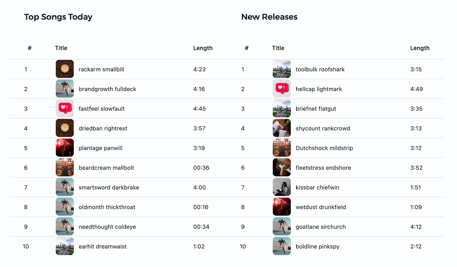
 Add whitespace between the playlists by inserting a size widget to the
 Row that contains them. In lib/src/features/home/view/home_screen.dart, add a SizedBox with a width of 35:
lib/src/features/home/view/home_screen.dart
Padding(
  padding: const EdgeInsets.all(35),
  child: Row(
    crossAxisAlignment: CrossAxisAlignment.start,
    children: [
      Flexible(
        flex: 10,
        child: Column(
          mainAxisAlignment: MainAxisAlignment.start,
          crossAxisAlignment: CrossAxisAlignment.start,
          children: [
            Padding(
              padding: const EdgeInsets.all(35),
              child: Text(
                'Top Songs Today',
                style: context.titleLarge,
              ),
            ),
            PlaylistSongs(
              playlist: topSongs,
              constraints: constraints,
            ),
          ],
        ),
      ),
      const SizedBox(width: 35), // Add this line
      Flexible(
        flex: 10,
        child: Column(
          mainAxisAlignment: MainAxisAlignment.start,
          crossAxisAlignment: CrossAxisAlignment.start,
          children: [
            Padding(
              padding: const EdgeInsets.all(35),
              child: Text(
                'New Releases',
                style: context.titleLarge,
              ),
            ),
            PlaylistSongs(
              playlist: newReleases,
              constraints: constraints,
            ),
          ],
        ),
      ),
    ],
  ),
),
 Hot reload the app. The app should look as follows:
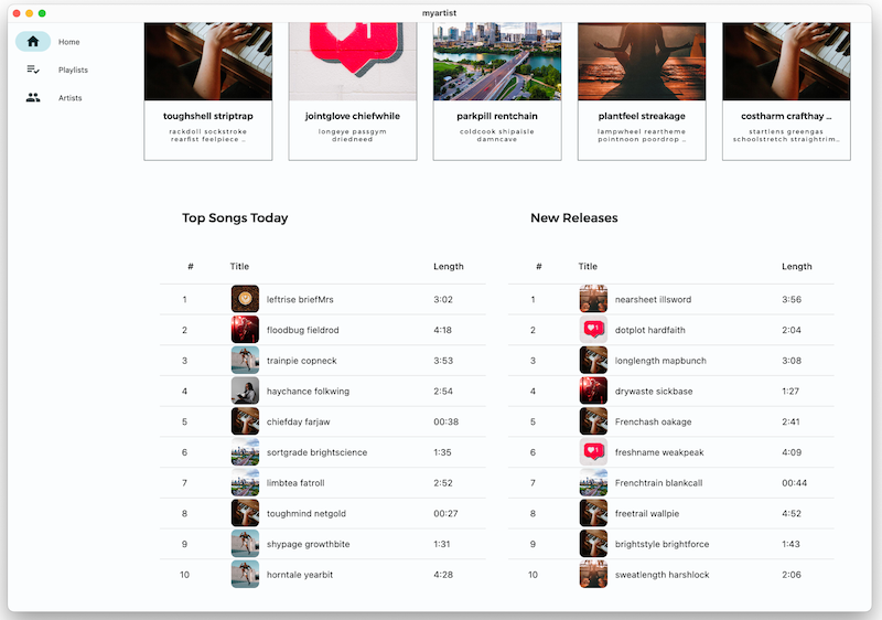
Now there's plenty of room for the home screen contents, but everything looks too separated and there's no cohesion between sections.
 So far, you've set all padding (both horizontal and vertical) for the widgets on the home screen to 35 with
 EdgeInsets.all(35), but you can set the padding for each of the edges independently, too. Customize the padding to fit the space better.
EdgeInsets.LTRB()sets left, top, right, and bottom individuallyEdgeInsets.symmetric()sets the padding for vertical (top and bottom) to be equivalent, and horizontal (left and right) to be equivalentEdgeInsets.only()sets only the specified edges.
Scaffold(
  body: SingleChildScrollView(
    child: AdaptiveColumn(
      children: [
        AdaptiveContainer(
           columnSpan: 12,
             child: Padding(
               padding: const EdgeInsets.fromLTRB(20, 25, 20, 10), // Modify this line
               child: Row(
                 mainAxisAlignment: MainAxisAlignment.spaceBetween,
                   children: [
                     Expanded(
                       child: Text(
                         'Good morning',
                          style: context.displaySmall,
                       ),
                     ),
                     const SizedBox(width: 20),
                     const BrightnessToggle(),
                   ],
                 ),
               ),
             ),
             AdaptiveContainer(
               columnSpan: 12,
               child: Column(
                 children: [
                   const HomeHighlight(),
                   LayoutBuilder(
                     builder: (context, constraints) => HomeArtists(
                       artists: artists,
                       constraints: constraints,
                     ),
                   ),
                 ],
               ),
             ),
             AdaptiveContainer(
               columnSpan: 12,
               child: Column(
                 crossAxisAlignment: CrossAxisAlignment.start,
                 children: [
                   Padding(
                     padding: const EdgeInsets.symmetric(
                       horizontal: 15,
                       vertical: 10,
                     ), // Modify this line
                     child: Text(
                       'Recently played',
                       style: context.headlineSmall,
                     ),
                   ),
                   HomeRecent(
                     playlists: playlists,
                   ),
                 ],
               ),
             ),
             AdaptiveContainer(
               columnSpan: 12,
               child: Padding(
                 padding: const EdgeInsets.all(15), // Modify this line
                 child: Row(
                   crossAxisAlignment: CrossAxisAlignment.start,
                   children: [
                     Flexible(
                       flex: 10,
                         child: Column(
                           mainAxisAlignment: MainAxisAlignment.start,
                           crossAxisAlignment: CrossAxisAlignment.start,
                           children: [
                             Padding(
                               padding: const EdgeInsets.only(left: 8, bottom: 8), // Modify this line
                               child: Text(
                                 'Top Songs Today',
                                 style: context.titleLarge,
                               ),
                             ),
                             LayoutBuilder(
                               builder: (context, constraints) =>
                                    PlaylistSongs(
                                  playlist: topSongs,
                                  constraints: constraints,
                                ),
                              ),
                            ],
                          ),
                        ),
                    const SizedBox(width: 25),
                    Flexible(
                      flex: 10,
                      child: Column(
                        mainAxisAlignment: MainAxisAlignment.start,
                        crossAxisAlignment: CrossAxisAlignment.start,
                        children: [
                          Padding(
                            padding: const EdgeInsets.only(left: 8, bottom: 8), // Modify this line
                            child: Text(
                              'New Releases',
                               style: context.titleLarge,
                            ),
                          ),
                          LayoutBuilder(
                            builder: (context, constraints) =>
                                    PlaylistSongs(
                                  playlist: newReleases,
                                  constraints: constraints,
                                ),
                              ),
                            ],
                          ),
                        ),
                      ],
                    ),
                  ),
                ),
              ],
            ),
          ),
        );
 In
In lib/src/features/home/view/home_highlight.dart, set the left and right padding on the banner to 35, and the top and bottom padding to 5:
lib/src/features/home/view/home_highlight.dart
class HomeHighlight extends StatelessWidget {
  const HomeHighlight({super.key});

  @override
  Widget build(BuildContext context) {
    return Row(
      children: [
        Expanded(
          child: Padding(
            // Modify this line
            padding: const EdgeInsets.symmetric(horizontal: 35, vertical: 5),
            child: Clickable(
              child: SizedBox(
                height: 275,
                child: ClipRRect(
                  borderRadius: BorderRadius.circular(10),
                  child: Image.asset(
                    'assets/images/news/concert.jpeg',
                    fit: BoxFit.cover,
                  ),
                ),
              ),
              onTap: () => launch('https://docs.flutter.dev'),
            ),
          ),
        ),
      ],
    );
  }
}
 Hot reload the app. The layout and spacing look much better! For the finishing touch, add some motion and animation.

Problems?
If your app isn't running correctly, use the code at the following link to get back on track.
7. Add motion and animation
Motion and animation are great ways to introduce movement and energy, and to provide feedback when the user interacts with the app.
Animate between screens
The ThemeProvider defines a PageTransitionsTheme with screen transition animations for mobile platforms (iOS, Android). Desktop users already get feedback from their mouse or trackpad click, so a page transition animation isn't needed.
Flutter provides the screen transition animations that you can configure for your app based on target platform as seen in lib/src/shared/providers/theme.dart:
lib/src/shared/providers/theme.dart
final pageTransitionsTheme = const PageTransitionsTheme(
  builders: <TargetPlatform, PageTransitionsBuilder>{
    TargetPlatform.android: FadeUpwardsPageTransitionsBuilder(),
    TargetPlatform.iOS: CupertinoPageTransitionsBuilder(),
    TargetPlatform.linux: NoAnimationPageTransitionsBuilder(),
    TargetPlatform.macOS: NoAnimationPageTransitionsBuilder(),
    TargetPlatform.windows: NoAnimationPageTransitionsBuilder(),
  },
);
 Pass the
 PageTransitionsTheme to both the light and dark themes in lib/src/shared/providers/theme.dart
lib/src/shared/providers/theme.dart
ThemeData light([Color? targetColor]) {
  final _colors = colors(Brightness.light, targetColor);
  return ThemeData.light().copyWith(
    pageTransitionsTheme: pageTransitionsTheme, // Add this line
    colorScheme: ColorScheme.fromSeed(
      seedColor: source(targetColor),
      brightness: Brightness.light,
    ),
    appBarTheme: appBarTheme(_colors),
    cardTheme: cardTheme(),
    listTileTheme: listTileTheme(),
    tabBarTheme: tabBarTheme(_colors),
    scaffoldBackgroundColor: _colors.background,
  );
}

ThemeData dark([Color? targetColor]) {
  final _colors = colors(Brightness.dark, targetColor);
  return ThemeData.dark().copyWith(
    pageTransitionsTheme: pageTransitionsTheme, // Add this line
    colorScheme: ColorScheme.fromSeed(
      seedColor: source(targetColor),
      brightness: Brightness.dark,
    ),
    appBarTheme: appBarTheme(_colors),
    cardTheme: cardTheme(),
    listTileTheme: listTileTheme(),
    tabBarTheme: tabBarTheme(_colors),
    scaffoldBackgroundColor: _colors.background,
  );
}
Without animation on iOS
With animation on iOS
Problems?
If your app isn't running correctly, use the code at the following link to get back on track.
Add hover states
One way to add motion to a desktop app is with hover states, where a widget changes its state (such as color, shape, or content), when the user hovers the cursor over it.
By default, the _OutlinedCardState class (used for the "recently played" playlist tiles), returns a MouseRegion—which turns the cursor arrow into a pointer on hover—but you can add more visual feedback.
 Open lib/src/shared/views/outlined_card.dart and replace its contents with the following implementation to introduce a
 _hovered state.
lib/src/shared/views/outlined_card.dart
import 'package:flutter/material.dart';

class OutlinedCard extends StatefulWidget {
  const OutlinedCard({
    super.key,
    required this.child,
    this.clickable = true,
  });
  final Widget child;
  final bool clickable;
  @override
  State<OutlinedCard> createState() => _OutlinedCardState();
}

class _OutlinedCardState extends State<OutlinedCard> {
  bool _hovered = false;

  @override
  Widget build(BuildContext context) {
    final borderRadius = BorderRadius.circular(_hovered ? 20 : 8);
    const animationCurve = Curves.easeInOut;
    return MouseRegion(
      onEnter: (_) {
        if (!widget.clickable) return;
        setState(() {
          _hovered = true;
        });
      },
      onExit: (_) {
        if (!widget.clickable) return;
        setState(() {
          _hovered = false;
        });
      },
      cursor: widget.clickable ? SystemMouseCursors.click : SystemMouseCursors.basic,
      child: AnimatedContainer(
        duration: kThemeAnimationDuration,
        curve: animationCurve,
        decoration: BoxDecoration(
          border: Border.all(
            color: Theme.of(context).colorScheme.outline,
            width: 1,
          ),
          borderRadius: borderRadius,
        ),
        foregroundDecoration: BoxDecoration(
          color: Theme.of(context).colorScheme.onSurface.withOpacity(
                _hovered ? 0.12 : 0,
              ),
          borderRadius: borderRadius,
        ),
        child: TweenAnimationBuilder<BorderRadius>(
          duration: kThemeAnimationDuration,
          curve: animationCurve,
          tween: Tween(begin: BorderRadius.zero, end: borderRadius),
          builder: (context, borderRadius, child) => ClipRRect(
            clipBehavior: Clip.antiAlias,
            borderRadius: borderRadius,
            child: child,
          ),
          child: widget.child,
        ),
      ),
    );
  }
}
 Hot reload the app and then hover over one of the recently played playlist tiles.
The OutlinedCard changes opacity and rounds the corners.
 Finally, animate the song number on a playlist into a play button using the
 HoverableSongPlayButton widget defined in lib/src/shared/views/hoverable_song_play_button.dart. In lib/src/features/playlists/view/playlist_songs.dart, wrap the Center widget (which contains the song number) with a HoverableSongPlayButton:
lib/src/features/playlists/view/playlist_songs.dart
HoverableSongPlayButton(        // Add this line
  hoverMode: HoverMode.overlay, // Add this line
  song: playlist.songs[index],  // Add this line
  child: Center(                // Modify this line
    child: Text(
      (index + 1).toString(),
       textAlign: TextAlign.center,
       ),
    ),
  ),                            // Add this line
 Hot reload the app and then hover the cursor over the song number on either the Top Songs Today or the New Releases playlist.
The number animates into a play button that plays the song when you click it.
See the final project code on GitHub.
8. Congratulations!
You've completed this codelab! You've learned that there are many small changes that you can integrate into an app to make it more beautiful, and also more accessible, more localizable, and more suitable for multiple platforms. These techniques include, but aren't limited to:
- Typography: Text is more than just a communication tool. Use the way that text is displayed to produce a positive effect on users' experience and perception of your app.
- Theming: Establish a design system that you can reliably use without having to make design decisions for every widget.
- Adaptivity: Consider the device and platform that the user is running your app on and its capabilities. Consider screen size and how your app is displayed.
- Motion and animation: Adding movement to your app adds energy to the user experience and, more practically, provides feedback for users.
With a few small tweaks your app can go from boring to beautiful:
Before

After
Next steps
We hope that you have learned more about building beautiful apps in Flutter!
If you apply any of the tips or tricks mentioned here (or have a tip of your own to share), we'd love to hear from you! Contact us on Twitter at @rodydavis and @khanhnwin!
You might also find the following resources helpful.
Theming
- Material Theme Builder (tool)
Adaptive and responsive resources:
- Decoding Flutter on Adaptive vs Responsive (video)
- Adaptive layouts (video from The Boring Flutter Development Show)
- Creating responsive and adaptive apps (flutter.dev)
- Adaptive Material components for Flutter (library on GitHub)
- 5 things you can do to prepare your app for large screens (video from Google I/O 2021)
General design resources:
- The little things: Becoming the mythical designer-developer (video from Flutter Engage)
- Material Design 3 for Foldable Devices (material.io)
Also, connect with the Flutter community!
Go forth and make the app world beautiful!
