
1. 簡介
Compose 和 View 系統可以同時搭配使用。
在本程式碼研究室中,您會遷移部分 Sunflower 植物詳細資料畫面至 Compose。我們建立了一份專案副本,協助您嘗試將實際的應用程式遷移至 Compose。
完成本程式碼研究室後,您可以繼續進行遷移作業,並視需要轉換 Sunflower 的其餘畫面。
如果您在閱讀本程式碼研究室時需要更多支援,請參閱下列程式碼:
學習目標
在本程式碼研究室,您將學到:
- 可採用的不同遷移路徑
- 如何將應用程式逐步遷移至 Compose
- 如何將 Compose 新增至使用 View 建立的現有畫面
- 如何在 Compose 中使用 View
- 如何在 Compose 中建立主題
- 如何測試使用 View 和 Compose 編寫的混合畫面
必要條件
- 熟悉 Kotlin 語法,包括 lambda
- 瞭解 Compose 基本概念
軟硬體需求
2. 遷移策略
Jetpack Compose 原本就設計成可與 View 互通操作。如您要遷移至 Compose 系統,建議採用逐步方式,讓 Compose 和 View 在程式碼集並存,直到應用程式完全遷移至 Compose。
我們建議採用以下遷移策略:
- 使用 Compose 建構新畫面
- 在建構功能時找出可重複使用的元素,並開始建立常用 UI 元件的程式庫
- 逐一取代每個畫面的現有功能
使用 Compose 建構新畫面
使用 Compose 建構能涵蓋整個畫面的新功能,是提高 Compose 採用率的最佳方法。只要採用這項策略,即可新增功能並充分利用 Compose 的優勢,同時仍滿足公司的業務需求。
如果新功能會涵蓋整個畫面,該畫面就會全盤以 Compose 呈現。如果您採用以 Fragment 為基礎的導覽架構,則會建立新的 Fragment,並用 Compose 建構其內容。
您也可以在現有畫面中導入新功能。在這種情況下,View 和 Compose 會並存在同一個畫面。舉例來說,假設您要新增的功能是 RecyclerView 中的新檢視畫面類型,在這種情況下,新的檢視畫面類型會使用 Compose,其他項目則維持不變。
建構常用 UI 元件的程式庫
當您使用 Compose 建構功能時,很快就會發現自己需要建立一個元件庫。建議您找出可重複使用的元件,並盡量在整個應用程式中重複運用,以便讓共用元件具備單一的可靠資料來源。您建構的新功能之後可能會經常需要這個元件庫。
使用 Compose 取代現有功能
除了建立新的功能之外,建議您逐步將應用程式現有的功能遷移至 Compose。您可以自行決定遷移方式,或是選擇以下幾種適合的方法:
- 簡易畫面 - 應用程式中的簡易畫面包含的 UI 元素和動態元素較少,例如歡迎畫面、確認畫面或設定畫面。由於只需要編寫幾行程式碼,因此很適合遷移至 Compose。
- View 和 Compose 混合式畫面 - 此為另一個適合的遷移方法,由於畫面已含有部分 Compose 程式碼,您可以繼續逐一遷移該畫面的元素。如果畫面在 Compose 中只有子樹狀結構,您可以繼續遷移樹狀結構的其他部分,直到整個 UI 都遷移至 Compose 為止。這就是所謂的「由下而上」遷移方法。
本程式碼研究室的做法
在本程式碼研究室中,您會將 Sunflower 植物詳細資料畫面逐步遷移至 Compose,讓 Compose 和 View 互相搭配運作。完成後,您就可以視需要繼續進行遷移作業。
3. 開始設定
取得程式碼
從 GitHub 取得程式碼研究室程式碼:
$ git clone https://github.com/android/codelab-android-compose
或者,您也可以將存放區下載為 ZIP 檔案:
執行範例應用程式
您剛才下載的程式碼包含所有 Compose 程式碼研究室可用的程式碼。如要完成本程式碼研究室,請在 Android Studio 中開啟 MigrationCodelab 專案。
在這個程式碼研究室中,您會將「向日葵」植物詳細資料畫面遷移到 Compose。輕觸植物清單畫面中的任一植物,即可開啟植物詳細資料畫面。
專案設定
專案在多個 Git 分支版本中建構而成:
main分支版本是程式碼研究室的起點。end內含本程式碼研究室的解決方案。
建議您先從 main 分支版本的程式碼著手,依自己的步調逐步完成本程式碼研究室。
在本程式碼研究室的學習過程中,我們會為您提供要新增到專案的程式碼片段。在某些地方,您還需要移除程式碼片段註解中明確提及的程式碼。
如要使用 Git 取得 end 分支版本,請透過 cd 指令進入 MigrationCodelab 專案的目錄,然後使用以下指令:
$ git checkout end
或者,您也可以從以下位置下載解決方案程式碼:
常見問題
4. Sunflower 中的 Compose 運用
Compose 已新增到您從 main 分支版本下載的程式碼中。不過,讓我們看看需要滿足哪些條件才能使用這個系統。
如果您開啟應用程式層級的 build.gradle 檔案,請查看該檔案如何匯入 Compose 依附元件,以及如何使用 buildFeatures { compose true } 標記,讓 Android Studio 能夠與 Compose 搭配運作。
app/build.gradle
android {
    //...
    kotlinOptions {
        jvmTarget = '1.8'
    }
    buildFeatures {
        //...
        compose true
    }
    composeOptions {
        kotlinCompilerExtensionVersion '1.3.2'
    }
}

dependencies {
    //...
    // Compose
    def composeBom = platform('androidx.compose:compose-bom:2022.10.00')
    implementation(composeBom)
    androidTestImplementation(composeBom)

    implementation "androidx.compose.runtime:runtime"
    implementation "androidx.compose.ui:ui"
    implementation "androidx.compose.foundation:foundation"
    implementation "androidx.compose.foundation:foundation-layout"
    implementation "androidx.compose.material:material"
    implementation "androidx.compose.runtime:runtime-livedata"
    implementation "androidx.compose.ui:ui-tooling"
    //...
}
這些依附元件的版本是由專案層級的 build.gradle 檔案所定義。
5. 開始使用 Compose!
在植物詳細資料畫面中,我們會將植物的說明遷移至 Compose,並且完整保留畫面的整體結構。
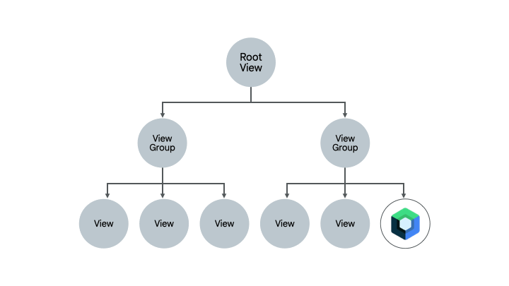
Compose 需要主機 Activity 或 Fragment 才能轉譯 UI。在 Sunflower 中,由於所有畫面都是使用片段,因此您會使用 ComposeView,也就是能透過其 setContent 方法代管 Compose UI 內容的 Android View。
移除 XML 程式碼
讓我們開始遷移作業!開啟 fragment_plant_detail.xml,然後遵循下列步驟:
- 切換至程式碼檢視模式
- 移除
NestedScrollView中的ConstraintLayout程式碼和 4 個巢狀TextView(程式碼研究室在遷移個別項目時會比較並參照 XML 程式碼,因此對程式碼進行註解排除會很有用) - 改為新增用來代管 Compose 程式碼的
ComposeView,並以compose_view做為檢視 ID
fragment_plant_detail.xml
<androidx.core.widget.NestedScrollView
    android:id="@+id/plant_detail_scrollview"
    android:layout_width="match_parent"
    android:layout_height="match_parent"
    android:clipToPadding="false"
    android:paddingBottom="@dimen/fab_bottom_padding"
    app:layout_behavior="@string/appbar_scrolling_view_behavior">

    <!-- Step 2) Comment out ConstraintLayout and its children –->
    <androidx.constraintlayout.widget.ConstraintLayout
        android:layout_width="match_parent"
        android:layout_height="match_parent"
        android:layout_margin="@dimen/margin_normal">

        <TextView
            android:id="@+id/plant_detail_name"
        ...

    </androidx.constraintlayout.widget.ConstraintLayout>
    <!-- End Step 2) Comment out until here –->

    <!-- Step 3) Add a ComposeView to host Compose code –->
    <androidx.compose.ui.platform.ComposeView
        android:id="@+id/compose_view"
        android:layout_width="match_parent"
        android:layout_height="match_parent"/>

</androidx.core.widget.NestedScrollView>
新增 Compose 程式碼
現在,您便可以開始將植物詳細資料畫面遷移至 Compose!
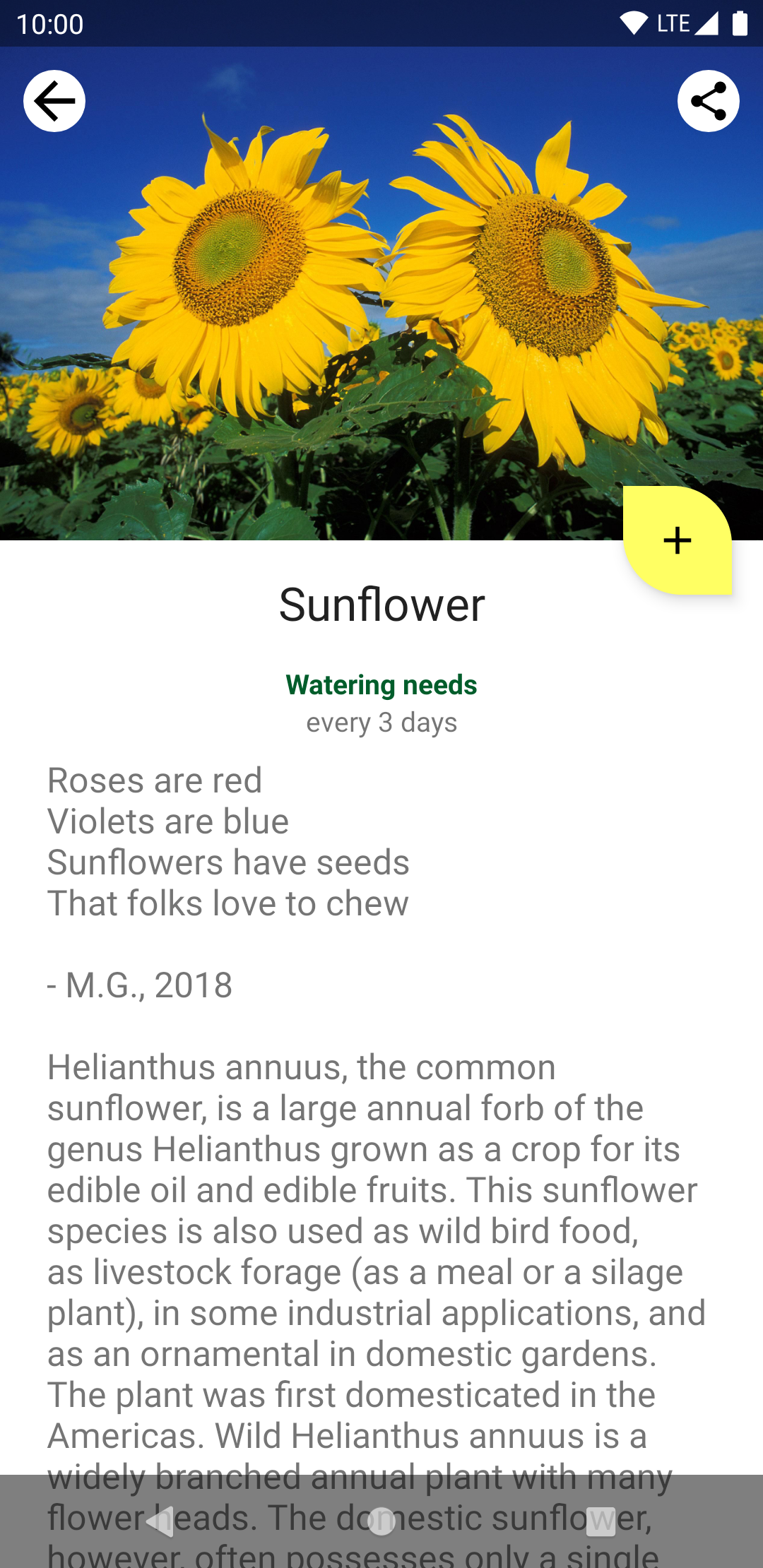
在本程式碼研究室的整個流程中,您都會將程式碼新增至 plantdetail 資料夾的的 PlantDetailDescription.kt 檔案。請開啟該檔案,看看我們如何在專案中預先提供預留位置的 "Hello Compose" 文字。
PlantDetailDescription.kt
@Composable
fun PlantDetailDescription() {
    Surface {
        Text("Hello Compose")
    }
}
讓我們透過在前一個步驟中新增的 ComposeView 呼叫這個可組合項,藉此在畫面上顯示此內容。開啟 PlantDetailFragment.kt。
畫面使用資料繫結時,您可以直接存取 composeView 並呼叫 setContent,藉此在畫面上顯示 Compose 程式碼。由於 Sunflower 採用質感設計,因此請在 MaterialTheme 中呼叫 PlantDetailDescription 可組合項。
PlantDetailFragment.kt
class PlantDetailFragment : Fragment() {
    // ...
    override fun onCreateView(...): View? {
        val binding = DataBindingUtil.inflate<FragmentPlantDetailBinding>(
            inflater, R.layout.fragment_plant_detail, container, false
        ).apply {
            // ...
            composeView.setContent {
                // You're in Compose world!
                MaterialTheme {
                    PlantDetailDescription()
                }
            }
        }
        // ...
    }
}
執行應用程式時,畫面上會顯示「Hello Compose」。
6. 透過 XML 建立可組合函式
首先遷移植物的名稱。更確切來說,這個名稱是指您在 fragment_plant_detail.xml 中移除的 TextView (ID 為 @+id/plant_detail_name)。XML 程式碼如下:
<TextView
    android:id="@+id/plant_detail_name"
    ...
    android:layout_marginStart="@dimen/margin_small"
    android:layout_marginEnd="@dimen/margin_small"
    android:gravity="center_horizontal"
    android:text="@{viewModel.plant.name}"
    android:textAppearance="?attr/textAppearanceHeadline5"
    ... />
您可以看到上述程式碼採用 textAppearanceHeadline5 樣式、將水平邊界設為 8.dp,並在畫面上以水平置中的方式顯示文字。但是,我們看到的顯示標題來自存放區層 PlantDetailViewModel 所公開的 LiveData。
稍後會介紹觀察 LiveData,我們先假設當中有可用的名稱,並以參數形式傳遞給我們在 PlantDetailDescription.kt 檔案中所建立的「新的」PlantName 可組合函式。您之後將透過 PlantDetailDescription 可組合項呼叫這個可組合項。
PlantDetailDescription.kt
@Composable
private fun PlantName(name: String) {
Text(
text = name,
style = MaterialTheme.typography.h5,
modifier = Modifier
.fillMaxWidth()
.padding(horizontal = dimensionResource(R.dimen.margin_small))
.wrapContentWidth(Alignment.CenterHorizontally)
)
}
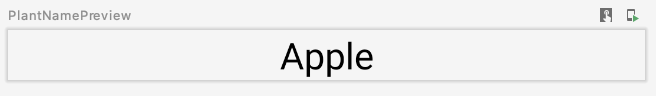
@Preview
@Composable
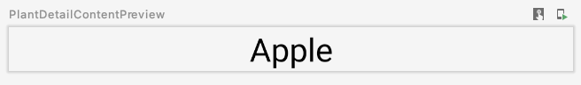
private fun PlantNamePreview() {
MaterialTheme {
PlantName("Apple")
}
}
預覽如下:
在此情況下:
Text的樣式為MaterialTheme.typography.h5,類似 XML 程式碼中的textAppearanceHeadline5。- 修飾符會修飾文字,使其看起來像是 XML 版本:
- 使用
fillMaxWidth修飾符,讓它佔用可用寬度上限。此修飾符對應 XML 程式碼中layout_width屬性的match_parent值。 - 使用
padding修飾符,藉此套用margin_small的水平邊框間距值。此修飾符對應 XML 中的marginStart和marginEnd宣告。margin_small值也是使用dimensionResource輔助函式擷取的現有維度資源。 wrapContentWidth修飾符可用來將文字水平置中對齊。這與在 XML 中設為center_horizontal的gravity屬性類似。
7. ViewModels 和 LiveData
現在,讓我們將標題連接至畫面。如要這麼做,您需要使用 PlantDetailViewModel 載入資料。為此,Compose 整合了 ViewModel 和 LiveData。
ViewModels
由於 Fragment 使用了 PlantDetailViewModel 的例項,因此我們可以將其做為參數傳送至 PlantDetailDescription,就這麼簡單。
開啟 PlantDetailDescription.kt 檔案,並將 PlantDetailViewModel 參數新增至 PlantDetailDescription:
PlantDetailDescription.kt
@Composable
fun PlantDetailDescription(plantDetailViewModel: PlantDetailViewModel) {
    //...
}
現在,從片段呼叫這個可組合函式時,傳送 ViewModel 的例項:
PlantDetailFragment.kt
class PlantDetailFragment : Fragment() {
    ...
    override fun onCreateView(...): View? {
        ...
        composeView.setContent {
            MaterialTheme {
                PlantDetailDescription(plantDetailViewModel)
            }
        }
    }
}
LiveData
透過此功能,您可以存取 PlantDetailViewModel 的 LiveData<Plant> 欄位取得植物名稱。
如要從可組合項觀察 LiveData,請使用 LiveData.observeAsState() 函式。
由於 LiveData 發出的值可能是 null,因此您必須將其用法納入 null 檢查中。因此,也為了方便重複使用,建議您將 LiveData 的消費與監聽分割至不同的可組合項。讓我們新建一個名為 PlantDetailContent 的可組合項,用來顯示 Plant 資訊。
進行以上更新後,PlantDetailDescription.kt 檔案現在應如下所示:
PlantDetailDescription.kt
@Composable
fun PlantDetailDescription(plantDetailViewModel: PlantDetailViewModel) {
// Observes values coming from the VM's LiveData<Plant> field
val plant by plantDetailViewModel.plant.observeAsState()
// If plant is not null, display the content
plant?.let {
PlantDetailContent(it)
}
}
@Composable
fun PlantDetailContent(plant: Plant) {
PlantName(plant.name)
}
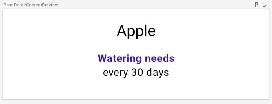
@Preview
@Composable
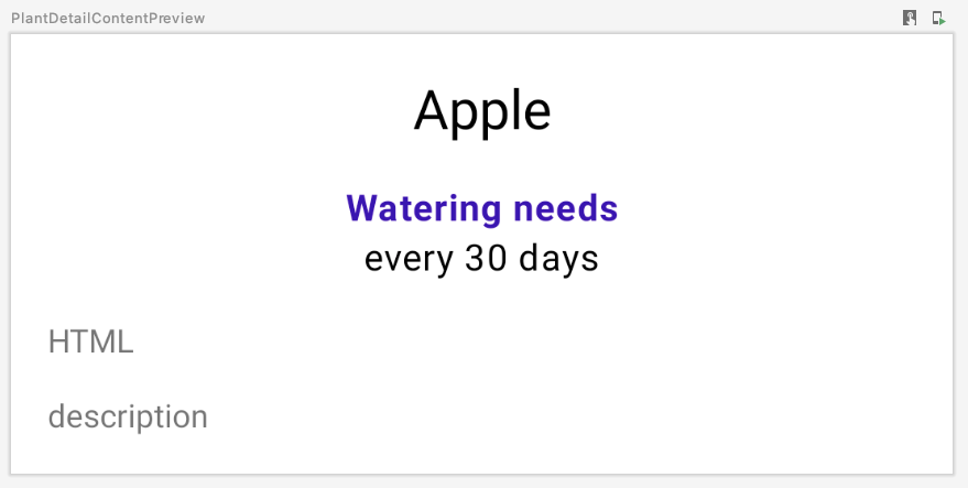
private fun PlantDetailContentPreview() {
val plant = Plant("id", "Apple", "description", 3, 30, "")
MaterialTheme {
PlantDetailContent(plant)
}
}
由於 PlantDetailContent 只會呼叫 PlantName,我們應該不必直接更新 PlantNamePreview,它就能反映我們做出的變更:
您現在已完成連結 ViewModel,因此可在 Compose 中顯示植物名稱。在接下來幾個章節中,您將建構其餘的可組合項,並以類似方式將這些可組合項連接至 ViewModel。
8. 其他 XML 程式碼遷移作業
現在,您可以更輕鬆地完成 UI 中缺少的內容:澆灌資訊和植物說明。按照先前的做法,即可遷移畫面的其餘部分。
您從 fragment_plant_detail.xml 移除的澆灌資訊 XML 程式碼是由兩個 TextView 所組成,ID 分別為 plant_watering_header 和 plant_watering。
<TextView
    android:id="@+id/plant_watering_header"
    ...
    android:layout_marginStart="@dimen/margin_small"
    android:layout_marginTop="@dimen/margin_normal"
    android:layout_marginEnd="@dimen/margin_small"
    android:gravity="center_horizontal"
    android:text="@string/watering_needs_prefix"
    android:textColor="?attr/colorAccent"
    android:textStyle="bold"
    ... />

<TextView
    android:id="@+id/plant_watering"
    ...
    android:layout_marginStart="@dimen/margin_small"
    android:layout_marginEnd="@dimen/margin_small"
    android:gravity="center_horizontal"
    app:wateringText="@{viewModel.plant.wateringInterval}"
    .../>
和先前的做法類似,請建立一個名為 PlantWatering 的新可組合項,並新增 Text 可組合項,藉此在畫面上顯示澆灌資訊:
PlantDetailDescription.kt
@OptIn(ExperimentalComposeUiApi::class)
@Composable
private fun PlantWatering(wateringInterval: Int) {
Column(Modifier.fillMaxWidth()) {
// Same modifier used by both Texts
val centerWithPaddingModifier = Modifier
.padding(horizontal = dimensionResource(R.dimen.margin_small))
.align(Alignment.CenterHorizontally)
val normalPadding = dimensionResource(R.dimen.margin_normal)
Text(
text = stringResource(R.string.watering_needs_prefix),
color = MaterialTheme.colors.primaryVariant,
fontWeight = FontWeight.Bold,
modifier = centerWithPaddingModifier.padding(top = normalPadding)
)
val wateringIntervalText = pluralStringResource(
R.plurals.watering_needs_suffix, wateringInterval, wateringInterval
)
Text(
text = wateringIntervalText,
modifier = centerWithPaddingModifier.padding(bottom = normalPadding)
)
}
}
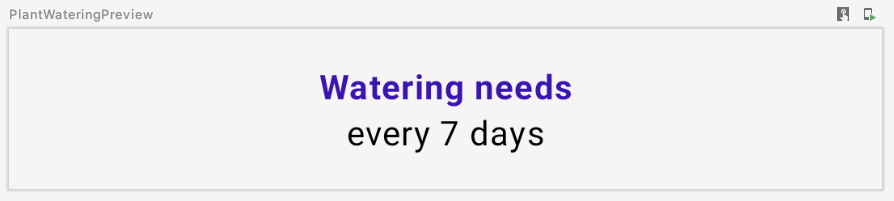
@Preview
@Composable
private fun PlantWateringPreview() {
MaterialTheme {
PlantWatering(7)
}
}
預覽如下:
請注意以下事項:
- 由於水平邊框間距和對齊裝飾由
Text可組合函式共用,因此您可以將修飾符指派至本機變數 (例如centerWithPaddingModifier) 以重複使用該修飾符。由於修飾符是一般的 Kotlin 物件,因此可以重複使用。 - Compose 的
MaterialTheme並未與plant_watering_header中使用的colorAccent完全相符。現在,讓我們使用MaterialTheme.colors.primaryVariant,您將在「互通性主題設定」一節中改進這個主題設定。 - 在 Compose 1.2.1 中,您必須選擇啟用
ExperimentalComposeUiApi才能使用pluralStringResource。不過,在日後的 Compose 版本中可能就不需要這麼做。
讓我們將所有部分組合在一起,並同樣從 PlantDetailContent 呼叫 PlantWatering。我們一開始移除的 ConstraintLayout XML 程式碼邊界為 16.dp,因此需要將此值包含在 Compose 程式碼中。
<androidx.constraintlayout.widget.ConstraintLayout
    android:layout_width="match_parent"
    android:layout_height="match_parent"
    android:layout_margin="@dimen/margin_normal">
在 PlantDetailContent 中建立一個 Column 以同時顯示名稱和澆灌資訊,並設為邊框間距。此外,為確保使用適當的背景顏色和文字顏色,請新增可處理此項目的 Surface。
PlantDetailDescription.kt
@Composable
fun PlantDetailContent(plant: Plant) {
    Surface {
        Column(Modifier.padding(dimensionResource(R.dimen.margin_normal))) {
            PlantName(plant.name)
            PlantWatering(plant.wateringInterval)
        }
    }
}
重新整理預覽畫面後,您就會看到以下內容:
9. Compose 程式碼中的 View
現在,讓我們來遷移植物說明。fragment_plant_detail.xml 中的程式碼包含具有 app:renderHtml="@{viewModel.plant.description}" 的 TextView,可讓 XML 知道要在畫面上顯示哪些文字。renderHtml 是一個位於 PlantDetailBindingAdapters.kt 檔案中的繫結轉接器。實作程序會使用 HtmlCompat.fromHtml 來設定 TextView 上的文字!
不過,Compose 目前不支援 Spanned 類別或顯示 HTML 格式的文字。因此,我們需要在 Compose 程式碼中使用 View 系統中的 TextView,才能略過這項限制。
Compose 尚不支援轉譯 HTML 程式碼,因此您可以使用 AndroidView API,以程式輔助的方式建立 TextView。
AndroidView 可讓您在其 factory lambda 中建構 View。此外還提供了一個 update lambda,這個 lambda 會在 View 加載後和後續的重組時叫用。
讓我們建立一個新的 PlantDescription 可組合項。這個可組合項會呼叫 AndroidView,並在其 factory lambda 中建構 TextView。在 factory lambda 中,初始化顯示 HTML 格式文字的 TextView,然後將 movementMethod 設為 LinkMovementMethod 的例項。最後,在 update lambda 中將 TextView 的文字設為 htmlDescription。
PlantDetailDescription.kt
@Composable
private fun PlantDescription(description: String) {
// Remembers the HTML formatted description. Re-executes on a new description
val htmlDescription = remember(description) {
HtmlCompat.fromHtml(description, HtmlCompat.FROM_HTML_MODE_COMPACT)
}
// Displays the TextView on the screen and updates with the HTML description when inflated
// Updates to htmlDescription will make AndroidView recompose and update the text
AndroidView(
factory = { context ->
TextView(context).apply {
movementMethod = LinkMovementMethod.getInstance()
}
},
update = {
it.text = htmlDescription
}
)
}
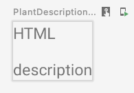
@Preview
@Composable
private fun PlantDescriptionPreview() {
MaterialTheme {
PlantDescription("HTML<br><br>description")
}
}
預覽:
請注意,htmlDescription 會記住做為參數傳遞的指定 description HTML 說明。如果 description 參數有所變更,remember 中的 htmlDescription 程式碼將會再次執行。
因此,如果 htmlDescription 有所變更,AndroidView 更新回呼將會重組。在 update lambda 中讀取的任何狀態都會導致重組。
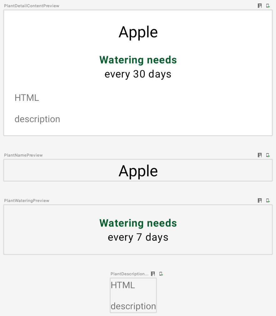
我們將 PlantDescription 新增到 PlantDetailContent 可組合項並變更預覽程式碼,讓畫面一併顯示 HTML 說明:
PlantDetailDescription.kt
@Composable
fun PlantDetailContent(plant: Plant) {
    Surface {
        Column(Modifier.padding(dimensionResource(R.dimen.margin_normal))) {
            PlantName(plant.name)
            PlantWatering(plant.wateringInterval)
            PlantDescription(plant.description)
        }
    }
}

@Preview
@Composable
private fun PlantDetailContentPreview() {
    val plant = Plant("id", "Apple", "HTML<br><br>description", 3, 30, "")
    MaterialTheme {
        PlantDetailContent(plant)
    }
}
預覽如下:
現在,您已經將原始 ConstraintLayout 中的所有內容遷移至 Compose。您可以執行應用程式以確認是否正常運作。
10. ViewCompositionStrategy
每當 ComposeView 從視窗卸離時,Compose 都會捨棄組合。如果在片段中使用 ComposeView,這並非理想的情況,原因有 2 項:
- 組合必須遵循片段的檢視區塊生命週期,Compose UI
View類型才能儲存狀態。 - 轉換作業完成後,底層
ComposeView將處於卸離狀態。不過,在轉換作業進行期間,Compose UI 元素仍會顯示。
如要修改此行為,請使用適合的 ViewCompositionStrategy 呼叫 setViewCompositionStrategy,使其改為遵循片段的檢視區塊生命週期。具體來說,在片段的 LifecycleOwner 遭到刪除時,建議您使用 DisposeOnViewTreeLifecycleDestroyed 策略來處置組合。
由於 PlantDetailFragment 包含進入和離開轉換 (詳情請參閱 nav_garden.xml),並且我們稍後會在 Compose 內使用 View 類型,因此需要確保 ComposeView 使用 DisposeOnViewTreeLifecycleDestroyed 策略 不過,在片段中使用 ComposeView 時,建議您一律設定此策略。
PlantDetailFragment.kt
import androidx.compose.ui.platform.ViewCompositionStrategy
...

class PlantDetailFragment : Fragment() {
    ...
    override fun onCreateView(...): View? {
        val binding = DataBindingUtil.inflate<FragmentPlantDetailBinding>(
            inflater, R.layout.fragment_plant_detail, container, false
        ).apply {
            ...
            composeView.apply {
                // Dispose the Composition when the view's LifecycleOwner
                // is destroyed
                setViewCompositionStrategy(
                    ViewCompositionStrategy.DisposeOnViewTreeLifecycleDestroyed
                )
                setContent {
                    MaterialTheme {
                        PlantDetailDescription(plantDetailViewModel)
                    }
                }
            }
        }
        ...
    }
}
11. Material Design 主題設定
我們已將植物詳細資料的文字內容遷移至 Compose。不過,您可能已注意到 Compose 並未使用正確的主題色彩。其中的植物名稱使用紫色,但應該是綠色。
如要使用正確的主題色彩,您需定義自己的主題並提供主題色彩來自訂 MaterialTheme。
自訂 MaterialTheme
如要建立自己的主題,請在 theme 套件下開啟 Theme.kt 檔案。Theme.kt 會定義名為 SunflowerTheme 的可組合函式,可接受內容 lambda,並向下傳遞給 MaterialTheme。
此時這項元素還不會執行任何動作,這部分將由您稍後自訂。
Theme.kt
import androidx.compose.material.MaterialTheme
import androidx.compose.runtime.Composable

@Composable
fun SunflowerTheme(
    content: @Composable () -> Unit
) {
    MaterialTheme(content = content)
}
MaterialTheme 可讓您自訂色彩、字體和形狀。現在,請繼續自訂色彩,方法是在 Sunflower View 的主題中提供相同的色彩。SunflowerTheme 也可接受名為 darkTheme 的布林值參數,如果系統處於深色模式,該參數預設為 true;若非深色模式則為 false。透過這個參數,我們可以將正確的色彩值傳遞至 MaterialTheme,以符合目前設定的系統主題。
Theme.kt
@Composable
fun SunflowerTheme(
    darkTheme: Boolean = isSystemInDarkTheme(),
    content: @Composable () -> Unit
) {
    val lightColors  = lightColors(
        primary = colorResource(id = R.color.sunflower_green_500),
        primaryVariant = colorResource(id = R.color.sunflower_green_700),
        secondary = colorResource(id = R.color.sunflower_yellow_500),
        background = colorResource(id = R.color.sunflower_green_500),
        onPrimary = colorResource(id = R.color.sunflower_black),
        onSecondary = colorResource(id = R.color.sunflower_black),
    )
    val darkColors  = darkColors(
        primary = colorResource(id = R.color.sunflower_green_100),
        primaryVariant = colorResource(id = R.color.sunflower_green_200),
        secondary = colorResource(id = R.color.sunflower_yellow_300),
        onPrimary = colorResource(id = R.color.sunflower_black),
        onSecondary = colorResource(id = R.color.sunflower_black),
        onBackground = colorResource(id = R.color.sunflower_black),
        surface = colorResource(id = R.color.sunflower_green_100_8pc_over_surface),
        onSurface = colorResource(id = R.color.sunflower_white),
    )
    val colors = if (darkTheme) darkColors else lightColors
    MaterialTheme(
        colors = colors,
        content = content
    )
}
如要使用此工具,請將 MaterialTheme 替換為 SunflowerTheme。例如,在 PlantDetailFragment 中:
PlantDetailFragment.kt
class PlantDetailFragment : Fragment() {
    ...
    composeView.apply {
        ...
        setContent {
            SunflowerTheme {
                PlantDetailDescription(plantDetailViewModel)
            }
        }
    }
}
以及 PlantDetailDescription.kt 檔案中所有的預覽可組合函式:
PlantDetailDescription.kt
@Preview
@Composable
private fun PlantDetailContentPreview() {
    val plant = Plant("id", "Apple", "HTML<br><br>description", 3, 30, "")
    SunflowerTheme {
        PlantDetailContent(plant)
    }
}

@Preview
@Composable
private fun PlantNamePreview() {
    SunflowerTheme {
        PlantName("Apple")
    }
}

@Preview
@Composable
private fun PlantWateringPreview() {
    SunflowerTheme {
        PlantWatering(7)
    }
}

@Preview
@Composable
private fun PlantDescriptionPreview() {
    SunflowerTheme {
        PlantDescription("HTML<br><br>description")
    }
}
如預覽畫面所示,現在色彩應與 Sunflower 主題的色彩相符。
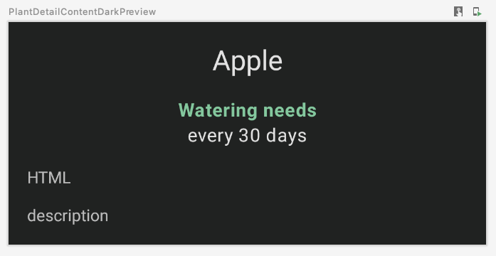
您也可以預覽深色主題的 UI,方法是建立新函式並將 Configuration.UI_MODE_NIGHT_YES 傳送至預覽的 uiMode:
import android.content.res.Configuration
...

@Preview(uiMode = Configuration.UI_MODE_NIGHT_YES)
@Composable
private fun PlantDetailContentDarkPreview() {
    val plant = Plant("id", "Apple", "HTML<br><br>description", 3, 30, "")
    SunflowerTheme {
        PlantDetailContent(plant)
    }
}
預覽如下:
應用程式執行時,在淺色和深色主題中的運作方式與遷移前相同:
12. 測試
將植物詳細資料畫面的部分內容遷移到 Compose 後,請務必進行測試以確保所有內容都完好無損。
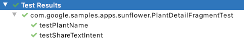
在 Sunflower 中,位於 androidTest 資料夾中的 PlantDetailFragmentTest 可測試應用程式的部分功能。請開啟檔案並查看目前的程式碼:
testPlantName會檢查畫面上的植物名稱testShareTextIntent會檢查使用者輕觸分享按鈕後是否觸發正確的意圖
活動或片段使用 Compose (而不是使用 ActivityScenarioRule) 時,您必須運用 createAndroidComposeRule 整合 ActivityScenarioRule 與 ComposeTestRule,藉此測試 Compose 程式碼。
在 PlantDetailFragmentTest 中,將 ActivityScenarioRule 用法替換為 createAndroidComposeRule。需要活動規則來設定測試時,請使用 createAndroidComposeRule 中的 activityRule 屬性,如下所示:
@RunWith(AndroidJUnit4::class)
class PlantDetailFragmentTest {

    @Rule
    @JvmField
    val composeTestRule = createAndroidComposeRule<GardenActivity>()

    ...

    @Before
    fun jumpToPlantDetailFragment() {
        populateDatabase()

        composeTestRule.activityRule.scenario.onActivity { gardenActivity ->
            activity = gardenActivity

            val bundle = Bundle().apply { putString("plantId", "malus-pumila") }
            findNavController(activity, R.id.nav_host).navigate(R.id.plant_detail_fragment, bundle)
        }
    }

    ...
}
若執行測試,testPlantName 將會失敗!testPlantName 會檢查畫面上是否出現 TextView。但您已經將這部分 UI 遷移到 Compose。因此,您需要改用 Compose 斷言:
@Test
fun testPlantName() {
    composeTestRule.onNodeWithText("Apple").assertIsDisplayed()
}
當您執行測試時,便會看到這些測試通過。
13. 恭喜
恭喜,您已經成功完成本程式碼研究室!
原始 Sunflower GitHub 專案的 compose 分支版本可將植物的詳細資料畫面完全遷移至 Compose。除了您在本程式碼研究室中完成的工作之外,此版本也會模擬 CollapsingToolbarLayout 的行為。這些行為包括:
- 使用 Compose 載入圖片
- 動畫
- 更完善的維度處理方式
- 還有更多功能!
後續步驟
請參閱 Compose 課程中的其他程式碼研究室: