
1. บทนำ
Material Components (MDC) ช่วยให้นักพัฒนาแอปนำ Material Design ไปใช้ได้ MDC สร้างขึ้นโดยทีมวิศวกรและนักออกแบบ UX ของ Google โดยมีคอมโพเนนต์ UI ที่สวยงามและใช้งานได้จริงมากมาย และพร้อมใช้งานสำหรับ Android, iOS, เว็บ และ Flutter.material.io/develop |
ใน Codelab MDC-101 คุณได้ใช้ Material Components (MDC) 2 รายการเพื่อสร้างหน้าเข้าสู่ระบบ ได้แก่ ช่องข้อความและปุ่มที่มีการกระเพื่อมของหมึก ตอนนี้เรามาขยายฐานรากนี้ด้วยการเพิ่มการนำทาง โครงสร้าง และข้อมูล
สิ่งที่คุณจะได้สร้าง
ใน Codelab นี้ คุณจะได้สร้างหน้าจอหลักสำหรับแอปที่ชื่อว่า Shrine ซึ่งเป็นแอปอีคอมเมิร์ซที่ขายเสื้อผ้าและของใช้ในบ้าน โดยจะมีองค์ประกอบต่อไปนี้
- แถบแอปด้านบน
- รายการแบบตารางที่เต็มไปด้วยผลิตภัณฑ์
คอมโพเนนต์ MDC-Android ใน Codelab นี้
- AppBarLayout
- MaterialCardView
สิ่งที่คุณต้องมี
- ความรู้พื้นฐานเกี่ยวกับการพัฒนาแอป Android
- Android Studio (ดาวน์โหลด ที่นี่ หากยังไม่มี)
- โปรแกรมจำลองหรืออุปกรณ์ Android (พร้อมใช้งานผ่าน Android Studio)
- โค้ดตัวอย่าง (ดูขั้นตอนถัดไป)
คุณให้คะแนนประสบการณ์การสร้างแอป Android ของคุณอยู่ในระดับใด
2. ตั้งค่าสภาพแวดล้อมในการพัฒนาซอฟต์แวร์
ทำต่อจาก MDC-101 ใช่ไหม
หากทำ MDC-101 เสร็จแล้ว โค้ดของคุณควรพร้อมสำหรับ Codelab นี้ ให้ข้ามไปที่ขั้นตอนที่ 3: เพิ่มแถบแอปด้านบน
เริ่มต้นจากศูนย์ใช่ไหม
ดาวน์โหลดแอป Codelab สำหรับผู้เริ่มต้น
แอปเริ่มต้นจะอยู่ในไดเรกทอรี material-components-android-codelabs-102-starter/kotlin อย่าลืมใช้คำสั่ง cd เพื่อไปยังไดเรกทอรีดังกล่าว ก่อนเริ่มต้น
...หรือโคลนจาก GitHub
หากต้องการโคลน Codelab นี้จาก GitHub ให้เรียกใช้คำสั่งต่อไปนี้
git clone https://github.com/material-components/material-components-android-codelabs
cd material-components-android-codelabs/
git checkout 102-starter
โหลดโค้ดเริ่มต้นใน Android Studio
- เมื่อวิซาร์ดการตั้งค่าเสร็จสมบูรณ์และหน้าต่าง Welcome to Android Studio ปรากฏขึ้น ให้คลิก Open an existing Android Studio project ไปที่ไดเรกทอรีที่คุณติดตั้งโค้ดตัวอย่างไว้ แล้วเลือก kotlin -> shrine (หรือค้นหา shrine ในคอมพิวเตอร์) เพื่อเปิดโปรเจ็กต์ Shipping
- รอสักครู่เพื่อให้ Android Studio สร้างและซิงค์โปรเจ็กต์ ดังที่แสดงโดยตัวบ่งชี้กิจกรรมที่ด้านล่างของหน้าต่าง Android Studio
- ในขั้นตอนนี้ Android Studio อาจแสดงข้อผิดพลาดในการสร้างบางอย่างเนื่องจากคุณไม่มี Android SDK หรือเครื่องมือสร้าง เช่น ข้อผิดพลาดที่แสดงด้านล่าง ทำตามวิธีการใน Android Studio เพื่อติดตั้ง/อัปเดต SDK และเครื่องมือเหล่านี้ แล้วซิงค์ โปรเจ็กต์

เพิ่มทรัพยากร Dependency ของโปรเจ็กต์
โปรเจ็กต์ต้องมีทรัพยากร Dependency ใน MDC Android Support Library โค้ดตัวอย่างที่คุณดาวน์โหลดควรมีทรัพยากร Dependency นี้อยู่ในรายการแล้ว แต่การทำตามขั้นตอนต่อไปนี้ถือเป็นแนวทางปฏิบัติแนะนำเพื่อให้แน่ใจ
- ไปที่ไฟล์
build.gradleของโมดูลappและตรวจสอบว่าบล็อกdependenciesมีทรัพยากร Dependency ใน MDC Android ดังนี้
api 'com.google.android.material:material:1.1.0-alpha06'
- (ไม่บังคับ) หากจำเป็น ให้แก้ไขไฟล์
build.gradleเพื่อเพิ่มทรัพยากร Dependency ต่อไปนี้ แล้วซิงค์โปรเจ็กต์
dependencies {
    api 'com.google.android.material:material:1.1.0-alpha06'
    implementation 'androidx.legacy:legacy-support-v4:1.0.0'
    implementation 'com.android.volley:volley:1.1.1'
    implementation 'com.google.code.gson:gson:2.8.5'
    implementation "org.jetbrains.kotlin:kotlin-stdlib-jdk7:1.3.21"
    testImplementation 'junit:junit:4.12'
    androidTestImplementation 'androidx.test:core:1.1.0'
    androidTestImplementation 'androidx.test.ext:junit:1.1.0'
    androidTestImplementation 'androidx.test:runner:1.2.0-alpha05'
    androidTestImplementation 'androidx.test.espresso:espresso-core:3.2.0-alpha05'
}
เรียกใช้แอปเริ่มต้น
|

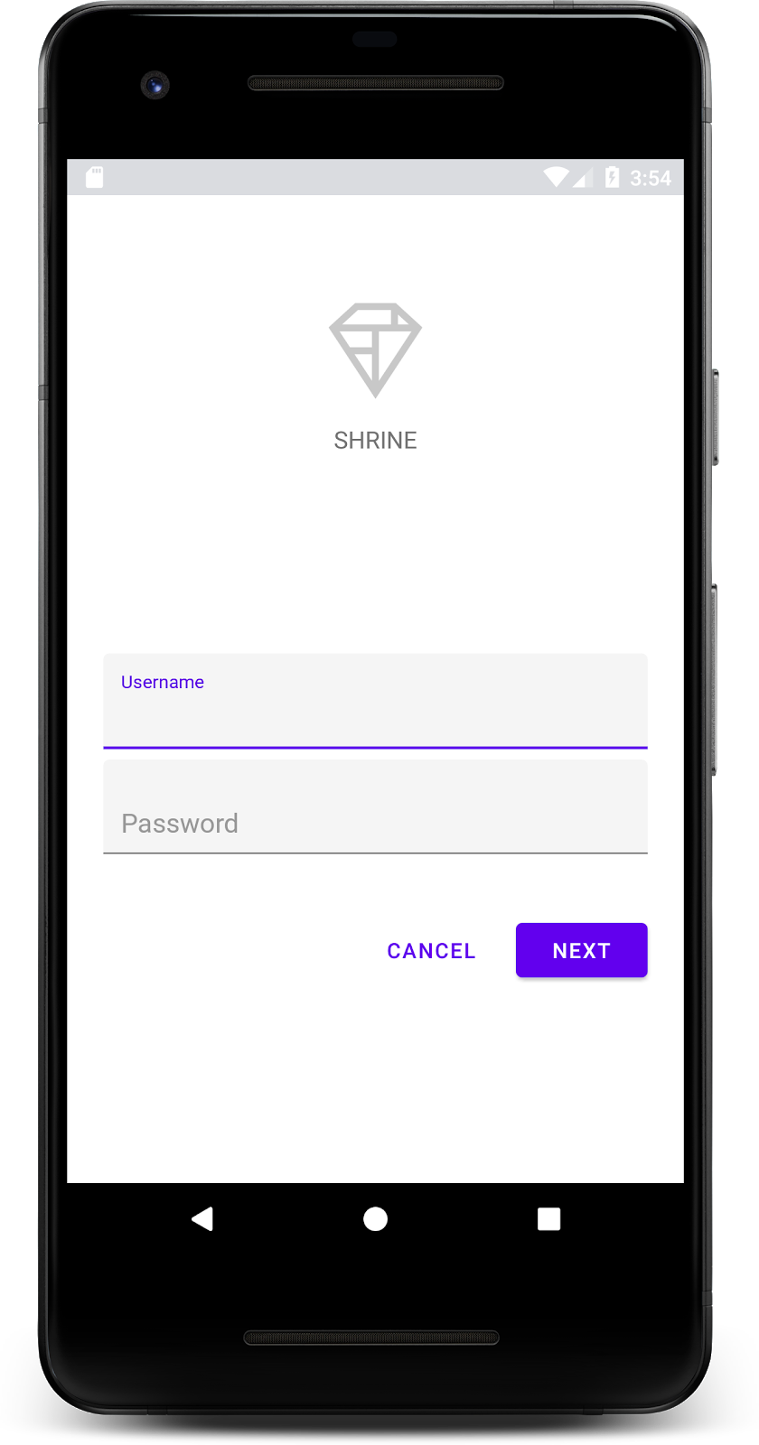
สำเร็จ! คุณควรเห็นหน้าเข้าสู่ระบบของ Shrine จาก Codelab MDC-101
เมื่อหน้าจอเข้าสู่ระบบดูดีแล้ว เรามาเพิ่มผลิตภัณฑ์ลงในแอปกัน
3. เพิ่มแถบแอปด้านบน
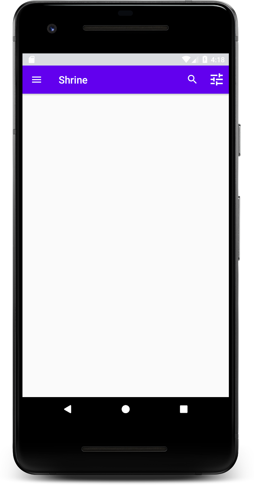
หน้าจอหลักจะปรากฏขึ้นเมื่อปิดหน้าเข้าสู่ระบบ โดยมีหน้าจอที่แสดงข้อความ "คุณทำได้แล้ว!" เยี่ยมเลย แต่ตอนนี้ผู้ใช้ไม่มีการดำเนินการใดๆ ให้ทำ หรือไม่รู้ว่าตนเองอยู่ที่ส่วนใดของแอป เราจึงต้องเพิ่มการนำทาง
Material Design มีรูปแบบการนำทางที่ช่วยให้มั่นใจได้ถึงความสามารถในการใช้งานในระดับสูง โดยหนึ่งในคอมโพเนนต์ที่มองเห็นได้ชัดเจนที่สุดคือแถบแอปด้านบน
เรามาเพิ่มแถบแอปด้านบนเพื่อให้ผู้ใช้ได้รับฟังก์ชันการนำทางและเข้าถึงการดำเนินการอื่นๆ ได้อย่างรวดเร็ว
เพิ่มวิดเจ็ต AppBar
ใน shr_product_grid_fragment.xml ให้ลบบล็อก <LinearLayout> ที่มี "คุณทำได้แล้ว!" และแทนที่ด้วยโค้ดต่อไปนี้TextView
shr_product_grid_fragment.xml
<com.google.android.material.appbar.AppBarLayout
   android:layout_width="match_parent"
   android:layout_height="wrap_content">

   <androidx.appcompat.widget.Toolbar
       android:id="@+id/app_bar"
       style="@style/Widget.Shrine.Toolbar"
       android:layout_width="match_parent"
       android:layout_height="?attr/actionBarSize"
       app:title="@string/shr_app_name" />
</com.google.android.material.appbar.AppBarLayout>
ตอนนี้ shr_product_grid_fragment.xml ควรมีลักษณะดังนี้
shr_product_grid_fragment.xml
<?xml version="1.0" encoding="utf-8"?>
<FrameLayout xmlns:android="http://schemas.android.com/apk/res/android"
   xmlns:app="http://schemas.android.com/apk/res-auto"
   xmlns:tools="http://schemas.android.com/tools"
   android:layout_width="match_parent"
   android:layout_height="match_parent"
   tools:context=".ProductGridFragment">

   <com.google.android.material.appbar.AppBarLayout
       android:layout_width="match_parent"
       android:layout_height="wrap_content">

       <androidx.appcompat.widget.Toolbar
           android:id="@+id/app_bar"
           style="@style/Widget.Shrine.Toolbar"
           android:layout_width="match_parent"
           android:layout_height="?attr/actionBarSize"
           app:title="@string/shr_app_name" />
   </com.google.android.material.appbar.AppBarLayout>

</FrameLayout>
แถบแอปจำนวนมากมีปุ่มอยู่ข้างชื่อ เรามาเพิ่มไอคอนเมนูลงในแถบแอปของเรากัน
เพิ่มไอคอนการนำทาง
ขณะที่ยังอยู่ใน shr_product_grid_fragment.xml ให้เพิ่มโค้ดต่อไปนี้ลงในคอมโพเนนต์ XML Toolbar ที่คุณเพิ่งเพิ่มลงในเลย์เอาต์
shr_product_grid_fragment.xml
app:navigationIcon="@drawable/shr_menu"
shr_product_grid_fragment.xml ควรมีลักษณะดังนี้
shr_product_grid_fragment.xml
<?xml version="1.0" encoding="utf-8"?>
<FrameLayout xmlns:android="http://schemas.android.com/apk/res/android"
   xmlns:app="http://schemas.android.com/apk/res-auto"
   xmlns:tools="http://schemas.android.com/tools"
   android:layout_width="match_parent"
   android:layout_height="match_parent"
   tools:context=".ProductGridFragment">

   <com.google.android.material.appbar.AppBarLayout
       android:layout_width="match_parent"
       android:layout_height="wrap_content">

       <androidx.appcompat.widget.Toolbar
           android:id="@+id/app_bar"
           style="@style/Widget.Shrine.Toolbar"
           android:layout_width="match_parent"
           android:layout_height="?attr/actionBarSize"
           app:navigationIcon="@drawable/shr_menu"
           app:title="@string/shr_app_name" />
   </com.google.android.material.appbar.AppBarLayout>

</FrameLayout>
เพิ่มปุ่มดำเนินการและจัดรูปแบบแถบแอปด้านบน
นอกจากนี้ คุณยังเพิ่มปุ่มที่ด้านท้ายของแถบแอปได้ด้วย ใน Android ปุ่มเหล่านี้เรียกว่า ปุ่มดำเนินการ เราจะจัดรูปแบบแถบแอปด้านบนและเพิ่มปุ่มดำเนินการลงในเมนูของแถบแอปโดยใช้โปรแกรม
ในฟังก์ชัน onCreateView ของ ProductGridFragment.kt ให้ตั้งค่า Toolbar ของ activity ให้ใช้เป็น ActionBar โดยใช้ setSupportActionBar คุณทำได้หลังจากสร้างมุมมองด้วย inflater แล้ว
ProductGridFragment.kt
override fun onCreateView(
       inflater: LayoutInflater, container: ViewGroup?, savedInstanceState: Bundle?): View? {
   // Inflate the layout for this fragment with the ProductGrid theme
   val view = inflater.inflate(R.layout.shr_product_grid_fragment, container, false)

   // Set up the toolbar.
   (activity as AppCompatActivity).setSupportActionBar(view.app_bar)

   return view;
}
จากนั้น ให้เขียนโค้ดเพื่อลบล้างเมธอดที่เราเพิ่งเปลี่ยนไปเพื่อตั้งค่าแถบเครื่องมือ โดยเขียนโค้ด onCreateOptionsMenu เพื่อ Inflate เนื้อหาของ shr_toolbar_menu.xml ลงในแถบเครื่องมือ
ProductGridFragment.kt
override fun onCreateOptionsMenu(menu: Menu, menuInflater: MenuInflater) {
   menuInflater.inflate(R.menu.shr_toolbar_menu, menu)
   super.onCreateOptionsMenu(menu, menuInflater)
}
สุดท้าย ให้เขียนโค้ดเพื่อแทนที่ onCreate() ใน ProductGridFragment.kt และหลังจากเรียกใช้ super() แล้ว ให้เรียกใช้ setHasOptionMenu ด้วย true
ProductGridFragment.kt
override fun onCreate(savedInstanceState: Bundle?) {
   super.onCreate(savedInstanceState)
   setHasOptionsMenu(true)
}
ข้อมูลโค้ดด้านบนจะตั้งค่าแถบแอปจากเลย์เอาต์ XML ให้เป็น ActionBar สำหรับกิจกรรมนี้ การเรียกกลับ onCreateOptionsMenu จะบอกกิจกรรมว่าจะใช้สิ่งใดเป็นเมนู ในกรณีนี้ ระบบจะใส่รายการเมนูจาก R.menu.shr_toolbar_menu ลงในแถบแอป ไฟล์เมนูมี 2 รายการ ได้แก่ "ค้นหา" และ "กรอง"
shr_toolbar_menu.xml
<?xml version="1.0" encoding="utf-8"?>
<menu xmlns:android="http://schemas.android.com/apk/res/android"
   xmlns:app="http://schemas.android.com/apk/res-auto">
   <item
       android:id="@+id/search"
       android:icon="@drawable/shr_search"
       android:title="@string/shr_search_title"
       app:showAsAction="always" />
   <item
       android:id="@+id/filter"
       android:icon="@drawable/shr_filter"
       android:title="@string/shr_filter_title"
       app:showAsAction="always" />
</menu>
หลังจากทำการเปลี่ยนแปลงแล้ว ไฟล์ ProductGridFragment.kt ควรมีลักษณะดังนี้
ProductGridFragment.kt
package com.google.codelabs.mdc.kotlin.shrine

import android.os.Bundle
import android.view.LayoutInflater
import android.view.Menu
import android.view.MenuInflater
import android.view.View
import android.view.ViewGroup
import androidx.appcompat.app.AppCompatActivity
import androidx.fragment.app.Fragment
import androidx.recyclerview.widget.GridLayoutManager
import com.google.codelabs.mdc.kotlin.shrine.network.ProductEntry
import kotlinx.android.synthetic.main.shr_product_grid_fragment.view.*

class ProductGridFragment : Fragment() {

   override fun onCreate(savedInstanceState: Bundle?) {
       super.onCreate(savedInstanceState)
       setHasOptionsMenu(true)
   }

   override fun onCreateView(
           inflater: LayoutInflater, container: ViewGroup?, savedInstanceState: Bundle?): View? {
       // Inflate the layout for this fragment with the ProductGrid theme
       val view = inflater.inflate(R.layout.shr_product_grid_fragment, container, false)

       // Set up the tool bar
       (activity as AppCompatActivity).setSupportActionBar(view.app_bar)

       return view;
   }

   override fun onCreateOptionsMenu(menu: Menu, menuInflater: MenuInflater) {
       menuInflater.inflate(R.menu.shr_toolbar_menu, menu)
       super.onCreateOptionsMenu(menu, menuInflater)
   }
}
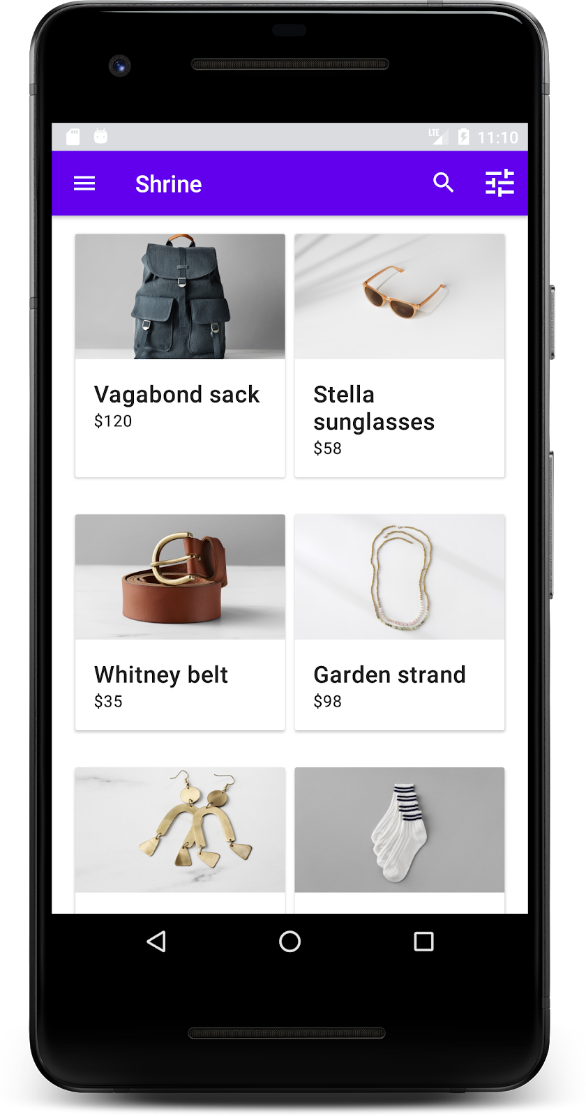
สร้างและเรียกใช้ หน้าจอหลักควรมีลักษณะดังนี้
ตอนนี้แถบเครื่องมือมีไอคอนการนำทาง ชื่อ และไอคอนการดำเนินการ 2 รายการทางด้านขวา นอกจากนี้ แถบเครื่องมือยังแสดงระดับความสูงโดยใช้เงาเล็กน้อยที่แสดงว่าแถบเครื่องมืออยู่คนละเลเยอร์กับเนื้อหา
4. เพิ่มการ์ด
เมื่อแอปมีโครงสร้างแล้ว เรามาจัดระเบียบเนื้อหาโดยวางเนื้อหาไว้ในการ์ดกัน
เพิ่มการ์ด
มาเริ่มต้นด้วยการเพิ่มการ์ด 1 ใบใต้แถบแอปด้านบน การ์ดควรมีพื้นที่สำหรับรูปภาพ ชื่อ และป้ายกำกับสำหรับข้อความรอง เพิ่มโค้ดต่อไปนี้ใน shr_product_grid_fragment.xml ใต้ AppBarLayout
shr_product_grid_fragment.xml
<com.google.android.material.card.MaterialCardView
   android:layout_width="160dp"
   android:layout_height="180dp"
   android:layout_marginBottom="16dp"
   android:layout_marginLeft="16dp"
   android:layout_marginRight="16dp"
   android:layout_marginTop="70dp"
   app:cardBackgroundColor="?attr/colorPrimaryDark"
   app:cardCornerRadius="4dp">

   <LinearLayout
       android:layout_width="match_parent"
       android:layout_height="wrap_content"
       android:layout_gravity="bottom"
       android:background="#FFFFFF"
       android:orientation="vertical"
       android:padding="8dp">

       <TextView
           android:layout_width="match_parent"
           android:layout_height="wrap_content"
           android:padding="2dp"
           android:text="@string/shr_product_title"
           android:textAppearance="?attr/textAppearanceHeadline6" />

       <TextView
           android:layout_width="match_parent"
           android:layout_height="wrap_content"
           android:padding="2dp"
           android:text="@string/shr_product_description"
           android:textAppearance="?attr/textAppearanceBody2" />
   </LinearLayout>
</com.google.android.material.card.MaterialCardView>
สร้างและเรียกใช้
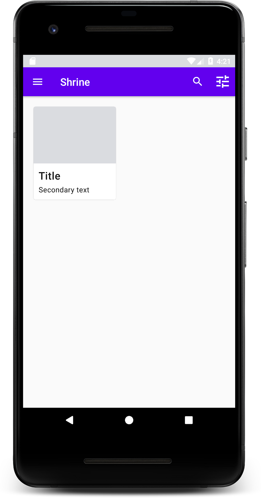
ในการแสดงตัวอย่างนี้ คุณจะเห็นว่าการ์ดมีการเยื้องจากขอบด้านซ้าย มีมุมโค้งมน และมีเงา (ซึ่งแสดงระดับความสูงของการ์ด) องค์ประกอบทั้งหมดเรียกว่า "คอนเทนเนอร์" นอกเหนือจากคอนเทนเนอร์แล้ว องค์ประกอบทั้งหมดภายในคอนเทนเนอร์เป็นค่าที่ไม่บังคับ
คุณสามารถเพิ่มองค์ประกอบต่อไปนี้ลงในคอนเทนเนอร์ ได้แก่ ข้อความส่วนหัว ภาพขนาดย่อหรือรูปโปรไฟล์ ข้อความหัวข้อย่อย ตัวคั่น รวมถึงปุ่มและไอคอน ตัวอย่างเช่น การ์ดที่เราเพิ่งสร้างมี TextView 2 รายการ (รายการหนึ่งสำหรับชื่อและอีกรายการหนึ่งสำหรับข้อความรอง) ใน LinearLayout ซึ่งจัดแนวไว้ที่ด้านล่างของการ์ด
โดยปกติการ์ดจะแสดงในคอลเล็กชันที่มีการ์ดอื่นๆ ในส่วนถัดไปของ Codelab นี้ เราจะจัดวางการ์ดเป็นคอลเล็กชันในตาราง
5. สร้างตารางการ์ด
เมื่อมีการ์ดหลายใบในหน้าจอ ระบบจะจัดกลุ่มการ์ดเหล่านั้นไว้ในคอลเล็กชันเดียวหรือหลายคอลเล็กชัน การ์ดในตารางจะอยู่ระนาบเดียวกัน ซึ่งหมายความว่าการ์ดจะมีความสูงเท่ากันเมื่อวางอยู่ (ยกเว้นเมื่อหยิบขึ้นมาหรือลาก แต่เราจะไม่พูดถึงเรื่องนี้ใน Codelab นี้)
ตั้งค่าตารางการ์ด
ดูไฟล์ shr_product_card.xml ที่เราเตรียมไว้ให้
shr_product_card.xml
<?xml version="1.0" encoding="utf-8"?>
<com.google.android.material.card.MaterialCardView xmlns:android="http://schemas.android.com/apk/res/android"
   xmlns:app="http://schemas.android.com/apk/res-auto"
   android:layout_width="match_parent"
   android:layout_height="wrap_content"
   app:cardBackgroundColor="@android:color/white"
   app:cardElevation="2dp"
   app:cardPreventCornerOverlap="true">

   <LinearLayout
       android:layout_width="match_parent"
       android:layout_height="wrap_content"
       android:orientation="vertical">

       <com.android.volley.toolbox.NetworkImageView
           android:id="@+id/product_image"
           android:layout_width="match_parent"
           android:layout_height="@dimen/shr_product_card_image_height"
           android:background="?attr/colorPrimaryDark"
           android:scaleType="centerCrop" />

       <LinearLayout
           android:layout_width="match_parent"
           android:layout_height="wrap_content"
           android:orientation="vertical"
           android:padding="16dp">

           <TextView
               android:id="@+id/product_title"
               android:layout_width="match_parent"
               android:layout_height="wrap_content"
               android:text="@string/shr_product_title"
               android:textAppearance="?attr/textAppearanceHeadline6" />

           <TextView
               android:id="@+id/product_price"
               android:layout_width="match_parent"
               android:layout_height="wrap_content"
               android:text="@string/shr_product_description"
               android:textAppearance="?attr/textAppearanceBody2" />
       </LinearLayout>
   </LinearLayout>
</com.google.android.material.card.MaterialCardView>
เลย์เอาต์การ์ดนี้มีการ์ดที่มีรูปภาพ (ในกรณีนี้คือ NetworkImageView ซึ่งช่วยให้เราโหลดและแสดงรูปภาพจาก URL ได้) และ TextViews 2 รายการ
จากนั้นดู ProductCardRecyclerViewAdapter ที่เราเตรียมไว้ให้ ซึ่งอยู่ในแพ็กเกจเดียวกับ ProductGridFragment
ProductCardRecyclerViewAdapter.kt
package com.google.codelabs.mdc.kotlin.shrine

import android.view.LayoutInflater
import android.view.ViewGroup
import androidx.recyclerview.widget.RecyclerView

import com.google.codelabs.mdc.kotlin.shrine.network.ProductEntry

/**
* Adapter used to show a simple grid of products.
*/
class ProductCardRecyclerViewAdapter(private val productList: List<ProductEntry>) : RecyclerView.Adapter<ProductCardViewHolder>() {

   override fun onCreateViewHolder(parent: ViewGroup, viewType: Int): ProductCardViewHolder {
       val layoutView = LayoutInflater.from(parent.context).inflate(R.layout.shr_product_card, parent, false)
       return ProductCardViewHolder(layoutView)
   }

   override fun onBindViewHolder(holder: ProductCardViewHolder, position: Int) {
       // TODO: Put ViewHolder binding code here in MDC-102
   }

   override fun getItemCount(): Int {
       return productList.size
   }
}
คลาส Adapter ด้านบนจะจัดการเนื้อหาของตาราง เราจะเขียนโค้ดสำหรับ onBindViewHolder() ในเร็วๆ นี้เพื่อกำหนดสิ่งที่มุมมองแต่ละรายการควรทำกับเนื้อหาที่กำหนด
นอกจากนี้ คุณยังดู ProductCardViewHolder ในแพ็กเกจเดียวกันได้ด้วย คลาสนี้จะจัดเก็บมุมมองที่ส่งผลต่อเลย์เอาต์การ์ด เพื่อให้เราแก้ไขมุมมองเหล่านั้นได้ในภายหลัง
package com.google.codelabs.mdc.kotlin.shrine

import android.view.View
import androidx.recyclerview.widget.RecyclerView

class ProductCardViewHolder(itemView: View) //TODO: Find and store views from itemView
   : RecyclerView.ViewHolder(itemView)
หากต้องการตั้งค่าตาราง ขั้นแรกเราจะต้องนำ MaterialCardView ตัวยึดตำแหน่งออกจาก shr_product_grid_fragment.xml จากนั้นคุณควรเพิ่มคอมโพเนนต์ที่แสดงตารางการ์ด ในกรณีนี้ เราจะใช้ RecyclerView เพิ่มคอมโพเนนต์ RecyclerView ลงใน shr_product_grid_fragment.xml ใต้คอมโพเนนต์ XML AppBarLayout
shr_product_grid_fragment.xml
<androidx.core.widget.NestedScrollView
   android:layout_width="match_parent"
   android:layout_height="match_parent"
   android:layout_marginTop="56dp"
   android:background="@color/productGridBackgroundColor"
   android:paddingStart="@dimen/shr_product_grid_spacing"
   android:paddingEnd="@dimen/shr_product_grid_spacing"
   app:layout_behavior="@string/appbar_scrolling_view_behavior">

   <androidx.recyclerview.widget.RecyclerView
       android:id="@+id/recycler_view"
       android:layout_width="match_parent"
       android:layout_height="match_parent" />

</androidx.core.widget.NestedScrollView>
shr_product_grid_fragment.xml ควรมีลักษณะดังนี้
shr_product_grid_fragment.xml
<?xml version="1.0" encoding="utf-8"?>
<FrameLayout xmlns:android="http://schemas.android.com/apk/res/android"
   xmlns:app="http://schemas.android.com/apk/res-auto"
   xmlns:tools="http://schemas.android.com/tools"
   android:layout_width="match_parent"
   android:layout_height="match_parent"
   tools:context=".ProductGridFragment">

   <com.google.android.material.appbar.AppBarLayout
       android:layout_width="match_parent"
       android:layout_height="wrap_content">

       <androidx.appcompat.widget.Toolbar
           android:id="@+id/app_bar"
           style="@style/Widget.Shrine.Toolbar"
           android:layout_width="match_parent"
           android:layout_height="?attr/actionBarSize"
           app:navigationIcon="@drawable/shr_menu"
           app:title="@string/shr_app_name" />
   </com.google.android.material.appbar.AppBarLayout>

   <androidx.core.widget.NestedScrollView
       android:layout_width="match_parent"
       android:layout_height="match_parent"
       android:layout_marginTop="56dp"
       android:background="@color/productGridBackgroundColor"
       android:paddingStart="@dimen/shr_product_grid_spacing"
       android:paddingEnd="@dimen/shr_product_grid_spacing"
       app:layout_behavior="@string/appbar_scrolling_view_behavior">

       <androidx.recyclerview.widget.RecyclerView
           android:id="@+id/recycler_view"
           android:layout_width="match_parent"
           android:layout_height="match_parent" />

   </androidx.core.widget.NestedScrollView>

</FrameLayout>
สุดท้าย ใน onCreateView() ให้เพิ่มโค้ดการเริ่มต้น RecyclerView ลงใน ProductGridFragment.kt หลังจากเรียกใช้ setUpToolbar(view) และก่อนคำสั่ง return
ProductGridFragment.kt
override fun onCreateView(
       inflater: LayoutInflater, container: ViewGroup?, savedInstanceState: Bundle?): View? {
   // Inflate the layout for this fragment with the ProductGrid theme
   val view = inflater.inflate(R.layout.shr_product_grid_fragment, container, false)

   // Set up the toolbar.
   (activity as AppCompatActivity).setSupportActionBar(view.app_bar)

   // Set up the RecyclerView
   view.recycler_view.setHasFixedSize(true)
   view.recycler_view.layoutManager = GridLayoutManager(context, 2, RecyclerView.VERTICAL, false)
   val adapter = ProductCardRecyclerViewAdapter(
           ProductEntry.initProductEntryList(resources))
   view.recycler_view.adapter = adapter
   val largePadding = resources.getDimensionPixelSize(R.dimen.shr_product_grid_spacing)
   val smallPadding = resources.getDimensionPixelSize(R.dimen.shr_product_grid_spacing_small)
   view.recycler_view.addItemDecoration(ProductGridItemDecoration(largePadding, smallPadding))

   return view;
}
ข้อมูลโค้ดด้านบนมีขั้นตอนการเริ่มต้นที่จำเป็นในการตั้งค่า RecyclerView ซึ่งรวมถึงการตั้งค่า Layout Manager ของ RecyclerView รวมถึงการเริ่มต้นและตั้งค่า Adapter ของ RecyclerView
ตอนนี้ไฟล์ ProductGridFragment.kt ควรมีลักษณะดังนี้
ProductGridFragment .kt
package com.google.codelabs.mdc.kotlin.shrine

import android.os.Bundle
import android.view.LayoutInflater
import android.view.Menu
import android.view.MenuInflater
import android.view.View
import android.view.ViewGroup
import androidx.appcompat.app.AppCompatActivity
import androidx.fragment.app.Fragment
import androidx.recyclerview.widget.GridLayoutManager
import androidx.recyclerview.widget.RecyclerView
import com.google.codelabs.mdc.kotlin.shrine.network.ProductEntry
import kotlinx.android.synthetic.main.shr_product_grid_fragment.view.*

class ProductGridFragment : Fragment() {

   override fun onCreate(savedInstanceState: Bundle?) {
       super.onCreate(savedInstanceState)
       setHasOptionsMenu(true)
   }

   override fun onCreateView(
           inflater: LayoutInflater, container: ViewGroup?, savedInstanceState: Bundle?): View? {
       // Inflate the layout for this fragment with the ProductGrid theme
       val view = inflater.inflate(R.layout.shr_product_grid_fragment, container, false)

       // Set up the toolbar.
       (activity as AppCompatActivity).setSupportActionBar(view.app_bar)

       // Set up the RecyclerView
       view.recycler_view.setHasFixedSize(true)
       view.recycler_view.layoutManager = GridLayoutManager(context, 2, RecyclerView.VERTICAL, false)
       val adapter = ProductCardRecyclerViewAdapter(
               ProductEntry.initProductEntryList(resources))
       view.recycler_view.adapter = adapter
       val largePadding = resources.getDimensionPixelSize(R.dimen.shr_product_grid_spacing)
       val smallPadding = resources.getDimensionPixelSize(R.dimen.shr_product_grid_spacing_small)
       view.recycler_view.addItemDecoration(ProductGridItemDecoration(largePadding, smallPadding))

       return view;
   }

   override fun onCreateOptionsMenu(menu: Menu, menuInflater: MenuInflater) {
       menuInflater.inflate(R.menu.shr_toolbar_menu, menu)
       super.onCreateOptionsMenu(menu, menuInflater)
   }
}
สร้างและเรียกใช้
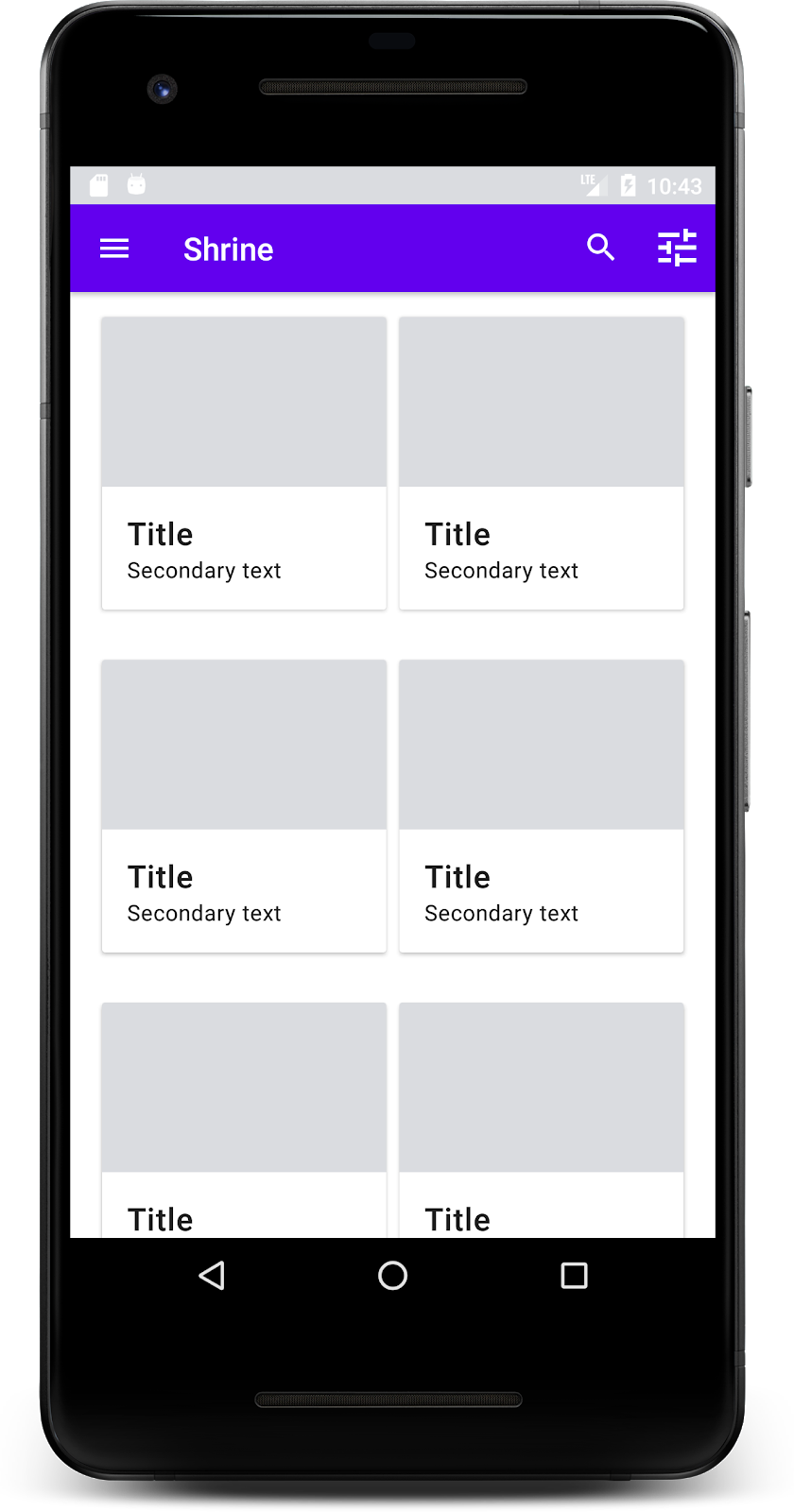
ตอนนี้การ์ดปรากฏขึ้นแล้ว แต่ยังไม่แสดงอะไรเลย เรามาเพิ่มข้อมูลสินค้ากัน
เพิ่มรูปภาพและข้อความ
เพิ่มรูปภาพ ชื่อสินค้า และราคาสำหรับการ์ดแต่ละใบ การแยกส่วน ViewHolder จะเก็บมุมมองสำหรับการ์ดแต่ละใบ เพิ่มมุมมอง 3 รายการใน ViewHolder ดังนี้
ProductCardViewHolder.kt
package com.google.codelabs.mdc.kotlin.shrine

import android.view.View
import android.widget.TextView
import androidx.recyclerview.widget.RecyclerView

import com.android.volley.toolbox.NetworkImageView

class ProductCardViewHolder(itemView: View) : RecyclerView.ViewHolder(itemView) {

   var productImage: NetworkImageView = itemView.findViewById(R.id.product_image)
   var productTitle: TextView = itemView.findViewById(R.id.product_title)
   var productPrice: TextView = itemView.findViewById(R.id.product_price)
}
อัปเดตเมธอด onBindViewHolder() ใน ProductCardRecyclerViewAdapter เพื่อตั้งค่าชื่อ ราคา และรูปภาพสินค้าสำหรับมุมมองผลิตภัณฑ์แต่ละรายการ ดังที่แสดงด้านล่าง
ProductCardRecyclerViewAdapter.kt
override fun onBindViewHolder(holder: ProductCardViewHolder, position: Int) {
   if (position < productList.size) {
       val product = productList[position]
       holder.productTitle.text = product.title
       holder.productPrice.text = product.price
       ImageRequester.setImageFromUrl(holder.productImage, product.url)
   }
}
โค้ดด้านบนจะบอก Adapter ของ RecyclerView ว่าควรทำอย่างไรกับการ์ดแต่ละใบ โดยใช้ ViewHolder
โดยโค้ดจะตั้งค่าข้อมูลข้อความใน TextView แต่ละรายการของ ViewHolder และเรียกใช้ ImageRequester เพื่อรับรูปภาพจาก URL ImageRequester เป็นคลาสที่เราเตรียมไว้เพื่อความสะดวกของคุณ และใช้ไลบรารี Volley (ซึ่งเป็นหัวข้อที่อยู่นอกขอบเขตของ Codelab นี้ แต่คุณสามารถสำรวจโค้ดได้ด้วยตนเอง)
สร้างและเรียกใช้
ตอนนี้ผลิตภัณฑ์ของเราแสดงในแอปแล้ว
6. สรุป
แอปของเรามีโฟลว์พื้นฐานที่นำผู้ใช้จากหน้าจอเข้าสู่ระบบไปยังหน้าจอหลัก ซึ่งผู้ใช้สามารถดูผลิตภัณฑ์ได้ เราได้เพิ่มแถบแอปด้านบนที่มีชื่อและปุ่ม 3 ปุ่ม รวมถึงตารางการ์ดเพื่อแสดงเนื้อหาของแอป โดยใช้โค้ดเพียงไม่กี่บรรทัด ตอนนี้หน้าจอหลักของเราเรียบง่ายและใช้งานได้จริง โดยมีโครงสร้างพื้นฐานและเนื้อหาที่ดำเนินการได้
ขั้นตอนถัดไป
ตอนนี้เราได้ใช้คอมโพเนนต์หลัก 4 รายการของ Material Design จากไลบรารี MDC-Android แล้ว ได้แก่ แถบแอปด้านบน การ์ด ช่องข้อความ และปุ่ม คุณสามารถสำรวจคอมโพเนนต์อื่นๆ ได้โดยไปที่แคตตาล็อก MDC-Android
แม้ว่าแอปจะทำงานได้อย่างสมบูรณ์ แต่แอปยังไม่ได้แสดงแบรนด์หรือสไตล์ใดๆ ที่เฉพาะเจาะจง ใน MDC-103: การกำหนดธีม Material Design ด้วยสี รูปร่าง ระดับความสูง และประเภท เราจะปรับแต่งสไตล์ของคอมโพเนนต์เหล่านี้เพื่อแสดงแบรนด์ที่สดใสและทันสมัย