

1. 简介
Material Components (MDC) 有助于开发者实现 Material Design。MDC 是由一组 Google 工程师和用户体验设计人员倾心打造的,提供数十种精美实用的界面组件,可用于 Android、iOS、Web 和 Flutter。如需了解详情,请访问 material.io/develop |
在 Codelab MDC-101 中,您已经使用以下两种 Material Components (MDC) 构建了一个登录页面:文本字段和带有水墨涟漪效果的按钮。现在,我们在此基础上通过添加导航、结构和数据进行扩展。
构建内容
在此 Codelab 中,您将为名为 Shrine 的应用构建一个主屏幕。Shrine 是一款销售服装和家居用品的电子商务应用。其中包含:
- 顶部应用栏
- 填满商品的网格列表
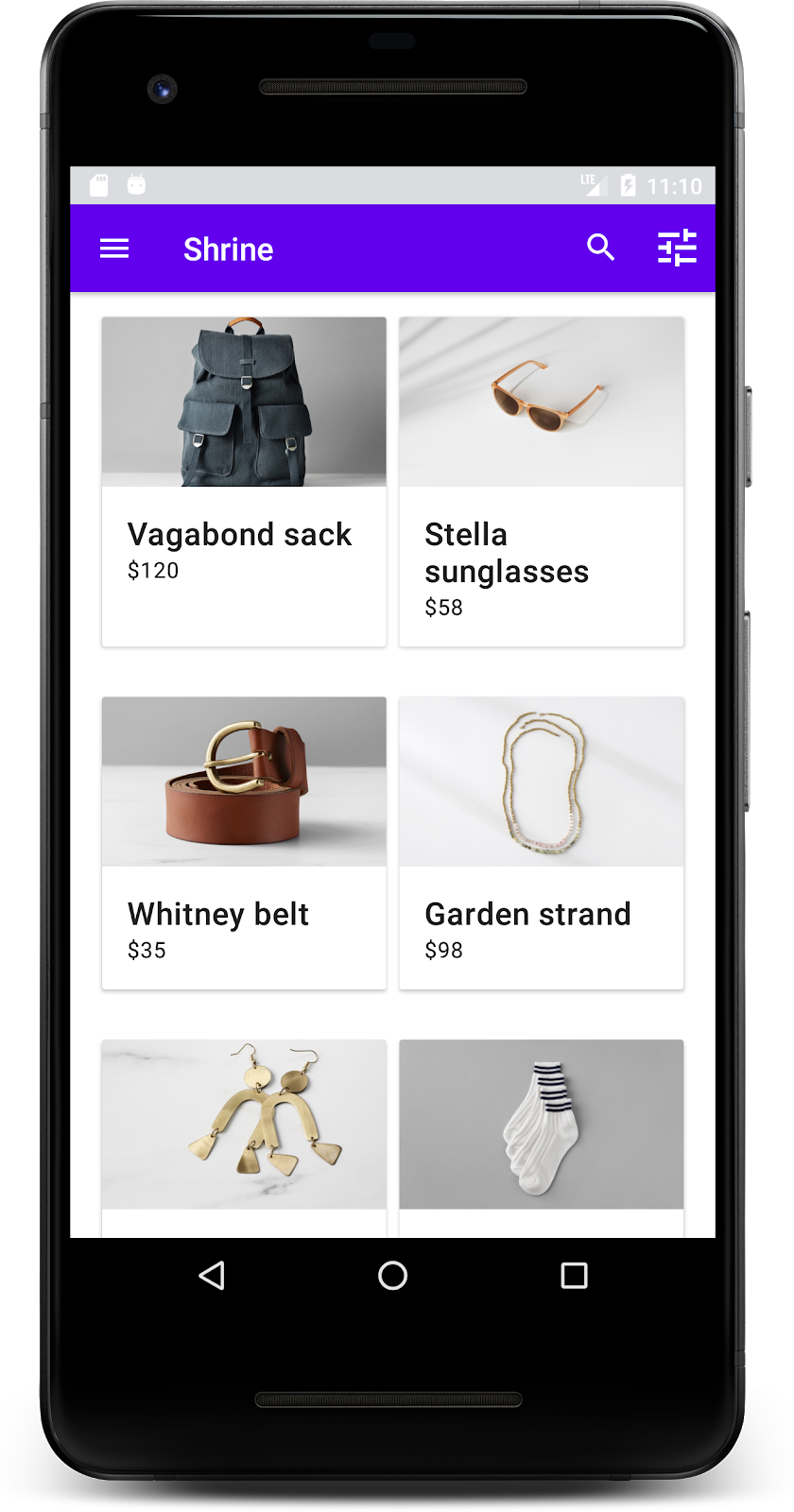
本 Codelab 中用到的 MDC-Android 组件
- AppBarLayout
- MaterialCardView
所需条件
- 已掌握 Android 开发方面的基础知识
- Android Studio(如果尚未安装,请在此处下载)
- Android 模拟器或设备(可通过 Android Studio 获取)
- 示例代码(参见下一步)
您如何评价自己在构建 Android 应用方面的经验水平?
2. 设置您的开发环境
接着 MDC-101 继续操作?
如果您已完成 MDC-101,您的代码应该就能用于本 Codelab 了。请跳到第 3 步:添加顶部应用栏。
从头开始?
下载起始 Codelab 应用
起始应用位于 material-components-android-codelabs-102-starter/kotlin 目录中。请务必先通过 cd 命令转到该目录,然后再开始操作。
…或从 GitHub 克隆
如需从 GitHub 克隆此 Codelab,请运行以下命令:
git clone https://github.com/material-components/material-components-android-codelabs
cd material-components-android-codelabs/
git checkout 102-starter
在 Android Studio 中加载起始代码
- 在设置向导完成且系统显示 Welcome to Android Studio 窗口后,点击 Open an existing Android Studio project。找到您安装了示例代码的目录,然后依次选择 kotlin -> shrine(或在计算机上搜索 shrine),以打开 Shipping 项目。
- 等待 Android Studio 构建和同步项目,如 Android Studio 窗口底部的 activity 指示器所示。
- 此时,由于缺少 Android SDK 或构建工具,因此 Android Studio 可能会显示一些构建错误(如下所示)。按照 Android Studio 中的说明安装/更新这些内容,并同步您的项目。

添加项目依赖项
项目需要一个 MDC Android 支持库的依赖项。您下载的示例代码应该已经列出了此依赖项,但您最好按照以下步骤操作,以确保万无一失。
- 转到
app模块的build.gradle文件,并确保dependencies代码块包含 MDC Android 的依赖项:
api 'com.google.android.material:material:1.1.0-alpha06'
- (可选)如有必要,请修改
build.gradle文件以添加以下依赖项,并同步项目。
dependencies {
    api 'com.google.android.material:material:1.1.0-alpha06'
    implementation 'androidx.legacy:legacy-support-v4:1.0.0'
    implementation 'com.android.volley:volley:1.1.1'
    implementation 'com.google.code.gson:gson:2.8.5'
    implementation "org.jetbrains.kotlin:kotlin-stdlib-jdk7:1.3.21"
    testImplementation 'junit:junit:4.12'
    androidTestImplementation 'androidx.test:core:1.1.0'
    androidTestImplementation 'androidx.test.ext:junit:1.1.0'
    androidTestImplementation 'androidx.test:runner:1.2.0-alpha05'
    androidTestImplementation 'androidx.test.espresso:espresso-core:3.2.0-alpha05'
}
运行起始应用
|

大功告成!您应该会看到在 MDC-101 Codelab 中构建的 Shrine 登录页面。
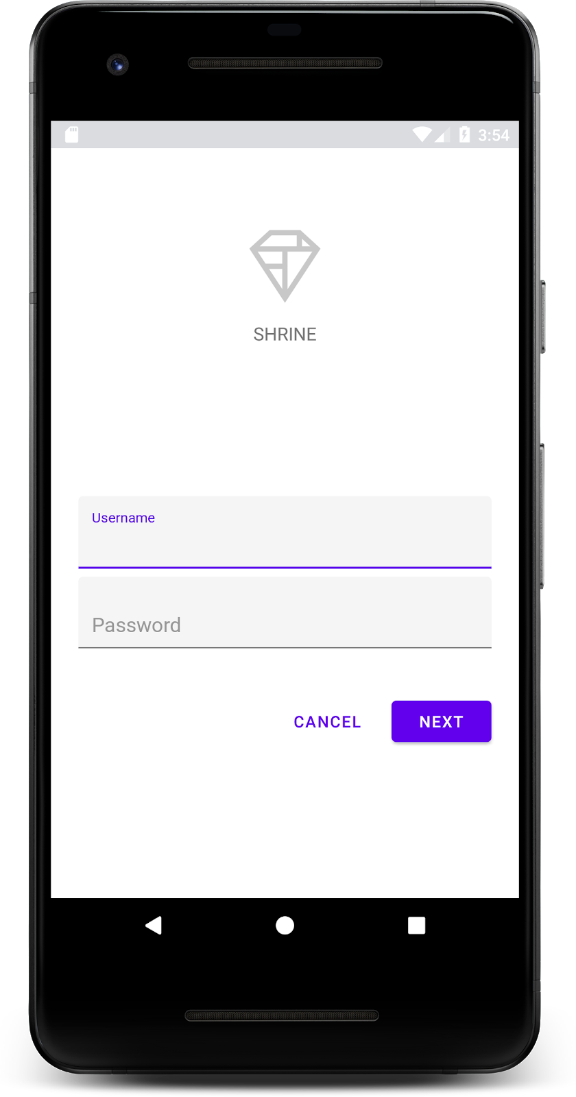
现在,登录屏幕看起来没有问题,下面我们要在应用中填充一些商品。
3. 添加顶部应用栏
登录页面关闭后,系统会显示主屏幕,其中一个屏幕会显示“You did it!”。太棒了!但现在用户没有操作可执行,也不知道自己处在应用中的哪一个位置。为解决此问题,接下来我们应该添加导航。
Material Design 可提供确保高度易用性的导航模式。顶部应用栏是最明显的组件之一。
为了提供导航功能并让用户快速执行其他操作,我们来添加一个顶部应用栏。
添加 AppBar widget
在 shr_product_grid_fragment.xml 中,删除包含“You do it!” 的 <LinearLayout> 代码块并将其替换为以下代码:TextView
shr_product_grid_fragment.xml
<com.google.android.material.appbar.AppBarLayout
   android:layout_width="match_parent"
   android:layout_height="wrap_content">

   <androidx.appcompat.widget.Toolbar
       android:id="@+id/app_bar"
       style="@style/Widget.Shrine.Toolbar"
       android:layout_width="match_parent"
       android:layout_height="?attr/actionBarSize"
       app:title="@string/shr_app_name" />
</com.google.android.material.appbar.AppBarLayout>
您的 shr_product_grid_fragment.xml 现在应如下所示:
shr_product_grid_fragment.xml
<?xml version="1.0" encoding="utf-8"?>
<FrameLayout xmlns:android="http://schemas.android.com/apk/res/android"
   xmlns:app="http://schemas.android.com/apk/res-auto"
   xmlns:tools="http://schemas.android.com/tools"
   android:layout_width="match_parent"
   android:layout_height="match_parent"
   tools:context=".ProductGridFragment">

   <com.google.android.material.appbar.AppBarLayout
       android:layout_width="match_parent"
       android:layout_height="wrap_content">

       <androidx.appcompat.widget.Toolbar
           android:id="@+id/app_bar"
           style="@style/Widget.Shrine.Toolbar"
           android:layout_width="match_parent"
           android:layout_height="?attr/actionBarSize"
           app:title="@string/shr_app_name" />
   </com.google.android.material.appbar.AppBarLayout>

</FrameLayout>
许多应用栏的标题旁边都有一个按钮。让我们在自己的应用栏中添加一个菜单图标。
添加导航图标
同样,还是在 shr_product_grid_fragment.xml 中,将以下内容添加到您刚刚添加到布局中的 Toolbar XML 组件:
shr_product_grid_fragment.xml
app:navigationIcon="@drawable/shr_menu"
您的 shr_product_grid_fragment.xml 应如下所示:
shr_product_grid_fragment.xml
<?xml version="1.0" encoding="utf-8"?>
<FrameLayout xmlns:android="http://schemas.android.com/apk/res/android"
   xmlns:app="http://schemas.android.com/apk/res-auto"
   xmlns:tools="http://schemas.android.com/tools"
   android:layout_width="match_parent"
   android:layout_height="match_parent"
   tools:context=".ProductGridFragment">

   <com.google.android.material.appbar.AppBarLayout
       android:layout_width="match_parent"
       android:layout_height="wrap_content">

       <androidx.appcompat.widget.Toolbar
           android:id="@+id/app_bar"
           style="@style/Widget.Shrine.Toolbar"
           android:layout_width="match_parent"
           android:layout_height="?attr/actionBarSize"
           app:navigationIcon="@drawable/shr_menu"
           app:title="@string/shr_app_name" />
   </com.google.android.material.appbar.AppBarLayout>

</FrameLayout>
添加操作按钮并设置顶部应用栏的样式
您也可以在应用栏末尾添加按钮。在 Android 中,这些按钮称为 操作按钮。我们将以编程方式设置顶部应用栏的样式,并向其菜单添加操作按钮。
在 ProductGridFragment.kt 的 onCreateView 函数中,使用 setSupportActionBar 将 activity 的 Toolbar 设置为用作 ActionBar。您可以在使用 inflater 创建视图后执行此操作。
ProductGridFragment.kt
override fun onCreateView(
       inflater: LayoutInflater, container: ViewGroup?, savedInstanceState: Bundle?): View? {
   // Inflate the layout for this fragment with the ProductGrid theme
   val view = inflater.inflate(R.layout.shr_product_grid_fragment, container, false)

   // Set up the toolbar.
   (activity as AppCompatActivity).setSupportActionBar(view.app_bar)

   return view;
}
接下来,在我们刚刚更改为设置工具栏的方法的正下方,我们来覆盖 onCreateOptionsMenu,以将 shr_toolbar_menu.xml 的内容膨胀到工具栏中:
ProductGridFragment.kt
override fun onCreateOptionsMenu(menu: Menu, menuInflater: MenuInflater) {
   menuInflater.inflate(R.menu.shr_toolbar_menu, menu)
   super.onCreateOptionsMenu(menu, menuInflater)
}
最后,在 ProductGridFragment.kt 中覆盖 onCreate(),并在调用 super() 之后,调用设置了 true 的 setHasOptionMenu:
ProductGridFragment.kt
override fun onCreate(savedInstanceState: Bundle?) {
   super.onCreate(savedInstanceState)
   setHasOptionsMenu(true)
}
以上代码段将 XML 布局中的应用栏设为该 activity 的操作栏。回调 onCreateOptionsMenu 会告知 activity 要用作菜单的内容。在本例中,它会将 R.menu.shr_toolbar_menu 中的菜单项放入应用栏中。该菜单文件包含项内容:“搜索”和“过滤器”。
shr_toolbar_menu.xml
<?xml version="1.0" encoding="utf-8"?>
<menu xmlns:android="http://schemas.android.com/apk/res/android"
   xmlns:app="http://schemas.android.com/apk/res-auto">
   <item
       android:id="@+id/search"
       android:icon="@drawable/shr_search"
       android:title="@string/shr_search_title"
       app:showAsAction="always" />
   <item
       android:id="@+id/filter"
       android:icon="@drawable/shr_filter"
       android:title="@string/shr_filter_title"
       app:showAsAction="always" />
</menu>
完成这些更改后,ProductGridFragment.kt 文件应如下所示:
ProductGridFragment.kt
package com.google.codelabs.mdc.kotlin.shrine

import android.os.Bundle
import android.view.LayoutInflater
import android.view.Menu
import android.view.MenuInflater
import android.view.View
import android.view.ViewGroup
import androidx.appcompat.app.AppCompatActivity
import androidx.fragment.app.Fragment
import androidx.recyclerview.widget.GridLayoutManager
import com.google.codelabs.mdc.kotlin.shrine.network.ProductEntry
import kotlinx.android.synthetic.main.shr_product_grid_fragment.view.*

class ProductGridFragment : Fragment() {

   override fun onCreate(savedInstanceState: Bundle?) {
       super.onCreate(savedInstanceState)
       setHasOptionsMenu(true)
   }

   override fun onCreateView(
           inflater: LayoutInflater, container: ViewGroup?, savedInstanceState: Bundle?): View? {
       // Inflate the layout for this fragment with the ProductGrid theme
       val view = inflater.inflate(R.layout.shr_product_grid_fragment, container, false)

       // Set up the tool bar
       (activity as AppCompatActivity).setSupportActionBar(view.app_bar)

       return view;
   }

   override fun onCreateOptionsMenu(menu: Menu, menuInflater: MenuInflater) {
       menuInflater.inflate(R.menu.shr_toolbar_menu, menu)
       super.onCreateOptionsMenu(menu, menuInflater)
   }
}
构建并运行。您的主屏幕应如下所示:
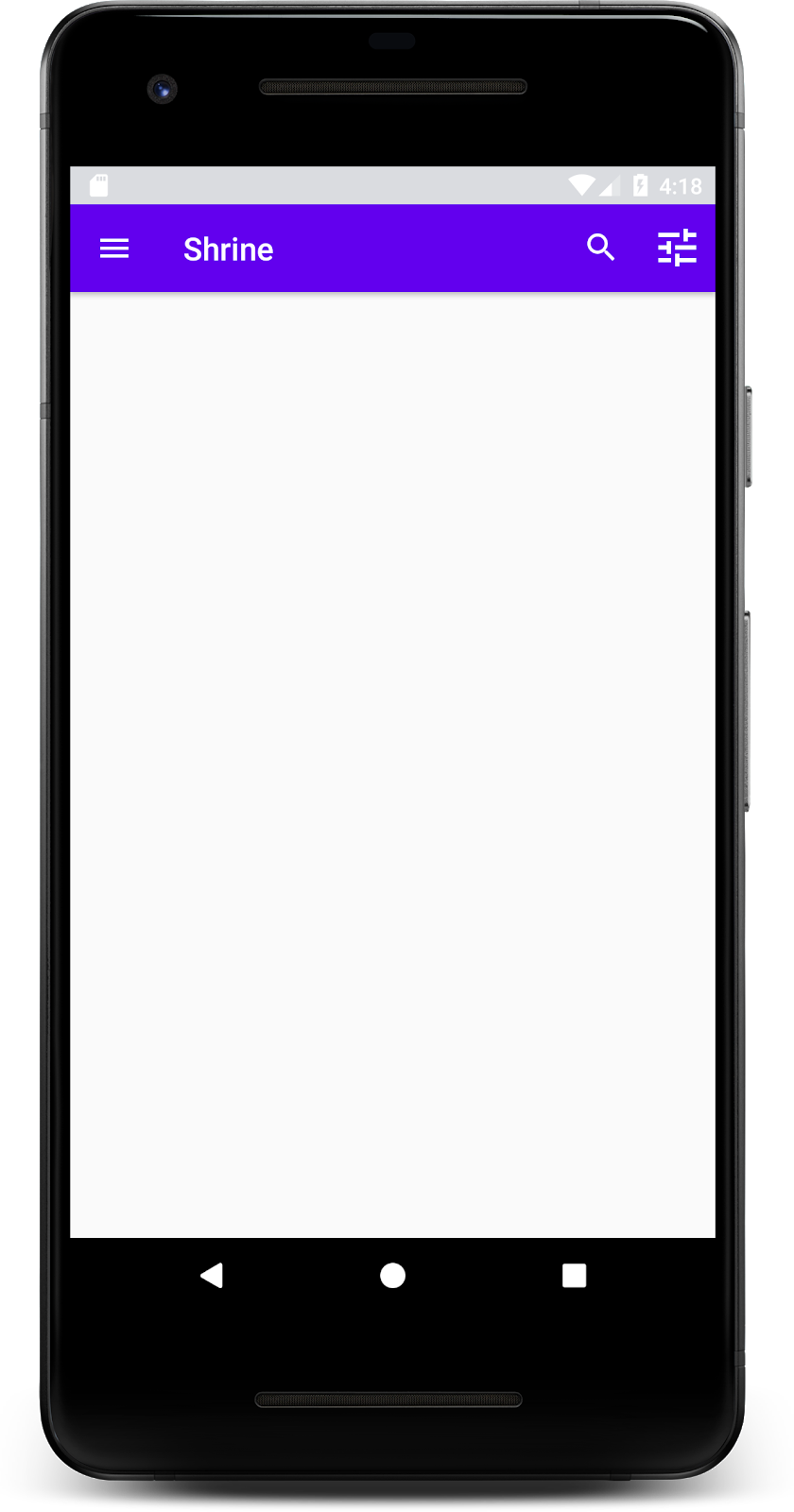
现在,工具栏中会显示一个导航图标、一个标题,并在右侧显示两个操作图标。此外,工具栏还使用细微的阴影来显示高度,表示其与内容位于不同的层级。
4. 添加卡片
现在,我们的应用已具有一些结构,接下来,我们需要将内容放到卡片中,以便对内容进行整理。
添加卡片
首先,在顶部应用栏下方添加一张卡片。卡片应包含一个图像区域、一个标题和一个辅助文本的标签。请在 shr_product_grid_fragment.xml 中的 AppBarLayout 下方添加以下代码。
shr_product_grid_fragment.xml
<com.google.android.material.card.MaterialCardView
   android:layout_width="160dp"
   android:layout_height="180dp"
   android:layout_marginBottom="16dp"
   android:layout_marginLeft="16dp"
   android:layout_marginRight="16dp"
   android:layout_marginTop="70dp"
   app:cardBackgroundColor="?attr/colorPrimaryDark"
   app:cardCornerRadius="4dp">

   <LinearLayout
       android:layout_width="match_parent"
       android:layout_height="wrap_content"
       android:layout_gravity="bottom"
       android:background="#FFFFFF"
       android:orientation="vertical"
       android:padding="8dp">

       <TextView
           android:layout_width="match_parent"
           android:layout_height="wrap_content"
           android:padding="2dp"
           android:text="@string/shr_product_title"
           android:textAppearance="?attr/textAppearanceHeadline6" />

       <TextView
           android:layout_width="match_parent"
           android:layout_height="wrap_content"
           android:padding="2dp"
           android:text="@string/shr_product_description"
           android:textAppearance="?attr/textAppearanceBody2" />
   </LinearLayout>
</com.google.android.material.card.MaterialCardView>
构建并运行:
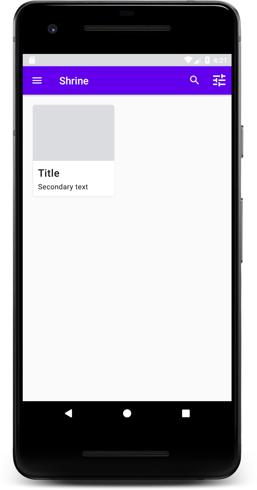
在此预览中,您可以看到卡片从屏幕左侧边缘插入,该卡片带有圆角和展现卡片高度的阴影。整个元素被称为“容器”。除了容器之外,容器中的所有元素都是可选的。
您可以在容器中添加以下元素:标题文本、缩略图或头像、子标题文本、分隔线,甚至是按钮和图标。例如,我们刚刚创建的卡片在 LinearLayout 中包含两个 TextView(一个用于标题,一个用于辅助文本),其位置与卡片底部对齐。
卡片通常以集合的形式和其他卡片一起出现,在此 Codelab 的下一部分中,我们会将它们作为集合放置在网格中。
5. 创建卡片网格
当屏幕上出现多张卡片时,它们就会组成一个或多个集合。网格中的卡片同处一个平面,这意味着它们的静止高度相同(除非被选中或拖动,但我们不会在此 Codelab 中讨论这些)。
设置卡片网格
看看我们为您提供的 shr_product_card.xml 文件:
shr_product_card.xml
<?xml version="1.0" encoding="utf-8"?>
<com.google.android.material.card.MaterialCardView xmlns:android="http://schemas.android.com/apk/res/android"
   xmlns:app="http://schemas.android.com/apk/res-auto"
   android:layout_width="match_parent"
   android:layout_height="wrap_content"
   app:cardBackgroundColor="@android:color/white"
   app:cardElevation="2dp"
   app:cardPreventCornerOverlap="true">

   <LinearLayout
       android:layout_width="match_parent"
       android:layout_height="wrap_content"
       android:orientation="vertical">

       <com.android.volley.toolbox.NetworkImageView
           android:id="@+id/product_image"
           android:layout_width="match_parent"
           android:layout_height="@dimen/shr_product_card_image_height"
           android:background="?attr/colorPrimaryDark"
           android:scaleType="centerCrop" />

       <LinearLayout
           android:layout_width="match_parent"
           android:layout_height="wrap_content"
           android:orientation="vertical"
           android:padding="16dp">

           <TextView
               android:id="@+id/product_title"
               android:layout_width="match_parent"
               android:layout_height="wrap_content"
               android:text="@string/shr_product_title"
               android:textAppearance="?attr/textAppearanceHeadline6" />

           <TextView
               android:id="@+id/product_price"
               android:layout_width="match_parent"
               android:layout_height="wrap_content"
               android:text="@string/shr_product_description"
               android:textAppearance="?attr/textAppearanceBody2" />
       </LinearLayout>
   </LinearLayout>
</com.google.android.material.card.MaterialCardView>
此卡片布局包含一张卡片,该卡片包含一个图片(本例中的 NetworkImageView 允许加载和显示来自网址的图片)和两个 TextViews。
接下来,看看我们为您提供的 ProductCardRecyclerViewAdapter。它与 ProductGridFragment 位于同一软件包中。
ProductCardRecyclerViewAdapter.kt
package com.google.codelabs.mdc.kotlin.shrine

import android.view.LayoutInflater
import android.view.ViewGroup
import androidx.recyclerview.widget.RecyclerView

import com.google.codelabs.mdc.kotlin.shrine.network.ProductEntry

/**
* Adapter used to show a simple grid of products.
*/
class ProductCardRecyclerViewAdapter(private val productList: List<ProductEntry>) : RecyclerView.Adapter<ProductCardViewHolder>() {

   override fun onCreateViewHolder(parent: ViewGroup, viewType: Int): ProductCardViewHolder {
       val layoutView = LayoutInflater.from(parent.context).inflate(R.layout.shr_product_card, parent, false)
       return ProductCardViewHolder(layoutView)
   }

   override fun onBindViewHolder(holder: ProductCardViewHolder, position: Int) {
       // TODO: Put ViewHolder binding code here in MDC-102
   }

   override fun getItemCount(): Int {
       return productList.size
   }
}
上方的适配器类负责管理网格的内容。为了确定每个视图应对其给定内容执行的操作,我们即将为 onBindViewHolder() 编写代码。
在同一软件包中,您还可以查看 ProductCardViewHolder。此类用于存储可影响卡片布局的视图,以便稍后进行修改。
package com.google.codelabs.mdc.kotlin.shrine

import android.view.View
import androidx.recyclerview.widget.RecyclerView

class ProductCardViewHolder(itemView: View) //TODO: Find and store views from itemView
   : RecyclerView.ViewHolder(itemView)
为了设置网格,我们首先要从 shr_product_grid_fragment.xml 中移除占位符 MaterialCardView。接下来,您应添加代表卡片网格的组件。在本例中,我们将使用 RecyclerView。请将该 RecyclerView 组件添加到 shr_product_grid_fragment.xml 中 AppBarLayout XML 组件的下方:
shr_product_grid_fragment.xml
<androidx.core.widget.NestedScrollView
   android:layout_width="match_parent"
   android:layout_height="match_parent"
   android:layout_marginTop="56dp"
   android:background="@color/productGridBackgroundColor"
   android:paddingStart="@dimen/shr_product_grid_spacing"
   android:paddingEnd="@dimen/shr_product_grid_spacing"
   app:layout_behavior="@string/appbar_scrolling_view_behavior">

   <androidx.recyclerview.widget.RecyclerView
       android:id="@+id/recycler_view"
       android:layout_width="match_parent"
       android:layout_height="match_parent" />

</androidx.core.widget.NestedScrollView>
您的 shr_product_grid_fragment.xml 应如下所示:
shr_product_grid_fragment.xml
<?xml version="1.0" encoding="utf-8"?>
<FrameLayout xmlns:android="http://schemas.android.com/apk/res/android"
   xmlns:app="http://schemas.android.com/apk/res-auto"
   xmlns:tools="http://schemas.android.com/tools"
   android:layout_width="match_parent"
   android:layout_height="match_parent"
   tools:context=".ProductGridFragment">

   <com.google.android.material.appbar.AppBarLayout
       android:layout_width="match_parent"
       android:layout_height="wrap_content">

       <androidx.appcompat.widget.Toolbar
           android:id="@+id/app_bar"
           style="@style/Widget.Shrine.Toolbar"
           android:layout_width="match_parent"
           android:layout_height="?attr/actionBarSize"
           app:navigationIcon="@drawable/shr_menu"
           app:title="@string/shr_app_name" />
   </com.google.android.material.appbar.AppBarLayout>

   <androidx.core.widget.NestedScrollView
       android:layout_width="match_parent"
       android:layout_height="match_parent"
       android:layout_marginTop="56dp"
       android:background="@color/productGridBackgroundColor"
       android:paddingStart="@dimen/shr_product_grid_spacing"
       android:paddingEnd="@dimen/shr_product_grid_spacing"
       app:layout_behavior="@string/appbar_scrolling_view_behavior">

       <androidx.recyclerview.widget.RecyclerView
           android:id="@+id/recycler_view"
           android:layout_width="match_parent"
           android:layout_height="match_parent" />

   </androidx.core.widget.NestedScrollView>

</FrameLayout>
最后,在 onCreateView() 中,在调用 setUpToolbar(view) 之后和 return 语句之前,将 RecyclerView 初始化代码添加到 ProductGridFragment.kt 中:
ProductGridFragment.kt
override fun onCreateView(
       inflater: LayoutInflater, container: ViewGroup?, savedInstanceState: Bundle?): View? {
   // Inflate the layout for this fragment with the ProductGrid theme
   val view = inflater.inflate(R.layout.shr_product_grid_fragment, container, false)

   // Set up the toolbar.
   (activity as AppCompatActivity).setSupportActionBar(view.app_bar)

   // Set up the RecyclerView
   view.recycler_view.setHasFixedSize(true)
   view.recycler_view.layoutManager = GridLayoutManager(context, 2, RecyclerView.VERTICAL, false)
   val adapter = ProductCardRecyclerViewAdapter(
           ProductEntry.initProductEntryList(resources))
   view.recycler_view.adapter = adapter
   val largePadding = resources.getDimensionPixelSize(R.dimen.shr_product_grid_spacing)
   val smallPadding = resources.getDimensionPixelSize(R.dimen.shr_product_grid_spacing_small)
   view.recycler_view.addItemDecoration(ProductGridItemDecoration(largePadding, smallPadding))

   return view;
}
上述代码段包含设置 RecyclerView 必需的初始化步骤,其中包括设置 RecyclerView 的布局管理器,以及初始化和设置 RecyclerView 的适配器。
您的 ProductGridFragment.kt 文件现在应如下所示:
ProductGridFragment .kt
package com.google.codelabs.mdc.kotlin.shrine

import android.os.Bundle
import android.view.LayoutInflater
import android.view.Menu
import android.view.MenuInflater
import android.view.View
import android.view.ViewGroup
import androidx.appcompat.app.AppCompatActivity
import androidx.fragment.app.Fragment
import androidx.recyclerview.widget.GridLayoutManager
import androidx.recyclerview.widget.RecyclerView
import com.google.codelabs.mdc.kotlin.shrine.network.ProductEntry
import kotlinx.android.synthetic.main.shr_product_grid_fragment.view.*

class ProductGridFragment : Fragment() {

   override fun onCreate(savedInstanceState: Bundle?) {
       super.onCreate(savedInstanceState)
       setHasOptionsMenu(true)
   }

   override fun onCreateView(
           inflater: LayoutInflater, container: ViewGroup?, savedInstanceState: Bundle?): View? {
       // Inflate the layout for this fragment with the ProductGrid theme
       val view = inflater.inflate(R.layout.shr_product_grid_fragment, container, false)

       // Set up the toolbar.
       (activity as AppCompatActivity).setSupportActionBar(view.app_bar)

       // Set up the RecyclerView
       view.recycler_view.setHasFixedSize(true)
       view.recycler_view.layoutManager = GridLayoutManager(context, 2, RecyclerView.VERTICAL, false)
       val adapter = ProductCardRecyclerViewAdapter(
               ProductEntry.initProductEntryList(resources))
       view.recycler_view.adapter = adapter
       val largePadding = resources.getDimensionPixelSize(R.dimen.shr_product_grid_spacing)
       val smallPadding = resources.getDimensionPixelSize(R.dimen.shr_product_grid_spacing_small)
       view.recycler_view.addItemDecoration(ProductGridItemDecoration(largePadding, smallPadding))

       return view;
   }

   override fun onCreateOptionsMenu(menu: Menu, menuInflater: MenuInflater) {
       menuInflater.inflate(R.menu.shr_toolbar_menu, menu)
       super.onCreateOptionsMenu(menu, menuInflater)
   }
}
构建并运行:
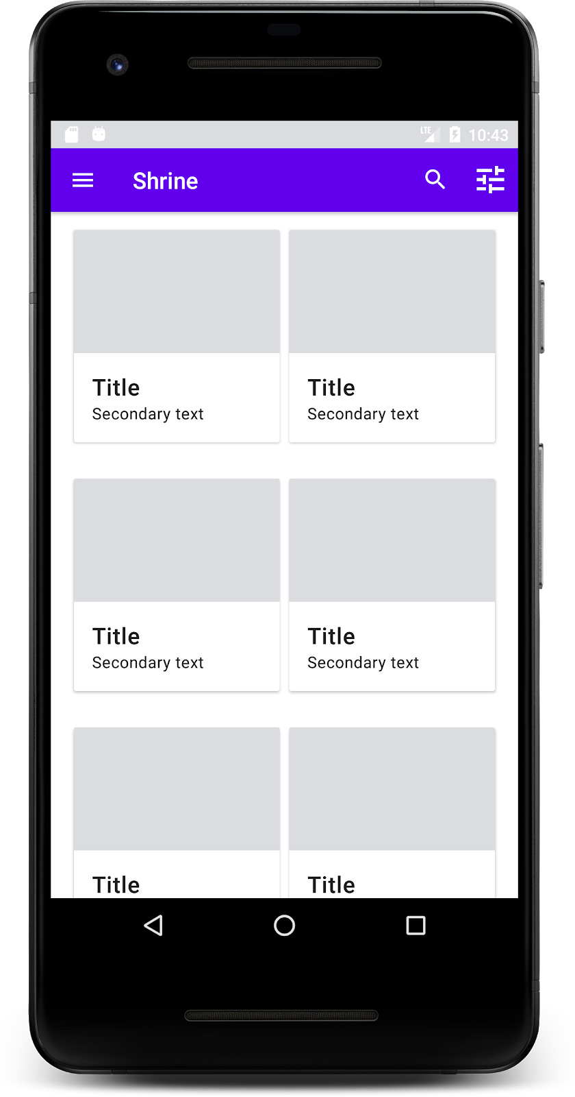
卡片现在出现在屏幕中了!卡片还未显示任何内容,让我们来添加一些商品数据。
添加图片和文字
为每张卡片添加图片、商品名称和价格。我们的 ViewHolder 抽象会存储每张卡片的视图。请在我们的 ViewHolder 中,添加三个视图,如下所示。
ProductCardViewHolder.kt
package com.google.codelabs.mdc.kotlin.shrine

import android.view.View
import android.widget.TextView
import androidx.recyclerview.widget.RecyclerView

import com.android.volley.toolbox.NetworkImageView

class ProductCardViewHolder(itemView: View) : RecyclerView.ViewHolder(itemView) {

   var productImage: NetworkImageView = itemView.findViewById(R.id.product_image)
   var productTitle: TextView = itemView.findViewById(R.id.product_title)
   var productPrice: TextView = itemView.findViewById(R.id.product_price)
}
更新 ProductCardRecyclerViewAdapter 中的 onBindViewHolder() 方法,以设置每个商品视图的标题、价格和商品图片,如下所示:
ProductCardRecyclerViewAdapter.kt
override fun onBindViewHolder(holder: ProductCardViewHolder, position: Int) {
   if (position < productList.size) {
       val product = productList[position]
       holder.productTitle.text = product.title
       holder.productPrice.text = product.price
       ImageRequester.setImageFromUrl(holder.productImage, product.url)
   }
}
上述代码使用 ViewHolder 告知 RecyclerView 的适配器要对每张卡片执行的操作。
在这里,它会设置 ViewHolder 中每个 TextView 的文本数据,并调用 ImageRequester 以获取来自网址的图片。ImageRequester 是我们为方便您而提供的一个类,它使用 Volley 库(这不是本 Codelab 讨论的主题,但您可以自行探索该代码)。
构建并运行:
我们的商品现在出现在应用中了!
6. 总结
我们的应用已经有了基本的流程,可将用户从登录页面转到主屏幕,然后用户可在主屏幕中查看商品。通过几行代码,我们添加了一个顶部应用栏(包含标题和三个按钮),以及一个用于展示应用内容的卡片网格。现在,我们的主屏幕非常简单实用,具有基本的结构和可操作的内容。
后续步骤
通过顶部应用栏、卡片、文本字段和按钮,我们现在已经使用了 MDC-Android 库中的四个核心 Material Design 组件!您可以访问 MDC-Android 目录,探索更多组件。
虽然我们的应用完全可以正常运行,但它尚未展现任何特殊的品牌或风格。在 MDC-103:通过颜色、形状、高度和类型设置 Material Design 主题中,我们将自定义这些组件的样式,来诠释一个充满活力的、现代的品牌。