1. Introduction
Material Components (MDC) help developers implement Material Design. Created by a team of engineers and UX designers at Google, MDC features dozens of beautiful and functional UI components and is available for Android, iOS, web and Flutter.material.io/develop |
In codelab MDC-101, you used two Material Components (MDC) to build a login page: text fields and buttons with ink ripples. Now let's expand upon this foundation by adding navigation, structure, and data.
What you'll build
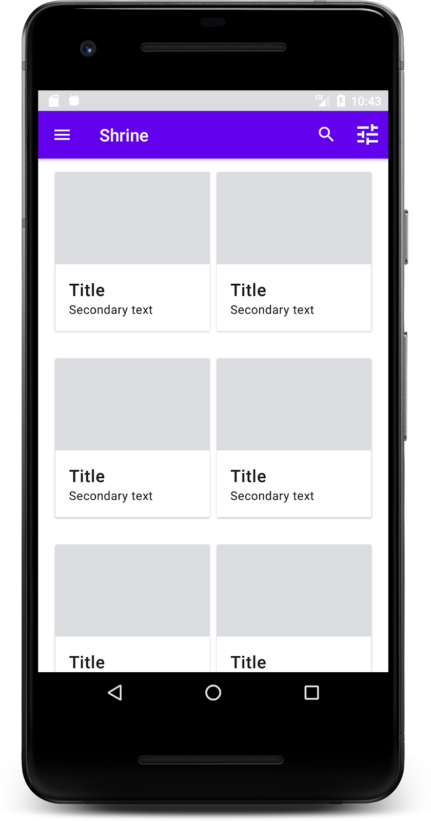
In this codelab, you'll build a home screen for an app called Shrine, an e-commerce app that sells clothing and home goods. It will contain:
- A top app bar
- A grid list full of products
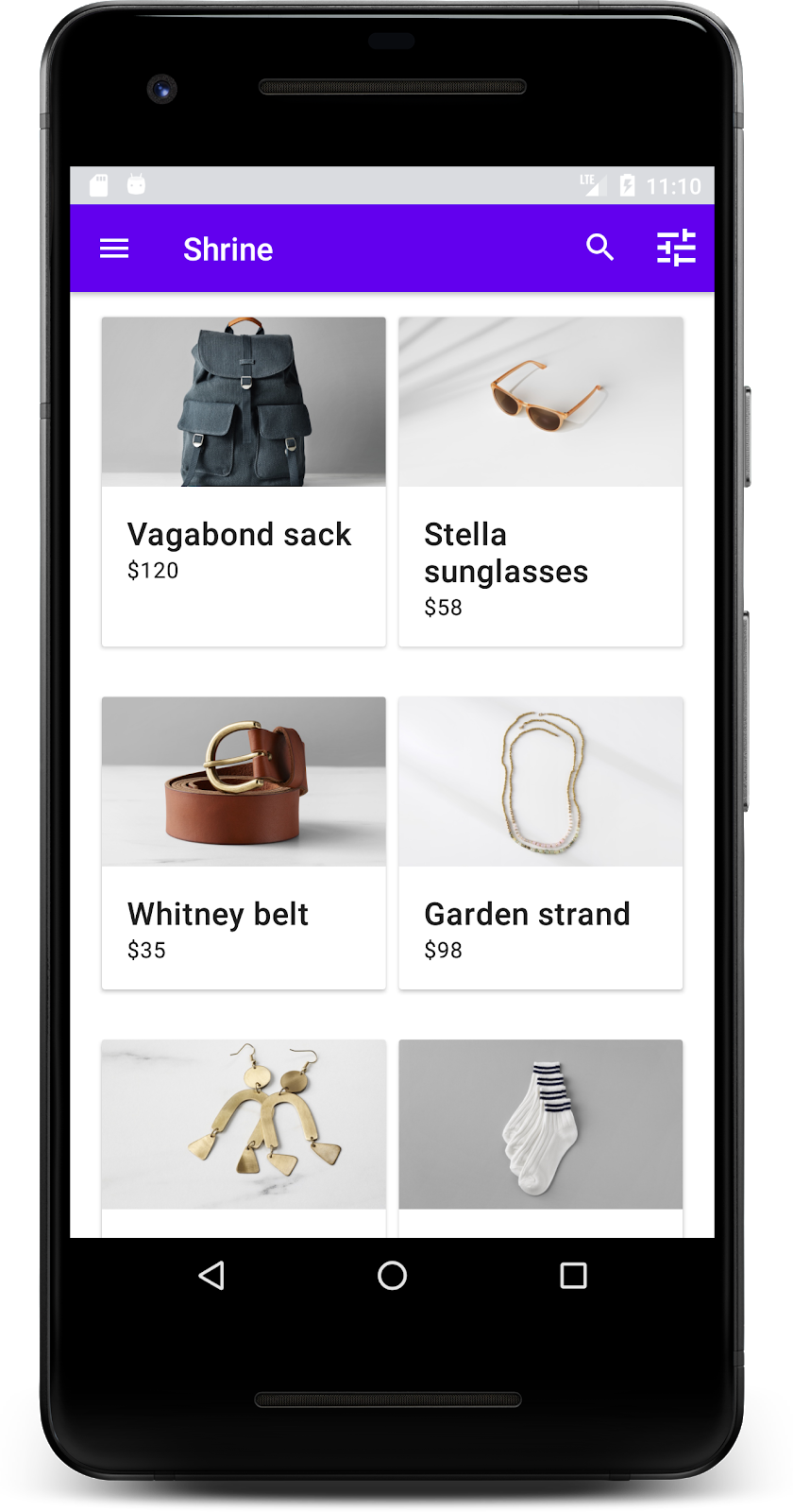
MDC-Android components in this codelab
- AppBarLayout
- MaterialCardView
What you'll need
- Basic knowledge of Android development
- Android Studio (download it here if you don't already have it)
- An Android emulator or device (available through Android Studio)
- The sample code (see next step)
How would you rate your level of experience building Android apps?
2. Set up your development environment
Continuing from MDC-101?
If you completed MDC-101, your code should be prepared for this codelab. Skip to step 3: Add a top app bar.
Starting from scratch?
Download the starter codelab app
The starter app is located in the material-components-android-codelabs-102-starter/kotlin directory. Be sure to cd into that directory before beginning.
...or clone it from GitHub
To clone this codelab from GitHub, run the following commands:
git clone https://github.com/material-components/material-components-android-codelabs
cd material-components-android-codelabs/
git checkout 102-starter
Load the starter code in Android Studio
- Once the setup wizard finishes and the Welcome to Android Studio window is shown, click Open an existing Android Studio project. Navigate to the directory where you had installed the sample code, and select kotlin -> shrine (or search your computer for shrine) to open the Shipping project.
- Wait a moment for Android Studio to build and sync the project, as shown by activity indicators along the bottom of the Android Studio window.
- At this point, Android Studio might raise some build errors because you are missing the Android SDK or build tools, such as the one shown below. Follow the instructions in Android Studio to install/update these and sync your project.
Add project dependencies
The project needs a dependency on the MDC Android support library. The sample code you downloaded should already have this dependency listed, but it is good practice to do the following steps to make sure.
- Navigate to the
appmodule'sbuild.gradlefile and make sure that thedependenciesblock includes a dependency on MDC Android:
api 'com.google.android.material:material:1.1.0-alpha06'
- (Optional) If necessary, edit the
build.gradlefile to add the following dependencies and sync the project.
dependencies {
    api 'com.google.android.material:material:1.1.0-alpha06'
    implementation 'androidx.legacy:legacy-support-v4:1.0.0'
    implementation 'com.android.volley:volley:1.1.1'
    implementation 'com.google.code.gson:gson:2.8.5'
    implementation "org.jetbrains.kotlin:kotlin-stdlib-jdk7:1.3.21"
    testImplementation 'junit:junit:4.12'
    androidTestImplementation 'androidx.test:core:1.1.0'
    androidTestImplementation 'androidx.test.ext:junit:1.1.0'
    androidTestImplementation 'androidx.test:runner:1.2.0-alpha05'
    androidTestImplementation 'androidx.test.espresso:espresso-core:3.2.0-alpha05'
}
Run the starter app
|
Success! You should see the Shrine login page from the MDC-101 codelab.
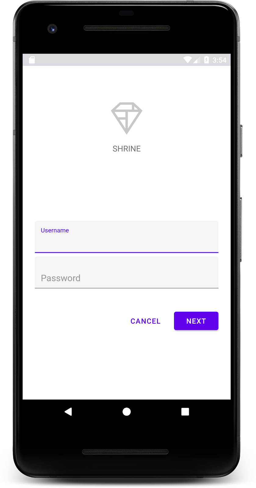
Now that the login screen is looking good, let's populate the app with some products.
3. Add a top app bar
The home screen is revealed when the login page is dismissed, with a screen that says "You did it!". That's great! But now our user has no actions to take, or any sense of where they are in the app. To help with that, it's time to add navigation.
Material Design offers navigation patterns that ensure a high degree of usability. One of the most visible components is a top app bar.
To provide navigation and give users quick access to other actions, let's add a top app bar.
Add an AppBar widget
In shr_product_grid_fragment.xml, delete the <LinearLayout> block containing the "You did it!" TextView and replace it with the following:
shr_product_grid_fragment.xml
<com.google.android.material.appbar.AppBarLayout
   android:layout_width="match_parent"
   android:layout_height="wrap_content">

   <androidx.appcompat.widget.Toolbar
       android:id="@+id/app_bar"
       style="@style/Widget.Shrine.Toolbar"
       android:layout_width="match_parent"
       android:layout_height="?attr/actionBarSize"
       app:title="@string/shr_app_name" />
</com.google.android.material.appbar.AppBarLayout>
Your shr_product_grid_fragment.xml should now look as follows:
shr_product_grid_fragment.xml
<?xml version="1.0" encoding="utf-8"?>
<FrameLayout xmlns:android="http://schemas.android.com/apk/res/android"
   xmlns:app="http://schemas.android.com/apk/res-auto"
   xmlns:tools="http://schemas.android.com/tools"
   android:layout_width="match_parent"
   android:layout_height="match_parent"
   tools:context=".ProductGridFragment">

   <com.google.android.material.appbar.AppBarLayout
       android:layout_width="match_parent"
       android:layout_height="wrap_content">

       <androidx.appcompat.widget.Toolbar
           android:id="@+id/app_bar"
           style="@style/Widget.Shrine.Toolbar"
           android:layout_width="match_parent"
           android:layout_height="?attr/actionBarSize"
           app:title="@string/shr_app_name" />
   </com.google.android.material.appbar.AppBarLayout>

</FrameLayout>
Many app bars have a button next to the title. Let's add a menu icon in ours.
Add a navigation icon
While still in shr_product_grid_fragment.xml, add the following to the Toolbar XML component you just added to your layout:
shr_product_grid_fragment.xml
app:navigationIcon="@drawable/shr_menu"
Your shr_product_grid_fragment.xml should look as follows:
shr_product_grid_fragment.xml
<?xml version="1.0" encoding="utf-8"?>
<FrameLayout xmlns:android="http://schemas.android.com/apk/res/android"
   xmlns:app="http://schemas.android.com/apk/res-auto"
   xmlns:tools="http://schemas.android.com/tools"
   android:layout_width="match_parent"
   android:layout_height="match_parent"
   tools:context=".ProductGridFragment">

   <com.google.android.material.appbar.AppBarLayout
       android:layout_width="match_parent"
       android:layout_height="wrap_content">

       <androidx.appcompat.widget.Toolbar
           android:id="@+id/app_bar"
           style="@style/Widget.Shrine.Toolbar"
           android:layout_width="match_parent"
           android:layout_height="?attr/actionBarSize"
           app:navigationIcon="@drawable/shr_menu"
           app:title="@string/shr_app_name" />
   </com.google.android.material.appbar.AppBarLayout>

</FrameLayout>
Add action buttons and style the top app bar
You can also add buttons to the end side of the app bar. In Android, these are called action buttons. We will style the top app bar and add action buttons to its menu programmatically.
In ProductGridFragment.kt's onCreateView function, set the activity's Toolbar to be used as an ActionBar using setSupportActionBar. You can do this after the view has been created with the inflater.
ProductGridFragment.kt
override fun onCreateView(
       inflater: LayoutInflater, container: ViewGroup?, savedInstanceState: Bundle?): View? {
   // Inflate the layout for this fragment with the ProductGrid theme
   val view = inflater.inflate(R.layout.shr_product_grid_fragment, container, false)

   // Set up the toolbar.
   (activity as AppCompatActivity).setSupportActionBar(view.app_bar)

   return view;
}
Next, directly underneath the method we just changed to set up the toolbar, let's override onCreateOptionsMenu to inflate the contents of shr_toolbar_menu.xml into the toolbar:
ProductGridFragment.kt
override fun onCreateOptionsMenu(menu: Menu, menuInflater: MenuInflater) {
   menuInflater.inflate(R.menu.shr_toolbar_menu, menu)
   super.onCreateOptionsMenu(menu, menuInflater)
}
Finally, override onCreate() in ProductGridFragment.kt, and after calling super(), call setHasOptionMenu with true:
ProductGridFragment.kt
override fun onCreate(savedInstanceState: Bundle?) {
   super.onCreate(savedInstanceState)
   setHasOptionsMenu(true)
}
The above code snippets set the app bar from our XML layout to be the Action Bar for this activity. The callback onCreateOptionsMenu tells the activity what to use as our menu. In this case, it will put the menu items from R.menu.shr_toolbar_menu into the app bar. The menu file contains two items: "Search" and "Filter".
shr_toolbar_menu.xml
<?xml version="1.0" encoding="utf-8"?>
<menu xmlns:android="http://schemas.android.com/apk/res/android"
   xmlns:app="http://schemas.android.com/apk/res-auto">
   <item
       android:id="@+id/search"
       android:icon="@drawable/shr_search"
       android:title="@string/shr_search_title"
       app:showAsAction="always" />
   <item
       android:id="@+id/filter"
       android:icon="@drawable/shr_filter"
       android:title="@string/shr_filter_title"
       app:showAsAction="always" />
</menu>
After those changes, your ProductGridFragment.kt file should look as follows:
ProductGridFragment.kt
package com.google.codelabs.mdc.kotlin.shrine

import android.os.Bundle
import android.view.LayoutInflater
import android.view.Menu
import android.view.MenuInflater
import android.view.View
import android.view.ViewGroup
import androidx.appcompat.app.AppCompatActivity
import androidx.fragment.app.Fragment
import androidx.recyclerview.widget.GridLayoutManager
import com.google.codelabs.mdc.kotlin.shrine.network.ProductEntry
import kotlinx.android.synthetic.main.shr_product_grid_fragment.view.*

class ProductGridFragment : Fragment() {

   override fun onCreate(savedInstanceState: Bundle?) {
       super.onCreate(savedInstanceState)
       setHasOptionsMenu(true)
   }

   override fun onCreateView(
           inflater: LayoutInflater, container: ViewGroup?, savedInstanceState: Bundle?): View? {
       // Inflate the layout for this fragment with the ProductGrid theme
       val view = inflater.inflate(R.layout.shr_product_grid_fragment, container, false)

       // Set up the tool bar
       (activity as AppCompatActivity).setSupportActionBar(view.app_bar)

       return view;
   }

   override fun onCreateOptionsMenu(menu: Menu, menuInflater: MenuInflater) {
       menuInflater.inflate(R.menu.shr_toolbar_menu, menu)
       super.onCreateOptionsMenu(menu, menuInflater)
   }
}
Build and run. Your home screen should look like this:
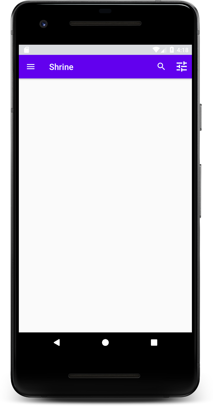
Now the toolbar has a navigation icon, a title, and two action icons on the right side. The toolbar also displays elevation using a subtle shadow that shows it's on a different layer than the content.
4. Add a card
Now that our app has some structure, let's organize the content by placing it in cards.
Add a card
Let's start by adding one card underneath the top app bar. A card should have a region for an image, a title, and a label for secondary text. Add the following in shr_product_grid_fragment.xml underneath the AppBarLayout.
shr_product_grid_fragment.xml
<com.google.android.material.card.MaterialCardView
   android:layout_width="160dp"
   android:layout_height="180dp"
   android:layout_marginBottom="16dp"
   android:layout_marginLeft="16dp"
   android:layout_marginRight="16dp"
   android:layout_marginTop="70dp"
   app:cardBackgroundColor="?attr/colorPrimaryDark"
   app:cardCornerRadius="4dp">

   <LinearLayout
       android:layout_width="match_parent"
       android:layout_height="wrap_content"
       android:layout_gravity="bottom"
       android:background="#FFFFFF"
       android:orientation="vertical"
       android:padding="8dp">

       <TextView
           android:layout_width="match_parent"
           android:layout_height="wrap_content"
           android:padding="2dp"
           android:text="@string/shr_product_title"
           android:textAppearance="?attr/textAppearanceHeadline6" />

       <TextView
           android:layout_width="match_parent"
           android:layout_height="wrap_content"
           android:padding="2dp"
           android:text="@string/shr_product_description"
           android:textAppearance="?attr/textAppearanceBody2" />
   </LinearLayout>
</com.google.android.material.card.MaterialCardView>
Build and run:
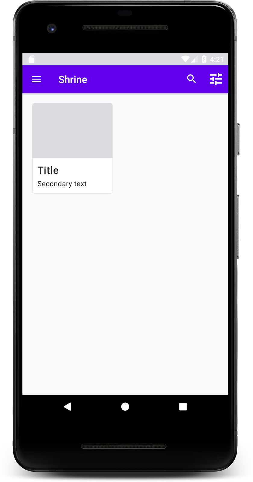
In this preview, you can see the card is inset from the left edge, and it has rounded corners and a shadow (which expresses the card's elevation). The entire element is called the "container." Aside from the container, all of the elements within it are optional.
You can add the following elements to a container: header text, a thumbnail or avatar, subhead text, dividers, and even buttons and icons. The card we just created, for instance, contains two TextViews (one for the title, and one for secondary text) in a LinearLayout , aligned to the bottom of the card.
Cards are usually shown in a collection with other cards. In the next section of this codelab, we'll lay them out as a collection in a grid.
5. Create a grid of cards
When multiple cards are present in a screen, they are grouped together into one or more collections. Cards in a grid are coplanar, meaning they share the same resting elevation as one another (unless picked up or dragged, but we won't be covering that in this codelab).
Set up the grid of cards
Take a look at the shr_product_card.xml file that we've provided for you:
shr_product_card.xml
<?xml version="1.0" encoding="utf-8"?>
<com.google.android.material.card.MaterialCardView xmlns:android="http://schemas.android.com/apk/res/android"
   xmlns:app="http://schemas.android.com/apk/res-auto"
   android:layout_width="match_parent"
   android:layout_height="wrap_content"
   app:cardBackgroundColor="@android:color/white"
   app:cardElevation="2dp"
   app:cardPreventCornerOverlap="true">

   <LinearLayout
       android:layout_width="match_parent"
       android:layout_height="wrap_content"
       android:orientation="vertical">

       <com.android.volley.toolbox.NetworkImageView
           android:id="@+id/product_image"
           android:layout_width="match_parent"
           android:layout_height="@dimen/shr_product_card_image_height"
           android:background="?attr/colorPrimaryDark"
           android:scaleType="centerCrop" />

       <LinearLayout
           android:layout_width="match_parent"
           android:layout_height="wrap_content"
           android:orientation="vertical"
           android:padding="16dp">

           <TextView
               android:id="@+id/product_title"
               android:layout_width="match_parent"
               android:layout_height="wrap_content"
               android:text="@string/shr_product_title"
               android:textAppearance="?attr/textAppearanceHeadline6" />

           <TextView
               android:id="@+id/product_price"
               android:layout_width="match_parent"
               android:layout_height="wrap_content"
               android:text="@string/shr_product_description"
               android:textAppearance="?attr/textAppearanceBody2" />
       </LinearLayout>
   </LinearLayout>
</com.google.android.material.card.MaterialCardView>
This card layout contains a card with an image (in this case, a NetworkImageView, which allows us to load and show images from a URL), and two TextViews.
Next, look at the ProductCardRecyclerViewAdapter we've provided for you. It's in the same package as ProductGridFragment.
ProductCardRecyclerViewAdapter.kt
package com.google.codelabs.mdc.kotlin.shrine

import android.view.LayoutInflater
import android.view.ViewGroup
import androidx.recyclerview.widget.RecyclerView

import com.google.codelabs.mdc.kotlin.shrine.network.ProductEntry

/**
* Adapter used to show a simple grid of products.
*/
class ProductCardRecyclerViewAdapter(private val productList: List<ProductEntry>) : RecyclerView.Adapter<ProductCardViewHolder>() {

   override fun onCreateViewHolder(parent: ViewGroup, viewType: Int): ProductCardViewHolder {
       val layoutView = LayoutInflater.from(parent.context).inflate(R.layout.shr_product_card, parent, false)
       return ProductCardViewHolder(layoutView)
   }

   override fun onBindViewHolder(holder: ProductCardViewHolder, position: Int) {
       // TODO: Put ViewHolder binding code here in MDC-102
   }

   override fun getItemCount(): Int {
       return productList.size
   }
}
The adapter class above manages the content of our grid. To determine what each view should do with its given content, we will soon write the code for onBindViewHolder().
In the same package, you can also take a look at ProductCardViewHolder. This class stores the views that affect our card layout, so we can modify them later.
package com.google.codelabs.mdc.kotlin.shrine

import android.view.View
import androidx.recyclerview.widget.RecyclerView

class ProductCardViewHolder(itemView: View) //TODO: Find and store views from itemView
   : RecyclerView.ViewHolder(itemView)
To set up our grid, first we'll want to remove the placeholder MaterialCardView from shr_product_grid_fragment.xml. Next, you should add the component representing our grid of cards. In this case, we will use a RecyclerView. Add the RecyclerView component to your shr_product_grid_fragment.xml below your AppBarLayout XML component:
shr_product_grid_fragment.xml
<androidx.core.widget.NestedScrollView
   android:layout_width="match_parent"
   android:layout_height="match_parent"
   android:layout_marginTop="56dp"
   android:background="@color/productGridBackgroundColor"
   android:paddingStart="@dimen/shr_product_grid_spacing"
   android:paddingEnd="@dimen/shr_product_grid_spacing"
   app:layout_behavior="@string/appbar_scrolling_view_behavior">

   <androidx.recyclerview.widget.RecyclerView
       android:id="@+id/recycler_view"
       android:layout_width="match_parent"
       android:layout_height="match_parent" />

</androidx.core.widget.NestedScrollView>
Your shr_product_grid_fragment.xml should look as follows:
shr_product_grid_fragment.xml
<?xml version="1.0" encoding="utf-8"?>
<FrameLayout xmlns:android="http://schemas.android.com/apk/res/android"
   xmlns:app="http://schemas.android.com/apk/res-auto"
   xmlns:tools="http://schemas.android.com/tools"
   android:layout_width="match_parent"
   android:layout_height="match_parent"
   tools:context=".ProductGridFragment">

   <com.google.android.material.appbar.AppBarLayout
       android:layout_width="match_parent"
       android:layout_height="wrap_content">

       <androidx.appcompat.widget.Toolbar
           android:id="@+id/app_bar"
           style="@style/Widget.Shrine.Toolbar"
           android:layout_width="match_parent"
           android:layout_height="?attr/actionBarSize"
           app:navigationIcon="@drawable/shr_menu"
           app:title="@string/shr_app_name" />
   </com.google.android.material.appbar.AppBarLayout>

   <androidx.core.widget.NestedScrollView
       android:layout_width="match_parent"
       android:layout_height="match_parent"
       android:layout_marginTop="56dp"
       android:background="@color/productGridBackgroundColor"
       android:paddingStart="@dimen/shr_product_grid_spacing"
       android:paddingEnd="@dimen/shr_product_grid_spacing"
       app:layout_behavior="@string/appbar_scrolling_view_behavior">

       <androidx.recyclerview.widget.RecyclerView
           android:id="@+id/recycler_view"
           android:layout_width="match_parent"
           android:layout_height="match_parent" />

   </androidx.core.widget.NestedScrollView>

</FrameLayout>
Finally, in onCreateView(), add the RecyclerView initialization code into ProductGridFragment.kt after you call setUpToolbar(view) and before the return statement:
ProductGridFragment.kt
override fun onCreateView(
       inflater: LayoutInflater, container: ViewGroup?, savedInstanceState: Bundle?): View? {
   // Inflate the layout for this fragment with the ProductGrid theme
   val view = inflater.inflate(R.layout.shr_product_grid_fragment, container, false)

   // Set up the toolbar.
   (activity as AppCompatActivity).setSupportActionBar(view.app_bar)

   // Set up the RecyclerView
   view.recycler_view.setHasFixedSize(true)
   view.recycler_view.layoutManager = GridLayoutManager(context, 2, RecyclerView.VERTICAL, false)
   val adapter = ProductCardRecyclerViewAdapter(
           ProductEntry.initProductEntryList(resources))
   view.recycler_view.adapter = adapter
   val largePadding = resources.getDimensionPixelSize(R.dimen.shr_product_grid_spacing)
   val smallPadding = resources.getDimensionPixelSize(R.dimen.shr_product_grid_spacing_small)
   view.recycler_view.addItemDecoration(ProductGridItemDecoration(largePadding, smallPadding))

   return view;
}
The above code snippet contains the necessary initialization steps to set up a RecyclerView. This includes setting the RecyclerView's layout manager, plus initializing and setting the RecyclerView's adapter.
Your ProductGridFragment.kt file should now look as follows:
ProductGridFragment .kt
package com.google.codelabs.mdc.kotlin.shrine

import android.os.Bundle
import android.view.LayoutInflater
import android.view.Menu
import android.view.MenuInflater
import android.view.View
import android.view.ViewGroup
import androidx.appcompat.app.AppCompatActivity
import androidx.fragment.app.Fragment
import androidx.recyclerview.widget.GridLayoutManager
import androidx.recyclerview.widget.RecyclerView
import com.google.codelabs.mdc.kotlin.shrine.network.ProductEntry
import kotlinx.android.synthetic.main.shr_product_grid_fragment.view.*

class ProductGridFragment : Fragment() {

   override fun onCreate(savedInstanceState: Bundle?) {
       super.onCreate(savedInstanceState)
       setHasOptionsMenu(true)
   }

   override fun onCreateView(
           inflater: LayoutInflater, container: ViewGroup?, savedInstanceState: Bundle?): View? {
       // Inflate the layout for this fragment with the ProductGrid theme
       val view = inflater.inflate(R.layout.shr_product_grid_fragment, container, false)

       // Set up the toolbar.
       (activity as AppCompatActivity).setSupportActionBar(view.app_bar)

       // Set up the RecyclerView
       view.recycler_view.setHasFixedSize(true)
       view.recycler_view.layoutManager = GridLayoutManager(context, 2, RecyclerView.VERTICAL, false)
       val adapter = ProductCardRecyclerViewAdapter(
               ProductEntry.initProductEntryList(resources))
       view.recycler_view.adapter = adapter
       val largePadding = resources.getDimensionPixelSize(R.dimen.shr_product_grid_spacing)
       val smallPadding = resources.getDimensionPixelSize(R.dimen.shr_product_grid_spacing_small)
       view.recycler_view.addItemDecoration(ProductGridItemDecoration(largePadding, smallPadding))

       return view;
   }

   override fun onCreateOptionsMenu(menu: Menu, menuInflater: MenuInflater) {
       menuInflater.inflate(R.menu.shr_toolbar_menu, menu)
       super.onCreateOptionsMenu(menu, menuInflater)
   }
}
Build and run:
The cards are there now! They don't show anything yet, so let's add some product data.
Add images and text
For each card, add an image, product name, and price. Our ViewHolder abstraction holds the views for each card. In our ViewHolder, add the three views as follows.
ProductCardViewHolder.kt
package com.google.codelabs.mdc.kotlin.shrine

import android.view.View
import android.widget.TextView
import androidx.recyclerview.widget.RecyclerView

import com.android.volley.toolbox.NetworkImageView

class ProductCardViewHolder(itemView: View) : RecyclerView.ViewHolder(itemView) {

   var productImage: NetworkImageView = itemView.findViewById(R.id.product_image)
   var productTitle: TextView = itemView.findViewById(R.id.product_title)
   var productPrice: TextView = itemView.findViewById(R.id.product_price)
}
Update the onBindViewHolder() method in the ProductCardRecyclerViewAdapter to set the title, price and product image for each product view as shown below:
ProductCardRecyclerViewAdapter.kt
override fun onBindViewHolder(holder: ProductCardViewHolder, position: Int) {
   if (position < productList.size) {
       val product = productList[position]
       holder.productTitle.text = product.title
       holder.productPrice.text = product.price
       ImageRequester.setImageFromUrl(holder.productImage, product.url)
   }
}
The above code tells our RecyclerView's adapter what to do with each card, using a ViewHolder.
Here, it sets the text data on each of the ViewHolder's TextViews, and calls an ImageRequester to get an image from a URL. The ImageRequester is a class we've provided for your convenience, and it uses the Volley library (That's a topic outside the scope of this codelab, but feel free to explore the code on your own).
Build and run:

Our products are now showing up in the app!
6. Recap
Our app has a basic flow that takes the user from the login screen to a home screen, where products can be viewed. In just a few lines of code, we added a top app bar with a title and three buttons, and a grid of cards to present our app's content. Our home screen is now simple and functional, with a basic structure and actionable content.
Next steps
With the top app bar, card, text field, and button, we've now used four core Material Design components from the MDC-Android library! You can explore even more components by visiting the MDC-Android Catalog.
While it's fully functional, our app doesn't yet express any particular brand or style. In MDC-103: Material Design Theming with Color, Shape, Elevation and Type, we'll customize the style of these components to express a vibrant, modern brand.

