
1. Введение
Компоненты Material (MDC) помогают разработчикам внедрять Material Design. Созданные командой инженеров и UX-дизайнеров Google, MDC включают в себя десятки красивых и функциональных компонентов пользовательского интерфейса и доступны для Android, iOS, веб-приложений и Flutter.material.io/develop |
В практических занятиях MDC-101 и MDC-102 вы использовали Material Components (MDC) для создания базовой части приложения Shrine , приложения для электронной коммерции, продающего одежду и товары для дома. Это приложение содержит пользовательский интерфейс, который начинается с экрана входа в систему и перенаправляет пользователя на главный экран, где отображаются товары.
Недавнее расширение Material Design предоставляет дизайнерам и разработчикам больше гибкости для выражения фирменного стиля своего продукта. Теперь вы можете использовать MDC для персонализации Shrine и более полного отражения его уникального стиля.
Что вы построите
В этом практическом занятии вы настроите Shrine в соответствии с его фирменным стилем, используя следующие инструменты:
- Цвет
- Типография
- Высота
- Макет
Компоненты и подсистемы MDC Android, используемые в этом практическом занятии.
- Темы
- Типография
- Высота
Что вам понадобится
- Базовые знания разработки под Android.
- Android Studio (скачайте её здесь, если у вас её ещё нет).
- Эмулятор или устройство Android (доступное через Android Studio)
- Пример кода (см. следующий шаг)
Как бы вы оценили свой уровень опыта в разработке Android-приложений?
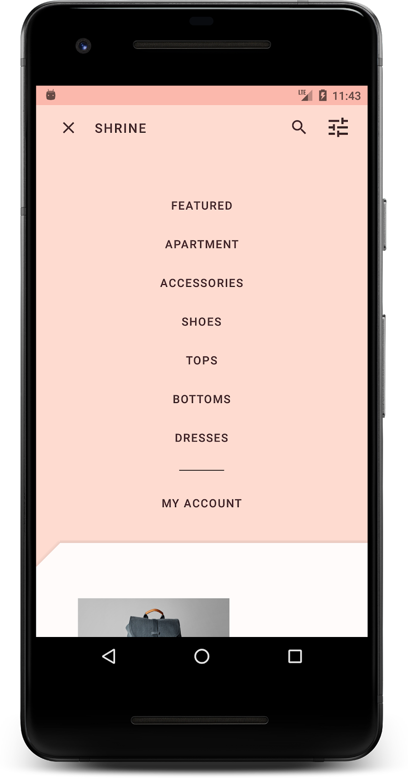
2. Настройте среду разработки.
Продолжение темы MDC-102?
Если вы прошли курс MDC-102, ваш код должен быть готов для этой практической работы. Перейдите к шагу 3: Измените цвет .
Скачайте стартовое приложение Codelab.
Стартовое приложение находится в каталоге material-components-android-codelabs-103-starter/java . Перед началом работы обязательно перейдите в этот каталог cd .
...или клонируйте его с GitHub
Чтобы клонировать этот код с GitHub, выполните следующие команды:
git clone https://github.com/material-components/material-components-android-codelabs
cd material-components-android-codelabs/
git checkout 103-starter
Загрузите стартовый код в Android Studio.
- После завершения работы мастера установки и появления окна «Добро пожаловать в Android Studio» нажмите « Открыть существующий проект Android Studio» . Перейдите в каталог, где вы установили примеры кода, и выберите java -> shrine (или найдите shrine на своем компьютере), чтобы открыть проект Shrine.
- Подождите немного, пока Android Studio соберет и синхронизирует проект, как это отобразится в индикаторах активности в нижней части окна Android Studio.
- На этом этапе Android Studio может выдавать ошибки сборки, поскольку у вас отсутствует Android SDK или инструменты сборки, например, показанные ниже. Следуйте инструкциям в Android Studio, чтобы установить/обновить их и синхронизировать ваш проект.

Добавьте зависимости проекта
Проекту необходима зависимость от библиотеки поддержки Android MDC . В загруженном вами примере кода эта зависимость уже должна быть указана, но для уверенности рекомендуется выполнить следующие шаги.
- Перейдите к файлу
build.gradleмодуляappи убедитесь, что блокdependenciesвключает зависимость от MDC Android:
api 'com.google.android.material:material:1.1.0-alpha06'
- (Необязательно) При необходимости отредактируйте файл
build.gradle, чтобы добавить следующие зависимости и синхронизировать проект.
dependencies {
    api 'com.google.android.material:material:1.1.0-alpha06'
    implementation 'androidx.legacy:legacy-support-v4:1.0.0'
    implementation 'com.android.volley:volley:1.1.1'
    implementation 'com.google.code.gson:gson:2.8.5'
    implementation "org.jetbrains.kotlin:kotlin-stdlib-jdk7:1.3.21"
    testImplementation 'junit:junit:4.12'
    androidTestImplementation 'androidx.test:core:1.1.0'
    androidTestImplementation 'androidx.test.ext:junit:1.1.0'
    androidTestImplementation 'androidx.test:runner:1.2.0-alpha05'
    androidTestImplementation 'androidx.test.espresso:espresso-core:3.2.0-alpha05'
}
Запустите стартовое приложение
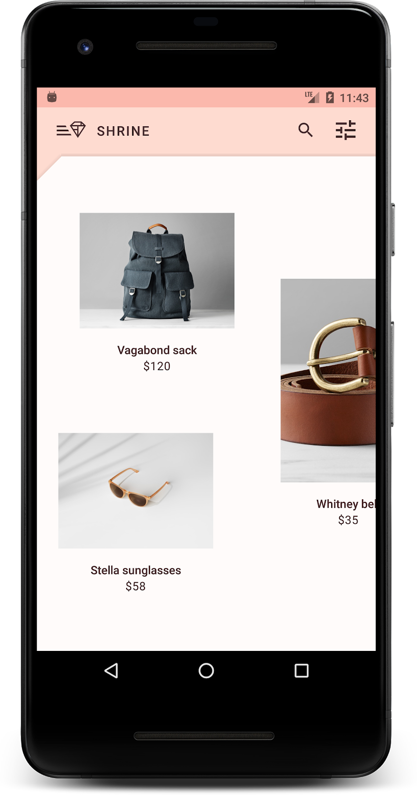
|

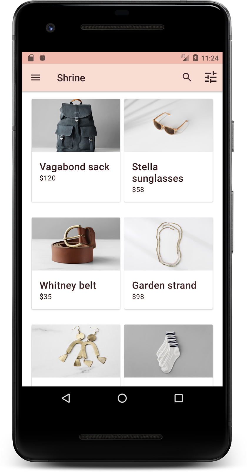
Успех! На вашем устройстве или эмуляторе должна отобразиться страница входа в Shrine. После нажатия кнопки «Далее» появится главная страница Shrine с панелью приложений вверху и сеткой изображений продуктов внизу.
Давайте придадим верхней панели приложения стиль, соответствующий бренду Shrine, изменив её цвет, рельеф и типографику.
3. Измените цвет
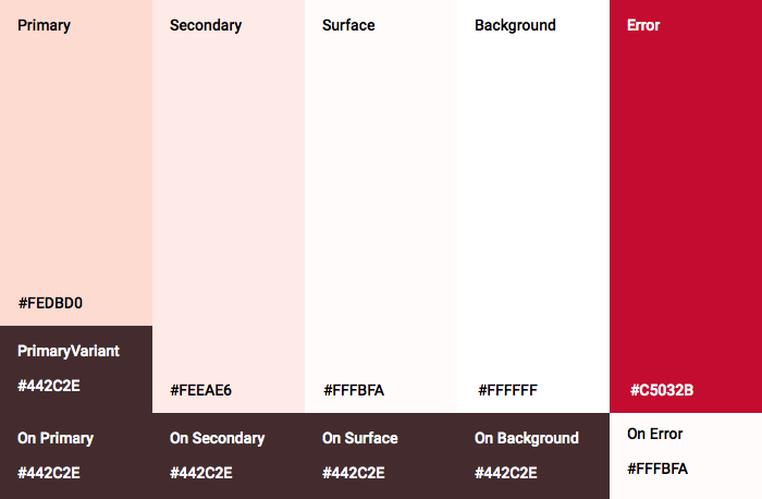
Эта цветовая схема была создана дизайнером с использованием пользовательских цветов (показано на изображении ниже). Она содержит цвета, выбранные из фирменного стиля Shrine и примененные к редактору тем Material, что позволило расширить их палитру и создать более полную коллекцию. (Эти цвета не входят в палитры Material 2014 года .)
Редактор тем Material Design организовал их по оттенкам, обозначенным числовыми номерами, включая 50, 100, 200, ... до 900 для каждого цвета. Shrine использует только оттенки 50, 100 и 300 из розовой палитры и 900 из коричневой палитры.

Давайте изменим цвет верхней панели приложения в соответствии с этой цветовой схемой.
Установите значения colorPrimaryDark и colorAccent.
В colors.xml измените следующие строки. Атрибут colorAccent , помимо прочего, управляет цветом верхней панели приложения, а атрибут colorPrimaryDark — цветом строки состояния.
colors.xml
<color name="colorPrimaryDark">#FBB8AC</color>
<color name="colorAccent">#FEDBD0</color>
Чтобы использовать темные значки в строке состояния, добавьте следующее в Theme.Shrine , тему приложения Shrine:
styles.xml
<item name="android:windowLightStatusBar" tools:targetApi="m">true</item>
Ваши colors.xml и styles.xml должны выглядеть следующим образом:
colors.xml
<?xml version="1.0" encoding="utf-8"?>
<resources>
   <color name="colorPrimary">#E0E0E0</color>
   <color name="colorPrimaryDark">#FBB8AC</color>
   <color name="colorAccent">#FEDBD0</color>
   <color name="toolbarIconColor">#FFFFFF</color>
   <color name="loginPageBackgroundColor">#FFFFFF</color>
   <color name="productGridBackgroundColor">#FFFFFF</color>
</resources>
styles.xml
<resources xmlns:android="http://schemas.android.com/tools">

   <!-- Base application theme. -->
   <style name="Theme.Shrine" parent="Theme.MaterialComponents.Light.NoActionBar">
       <!-- Customize your theme here. -->
       <item name="colorPrimary">@color/colorPrimary</item>
       <item name="colorPrimaryDark">@color/colorPrimaryDark</item>
       <item name="colorAccent">@color/colorAccent</item>
       <item name="android:windowLightStatusBar" tools:targetApi="m">true</item>
   </style>

   <style name="Widget.Shrine.Toolbar" parent="Widget.AppCompat.Toolbar">
       <item name="android:background">?attr/colorAccent</item>
       <item name="android:theme">@style/ThemeOverlay.AppCompat.Dark.ActionBar</item>
       <item name="popupTheme">@style/ThemeOverlay.AppCompat.Light</item>
   </style>

</resources>
В colors.xml добавьте новый ресурс цвета textColorPrimary заданный значением #442C2E , и обновите атрибут toolbarIconColor , указав в нем ссылку на цвет textColorPrimary .
Обновите файл styles.xml , установив атрибут android:textColorPrimary на цвет textColorPrimary .
Установка параметра android:textColorPrimary в Theme.Shrine изменит стиль текста на всех элементах, включая верхнюю панель приложения и значки в нашей верхней панели приложения.
И ещё одно: установите атрибут android:theme в стиле Widget.Shrine.Toolbar на Theme.Shrine .
Ваши colors.xml и styles.xml должны выглядеть следующим образом:
colors.xml
<?xml version="1.0" encoding="utf-8"?>
<resources>
   <color name="colorPrimary">#E0E0E0</color>
   <color name="colorPrimaryDark">#FBB8AC</color>
   <color name="colorAccent">#FEDBD0</color>
   <color name="textColorPrimary">#442C2E</color>
   <color name="toolbarIconColor">@color/textColorPrimary</color>
   <color name="loginPageBackgroundColor">#FFFFFF</color>
   <color name="productGridBackgroundColor">#FFFFFF</color>
</resources>
styles.xml
<resources xmlns:android="http://schemas.android.com/tools">

   <!-- Base application theme. -->
   <style name="Theme.Shrine" parent="Theme.MaterialComponents.Light.NoActionBar">
       <!-- Customize your theme here. -->
       <item name="colorPrimary">@color/colorPrimary</item>
       <item name="colorPrimaryDark">@color/colorPrimaryDark</item>
       <item name="colorAccent">@color/colorAccent</item>
       <item name="android:windowLightStatusBar" tools:targetApi="m">true</item>
       <item name="android:textColorPrimary">@color/textColorPrimary</item>
   </style>

   <style name="Widget.Shrine.Toolbar" parent="Widget.AppCompat.Toolbar">
       <item name="android:background">?attr/colorAccent</item>
       <item name="android:theme">@style/Theme.Shrine</item>
       <item name="popupTheme">@style/ThemeOverlay.AppCompat.Light</item>
   </style>

</resources>
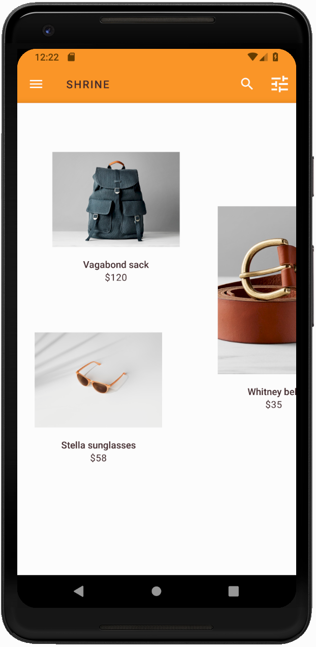
Соберите и запустите. Ваша продуктовая сетка теперь должна выглядеть так:
Давайте изменим стиль экрана входа в систему, чтобы он соответствовал нашей цветовой схеме.
Настройте стиль текстовых полей
Давайте изменим форматирование текстовых полей на странице входа, сделав их контурными, и используем более подходящие цвета для оформления.
Добавьте следующий ресурс цвета в файл colors.xml :
colors.xml
<color name="textInputOutlineColor">#FBB8AC</color>
Добавьте два новых стиля в файл styles.xml :
styles.xml
<style name="Widget.Shrine.TextInputLayout" parent="Widget.MaterialComponents.TextInputLayout.OutlinedBox">
   <item name="hintTextAppearance">@style/TextAppearance.Shrine.TextInputLayout.HintText</item>
   <item name="hintTextColor">@color/textColorPrimary</item>
   <item name="android:paddingBottom">8dp</item>
   <item name="boxStrokeColor">@color/textInputOutlineColor</item>
</style>

<style name="TextAppearance.Shrine.TextInputLayout.HintText" parent="TextAppearance.MaterialComponents.Subtitle2">
   <item name="android:textColor">?android:attr/textColorPrimary</item>
</style>
Наконец, установите атрибут style для обоих XML-компонентов TextInputLayout в файле shr_login_fragment.xml на ваш новый стиль:
shr_login_fragment.xml
<com.google.android.material.textfield.TextInputLayout
   style="@style/Widget.Shrine.TextInputLayout"
   android:layout_width="match_parent"
   android:layout_height="wrap_content"
   android:hint="@string/shr_hint_username">

   <com.google.android.material.textfield.TextInputEditText
       android:layout_width="match_parent"
       android:layout_height="wrap_content"
       android:inputType="text"
       android:maxLines="1" />
</com.google.android.material.textfield.TextInputLayout>

<com.google.android.material.textfield.TextInputLayout
   android:id="@+id/password_text_input"
   style="@style/Widget.Shrine.TextInputLayout"
   android:layout_width="match_parent"
   android:layout_height="wrap_content"
   android:hint="@string/shr_hint_password"
   app:errorEnabled="true">

   <com.google.android.material.textfield.TextInputEditText
       android:id="@+id/password_edit_text"
       android:layout_width="match_parent"
       android:layout_height="wrap_content"
       android:inputType="textPassword" />
</com.google.android.material.textfield.TextInputLayout>
Настройте цвет кнопок
Наконец, настройте цвета кнопок на странице входа. Добавьте следующие стили в ваш styles.xml :
styles.xml
<style name="Widget.Shrine.Button" parent="Widget.MaterialComponents.Button">
   <item name="android:textColor">?android:attr/textColorPrimary</item>
   <item name="backgroundTint">?attr/colorPrimaryDark</item>
</style>

<style name="Widget.Shrine.Button.TextButton" parent="Widget.MaterialComponents.Button.TextButton">
   <item name="android:textColor">?android:attr/textColorPrimary</item>
</style>
Стиль Widget.Shrine.Button наследуется от стандартного стиля MaterialButton и изменяет цвет текста и оттенок фона кнопки. Стиль Widget.Shrine.Button.TextButton наследуется от стандартного стиля MaterialButton для текста и изменяет только цвет текста.
Установите стиль Widget.Shrine.Button для кнопки "Далее" и стиль Widget.Shrine.Button.TextButton для кнопки "Отмена" следующим образом:
shr_login_fragment.xml
<RelativeLayout
   android:layout_width="match_parent"
   android:layout_height="wrap_content">

   <com.google.android.material.button.MaterialButton
       android:id="@+id/next_button"
       style="@style/Widget.Shrine.Button"
       android:layout_width="wrap_content"
       android:layout_height="wrap_content"
       android:layout_alignParentEnd="true"
       android:layout_alignParentRight="true"
       android:text="@string/shr_button_next" />

   <com.google.android.material.button.MaterialButton
       android:id="@+id/cancel_button"
       style="@style/Widget.Shrine.Button.TextButton"
       android:layout_width="wrap_content"
       android:layout_height="wrap_content"
       android:layout_marginEnd="12dp"
       android:layout_marginRight="12dp"
       android:layout_toStartOf="@id/next_button"
       android:layout_toLeftOf="@id/next_button"
       android:text="@string/shr_button_cancel" />

</RelativeLayout>
Обновите цвет логотипа Shrine на странице входа. Для этого потребуется внести небольшие изменения в векторный файл drawable, shr_logo.xml . Откройте файл drawable и измените свойство android:fillAlpha на 1. Результат должен выглядеть следующим образом:
shr_logo.xml
<vector xmlns:android="http://schemas.android.com/apk/res/android"
   android:width="149dp"
   android:height="152dp"
   android:tint="?attr/colorControlNormal"
   android:viewportWidth="149"
   android:viewportHeight="152">
   <path
       android:fillAlpha="1"
       android:fillColor="#DADCE0"
       android:fillType="evenOdd"
       android:pathData="M42.262,0L0,38.653L74.489,151.994L148.977,38.653L106.723,0M46.568,11.11L21.554,33.998L99.007,33.998L99.007,11.11L46.568,11.11ZM110.125,18.174L110.125,33.998L127.416,33.998L110.125,18.174ZM80.048,45.116L80.048,123.296L131.426,45.116L80.048,45.116ZM17.551,45.116L33.976,70.101L68.93,70.101L68.93,45.116L17.551,45.116ZM41.284,81.219L68.93,123.296L68.93,81.219L41.284,81.219Z"
       android:strokeWidth="1"
       android:strokeAlpha="0.4"
       android:strokeColor="#00000000" />
</vector>
Установите атрибут android:tint для элемента logo <ImageView> в файле shr_login_fragment.xml на значение ?android:attr/textColorPrimary следующим образом:
shr_login_fragment.xml
<ImageView
   android:layout_width="64dp"
   android:layout_height="64dp"
   android:layout_gravity="center_horizontal"
   android:layout_marginTop="48dp"
   android:layout_marginBottom="16dp"
   android:tint="?android:attr/textColorPrimary"
   app:srcCompat="@drawable/shr_logo" />
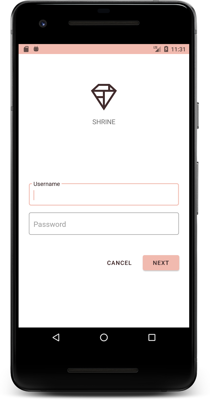
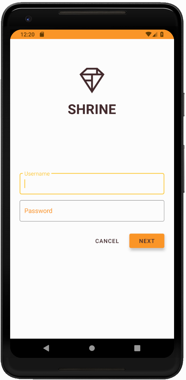
Соберите и запустите. Теперь ваш экран входа в систему должен выглядеть так:
4. Измените типографику и стили подписей.
Помимо изменения цвета, ваш дизайнер также предоставил вам определенный набор шрифтов для использования на сайте. Давайте добавим его и в верхнюю панель приложения.
Оформите верхнюю панель приложений
Оформите внешний вид текста на верхней панели приложения в соответствии с требованиями, предоставленными вашим дизайнером. Добавьте следующий стиль оформления текста в styles.xml и установите свойство titleTextAppearance , чтобы оно ссылалось на этот стиль в стиле вашего виджета Widget.Shrine.Toolbar .
styles.xml
<style name="Widget.Shrine.Toolbar" parent="Widget.AppCompat.Toolbar">
   <item name="android:background">?attr/colorAccent</item>
   <item name="android:theme">@style/Theme.Shrine</item>
   <item name="popupTheme">@style/ThemeOverlay.AppCompat.Light</item>
   <item name="titleTextAppearance">@style/TextAppearance.Shrine.Toolbar</item>
</style>

<style name="TextAppearance.Shrine.Toolbar" parent="TextAppearance.MaterialComponents.Button">
   <item name="android:textSize">16sp</item>
</style>
Ваши colors.xml и styles.xml должны выглядеть следующим образом:
colors.xml
<?xml version="1.0" encoding="utf-8"?>
<resources>
   <color name="colorPrimary">#E0E0E0</color>
   <color name="colorPrimaryDark">#FBB8AC</color>
   <color name="colorAccent">#FEDBD0</color>
   <color name="textColorPrimary">#442C2E</color>
   <color name="toolbarIconColor">@color/textColorPrimary</color>
   <color name="loginPageBackgroundColor">#FFFFFF</color>
   <color name="productGridBackgroundColor">#FFFFFF</color>
   <color name="textInputOutlineColor">#FBB8AC</color>
</resources>
styles.xml
<resources xmlns:android="http://schemas.android.com/tools">

   <!-- Base application theme. -->
   <style name="Theme.Shrine" parent="Theme.MaterialComponents.Light.NoActionBar">
       <!-- Customize your theme here. -->
       <item name="colorPrimary">@color/colorPrimary</item>
       <item name="colorPrimaryDark">@color/colorPrimaryDark</item>
       <item name="colorAccent">@color/colorAccent</item>
       <item name="android:windowLightStatusBar" tools:targetApi="m">true</item>
       <item name="android:textColorPrimary">@color/textColorPrimary</item>
   </style>

   <style name="Widget.Shrine.TextInputLayout" parent="Widget.MaterialComponents.TextInputLayout.OutlinedBox">
       <item name="hintTextAppearance">@style/TextAppearance.Shrine.TextInputLayout.HintText</item>
       <item name="hintTextColor">@color/textColorPrimary</item>
       <item name="android:paddingBottom">8dp</item>
       <item name="boxStrokeColor">@color/textInputOutlineColor</item>
   </style>

   <style name="TextAppearance.Shrine.TextInputLayout.HintText" parent="TextAppearance.MaterialComponents.Subtitle2">
       <item name="android:textColor">?android:attr/textColorPrimary</item>
   </style>


   <style name="Widget.Shrine.Button" parent="Widget.MaterialComponents.Button">
       <item name="android:textColor">?android:attr/textColorPrimary</item>
       <item name="backgroundTint">?attr/colorPrimaryDark</item>
   </style>

   <style name="Widget.Shrine.Button.TextButton" parent="Widget.MaterialComponents.Button.TextButton">
       <item name="android:textColor">?android:attr/textColorPrimary</item>
   </style>

   <style name="Widget.Shrine.Toolbar" parent="Widget.AppCompat.Toolbar">
       <item name="android:background">?attr/colorAccent</item>
       <item name="android:theme">@style/Theme.Shrine</item>
       <item name="popupTheme">@style/ThemeOverlay.AppCompat.Light</item>
       <item name="titleTextAppearance">@style/TextAppearance.Shrine.Toolbar</item>
   </style>

   <style name="TextAppearance.Shrine.Toolbar" parent="TextAppearance.MaterialComponents.Button">
       <item name="android:textSize">16sp</item>
   </style>

</resources>
Оформите этикетки
Мы оформим этикетки на карточках товаров таким образом, чтобы текст отображался корректно и располагался по центру по горизонтали внутри карточки.
Измените типографику заголовка, заменив textAppearanceHeadline6 на textAppearanceSubtitle2 следующим образом:
shr_product_card.xml
<TextView
   android:id="@+id/product_title"
   android:layout_width="match_parent"
   android:layout_height="wrap_content"
   android:text="@string/shr_product_title"
   android:textAppearance="?attr/textAppearanceSubtitle2" />
Чтобы центрировать подписи изображений, измените атрибут android:textAlignment="center" ` в файле shr_product_card.xml , установив для него значение <TextView> `.
shr_product_card.xml
<LinearLayout
   android:layout_width="match_parent"
   android:layout_height="wrap_content"
   android:orientation="vertical"
   android:padding="16dp">

   <TextView
       android:id="@+id/product_title"
       android:layout_width="match_parent"
       android:layout_height="wrap_content"
       android:text="@string/shr_product_title"
       android:textAlignment="center"
       android:textAppearance="?attr/textAppearanceSubtitle2" />

   <TextView
       android:id="@+id/product_price"
       android:layout_width="match_parent"
       android:layout_height="wrap_content"
       android:text="@string/shr_product_description"
       android:textAlignment="center"
       android:textAppearance="?attr/textAppearanceBody2" />
</LinearLayout>
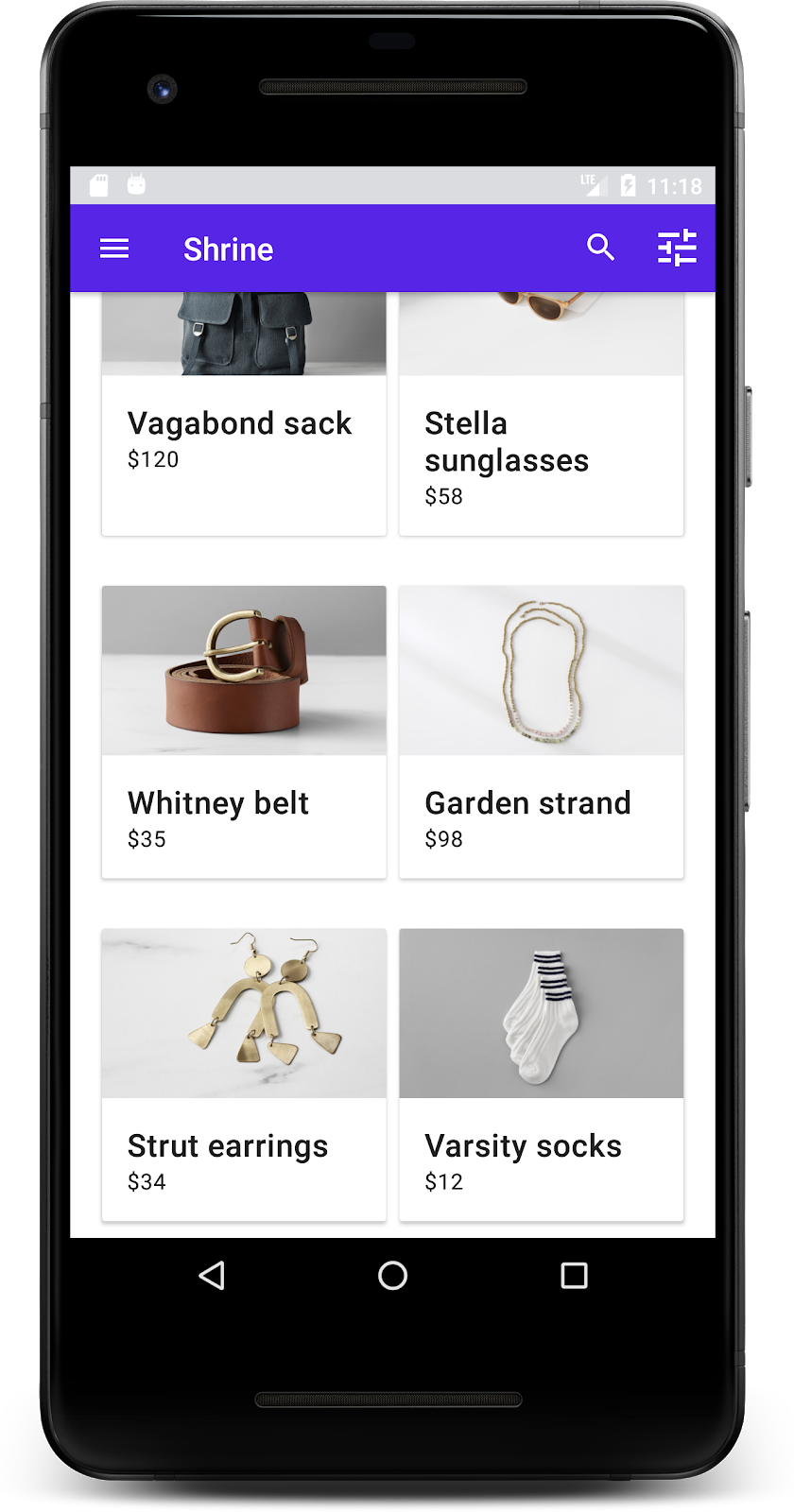
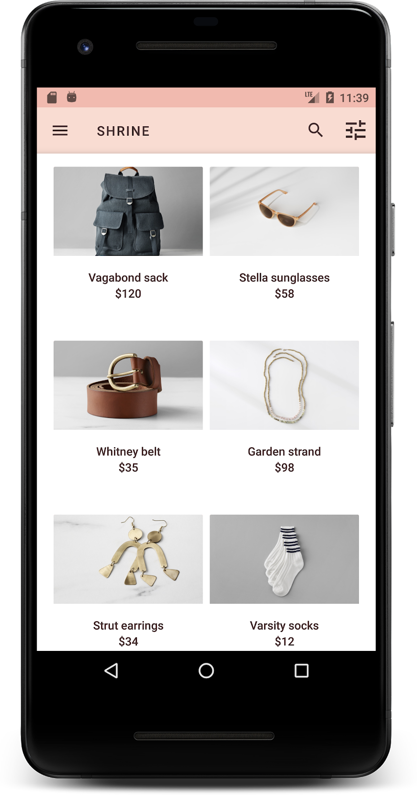
Соберите и запустите. Теперь экран с таблицей товаров должен выглядеть так:

Давайте изменим типографику экрана входа в систему, чтобы она соответствовала общему стилю.
Изменить шрифт экрана входа в систему.
В styles.xml добавьте следующий стиль:
styles.xml
<style name="TextAppearance.Shrine.Title" parent="TextAppearance.MaterialComponents.Headline4">
   <item name="textAllCaps">true</item>
   <item name="android:textStyle">bold</item>
   <item name="android:textColor">?android:attr/textColorPrimary</item>
</style>
В shr_login_fragment.xml установите новый стиль для заголовка "SHRINE" <TextView> (и удалите имеющиеся атрибуты textAllCaps и textSize ):
shr_login_fragment.xml
<TextView
   android:layout_width="wrap_content"
   android:layout_height="wrap_content"
   android:layout_gravity="center_horizontal"
   android:layout_marginBottom="132dp"
   android:text="@string/shr_app_name"
   android:textAppearance="@style/TextAppearance.Shrine.Title" />
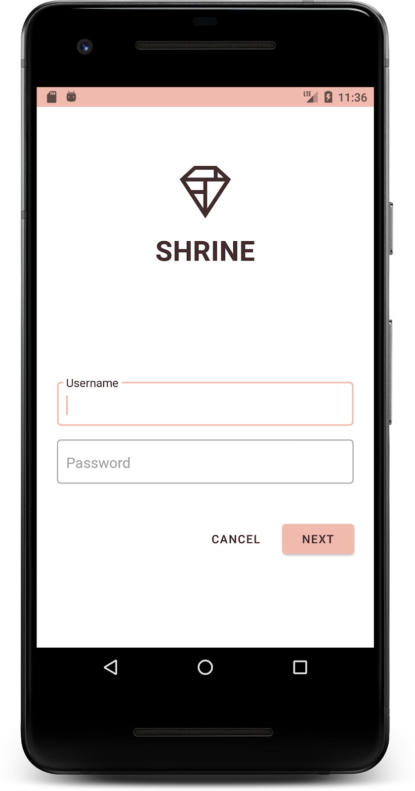
Соберите и запустите. Теперь ваш экран входа в систему должен выглядеть так:
5. Отрегулируйте высоту.
Теперь, когда вы оформили страницу в соответствии с цветом и типографикой Shrine, давайте посмотрим на карточки с товарами Shrine. Сейчас они размещены на белой поверхности под навигацией приложения. Давайте выделим товары, чтобы привлечь к ним внимание.
Изменить высоту сетки товаров
Давайте изменим высоту верхней панели приложения и содержимого так, чтобы создавалось впечатление, будто содержимое находится на листе, плавающем над верхней панелью приложения. Добавьте атрибут app:elevation к вашему AppBarLayout и атрибут android:elevation к XML-компонентам ` NestedScrollView в shr_product_grid_fragment.xml следующим образом:
shr_product_grid_fragment.xml
<com.google.android.material.appbar.AppBarLayout
   android:layout_width="match_parent"
   android:layout_height="wrap_content"
   app:elevation="0dp">

   <androidx.appcompat.widget.Toolbar
       android:id="@+id/app_bar"
       style="@style/Widget.Shrine.Toolbar"
       android:layout_width="match_parent"
       android:layout_height="?attr/actionBarSize"
       app:navigationIcon="@drawable/shr_menu"
       app:title="@string/shr_app_name" />
</com.google.android.material.appbar.AppBarLayout>

<androidx.core.widget.NestedScrollView
   android:layout_width="match_parent"
   android:layout_height="match_parent"
   android:layout_marginTop="56dp"
   android:background="@color/productGridBackgroundColor"
   android:elevation="8dp"
   android:paddingStart="@dimen/shr_product_grid_spacing"
   android:paddingEnd="@dimen/shr_product_grid_spacing"
   app:layout_behavior="@string/appbar_scrolling_view_behavior">

   <androidx.appcompat.app.AlertController.RecycleListView
       android:id="@+id/recycler_view"
       android:layout_width="match_parent"
       android:layout_height="match_parent" />

</androidx.core.widget.NestedScrollView>
Изменить высоту (и цвет) карточки
Вы можете отрегулировать высоту каждой карточки, изменив значение app:cardElevation в shr_product_card.xml с 2dp на 0dp . Также измените значение app:cardBackgroundColor на @android:color/transparent .
shr_product_card.xml
<com.google.material.card.MaterialCardView xmlns:android="http://schemas.android.com/apk/res/android"
   xmlns:app="http://schemas.android.com/apk/res-auto"
   android:layout_width="match_parent"
   android:layout_height="wrap_content"
   app:cardBackgroundColor="@android:color/transparent"
   app:cardElevation="0dp"
   app:cardPreventCornerOverlap="true">
Посмотрите! Вы отрегулировали высоту каждой карточки на странице сетки товаров.
Измените высоту кнопки «Далее».
В styles.xml добавьте следующее свойство к стилю вашего виджета Widget.Shrine.Button :
styles.xml
<item name="android:stateListAnimator" tools:ignore="NewApi">
    @animator/shr_next_button_state_list_anim
</item>
Установка свойства android:stateListAnimator в стиле Button приводит к тому, что кнопка "Далее" использует предоставленный нами аниматор.
Соберите и запустите. Теперь ваш экран входа в систему должен выглядеть так:

6. Измените макет.
Измените макет, чтобы отображать карточки с разными соотношениями сторон и размерами, так чтобы каждая карточка выглядела уникальной по сравнению с другими.
Используйте адаптер RecyclerView с поэтапным размещением элементов.
В пакете staggeredgridlayout мы добавили новый адаптер RecyclerView , который отображает асимметричную, смещенную по горизонтали, разметку карточек. Вы можете самостоятельно изучить этот код, но мы не будем здесь подробно рассказывать о его реализации.
Чтобы использовать этот новый адаптер, измените метод onCreateView() в ProductGridFragment.java . Замените блок кода после комментария "set up the RecyclerView " следующим:
ProductGridFragment.java
// Set up the RecyclerView
RecyclerView recyclerView = view.findViewById(R.id.recycler_view);
recyclerView.setHasFixedSize(true);
GridLayoutManager gridLayoutManager = new GridLayoutManager(getContext(), 2, GridLayoutManager.HORIZONTAL, false);
gridLayoutManager.setSpanSizeLookup(new GridLayoutManager.SpanSizeLookup() {
   @Override
   public int getSpanSize(int position) {
       return position % 3 == 2 ? 2 : 1;
   }
});
recyclerView.setLayoutManager(gridLayoutManager);
StaggeredProductCardRecyclerViewAdapter adapter = new StaggeredProductCardRecyclerViewAdapter(
       ProductEntry.initProductEntryList(getResources()));
recyclerView.setAdapter(adapter);
int largePadding = getResources().getDimensionPixelSize(R.dimen.shr_staggered_product_grid_spacing_large);
int smallPadding = getResources().getDimensionPixelSize(R.dimen.shr_staggered_product_grid_spacing_small);
recyclerView.addItemDecoration(new ProductGridItemDecoration(largePadding, smallPadding));
Нам также потребуется внести небольшое изменение в файл product_grid_fragment.xml , чтобы удалить отступы из NestedScrollView , следующим образом:
shr_product_grid_fragment.xml
<androidx.core.widget.NestedScrollView
   android:layout_width="match_parent"
   android:layout_height="match_parent"
   android:layout_marginTop="56dp"
   android:background="@color/productGridBackgroundColor"
   app:layout_behavior="@string/appbar_scrolling_view_behavior"
   android:elevation="6dp">
Наконец, мы также отрегулируем отступы карточек в RecyclerView , изменив файл ProductGridItemDecoration.java . Измените метод getItemOffsets() в файле ProductGridItemDecoration.java следующим образом:
ProductGridItemDecoration.java
@Override
public void getItemOffsets(Rect outRect, View view,
                          RecyclerView parent, RecyclerView.State state) {
   outRect.left = smallPadding;
   outRect.right = largePadding;
}
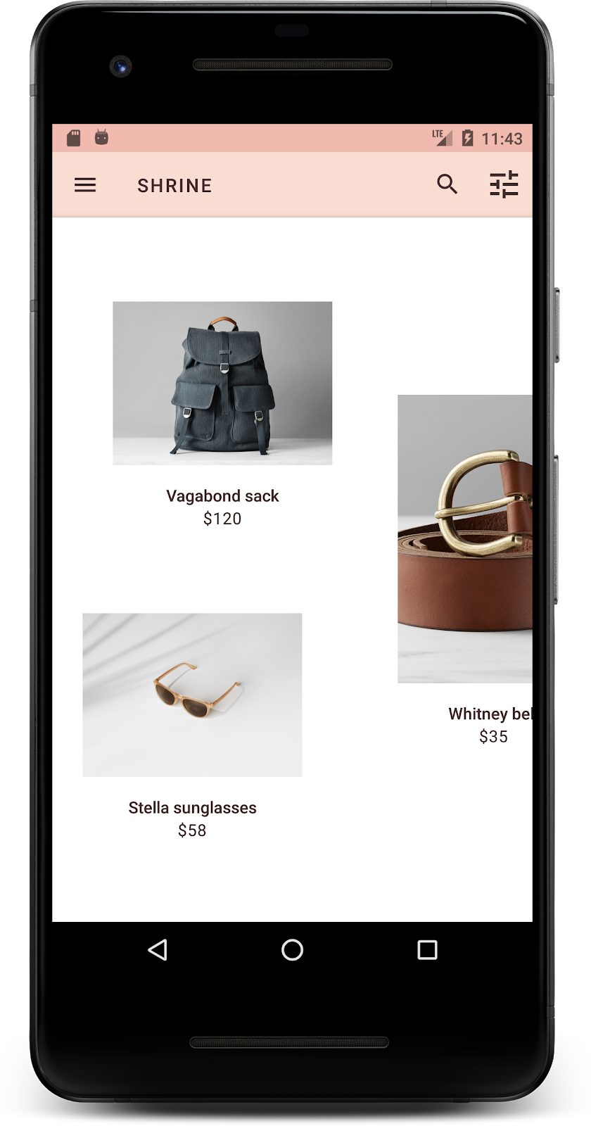
Создайте и запустите. Теперь элементы товарной сетки должны быть расположены в шахматном порядке:
7. Попробуйте другую тему.
Цвет — мощный инструмент для выражения вашего бренда, и даже небольшое изменение цвета может существенно повлиять на пользовательский опыт. Чтобы это проверить, давайте посмотрим, как бы выглядел Shrine, если бы цветовая гамма бренда была совершенно другой.
Изменяйте стили и цвета.
В файл styles.xml добавьте следующую новую тему:
styles.xml
<style name="Theme.Shrine.Autumn" parent="Theme.Shrine">
   <item name="colorPrimary">#FFCF44</item>
   <item name="colorPrimaryDark">#FD9725</item>
   <item name="colorAccent">#FD9725</item>
   <item name="colorOnPrimary">#FFFFFF</item>
   <item name="colorError">#FD9725</item>
</style>
А в файле AndroidManifest.xml используйте эту новую тему оформления в своем приложении:
AndroidManifest.xml
<application
   android:allowBackup="true"
   android:icon="@mipmap/ic_launcher"
   android:label="@string/shr_app_name"
   android:roundIcon="@mipmap/ic_launcher_round"
   android:supportsRtl="true"
   android:name="com.google.codelabs.mdc.java.shrine.application.ShrineApplication"
   android:theme="@style/Theme.Shrine.Autumn">
   <activity android:name=".MainActivity">
       <intent-filter>
           <action android:name="android.intent.action.MAIN" />

           <category android:name="android.intent.category.LAUNCHER" />
       </intent-filter>
   </activity>
</application>
Измените цвет значка на панели инструментов в файле colors.xml , как показано ниже:
colors.xml
<color name="toolbarIconColor">#FFFFFF</color>
Затем установите атрибут android:theme в стиле панели инструментов так, чтобы он ссылался на текущую тему, используя атрибут "?theme", вместо того, чтобы прописывать её жёстко в коде:
styles.xml
<style name="Widget.Shrine.Toolbar" parent="Widget.AppCompat.Toolbar">
   <item name="android:background">?attr/colorAccent</item>
   <item name="android:theme">?theme</item>
   <item name="popupTheme">@style/ThemeOverlay.AppCompat.Light</item>
   <item name="titleTextAppearance">@style/TextAppearance.Shrine.Toolbar</item>
</style>
Далее, осветлите цвет текста подсказки в текстовых полях экрана входа в систему. Добавьте атрибут android:textColorHint к стилю текстовых полей:
styles.xml
<style name="Widget.Shrine.TextInputLayout" parent="Widget.MaterialComponents.TextInputLayout.OutlinedBox">
   <item name="hintTextAppearance">
@style/TextAppearance.Shrine.TextInputLayout.HintText
</item>
   <item name="android:paddingBottom">8dp</item>
   <item name="android:textColorHint">?attr/colorPrimaryDark</item>
</style>
Соберите и запустите. Новая тема должна отобразиться для предварительного просмотра.
Перед переходом к MDC-104 отмените изменения кода, внесенные в этом разделе.
8. Подведение итогов
К этому моменту вы уже создали приложение, которое соответствует техническим требованиям вашего дизайнера.
Следующие шаги
Вы использовали следующие компоненты MDC: тема, типографика и оформление. Вы можете ознакомиться с другими компонентами в каталоге компонентов MDC-Android в MDC Android .
Что делать, если в запланированном дизайне вашего приложения есть элементы, для которых нет компонентов в библиотеке MDC? В курсе MDC-104: Расширенные компоненты Material Design мы рассмотрим, как создавать пользовательские компоненты с помощью библиотеки MDC для достижения определенного внешнего вида.