
1. บทนำ
Material Components (MDC) ช่วยให้นักพัฒนาแอปใช้งาน Material Design ได้ MDC สร้างขึ้นโดยทีมวิศวกรและนักออกแบบ UX ของ Google โดยมีคอมโพเนนต์ UI ที่สวยงามและใช้งานได้หลายสิบรายการ และพร้อมใช้งานสำหรับ Android, iOS, เว็บ และ Flutter.material.io/develop |
ใน Codelab MDC-101 และ MDC-102 คุณได้ใช้ Material Components (MDC) เพื่อสร้างพื้นฐานของแอปชื่อ Shrine ซึ่งเป็นแอปอีคอมเมิร์ซที่ขายเสื้อผ้าและของใช้ในบ้าน แอปนี้มีโฟลว์ผู้ใช้ที่เริ่มต้นด้วยหน้าจอเข้าสู่ระบบและนำผู้ใช้ไปยังหน้าจอหลักที่แสดงผลิตภัณฑ์
การขยาย Material Design เมื่อเร็วๆ นี้ช่วยให้นักออกแบบและนักพัฒนาแอปมีความยืดหยุ่นมากขึ้นในการแสดงแบรนด์ของผลิตภัณฑ์ ตอนนี้คุณสามารถใช้ MDC เพื่อปรับแต่ง Shrine และแสดงสไตล์ที่เป็นเอกลักษณ์ได้แล้ว
สิ่งที่คุณจะสร้าง
ใน Codelab นี้ คุณจะได้ปรับแต่ง Shrine ให้แสดงถึงแบรนด์โดยใช้สิ่งต่อไปนี้
- สี
- การพิมพ์
- ระดับความสูง
- เลย์เอาต์
คอมโพเนนต์และระบบย่อยของ MDC Android ที่ใช้ใน Codelab นี้
- ธีม
- การพิมพ์
- ระดับความสูง
สิ่งที่คุณต้องมี
- มีความรู้พื้นฐานเกี่ยวกับการพัฒนาแอป Android
- Android Studio (ดาวน์โหลดที่นี่หากยังไม่มี)
- โปรแกรมจำลองหรืออุปกรณ์ Android (พร้อมใช้งานผ่าน Android Studio)
- โค้ดตัวอย่าง (ดูขั้นตอนถัดไป)
คุณจะให้คะแนนระดับประสบการณ์ในการสร้างแอป Android เท่าใด
2. ตั้งค่าสภาพแวดล้อมในการพัฒนาซอฟต์แวร์
หากเคยเรียน MDC-102 มาแล้ว
หากคุณทำ MDC-102 เสร็จแล้ว โค้ดของคุณก็ควรพร้อมใช้งานสำหรับ Codelab นี้ ข้ามไปขั้นตอนที่ 3: เปลี่ยนสี
ดาวน์โหลดแอป Codelab สำหรับผู้เริ่มต้น
แอปเริ่มต้นอยู่ในไดเรกทอรี material-components-android-codelabs-103-starter/kotlin อย่าลืม cd ไปยังไดเรกทอรีนั้นก่อนเริ่มต้น
...หรือโคลนจาก GitHub
หากต้องการโคลน Codelab นี้จาก GitHub ให้เรียกใช้คำสั่งต่อไปนี้
git clone https://github.com/material-components/material-components-android-codelabs
cd material-components-android-codelabs/
git checkout 103-starter
โหลดโค้ดเริ่มต้นใน Android Studio
- เมื่อวิซาร์ดการตั้งค่าเสร็จสิ้นและหน้าต่าง Welcome to Android Studio ปรากฏขึ้น ให้คลิก Open an existing Android Studio project ไปที่ไดเรกทอรีที่คุณติดตั้งโค้ดตัวอย่าง แล้วเลือก kotlin -> shrine (หรือค้นหา shrine ในคอมพิวเตอร์) เพื่อเปิดโปรเจ็กต์การจัดส่ง
- รอสักครู่เพื่อให้ Android Studio สร้างและซิงค์โปรเจ็กต์ ดังที่แสดงโดยตัวบ่งชี้กิจกรรมที่ด้านล่างของหน้าต่าง Android Studio
- ในขั้นตอนนี้ Android Studio อาจแสดงข้อผิดพลาดในการสร้างบางอย่างเนื่องจากคุณไม่มี Android SDK หรือเครื่องมือบิลด์ เช่น เครื่องมือที่แสดงด้านล่าง ทำตามวิธีการใน Android Studio เพื่อติดตั้ง/อัปเดตเครื่องมือเหล่านี้และซิงค์โปรเจ็กต์

เพิ่มการขึ้นต่อกันของโปรเจ็กต์
โปรเจ็กต์ต้องมีทรัพยากร Dependency ในไลบรารีการรองรับ MDC Android โค้ดตัวอย่างที่คุณดาวน์โหลดควรมีรายการทรัพยากร Dependency นี้อยู่แล้ว แต่แนวทางปฏิบัติที่ดีคือการทำตามขั้นตอนต่อไปนี้เพื่อให้แน่ใจ
- ไปที่ไฟล์
build.gradleของโมดูลappและตรวจสอบว่าบล็อกdependenciesมีทรัพยากร Dependency ใน MDC Android
api 'com.google.android.material:material:1.1.0-alpha06'
- (ไม่บังคับ) หากจำเป็น ให้แก้ไขไฟล์
build.gradleเพื่อเพิ่มการอ้างอิงต่อไปนี้และซิงค์โปรเจ็กต์
dependencies {
    api 'com.google.android.material:material:1.1.0-alpha06'
    implementation 'androidx.legacy:legacy-support-v4:1.0.0'
    implementation 'com.android.volley:volley:1.1.1'
    implementation 'com.google.code.gson:gson:2.8.5'
    implementation "org.jetbrains.kotlin:kotlin-stdlib-jdk7:1.3.21"
    testImplementation 'junit:junit:4.12'
    androidTestImplementation 'androidx.test:core:1.1.0'
    androidTestImplementation 'androidx.test.ext:junit:1.1.0'
    androidTestImplementation 'androidx.test:runner:1.2.0-alpha05'
    androidTestImplementation 'androidx.test.espresso:espresso-core:3.2.0-alpha05'
}
เรียกใช้แอปเริ่มต้น
|

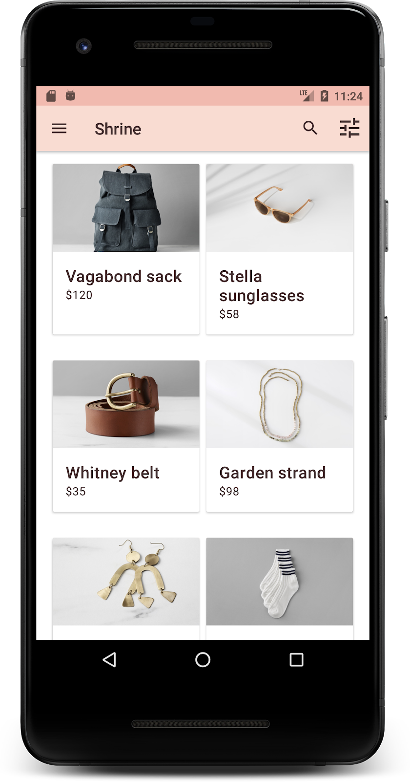
สำเร็จ! คุณควรเห็นหน้าเข้าสู่ระบบของ Shrine ทำงานในอุปกรณ์หรือโปรแกรมจำลอง เมื่อกดถัดไป หน้าแรกของ Shrine จะปรากฏพร้อมแถบแอปที่ด้านบนและตารางรูปภาพผลิตภัณฑ์ที่ด้านล่าง
มาทำให้แถบแอปด้านบนเข้ากับแบรนด์ Shrine โดยเปลี่ยนสี ระดับความสูง และการพิมพ์กัน
3. เปลี่ยนสี
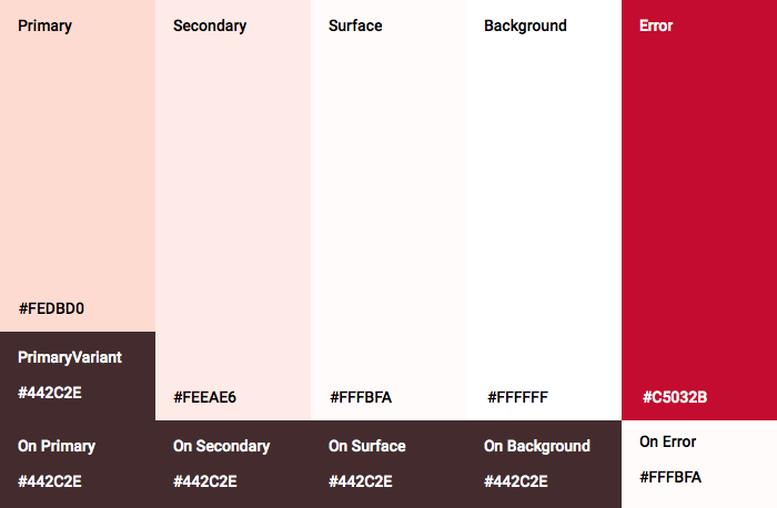
ธีมสีนี้สร้างขึ้นโดยนักออกแบบที่มีสีแบบกำหนดเอง (แสดงในรูปภาพด้านล่าง) ซึ่งมีสีที่เลือกจากแบรนด์ของ Shrine และนำไปใช้กับ Material Theme Editor ซึ่งได้ขยายสีเหล่านั้นเพื่อสร้างชุดสีที่สมบูรณ์ยิ่งขึ้น (สีเหล่านี้ไม่ได้มาจากชุดสี Material ปี 2014)
Material Theme Editor ได้จัดระเบียบสีเหล่านี้เป็นเฉดสีที่มีป้ายกำกับเป็นตัวเลข รวมถึงป้ายกำกับ 50, 100, 200, .... ถึง 900 ของแต่ละสี Shrine ใช้เฉพาะเฉดสี 50, 100 และ 300 จากตัวอย่างสีชมพู และ 900 จากตัวอย่างสีน้ำตาล

มาเปลี่ยนสีของแถบแอปด้านบนให้สอดคล้องกับรูปแบบสีนั้นกัน
ตั้งค่า colorPrimaryDark และ colorAccent
ใน colors.xml ให้แก้ไขบรรทัดต่อไปนี้ แอตทริบิวต์ colorAccent ควบคุมสีของแถบแอปด้านบน และแอตทริบิวต์ colorPrimaryDark ควบคุมสีของแถบสถานะ
colors.xml
<color name="colorPrimaryDark">#FBB8AC</color>
<color name="colorAccent">#FEDBD0</color>
หากต้องการใช้ไอคอนสีเข้มในแถบสถานะ ให้เพิ่มรายการต่อไปนี้ลงในธีมแอปของ Theme.Shrine Shrine
styles.xml
<item name="android:windowLightStatusBar" tools:targetApi="m">true</item>
<resources xmlns:tools="http://schemas.android.com/tools">
colors.xml และ styles.xml ควรมีลักษณะดังนี้
colors.xml
<?xml version="1.0" encoding="utf-8"?>
<resources>
   <color name="colorPrimary">#E0E0E0</color>
   <color name="colorPrimaryDark">#FBB8AC</color>
   <color name="colorAccent">#FEDBD0</color>
   <color name="toolbarIconColor">#FFFFFF</color>
   <color name="loginPageBackgroundColor">#FFFFFF</color>
   <color name="productGridBackgroundColor">#FFFFFF</color>
</resources>
styles.xml
<resources xmlns:android="http://schemas.android.com/tools">

   <!-- Base application theme. -->
   <style name="Theme.Shrine" parent="Theme.MaterialComponents.Light.NoActionBar">
       <!-- Customize your theme here. -->
       <item name="colorPrimary">@color/colorPrimary</item>
       <item name="colorPrimaryDark">@color/colorPrimaryDark</item>
       <item name="colorAccent">@color/colorAccent</item>
       <item name="android:windowLightStatusBar" tools:targetApi="m">true</item>
   </style>

   <style name="Widget.Shrine.Toolbar" parent="Widget.AppCompat.Toolbar">
       <item name="android:background">?attr/colorAccent</item>
       <item name="android:theme">@style/ThemeOverlay.AppCompat.Dark.ActionBar</item>
       <item name="popupTheme">@style/ThemeOverlay.AppCompat.Light</item>
   </style>

</resources>
ใน colors.xml ให้เพิ่มชุดทรัพยากรสีใหม่ textColorPrimary ลงใน #442C2E แล้วอัปเดตแอตทริบิวต์ toolbarIconColor เพื่ออ้างอิงสี textColorPrimary
อัปเดตไฟล์ styles.xml เพื่อตั้งค่า
กับtextColorPrimary สีที่เราเพิ่งกำหนด
อีกอย่างคือตั้งค่าแอตทริบิวต์ android:theme ในรูปแบบ Widget.Shrine.Toolbar เป็น Theme.Shrine
colors.xml และ styles.xml ควรมีลักษณะดังนี้
colors.xml
<?xml version="1.0" encoding="utf-8"?>
<resources>
   <color name="colorPrimary">#E0E0E0</color>
   <color name="colorPrimaryDark">#FBB8AC</color>
   <color name="colorAccent">#FEDBD0</color>
   <color name="textColorPrimary">#442C2E</color>
   <color name="toolbarIconColor">@color/textColorPrimary</color>
   <color name="loginPageBackgroundColor">#FFFFFF</color>
   <color name="productGridBackgroundColor">#FFFFFF</color>
</resources>
styles.xml
<resources xmlns:android="http://schemas.android.com/tools">

   <!-- Base application theme. -->
   <style name="Theme.Shrine" parent="Theme.MaterialComponents.Light.NoActionBar">
       <!-- Customize your theme here. -->
       <item name="colorPrimary">@color/colorPrimary</item>
       <item name="colorPrimaryDark">@color/colorPrimaryDark</item>
       <item name="colorAccent">@color/colorAccent</item>
       <item name="android:windowLightStatusBar" tools:targetApi="m">true</item>
       <item name="android:textColorPrimary">@color/textColorPrimary</item>
   </style>

   <style name="Widget.Shrine.Toolbar" parent="Widget.AppCompat.Toolbar">
       <item name="android:background">?attr/colorAccent</item>
       <item name="android:theme">@style/Theme.Shrine</item>
       <item name="popupTheme">@style/ThemeOverlay.AppCompat.Light</item>
   </style>

</resources>
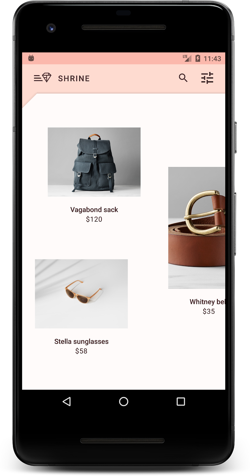
สร้างและเรียกใช้ ตอนนี้ตารางผลิตภัณฑ์ควรมีลักษณะดังนี้
มาเปลี่ยนสไตล์ของหน้าจอเข้าสู่ระบบให้เข้ากับรูปแบบสีของเรากัน
จัดรูปแบบช่องข้อความ
มาเปลี่ยนช่องป้อนข้อความในหน้าเข้าสู่ระบบให้มีเส้นขอบและใช้สีที่ดีขึ้นสำหรับเลย์เอาต์กัน
เพิ่มทรัพยากรสีต่อไปนี้ลงในไฟล์ colors.xml
colors.xml
<color name="textInputOutlineColor">#FBB8AC</color>
เพิ่มสไตล์ใหม่ 2 รายการใน styles.xml ดังนี้
styles.xml
<style name="Widget.Shrine.TextInputLayout" parent="Widget.MaterialComponents.TextInputLayout.OutlinedBox">
   <item name="hintTextAppearance">@style/TextAppearance.Shrine.TextInputLayout.HintText</item>
   <item name="hintTextColor">@color/textColorPrimary</item>
   <item name="android:paddingBottom">8dp</item>
   <item name="boxStrokeColor">@color/textInputOutlineColor</item>
</style>

<style name="TextAppearance.Shrine.TextInputLayout.HintText" parent="TextAppearance.MaterialComponents.Subtitle2">
   <item name="android:textColor">?android:attr/textColorPrimary</item>
</style>
สุดท้าย ให้ตั้งค่าแอตทริบิวต์รูปแบบในคอมโพเนนต์ XML ทั้ง 2 รายการของ TextInputLayout ใน shr_login_fragment.xml เป็นรูปแบบใหม่
shr_login_fragment.xml
<com.google.android.material.textfield.TextInputLayout
   style="@style/Widget.Shrine.TextInputLayout"
   android:layout_width="match_parent"
   android:layout_height="wrap_content"
   android:hint="@string/shr_hint_username">

   <com.google.android.material.textfield.TextInputEditText
       android:layout_width="match_parent"
       android:layout_height="wrap_content"
       android:inputType="text"
       android:maxLines="1" />
</com.google.android.material.textfield.TextInputLayout>

<com.google.android.material.textfield.TextInputLayout
   android:id="@+id/password_text_input"
   style="@style/Widget.Shrine.TextInputLayout"
   android:layout_width="match_parent"
   android:layout_height="wrap_content"
   android:hint="@string/shr_hint_password"
   app:errorEnabled="true">

   <com.google.android.material.textfield.TextInputEditText
       android:id="@+id/password_edit_text"
       android:layout_width="match_parent"
       android:layout_height="wrap_content"
       android:inputType="textPassword" />
</com.google.android.material.textfield.TextInputLayout>
จัดรูปแบบสีปุ่ม
สุดท้าย ให้จัดรูปแบบสีของปุ่มในหน้าเข้าสู่ระบบ เพิ่มรูปแบบต่อไปนี้ลงใน styles.xml
styles.xml
<style name="Widget.Shrine.Button" parent="Widget.MaterialComponents.Button">
   <item name="android:textColor">?android:attr/textColorPrimary</item>
   <item name="backgroundTint">?attr/colorPrimaryDark</item>
</style>

<style name="Widget.Shrine.Button.TextButton" parent="Widget.MaterialComponents.Button.TextButton">
   <item name="android:textColor">?android:attr/textColorPrimary</item>
</style>
Widget.Shrine.Button สไตล์จะขยายจากสไตล์ MaterialButton เริ่มต้น และเปลี่ยนสีข้อความและสีพื้นหลังของปุ่ม Widget.Shrine.Button.TextButton ขยายจากรูปแบบข้อความ MaterialButtonเริ่มต้น และเปลี่ยนเฉพาะสีข้อความ
ตั้งค่ารูปแบบ Widget.Shrine.Button ในปุ่มถัดไป และรูปแบบ Widget.Shrine.Button.TextButton ในปุ่มยกเลิก ดังนี้
shr_login_fragment.xml
<RelativeLayout
   android:layout_width="match_parent"
   android:layout_height="wrap_content">

   <com.google.android.material.button.MaterialButton
       android:id="@+id/next_button"
       style="@style/Widget.Shrine.Button"
       android:layout_width="wrap_content"
       android:layout_height="wrap_content"
       android:layout_alignParentEnd="true"
       android:layout_alignParentRight="true"
       android:text="@string/shr_button_next" />

   <com.google.android.material.button.MaterialButton
       android:id="@+id/cancel_button"
       style="@style/Widget.Shrine.Button.TextButton"
       android:layout_width="wrap_content"
       android:layout_height="wrap_content"
       android:layout_marginEnd="12dp"
       android:layout_marginRight="12dp"
       android:layout_toStartOf="@id/next_button"
       android:layout_toLeftOf="@id/next_button"
       android:text="@string/shr_button_cancel" />

</RelativeLayout>
อัปเดตสีของโลโก้ Shrine ในหน้าเข้าสู่ระบบ ซึ่งจะต้องมีการเปลี่ยนแปลงเล็กน้อยใน Vector Drawable shr_logo.xml เปิดไฟล์ Drawable แล้วเปลี่ยนพร็อพเพอร์ตี้ android:fillAlpha เป็น 1 Drawable ควรมีลักษณะดังนี้
shr_logo.xml
<vector xmlns:android="http://schemas.android.com/apk/res/android"
   android:width="149dp"
   android:height="152dp"
   android:tint="?attr/colorControlNormal"
   android:viewportWidth="149"
   android:viewportHeight="152">
   <path
       android:fillAlpha="1"
       android:fillColor="#DADCE0"
       android:fillType="evenOdd"
       android:pathData="M42.262,0L0,38.653L74.489,151.994L148.977,38.653L106.723,0M46.568,11.11L21.554,33.998L99.007,33.998L99.007,11.11L46.568,11.11ZM110.125,18.174L110.125,33.998L127.416,33.998L110.125,18.174ZM80.048,45.116L80.048,123.296L131.426,45.116L80.048,45.116ZM17.551,45.116L33.976,70.101L68.93,70.101L68.93,45.116L17.551,45.116ZM41.284,81.219L68.93,123.296L68.93,81.219L41.284,81.219Z"
       android:strokeWidth="1"
       android:strokeAlpha="0.4"
       android:strokeColor="#00000000" />
</vector>
จากนั้นตั้งค่าแอตทริบิวต์ android:tint ในโลโก้ <ImageView> ใน shr_login_fragment.xml เป็น ?android:attr/textColorPrimary ดังนี้
shr_login_fragment.xml
<ImageView
   android:layout_width="64dp"
   android:layout_height="64dp"
   android:layout_gravity="center_horizontal"
   android:layout_marginTop="48dp"
   android:layout_marginBottom="16dp"
   android:tint="?android:attr/textColorPrimary"
   app:srcCompat="@drawable/shr_logo" />
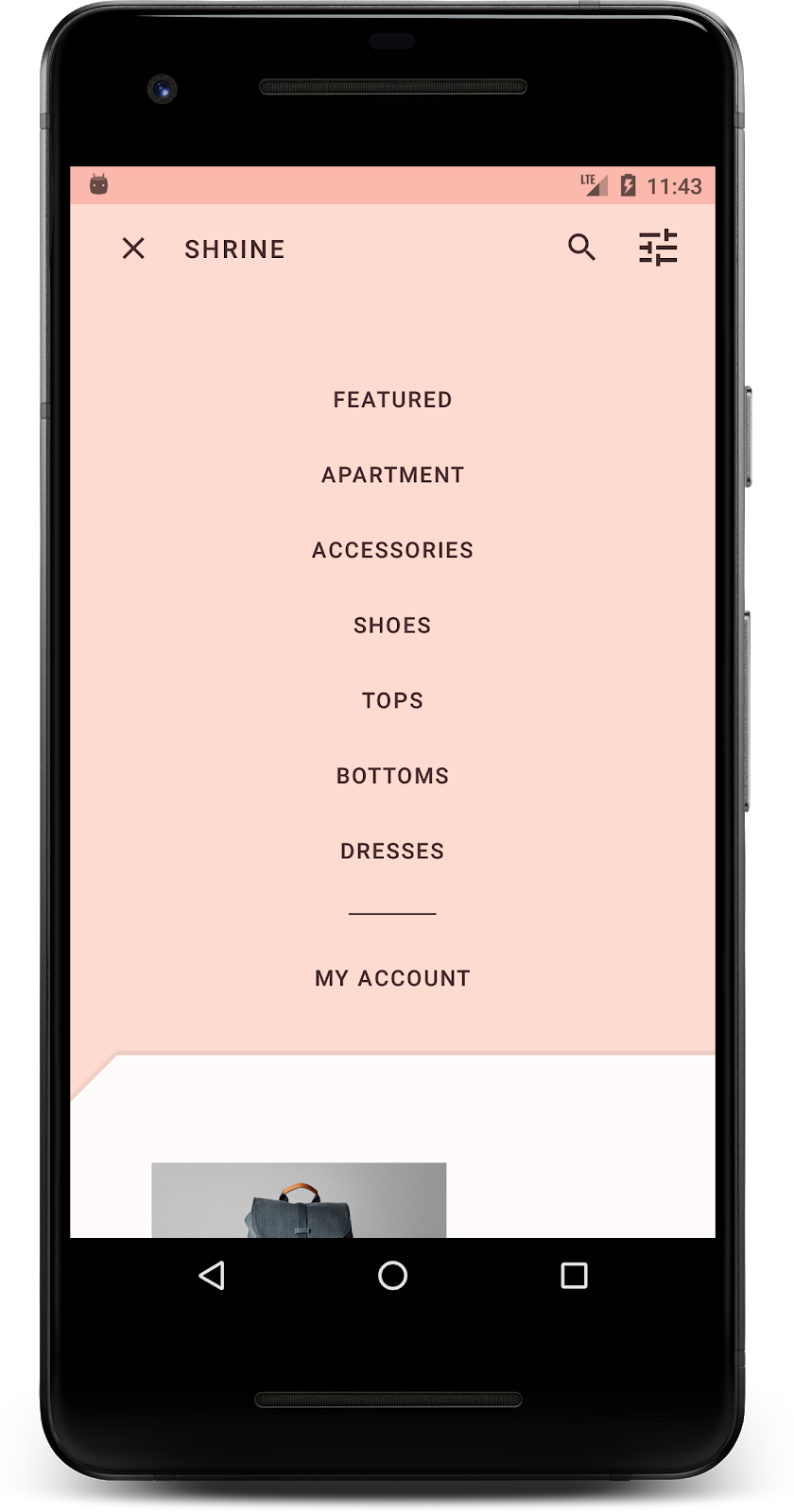
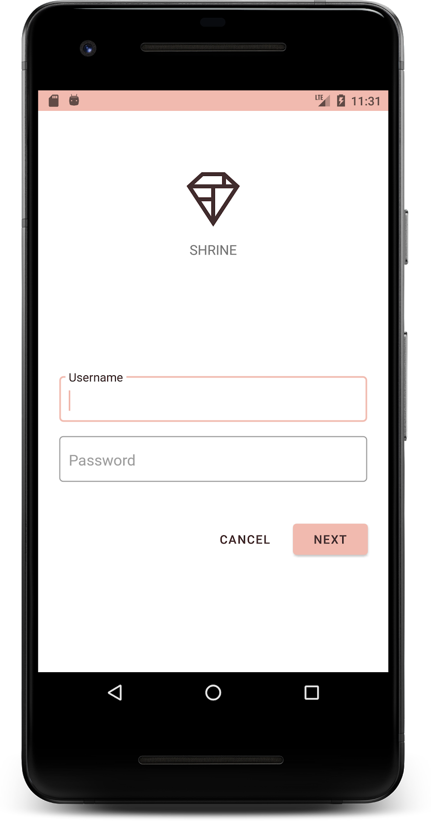
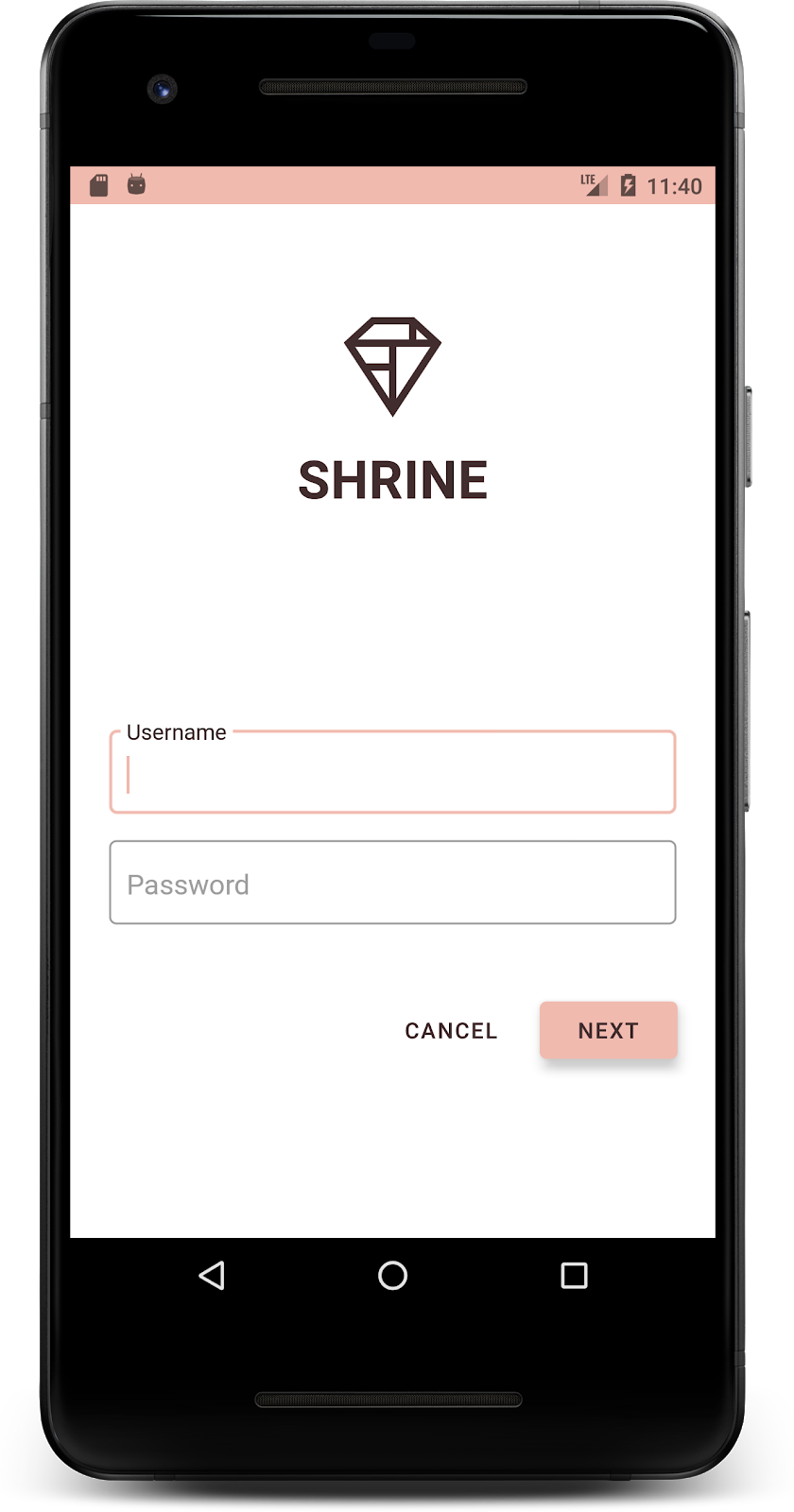
สร้างและเรียกใช้ ตอนนี้หน้าจอเข้าสู่ระบบควรมีลักษณะดังนี้
4. แก้ไขรูปแบบตัวอักษรและรูปแบบป้ายกำกับ
นอกจากจะเปลี่ยนสีแล้ว นักออกแบบยังให้แบบตัวพิมพ์ที่เฉพาะเจาะจงแก่คุณเพื่อใช้ในเว็บไซต์ด้วย มาเพิ่มปุ่มนั้นลงในแถบแอปด้านบนด้วยกัน
จัดรูปแบบแถบแอปด้านบน
จัดรูปแบบลักษณะข้อความของแถบแอปด้านบนให้ตรงกับข้อกำหนดที่นักออกแบบระบุ เพิ่มรูปแบบลักษณะข้อความต่อไปนี้ลงใน styles.xml และตั้งค่าพร็อพเพอร์ตี้ titleTextAppearance เพื่ออ้างอิงรูปแบบนี้ในสไตล์ Widget.Shrine.Toolbar
styles.xml
<style name="Widget.Shrine.Toolbar" parent="Widget.AppCompat.Toolbar">
   <item name="android:background">?attr/colorAccent</item>
   <item name="android:theme">@style/Theme.Shrine</item>
   <item name="popupTheme">@style/ThemeOverlay.AppCompat.Light</item>
   <item name="titleTextAppearance">@style/TextAppearance.Shrine.Toolbar</item>
</style>

<style name="TextAppearance.Shrine.Toolbar" parent="TextAppearance.MaterialComponents.Button">
   <item name="android:textSize">16sp</item>
</style>
colors.xml และ styles.xml ควรมีลักษณะดังนี้
colors.xml
<?xml version="1.0" encoding="utf-8"?>
<resources>
   <color name="colorPrimary">#E0E0E0</color>
   <color name="colorPrimaryDark">#FBB8AC</color>
   <color name="colorAccent">#FEDBD0</color>
   <color name="textColorPrimary">#442C2E</color>
   <color name="toolbarIconColor">@color/textColorPrimary</color>
   <color name="loginPageBackgroundColor">#FFFFFF</color>
   <color name="productGridBackgroundColor">#FFFFFF</color>
   <color name="textInputOutlineColor">#FBB8AC</color>
</resources>
styles.xml
<resources xmlns:android="http://schemas.android.com/tools">

   <!-- Base application theme. -->
   <style name="Theme.Shrine" parent="Theme.MaterialComponents.Light.NoActionBar">
       <!-- Customize your theme here. -->
       <item name="colorPrimary">@color/colorPrimary</item>
       <item name="colorPrimaryDark">@color/colorPrimaryDark</item>
       <item name="colorAccent">@color/colorAccent</item>
       <item name="android:windowLightStatusBar" tools:targetApi="m">true</item>
       <item name="android:textColorPrimary">@color/textColorPrimary</item>
   </style>

   <style name="Widget.Shrine.TextInputLayout" parent="Widget.MaterialComponents.TextInputLayout.OutlinedBox">
       <item name="hintTextAppearance">@style/TextAppearance.Shrine.TextInputLayout.HintText</item>
       <item name="hintTextColor">@color/textColorPrimary</item>
       <item name="android:paddingBottom">8dp</item>
       <item name="boxStrokeColor">@color/textInputOutlineColor</item>
   </style>

   <style name="TextAppearance.Shrine.TextInputLayout.HintText" parent="TextAppearance.MaterialComponents.Subtitle2">
       <item name="android:textColor">?android:attr/textColorPrimary</item>
   </style>

   <style name="Widget.Shrine.Button" parent="Widget.MaterialComponents.Button">
       <item name="android:textColor">?android:attr/textColorPrimary</item>
       <item name="backgroundTint">?attr/colorPrimaryDark</item>
   </style>

   <style name="Widget.Shrine.Button.TextButton" parent="Widget.MaterialComponents.Button.TextButton">
       <item name="android:textColor">?android:attr/textColorPrimary</item>
   </style>

   <style name="Widget.Shrine.Toolbar" parent="Widget.AppCompat.Toolbar">
       <item name="android:background">?attr/colorAccent</item>
       <item name="android:theme">@style/Theme.Shrine</item>
       <item name="popupTheme">@style/ThemeOverlay.AppCompat.Light</item>
       <item name="titleTextAppearance">@style/TextAppearance.Shrine.Toolbar</item>
   </style>

   <style name="TextAppearance.Shrine.Toolbar" parent="TextAppearance.MaterialComponents.Button">
       <item name="android:textSize">16sp</item>
   </style>

</resources>
จัดรูปแบบป้ายกำกับ
เราจะจัดรูปแบบป้ายกำกับการ์ดผลิตภัณฑ์ให้ใช้ลักษณะข้อความที่ถูกต้องและอยู่ตรงกลางในแนวนอนในการ์ด
อัปเดตการจัดรูปแบบตัวอักษรในป้ายกำกับชื่อจาก textAppearanceHeadline6 เป็น textAppearanceSubtitle2 ดังนี้
shr_product_card.xml
<TextView
   android:id="@+id/product_title"
   android:layout_width="match_parent"
   android:layout_height="wrap_content"
   android:text="@string/shr_product_title"
   android:textAppearance="?attr/textAppearanceSubtitle2" />
หากต้องการจัดป้ายกำกับรูปภาพไว้ตรงกลาง ให้แก้ไขป้ายกำกับ <TextView>ใน shr_product_card.xml เพื่อตั้งค่าแอตทริบิวต์ android:textAlignment="center" ดังนี้
shr_product_card.xml
<LinearLayout
   android:layout_width="match_parent"
   android:layout_height="wrap_content"
   android:orientation="vertical"
   android:padding="16dp">

   <TextView
       android:id="@+id/product_title"
       android:layout_width="match_parent"
       android:layout_height="wrap_content"
       android:text="@string/shr_product_title"
       android:textAlignment="center"
       android:textAppearance="?attr/textAppearanceSubtitle2" />

   <TextView
       android:id="@+id/product_price"
       android:layout_width="match_parent"
       android:layout_height="wrap_content"
       android:text="@string/shr_product_description"
       android:textAlignment="center"
       android:textAppearance="?attr/textAppearanceBody2" />
</LinearLayout>
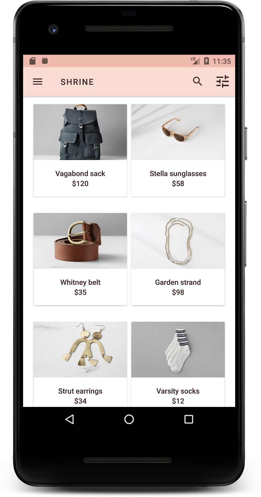
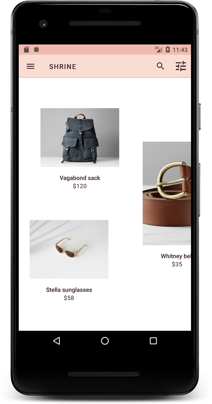
สร้างและเรียกใช้ ตอนนี้หน้าจอตารางผลิตภัณฑ์ควรมีลักษณะดังนี้
มาเปลี่ยนการจัดรูปแบบตัวอักษรของหน้าจอเข้าสู่ระบบให้ตรงกัน
เปลี่ยนแบบอักษรของหน้าจอเข้าสู่ระบบ
ใน styles.xml ให้เพิ่มรูปแบบต่อไปนี้
styles.xml
<style name="TextAppearance.Shrine.Title" parent="TextAppearance.MaterialComponents.Headline4">
   <item name="textAllCaps">true</item>
   <item name="android:textStyle">bold</item>
   <item name="android:textColor">?android:attr/textColorPrimary</item>
</style>
ใน shr_login_fragment.xml ให้ตั้งค่าสไตล์ใหม่เป็นชื่อ "SHRINE" <TextView> (และลบแอตทริบิวต์ textAllCaps และ textSize ที่มีอยู่)
shr_login_fragment.xml
<TextView
   android:layout_width="wrap_content"
   android:layout_height="wrap_content"
   android:layout_gravity="center_horizontal"
   android:layout_marginBottom="132dp"
   android:text="@string/shr_app_name"
   android:textAppearance="@style/TextAppearance.Shrine.Title" />
สร้างและเรียกใช้ ตอนนี้หน้าจอเข้าสู่ระบบควรมีลักษณะดังนี้

5. ปรับระดับความสูง
ตอนนี้คุณได้จัดรูปแบบหน้าเว็บด้วยสีและตัวอักษรที่เฉพาะเจาะจงซึ่งตรงกับ Shrine แล้ว มาดูการ์ดที่แสดงผลิตภัณฑ์ของ Shrine กัน ปัจจุบันปุ่มเหล่านี้จะอยู่บนพื้นผิวสีขาวใต้การนำทางของแอป เรามาเน้นย้ำผลิตภัณฑ์ให้มากขึ้นเพื่อดึงดูดความสนใจกัน
เปลี่ยนระดับความสูงของตารางผลิตภัณฑ์
หากต้องการให้เนื้อหาดูเหมือนอยู่ในชีตที่ลอยอยู่เหนือแถบแอปด้านบน ให้เปลี่ยนระดับความสูงของแถบแอปด้านบน เพิ่มแอตทริบิวต์ app:elevation ลงในคอมโพเนนต์ XML ของ AppBarLayout และแอตทริบิวต์ android:elevation ลงในคอมโพเนนต์ XML ของ NestedScrollView ใน shr_product_grid_fragment.xml ดังนี้
shr_product_grid_fragment.xml
<com.google.android.material.appbar.AppBarLayout
   android:layout_width="match_parent"
   android:layout_height="wrap_content"
   app:elevation="0dp">

   <androidx.appcompat.widget.Toolbar
       android:id="@+id/app_bar"
       style="@style/Widget.Shrine.Toolbar"
       android:layout_width="match_parent"
       android:layout_height="?attr/actionBarSize"
       app:navigationIcon="@drawable/shr_menu"
       app:title="@string/shr_app_name" />
</com.google.android.material.appbar.AppBarLayout>

<androidx.core.widget.NestedScrollView
   android:layout_width="match_parent"
   android:layout_height="match_parent"
   android:layout_marginTop="56dp"
   android:background="@color/productGridBackgroundColor"
   android:elevation="8dp"
   android:paddingStart="@dimen/shr_product_grid_spacing"
   android:paddingEnd="@dimen/shr_product_grid_spacing"
   app:layout_behavior="@string/appbar_scrolling_view_behavior">

   <androidx.recyclerview.widget.RecyclerView
       android:id="@+id/recycler_view"
       android:layout_width="match_parent"
       android:layout_height="match_parent" />

</androidx.core.widget.NestedScrollView>
เปลี่ยนระดับความสูง (และสี) ของการ์ด
ปรับระดับความสูงของการ์ดทุกใบโดยเปลี่ยน app:cardElevation ใน shr_product_card.xml จาก 2dp เป็น 0dp เปลี่ยน app:cardBackgroundColor เป็น @android:color/transparent ด้วย
shr_product_card.xml
<com.google.android.material.card.MaterialCardView xmlns:android="http://schemas.android.com/apk/res/android"
   xmlns:app="http://schemas.android.com/apk/res-auto"
   android:layout_width="match_parent"
   android:layout_height="wrap_content"
   app:cardBackgroundColor="@android:color/transparent"
   app:cardElevation="0dp"
   app:cardPreventCornerOverlap="true">
ลองดูเลย คุณได้ปรับระดับความสูงของการ์ดทุกใบในหน้าตารางกริดผลิตภัณฑ์แล้ว

เปลี่ยนระดับความสูงของปุ่มถัดไป
ใน styles.xml ให้เพิ่มพร็อพเพอร์ตี้ต่อไปนี้ลงในสไตล์ Widget.Shrine.Button
styles.xml
<item name="android:stateListAnimator" tools:ignore="NewApi">
    @animator/shr_next_button_state_list_anim
</item>
การตั้งค่า android:stateListAnimator ในรูปแบบของ Button จะตั้งค่าปุ่มถัดไปให้ใช้ภาพเคลื่อนไหวที่เราให้ไว้
สร้างและเรียกใช้ ตอนนี้หน้าจอเข้าสู่ระบบควรมีลักษณะดังนี้
6. เปลี่ยนเลย์เอาต์
มาเปลี่ยนเลย์เอาต์เพื่อแสดงการ์ดในสัดส่วนและขนาดต่างๆ เพื่อให้การ์ดแต่ละใบดูไม่ซ้ำกัน
ใช้อะแดปเตอร์ RecyclerView แบบเหลื่อม
เราได้จัดเตรียมRecyclerViewอแดปเตอร์ใหม่ไว้ให้คุณในแพ็กเกจ staggeredgridlayout ซึ่งจะแสดงเลย์เอาต์การ์ดแบบเหลื่อมไม่สมมาตรที่ออกแบบมาให้เลื่อนในแนวนอน คุณสามารถเจาะลึกโค้ดนั้นได้ด้วยตนเอง แต่เราจะไม่พูดถึงวิธีติดตั้งใช้งานที่นี่
หากต้องการใช้อะแดปเตอร์ใหม่นี้ ให้แก้ไขเมธอด onCreateView() ใน ProductGridFragment.kt แทนที่โค้ดบล็อกหลังความคิดเห็น "ตั้งค่า RecyclerView" ด้วยโค้ดต่อไปนี้
ProductGridFragment.kt
// Set up the RecyclerView
view.recycler_view.setHasFixedSize(true)
val gridLayoutManager = GridLayoutManager(context, 2, RecyclerView.HORIZONTAL, false)
gridLayoutManager.spanSizeLookup = object : GridLayoutManager.SpanSizeLookup() {
   override fun getSpanSize(position: Int): Int {
       return if (position % 3 == 2) 2 else 1
   }
}
view.recycler_view.layoutManager = gridLayoutManager
val adapter = StaggeredProductCardRecyclerViewAdapter(
       ProductEntry.initProductEntryList(resources))
view.recycler_view.adapter = adapter
val largePadding = resources.getDimensionPixelSize(R.dimen.shr_staggered_product_grid_spacing_large)
val smallPadding = resources.getDimensionPixelSize(R.dimen.shr_staggered_product_grid_spacing_small)
view.recycler_view.addItemDecoration(ProductGridItemDecoration(largePadding, smallPadding))
นอกจากนี้ เรายังต้องทำการเปลี่ยนแปลงเล็กน้อยใน shr_product_grid_fragment.xml เพื่อนำระยะขอบออกจาก NestedScrollView ดังนี้
shr_product_grid_fragment.xml
<androidx.core.widget.NestedScrollView
   android:layout_width="match_parent"
   android:layout_height="match_parent"
   android:layout_marginTop="56dp"
   android:background="@color/productGridBackgroundColor"
   app:layout_behavior="@string/appbar_scrolling_view_behavior"
   android:elevation="6dp">
สุดท้าย เราจะปรับระยะห่างจากขอบภายในของการ์ดใน RecyclerView ด้วยการแก้ไข ProductGridItemDecoration.kt แก้ไขเมธอด getItemOffsets() ของ ProductGridItemDecoration.kt ดังนี้
ProductGridItemDecoration.kt
override fun getItemOffsets(outRect: Rect, view: View,
                           parent: RecyclerView, state: RecyclerView.State?) {
   outRect.left = smallPadding
   outRect.right = largePadding
}
สร้างและเรียกใช้ ตอนนี้รายการในตารางผลิตภัณฑ์ควรจะสลับกันแล้ว
7. ลองใช้ธีมอื่น
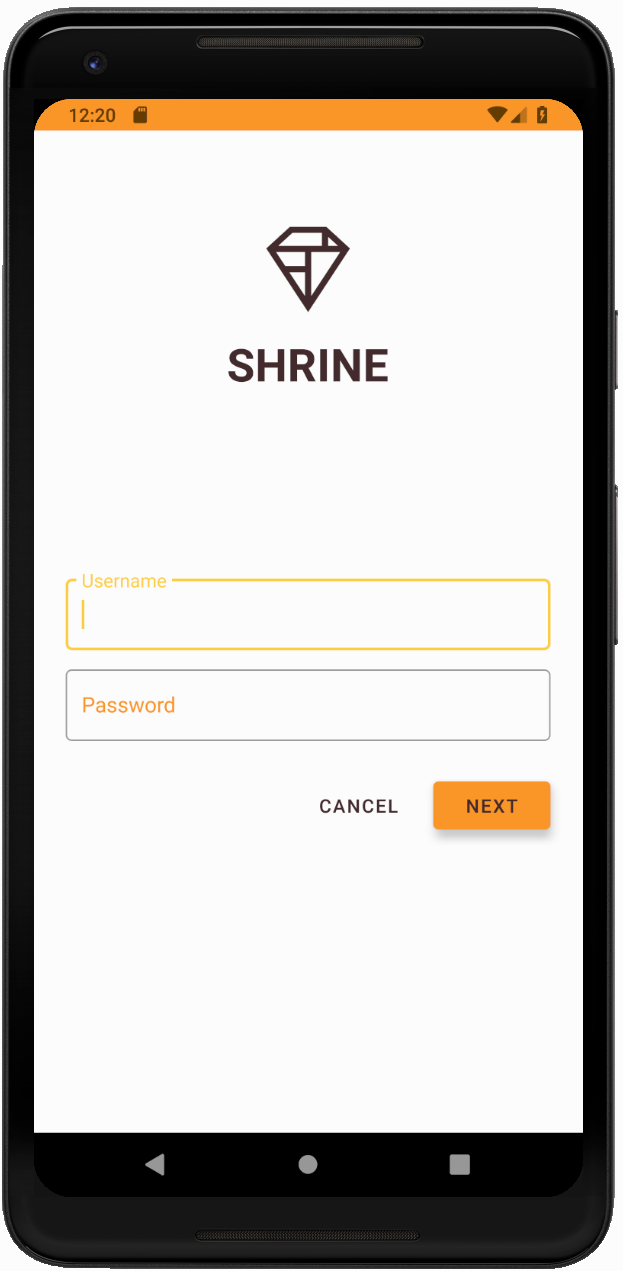
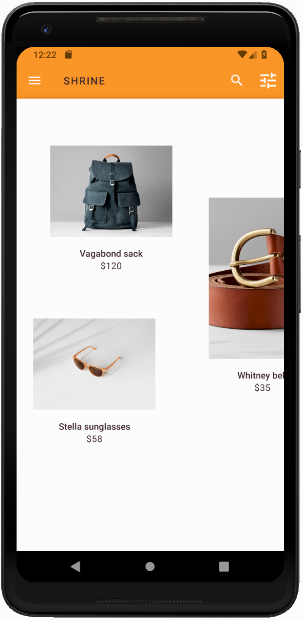
สีเป็นวิธีที่มีประสิทธิภาพในการแสดงออกถึงแบรนด์ และการเปลี่ยนแปลงสีเพียงเล็กน้อยอาจส่งผลอย่างมากต่อประสบการณ์ของผู้ใช้ มาลองดูว่า Shrine จะมีลักษณะอย่างไรหากรูปแบบสีของแบรนด์แตกต่างออกไปโดยสิ้นเชิง
แก้ไขรูปแบบและสี
ใน styles.xml ให้เพิ่มธีมใหม่ต่อไปนี้
styles.xml
<style name="Theme.Shrine.Autumn" parent="Theme.Shrine">
   <item name="colorPrimary">#FFCF44</item>
   <item name="colorPrimaryDark">#FD9725</item>
   <item name="colorAccent">#FD9725</item>
   <item name="colorOnPrimary">#FFFFFF</item>
   <item name="colorError">#FD9725</item>
</style>
และใน AndroidManifest.xml ให้ใช้ธีมใหม่นี้ในแอปพลิเคชันของคุณ
AndroidManifest.xml
<application
   android:allowBackup="true"
   android:icon="@mipmap/ic_launcher"
   android:label="@string/shr_app_name"
   android:roundIcon="@mipmap/ic_launcher_round"
   android:supportsRtl="true"
  android:name="com.google.codelabs.mdc.kotlin.shrine.application.ShrineApplication"
   android:theme="@style/Theme.Shrine.Autumn">
   <activity android:name=".MainActivity">
       <intent-filter>
           <action android:name="android.intent.action.MAIN" />

           <category android:name="android.intent.category.LAUNCHER" />
       </intent-filter>
   </activity>
</application>
แก้ไขสีไอคอนแถบเครื่องมือใน colors.xml ดังที่แสดงด้านล่าง
colors.xml
<color name="toolbarIconColor">#FFFFFF</color>
จากนั้นตั้งค่าแอตทริบิวต์ android:theme ของรูปแบบแถบเครื่องมือเพื่ออ้างอิงธีมปัจจุบันโดยใช้แอตทริบิวต์ "?theme" แทนการเขียนโค้ดแบบฮาร์ดโค้ด
styles.xml
<style name="Widget.Shrine.Toolbar" parent="Widget.AppCompat.Toolbar">
   <item name="android:background">?attr/colorAccent</item>
   <item name="android:theme">?theme</item>
   <item name="popupTheme">@style/ThemeOverlay.AppCompat.Light</item>
   <item name="titleTextAppearance">@style/TextAppearance.Shrine.Toolbar</item>
</style>
จากนั้นลดความสว่างของสีข้อความคำแนะนำในช่องข้อความของหน้าจอเข้าสู่ระบบ เพิ่มแอตทริบิวต์ android:textColorHint ลงในสไตล์ของช่องข้อความ
styles.xml
<style name="Widget.Shrine.TextInputLayout" parent="Widget.MaterialComponents.TextInputLayout.OutlinedBox">
   <item name="hintTextAppearance">
@style/TextAppearance.Shrine.TextInputLayout.HintText
</item>
   <item name="android:paddingBottom">8dp</item>
   <item name="android:textColorHint">?attr/colorPrimaryDark</item>
</style>
สร้างและเรียกใช้ ตอนนี้ธีมใหม่ควรปรากฏให้คุณดูตัวอย่างแล้ว
เปลี่ยนโค้ดที่เปลี่ยนแปลงในส่วนนี้กลับก่อนที่จะไปยัง MDC-104
8. สรุป
ตอนนี้คุณได้สร้างแอปที่คล้ายกับข้อกำหนดการออกแบบจากนักออกแบบแล้ว
ขั้นตอนถัดไป
คุณได้ใช้คอมโพเนนต์ MDC ต่อไปนี้แล้ว ได้แก่ ธีม การออกแบบตัวอักษร และระดับความสูง คุณดูคอมโพเนนต์และระบบย่อยเพิ่มเติมได้ใน [the MDC Web library]
จะเกิดอะไรขึ้นหากการออกแบบแอปที่วางแผนไว้มีองค์ประกอบที่ไม่มีคอมโพเนนต์ในไลบรารี MDC ใน MDC-104: คอมโพเนนต์ขั้นสูงของ Material Design เราจะอธิบายวิธีสร้างคอมโพเนนต์ที่กำหนดเองโดยใช้ไลบรารี MDC เพื่อให้ได้รูปลักษณ์ที่เฉพาะเจาะจง