

1. Wprowadzenie
Komponenty Material Design (MDC) pomagają deweloperom wdrażać Material Design. MDC zostało stworzone przez zespół inżynierów i projektantów UX w Google. Zawiera dziesiątki atrakcyjnych i funkcjonalnych komponentów interfejsu, które są dostępne na platformach Android, iOS, internetowej i Flutter.material.io/develop |
W ćwiczeniach MDC-101 i MDC-102 używasz komponentów Material Design (MDC) do tworzenia podstaw aplikacji o nazwie Shrine, czyli aplikacji e-commerce do sprzedaży odzieży i artykułów gospodarstwa domowego. Ta aplikacja zawiera ścieżkę użytkownika, która zaczyna się od ekranu logowania i prowadzi do ekranu głównego z wyświetlonymi produktami.
Niedawne rozszerzenie Material Design zapewnia projektantom i programistom większą elastyczność w zakresie wyrażania marki produktu. Możesz teraz używać MDC do dostosowywania aplikacji Shrine i odzwierciedlania jej unikalnego stylu.
Co utworzysz
W tym ćwiczeniu dostosujesz aplikację Shrine do swojej marki, korzystając z tych elementów:
- Kolor
- Typografia
- Wysokość
- Układ
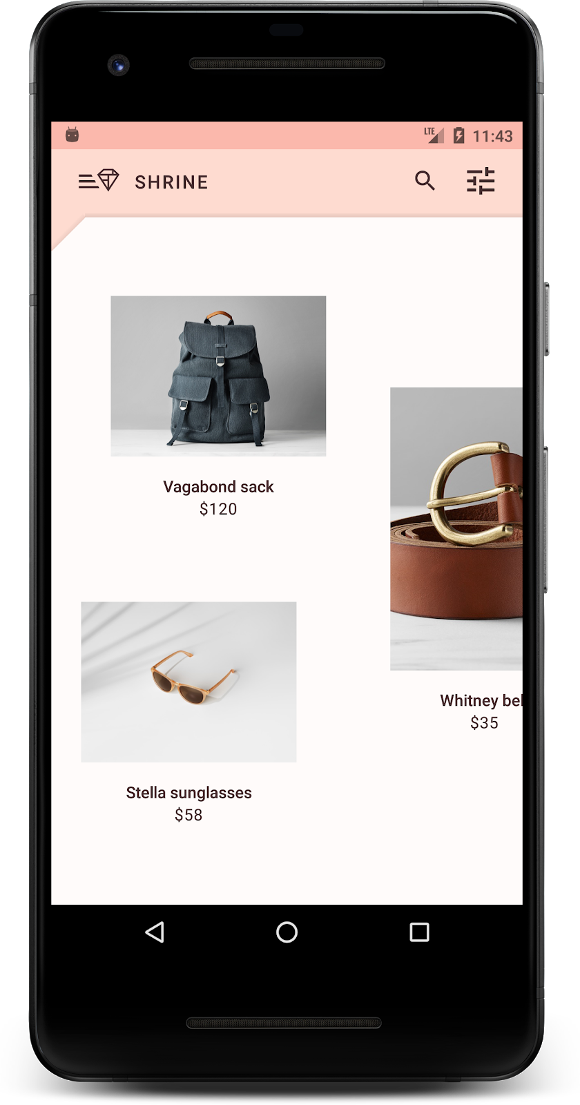
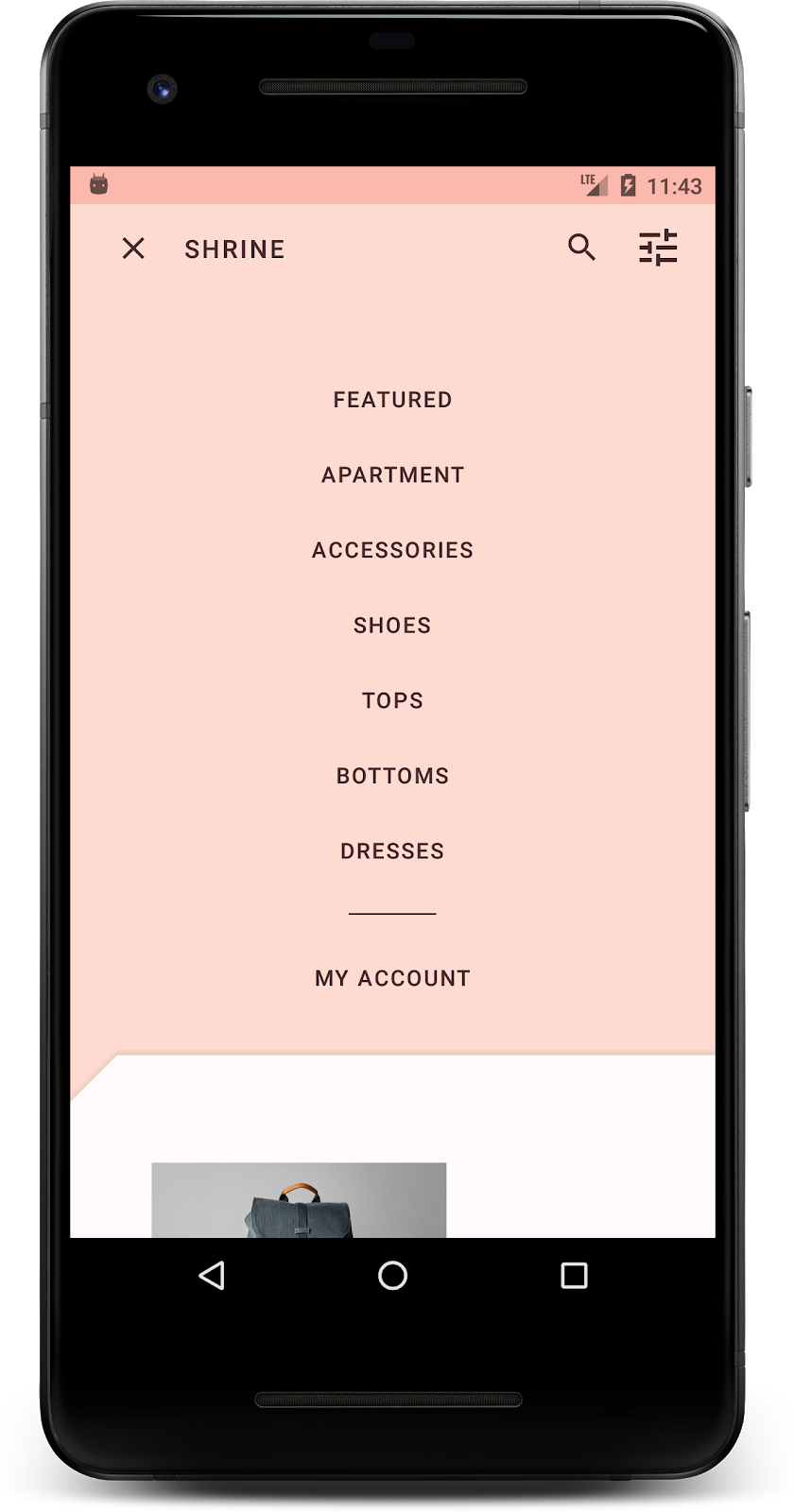
Komponenty i podsystemy MDC na Androida używane w tym ćwiczeniu:
- Motywy
- Typografia
- Wysokość
Czego potrzebujesz
- Podstawowa wiedza na temat programowania na Androida
- Android Studio (jeśli nie masz jeszcze tego środowiska, pobierz je tutaj)
- emulator lub urządzenie z Androidem (dostępne w Androidzie Studio);
- Przykładowy kod (patrz następny krok)
Jak oceniasz swoje doświadczenie w tworzeniu aplikacji na Androida?
2. Konfigurowanie środowiska programistycznego
Kontynuujesz naukę z MDC-102?
Jeśli udało Ci się ukończyć MDC-102, kod powinien być gotowy do użycia w tym ćwiczeniu. Przejdź do kroku 3: Zmień kolor.
Pobieranie aplikacji do ćwiczeń z programowania
Aplikacja startowa znajduje się w katalogu material-components-android-codelabs-103-starter/kotlin. Zanim zaczniesz, cd do tego katalogu.
...lub sklonuj go z GitHub
Aby skopiować ten codelab z GitHuba, uruchom te polecenia:
git clone https://github.com/material-components/material-components-android-codelabs
cd material-components-android-codelabs/
git checkout 103-starter
Wczytaj kod startowy w Android Studio
- Gdy kreator konfiguracji zakończy działanie i wyświetli się okno Witamy w Android Studio, kliknij Otwórz istniejący projekt Android Studio. Przejdź do katalogu, w którym został zainstalowany przykładowy kod, i wybierz kotlin -> shrine (lub wyszukaj na komputerze shrine), aby otworzyć projekt Shipping.
- Poczekaj chwilę, aż Android Studio utworzy i zsynchronizuje projekt. Wskaźniki aktywności w dolnej części okna Android Studio będą pokazywać postęp.
- W tym momencie Android Studio może zgłosić błędy kompilacji z powodu braku pakietu Android SDK lub narzędzi do kompilacji, np. błąd widoczny poniżej. Postępuj zgodnie z instrukcjami w Android Studio, aby zainstalować lub zaktualizować te komponenty i zsynchronizować projekt.

Dodawanie zależności projektu
Projekt musi być zależny od biblioteki pomocy MDC na Androida. Pobrany przykładowy kod powinien już zawierać tę zależność, ale warto wykonać poniższe czynności, aby się upewnić.
- Otwórz plik
build.gradlemodułuappi upewnij się, że blokdependencieszawiera zależność od MDC Android:
api 'com.google.android.material:material:1.1.0-alpha06'
- (Opcjonalnie) W razie potrzeby edytuj plik
build.gradle, aby dodać te zależności, i zsynchronizuj projekt.
dependencies {
    api 'com.google.android.material:material:1.1.0-alpha06'
    implementation 'androidx.legacy:legacy-support-v4:1.0.0'
    implementation 'com.android.volley:volley:1.1.1'
    implementation 'com.google.code.gson:gson:2.8.5'
    implementation "org.jetbrains.kotlin:kotlin-stdlib-jdk7:1.3.21"
    testImplementation 'junit:junit:4.12'
    androidTestImplementation 'androidx.test:core:1.1.0'
    androidTestImplementation 'androidx.test.ext:junit:1.1.0'
    androidTestImplementation 'androidx.test:runner:1.2.0-alpha05'
    androidTestImplementation 'androidx.test.espresso:espresso-core:3.2.0-alpha05'
}
Uruchom aplikację startową
|

Gotowe! Na urządzeniu lub emulatorze powinna pojawić się strona logowania Shrine. Gdy naciśniesz Dalej, pojawi się strona główna Shrine z paskiem aplikacji u góry i siatką obrazów produktów poniżej.
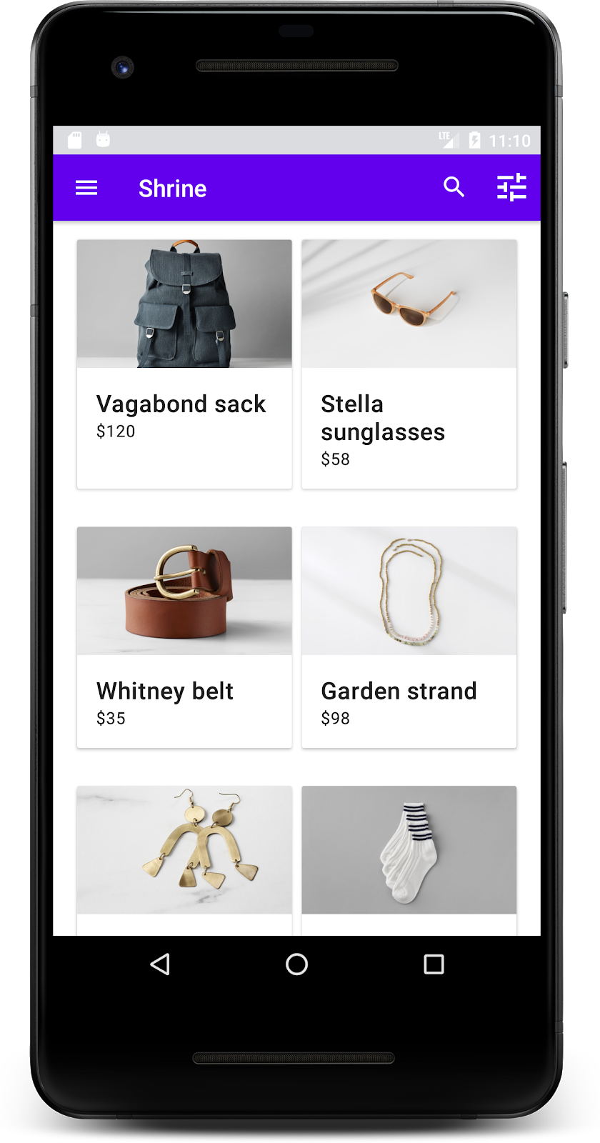
Sprawimy, że górny pasek aplikacji będzie pasował do marki Shrine, zmieniając jego kolor, wysokość i typografię.
3. Zmiana koloru
Ten motyw kolorystyczny został utworzony przez projektanta z użyciem spersonalizowanych kolorów (widocznych na obrazie poniżej). Zawiera kolory wybrane z marki Shrine i zastosowane w Material Theme Editor, który rozszerzył je, aby stworzyć pełniejszą paletę. (Te kolory nie pochodzą z palet kolorów Material z 2014 roku).
Edytor motywów Material Theme Editor podzielił je na odcienie oznaczone numerami, w tym etykietami 50, 100, 200, ..., 900 dla każdego koloru. Shrine używa tylko odcieni 50, 100 i 300 z różowej próbki oraz 900 z brązowej próbki.

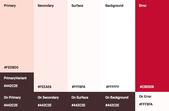
Zmieńmy kolor górnego paska aplikacji, aby odzwierciedlał ten schemat kolorów.
Ustawianie kolorów colorPrimaryDark i colorAccent
W colors.xml zmodyfikuj te wiersze. Atrybut colorAccent określa m.in. kolor górnego paska aplikacji, a atrybut colorPrimaryDark – kolor paska stanu.
colors.xml
<color name="colorPrimaryDark">#FBB8AC</color>
<color name="colorAccent">#FEDBD0</color>
Aby używać ciemnych ikon na pasku stanu, dodaj do Theme.Shrine motywu aplikacji Shrine te elementy:
styles.xml
<item name="android:windowLightStatusBar" tools:targetApi="m">true</item>
<resources xmlns:tools="http://schemas.android.com/tools">
Pliki colors.xml i styles.xml powinny wyglądać tak:
colors.xml
<?xml version="1.0" encoding="utf-8"?>
<resources>
   <color name="colorPrimary">#E0E0E0</color>
   <color name="colorPrimaryDark">#FBB8AC</color>
   <color name="colorAccent">#FEDBD0</color>
   <color name="toolbarIconColor">#FFFFFF</color>
   <color name="loginPageBackgroundColor">#FFFFFF</color>
   <color name="productGridBackgroundColor">#FFFFFF</color>
</resources>
styles.xml
<resources xmlns:android="http://schemas.android.com/tools">

   <!-- Base application theme. -->
   <style name="Theme.Shrine" parent="Theme.MaterialComponents.Light.NoActionBar">
       <!-- Customize your theme here. -->
       <item name="colorPrimary">@color/colorPrimary</item>
       <item name="colorPrimaryDark">@color/colorPrimaryDark</item>
       <item name="colorAccent">@color/colorAccent</item>
       <item name="android:windowLightStatusBar" tools:targetApi="m">true</item>
   </style>

   <style name="Widget.Shrine.Toolbar" parent="Widget.AppCompat.Toolbar">
       <item name="android:background">?attr/colorAccent</item>
       <item name="android:theme">@style/ThemeOverlay.AppCompat.Dark.ActionBar</item>
       <item name="popupTheme">@style/ThemeOverlay.AppCompat.Light</item>
   </style>

</resources>
W colors.xml dodaj nowy textColorPrimary zestaw zasobów kolorów do #442C2E i zaktualizuj atrybut toolbarIconColor, aby odwoływał się do textColorPrimary koloru.
Aby ustawić styles.xml, zaktualizuj plik
atrybutu do textColorPrimary koloru, który właśnie zdefiniowaliśmy.
Jeszcze jedno: ustaw atrybut android:theme w stylu Widget.Shrine.Toolbar na Theme.Shrine.
Pliki colors.xml i styles.xml powinny wyglądać tak:
colors.xml
<?xml version="1.0" encoding="utf-8"?>
<resources>
   <color name="colorPrimary">#E0E0E0</color>
   <color name="colorPrimaryDark">#FBB8AC</color>
   <color name="colorAccent">#FEDBD0</color>
   <color name="textColorPrimary">#442C2E</color>
   <color name="toolbarIconColor">@color/textColorPrimary</color>
   <color name="loginPageBackgroundColor">#FFFFFF</color>
   <color name="productGridBackgroundColor">#FFFFFF</color>
</resources>
styles.xml
<resources xmlns:android="http://schemas.android.com/tools">

   <!-- Base application theme. -->
   <style name="Theme.Shrine" parent="Theme.MaterialComponents.Light.NoActionBar">
       <!-- Customize your theme here. -->
       <item name="colorPrimary">@color/colorPrimary</item>
       <item name="colorPrimaryDark">@color/colorPrimaryDark</item>
       <item name="colorAccent">@color/colorAccent</item>
       <item name="android:windowLightStatusBar" tools:targetApi="m">true</item>
       <item name="android:textColorPrimary">@color/textColorPrimary</item>
   </style>

   <style name="Widget.Shrine.Toolbar" parent="Widget.AppCompat.Toolbar">
       <item name="android:background">?attr/colorAccent</item>
       <item name="android:theme">@style/Theme.Shrine</item>
       <item name="popupTheme">@style/ThemeOverlay.AppCompat.Light</item>
   </style>

</resources>
Skompiluj i uruchom. Siatka produktów powinna teraz wyglądać tak:
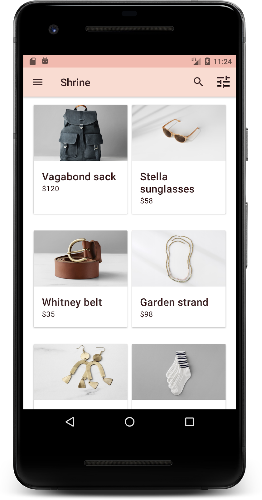
Zmieńmy styl ekranu logowania, aby pasował do naszego schematu kolorów.
Stylizowanie pól tekstowych
Zmieńmy pola tekstowe na stronie logowania, aby były obrysowane, i użyjmy lepszych kolorów w układzie.
Dodaj do pliku colors.xml ten zasób koloru:
colors.xml
<color name="textInputOutlineColor">#FBB8AC</color>
Dodaj 2 nowe style w sekcji styles.xml:
styles.xml
<style name="Widget.Shrine.TextInputLayout" parent="Widget.MaterialComponents.TextInputLayout.OutlinedBox">
   <item name="hintTextAppearance">@style/TextAppearance.Shrine.TextInputLayout.HintText</item>
   <item name="hintTextColor">@color/textColorPrimary</item>
   <item name="android:paddingBottom">8dp</item>
   <item name="boxStrokeColor">@color/textInputOutlineColor</item>
</style>

<style name="TextAppearance.Shrine.TextInputLayout.HintText" parent="TextAppearance.MaterialComponents.Subtitle2">
   <item name="android:textColor">?android:attr/textColorPrimary</item>
</style>
Na koniec ustaw atrybut stylu na obu komponentach XML TextInputLayout w shr_login_fragment.xml na nowy styl:
shr_login_fragment.xml
<com.google.android.material.textfield.TextInputLayout
   style="@style/Widget.Shrine.TextInputLayout"
   android:layout_width="match_parent"
   android:layout_height="wrap_content"
   android:hint="@string/shr_hint_username">

   <com.google.android.material.textfield.TextInputEditText
       android:layout_width="match_parent"
       android:layout_height="wrap_content"
       android:inputType="text"
       android:maxLines="1" />
</com.google.android.material.textfield.TextInputLayout>

<com.google.android.material.textfield.TextInputLayout
   android:id="@+id/password_text_input"
   style="@style/Widget.Shrine.TextInputLayout"
   android:layout_width="match_parent"
   android:layout_height="wrap_content"
   android:hint="@string/shr_hint_password"
   app:errorEnabled="true">

   <com.google.android.material.textfield.TextInputEditText
       android:id="@+id/password_edit_text"
       android:layout_width="match_parent"
       android:layout_height="wrap_content"
       android:inputType="textPassword" />
</com.google.android.material.textfield.TextInputLayout>
Dostosowywanie kolorów przycisków
Na koniec dostosuj kolory przycisków na stronie logowania. Dodaj do pliku styles.xml te style:
styles.xml
<style name="Widget.Shrine.Button" parent="Widget.MaterialComponents.Button">
   <item name="android:textColor">?android:attr/textColorPrimary</item>
   <item name="backgroundTint">?attr/colorPrimaryDark</item>
</style>

<style name="Widget.Shrine.Button.TextButton" parent="Widget.MaterialComponents.Button.TextButton">
   <item name="android:textColor">?android:attr/textColorPrimary</item>
</style>
Styl Widget.Shrine.Button jest rozszerzeniem domyślnego stylu MaterialButton i zmienia kolor tekstu oraz odcień tła przycisku. Widget.Shrine.Button.TextButton rozszerza domyślny styl tekstu MaterialButton i zmienia tylko kolor tekstu.
Ustaw styl Widget.Shrine.Button na przycisku Dalej, a styl Widget.Shrine.Button.TextButton na przycisku Anuluj w ten sposób:
shr_login_fragment.xml
<RelativeLayout
   android:layout_width="match_parent"
   android:layout_height="wrap_content">

   <com.google.android.material.button.MaterialButton
       android:id="@+id/next_button"
       style="@style/Widget.Shrine.Button"
       android:layout_width="wrap_content"
       android:layout_height="wrap_content"
       android:layout_alignParentEnd="true"
       android:layout_alignParentRight="true"
       android:text="@string/shr_button_next" />

   <com.google.android.material.button.MaterialButton
       android:id="@+id/cancel_button"
       style="@style/Widget.Shrine.Button.TextButton"
       android:layout_width="wrap_content"
       android:layout_height="wrap_content"
       android:layout_marginEnd="12dp"
       android:layout_marginRight="12dp"
       android:layout_toStartOf="@id/next_button"
       android:layout_toLeftOf="@id/next_button"
       android:text="@string/shr_button_cancel" />

</RelativeLayout>
Zaktualizuj kolor logo Shrine na stronie logowania. Wymaga to niewielkiej zmiany w obiekcie rysowalnym wektorowo shr_logo.xml. Otwórz plik obiektu rysowalnego i zmień właściwość android:fillAlpha na 1. Obiekt rysowalny powinien wyglądać tak:
shr_logo.xml
<vector xmlns:android="http://schemas.android.com/apk/res/android"
   android:width="149dp"
   android:height="152dp"
   android:tint="?attr/colorControlNormal"
   android:viewportWidth="149"
   android:viewportHeight="152">
   <path
       android:fillAlpha="1"
       android:fillColor="#DADCE0"
       android:fillType="evenOdd"
       android:pathData="M42.262,0L0,38.653L74.489,151.994L148.977,38.653L106.723,0M46.568,11.11L21.554,33.998L99.007,33.998L99.007,11.11L46.568,11.11ZM110.125,18.174L110.125,33.998L127.416,33.998L110.125,18.174ZM80.048,45.116L80.048,123.296L131.426,45.116L80.048,45.116ZM17.551,45.116L33.976,70.101L68.93,70.101L68.93,45.116L17.551,45.116ZM41.284,81.219L68.93,123.296L68.93,81.219L41.284,81.219Z"
       android:strokeWidth="1"
       android:strokeAlpha="0.4"
       android:strokeColor="#00000000" />
</vector>
Następnie ustaw atrybut android:tint w logo <ImageView> w shr_login_fragment.xml na ?android:attr/textColorPrimary w ten sposób:
shr_login_fragment.xml
<ImageView
   android:layout_width="64dp"
   android:layout_height="64dp"
   android:layout_gravity="center_horizontal"
   android:layout_marginTop="48dp"
   android:layout_marginBottom="16dp"
   android:tint="?android:attr/textColorPrimary"
   app:srcCompat="@drawable/shr_logo" />
Skompiluj i uruchom. Ekran logowania powinien teraz wyglądać tak:
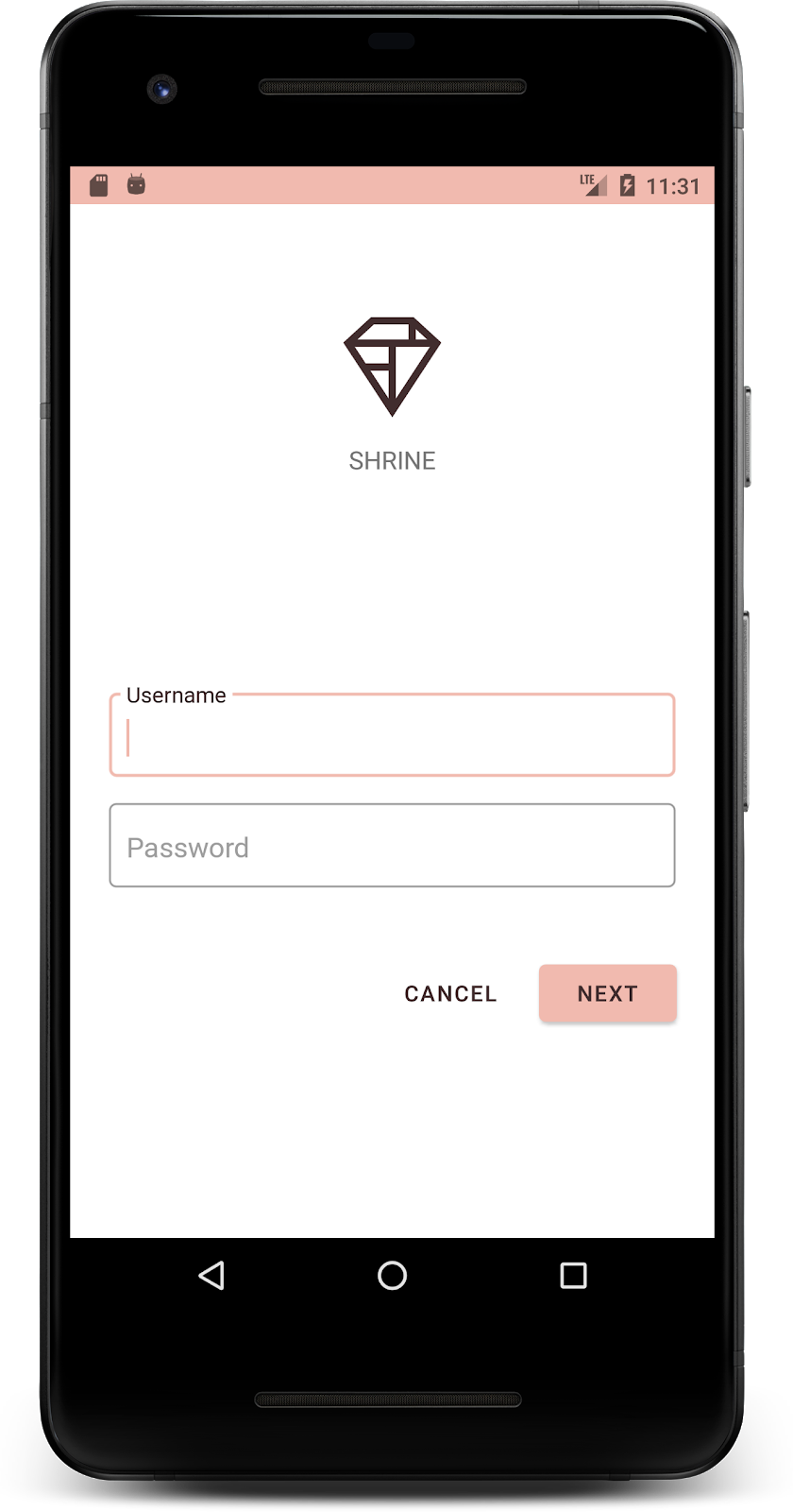
4. Modyfikowanie typografii i stylów etykiet
Oprócz zmian kolorów projektant podał też konkretną typografię, której należy używać w witrynie. Dodajmy go też do górnego paska aplikacji.
Określanie stylu górnego paska aplikacji
Dostosuj wygląd tekstu na górnym pasku aplikacji do specyfikacji podanej przez projektanta. Dodaj do styles.xml ten styl wyglądu tekstu i ustaw właściwość titleTextAppearance, aby odwoływać się do tego stylu w stylu Widget.Shrine.Toolbar.
styles.xml
<style name="Widget.Shrine.Toolbar" parent="Widget.AppCompat.Toolbar">
   <item name="android:background">?attr/colorAccent</item>
   <item name="android:theme">@style/Theme.Shrine</item>
   <item name="popupTheme">@style/ThemeOverlay.AppCompat.Light</item>
   <item name="titleTextAppearance">@style/TextAppearance.Shrine.Toolbar</item>
</style>

<style name="TextAppearance.Shrine.Toolbar" parent="TextAppearance.MaterialComponents.Button">
   <item name="android:textSize">16sp</item>
</style>
Pliki colors.xml i styles.xml powinny wyglądać tak:
colors.xml
<?xml version="1.0" encoding="utf-8"?>
<resources>
   <color name="colorPrimary">#E0E0E0</color>
   <color name="colorPrimaryDark">#FBB8AC</color>
   <color name="colorAccent">#FEDBD0</color>
   <color name="textColorPrimary">#442C2E</color>
   <color name="toolbarIconColor">@color/textColorPrimary</color>
   <color name="loginPageBackgroundColor">#FFFFFF</color>
   <color name="productGridBackgroundColor">#FFFFFF</color>
   <color name="textInputOutlineColor">#FBB8AC</color>
</resources>
styles.xml
<resources xmlns:android="http://schemas.android.com/tools">

   <!-- Base application theme. -->
   <style name="Theme.Shrine" parent="Theme.MaterialComponents.Light.NoActionBar">
       <!-- Customize your theme here. -->
       <item name="colorPrimary">@color/colorPrimary</item>
       <item name="colorPrimaryDark">@color/colorPrimaryDark</item>
       <item name="colorAccent">@color/colorAccent</item>
       <item name="android:windowLightStatusBar" tools:targetApi="m">true</item>
       <item name="android:textColorPrimary">@color/textColorPrimary</item>
   </style>

   <style name="Widget.Shrine.TextInputLayout" parent="Widget.MaterialComponents.TextInputLayout.OutlinedBox">
       <item name="hintTextAppearance">@style/TextAppearance.Shrine.TextInputLayout.HintText</item>
       <item name="hintTextColor">@color/textColorPrimary</item>
       <item name="android:paddingBottom">8dp</item>
       <item name="boxStrokeColor">@color/textInputOutlineColor</item>
   </style>

   <style name="TextAppearance.Shrine.TextInputLayout.HintText" parent="TextAppearance.MaterialComponents.Subtitle2">
       <item name="android:textColor">?android:attr/textColorPrimary</item>
   </style>

   <style name="Widget.Shrine.Button" parent="Widget.MaterialComponents.Button">
       <item name="android:textColor">?android:attr/textColorPrimary</item>
       <item name="backgroundTint">?attr/colorPrimaryDark</item>
   </style>

   <style name="Widget.Shrine.Button.TextButton" parent="Widget.MaterialComponents.Button.TextButton">
       <item name="android:textColor">?android:attr/textColorPrimary</item>
   </style>

   <style name="Widget.Shrine.Toolbar" parent="Widget.AppCompat.Toolbar">
       <item name="android:background">?attr/colorAccent</item>
       <item name="android:theme">@style/Theme.Shrine</item>
       <item name="popupTheme">@style/ThemeOverlay.AppCompat.Light</item>
       <item name="titleTextAppearance">@style/TextAppearance.Shrine.Toolbar</item>
   </style>

   <style name="TextAppearance.Shrine.Toolbar" parent="TextAppearance.MaterialComponents.Button">
       <item name="android:textSize">16sp</item>
   </style>

</resources>
Stylizowanie etykiet
Nadamy etykietom na karcie produktu odpowiedni styl, aby miały prawidłowy wygląd tekstu i były wyśrodkowane w poziomie na karcie.
Zmień typografię etykiety tytułu z textAppearanceHeadline6 na textAppearanceSubtitle2 w ten sposób:
shr_product_card.xml
<TextView
   android:id="@+id/product_title"
   android:layout_width="match_parent"
   android:layout_height="wrap_content"
   android:text="@string/shr_product_title"
   android:textAppearance="?attr/textAppearanceSubtitle2" />
Aby wyśrodkować etykiety obrazów, zmodyfikuj etykiety <TextView>s w shr_product_card.xml, aby ustawić atrybut android:textAlignment="center":
shr_product_card.xml
<LinearLayout
   android:layout_width="match_parent"
   android:layout_height="wrap_content"
   android:orientation="vertical"
   android:padding="16dp">

   <TextView
       android:id="@+id/product_title"
       android:layout_width="match_parent"
       android:layout_height="wrap_content"
       android:text="@string/shr_product_title"
       android:textAlignment="center"
       android:textAppearance="?attr/textAppearanceSubtitle2" />

   <TextView
       android:id="@+id/product_price"
       android:layout_width="match_parent"
       android:layout_height="wrap_content"
       android:text="@string/shr_product_description"
       android:textAlignment="center"
       android:textAppearance="?attr/textAppearanceBody2" />
</LinearLayout>
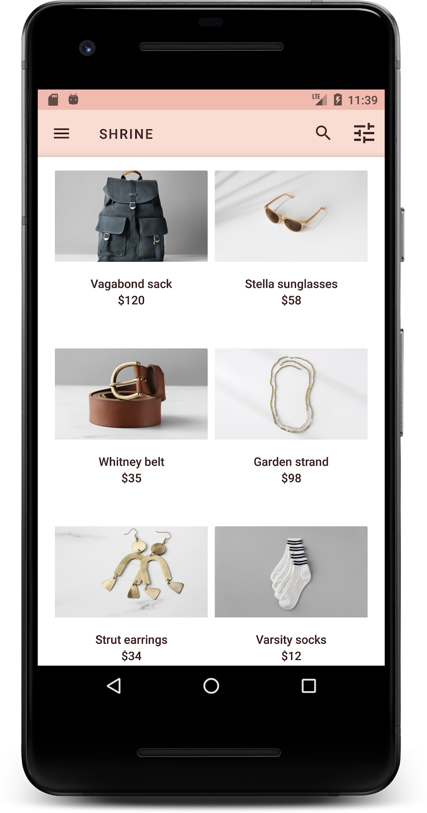
Skompiluj i uruchom. Ekran siatki produktów powinien teraz wyglądać tak:
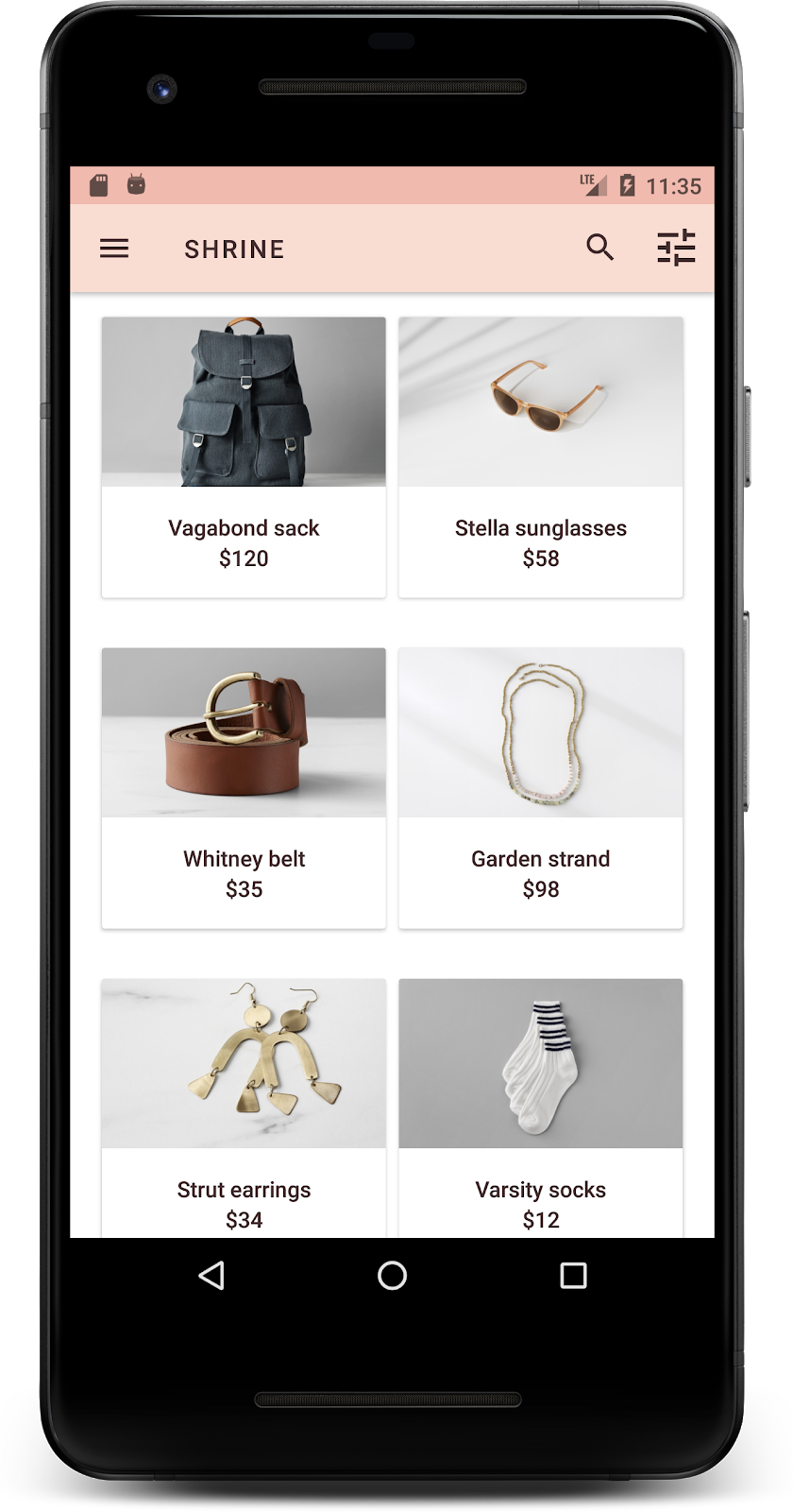
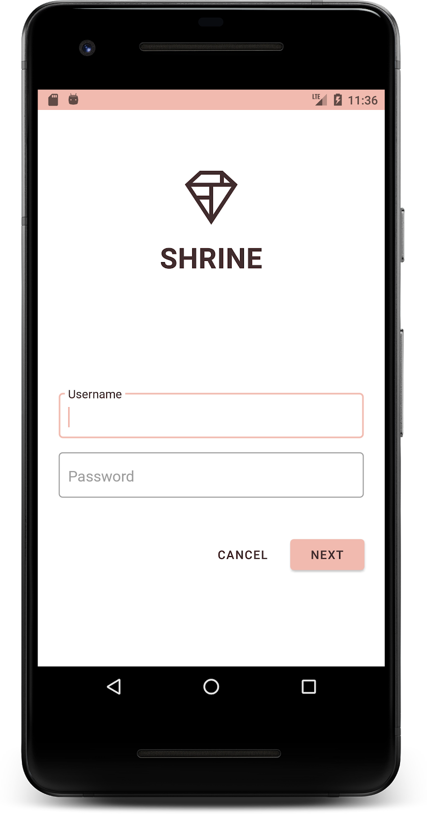
Zmieńmy typografię ekranu logowania, aby pasowała do tego stylu.
Zmiana kroju pisma na ekranie logowania
W polu styles.xml dodaj ten styl:
styles.xml
<style name="TextAppearance.Shrine.Title" parent="TextAppearance.MaterialComponents.Headline4">
   <item name="textAllCaps">true</item>
   <item name="android:textStyle">bold</item>
   <item name="android:textColor">?android:attr/textColorPrimary</item>
</style>
W shr_login_fragment.xml ustaw nowy styl dla tytułu „SHRINE” <TextView> (i usuń atrybuty textAllCaps i textSize):
shr_login_fragment.xml
<TextView
   android:layout_width="wrap_content"
   android:layout_height="wrap_content"
   android:layout_gravity="center_horizontal"
   android:layout_marginBottom="132dp"
   android:text="@string/shr_app_name"
   android:textAppearance="@style/TextAppearance.Shrine.Title" />
Skompiluj i uruchom. Ekran logowania powinien teraz wyglądać tak:
5. Dostosowywanie wysokości
Strona ma już określony styl, kolor i typografię pasujące do Shrine. Przyjrzyjmy się teraz kartom, na których wyświetlają się produkty Shrine. Obecnie są one umieszczane na białej powierzchni pod nawigacją aplikacji. Aby zwrócić uwagę na produkty, podkreślmy je.
Zmiana wysokości siatki produktów
Aby sprawić, że treść będzie wyglądać jak arkusz unoszący się nad górnym paskiem aplikacji, zmień jego poziom. Dodaj atrybut app:elevation do komponentu XML AppBarLayout i atrybut android:elevation do komponentu XML NestedScrollView w shr_product_grid_fragment.xml w ten sposób:
shr_product_grid_fragment.xml
<com.google.android.material.appbar.AppBarLayout
   android:layout_width="match_parent"
   android:layout_height="wrap_content"
   app:elevation="0dp">

   <androidx.appcompat.widget.Toolbar
       android:id="@+id/app_bar"
       style="@style/Widget.Shrine.Toolbar"
       android:layout_width="match_parent"
       android:layout_height="?attr/actionBarSize"
       app:navigationIcon="@drawable/shr_menu"
       app:title="@string/shr_app_name" />
</com.google.android.material.appbar.AppBarLayout>

<androidx.core.widget.NestedScrollView
   android:layout_width="match_parent"
   android:layout_height="match_parent"
   android:layout_marginTop="56dp"
   android:background="@color/productGridBackgroundColor"
   android:elevation="8dp"
   android:paddingStart="@dimen/shr_product_grid_spacing"
   android:paddingEnd="@dimen/shr_product_grid_spacing"
   app:layout_behavior="@string/appbar_scrolling_view_behavior">

   <androidx.recyclerview.widget.RecyclerView
       android:id="@+id/recycler_view"
       android:layout_width="match_parent"
       android:layout_height="match_parent" />

</androidx.core.widget.NestedScrollView>
Zmiana wysokości karty (i koloru)
Dostosuj wysokość każdej karty, zmieniając wartość app:cardElevation w shr_product_card.xml z 2dp na 0dp. Zmień też app:cardBackgroundColor na @android:color/transparent.
shr_product_card.xml
<com.google.android.material.card.MaterialCardView xmlns:android="http://schemas.android.com/apk/res/android"
   xmlns:app="http://schemas.android.com/apk/res-auto"
   android:layout_width="match_parent"
   android:layout_height="wrap_content"
   app:cardBackgroundColor="@android:color/transparent"
   app:cardElevation="0dp"
   app:cardPreventCornerOverlap="true">
Sprawdź! Dostosowano poziom każdej karty na stronie siatki produktów.
Zmiana wysokości przycisku Dalej
W styles.xml dodaj do stylu Widget.Shrine.Button tę właściwość:
styles.xml
<item name="android:stateListAnimator" tools:ignore="NewApi">
    @animator/shr_next_button_state_list_anim
</item>
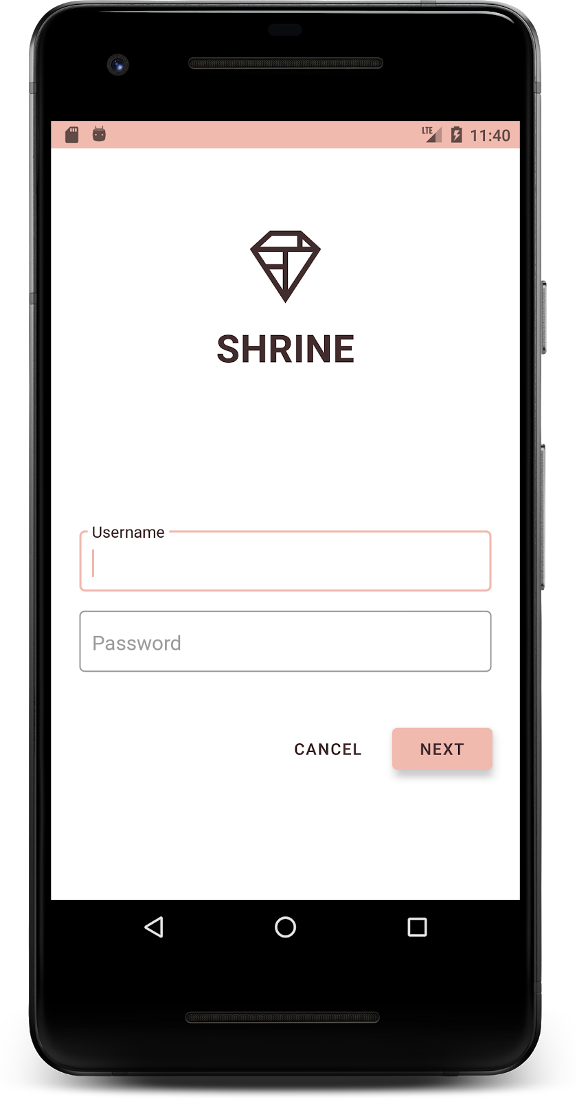
Ustawienie android:stateListAnimator w stylu Button powoduje, że przycisk Dalej korzysta z animatora, który udostępniliśmy.
Skompiluj i uruchom. Ekran logowania powinien teraz wyglądać tak:
6. Zmiana układu
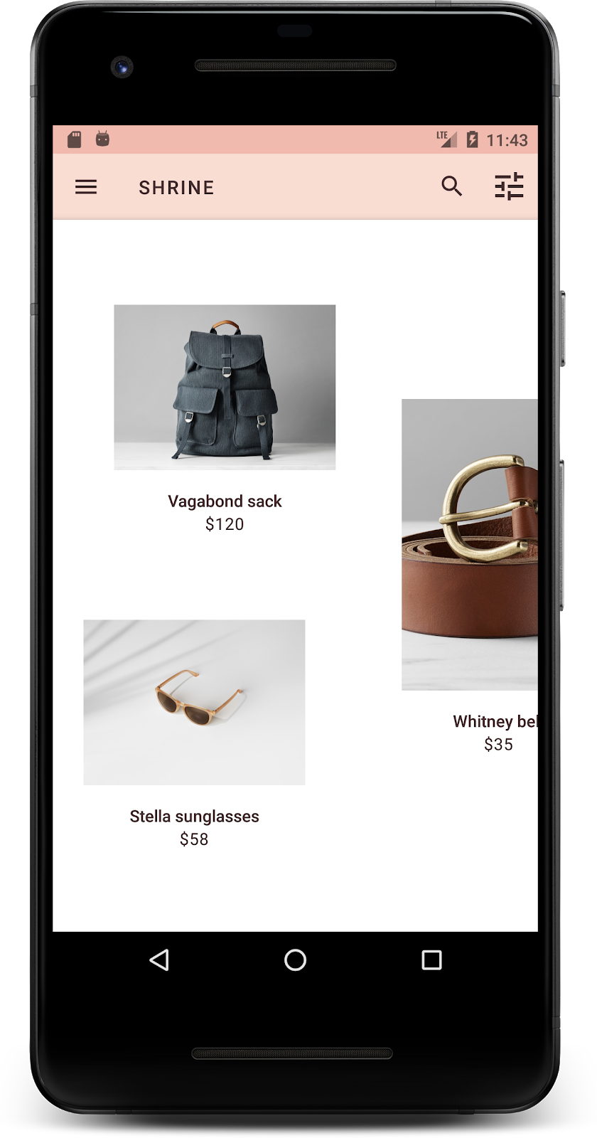
Zmieńmy układ, aby karty miały różne proporcje i rozmiary, dzięki czemu każda z nich będzie wyglądać inaczej.
Używanie adaptera RecyclerView z układem kaskadowym
W pakiecie staggeredgridlayout udostępniliśmy nowy RecyclerView adapter, który wyświetla asymetryczny układ kart z przesunięciem, przeznaczony do przewijania w poziomie. Możesz samodzielnie przeanalizować ten kod, ale nie będziemy tutaj omawiać sposobu jego wdrożenia.
Aby użyć tego nowego adaptera, zmień metodę onCreateView() w ProductGridFragment.kt. Zastąp blok kodu po komentarzu „set up the RecyclerView” tym kodem:
ProductGridFragment.kt
// Set up the RecyclerView
view.recycler_view.setHasFixedSize(true)
val gridLayoutManager = GridLayoutManager(context, 2, RecyclerView.HORIZONTAL, false)
gridLayoutManager.spanSizeLookup = object : GridLayoutManager.SpanSizeLookup() {
   override fun getSpanSize(position: Int): Int {
       return if (position % 3 == 2) 2 else 1
   }
}
view.recycler_view.layoutManager = gridLayoutManager
val adapter = StaggeredProductCardRecyclerViewAdapter(
       ProductEntry.initProductEntryList(resources))
view.recycler_view.adapter = adapter
val largePadding = resources.getDimensionPixelSize(R.dimen.shr_staggered_product_grid_spacing_large)
val smallPadding = resources.getDimensionPixelSize(R.dimen.shr_staggered_product_grid_spacing_small)
view.recycler_view.addItemDecoration(ProductGridItemDecoration(largePadding, smallPadding))
Musimy też wprowadzić niewielką zmianę w shr_product_grid_fragment.xml, aby usunąć dopełnienie z NestedScrollView:
shr_product_grid_fragment.xml
<androidx.core.widget.NestedScrollView
   android:layout_width="match_parent"
   android:layout_height="match_parent"
   android:layout_marginTop="56dp"
   android:background="@color/productGridBackgroundColor"
   app:layout_behavior="@string/appbar_scrolling_view_behavior"
   android:elevation="6dp">
Na koniec dostosujemy też dopełnienie karty w RecyclerView, modyfikując ProductGridItemDecoration.kt. Zmodyfikuj metodę getItemOffsets() klasy ProductGridItemDecoration.kt w ten sposób:
ProductGridItemDecoration.kt
override fun getItemOffsets(outRect: Rect, view: View,
                           parent: RecyclerView, state: RecyclerView.State?) {
   outRect.left = smallPadding
   outRect.right = largePadding
}
Skompiluj i uruchom. Elementy siatki produktów powinny być teraz rozmieszczone naprzemiennie:
7. Wypróbuj inny motyw
Kolor to skuteczny sposób na wyrażenie tożsamości marki, a nawet niewielka zmiana koloru może mieć duży wpływ na wrażenia użytkowników. Aby to sprawdzić, zobaczmy, jak wyglądałaby aplikacja Shrine, gdyby schemat kolorów marki był zupełnie inny.
Modyfikowanie stylów i kolorów
W sekcji styles.xml dodaj ten nowy motyw:
styles.xml
<style name="Theme.Shrine.Autumn" parent="Theme.Shrine">
   <item name="colorPrimary">#FFCF44</item>
   <item name="colorPrimaryDark">#FD9725</item>
   <item name="colorAccent">#FD9725</item>
   <item name="colorOnPrimary">#FFFFFF</item>
   <item name="colorError">#FD9725</item>
</style>
W AndroidManifest.xml użyj tego nowego motywu w aplikacji:
AndroidManifest.xml
<application
   android:allowBackup="true"
   android:icon="@mipmap/ic_launcher"
   android:label="@string/shr_app_name"
   android:roundIcon="@mipmap/ic_launcher_round"
   android:supportsRtl="true"
  android:name="com.google.codelabs.mdc.kotlin.shrine.application.ShrineApplication"
   android:theme="@style/Theme.Shrine.Autumn">
   <activity android:name=".MainActivity">
       <intent-filter>
           <action android:name="android.intent.action.MAIN" />

           <category android:name="android.intent.category.LAUNCHER" />
       </intent-filter>
   </activity>
</application>
Zmień kolor ikony paska narzędzi w colors.xml, jak pokazano poniżej:
colors.xml
<color name="toolbarIconColor">#FFFFFF</color>
Następnie ustaw atrybut android:theme stylu paska narzędzi, aby odwoływał się do bieżącego motywu za pomocą atrybutu „?theme”, zamiast go zakodować na stałe:
styles.xml
<style name="Widget.Shrine.Toolbar" parent="Widget.AppCompat.Toolbar">
   <item name="android:background">?attr/colorAccent</item>
   <item name="android:theme">?theme</item>
   <item name="popupTheme">@style/ThemeOverlay.AppCompat.Light</item>
   <item name="titleTextAppearance">@style/TextAppearance.Shrine.Toolbar</item>
</style>
Następnie rozjaśnij kolor tekstu podpowiedzi w polach tekstowych na ekranie logowania. Dodaj atrybut android:textColorHint do stylu pól tekstowych:
styles.xml
<style name="Widget.Shrine.TextInputLayout" parent="Widget.MaterialComponents.TextInputLayout.OutlinedBox">
   <item name="hintTextAppearance">
@style/TextAppearance.Shrine.TextInputLayout.HintText
</item>
   <item name="android:paddingBottom">8dp</item>
   <item name="android:textColorHint">?attr/colorPrimaryDark</item>
</style>
Skompiluj i uruchom. Nowy motyw powinien być teraz widoczny w podglądzie.
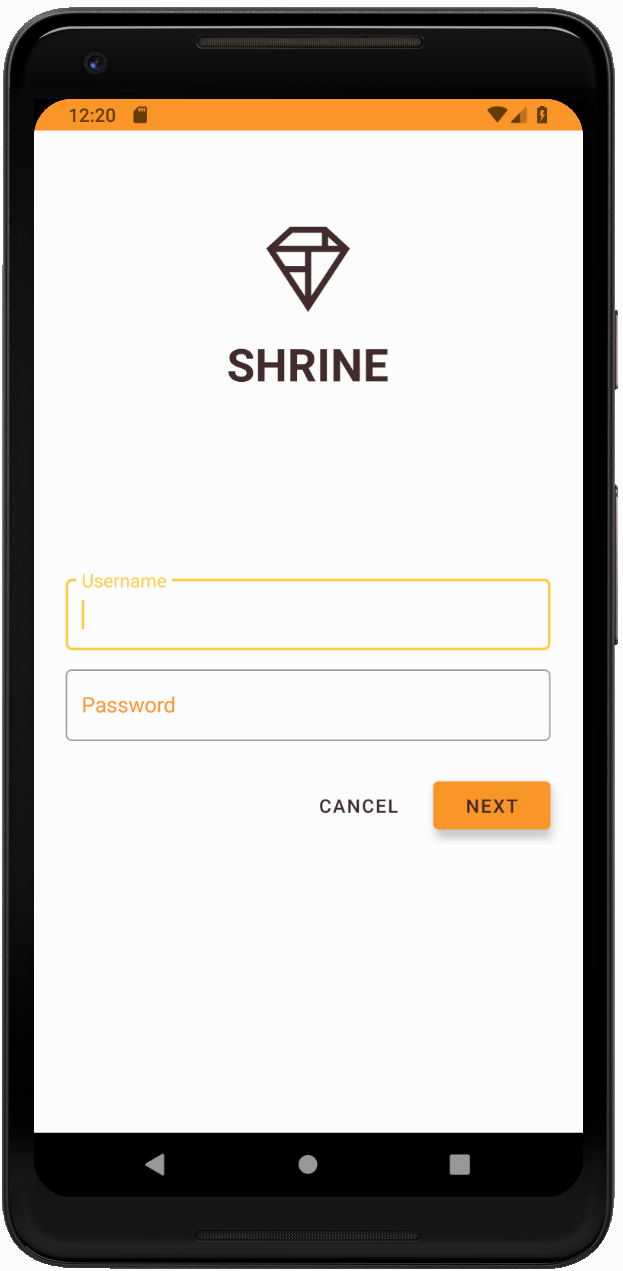
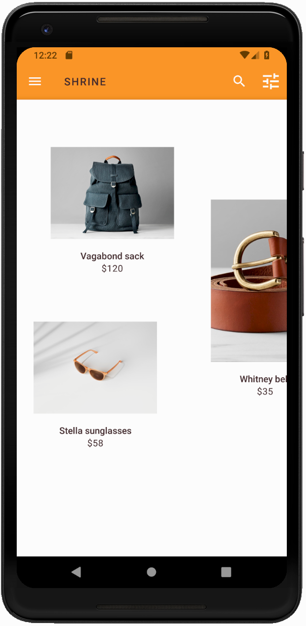
Przed przejściem do MDC-104 przywróć kod zmieniony w tej sekcji.
8. Podsumowanie
Masz już aplikację, która jest zgodna ze specyfikacją projektu od projektanta.
Dalsze kroki
Używasz tych komponentów MDC: motyw, typografia i wysokość. Więcej komponentów i podsystemów znajdziesz w [bibliotece MDC Web].
Co zrobić, jeśli planowany projekt aplikacji zawiera elementy, które nie mają komponentów w bibliotece MDC? W MDC-104: zaawansowane komponenty Material Design pokażemy, jak tworzyć komponenty niestandardowe przy użyciu biblioteki MDC, aby uzyskać określony wygląd.