
1. מבוא
רכיבי Material (MDC) עוזרים למפתחים להטמיע את Material Design. MDC נוצרה על ידי צוות של מהנדסים ומעצבי UX ב-Google. היא כוללת עשרות רכיבי ממשק משתמש יפים ופונקציונליים, וזמינה ל-Android, ל-iOS, לאינטרנט ול-Flutter.material.io/develop |
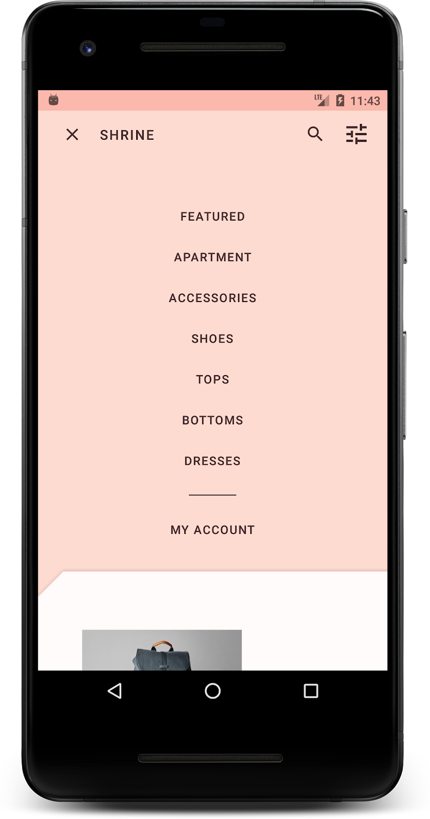
בסדנאות התכנות MDC-101 ו-MDC-102, השתמשתם ב-Material Components (MDC) כדי לבנות את הבסיס של אפליקציה בשם Shrine, אפליקציית מסחר אלקטרוני שמוכרת בגדים ומוצרים לבית. האפליקציה הזו מכילה תהליך שימוש שמתחיל במסך כניסה ומעביר את המשתמש למסך הבית שבו מוצגים מוצרים.
ההרחבה האחרונה של Material Design מעניקה למעצבים ולמפתחים גמישות רבה יותר בביטוי המותג של המוצר שלהם. עכשיו אפשר להשתמש ב-MDC כדי להתאים אישית את Shrine ולשקף את הסגנון הייחודי שלו.
מה תפַתחו
ב-Codelab הזה נסביר איך להתאים אישית את Shrine כך שישקף את המותג שלו באמצעות:
- צבע
- טיפוגרפיה
- גובה
- פריסה
רכיבים ומערכות משנה של MDC Android שנעשה בהם שימוש ב-Codelab הזה:
- עיצובים
- טיפוגרפיה
- גובה
מה תצטרכו
- ידע בסיסי בפיתוח ל-Android
- Android Studio (אם עדיין לא הורדתם אותו, אפשר להוריד אותו כאן)
- מכשיר או אמולטור Android (זמינים דרך Android Studio)
- קוד לדוגמה (ראו השלב הבא)
מה רמת הניסיון שלך בפיתוח אפליקציות ל-Android?
2. הגדרת סביבת הפיתוח
המשך מ-MDC-102?
אם השלמתם את MDC-102, הקוד שלכם אמור להיות מוכן לשימוש ב-Codelab הזה. אפשר לדלג לשלב 3: שינוי הצבע.
הורדת האפליקציה לתחילת הדרך של Codelab
אפליקציה לתחילת הדרך נמצאת בספרייה material-components-android-codelabs-103-starter/kotlin. חשוב לעבור לספרייה הזו באמצעות הפקודה cd לפני שמתחילים.
...או לשכפל אותו מ-GitHub
כדי לשכפל את ה-codelab הזה מ-GitHub, מריצים את הפקודות הבאות:
git clone https://github.com/material-components/material-components-android-codelabs
cd material-components-android-codelabs/
git checkout 103-starter
טעינת קוד לתחילת הדרך ב-Android Studio
- אחרי שאשף ההגדרה יסיים את הפעולה ויוצג החלון Welcome to Android Studio (ברוכים הבאים ל-Android Studio), לוחצים על Open an existing Android Studio project (פתיחת פרויקט קיים של Android Studio). עוברים לספרייה שבה התקנתם את קוד הדוגמה ובוחרים באפשרות kotlin -> shrine (או מחפשים במחשב את shrine) כדי לפתוח את פרויקט המשלוח.
- מחכים כמה רגעים עד ש-Android Studio יבצע build ויסנכרן את הפרויקט, כפי שמצוין על ידי אינדיקטורים של פעילות לאורך החלק התחתון של חלון Android Studio.
- בשלב הזה, יכול להיות ש-Android Studio יציג שגיאות build כי חסר לכם Android SDK או כלי build, כמו השגיאה שמוצגת למטה. פועלים לפי ההוראות ב-Android Studio כדי להתקין או לעדכן את התוספים האלה ולסנכרן את הפרויקט.

הוספת יחסי תלות בפרויקט
הפרויקט צריך להיות תלוי בספריית התמיכה של MDC ב-Android. התלות הזו כבר אמורה להופיע בקוד לדוגמה שהורדתם, אבל מומלץ לבצע את השלבים הבאים כדי לוודא זאת.
- עוברים לקובץ
build.gradleשל המודולappומוודאים שהבלוקdependenciesכולל תלות ב-MDC Android:
api 'com.google.android.material:material:1.1.0-alpha06'
- (אופציונלי) אם צריך, עורכים את הקובץ
build.gradleכדי להוסיף את התלות הבאה ומסנכרנים את הפרויקט.
dependencies {
    api 'com.google.android.material:material:1.1.0-alpha06'
    implementation 'androidx.legacy:legacy-support-v4:1.0.0'
    implementation 'com.android.volley:volley:1.1.1'
    implementation 'com.google.code.gson:gson:2.8.5'
    implementation "org.jetbrains.kotlin:kotlin-stdlib-jdk7:1.3.21"
    testImplementation 'junit:junit:4.12'
    androidTestImplementation 'androidx.test:core:1.1.0'
    androidTestImplementation 'androidx.test.ext:junit:1.1.0'
    androidTestImplementation 'androidx.test:runner:1.2.0-alpha05'
    androidTestImplementation 'androidx.test.espresso:espresso-core:3.2.0-alpha05'
}
הפעלת אפליקציה לתחילת הדרך
|

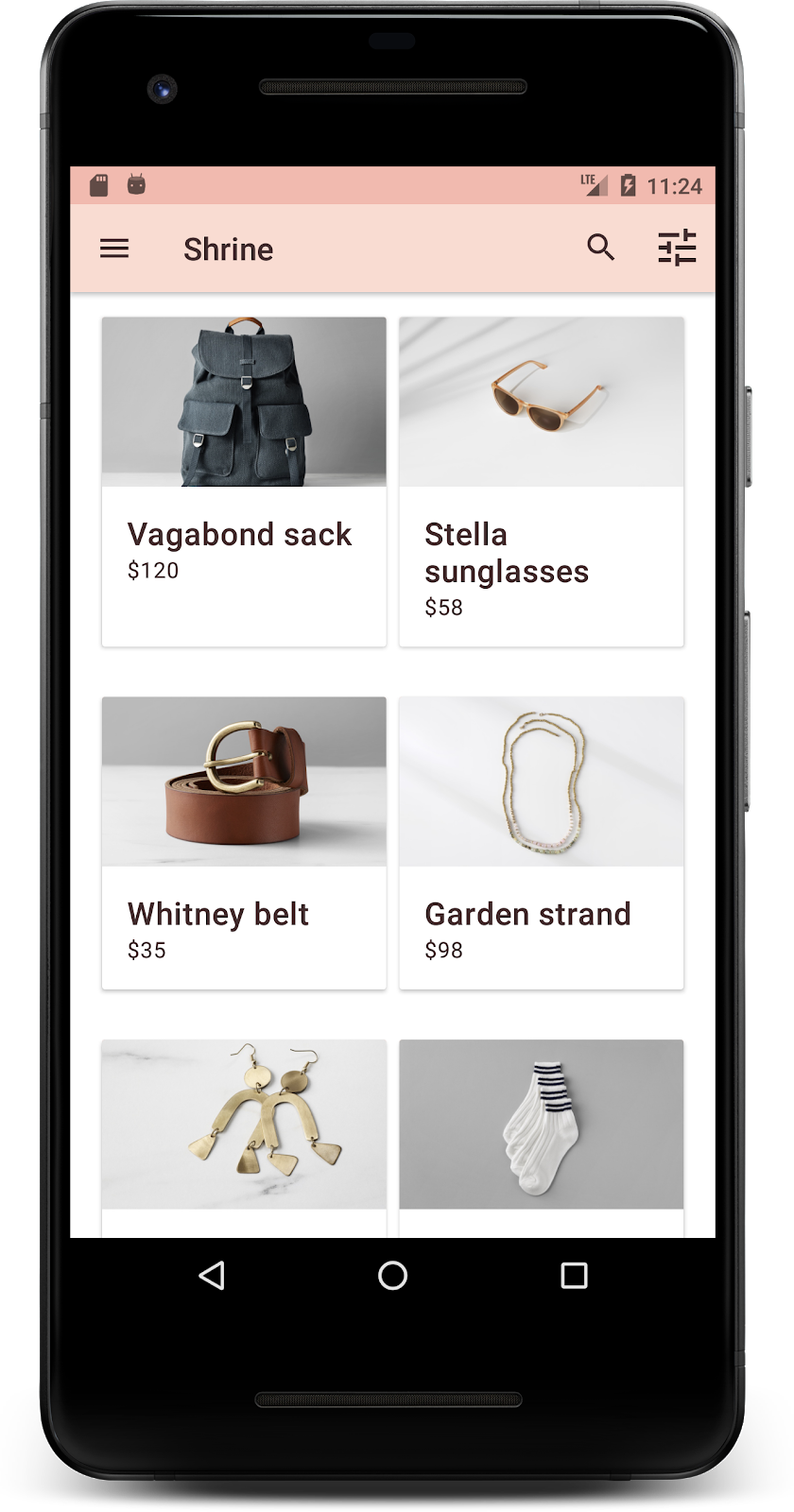
הצלחת! אמור להופיע דף הכניסה של Shrine במכשיר או באמולטור. כשלוחצים על 'הבא', מופיע דף הבית של Shrine עם סרגל אפליקציות בחלק העליון ורשת של תמונות מוצרים מתחתיו.
נשנה את הצבע, הגובה והטיפוגרפיה של סרגל האפליקציות העליון כדי שיתאימו למותג Shrine.
3. שינוי הצבע
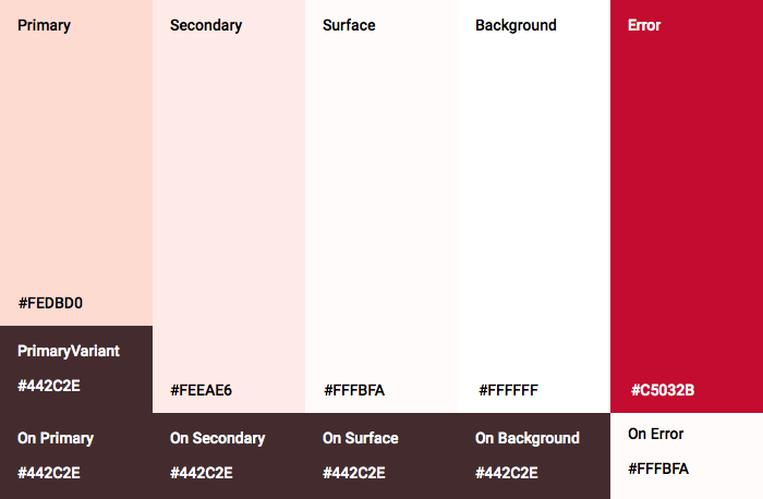
ערכת הצבעים הזו נוצרה על ידי מעצב עם צבעים בהתאמה אישית (כפי שמוצג בתמונה שלמטה). הוא מכיל צבעים שנבחרו מהמותג של Shrine והוחלו על Material Theme Editor, שהרחיב אותם כדי ליצור פלטה מלאה יותר. (הצבעים האלה לא נלקחו מלוחות הצבעים של Material משנת 2014).
ב-Material Theme Editor, הצבעים מאורגנים בגוונים שמסומנים במספרים, כולל התוויות 50, 100, 200 ועד 900 של כל צבע. הגופן Shrine משתמש רק בגוונים 50, 100 ו-300 מלוח הצבעים הוורוד ובגוון 900 מלוח הצבעים החום.

נשנה את הצבע של סרגל האפליקציות העליון כך שיתאים לערכת הצבעים הזו.
הגדרת colorPrimaryDark ו-colorAccent
בקטע colors.xml, משנים את השורות הבאות. המאפיין colorAccent קובע את הצבע של סרגל האפליקציות העליון, בין היתר, והמאפיין colorPrimaryDark קובע את הצבע של שורת הסטטוס.
colors.xml
<color name="colorPrimaryDark">#FBB8AC</color>
<color name="colorAccent">#FEDBD0</color>
כדי להשתמש בסמלים כהים בשורת הסטטוס, מוסיפים את הקוד הבא ל-Theme.Shrine, עיצוב האפליקציה של Shrine:
styles.xml
<item name="android:windowLightStatusBar" tools:targetApi="m">true</item>
<resources xmlns:tools="http://schemas.android.com/tools">
התגים colors.xml ו-styles.xml אמורים להיראות כך:
colors.xml
<?xml version="1.0" encoding="utf-8"?>
<resources>
   <color name="colorPrimary">#E0E0E0</color>
   <color name="colorPrimaryDark">#FBB8AC</color>
   <color name="colorAccent">#FEDBD0</color>
   <color name="toolbarIconColor">#FFFFFF</color>
   <color name="loginPageBackgroundColor">#FFFFFF</color>
   <color name="productGridBackgroundColor">#FFFFFF</color>
</resources>
styles.xml
<resources xmlns:android="http://schemas.android.com/tools">

   <!-- Base application theme. -->
   <style name="Theme.Shrine" parent="Theme.MaterialComponents.Light.NoActionBar">
       <!-- Customize your theme here. -->
       <item name="colorPrimary">@color/colorPrimary</item>
       <item name="colorPrimaryDark">@color/colorPrimaryDark</item>
       <item name="colorAccent">@color/colorAccent</item>
       <item name="android:windowLightStatusBar" tools:targetApi="m">true</item>
   </style>

   <style name="Widget.Shrine.Toolbar" parent="Widget.AppCompat.Toolbar">
       <item name="android:background">?attr/colorAccent</item>
       <item name="android:theme">@style/ThemeOverlay.AppCompat.Dark.ActionBar</item>
       <item name="popupTheme">@style/ThemeOverlay.AppCompat.Light</item>
   </style>

</resources>
ב-colors.xml, מוסיפים קבוצת משאבי צבע חדשה textColorPrimary ל-#442C2E, ומעדכנים את מאפיין toolbarIconColor כך שיפנה לצבע textColorPrimary.
מעדכנים את הקובץ styles.xml כדי להגדיר את
המאפיין textColorPrimary צבע שהגדרנו.
עוד דבר אחד: מגדירים את מאפיין android:theme בסגנון Widget.Shrine.Toolbar לערך Theme.Shrine.
התגים colors.xml ו-styles.xml אמורים להיראות כך:
colors.xml
<?xml version="1.0" encoding="utf-8"?>
<resources>
   <color name="colorPrimary">#E0E0E0</color>
   <color name="colorPrimaryDark">#FBB8AC</color>
   <color name="colorAccent">#FEDBD0</color>
   <color name="textColorPrimary">#442C2E</color>
   <color name="toolbarIconColor">@color/textColorPrimary</color>
   <color name="loginPageBackgroundColor">#FFFFFF</color>
   <color name="productGridBackgroundColor">#FFFFFF</color>
</resources>
styles.xml
<resources xmlns:android="http://schemas.android.com/tools">

   <!-- Base application theme. -->
   <style name="Theme.Shrine" parent="Theme.MaterialComponents.Light.NoActionBar">
       <!-- Customize your theme here. -->
       <item name="colorPrimary">@color/colorPrimary</item>
       <item name="colorPrimaryDark">@color/colorPrimaryDark</item>
       <item name="colorAccent">@color/colorAccent</item>
       <item name="android:windowLightStatusBar" tools:targetApi="m">true</item>
       <item name="android:textColorPrimary">@color/textColorPrimary</item>
   </style>

   <style name="Widget.Shrine.Toolbar" parent="Widget.AppCompat.Toolbar">
       <item name="android:background">?attr/colorAccent</item>
       <item name="android:theme">@style/Theme.Shrine</item>
       <item name="popupTheme">@style/ThemeOverlay.AppCompat.Light</item>
   </style>

</resources>
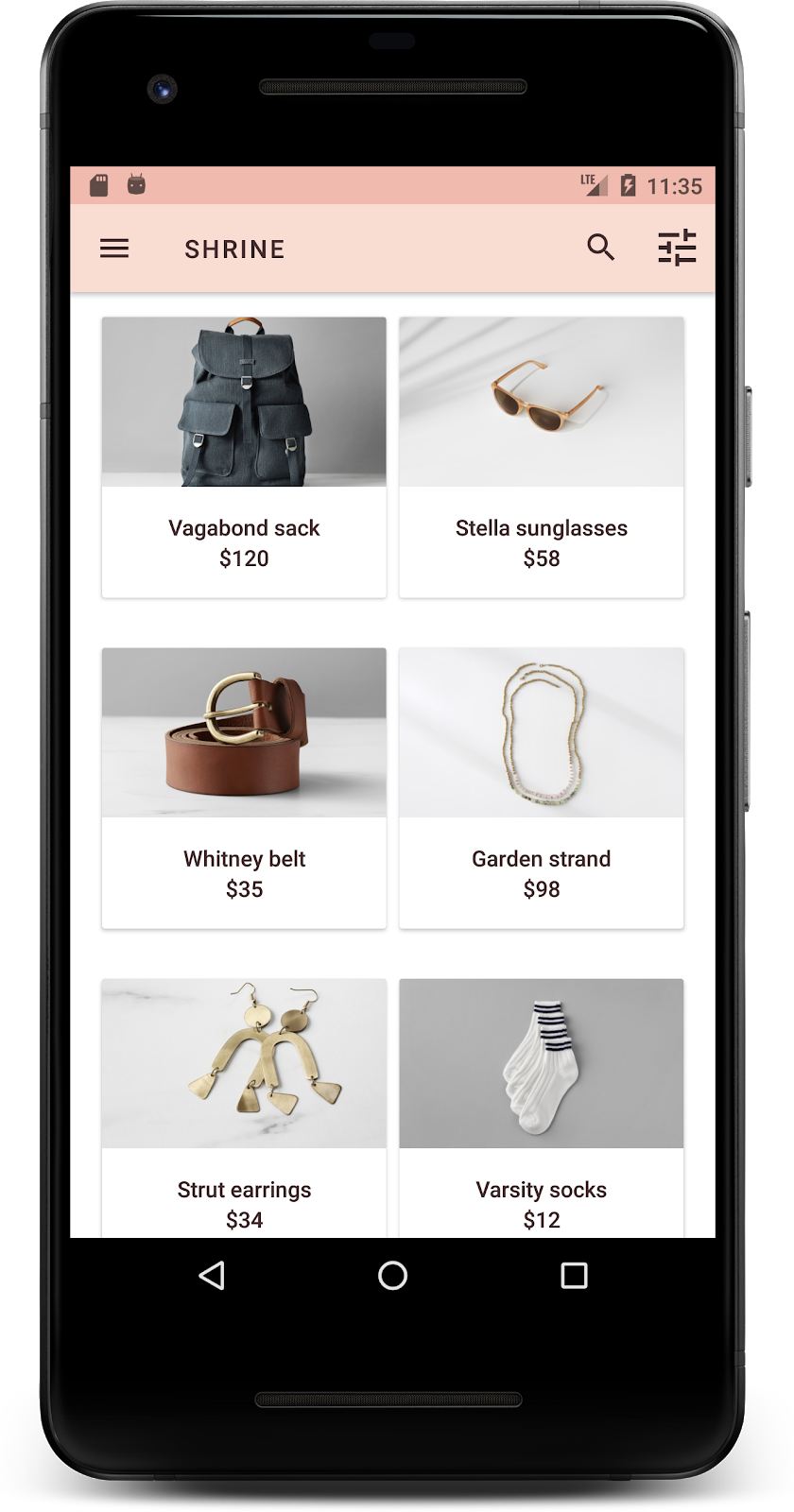
מבצעים build והרצה. רשת המוצרים שלכם אמורה להיראות כך:
נשנה את הסגנון של מסך הכניסה כך שיתאים לערכת הצבעים שלנו.
עיצוב שדות הטקסט
נשנה את שדות הזנת הטקסט בדף הכניסה כך שיוצגו עם קו מתאר, ונשתמש בצבעים טובים יותר לפריסה.
מוסיפים את משאב הצבע הבא לקובץ colors.xml:
colors.xml
<color name="textInputOutlineColor">#FBB8AC</color>
מוסיפים שני סגנונות חדשים בקובץ styles.xml:
styles.xml
<style name="Widget.Shrine.TextInputLayout" parent="Widget.MaterialComponents.TextInputLayout.OutlinedBox">
   <item name="hintTextAppearance">@style/TextAppearance.Shrine.TextInputLayout.HintText</item>
   <item name="hintTextColor">@color/textColorPrimary</item>
   <item name="android:paddingBottom">8dp</item>
   <item name="boxStrokeColor">@color/textInputOutlineColor</item>
</style>

<style name="TextAppearance.Shrine.TextInputLayout.HintText" parent="TextAppearance.MaterialComponents.Subtitle2">
   <item name="android:textColor">?android:attr/textColorPrimary</item>
</style>
לבסוף, מגדירים את מאפיין הסגנון בשני רכיבי ה-XML TextInputLayout ב-shr_login_fragment.xml לסגנון החדש:
shr_login_fragment.xml
<com.google.android.material.textfield.TextInputLayout
   style="@style/Widget.Shrine.TextInputLayout"
   android:layout_width="match_parent"
   android:layout_height="wrap_content"
   android:hint="@string/shr_hint_username">

   <com.google.android.material.textfield.TextInputEditText
       android:layout_width="match_parent"
       android:layout_height="wrap_content"
       android:inputType="text"
       android:maxLines="1" />
</com.google.android.material.textfield.TextInputLayout>

<com.google.android.material.textfield.TextInputLayout
   android:id="@+id/password_text_input"
   style="@style/Widget.Shrine.TextInputLayout"
   android:layout_width="match_parent"
   android:layout_height="wrap_content"
   android:hint="@string/shr_hint_password"
   app:errorEnabled="true">

   <com.google.android.material.textfield.TextInputEditText
       android:id="@+id/password_edit_text"
       android:layout_width="match_parent"
       android:layout_height="wrap_content"
       android:inputType="textPassword" />
</com.google.android.material.textfield.TextInputLayout>
עיצוב הצבעים של הכפתורים
לבסוף, מעצבים את הצבעים של הלחצנים בדף הכניסה. מוסיפים את הסגנונות הבאים לקובץ styles.xml:
styles.xml
<style name="Widget.Shrine.Button" parent="Widget.MaterialComponents.Button">
   <item name="android:textColor">?android:attr/textColorPrimary</item>
   <item name="backgroundTint">?attr/colorPrimaryDark</item>
</style>

<style name="Widget.Shrine.Button.TextButton" parent="Widget.MaterialComponents.Button.TextButton">
   <item name="android:textColor">?android:attr/textColorPrimary</item>
</style>
הסגנון Widget.Shrine.Button הוא הרחבה של סגנון ברירת המחדל MaterialButton, והוא משנה את צבע הטקסט ואת גוון הרקע של הלחצן. Widget.Shrine.Button.TextButton extends from the default text MaterialButton style, and changes just the text color.
מגדירים את הסגנון Widget.Shrine.Button ללחצן 'הבא' ואת הסגנון Widget.Shrine.Button.TextButton ללחצן 'ביטול' באופן הבא:
shr_login_fragment.xml
<RelativeLayout
   android:layout_width="match_parent"
   android:layout_height="wrap_content">

   <com.google.android.material.button.MaterialButton
       android:id="@+id/next_button"
       style="@style/Widget.Shrine.Button"
       android:layout_width="wrap_content"
       android:layout_height="wrap_content"
       android:layout_alignParentEnd="true"
       android:layout_alignParentRight="true"
       android:text="@string/shr_button_next" />

   <com.google.android.material.button.MaterialButton
       android:id="@+id/cancel_button"
       style="@style/Widget.Shrine.Button.TextButton"
       android:layout_width="wrap_content"
       android:layout_height="wrap_content"
       android:layout_marginEnd="12dp"
       android:layout_marginRight="12dp"
       android:layout_toStartOf="@id/next_button"
       android:layout_toLeftOf="@id/next_button"
       android:text="@string/shr_button_cancel" />

</RelativeLayout>
עדכון הצבע של הלוגו של Shrine בדף הכניסה. לשם כך צריך לבצע שינוי קטן בפריט הגרפי הווקטורי שניתן לשרטוט, shr_logo.xml. פותחים את קובץ ה-drawable ומשנים את המאפיין android:fillAlpha ל-1. הפריט הגרפי שניתן להזזה אמור להיראות כך:
shr_logo.xml
<vector xmlns:android="http://schemas.android.com/apk/res/android"
   android:width="149dp"
   android:height="152dp"
   android:tint="?attr/colorControlNormal"
   android:viewportWidth="149"
   android:viewportHeight="152">
   <path
       android:fillAlpha="1"
       android:fillColor="#DADCE0"
       android:fillType="evenOdd"
       android:pathData="M42.262,0L0,38.653L74.489,151.994L148.977,38.653L106.723,0M46.568,11.11L21.554,33.998L99.007,33.998L99.007,11.11L46.568,11.11ZM110.125,18.174L110.125,33.998L127.416,33.998L110.125,18.174ZM80.048,45.116L80.048,123.296L131.426,45.116L80.048,45.116ZM17.551,45.116L33.976,70.101L68.93,70.101L68.93,45.116L17.551,45.116ZM41.284,81.219L68.93,123.296L68.93,81.219L41.284,81.219Z"
       android:strokeWidth="1"
       android:strokeAlpha="0.4"
       android:strokeColor="#00000000" />
</vector>
לאחר מכן, מגדירים את המאפיין android:tint בלוגו <ImageView> ב-shr_login_fragment.xml לערך ?android:attr/textColorPrimary, באופן הבא:
shr_login_fragment.xml
<ImageView
   android:layout_width="64dp"
   android:layout_height="64dp"
   android:layout_gravity="center_horizontal"
   android:layout_marginTop="48dp"
   android:layout_marginBottom="16dp"
   android:tint="?android:attr/textColorPrimary"
   app:srcCompat="@drawable/shr_logo" />
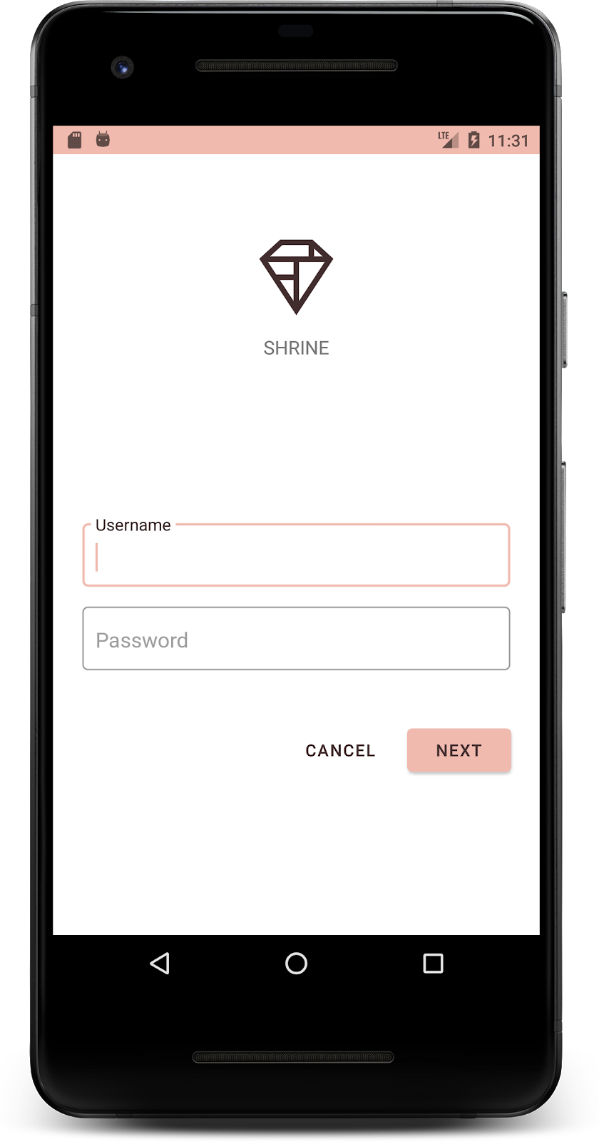
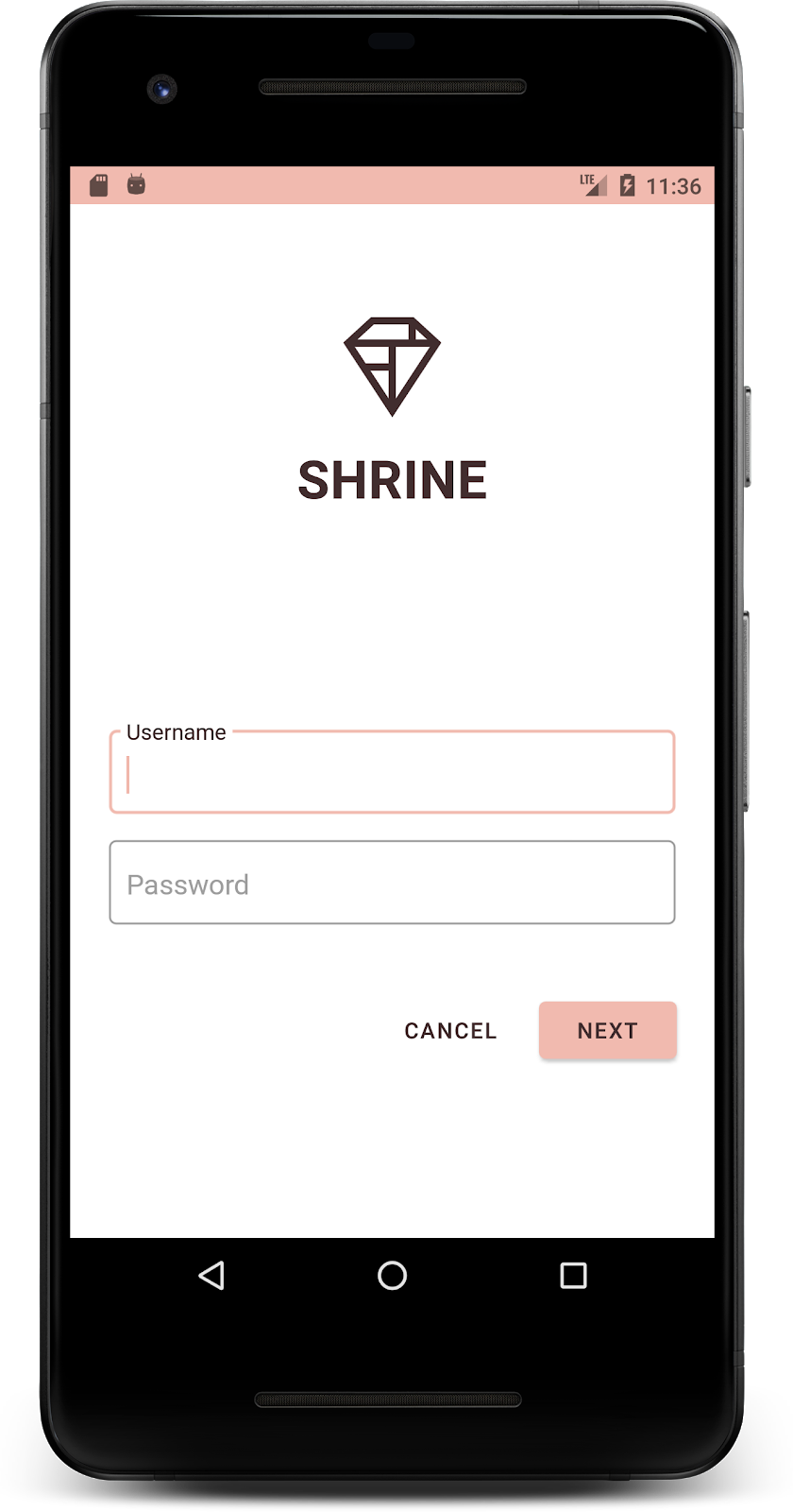
מבצעים build והרצה. מסך הכניסה שלכם אמור להיראות כך:
4. שינוי סגנונות של טיפוגרפיה ותוויות
בנוסף לשינויים בצבעים, המעצב שלכם נתן לכם גם טיפוגרפיה ספציפית לשימוש באתר. בואו נוסיף את זה גם לסרגל האפליקציות העליון.
הגדרת סגנון לסרגל האפליקציות העליון
מעצבים את המראה של הטקסט בסרגל האפליקציות העליון כך שיתאים למפרט שסיפק המעצב. מוסיפים את סגנון מראה הטקסט הבא ל-styles.xml, ומגדירים את המאפיין titleTextAppearance כך שיפנה לסגנון הזה בסגנון Widget.Shrine.Toolbar.
styles.xml
<style name="Widget.Shrine.Toolbar" parent="Widget.AppCompat.Toolbar">
   <item name="android:background">?attr/colorAccent</item>
   <item name="android:theme">@style/Theme.Shrine</item>
   <item name="popupTheme">@style/ThemeOverlay.AppCompat.Light</item>
   <item name="titleTextAppearance">@style/TextAppearance.Shrine.Toolbar</item>
</style>

<style name="TextAppearance.Shrine.Toolbar" parent="TextAppearance.MaterialComponents.Button">
   <item name="android:textSize">16sp</item>
</style>
התגים colors.xml ו-styles.xml אמורים להיראות כך:
colors.xml
<?xml version="1.0" encoding="utf-8"?>
<resources>
   <color name="colorPrimary">#E0E0E0</color>
   <color name="colorPrimaryDark">#FBB8AC</color>
   <color name="colorAccent">#FEDBD0</color>
   <color name="textColorPrimary">#442C2E</color>
   <color name="toolbarIconColor">@color/textColorPrimary</color>
   <color name="loginPageBackgroundColor">#FFFFFF</color>
   <color name="productGridBackgroundColor">#FFFFFF</color>
   <color name="textInputOutlineColor">#FBB8AC</color>
</resources>
styles.xml
<resources xmlns:android="http://schemas.android.com/tools">

   <!-- Base application theme. -->
   <style name="Theme.Shrine" parent="Theme.MaterialComponents.Light.NoActionBar">
       <!-- Customize your theme here. -->
       <item name="colorPrimary">@color/colorPrimary</item>
       <item name="colorPrimaryDark">@color/colorPrimaryDark</item>
       <item name="colorAccent">@color/colorAccent</item>
       <item name="android:windowLightStatusBar" tools:targetApi="m">true</item>
       <item name="android:textColorPrimary">@color/textColorPrimary</item>
   </style>

   <style name="Widget.Shrine.TextInputLayout" parent="Widget.MaterialComponents.TextInputLayout.OutlinedBox">
       <item name="hintTextAppearance">@style/TextAppearance.Shrine.TextInputLayout.HintText</item>
       <item name="hintTextColor">@color/textColorPrimary</item>
       <item name="android:paddingBottom">8dp</item>
       <item name="boxStrokeColor">@color/textInputOutlineColor</item>
   </style>

   <style name="TextAppearance.Shrine.TextInputLayout.HintText" parent="TextAppearance.MaterialComponents.Subtitle2">
       <item name="android:textColor">?android:attr/textColorPrimary</item>
   </style>

   <style name="Widget.Shrine.Button" parent="Widget.MaterialComponents.Button">
       <item name="android:textColor">?android:attr/textColorPrimary</item>
       <item name="backgroundTint">?attr/colorPrimaryDark</item>
   </style>

   <style name="Widget.Shrine.Button.TextButton" parent="Widget.MaterialComponents.Button.TextButton">
       <item name="android:textColor">?android:attr/textColorPrimary</item>
   </style>

   <style name="Widget.Shrine.Toolbar" parent="Widget.AppCompat.Toolbar">
       <item name="android:background">?attr/colorAccent</item>
       <item name="android:theme">@style/Theme.Shrine</item>
       <item name="popupTheme">@style/ThemeOverlay.AppCompat.Light</item>
       <item name="titleTextAppearance">@style/TextAppearance.Shrine.Toolbar</item>
   </style>

   <style name="TextAppearance.Shrine.Toolbar" parent="TextAppearance.MaterialComponents.Button">
       <item name="android:textSize">16sp</item>
   </style>

</resources>
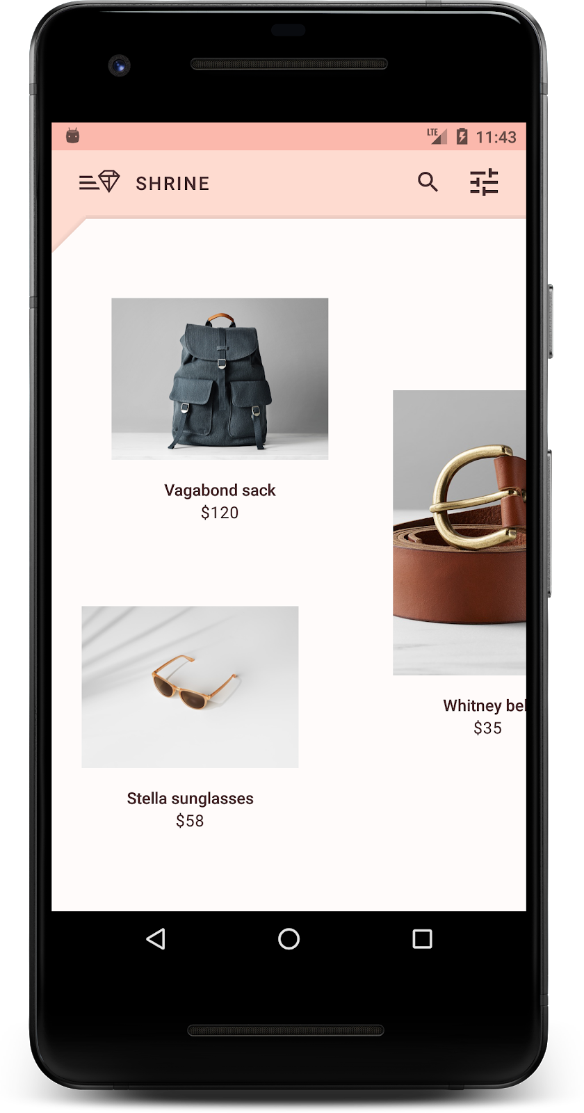
עיצוב התוויות
אנחנו נסדר את תוויות כרטיסי המוצרים כך שהטקסט ייראה כמו שצריך, ושהתוויות יהיו מיושרות למרכז הכרטיס לרוחב.
מעדכנים את הטיפוגרפיה של תווית הכותרת מ-textAppearanceHeadline6 ל-textAppearanceSubtitle2 באופן הבא:
shr_product_card.xml
<TextView
   android:id="@+id/product_title"
   android:layout_width="match_parent"
   android:layout_height="wrap_content"
   android:text="@string/shr_product_title"
   android:textAppearance="?attr/textAppearanceSubtitle2" />
כדי למרכז את תוויות התמונות, משנים את התוויות <TextView>s ב- shr_product_card.xml כדי להגדיר את המאפיין android:textAlignment="center":
shr_product_card.xml
<LinearLayout
   android:layout_width="match_parent"
   android:layout_height="wrap_content"
   android:orientation="vertical"
   android:padding="16dp">

   <TextView
       android:id="@+id/product_title"
       android:layout_width="match_parent"
       android:layout_height="wrap_content"
       android:text="@string/shr_product_title"
       android:textAlignment="center"
       android:textAppearance="?attr/textAppearanceSubtitle2" />

   <TextView
       android:id="@+id/product_price"
       android:layout_width="match_parent"
       android:layout_height="wrap_content"
       android:text="@string/shr_product_description"
       android:textAlignment="center"
       android:textAppearance="?attr/textAppearanceBody2" />
</LinearLayout>
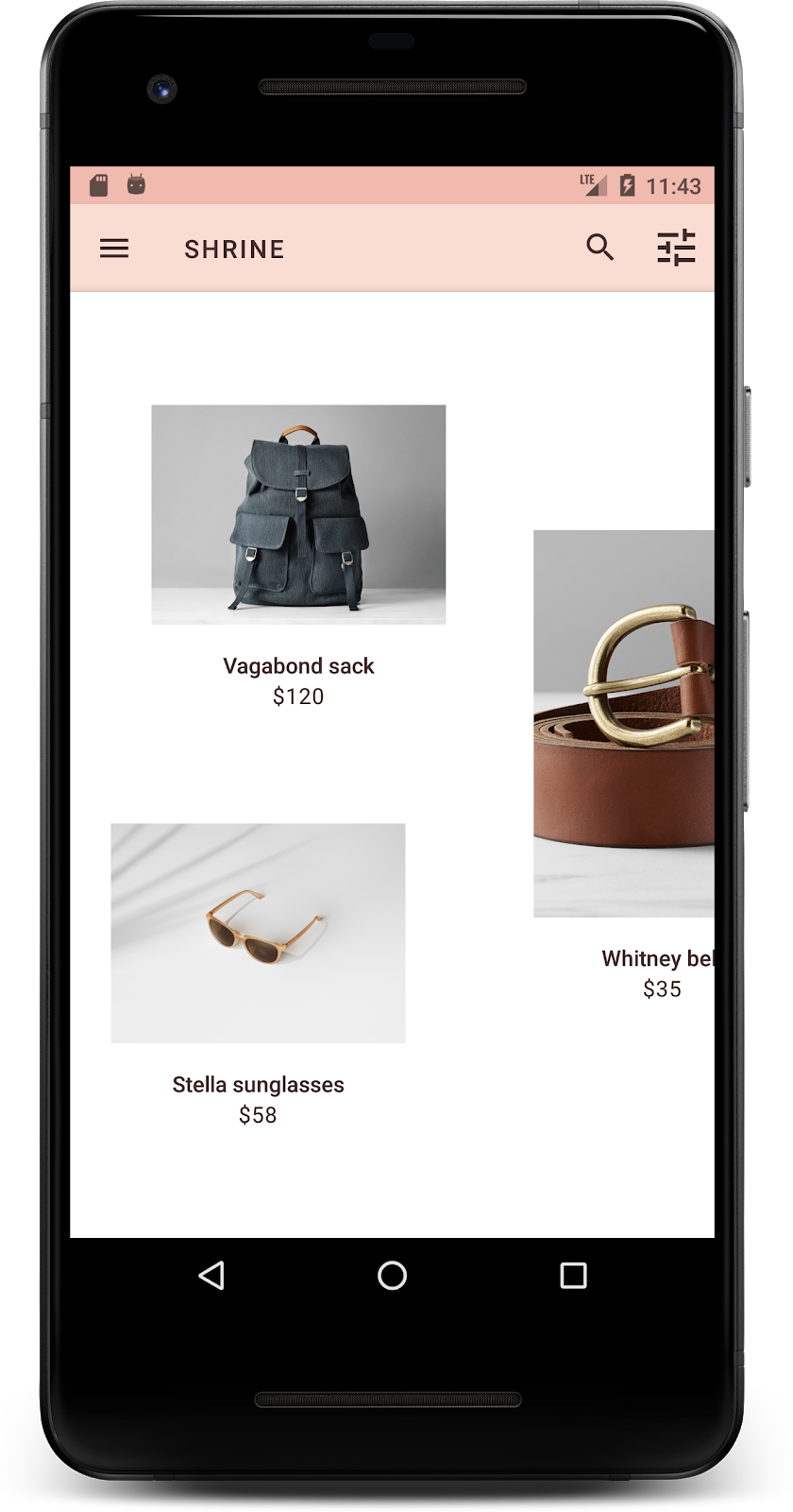
מבצעים build והרצה. מסך רשת המוצרים אמור להיראות כך:
בואו נשנה את הטיפוגרפיה של מסך הכניסה כך שתתאים.
שינוי הגופן במסך הכניסה
ב-styles.xml, מוסיפים את הסגנון הבא:
styles.xml
<style name="TextAppearance.Shrine.Title" parent="TextAppearance.MaterialComponents.Headline4">
   <item name="textAllCaps">true</item>
   <item name="android:textStyle">bold</item>
   <item name="android:textColor">?android:attr/textColorPrimary</item>
</style>
ב-shr_login_fragment.xml, מגדירים את הסגנון החדש לכותרת <TextView> 'SHRINE' (ומוחקים את המאפיינים textAllCaps ו-textSize שמופיעים שם):
shr_login_fragment.xml
<TextView
   android:layout_width="wrap_content"
   android:layout_height="wrap_content"
   android:layout_gravity="center_horizontal"
   android:layout_marginBottom="132dp"
   android:text="@string/shr_app_name"
   android:textAppearance="@style/TextAppearance.Shrine.Title" />
מבצעים build והרצה. מסך הכניסה שלכם אמור להיראות כך:
5. שינוי הגובה
אחרי שעיצבתם את הדף עם צבע וטיפוגרפיה ספציפיים שמתאימים ל-Shrine, בואו נסתכל על הכרטיסים שבהם מוצגים המוצרים של Shrine. כרגע, הן מוצבות על משטח לבן מתחת לניווט באפליקציה. כדי למשוך תשומת לב למוצרים, נדגיש אותם יותר.
שינוי הגובה של רשת המוצרים
כדי שהתוכן ייראה כאילו הוא נמצא בגיליון שצף מעל סרגל האפליקציות העליון, משנים את הגבהים של סרגל האפליקציות העליון. מוסיפים את המאפיין app:elevation לרכיבי ה-XML של AppBarLayout ואת המאפיין android:elevation לרכיבי ה-XML של NestedScrollView ב-shr_product_grid_fragment.xml באופן הבא:
shr_product_grid_fragment.xml
<com.google.android.material.appbar.AppBarLayout
   android:layout_width="match_parent"
   android:layout_height="wrap_content"
   app:elevation="0dp">

   <androidx.appcompat.widget.Toolbar
       android:id="@+id/app_bar"
       style="@style/Widget.Shrine.Toolbar"
       android:layout_width="match_parent"
       android:layout_height="?attr/actionBarSize"
       app:navigationIcon="@drawable/shr_menu"
       app:title="@string/shr_app_name" />
</com.google.android.material.appbar.AppBarLayout>

<androidx.core.widget.NestedScrollView
   android:layout_width="match_parent"
   android:layout_height="match_parent"
   android:layout_marginTop="56dp"
   android:background="@color/productGridBackgroundColor"
   android:elevation="8dp"
   android:paddingStart="@dimen/shr_product_grid_spacing"
   android:paddingEnd="@dimen/shr_product_grid_spacing"
   app:layout_behavior="@string/appbar_scrolling_view_behavior">

   <androidx.recyclerview.widget.RecyclerView
       android:id="@+id/recycler_view"
       android:layout_width="match_parent"
       android:layout_height="match_parent" />

</androidx.core.widget.NestedScrollView>
שינוי הגובה של הכרטיס (והצבע)
משנים את הגובה של כל כרטיס על ידי שינוי הערך app:cardElevation ב-shr_product_card.xml מ-2dp ל-0dp. צריך לשנות גם את הערך של app:cardBackgroundColor ל-@android:color/transparent.
shr_product_card.xml
<com.google.android.material.card.MaterialCardView xmlns:android="http://schemas.android.com/apk/res/android"
   xmlns:app="http://schemas.android.com/apk/res-auto"
   android:layout_width="match_parent"
   android:layout_height="wrap_content"
   app:cardBackgroundColor="@android:color/transparent"
   app:cardElevation="0dp"
   app:cardPreventCornerOverlap="true">
כדאי לנסות! שיניתם את הגובה של כל כרטיס בדף רשת המוצרים.

שינוי הגובה של הלחצן 'הבא'
ב-styles.xml, מוסיפים את המאפיין הבא לסגנון Widget.Shrine.Button:
styles.xml
<item name="android:stateListAnimator" tools:ignore="NewApi">
    @animator/shr_next_button_state_list_anim
</item>
הגדרת android:stateListAnimator בסגנון של Button מגדירה את הלחצן 'הבא' לשימוש באנימטור שסיפקנו.
מבצעים build והרצה. מסך הכניסה שלכם אמור להיראות כך:

6. איך משנים את הפריסה
נשנה את הפריסה כדי להציג את הכרטיסים ביחסי גובה-רוחב ובגדלים שונים, כך שכל כרטיס ייראה שונה מהאחרים.
שימוש במתאם RecyclerView מדורג
סיפקנו לכם מתאם RecyclerView חדש בחבילה staggeredgridlayout, שמציג פריסת כרטיסים מדורגת אסימטרית, שנועדה לגלילה אופקית. אתם יכולים לעיין בקוד הזה בעצמכם, אבל אנחנו לא נסביר כאן איך הוא מיושם.
כדי להשתמש במתאם החדש הזה, צריך לשנות את השיטה onCreateView() ב-ProductGridFragment.kt. מחליפים את בלוק הקוד אחרי ההערה set up the RecyclerView בקוד הבא:
ProductGridFragment.kt
// Set up the RecyclerView
view.recycler_view.setHasFixedSize(true)
val gridLayoutManager = GridLayoutManager(context, 2, RecyclerView.HORIZONTAL, false)
gridLayoutManager.spanSizeLookup = object : GridLayoutManager.SpanSizeLookup() {
   override fun getSpanSize(position: Int): Int {
       return if (position % 3 == 2) 2 else 1
   }
}
view.recycler_view.layoutManager = gridLayoutManager
val adapter = StaggeredProductCardRecyclerViewAdapter(
       ProductEntry.initProductEntryList(resources))
view.recycler_view.adapter = adapter
val largePadding = resources.getDimensionPixelSize(R.dimen.shr_staggered_product_grid_spacing_large)
val smallPadding = resources.getDimensionPixelSize(R.dimen.shr_staggered_product_grid_spacing_small)
view.recycler_view.addItemDecoration(ProductGridItemDecoration(largePadding, smallPadding))
בנוסף, נצטרך לבצע שינוי קטן ב-shr_product_grid_fragment.xml כדי להסיר את המרווחים הפנימיים מ-NestedScrollView, באופן הבא:
shr_product_grid_fragment.xml
<androidx.core.widget.NestedScrollView
   android:layout_width="match_parent"
   android:layout_height="match_parent"
   android:layout_marginTop="56dp"
   android:background="@color/productGridBackgroundColor"
   app:layout_behavior="@string/appbar_scrolling_view_behavior"
   android:elevation="6dp">
בסיום, נשנה גם את הריווח הפנימי של הכרטיס בתוך RecyclerView על ידי שינוי ProductGridItemDecoration.kt. כדי לשנות את אמצעי התשלום getItemOffsets() של ProductGridItemDecoration.kt:
ProductGridItemDecoration.kt
override fun getItemOffsets(outRect: Rect, view: View,
                           parent: RecyclerView, state: RecyclerView.State?) {
   outRect.left = smallPadding
   outRect.right = largePadding
}
מבצעים build והרצה. פריטי רשת המוצרים צריכים להיות עכשיו מדורגים:
7. אני רוצה לנסות נושא אחר
הצבע הוא דרך יעילה לבטא את המותג, ושינוי קטן בצבע יכול להשפיע מאוד על חוויית המשתמש. כדי לבדוק את זה, נראה איך אפליקציית Shrine תיראה אם ערכת הצבעים של המותג תהיה שונה לגמרי.
שינוי סגנונות וצבעים
ב-styles.xml, מוסיפים את העיצוב החדש הבא:
styles.xml
<style name="Theme.Shrine.Autumn" parent="Theme.Shrine">
   <item name="colorPrimary">#FFCF44</item>
   <item name="colorPrimaryDark">#FD9725</item>
   <item name="colorAccent">#FD9725</item>
   <item name="colorOnPrimary">#FFFFFF</item>
   <item name="colorError">#FD9725</item>
</style>
וב-AndroidManifest.xml, משתמשים בעיצוב החדש הזה באפליקציה:
AndroidManifest.xml
<application
   android:allowBackup="true"
   android:icon="@mipmap/ic_launcher"
   android:label="@string/shr_app_name"
   android:roundIcon="@mipmap/ic_launcher_round"
   android:supportsRtl="true"
  android:name="com.google.codelabs.mdc.kotlin.shrine.application.ShrineApplication"
   android:theme="@style/Theme.Shrine.Autumn">
   <activity android:name=".MainActivity">
       <intent-filter>
           <action android:name="android.intent.action.MAIN" />

           <category android:name="android.intent.category.LAUNCHER" />
       </intent-filter>
   </activity>
</application>
משנים את הצבע של סמל סרגל הכלים ב-colors.xml כמו שמוצג בהמשך:
colors.xml
<color name="toolbarIconColor">#FFFFFF</color>
לאחר מכן, מגדירים את המאפיין android:theme של סגנון סרגל הכלים כך שיפנה לנושא הנוכחי באמצעות המאפיין ?theme, במקום להגדיר אותו בהארדקוד:
styles.xml
<style name="Widget.Shrine.Toolbar" parent="Widget.AppCompat.Toolbar">
   <item name="android:background">?attr/colorAccent</item>
   <item name="android:theme">?theme</item>
   <item name="popupTheme">@style/ThemeOverlay.AppCompat.Light</item>
   <item name="titleTextAppearance">@style/TextAppearance.Shrine.Toolbar</item>
</style>
לאחר מכן, בהיר יותר לצבע של טקסט ההנחיה בשדות הטקסט במסך הכניסה. מוסיפים את המאפיין android:textColorHint לסגנון של שדות הטקסט:
styles.xml
<style name="Widget.Shrine.TextInputLayout" parent="Widget.MaterialComponents.TextInputLayout.OutlinedBox">
   <item name="hintTextAppearance">
@style/TextAppearance.Shrine.TextInputLayout.HintText
</item>
   <item name="android:paddingBottom">8dp</item>
   <item name="android:textColorHint">?attr/colorPrimaryDark</item>
</style>
מבצעים build והרצה. העיצוב החדש אמור להופיע עכשיו בתצוגה המקדימה.


לפני שעוברים אל MDC-104, צריך לבטל את השינויים בקוד שבוצעו בקטע הזה.
8. Recap
עד עכשיו יצרתם אפליקציה שדומה למפרט העיצוב של המעצב.
השלבים הבאים
השתמשת ברכיבי MDC הבאים: theme, typography ו-elevation. אפשר לעיין ברכיבים ובמערכות משנה נוספים ב[ספריית MDC Web].
מה קורה אם עיצוב האפליקציה המתוכנן מכיל רכיבים שלא קיימים בספריית MDC? ב-MDC-104: רכיבים מתקדמים של Material Design, נסביר איך ליצור רכיבים בהתאמה אישית באמצעות ספריית MDC כדי להשיג מראה ספציפי.