1. Introduction
Material Components (MDC) help developers implement Material Design. Created by a team of engineers and UX designers at Google, MDC features dozens of beautiful and functional UI components and is available for Android, iOS, web and Flutter.material.io/develop |
In codelab MDC-103, you customized the color, elevation, and typography, of Material Components (MDC) to style your app.
A component in the Material Design system performs a set of predefined tasks and has certain characteristics, like a button. However, a button is more than just a way for a user to perform an action, it's also a visual expression of shape, size, and color that lets the user know that it's interactive, and that something will happen upon touch or click.
The Material Design guidelines describe components from a designer's point of view. They describe a wide range of basic functions available across platforms, as well as the anatomic elements that make up each component. For instance, a backdrop contains a back layer and its content, the front layer and its content, motion rules, and display options. Each of these components can be customized for each app's needs, use cases, and content. These pieces are, for the most part, traditional views, controls, and functions from your platform's SDK.
While the Material Design guidelines name many components, not all of them are good candidates for reusable code and therefore aren't found in MDC. You can create these experiences yourself to achieve a customized style for your app, all using traditional code.
What you'll build
In this codelab, you'll add a backdrop to Shrine. It will filter the products shown in the asymmetrical grid by category. You'll be using:
- Shape
- Motion
- Traditional Android SDK classes

MDC-Android components in this codelab
- Shape
What you'll need
- Basic knowledge of Android development
- Android Studio (download it here if you don't already have it)
- An Android emulator or device (available through Android Studio)
- The sample code (see next step)
How would you rate your level of experience building Android apps?
2. Set up your development environment
Continuing from MDC-103?
If you completed MDC-103, your code should be ready for this codelab. Skip to step 3.
Starting from scratch?
Download the starter codelab app
The starter app is located in the material-components-android-codelabs-104-starter/java directory. Be sure to cd into that directory before beginning.
...or clone it from GitHub
To clone this codelab from GitHub, run the following commands:
git clone https://github.com/material-components/material-components-android-codelabs
cd material-components-android-codelabs/
git checkout 104-starter
Load the starter code in Android Studio
- Once the setup wizard finishes and the Welcome to Android Studio window is shown, click Open an existing Android Studio project. Navigate to the directory where you had installed the sample code, and select java -> shrine (or search your computer for shrine) to open the Shrine project.
- Wait a moment for Android Studio to build and sync the project, as shown by activity indicators along the bottom of the Android Studio window.
- At this point, Android Studio might raise some build errors because you are missing the Android SDK or build tools, such as the one shown below. Follow the instructions in Android Studio to install/update these and sync your project.
Add project dependencies
The project needs a dependency on the MDC Android support library. The sample code you downloaded should already have this dependency listed, but it is good practice to do the following steps to make sure.
- Navigate to the
appmodule'sbuild.gradlefile and make sure that thedependenciesblock includes a dependency on MDC Android:
api 'com.google.android.material:material:1.1.0-alpha06'
- (Optional) If necessary, edit the
build.gradlefile to add the following dependencies and sync the project.
dependencies {
    api 'com.google.android.material:material:1.1.0-alpha06'
    implementation 'androidx.legacy:legacy-support-v4:1.0.0'
    implementation 'com.android.volley:volley:1.1.1'
    implementation 'com.google.code.gson:gson:2.8.5'
    implementation "org.jetbrains.kotlin:kotlin-stdlib-jdk7:1.3.21"
    testImplementation 'junit:junit:4.12'
    androidTestImplementation 'androidx.test:core:1.1.0'
    androidTestImplementation 'androidx.test.ext:junit:1.1.0'
    androidTestImplementation 'androidx.test:runner:1.2.0-alpha05'
    androidTestImplementation 'androidx.test.espresso:espresso-core:3.2.0-alpha05'
}
Run the starter app
|
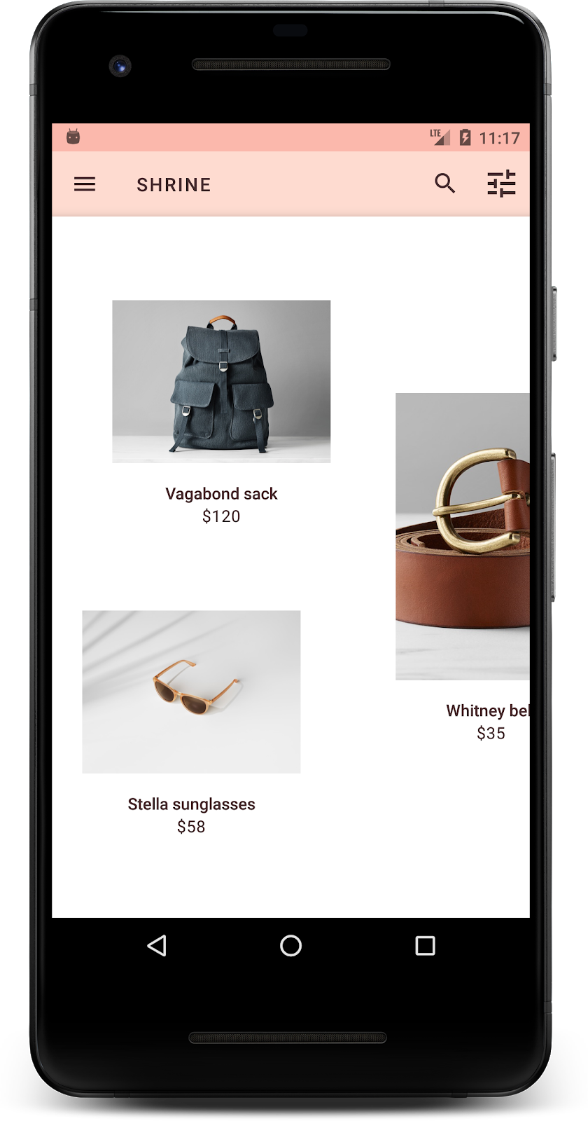
Success! You should see the Shrine app running on your device.
3. Add the backdrop menu
A backdrop is the furthest back surface of an app, appearing behind all other content and components. It's composed of two surfaces: a back layer (which displays actions and filters) and a front layer (which displays content). You can use a backdrop to display interactive information and actions, such as navigation or content filters.
Conceal the grid content
In shr_product_grid_fragment.xml, add the android:visibility="gone" attribute to your NestedScrollView to temporarily remove the product content:
shr_product_grid_fragment.xml
<androidx.core.widget.NestedScrollView
   android:layout_width="match_parent"
   android:layout_height="match_parent"
   android:layout_marginTop="56dp"
   android:background="@color/productGridBackgroundColor"
   android:elevation="8dp"
   android:visibility="gone"
   app:layout_behavior="@string/appbar_scrolling_view_behavior">
We'll install a backdrop in this region. To avoid showing a division between the top app bar and menu content that appears on the backdrop, we'll make the backdrop the same color as the top app bar.
In shr_product_grid_fragment.xml, add the following as the first element in your root FrameLayout, before the AppBarLayout:
shr_product_grid_fragment.xml
<LinearLayout
   style="@style/Widget.Shrine.Backdrop"
   android:layout_width="match_parent"
   android:layout_height="match_parent"
   android:gravity="center_horizontal"
   android:orientation="vertical"
   android:paddingTop="100dp"
   android:paddingBottom="100dp">

</LinearLayout>
In styles.xml, add the following:
styles.xml
<style name="Widget.Shrine.Backdrop" parent="">
   <item name="android:background">?attr/colorAccent</item>
</style>
Well done! You've added a beautiful backdrop to Shrine's UI. Next, we'll add a menu.
Add the menu
A menu is essentially a list of text buttons. We'll add one here.
Create a new layout called shr_backdrop.xml in your res -> layout directory, and add the following:
shr_backdrop.xml
<?xml version="1.0" encoding="utf-8"?>
<merge xmlns:android="http://schemas.android.com/apk/res/android">

   <com.google.android.material.button.MaterialButton
       style="@style/Widget.Shrine.Button.TextButton"
       android:layout_width="wrap_content"
       android:layout_height="wrap_content"
       android:text="@string/shr_featured_label" />

   <com.google.android.material.button.MaterialButton
       style="@style/Widget.Shrine.Button.TextButton"
       android:layout_width="wrap_content"
       android:layout_height="wrap_content"
       android:text="@string/shr_apartment_label" />

   <com.google.android.material.button.MaterialButton
       style="@style/Widget.Shrine.Button.TextButton"
       android:layout_width="wrap_content"
       android:layout_height="wrap_content"
       android:text="@string/shr_accessories_label" />

   <com.google.android.material.button.MaterialButton
       style="@style/Widget.Shrine.Button.TextButton"
       android:layout_width="wrap_content"
       android:layout_height="wrap_content"
       android:text="@string/shr_shoes_label" />

   <com.google.android.material.button.MaterialButton
       style="@style/Widget.Shrine.Button.TextButton"
       android:layout_width="wrap_content"
       android:layout_height="wrap_content"
       android:text="@string/shr_tops_label" />

   <com.google.android.material.button.MaterialButton
       style="@style/Widget.Shrine.Button.TextButton"
       android:layout_width="wrap_content"
       android:layout_height="wrap_content"
       android:text="@string/shr_bottoms_label" />

   <com.google.android.material.button.MaterialButton
       style="@style/Widget.Shrine.Button.TextButton"
       android:layout_width="wrap_content"
       android:layout_height="wrap_content"
       android:text="@string/shr_dresses_label" />

   <View
       android:layout_width="56dp"
       android:layout_height="1dp"
       android:layout_margin="16dp"
       android:background="?android:attr/textColorPrimary" />

   <com.google.android.material.button.MaterialButton
       style="@style/Widget.Shrine.Button.TextButton"
       android:layout_width="wrap_content"
       android:layout_height="wrap_content"
       android:text="@string/shr_account_label" />

</merge>
And add this list to the LinearLayout you just added in shr_product_grid_fragment.xml using an <include> tag:
shr_product_grid_fragment.xml
<LinearLayout
   style="@style/Widget.Shrine.Backdrop"
   android:layout_width="match_parent"
   android:layout_height="match_parent"
   android:gravity="center_horizontal"
   android:orientation="vertical"
   android:paddingTop="88dp">

   <include layout="@layout/shr_backdrop" />
</LinearLayout>
Build and run. Your home screen should look like this:
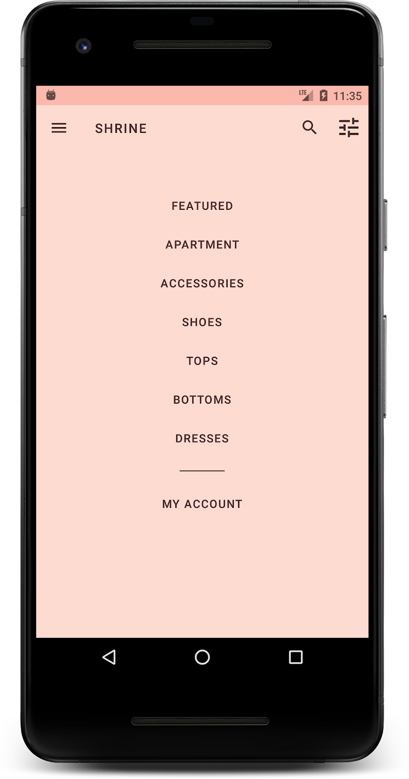
Your backdrop is done. Let's bring back the content that we concealed earlier.
4. Add a shape
Before we made any changes to Shrine in this codelab, its primary product content was located on the furthest back surface. By adding a backdrop, this content is now more emphasized because it appears in front of that backdrop.
Add a new layer
We should show the product grid layer again. Remove the android:visibility="gone" attribute from your NestedScrollView:
shr_product_grid_fragment.xml
<androidx.core.widget.NestedScrollView
   android:layout_width="match_parent"
   android:layout_height="match_parent"
   android:layout_marginTop="56dp"
   android:background="@color/productGridBackgroundColor"
   android:elevation="8dp"
   app:layout_behavior="@string/appbar_scrolling_view_behavior">
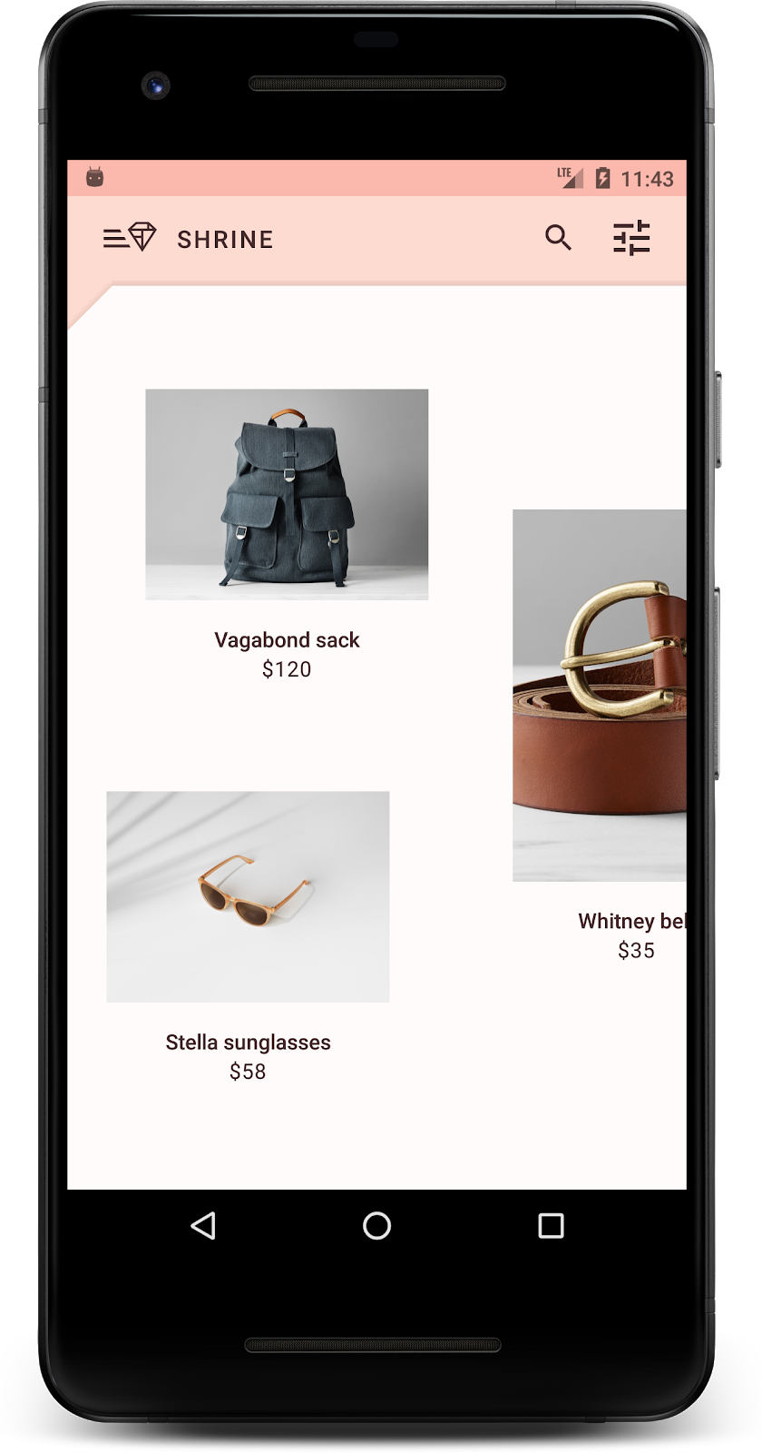
Let's style the front layer with a notch in the upper left corner. Material Design refers to this type of customization as a shape. Material surfaces can be displayed in different shapes. Shapes add emphasis and style to surfaces and can be used to express branding. Material shapes can have curved or angled corners and edges, and any number of sides. They can be symmetrical or irregular.
Add a shape
Modify the shape of the grid. We've provided a custom shape background, but the shape only displays correctly on Android Marshmallow and above. We can set the shr_product_grid_background_shape background on your NestedScrollView for only Android Marshmallow and above. First, add an id to your NestedScrollView so we can reference it in code, as follows:
shr_product_grid_fragment.xml
<androidx.core.widget.NestedScrollView
   android:id="@+id/product_grid"
   android:layout_width="match_parent"
   android:layout_height="match_parent"
   android:layout_marginTop="56dp"
   android:background="@color/productGridBackgroundColor"
   android:elevation="8dp"
   app:layout_behavior="@string/appbar_scrolling_view_behavior">
Then, set the background programmatically in ProductGridFragment.java. Add the following logic to set the background to the end of onCreateView(), just before the return statement:
ProductGridFragment.java
// Set cut corner background for API 23+
if (Build.VERSION.SDK_INT >= Build.VERSION_CODES.M) {
    view.findViewById(R.id.product_grid).setBackgroundResource(R.drawable.shr_product_grid_background_shape);
}
Finally, we will update the productGridBackgroundColor color resource (also used by the custom shape background) as follows:
colors.xml
<color name="productGridBackgroundColor">#FFFBFA</color>
Build and run:

We've given Shrine a custom styled shape to its primary surface. Because of the surface elevation, users can see that there is something just behind the front white layer. Let's add motion so that users can see what's there: the menu.
5. Add motion
Motion is a way to bring your app to life. Motion can be big and dramatic, subtle and minimal, or anywhere in between. The type of motion you use should be suitable to the situation. Motion that's applied to repeated regular actions should be small and subtle, so they don't take up too much time on a regular basis. Other situations, like the first time a user opens an app, can be more eye-catching, and can help educate the user about how to use your app.
Add reveal motion to the menu button
The motion is the shape in front moving straight down. We've already provided a click listener for you which will accomplish the translation animation for the sheet, in NavigationIconClickListener.java. We can set this click listener inside the setupToolbar() method of ProductGridFragment.java:
ProductGridFragment.java
toolbar.setNavigationOnClickListener(new NavigationIconClickListener(getContext(), view.findViewById(R.id.product_grid)));
Your setUpToolbar() method should now look as follows:
ProductGridFragment.java
private void setUpToolbar(View view) {
   Toolbar toolbar = view.findViewById(R.id.app_bar);
   AppCompatActivity activity = (AppCompatActivity) getActivity();
   if (activity != null) {
       activity.setSupportActionBar(toolbar);
   }

   toolbar.setNavigationOnClickListener(new NavigationIconClickListener(getContext(), view.findViewById(R.id.product_grid)));
}
Build and run. Press the menu button:
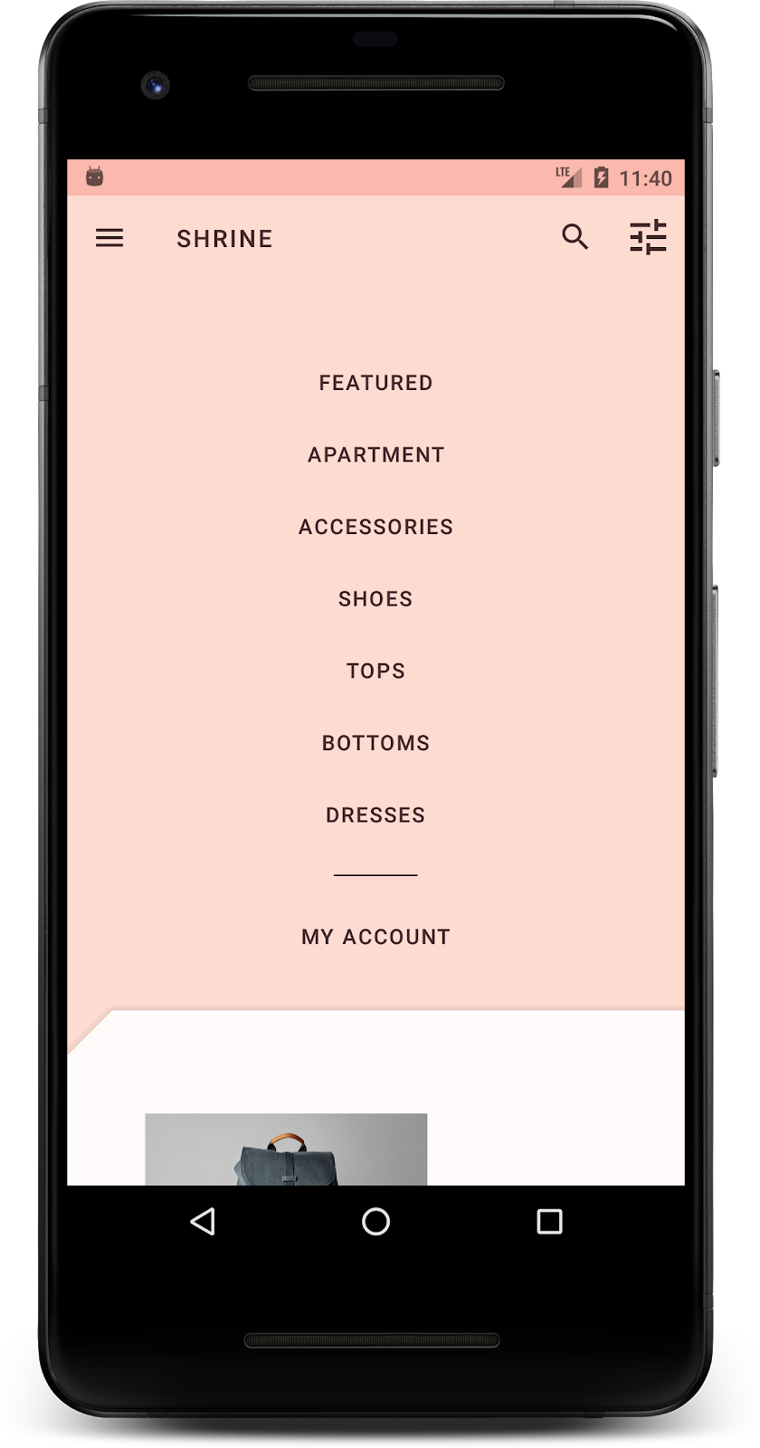
Pressing the navigation menu icon again should conceal the menu.
Tweak motion of front layer
Motion is a great way to express your brand. Let's see what the reveal animation looks like using a different timing curve.
Update your code in setupToolbar() in ProductGridFragment.java to pass an Interpolator to your navigation icon's click listener, as follows:
ProductGridFragment.java
private void setUpToolbar(View view) {
   Toolbar toolbar = view.findViewById(R.id.app_bar);
   AppCompatActivity activity = (AppCompatActivity) getActivity();
   if (activity != null) {
       activity.setSupportActionBar(toolbar);
   }

   toolbar.setNavigationOnClickListener(new NavigationIconClickListener(
           getContext(),
           view.findViewById(R.id.product_grid),
           new AccelerateDecelerateInterpolator()));
}
This creates a different effect, doesn't it?
6. Branded icon
Branded iconography extends to familiar icons too. Let's make the reveal icon custom and merge it with our title for a unique, branded look.
Change the menu button icon
Change the the menu button to display an icon that includes a diamond design. Update your Toolbar in shr_product_grid_fragment.xml to use a new branded icon we've provided (shr_branded_menu), and set the app:contentInsetStart and android:padding attributes to make the toolbar better match your designer's specifications:
shr_product_grid_fragment.xml
<androidx.appcompat.widget.Toolbar
   android:id="@+id/app_bar"
   style="@style/Widget.Shrine.Toolbar"
   android:layout_width="match_parent"
   android:layout_height="?attr/actionBarSize"
   android:paddingStart="12dp"
   android:paddingLeft="12dp"
   android:paddingEnd="12dp"
   android:paddingRight="12dp"
   app:contentInsetStart="0dp"
   app:navigationIcon="@drawable/shr_branded_menu"
   app:title="@string/shr_app_name" />
Update our click listener again in setupToolbar() in ProductGridFragment.java to take in drawables for the toolbar when the menu is open and when it is closed, as follows:
ProductGridFragment.java
private void setUpToolbar(View view) {
   Toolbar toolbar = view.findViewById(R.id.app_bar);
   AppCompatActivity activity = (AppCompatActivity) getActivity();
   if (activity != null) {
       activity.setSupportActionBar(toolbar);
   }

   toolbar.setNavigationOnClickListener(new NavigationIconClickListener(
           getContext(),
           view.findViewById(R.id.product_grid),
           new AccelerateDecelerateInterpolator(),
           getContext().getResources().getDrawable(R.drawable.shr_branded_menu), // Menu open icon
           getContext().getResources().getDrawable(R.drawable.shr_close_menu))); // Menu close icon
}
Build and run:


Nice! When the backdrop can be revealed, the diamond menu icon is displayed. When the menu can be concealed, a close icon is displayed instead.
7. Recap
Over the course of these four codelabs, you've seen how to use Material Components to build unique, elegant user experiences that express a brand's personality and style.
Next steps
This codelab, MDC-104, completes this sequence of codelabs. You can explore even more components in MDC-Android by visiting the Android Widgets Catalog.
For a further challenge with this codelab, modify your Shrine application to change the product images shown when a category is selected from the backdrop menu.
To learn how to connect this app up to Firebase for a working backend, see the Firebase Android Codelab.
