
1. Before you begin
This codelab is part of the Advanced Android in Kotlin course. You'll get the most value out of this course if you work through the codelabs in sequence, but it is not mandatory. All the course codelabs are listed on the Advanced Android in Kotlin codelabs landing page.
MotionLayout is a library that lets you add rich motion into your Android app. It's based upon ConstraintLayout, and lets you animate anything that you can build using ConstraintLayout.
You can use MotionLayout to animate the location, size, visibility, alpha, color, elevation, rotation, and other attributes of multiple views at the same time. Using declarative XML you can create coordinated animations, involving multiple views, that are difficult to achieve in code.
Animations are a great way to enhance an app experience. You can use animations to:
- Show changes—animating between states lets the user naturally track changes in your UI.
- Draw attention—use animations to draw attention to important UI elements.
- Build beautiful designs—effective motion in design makes apps look polished.
Prerequisites
This codelab has been designed for developers with some Android development experience. Before attempting to complete this codelab, you should:
- Know how to create an app with an activity, a basic layout, and run it on a device or emulator using Android Studio. Be familiar with
ConstraintLayout. Read through the Constraint Layout codelab to learn more aboutConstraintLayout.
What you'll do
- Define an animation with
ConstraintSetsandMotionLayout - Animate based on drag events
- Change the animation with
KeyPosition - Change attributes with
KeyAttribute - Run animations with code
- Animate collapsible headers with
MotionLayout
What you'll need
- Android Studio 4.0 (The
MotionLayouteditor only works with this version of Android Studio.)
2. Getting Started
To download the sample app, you can either:
... or clone the GitHub repository from the command line by using the following command:
$ git clone https://github.com/googlecodelabs/motionlayout.git
3. Creating animations with MotionLayout
First, you'll build an animation that moves a view from the top start of the screen to the bottom end in response to user clicks.
To create an animation from the starter code, you'll need the following major pieces:
- A
MotionLayout,which is a subclass ofConstraintLayout. You specify all the views to be animated inside theMotionLayouttag. - A
MotionScene,which is an XML file that describes an animation forMotionLayout. - A
Transition,which is part of theMotionScenethat specifies the animation duration, trigger, and how to move the views. - A
ConstraintSetthat specifies both the start and the end constraints of the transition.
Let's take a look at each of these in turn, starting with the MotionLayout.
Step 1: Explore the existing code
MotionLayout is a subclass of ConstraintLayout, so it supports all the same features while adding animation. To use MotionLayout, you add a MotionLayout view where you would use ConstraintLayout.
- In
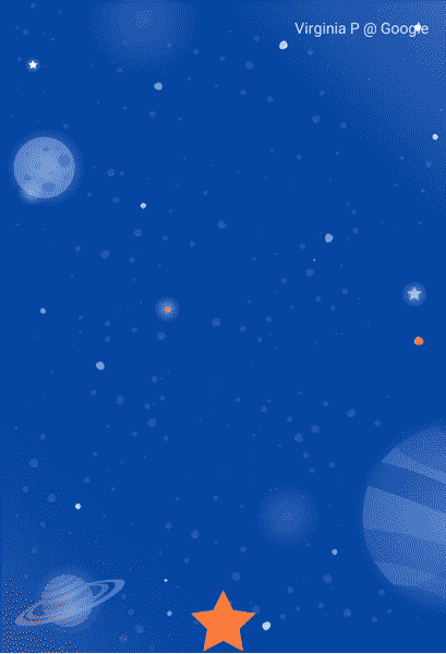
res/layout, openactivity_step1.xml.Here you have aConstraintLayoutwith a singleImageViewof a star, with a tint applied inside of it.
activity_step1.xml
<!-- initial code -->
<androidx.constraintlayout.widget.ConstraintLayout
       ...
       android:layout_width="match_parent"
       android:layout_height="match_parent"
       >

   <ImageView
           android:id="@+id/red_star"
           ...
   />

</androidx.constraintlayout.motion.widget.MotionLayout>
This ConstraintLayout does not have any constraints on it, so if you were to run the app now you would see the star display unconstrained, which means they would be positioned in an unknown location. Android Studio will give you a warning about the lack of constraints.
Step 2: Convert to Motion Layout
To animate using MotionLayout, you have to convert the ConstraintLayout to a MotionLayout.
For your layout to use a motion scene, it has to point at it.
- To do this, open the design surface. In Android Studio 4.0, you open the design surface by using the split or design icon at the top right when looking at a layout XML file.
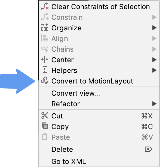
- Once you open the design surface, right click the preview and select Convert to MotionLayout.
This replaces the ConstraintLayout tag with a MotionLayout tag and adds a motion:layoutDescription to the MotionLayout tag that points to @xml/activity_step1_scene.
activity_step1**.xml**
<!-- explore motion:layoutDescription="@xml/activity_step1_scene" -->
<androidx.constraintlayout.motion.widget.MotionLayout
       ...
       motion:layoutDescription="@xml/activity_step1_scene">
A motion scene is a single XML file that describes an animation in a MotionLayout.
As soon as you convert to a MotionLayout, the design surface will display Motion Editor
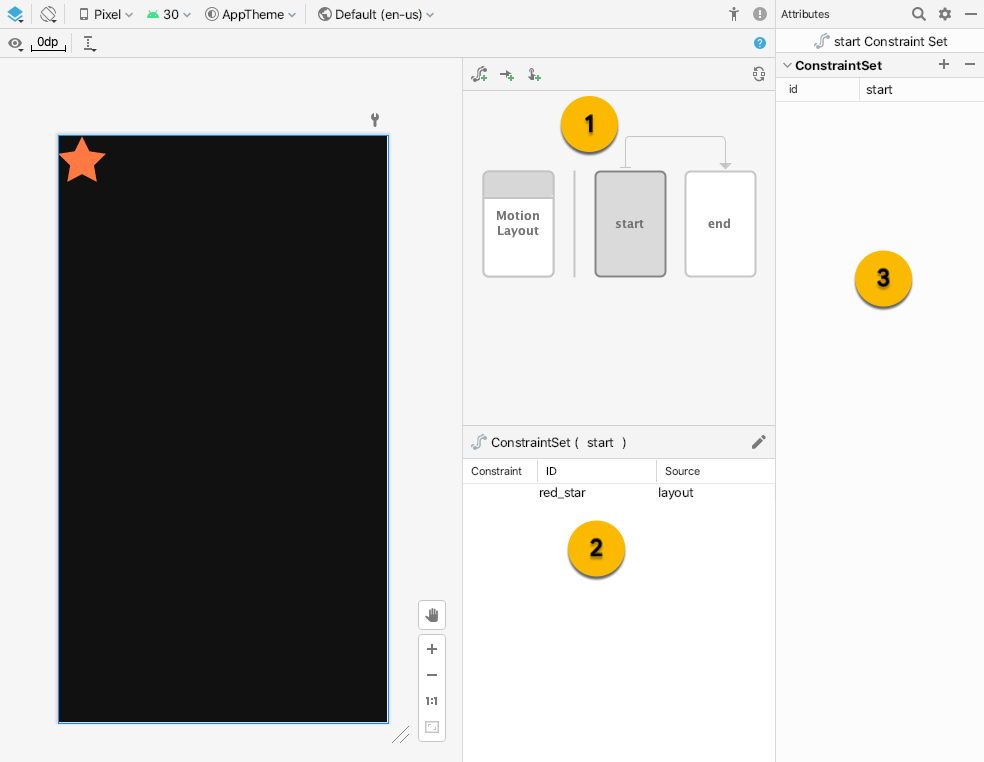
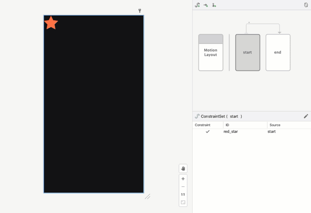
There are three new UI elements in the Motion Editor:
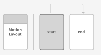
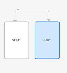
- Overview – This is a modal selection that allows you to select different parts of the animation. In this image the
startConstraintSetis selected. You can also select the transition betweenstartandendby clicking on the arrow between them. - Section – Below the overview is a section window that changes based on the currently selected overview item. In this image, the
startConstraintSetinformation is displayed in the selection window. - Attribute – The attribute panel shows and allows you to edit the attributes of the current selected item from either the overview or selection window. In this image, it's showing the attributes for the
startConstraintSet.
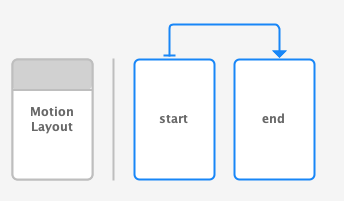
Step 3: Define start and end constraints
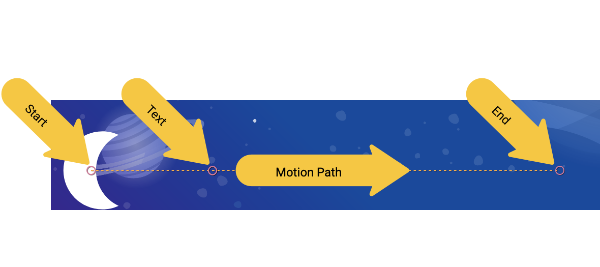
All animations can be defined in terms of a start and an end. The start describes what the screen looks like before the animation, and the end describes what the screen looks like after the animation has completed. MotionLayout is responsible for figuring out how to animate between the start and end state (over time).
MotionScene uses a ConstraintSet tag to define the start and end states. A ConstraintSet is what it sounds like, a set of constraints that can be applied to views. This includes width, height, and ConstraintLayout constraints. It also includes some attributes such as alpha. It doesn't contain the views themselves, just the constraints on those views.
Any constraints specified in a ConstraintSet will override the constraints specified in the layout file. If you define constraints in both the layout and the MotionScene, only the constraints in the MotionScene are applied.
In this step, you'll constrain the star view to begin at the top start of the screen, and finish at the bottom end of the screen.
You can complete this step either using the Motion Editor, or by editing the text of activity_step1_scene.xml directly.
- Select the
startConstraintSet in the overview panel
- In the selection panel, select
red_star. Currently it shows Source oflayout– this means it's not constrained in thisConstraintSet. Use the pencil icon in the upper right to Create Constraint
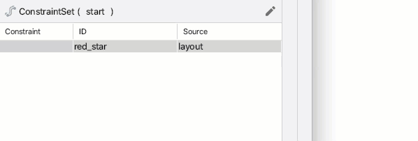
- Confirm that
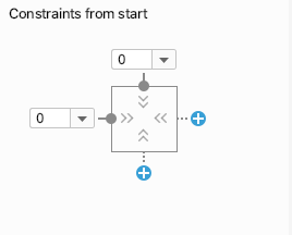
red_starshows a Source ofstartwhen thestartConstraintSetis selected in the overview panel. - In the Attributes panel, with
red_starselected in thestartConstraintSet, add a Constraint on the top and start by clicking on the blue + buttons.
- Open
xml/activity_step1_scene.xmlto see the code that Motion Editor generated for this constraint.
activity_step1_scene.xml
<!-- Constraints to apply at the start of the animation -->
<ConstraintSet android:id="@+id/start">
   <Constraint
           android:id="@+id/red_star"
           android:layout_width="wrap_content"
           android:layout_height="wrap_content"
           motion:layout_constraintStart_toStartOf="parent"
           motion:layout_constraintTop_toTopOf="parent" />
</ConstraintSet>
The ConstraintSet has an id of @id/start, and specifies all the constraints to apply to all the views in the MotionLayout. Since this MotionLayout only has one view, it only needs one Constraint.
The Constraint inside the ConstraintSet specifies the id of the view that it's constraining, @id/red_star defined in activity_step1.xml. It's important to note that Constraint tags specify only constraints and layout information. The Constraint tag doesn't know that it's being applied to an ImageView.
This constraint specifies the height, width, and the two other constraints needed to constrain the red_star view to the top start of its parent.
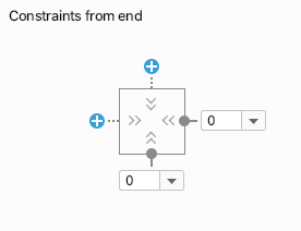
- Select the
endConstraintSet in the overview panel.
- Follow the same steps as you did before to add a
Constraintforred_starin theendConstraintSet. - To use Motion Editor to complete this step, add a constraint to the
bottomandendby clicking on the blue + buttons.
- The code in XML looks like this:
activitiy_step1_scene.xml
<!-- Constraints to apply at the end of the animation -->
<ConstraintSet android:id="@+id/end">
   <Constraint
           android:id="@+id/red_star"
           android:layout_width="wrap_content"
           android:layout_height="wrap_content"
           motion:layout_constraintEnd_toEndOf="parent"
           motion:layout_constraintBottom_toBottomOf="parent" />
</ConstraintSet>
Just like @id/start, this ConstraintSet has a single Constraint on @id/red_star. This time it constrains it to the bottom end of the screen.
You don't have to name them @id/start and @id/end, but it is convenient to do so.
Step 4: Define a transition
Every MotionScene must also include at least one transition. A transition defines every part of one animation, from start to end.
A transition has to specify a start and end ConstraintSet for the transition. A transition can also specify how to modify the animation in other ways, such as how long to run the animation or how to animate by dragging views.
- Motion Editor created a transition for us by default when it created the MotionScene file. Open
activity_step1_scene.xmlto see the generated transition.
activity_step1_scene.xml
<!-- A transition describes an animation via start and end state -->
<Transition
   motion:constraintSetEnd="@+id/end"
   motion:constraintSetStart="@id/start"
   motion:duration="1000">
  <KeyFrameSet>
  </KeyFrameSet>
</Transition>
This is everything that MotionLayout needs to build an animation. Looking at each attribute:
constraintSetStartwill be applied to the views as the animation starts.constraintSetEndwill be applied to the views at the end of the animation.durationspecifies how long the animation should take in milliseconds.
MotionLayout will then figure out a path between the start and end constraints and animate it for the specified duration.
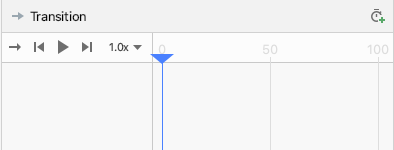
Step 5: Preview animation in Motion Editor
Animation: Video of playing a transition preview in Motion Editor
- Open Motion Editor and select the transition by clicking on the arrow between
startandendin the overview panel.
- The selection panel shows playback controls and a scrub bar when a transition is selected. Click play or drag the current position to preview the animation.
Step 6: Add an on click handler
You need a way to start the animation. One way to do this is to make the MotionLayout respond to click events on @id/red_star.
- Open up the motion editor and select the transition by clicking on the arrow between start and end in the overview panel.
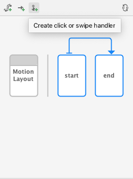
- Click
 Create click or swipe handler in the toolbar for the overview panel . This adds a handler that will start a transition.
 - Select Click Handler from the popup
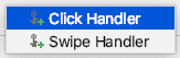
- Change the View To Click to
red_star.
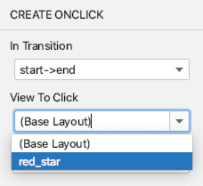
- Click Add the click handler is represented by a small dot on the Transition in Motion Editor.
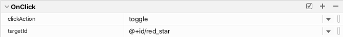
- With the transition selected in the overview panel, add a
clickActionattribute oftoggleto the OnClick handler you just added in the attributes panel.
- Open
activity_step1_scene.xmlto see the code that Motion Editor generated
activity_step1_scene.xml
<!-- A transition describes an animation via start and end state -->
<Transition
    motion:constraintSetStart="@+id/start"
    motion:constraintSetEnd="@+id/end"
    motion:duration="1000">
    <!-- MotionLayout will handle clicks on @id/red_star to "toggle" the animation between the start and end -->
    <OnClick
        motion:targetId="@id/red_star"
        motion:clickAction="toggle" />
</Transition>
The Transition tells MotionLayout to run the animation in response to click events using an <OnClick> tag. Looking at each attribute:
targetIdis the view to watch for clicks.clickActionoftogglewill switch between the start and end state on click. You can see other options forclickActionin the documentation.
- Run your code, click Step 1, then click the red star and see the animation!
Step 5: Animations in action
Run the app! You should see your animation run when you click on the star.
The completed motion scene file defines one Transition which points to a start and end ConstraintSet.
At the start of the animation (@id/start), the star icon is constrained to the top start of the screen. At the end of the animation (@id/end) the star icon is constrained to the bottom end of the screen.
<?xml version="1.0" encoding="utf-8"?>

<!-- Describe the animation for activity_step1.xml -->
<MotionScene xmlns:app="http://schemas.android.com/apk/res-auto"
            xmlns:android="http://schemas.android.com/apk/res/android">
   <!-- A transition describes an animation via start and end state -->
   <Transition
           motion:constraintSetStart="@+id/start"
           motion:constraintSetEnd="@+id/end"
           motion:duration="1000">
       <!-- MotionLayout will handle clicks on @id/star to "toggle" the animation between the start and end -->
       <OnClick
               motion:targetId="@id/red_star"
               motion:clickAction="toggle" />
   </Transition>

   <!-- Constraints to apply at the end of the animation -->
   <ConstraintSet android:id="@+id/start">
       <Constraint
               android:id="@+id/red_star"
               android:layout_width="wrap_content"
               android:layout_height="wrap_content"
               motion:layout_constraintStart_toStartOf="parent"
               motion:layout_constraintTop_toTopOf="parent" />
   </ConstraintSet>

   <!-- Constraints to apply at the end of the animation -->
   <ConstraintSet android:id="@+id/end">
       <Constraint
               android:id="@+id/red_star"
               android:layout_width="wrap_content"
               android:layout_height="wrap_content"
               motion:layout_constraintEnd_toEndOf="parent"
               motion:layout_constraintBottom_toBottomOf="parent" />
   </ConstraintSet>
</MotionScene>
4. Animating based on drag events
For this step you will build an animation that responds to a user drag event (when the user swipes the screen) to run the animation. MotionLayout supports tracking touch events to move views, as well as physics-based fling gestures to make the motion fluid.
Step 1: Inspect the initial code
- To get started, open the layout file
activity_step2.xml, which has an existingMotionLayout. Take a look at the code.
activity_step2.xml
<!-- initial code -->

<androidx.constraintlayout.motion.widget.MotionLayout
       ...
       motion:layoutDescription="@xml/step2" >

   <ImageView
           android:id="@+id/left_star"
           ...
   />

   <ImageView
           android:id="@+id/right_star"
           ...
   />

   <ImageView
           android:id="@+id/red_star"
           ...
   />

   <TextView
           android:id="@+id/credits"
           ...
           motion:layout_constraintTop_toTopOf="parent"
           motion:layout_constraintEnd_toEndOf="parent"/>
</androidx.constraintlayout.motion.widget.MotionLayout>
This layout defines all the views for the animation. The three star icons are not constrained in the layout because they will be animated in the motion scene.
The credits TextView does have constraints applied, because it stays in the same place for the entire animation and doesn't modify any attributes.
Step 2: Animate the scene
Just like the last animation, the animation will be defined by a start and end ConstraintSet, and a Transition.
Define the start ConstraintSet
- Open the motion scene
xml/step2.xmlto define the animation. - Add the constraints for the starting constraint
start. At the start, all three stars are centered at the bottom of the screen. The right and left stars have analphavalue of0.0, which means that they're fully transparent and hidden.
step2.xml
<!-- TODO apply starting constraints -->

<!-- Constraints to apply at the start of the animation -->
<ConstraintSet android:id="@+id/start">
   <Constraint
           android:id="@+id/red_star"
           android:layout_width="wrap_content"
           android:layout_height="wrap_content"
           motion:layout_constraintStart_toStartOf="parent"
           motion:layout_constraintEnd_toEndOf="parent"
           motion:layout_constraintBottom_toBottomOf="parent" />

   <Constraint
           android:id="@+id/left_star"
           android:layout_width="wrap_content"
           android:layout_height="wrap_content"
           android:alpha="0.0"
           motion:layout_constraintStart_toStartOf="parent"
           motion:layout_constraintEnd_toEndOf="parent"
           motion:layout_constraintBottom_toBottomOf="parent" />

   <Constraint
           android:id="@+id/right_star"
           android:layout_width="wrap_content"
           android:layout_height="wrap_content"
           android:alpha="0.0"
           motion:layout_constraintStart_toStartOf="parent"
           motion:layout_constraintEnd_toEndOf="parent"
           motion:layout_constraintBottom_toBottomOf="parent" />
</ConstraintSet>
In this ConstraintSet, you specify one Constraint for each of the stars. Each constraint will be applied by MotionLayout at the start of the animation.
Each star view is centered at the bottom of the screen using start, end, and bottom constraints. The two stars @id/left_star and @id/right_star both have an additional alpha value that makes them invisible and that will be applied at the start of the animation.
The start and end constraint sets define the start and end of the animation. A constraint on the start, like motion:layout_constraintStart_toStartOf will constrain a view's start to the start of another view. This can be confusing at first, because the name start is used for both and they're both used in the context of constraints. To help draw out the distinction, the start in layout_constraintStart refers to the "start" of the view, which is the left in a left to right language and right in a right to left language. The start constraint set refers to the start of the animation.
Define the end ConstraintSet
- Define the end constraint to use a chain to position all three stars together below
@id/credits. In addition, it will set the end value of thealphaof the left and right stars to1.0.
step2.xml
<!-- TODO apply ending constraints -->

<!-- Constraints to apply at the end of the animation -->
<ConstraintSet android:id="@+id/end">

   <Constraint
           android:id="@+id/left_star"
           android:layout_width="wrap_content"
           android:layout_height="wrap_content"
           android:alpha="1.0"
           motion:layout_constraintHorizontal_chainStyle="packed"
           motion:layout_constraintStart_toStartOf="parent"
           motion:layout_constraintEnd_toStartOf="@id/red_star"
           motion:layout_constraintTop_toBottomOf="@id/credits" />

   <Constraint
           android:id="@+id/red_star"
           android:layout_width="wrap_content"
           android:layout_height="wrap_content"
           motion:layout_constraintStart_toEndOf="@id/left_star"
           motion:layout_constraintEnd_toStartOf="@id/right_star"
           motion:layout_constraintTop_toBottomOf="@id/credits" />

   <Constraint
           android:id="@+id/right_star"
           android:layout_width="wrap_content"
           android:layout_height="wrap_content"
           android:alpha="1.0"
           motion:layout_constraintStart_toEndOf="@id/red_star"
           motion:layout_constraintEnd_toEndOf="parent"
           motion:layout_constraintTop_toBottomOf="@id/credits" />
</ConstraintSet>
The end result is that the views will spread out and up from the center as they animate.
In addition, since the alpha property is set on @id/right_start and @id/left_star in both ConstraintSets, both views will fade in as the animation progresses.
Animating based on user swipe
MotionLayout can track user drag events, or a swipe, to create a physics-based "fling" animation. This means the views will keep going if the user flings them and will slow down like a physical object would when rolling across a surface. You can add this type of animation with an OnSwipe tag in the Transition.
- Replace the TODO for adding an
OnSwipetag with<OnSwipe motion:touchAnchorId="@id/red_star" />.
step2.xml
<!-- TODO add OnSwipe tag -->

<!-- A transition describes an animation via start and end state -->
<Transition
       motion:constraintSetStart="@+id/start"
       motion:constraintSetEnd="@+id/end">
   <!-- MotionLayout will track swipes relative to this view -->
   <OnSwipe motion:touchAnchorId="@id/red_star" />
</Transition>
OnSwipe contains a few attributes, the most important being touchAnchorId.
touchAnchorIdis the tracked view that moves in response to touch.MotionLayoutwill keep this view the same distance from the finger that's swiping.touchAnchorSidedetermines which side of the view should be tracked. This is important for views that resize, follow complex paths, or have one side that moves faster than the other.dragDirectiondetermines which direction matters for this animation (up, down, left or right).
When MotionLayout listens for drag events, the listener will be registered on the MotionLayout view and not the view specified by touchAnchorId. When a user starts a gesture anywhere on the screen, MotionLayout will keep the distance between their finger and the touchAnchorSide of the touchAnchorId view constant. If they touch 100dp away from the anchor side, for example, MotionLayout will keep that side 100dp away from their finger for the entire animation.
Try it out
- Run the app again, and open the Step 2 screen. You will see the animation.
- Try "flinging" or releasing your finger halfway through the animation to explore how
MotionLayoutdisplays fluid physics based animations!
MotionLayout can animate between very different designs using the features from ConstraintLayout to create rich effects.
In this animation, all three views are positioned relative to their parent at the bottom of the screen to start. At the end, the three views are positioned relative to @id/credits in a chain.
Despite these very different layouts, MotionLayout will create a fluid animation between start and end.
5. Modifying a path
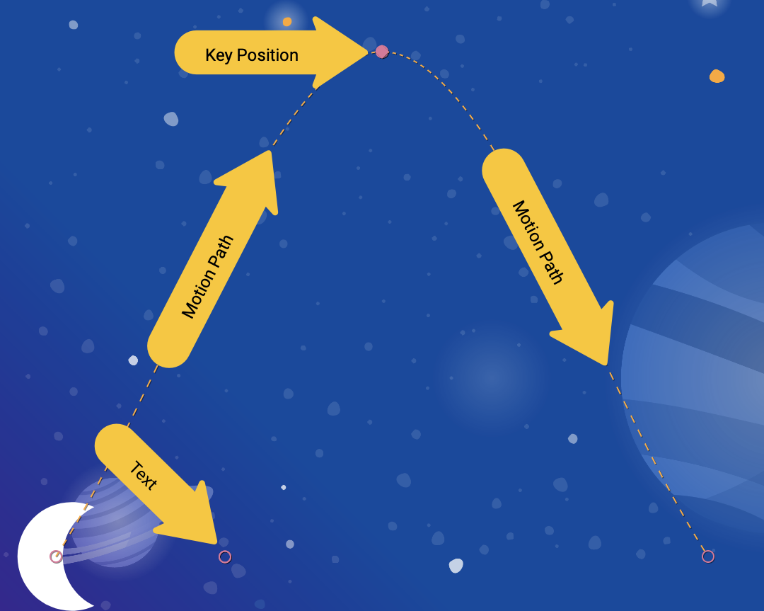
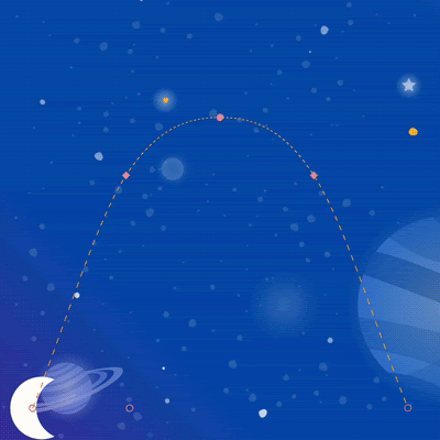
In this step you'll build an animation that follows a complex path during the animation and animates the credits during the motion. MotionLayout can modify the path that a view will take between the start and the end using a KeyPosition.
Step 1: Explore the existing code
- Open
layout/activity_step3.xmlandxml/step3.xmlto see the existing layout and motion scene. AnImageViewandTextViewdisplay the moon and credits text. - Open the motion scene file (
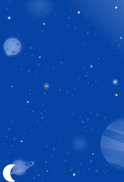
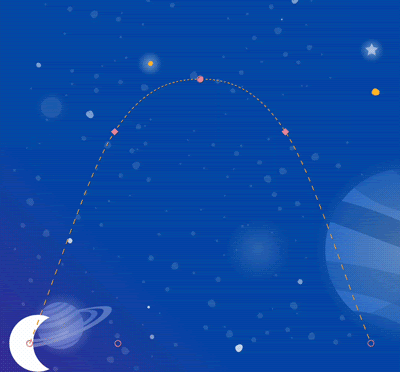
xml/step3.xml). You see that aTransitionfrom@id/startto@id/endis defined. The animation moves the moon image from the lower left of the screen to the bottom right of the screen using twoConstraintSets. The credits text fades in fromalpha="0.0"toalpha="1.0"as the moon is moving. - Run the app now and select Step 3. You'll see that the moon follows a linear path (or a straight line) from start to end when you click on the moon.
Step 2: Enable path debugging
Before you add an arc to the moon's motion, it's helpful to enable path debugging in MotionLayout.
To help develop complex animations with MotionLayout, you can draw the animation path of every view. This is helpful when you want to visualize your animation, and for fine tuning the small details of motion.
- To enable debugging paths, open
layout/activity_step3.xmland addmotion:motionDebug="SHOW_PATH"to theMotionLayouttag.
activity_step3.xml
<!-- Add motion:motionDebug="SHOW_PATH" -->

<androidx.constraintlayout.motion.widget.MotionLayout
       ...
       motion:motionDebug="SHOW_PATH" >
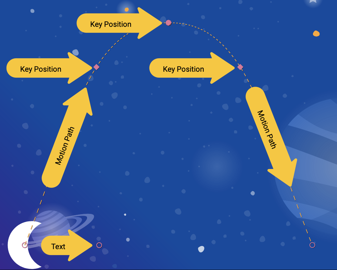
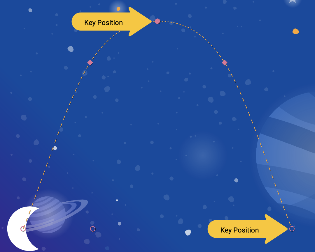
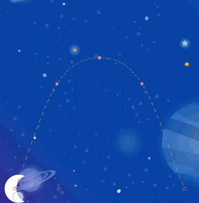
After you enable path debugging, when you run the app again, you'll see the paths of all views visualized with a dotted line.
- Circles represent the start or end position of one view.
- Lines represent the path of one view.
- Diamonds represent a
KeyPositionthat modifies the path.
For example, in this animation, the middle circle is the position of the credits text.
Step 3: Modify a path
All animations in MotionLayout are defined by a start and an end ConstraintSet that defines what the screen looks like before the animation starts and after the animation is done. By default, MotionLayout plots a linear path (a straight line) between the start and end position of each view that changes position.
To build complex paths like the arc of the moon in this example, MotionLayout uses a KeyPosition to modify the path that a view takes between the start and end.
- Open
xml/step3.xmland add aKeyPositionto the scene. TheKeyPositiontag is placed inside theTransitiontag.
step3.xml
<!-- TODO: Add KeyFrameSet and KeyPosition -->
<KeyFrameSet>
   <KeyPosition
           motion:framePosition="50"
           motion:motionTarget="@id/moon"
           motion:keyPositionType="parentRelative"
           motion:percentY="0.5"
   />
</KeyFrameSet>
A KeyFrameSet is a child of a Transition, and it is a set of all the KeyFrames, such as KeyPosition, that should be applied during the transition.
As MotionLayout is calculating the path for the moon between the start and the end, it modifies the path based on the KeyPosition specified in the KeyFrameSet. You can see how this modifies the path by running the app again.
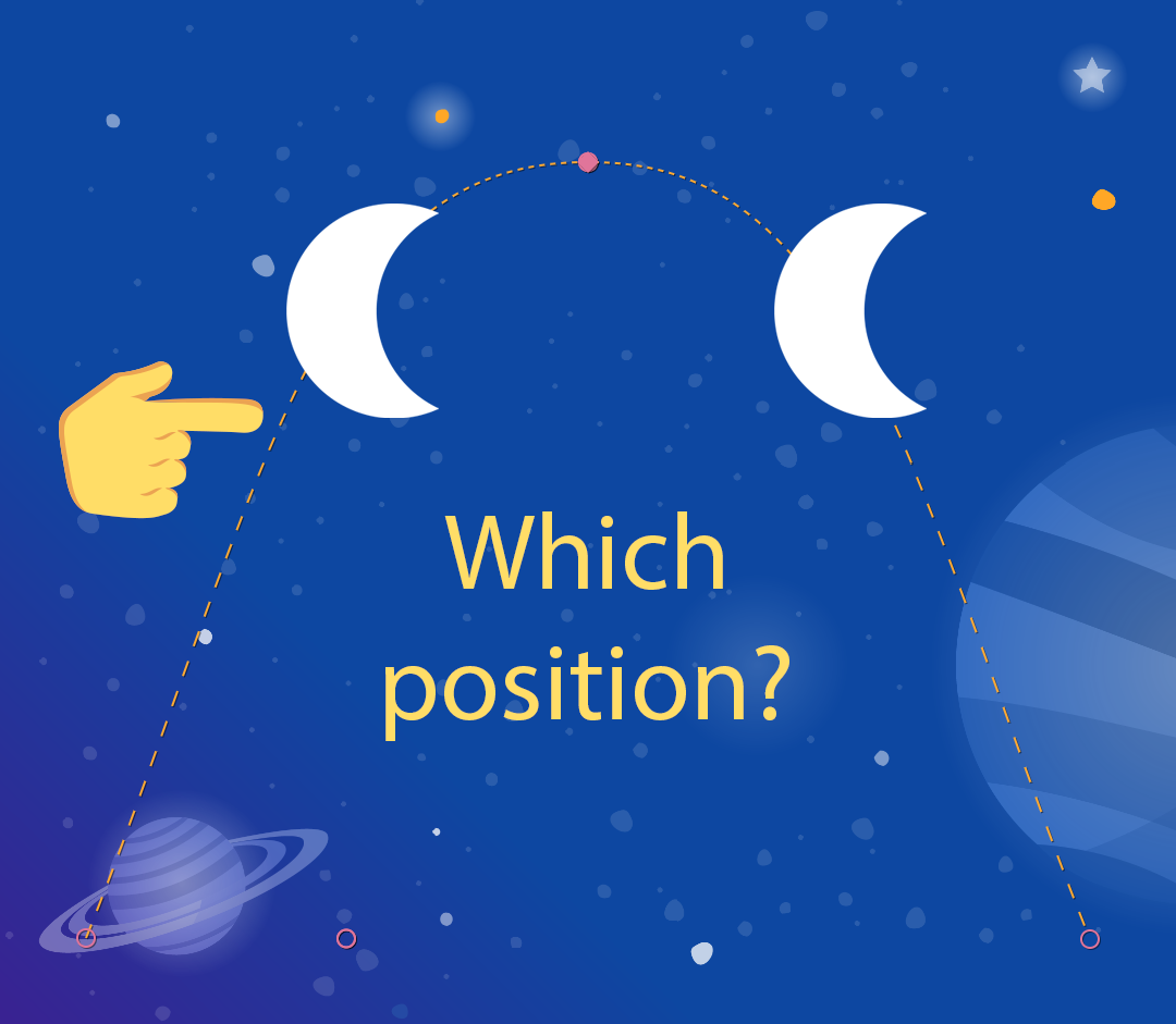
A KeyPosition has several attributes that describe how it modifies the path. The most important ones are:
framePositionis a number between 0 and 100. It defines when in the animation thisKeyPositionshould be applied, with 1 being 1% through the animation, and 99 being 99% through the animation. So if the value is 50, you apply it right in the middle.motionTargetis the view for which thisKeyPositionmodifies the path.keyPositionTypeis how thisKeyPositionmodifies the path. It can be eitherparentRelative,pathRelative, ordeltaRelative(as explained in the next step).percentX | percentYis how much to modify the path atframePosition(values between 0.0 and 1.0, with negative values and values >1 allowed).
You can think of it this way: "At framePosition modify the path of motionTarget by moving it by percentX or percentY according to the coordinates determined by keyPositionType."
By default MotionLayout will round any corners that are introduced by modifying the path. If you look at the animation you just created, you can see that the moon follows a curved path at the bend. For most animations, this is what you want, and if not, you can specify the curveFit attribute to customize it.
Try it out
If you run the app again, you'll see the animation for this step.
The moon follows an arc because it goes through a KeyPosition specified in the Transition.
<KeyPosition
       motion:framePosition="50"
       motion:motionTarget="@id/moon"
       motion:keyPositionType="parentRelative"
       motion:percentY="0.5"
/>
You can read this KeyPosition as: "At framePosition 50 (halfway through the animation) modify the path of motionTarget @id/moon by moving it by 50% Y (halfway down the screen) according to the coordinates determined by parentRelative (the entire MotionLayout)."
So, half-way through the animation, the moon must go through a KeyPosition that's 50% down on the screen. This KeyPosition doesn't modify the X motion at all, so the moon will still go from start to end horizontally. MotionLayout will figure out a smooth path that goes through this KeyPosition while moving between start and end.
If you look closely, the credits text is constrained by the position of the moon. Why isn't it moving vertically as well?

<Constraint
       android:id="@id/credits"
       ...
       motion:layout_constraintBottom_toBottomOf="@id/moon"
       motion:layout_constraintTop_toTopOf="@id/moon"
/>
It turns out, even though you're modifying the path that the moon takes, the start and end positions of the moon don't move it vertically at all. The KeyPosition doesn't modify the start or the end position, so the credits text is constrained to the final end position of the moon.
If you did want the credits to move with the moon, you could add a KeyPosition to the credits, or modify the start constraints on @id/credits.
In the next section you'll dive into the different types of keyPositionType in MotionLayout.
6. Understanding keyPositionType
In the last step you used a keyPosition type of parentRelative to offset the path by 50% of the screen. The attribute keyPositionType determines how MotionLayout will modify the path according to percentX or percentY.
<KeyFrameSet>
   <KeyPosition
           motion:framePosition="50"
           motion:motionTarget="@id/moon"
           motion:keyPositionType="parentRelative"
           motion:percentY="0.5"
   />
</KeyFrameSet>
There are three different types of keyPosition possible: parentRelative, pathRelative, and deltaRelative. Specifying a type will change the coordinate system by which percentX and percentY are calculated.
What is a coordinate system?
A coordinate system gives a way to specify a point in space. They are also useful for describing a position on the screen.
MotionLayout coordinate systems are a cartesian coordinate system. This means they have an X and a Y axis defined by two perpendicular lines. The key difference between them is where on the screen the X axis goes (the Y axis is always perpendicular to the X axis).
All coordinate systems in MotionLayout use values between 0.0 and 1.0 on both the X and Y axis. They allow negative values, and values larger than 1.0. So for example, an percentX value of -2.0 would mean, go in the opposite direction of the X axis twice.
If that all sounds a bit too much like Algebra class, check out the pictures below!
parentRelative coordinates
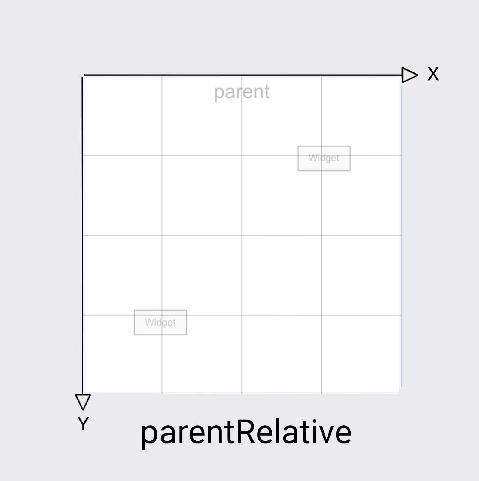
The keyPositionType of parentRelative uses the same coordinate system as the screen. It defines (0, 0) to the top left of the entire MotionLayout, and (1, 1) to the bottom right.
You can use parentRelative whenever you want to make an animation that moves through the entire MotionLayout – like the moon arc in this example.
However, if you want to modify a path relative to the motion, for example make it curve just a little bit, the other two coordinate systems are a better choice.
deltaRelative coordinates
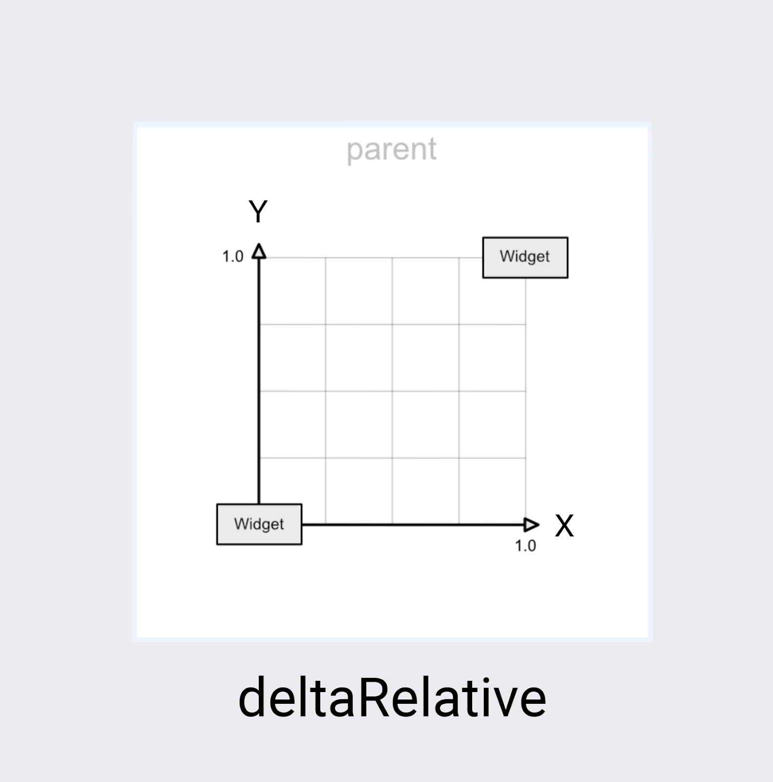
Delta is a math term for change, so deltaRelative is a way of saying "change relative." In deltaRelative coordinates(0,0) is the starting position of the view, and (1,1) is the ending position. The X and Y axes are aligned with the screen.
The X axis is always horizontal on the screen, and the Y axis is always vertical on the screen. Compared to parentRelative, the main difference is that the coordinates describe just the part of the screen in which the view will be moving.
deltaRelative is a great coordinate system for controlling the horizontal or vertical motion in isolation. For example, you could create an animation that completes just its vertical (Y) movement at 50%, and continues animating horizontally (X).
pathRelative coordinates
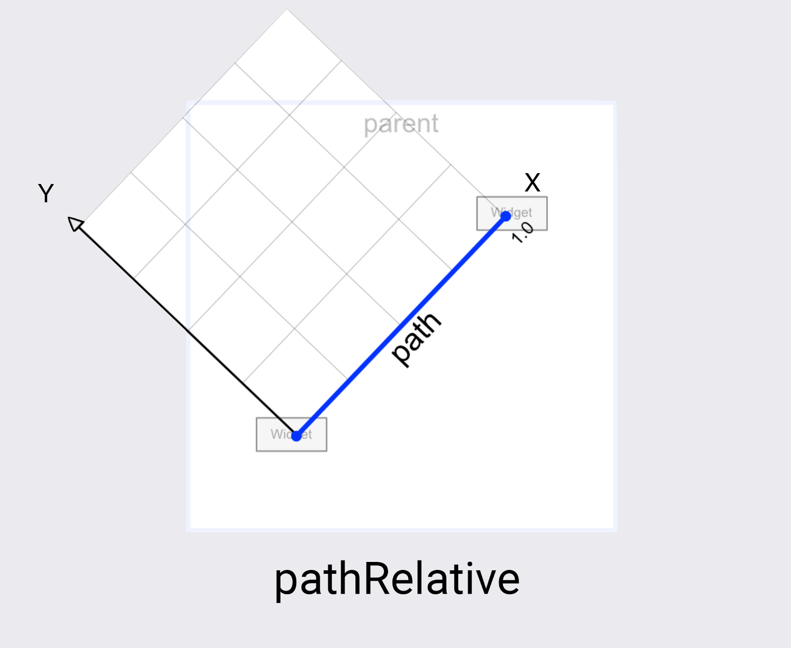
The last coordinate system in MotionLayout is pathRelative. It's quite different from the other two as the X axis follows the motion path from start to end. So (0,0) is the starting position, and (1,0) is the ending position.
Why would you want this? It's quite surprising at first glance, especially since this coordinate system isn't even aligned to the screen coordinate system.
It turns out pathRelative is really useful for a few things.
- Speeding up, slowing down, or stopping a view during part of the animation. Since the X dimension will always match the path the view takes exactly, you can use a
pathRelativeKeyPositionto change whichframePositiona particular point in that path is reached. So aKeyPositionatframePosition="50"with apercentX="0.1"would cause the animation to take 50% of the time to travel the first 10% of the motion. - Adding a subtle arc to a path. Since the Y dimension is always perpendicular to motion, changing Y will change the path to curve relative to the overall motion.
- Adding a second dimension when
deltaRelativewon't work. For completely horizontal and vertical motion,deltaRelativewill only create one useful dimension. However,pathRelativewill always create usable X and Y coordinates.
In the next step you'll learn how to build even more complex paths using more than one KeyPosition.
7. Building complex paths
Looking at the animation you built in the last step, it does create a smooth curve, but the shape could be more "moon like."
Modify a path with multiple KeyPosition elements
MotionLayout can modify a path further by defining as many KeyPosition as needed to get any motion. For this animation you will build an arc, but you could make the moon jump up and down in the middle of the screen, if you wanted.
- Open
xml/step4.xml. You see it has the same views and theKeyFrameyou added in the last step. - To round out the top of the curve, add two more
KeyPositionsto the path of@id/moon, one just before it reaches the top, and one after.
step4.xml
<!-- TODO: Add two more KeyPositions to the KeyFrameSet here -->
<KeyPosition
       motion:framePosition="25"
       motion:motionTarget="@id/moon"
       motion:keyPositionType="parentRelative"
       motion:percentY="0.6"
/>
<KeyPosition
       motion:framePosition="75"
       motion:motionTarget="@id/moon"
       motion:keyPositionType="parentRelative"
       motion:percentY="0.6"
/>
These KeyPositions will be applied 25% and 75% of the way through the animation, and cause @id/moon to move through a path that is 60% from the top of the screen. Combined with the existing KeyPosition at 50%, this creates a smooth arc for the moon to follow.
In MotionLayout, you can add as many KeyPositions as you would need to get the motion path you want. MotionLayout will apply each KeyPosition at the specified framePosition, and figure out how to create a smooth motion that goes through all of the KeyPositions.
Try it out
- Run the app again. Go to Step 4 to see the animation in action. When you click on the moon, it follows the path from start to end, going through each
KeyPositionthat was specified in theKeyFrameSet.
Explore on your own
Before you move on to other types of KeyFrame, try adding some more KeyPositions to the KeyFrameSet to see what kind of effects you can create just using KeyPosition.
Here's one example showing how to build a complex path that moves back and forth during the animation.
step4.xml
<!-- Complex paths example: Dancing moon -->
<KeyFrameSet>
   <KeyPosition
           motion:framePosition="25"
           motion:motionTarget="@id/moon"
           motion:keyPositionType="parentRelative"
           motion:percentY="0.6"
           motion:percentX="0.1"
   />
   <KeyPosition
           motion:framePosition="50"
           motion:motionTarget="@id/moon"
           motion:keyPositionType="parentRelative"
           motion:percentY="0.5"
           motion:percentX="0.3"
   />
   <KeyPosition
           motion:framePosition="75"
           motion:motionTarget="@id/moon"
           motion:keyPositionType="parentRelative"
           motion:percentY="0.6"
           motion:percentX="0.1"
   />
</KeyFrameSet>
Once you're done exploring KeyPosition, in the next step you'll move on to other types of KeyFrames.
8. Changing attributes during motion
Building dynamic animations often means changing the size, rotation, or alpha of views as the animation progresses. MotionLayout supports animating many attributes on any view using a KeyAttribute.
In this step, you will use KeyAttribute to make the moon scale and rotate. You will also use a KeyAttribute to delay the appearance of the text until the moon has almost completed its journey.
Step 1: Resize and rotate with KeyAttribute
- Open
xml/step5.xmlwhich contains the same animation you built in the last step. For variety, this screen uses a different space picture as the background. - To make the moon expand in size and rotate, add two
KeyAttributetags in theKeyFrameSetatkeyFrame="50"andkeyFrame="100"
step5.xml
<!-- TODO: Add KeyAttributes to rotate and resize @id/moon -->

<KeyAttribute
       motion:framePosition="50"
       motion:motionTarget="@id/moon"
       android:scaleY="2.0"
       android:scaleX="2.0"
       android:rotation="-360"
/>
<KeyAttribute
       motion:framePosition="100"
       motion:motionTarget="@id/moon"
       android:rotation="-720"
/>
These KeyAttributes are applied at 50% and 100% of the animation. The first KeyAttribute at 50% will happen at the top of the arc, and causes the view to be doubled in size as well as rotate -360 degrees (or one full circle). The second KeyAttribute will finish the second rotation to -720 degrees (two full circles) and shrink the size back to regular since the scaleX and scaleY values default to 1.0.
Just like a KeyPosition, a KeyAttribute uses the framePosition and motionTarget to specify when to apply the KeyFrame, and which view to modify. MotionLayout will interpolate between KeyPositions to create fluid animations.
KeyAttributes support attributes that can be applied to all views. They support changing basic attributes such as the visibility, alpha, or elevation. You can also change the rotation like you're doing here, rotate in three dimensions with rotateX and rotateY, scale the size with scaleX and scaleY, or translate the view's position in X, Y, or Z.
Step 2: Delay the appearance of credits
One of the goals of this step is to update the animation so that the credits text doesn't appear until the animation is mostly complete.
- To delay the appearance of credits, define one more
KeyAttributethat ensures thatalphawill remain 0 untilkeyPosition="85".MotionLayoutwill still smoothly transition from 0 to 100 alpha, but it will do it over the last 15% of the animation.
step5.xml
<!-- TODO: Add KeyAttribute to delay the appearance of @id/credits -->

<KeyAttribute
       motion:framePosition="85"
       motion:motionTarget="@id/credits"
       android:alpha="0.0"
/>
This KeyAttribute keeps the alpha of @id/credits at 0.0 for the first 85% of the animation. Since it starts at an alpha of 0, this means it will be invisible for the first 85% of the animation.
The end effect of this KeyAttribute is that the credits appear towards the end of the animation. This gives the appearance of them being coordinated with the moon settling down in the right corner of the screen.
By delaying animations on one view while another view moves like this, you can build impressive animations that feel dynamic to the user.
Try it out
- Run the app again and go to Step 5 to see the animation in action. When you click on the moon, it'll follow the path from start to end, going through each
KeyAttributethat was specified in theKeyFrameSet.
Because you rotate the moon two full circles, it will now do a double back flip, and the credits will delay their appearance until the animation is almost done.
Explore on your own
Before you move on to the final type of KeyFrame, try modifying other standard attributes in the KeyAttributes. For example, try changing rotation to rotationX to see what animation it produces.
Here's a list of the standard attributes that you can try:
android:visibilityandroid:alphaandroid:elevationandroid:rotationandroid:rotationXandroid:rotationYandroid:scaleXandroid:scaleYandroid:translationXandroid:translationYandroid:translationZ
9. Changing custom attributes
Rich animations involve changing the color or other attributes of a view. While MotionLayout can use a KeyAttribute to change any of the standard attributes listed in the previous task, you use a CustomAttribute to specify any other attribute.
A CustomAttribute can be used to set any value that has a setter. For example, you can set the backgroundColor on a View using a CustomAttribute. MotionLayout will use reflection to find the setter, then call it repeatedly to animate the view.
In this step, you will use a CustomAttribute to set the colorFilter attribute on the moon to build the animation shown below.
Define custom attributes
- To get started open
xml/step6.xmlwhich contains the same animation you built in the last step. - To make the moon change colors, add two
KeyAttributewith aCustomAttributein theKeyFrameSetatkeyFrame="0",keyFrame="50"andkeyFrame="100".
step6.xml
<!-- TODO: Add Custom attributes here -->
<KeyAttribute
motion:framePosition="0"
motion:motionTarget="@id/moon">
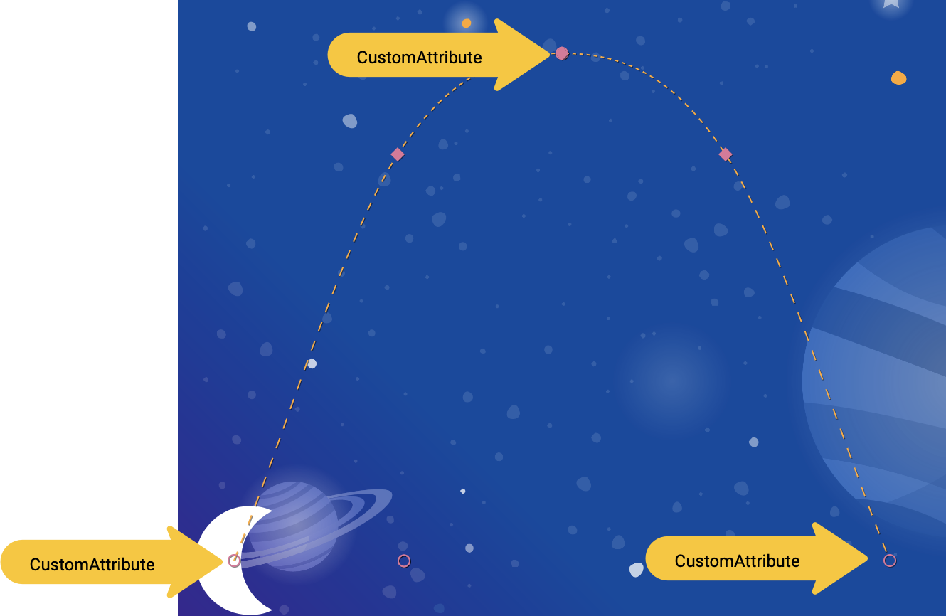
<CustomAttribute
motion:attributeName="colorFilter"
motion:customColorValue="#FFFFFF"
/>
</KeyAttribute>
<KeyAttribute
motion:framePosition="50"
motion:motionTarget="@id/moon">
<CustomAttribute
motion:attributeName="colorFilter"
motion:customColorValue="#FFB612"
/>
</KeyAttribute>
<KeyAttribute
motion:framePosition="100"
motion:motionTarget="@id/moon">
<CustomAttribute
motion:attributeName="colorFilter"
motion:customColorValue="#FFFFFF"
/>
</KeyAttribute>
You add a CustomAttribute inside a KeyAttribute. The CustomAttribute will be applied at the framePosition specified by the KeyAttribute.
Inside the CustomAttribute you must specify an attributeName and one value to set.
motion:attributeNameis the name of the setter that will be called by this custom attribute. In this examplesetColorFilteronDrawablewill be called.motion:custom*Valueis a custom value of the type noted in the name, in this example the custom value is a color specified.
Custom values can have any of the following types:
- Color
- Integer
- Float
- String
- Dimension
- Boolean
Using this API, MotionLayout can animate anything that provides a setter on any view.
Try it out
- Run the app again and go to Step 6 to see the animation in action. When you click on the moon, it'll follow the path from start to end, going through each
KeyAttributethat was specified in theKeyFrameSet.
When you add more KeyFrames, MotionLayout changes the path of the moon from a straight line to a complex curve, adding a double backflip, resize, and a color change midway through the animation.
In real animations, you'll often animate several views at the same time controlling their motion along different paths and speeds. By specifying a different KeyFrame for each view, it's possible to choreograph rich animations that animate multiple views with MotionLayout.
10. Drag events and complex paths
In this step you'll explore using OnSwipe with complex paths. So far, the animation of the moon has been triggered by an OnClick listener and runs for a fixed duration.
Controlling animations that have complex paths using OnSwipe, like the moon animation you've built in the last few steps, requires understanding how OnSwipe works.
Step 1: Explore OnSwipe behavior
- Open
xml/step7.xmland find the existingOnSwipedeclaration.
step7.xml
<!-- Fix OnSwipe by changing touchAnchorSide →

<OnSwipe
       motion:touchAnchorId="@id/moon"
       motion:touchAnchorSide="bottom"
/>
- Run the app on your device and go to Step 7. See if you can produce a smooth animation by dragging the moon along the path of the arc.
When you run this animation, it doesn't look very good. After the moon reaches the top of the arc, it starts jumping around.
To understand the bug, consider what happens when the user is touching just below the top of the arc. Because the OnSwipe tag has an motion:touchAnchorSide="bottom" MotionLayout will try to make the distance between the finger and the bottom of the view constant throughout the animation.
But, since the bottom of the moon doesn't always go in the same direction, it goes up then comes back down, MotionLayout doesn't know what to do when the user has just passed the top of the arc. To consider this, since you're tracking the bottom of the moon, where should it be placed when the user is touching here?
Step 2: Use the right side
To avoid bugs like this, it is important to always choose a touchAnchorId and touchAnchorSide that always progresses in one direction throughout the duration of the entire animation.
In this animation, both the right side and the left side of the moon will progress across the screen in one direction.
However, both the bottom and the top will reverse direction. When OnSwipe attempts to track them, it will get confused when their direction changes.
- To make this animation follow touch events, change the
touchAnchorSidetoright.
step7.xml
<!-- Fix OnSwipe by changing touchAnchorSide →

<OnSwipe
       motion:touchAnchorId="@id/moon"
       motion:touchAnchorSide="right"
/>
Step 3: Use dragDirection
You can also combine dragDirection with touchAnchorSide to make a side track a different direction than it normally would. It's still important that the touchAnchorSide only progresses in one direction, but you can tell MotionLayout which direction to track. For example, you can keep the touchAnchorSide="bottom", but add dragDirection="dragRight". This will cause MotionLayout to track the position of the bottom of the view, but only consider its location when moving right (it ignores vertical motion). So, even though the bottom goes up and down, it will still animate correctly with OnSwipe.
- Update
OnSwipeto track the moon's motion correctly.
step7.xml
<!-- Using dragDirection to control the direction of drag tracking →

<OnSwipe
       motion:touchAnchorId="@id/moon"
       motion:touchAnchorSide="bottom"
       motion:dragDirection="dragRight"
/>
Try it out
- Run the app again and try dragging the moon through the entire path. Even though it follows a complex arc,
MotionLayoutwill be able to progress the animation in response to swipe events.
11. Running motion with code
MotionLayout can be used to build rich animations when used with CoordinatorLayout. In this step, you'll build a collapsible header using MotionLayout.
Step 1: Explore the existing code
- To get started, open
layout/activity_step8.xml. - In
layout/activity_step8.xml, you see that a workingCoordinatorLayoutandAppBarLayoutis already built.
activity_step8.xml
<androidx.coordinatorlayout.widget.CoordinatorLayout
       ...>
   <com.google.android.material.appbar.AppBarLayout
           android:id="@+id/appbar_layout"
           android:layout_width="match_parent"
           android:layout_height="180dp">
       <androidx.constraintlayout.motion.widget.MotionLayout
               android:id="@+id/motion_layout"
               ... >
           ...
       </androidx.constraintlayout.motion.widget.MotionLayout>
   </com.google.android.material.appbar.AppBarLayout>

   <androidx.core.widget.NestedScrollView
           ...
           motion:layout_behavior="@string/appbar_scrolling_view_behavior" >
           ...
   </androidx.core.widget.NestedScrollView>
</androidx.coordinatorlayout.widget.CoordinatorLayout>
This layout uses a CoordinatorLayout to share scrolling information between the NestedScrollView and the AppBarLayout. So, when the NestedScrollView scrolls up, it will tell the AppBarLayout about the change. That's how you implement a collapsing toolbar like this on Android—the scrolling of the text will be "coordinated" with the collapsing header.
The motion scene that @id/motion_layout points to is similar to the motion scene in the last step. However, the OnSwipe declaration was removed to enable it to work with CoordinatorLayout.
- Run the app and go to Step 8. You see that when you scroll the text, the moon does not move.
Step 2: Make the MotionLayout scroll
- To make the
MotionLayoutview scroll as soon as theNestedScrollViewscrolls, addmotion:minHeightandmotion:layout_scrollFlagsto theMotionLayout.
activity_step8.xml
<!-- Add minHeight and layout_scrollFlags to the MotionLayout -->

<androidx.constraintlayout.motion.widget.MotionLayout
       android:id="@+id/motion_layout"
       android:layout_width="match_parent"
       android:layout_height="match_parent"
       motion:layoutDescription="@xml/step8"
       motion:motionDebug="SHOW_PATH"
       android:minHeight="80dp"
       motion:layout_scrollFlags="scroll|enterAlways|snap|exitUntilCollapsed"  >
- Run the app again and go to Step 8. You see that the
MotionLayoutcollapses as you scroll up. However, the animation does not progress based on the scroll behavior yet.
Step 3: Move the motion with code
- Open
Step8Activity.kt. Edit thecoordinateMotion()function to tellMotionLayoutabout the changes in scroll position.
Step8Activity.kt
// TODO: set progress of MotionLayout based on an AppBarLayout.OnOffsetChangedListener

private fun coordinateMotion() {
    val appBarLayout: AppBarLayout = findViewById(R.id.appbar_layout)
    val motionLayout: MotionLayout = findViewById(R.id.motion_layout)

    val listener = AppBarLayout.OnOffsetChangedListener { unused, verticalOffset ->
        val seekPosition = -verticalOffset / appBarLayout.totalScrollRange.toFloat()
        motionLayout.progress = seekPosition
    }

    appBarLayout.addOnOffsetChangedListener(listener)
}
This code will register a OnOffsetChangedListener that will be called every time the user scrolls with the current scroll offset.
MotionLayout supports seeking its transition by setting the progress property. To convert between a verticalOffset and a percentage progress, divide by the total scroll range.
Try it out
- Deploy the app again and run the Step 8 animation. You see that
MotionLayoutwill progress the animation based on the scroll position.
It's possible to build custom dynamic collapsing toolbar animations using MotionLayout. By using a sequence of KeyFrames you can achieve very bold effects.
12. Congratulations
This codelab covered the basic API of MotionLayout.
To see more examples of MotionLayout in practice, check out the official sample. And be sure to check out the documentation!
Learn More
MotionLayout supports even more features not covered in this codelab, like KeyCycle, which lets you control paths or attributes with repeating cycles, and KeyTimeCycle, which lets you animate based on clock time. Check out the samples for examples of each.
For links to other codelabs in this course, see the Advanced Android in Kotlin codelabs landing page.