1. Introduction
Last Updated: 08/04/22
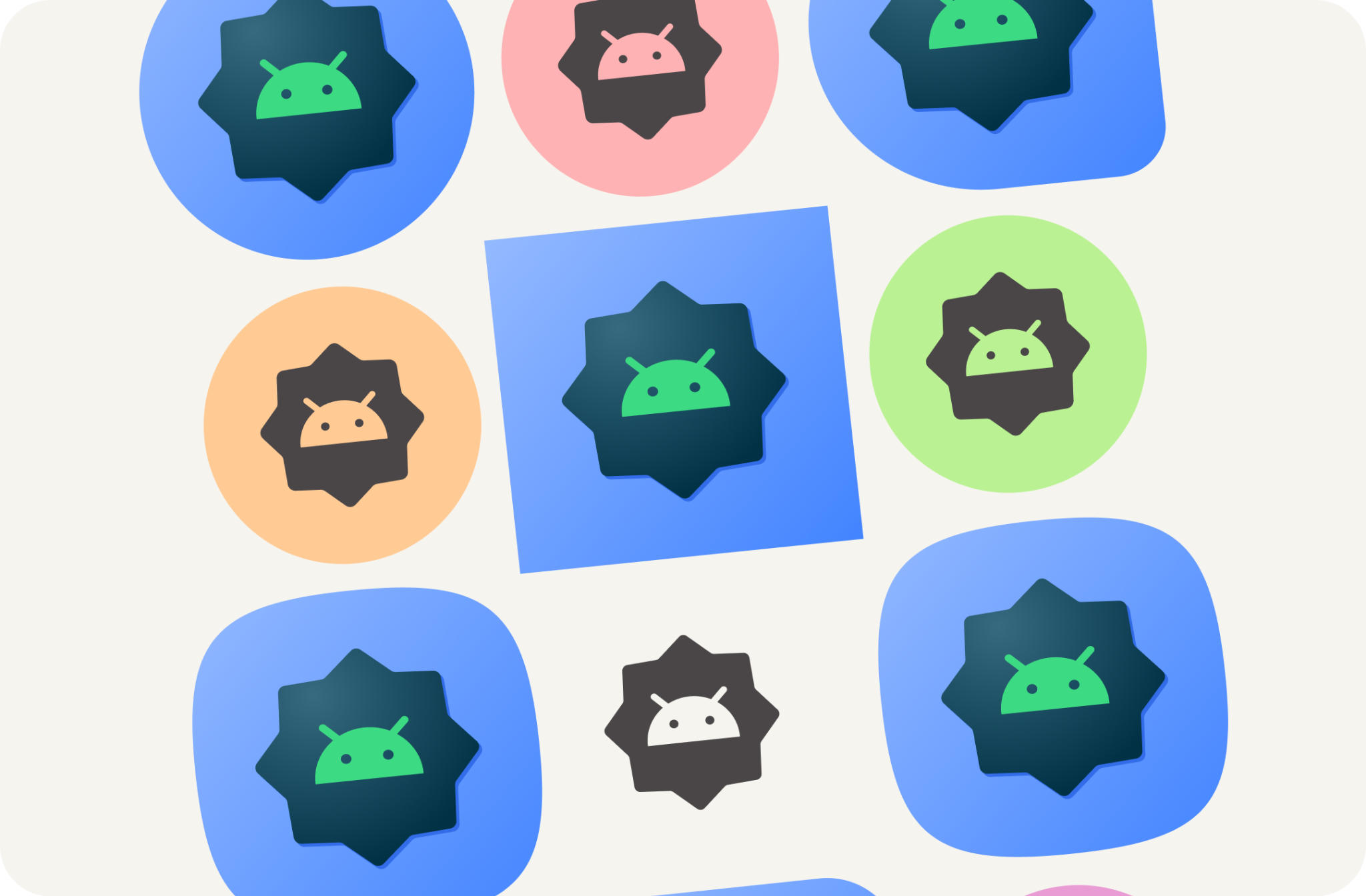
Starting with Android 13, users can theme their adaptive launcher icons. With this feature, app icons in supported Android launchers are tinted to inherit the coloring of the user's chosen wallpaper and other themes.
Easily create all the system assets needed for your Android app, including the new adaptive color icons.
What you'll learn
- An understanding of the different types of app icons and tips to design for them.
- How to use the Android launcher Figma template.
- How to use the Android Studio asset generator.
- How to preview your launcher icon with Android Studio emulator.
Prerequisites
- A basic knowledge of Figma
- Optional: App icon artwork (foreground, background, and monochromatic)
What you'll need
- A Figma account
- A Figma designlab file
- Optional: A PC installed with Android Studio
2. Get started
Setup
To get started, you need to access the Android app icon Figma file.
First, sign into Figma or create an account.
Duplicate from Figma Community
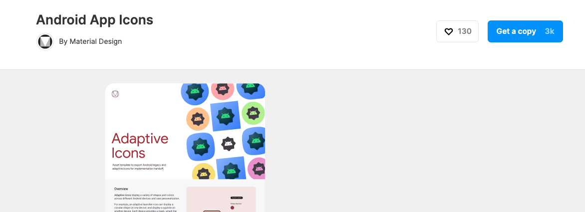
Navigate to the Android launcher template file or search for Android Adaptive icons fonts within Figma Community. Click Get a Copy in the top right corner to copy the file into your files.
Using the template
The Android icon template consists of two pages:
- The cover page briefly covers relevant concepts and how to use the template.
- The template page includes everything you need creating required assets,divided into three frames (Color, Shape, Play store).
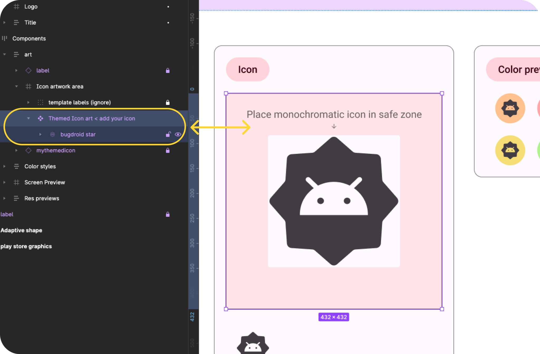
Note: In the left Layer Panel, most of the layers and groups are locked; these should remain locked. (You'll be able to place artwork within the unlocked artwork groups.)
But before we jump into creating assets, let's look at what we'll be creating...
3. Android system icons
Launcher icons
Launcher icons, or app icons, act as an essential part of your app's launch experience, launcher icons appear on the homescreen as an entry point into your app.
Adaptive shape
An adaptive icon, or AdaptiveIconDrawable, can display differently depending on individual device capabilities and user theming. Adaptive icons are primarily used by the launcher on the homescreen, but can also be used in shortcuts, the Settings app, sharing dialogs, and the overview screen.
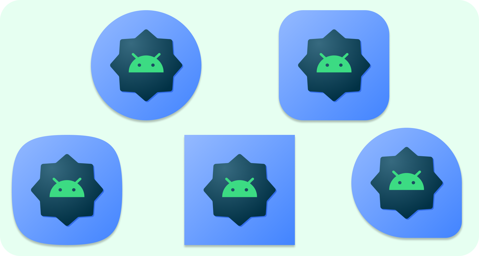
An adaptive icon can display a variety of shapes across different device models. For example, it can display a circular shape on one OEM device, and display a squircle on another device. Each device OEM must provide a mask, which the system uses to render all adaptive icons with the same shape.
The ability to adapt to shape also allows the system to apply various animation effects with user interaction.
Adaptive color
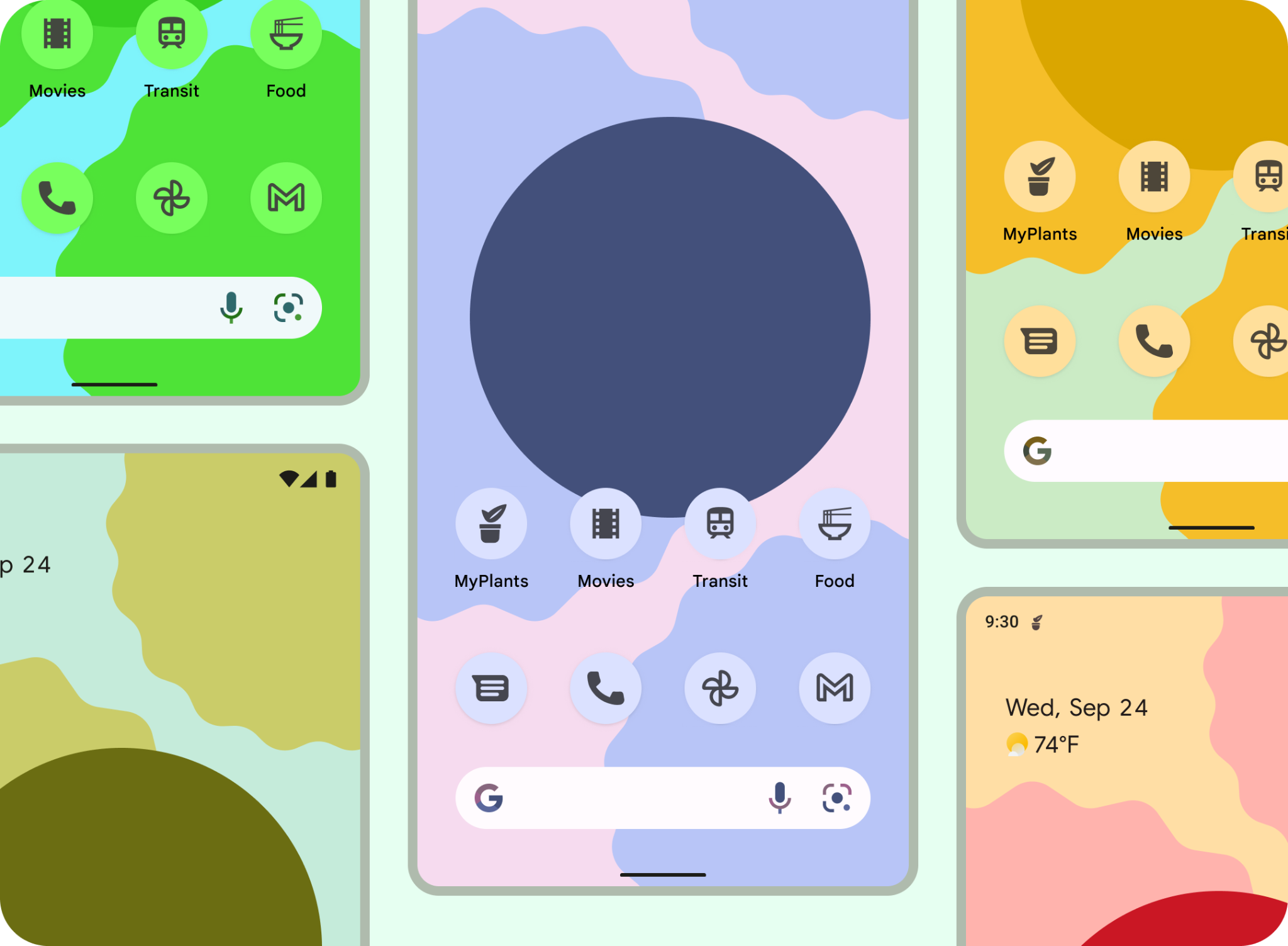
Adaptive icons can now use dynamic color to allow for personalized themed app icons.
If a user has enabled themed app icons (in other words, turned on the Themed icons toggle in system settings), and the launcher supports this feature, the system uses the coloring of the user's chosen wallpaper and theme to determine the tint color.
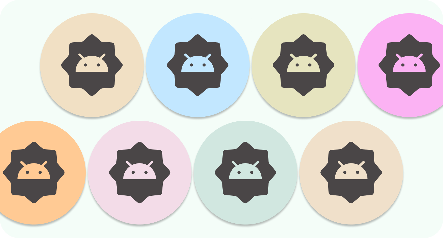
Much like icons that adapt to shape, adaptive color icons are composed of a foreground and background, only a monochromatic foreground icon asset needs to be provided, the system will take care of the background and color both with the extracted color scheme.
You can also use the same monochromatic icon for a notification icon.
Legacy
Legacy icons should be included to support devices running older Android versions or do not support Adaptive features (Pre-8.0).
They won't have foreground and background resources, and can have a freeform shape. If you're using the provided template, the final adaptive shape artwork will be exported in the necessary sizes for your legacy icon.

Notification icons
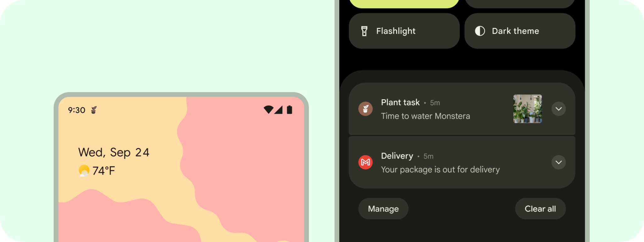
A notification is a message that Android displays outside your app's UI to provide the user with reminders, communication from other people, or other timely information from your app. The system shows notifications in different locations and formats, such as an icon in the status bar, a more detailed entry in the notification drawer, as a badge on the app's icon, and on paired wearables automatically.
Store artwork
You can use a feature graphic, screenshots, a short description, and videos to highlight and promote your app on Google Play and other Google promotional channels.
The app icon doesn't replace your app's launcher icon but should be a higher-fidelity, higher-resolution version.
Similar to the launcher icon, artwork can populate the entire asset space, or you can design and position artwork elements such as logos onto the keyline grid.
You must provide a 512x512 px square app icon to publish your store listing. If you're using the Android app icon template, this is provided on export using the Adaptive Shape artwork.
4. Design best practices
Launcher icons launch your app for the user. As an entry into your app, they must be recognizable and readable. Here are some best practices for ensuring these qualities in your launcher icon.
Keep artwork simple. Avoid multiple layers, many effects, and text. These details will be lost or difficult to see at small sizes. 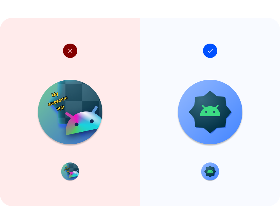
Avoid complex shapes. This includes logos. Use a simplified logo, if possible, or consider symbology that your users connect with your app. A readable and distinct shape helps create unity for users to easily recognize your app from different contexts (adaptive color and notification). 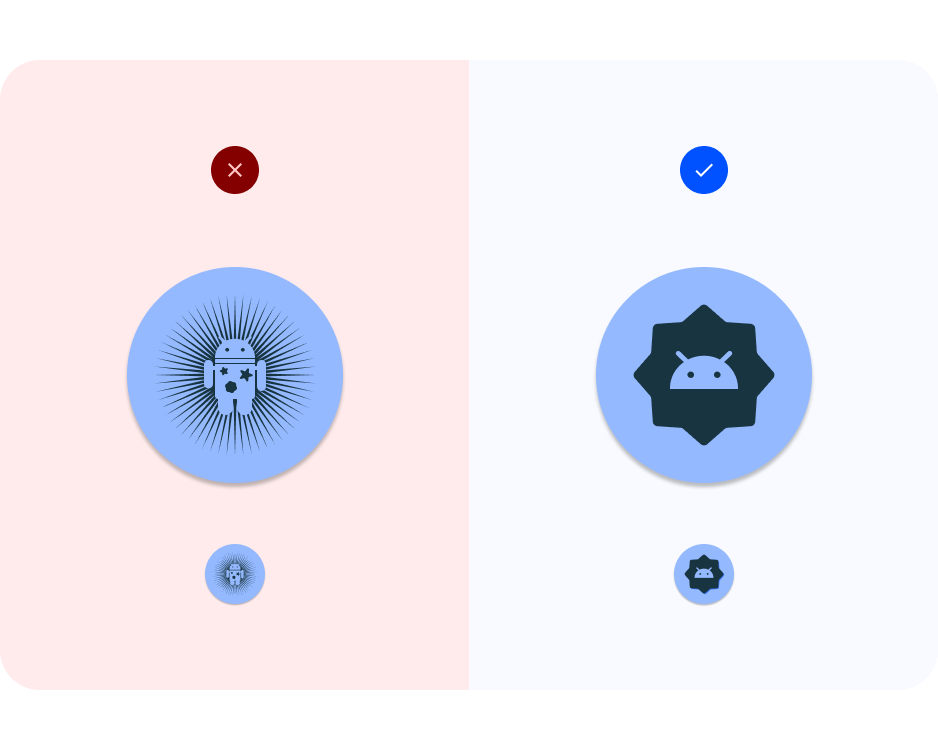
Use a grid. Take advantage of a grid or keylines to ensure the foreground artwork will work when cropped, including full bleed illustration artwork. 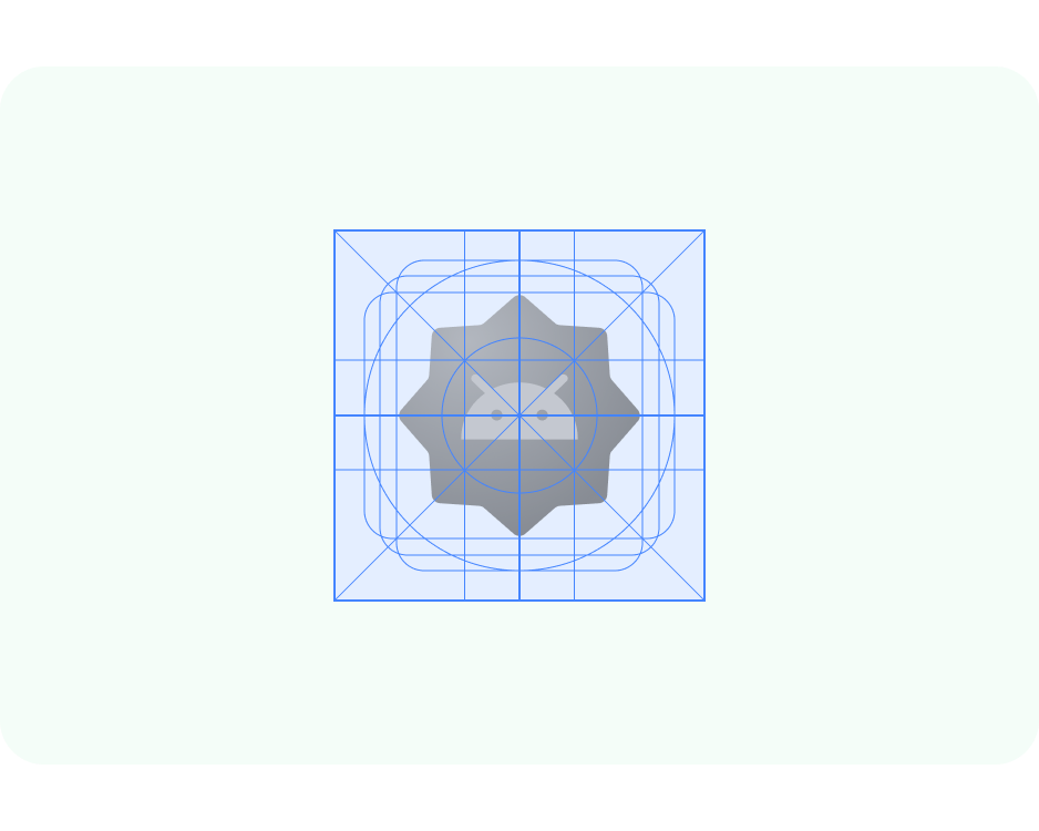
Consider contrast. For adaptive shape and legacy icons, make sure the icon foreground and background have legible contrast. Avoid using heavy drop shadows, which can be mistaken for the system shadow. 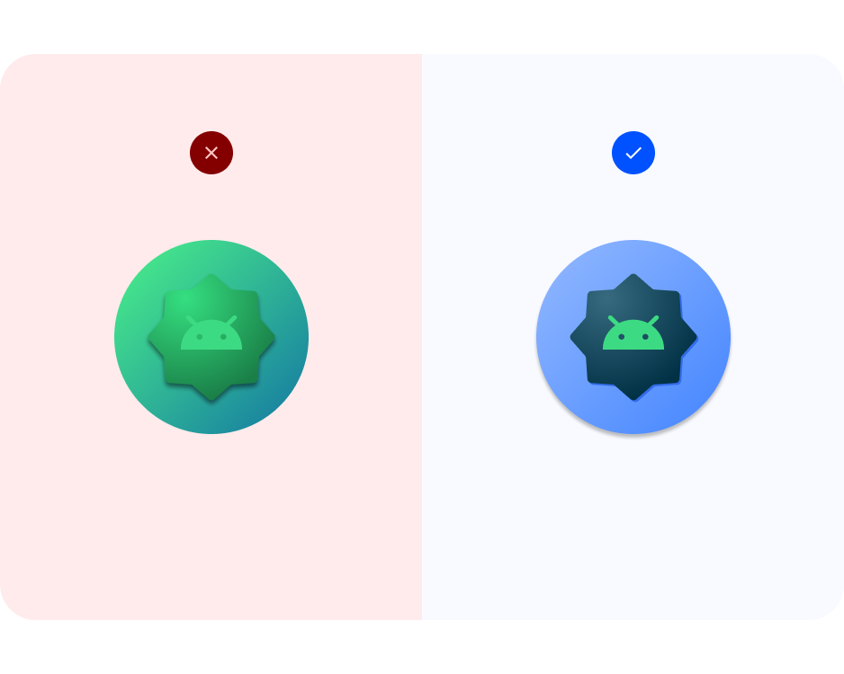
Keep artwork within safe zones. Keep foreground assets within 72x72 px (unless you're going full bleed). Keep backgrounds at 108x108 px. Note: The icon template artwork frame is larger than 72x72 px to allow you to build out icon artwork. The assets will be resized to fit specs.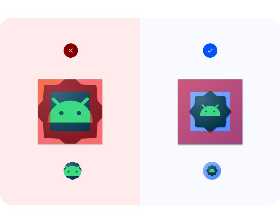
Vector format. Try to use artwork that is in a vector format (such as SVG, AI, PDF, and EPS files) instead of opposed a raster format (such as PNG, JPG, and GIF files). This ensures your artwork is compatible with newer features and easier to edit. 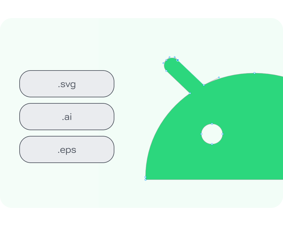
5. Adaptive color and notification icons
Now it's your turn to create your own Android system icons.
- Locate the Android app icons Figma file.
- Within the file, locate the Adaptive color frame. Look in the left layers panel to find Adaptive color > Components > art > Icon artwork area > Themed Icon art < add your icon. If you have a monochromatic icon ready, copy it here to replace the sample bugdroid icon, and skip to step 6.
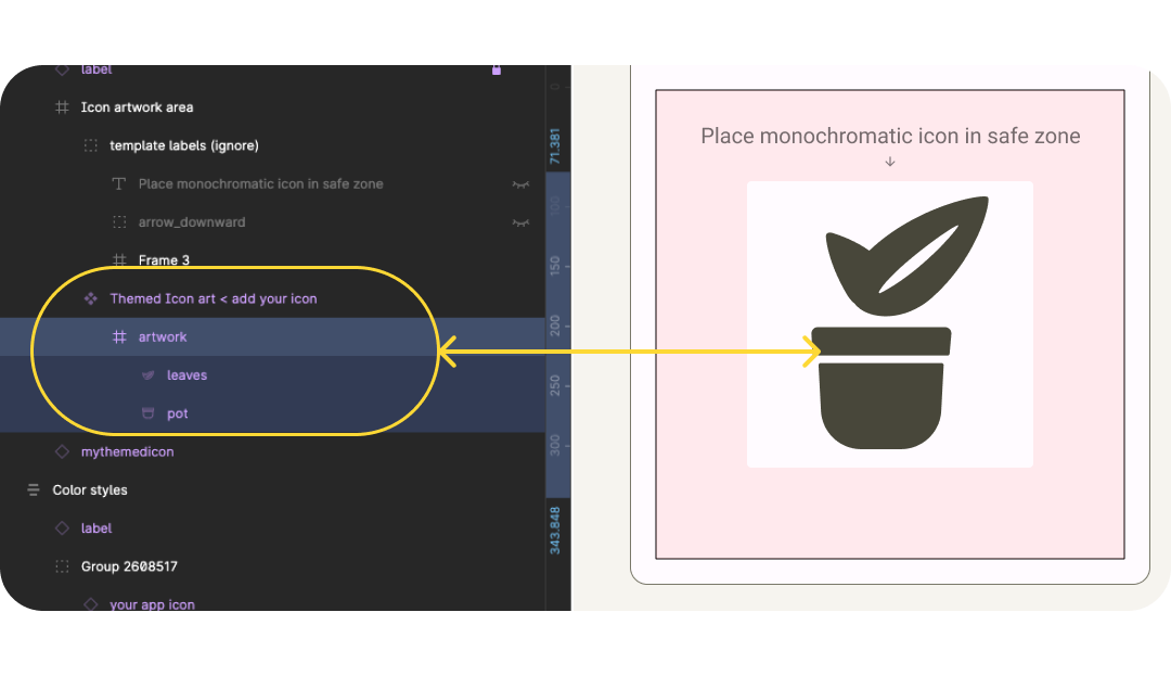
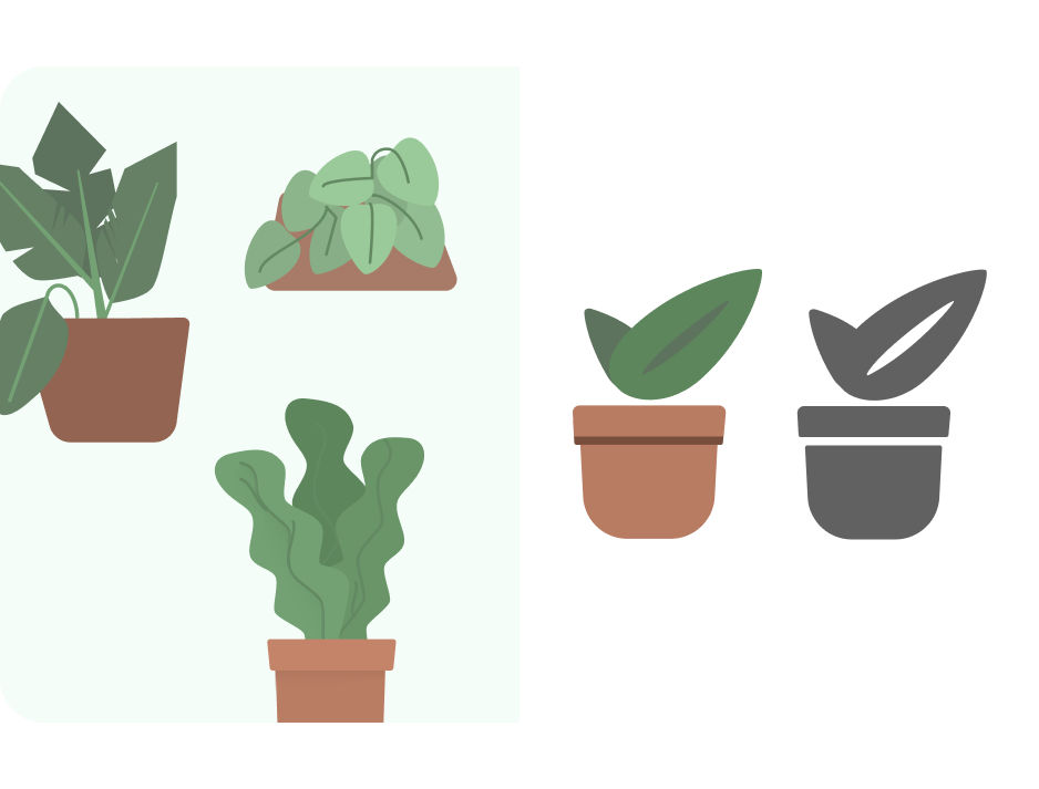
- If you do not have a monochromatic icon, start with a logo or icon related to your app. Go through the design tips to update your icon. First simplifying and avoiding complex shapes. For example, here illustrations used in-app are simplified with less complex leaf shapes. Shadows and line details are simulated with white space.
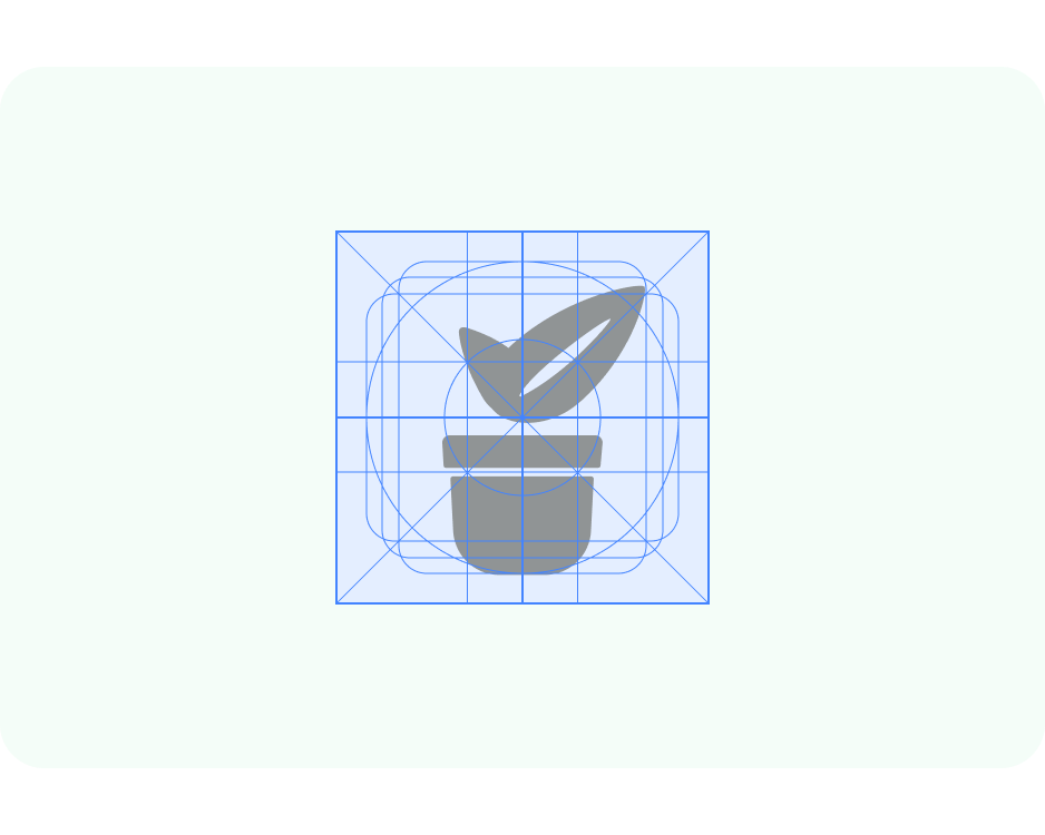
- Now, update sizing using the keyline grid. Here we've set resize to Scale and made sure the artwork is within the foreground safe zone. The template is set up with the artwork at 4x, and automatically resizes for export, so you can design your icons at a larger scale.
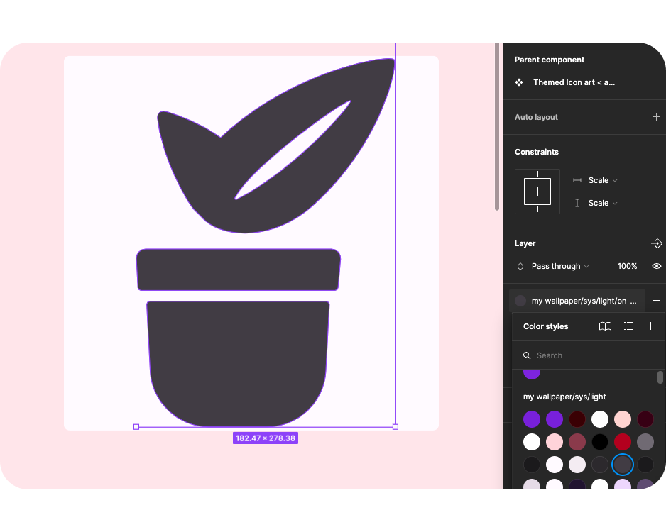
- The file is set up to work with the Material Theme Builder to help preview dynamic color. Connect the foreground icon color style to On-surface-variant.
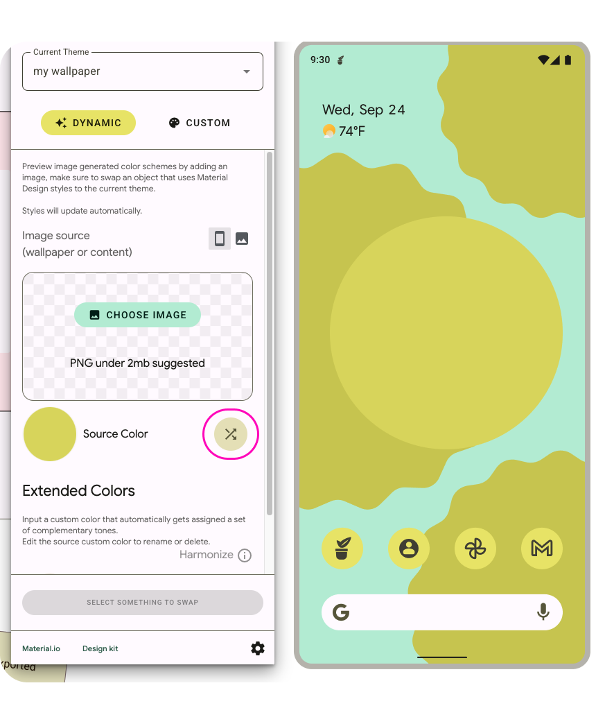
- Now, opening the Material Theme Builder from the Plugin Panel, you can either shuffle the source color or add an image to update the colors using the extracted source color.
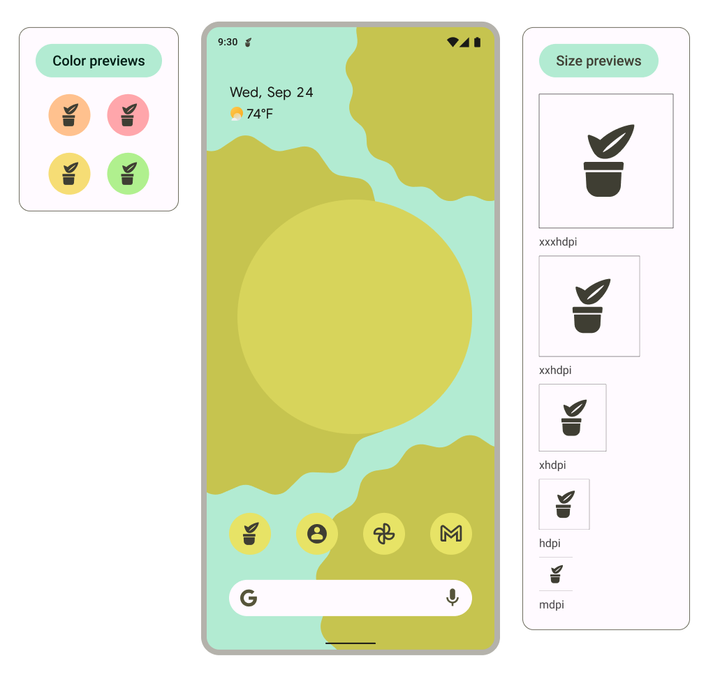
- What will this look like at different resolutions or on a home screen? The template is set up so that artwork placed within the artwork frames appears in the various preview contexts.
- The system uses the monochromatic icon as the notification and displays as such in the previews.
6. Adaptive shape and legacy icons
Now, we'll create the adaptive shape and legacy icons to ensure wide support of the icon.
- Within the file, locate the Shape frame. Look in the left layers panel to find Icon background < add your icon*. If you have an icon ready, copy it here to replace the sample bugdroid icon, and skip to step 5.* If you do not have an icon, start with a logo or icon related to your app or reuse the monochromatic icon.

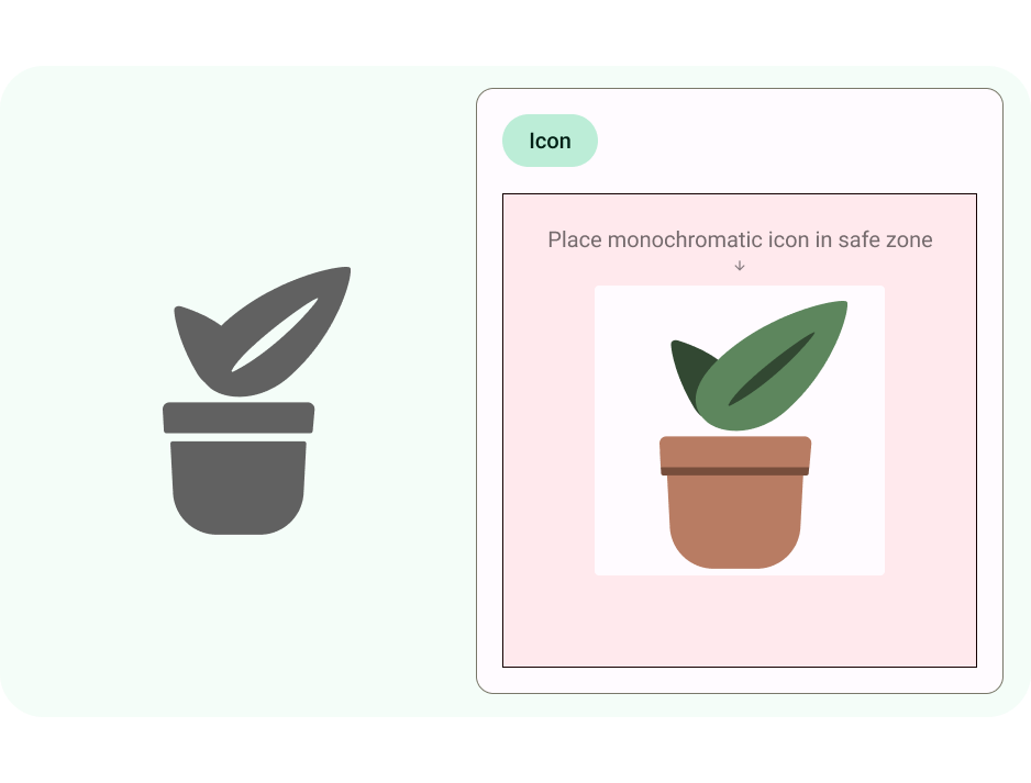
- Update foreground icon, keeping in mind the icon best practices. Here I've brought back the original illustration colors, but kept details minimal.
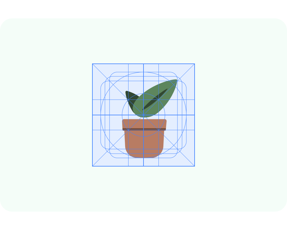
- Now, update sizing using the keyline grid. Here we've set resize to Scale and made sure the artwork is within the foreground safe zone.
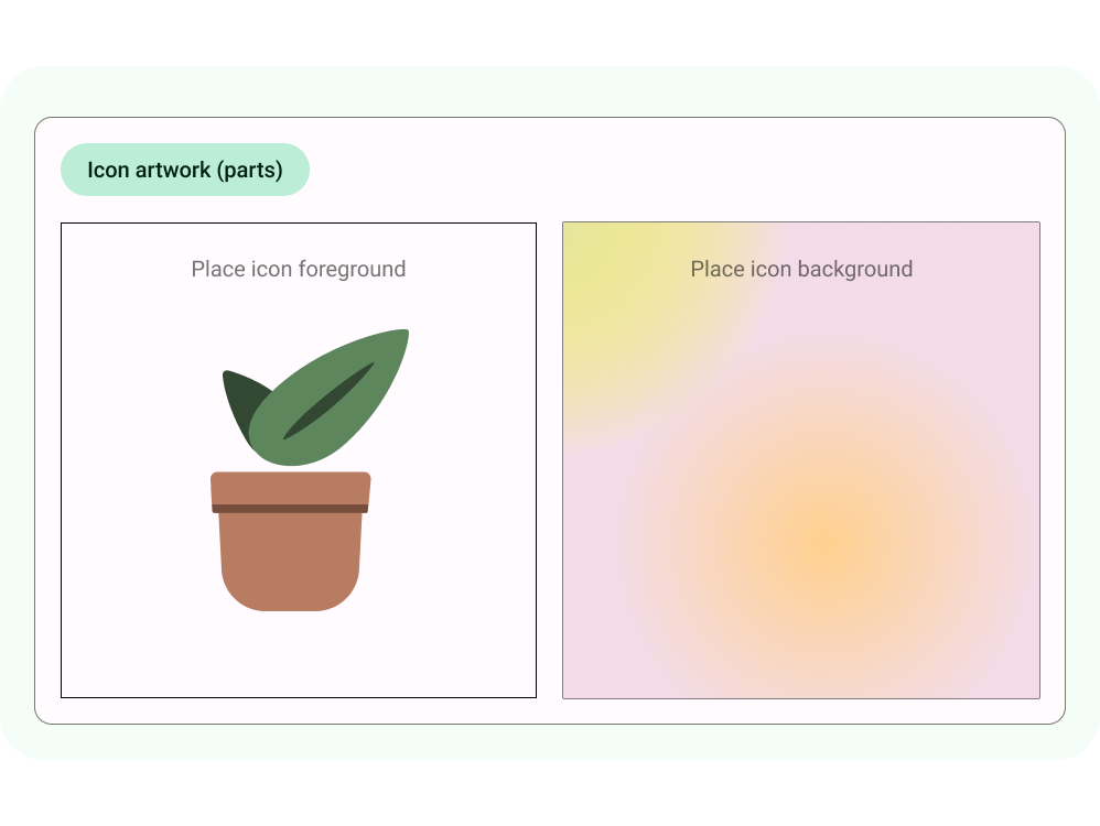
- Adaptive shape app icons can also have a distinct background. This allows for the icon's layers to be safely cropped and provide subtle movement effects on interaction. You can also use and define a solid color background in Android Studio.
- The previews update to show what the foreground and backgrounds look like together, on the homescreen, different cropped shapes, and as a legacy icon.
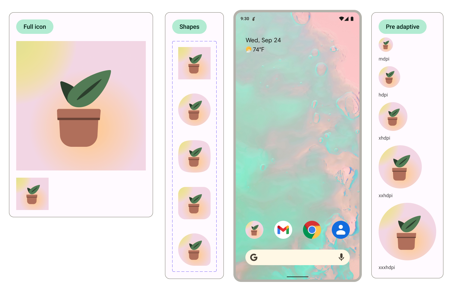
The shape used to crop can be updated within the home screen preview by selecting the icons and changing the shape variant option. 
7. Exporting
Great, you've now updated the template with your app icons! Let's export them for implementation..
- Make sure nothing is selected on the canvas.
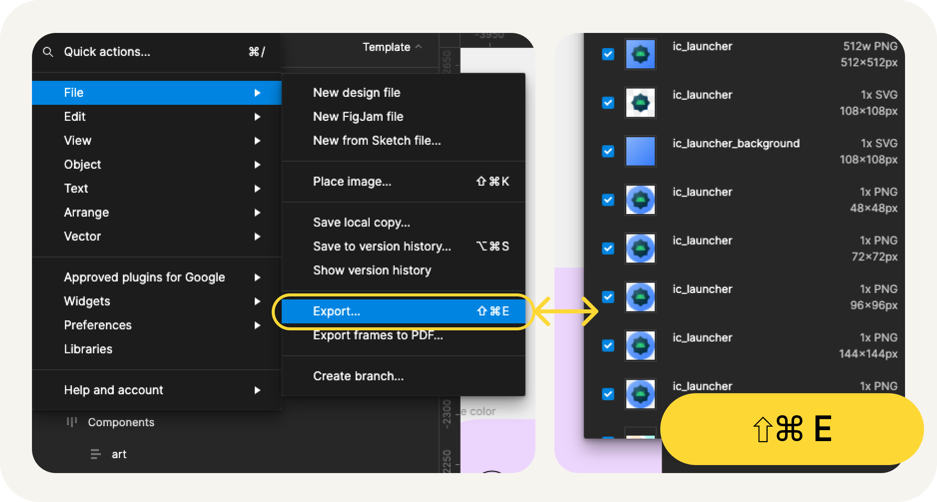
- Go to the Figma menu > File > Export (Shift + Cmd + E).
- In the export menu, confirm export. This will download the assets from the template.
What is in the export?
The exported assets have all the necessary files to implement your app icon, as follows
- Figma exports the monochromatic foreground icon for adaptive color as an SVG file, along with both foreground and background for adaptive shape icons.
- Figma also provides legacy icons in different mipmap directories organized by resolution.
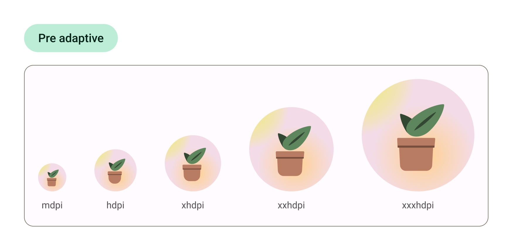
That's it! Your icon is ready to send over to development.
Alternatively, if you would like to preview your icons within Android Studio and convert those SVGs into their final asset format, continue to the next step.
8. Use Image Asset Studio
Get started with Android Studio
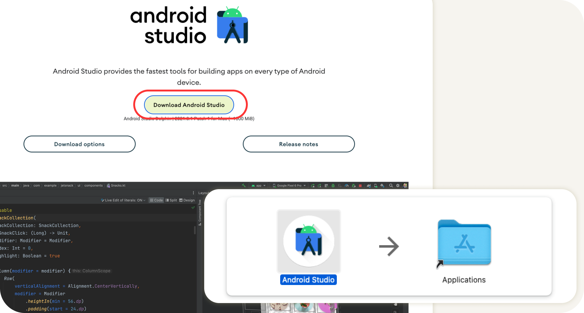
- Download and install Android Studio..
- Launch Android Studio.
Android Studio prompts you with options to start a new project or select existing projects.
- Select a new project for now. The following screens will walk you through setting up your new project.

- Select any template from the starter templates, as we'll only look at the launch icons.
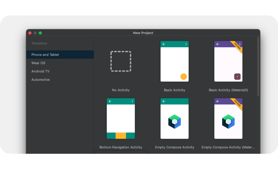
- After, name your new project and select Finish. The new project will take a few moments to be created.
Use Image Asset Studio
Now we can add your icons to the project using a helpful tool, Asset Studio.
- To access this tool, select File menu > New > Image Asset.
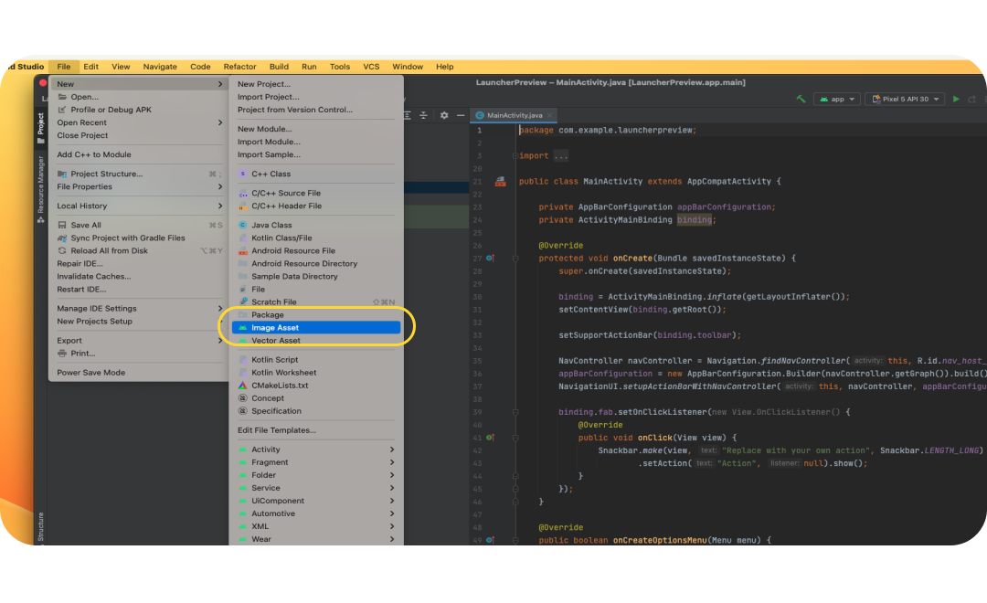
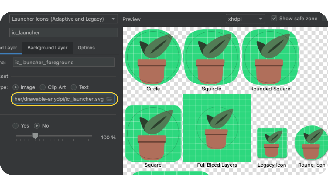
- When Image Asset Studio opens, add the foreground layer by selecting the folder icon in Path. Choose the exported SVG file as drawable-anydpi/ic_launcher.svg
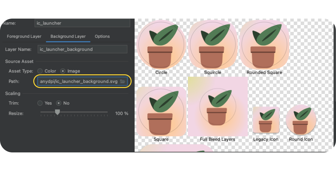
- Select the Background Layer tab and similarly choose the background layer that was exported. Alternatively, choose Asset Type: Color, to instead have a solid color launcher background.
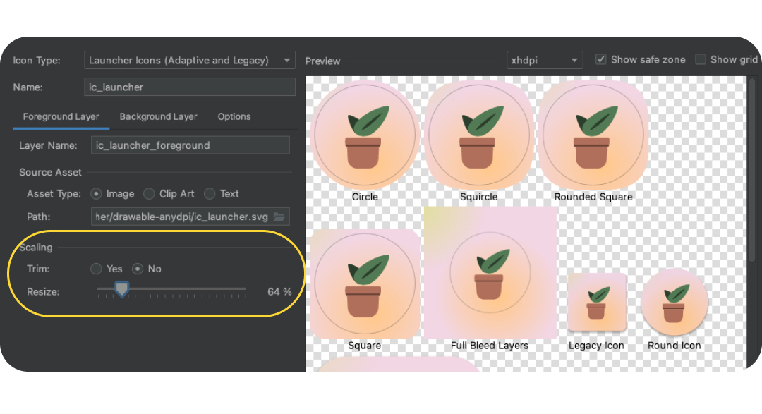
- Go back to the foreground layer and double check the image is within the safe zone. Resize the icon to what visually works best.
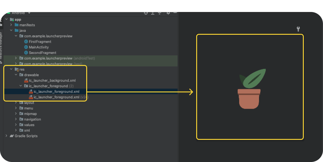
- When done, click Next this will ask where the icons should go within your project (leave this to the default or switch to Main). Then click Finish. You'll be able to find your launcher assets under res > drawable. Double clicking will open a preview of the final vector drawables.
- Manually copy-paste the monochrome layer asset into res/drawable or res/drawable-v24 or manually import the monochrome layer by right-clicking the res folder and selecting New > Vector Asset.
- In res/mipmap-anydpi-v26/ic_launcher.xml and res/mipmap-anydpi-v26/ic_launcher_round.xml add or change the existing android:monochrome="path/to/monochrome/asset to point to the correct monochrome asset.
9. Preview and resources
Preview in Emulator
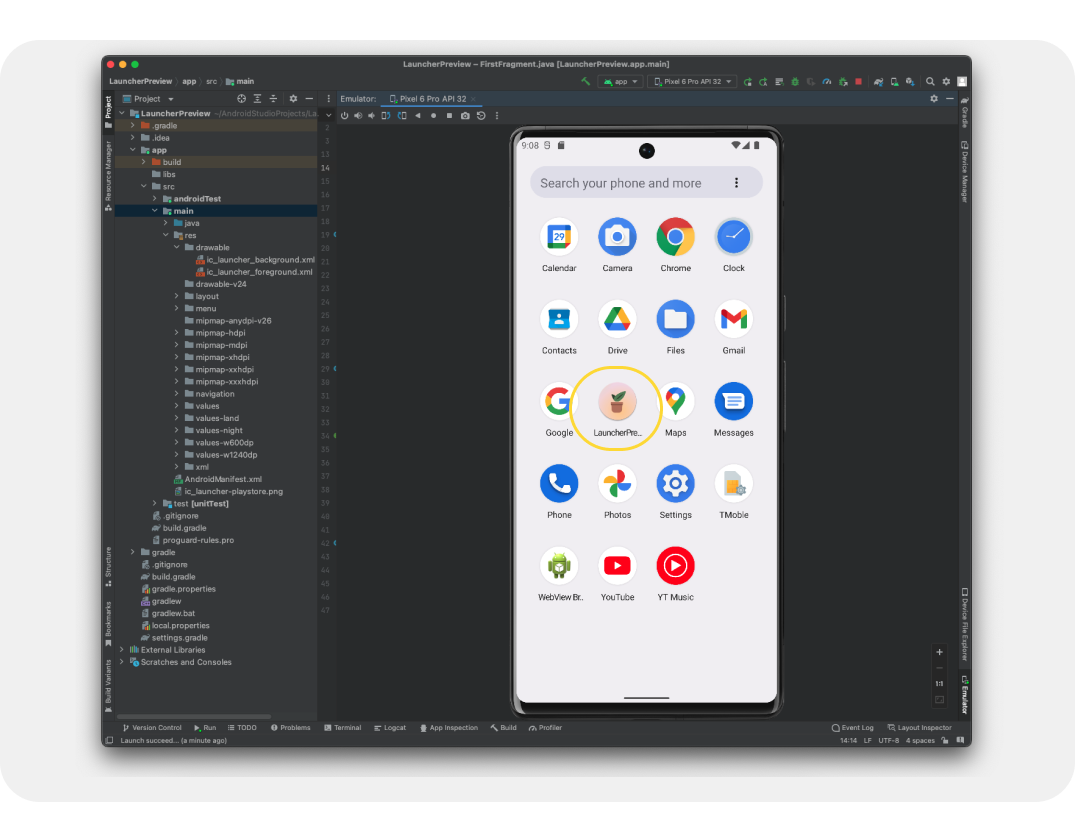
We've done this to add them to the app project, allowing us to preview on a real device or emulator! Let's see how our icons will look for real.
You should have an emulator setup by default, but if not, Create an Android Virtual Device. Click the green play button. This will build the project and open the emulator.
Final assets
Terrific, you've been able to check out how your launcher icon will look on a device using the emulator and added them to an app project. Doing so has converted them into their final production form! But where are they?
Assets live as resources with an Android app, and can be located by opening the Resource panel (typically in the left side). Drill down into the app, then find your Res folder. Right click to open a menu and select Open in Finder (on Mac), this will open a Finder window. Optionally, You can save some development and QA time by converting and testing the rest of your app's assets using a similar process. If you've converted the rest of your app's assets, then this folder can be shared with development.
10. Congratulations
Great job, you've learned about Android System icons needed to build an Android app, design your own icons, explored the icon template resource, and possibly gone beyond by diving into Android Studio to preview and convert assets for production!
If you have questions, feel free to ask us anytime using @MaterialDesign on Twitter.
Stay tuned for more design content and tutorials on youtube.com/MaterialDesign
