
1. Introduction
In this codelab you will learn how to build adaptive apps for phones, tablets, and foldables, and how they enhance reachability with Jetpack Compose. You will also learn best practices for using Material 3 components and theming.
Before we dive in, it's important to understand what we mean by adaptability.
Adaptability
The UI for your app should be responsive to account for different window sizes, orientations, and form factors. An adaptive layout changes based on the screen space available to it. These changes range from simple layout adjustments to fill up space, choosing respective navigation styles, to changing layouts completely to make use of additional room.
To learn more, check out Adaptive design.
In this codelab, you explore how to use and think about adaptability when using Jetpack Compose. You build an application, called Reply, that shows you how to implement adaptability for all kinds of screens, and how adaptability and reachability work together to give users an optimal experience.
What you'll learn
- How to design your app to target all window sizes with Jetpack Compose.
- How to target your app for different foldables.
- How to use different types of navigation for better reachability and accessibility.
- How to use Material 3 components to provide the best experience for every window size.
What you'll need
- The latest stable version of Android Studio.
- An Android 13 resizable virtual device.
- Knowledge of Kotlin.
- Basic understanding of Compose (such as the
@Composableannotation). - Basic familiarity with Compose layouts (e.g.
RowandColumn). - Basic familiarity with modifiers (e.g.
Modifier.padding()).
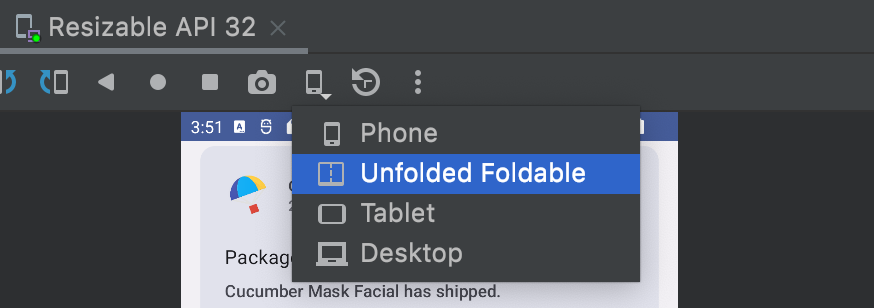
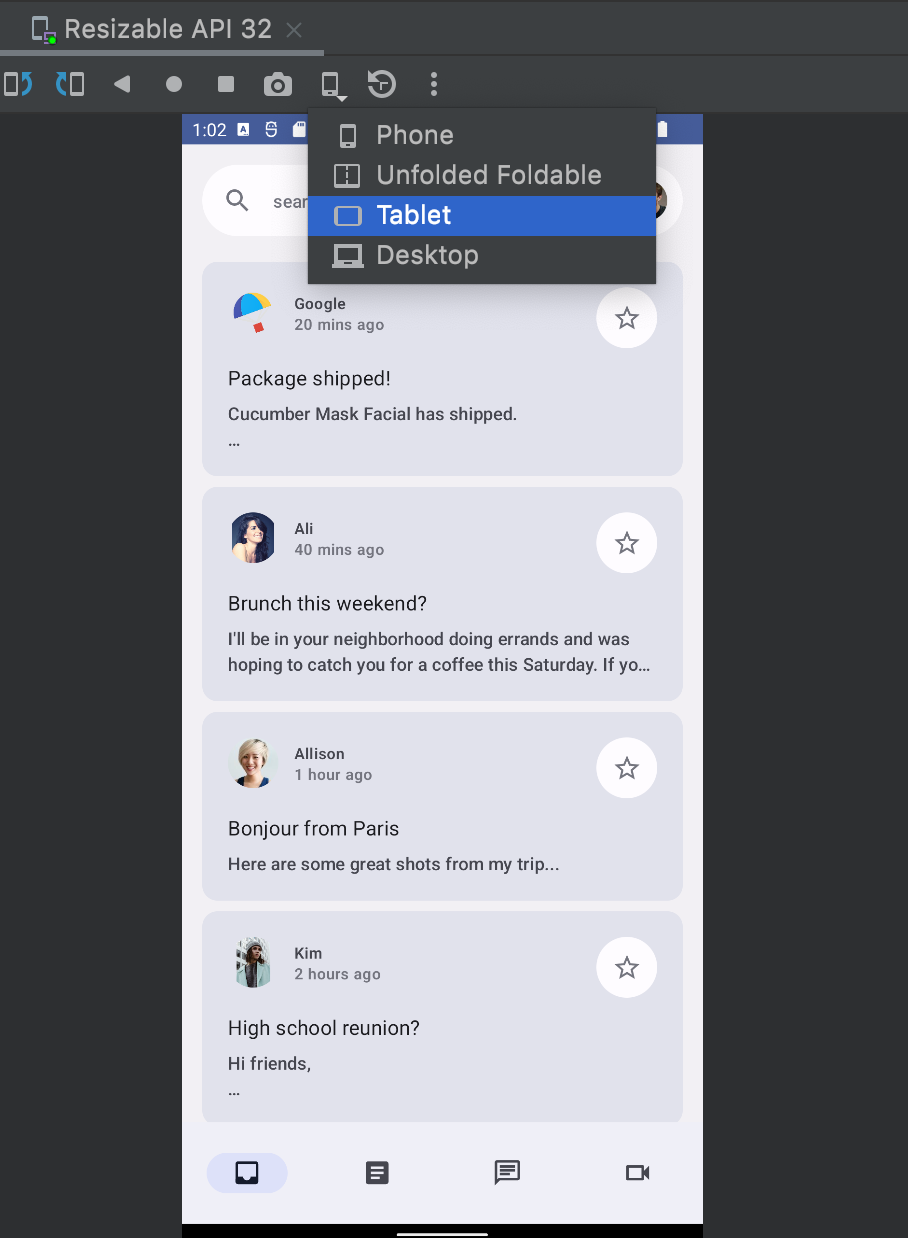
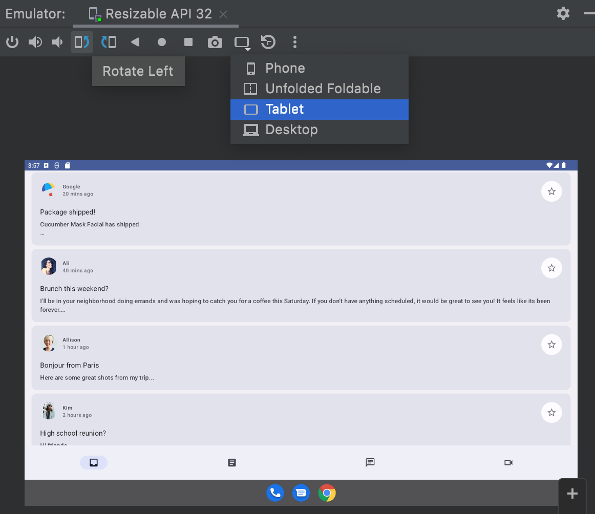
You'll use the Resizable emulator for this codelab, which lets you switch between different types of devices and window sizes.
If you're unfamiliar with Compose, consider taking the Jetpack Compose basics codelab before completing this codelab.
What you'll build
- An interactive email client app called Reply, using best practices for adaptable designs, different Material navigations, and optimal screen space usage.
2. Get set up
To get the code for this codelab, clone the GitHub repository from the command line:
git clone https://github.com/android/codelab-android-compose.git
cd codelab-android-compose/AdaptiveUiCodelab
Alternatively, you can download the repository as a ZIP file:
We recommend that you start with the code in the main branch and follow the codelab step-by-step at your own pace.
Open the project in Android Studio
- On the Welcome to Android Studio window, select
 Open an Existing Project.
 - Select the folder
<Download Location>/AdaptiveUiCodelab(make sure you select theAdaptiveUiCodelabdirectory containingbuild.gradle). - When Android Studio has imported the project, test that you can run the
mainbranch.
Explore the start code
The main branch code contains the ui package. You will work with the following files in that package:
MainActivity.kt- Entry point activity where you start your app.ReplyApp.kt- Contains main screen UI composables.ReplyHomeViewModel.kt- Provides the data and UI state for the app content.ReplyListContent.kt- Contains composables for providing lists and detail screens.
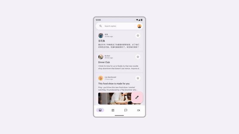
If you run this app on a resizable emulator and try different device types, like a phone or tablet, the UI just expands to the given space instead of taking advantage of screen space or providing reachability ergonomics.
You'll update it to take advantage of the screen space, increase usability, and improve the overall user experience.
3. Make apps adaptable
This section introduces what making apps adaptable means, and what components Material 3 provides to make that easier. It also covers the types of screens and states you'll target, including phones, tablets, large tablets, and foldables.
You'll start by going through the fundamentals of window sizes, fold postures, and different types of navigation options. Then, you can use these APIs in your app to make it more adaptive.
Window sizes
Android devices come in all shapes and sizes, from phones to foldables to tablets and ChromeOS devices. To support as many window sizes as possible, your UI needs to be responsive and adaptive. To help you find the right threshold at which to change the UI of your app, we've defined breakpoint values that help classify devices into predefined size classes (compact, medium, and expanded), called window size classes. These are a set of opinionated viewport breakpoints that help you design, develop, and test responsive and adaptive application layouts.
The categories were chosen specifically to balance layout simplicity, with the flexibility to optimize your app for unique cases. Window size class is always determined by the screen space available to the app, which may not be the entire physical screen for multitasking or other segmentations.
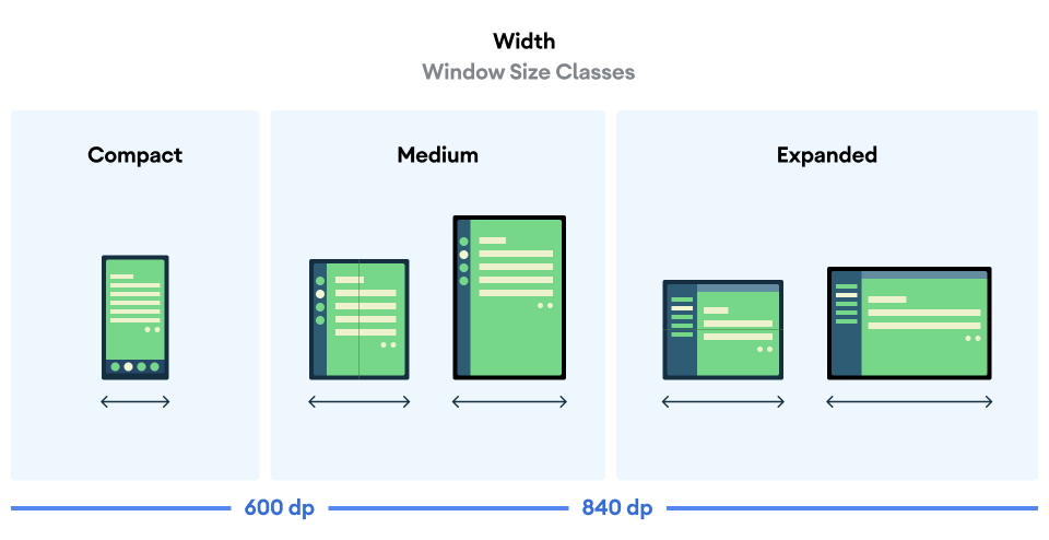
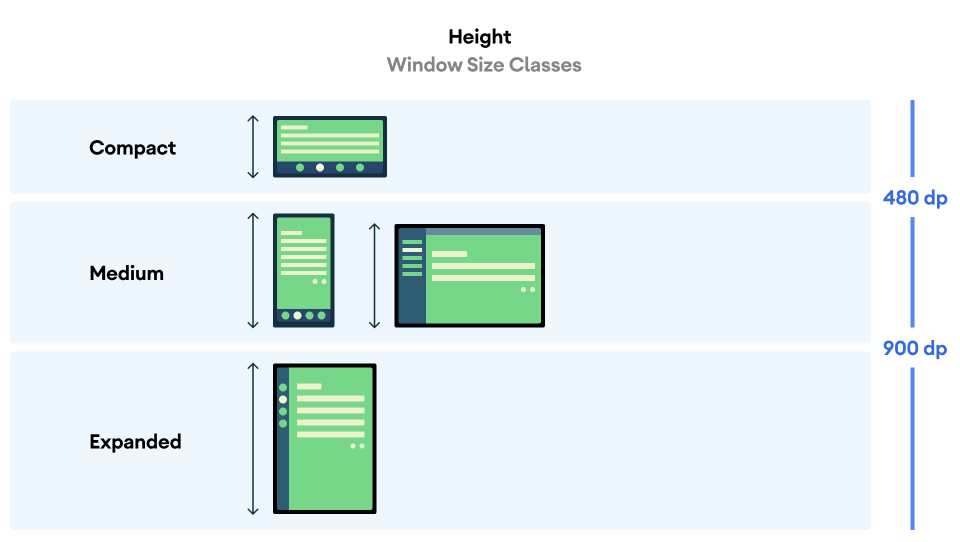
Both width and height are classified separately, so at any point in time, your app has two window size classes—one for width and one for height. Available width is usually more important than available height due to the ubiquity of vertical scrolling, so for this case you'll also use width size classes.
Fold states
Foldable devices present yet more situations your app can adapt to because of their varying sizes and the presence of hinges. Hinges can obscure part of the display, making that area unsuitable to show content; they could also be separating, meaning there are two separate physical displays when the device is unfolded.
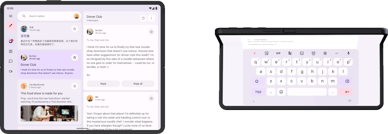
Additionally, the user could be looking at the inner display while the hinge is partly open, resulting in different physical postures based on the orientation of the fold: tabletop posture (horizontal fold, shown to the right in the image above) and book posture (vertical fold).
Read more about fold postures and hinges.
All of these are things to consider when implementing adaptive layouts that support foldables.
Get adaptive information
The Material3 adaptive library provides convenient access to information about the window your app is running in.
- Add entries for this artifact and its version to the version catalog file:
gradle/libs.versions.toml
[versions]
material3Adaptive = "1.0.0"

[libraries]
androidx-material3-adaptive = { module = "androidx.compose.material3.adaptive:adaptive", version.ref = "material3Adaptive" }
- In the build file of the app module, add the new library dependency and then perform a Gradle sync:
app/build.gradle.kts
dependencies {

    implementation(libs.androidx.material3.adaptive)
}
Now, in any composable scope, you can use currentWindowAdaptiveInfo() to get a WindowAdaptiveInfo object containing information like the current window size class and whether the device is in a foldable posture like tabletop posture.
You can try this now in MainActivity.
- In
onCreate()inside of theReplyThemeblock, get the window adaptive info and display the size classes in aTextcomposable. You can add this after theReplyApp()element:
MainActivity.kt
override fun onCreate(savedInstanceState: Bundle?) {
    super.onCreate(savedInstanceState)

    setContent {
        ReplyTheme {
            val uiState by viewModel.uiState.collectAsStateWithLifecycle()
            ReplyApp(
                replyHomeUIState = uiState,
                onEmailClick = viewModel::setSelectedEmail
            )

            val adaptiveInfo = currentWindowAdaptiveInfo()
            val sizeClassText =
                "${adaptiveInfo.windowSizeClass.windowWidthSizeClass}\n" +
                "${adaptiveInfo.windowSizeClass.windowHeightSizeClass}"
            Text(
                text = sizeClassText,
                color = Color.Magenta,
                modifier = Modifier.padding(
                    WindowInsets.safeDrawing.asPaddingValues()
                )
            )
        }
    }
}
Running the app now will show the window size classes printed over the app content. Feel free to explore what else is provided in the window adaptive info. Afterwards you can remove this Text since it covers the app content and it won't be necessary for the next steps.
4. Dynamic navigation
Now you'll adapt the app's navigation as the device state and size changes in order to make your app easier to use.
When users hold a phone, their fingers are usually at the bottom of the screen. When users hold an opened foldable device or a tablet, their fingers are usually close to the sides. Your users should be able to navigate or initiate an interaction with an app without requiring extreme hand positions or changing their hand placements.
As you design your app and decide where to place interactive UI elements in your layout, consider the ergonomic implications of different regions of the screen.
- Which areas are comfortable to reach while holding the device?
- Which areas can be reached only by extending fingers, which may be inconvenient?
- Which areas are challenging to reach or are far away from where the user holds the device?
Navigation is the first thing users interact with and it contains high-importance actions related to critical user journeys, so it should be placed in areas that are easiest to reach. The Material adaptive library provides several components that help you implement navigation, depending on the window size class of the device.
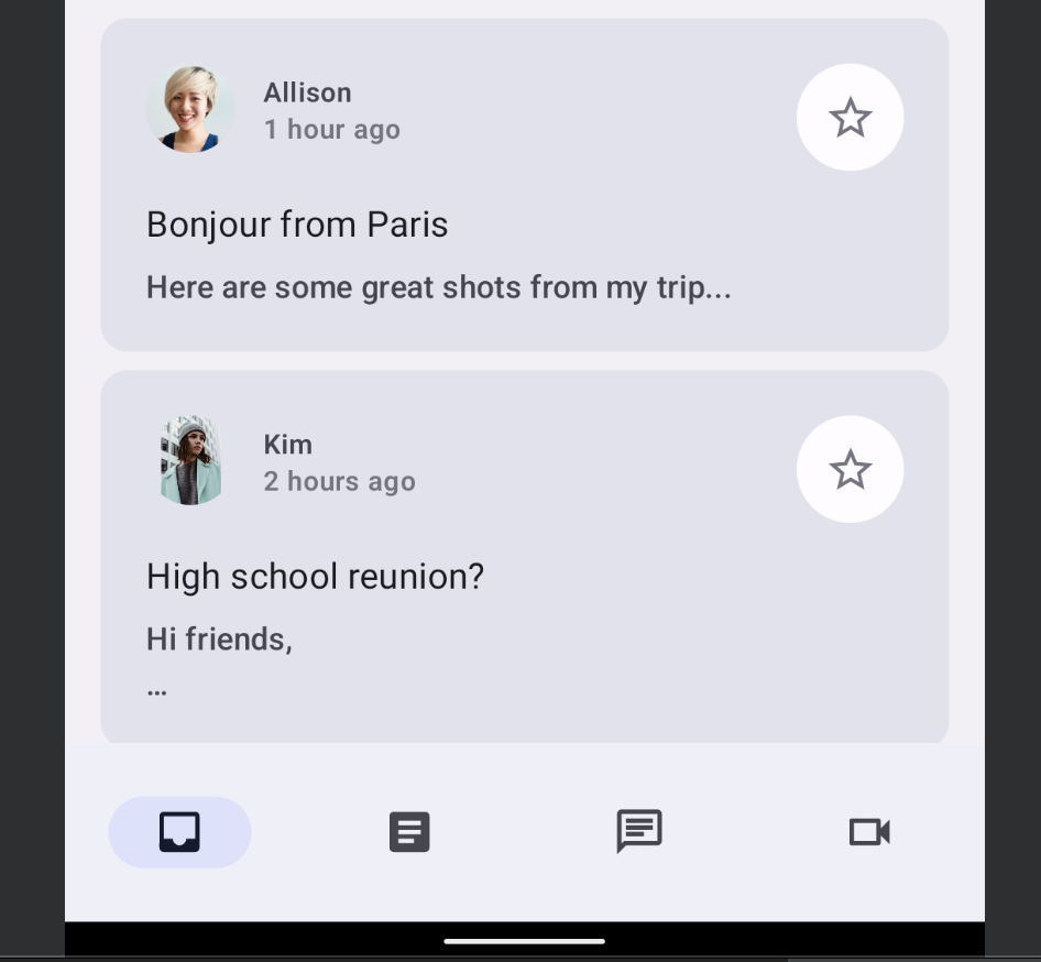
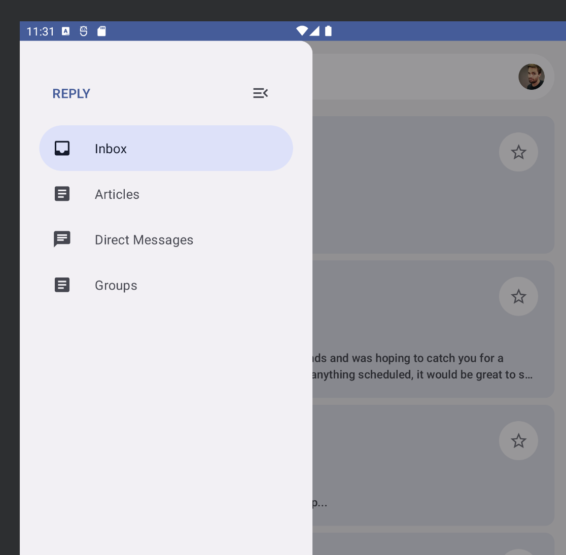
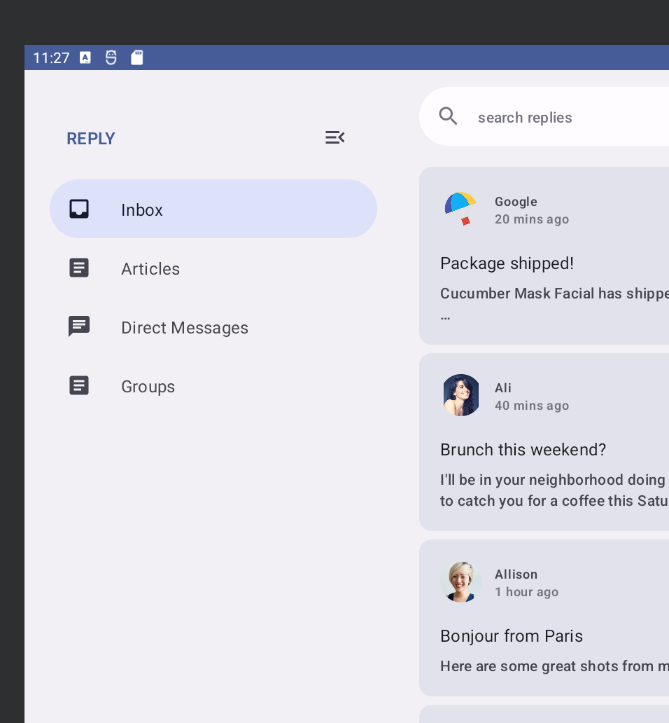
Bottom navigation
Bottom navigation is perfect for compact sizes, as we naturally hold the device where our thumb can easily reach all the bottom navigation touch points. Use it whenever you have a compact device size or a foldable in a compact folded state.
Navigation rail
For a medium width window size, the navigation rail is ideal for reachability as our thumb naturally falls along the side of the device. You can also combine a navigation rail with a navigation drawer to show more information.
Navigation drawer
The navigation drawer provides an easy way to see detailed information for navigation tabs, and is easily accessible when you're using tablets or larger devices. There are two kinds of navigation drawers available: a modal navigation drawer and a permanent navigation drawer.
Modal navigation drawer
You can use a modal navigation drawer for compact to medium size phones and tablets as it can be expanded or hidden as an overlay on the content. This can sometimes be combined with a navigation rail.
Permanent navigation drawer
You can use a permanent navigation drawer for fixed navigation on large tablets, Chromebooks, and desktops.
Implement dynamic navigation
Now, you'll switch between different types of navigation as the device state and size changes.
Currently, the app always shows a NavigationBar below the screen content regardless of the device state. Instead, you can use the Material NavigationSuiteScaffold component to automatically switch between the different navigation components based on information like the current window size class.
- Add the Gradle dependency to get this component by updating the version catalog and the app's build script, then perform a Gradle sync:
gradle/libs.versions.toml
[versions]
material3AdaptiveNavSuite = "1.3.0"

[libraries]
androidx-material3-adaptive-navigation-suite = { module = "androidx.compose.material3:material3-adaptive-navigation-suite", version.ref = "material3AdaptiveNavSuite" }
app/build.gradle.kts
dependencies {

    implementation(libs.androidx.material3.adaptive.navigation.suite)
}
- Find the
ReplyNavigationWrapper()composable function inReplyApp.ktand replace theColumnand its contents with aNavigationSuiteScaffold:
ReplyApp.kt
@Composable
private fun ReplyNavigationWrapperUI(
    content: @Composable () -> Unit = {}
) {
    var selectedDestination: ReplyDestination by remember {
        mutableStateOf(ReplyDestination.Inbox)
    }

    NavigationSuiteScaffold(
        navigationSuiteItems = {
            ReplyDestination.entries.forEach {
                item(
                    selected = it == selectedDestination,
                    onClick = { /*TODO update selection*/ },
                    icon = {
                        Icon(
                            imageVector = it.icon,
                            contentDescription = stringResource(it.labelRes)
                        )
                    },
                    label = {
                        Text(text = stringResource(it.labelRes))
                    },
                )
            }
        }
    ) {
        content()
    }
}
The navigationSuiteItems argument is a block that lets you add items using the item() function, similar to adding items in a LazyColumn. Inside the trailing lambda, this code calls the content() passed as an argument to ReplyNavigationWrapperUI().
Run the app on the emulator and try changing sizes between phone, foldable, and tablet, and you will see the navigation bar change to a navigation rail and back.
On very wide windows, such as on a tablet in landscape, you may want to show the permanent navigation drawer. NavigationSuiteScaffold does support showing a permanent drawer, though it's not shown in any of the current WindowWidthSizeClass values. However, you can make it do so with a small change.
- Add the following code just before the call to
NavigationSuiteScaffold:
ReplyApp.kt
@Composable
private fun ReplyNavigationWrapperUI(
    content: @Composable () -> Unit = {}
) {
    var selectedDestination: ReplyDestination by remember {
        mutableStateOf(ReplyDestination.Inbox)
    }

    val windowSize = with(LocalDensity.current) {
        currentWindowSize().toSize().toDpSize()
    }
    val layoutType = if (windowSize.width >= 1200.dp) {
        NavigationSuiteType.NavigationDrawer
    } else {
        NavigationSuiteScaffoldDefaults.calculateFromAdaptiveInfo(
            currentWindowAdaptiveInfo()
        )
    }

    NavigationSuiteScaffold(
        layoutType = layoutType,
        ...
    ) {
        content()
    }
}
This code first gets the window size and converts it to DP units using currentWindowSize() and LocalDensity.current, and then compares the window width to decide the layout type of the navigation UI. If the window width is at least 1200.dp, it uses NavigationSuiteType.NavigationDrawer. Otherwise, it falls back to the default calculation.
When you run the app again on your resizable emulator and try out different types, notice that whenever the screen configuration changes or you unfold a folding device, the navigation changes to the appropriate type for that size.
Congratulations, you've learned about different types of navigation to support different types of window sizes and states!
In the next section, you explore how to take advantage of any remaining screen area instead of stretching the same list item edge to edge.
5. Screen space use
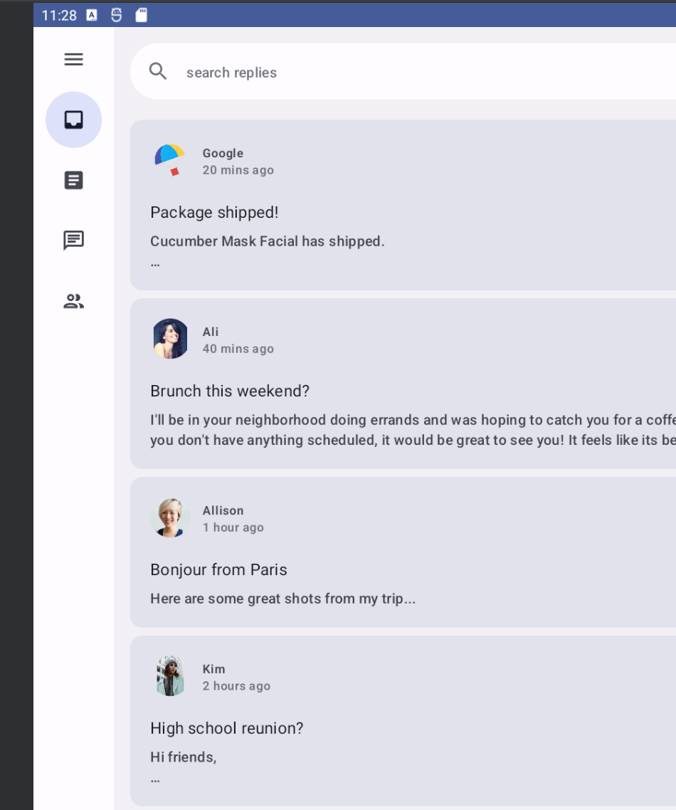
No matter if you're running the app on a small tablet, unfolded device, or large tablet, the screen is stretched to fill the remaining space. You want to make sure you can take advantage of that screen space to show more info, like for this app, showing email and threads to users on the same page.
Material 3 defines three canonical layouts which each have configurations for compact, medium, and expanded window size classes. The List Detail canonical layout is perfect for this use case, and is available in compose as ListDetailPaneScaffold.
- Get this component by adding the following dependencies and performing a Gradle sync:
gradle/libs.versions.toml
[libraries]
androidx-material3-adaptive-layout = { module = "androidx.compose.material3.adaptive:adaptive-layout", version.ref = "material3Adaptive" }
androidx-material3-adaptive-navigation = { module = "androidx.compose.material3.adaptive:adaptive-navigation", version.ref = "material3Adaptive" }
app/build.gradle.kts
dependencies {

    implementation(libs.androidx.material3.adaptive.layout)
    implementation(libs.androidx.material3.adaptive.navigation)
}
- Find the
ReplyAppContent()composable function inReplyApp.kt, which currently only shows the list pane by callingReplyListPane(). Replace this implementation withListDetailPaneScaffoldby inserting the following code. Since this is an experimental API, you will also add the@OptInannotation on theReplyAppContent()function:
ReplyApp.kt
@OptIn(ExperimentalMaterial3AdaptiveApi::class)
@Composable
fun ReplyAppContent(
    replyHomeUIState: ReplyHomeUIState,
    onEmailClick: (Email) -> Unit,
) {
    val navigator = rememberListDetailPaneScaffoldNavigator<Long>()

    ListDetailPaneScaffold(
        directive = navigator.scaffoldDirective,
        value = navigator.scaffoldValue,
        listPane = {
            ReplyListPane(replyHomeUIState, onEmailClick)
        },
        detailPane = {
            ReplyDetailPane(replyHomeUIState.emails.first())
        }
    )
}
This code first creates a navigator using rememberListDetailPaneNavigator. The navigator provides some control over which pane is displayed and what content should be represented in that pane, which will be demonstrated later.
ListDetailPaneScaffold will show two panes when the window width size class is expanded. Otherwise, it will show one pane or the other pane based on values provided for two parameters: the scaffold directive, and the scaffold value. To get the default behavior, this code uses the scaffold directive and the scaffold value provided by the navigator.
The remaining required parameters are composable lambdas for the panes. ReplyListPane() and ReplyDetailPane() (found in ReplyListContent.kt) are used to fill in the roles of the list and detail panes, respectively. ReplyDetailPane() expects an email argument, so for now this code uses the first email from the list of emails in ReplyHomeUIState.
Run the app and switch the emulator view to foldable or tablet (you might also have to change orientation) to see the two pane layout. This already looks a lot better than before!
Now let's address some of the desired behavior of this screen. When the user taps on an email in the list pane, it should be shown in the detail pane along with all of the replies. Currently, the app doesn't keep track of which email was selected, and tapping an item does nothing. The best place to keep this information is with the rest of the UI state in ReplyHomeUIState.
- Open
ReplyHomeViewModel.ktand find theReplyHomeUIStatedata class. Add a property for the selected email, with a default value ofnull:
ReplyHomeViewModel.kt
data class ReplyHomeUIState(
    val emails : List<Email> = emptyList(),
    val selectedEmail: Email? = null,
    val loading: Boolean = false,
    val error: String? = null
)
- In the same file,
ReplyHomeViewModelhas asetSelectedEmail()function that is called when the user taps a list item. Modify this function to copy the UI state and record the selected email:
ReplyHomeViewModel.kt
fun setSelectedEmail(email: Email) {
    _uiState.update {
        it.copy(selectedEmail = email)
    }
}
Something to consider is what happens before the user has tapped any item and the selected email is null. What should be displayed in the detail pane? There are multiple ways to handle this case, such as showing the first item in the list by default.
- In the same file, modify the
observeEmails()function. When the list of emails is loaded, if the previous UI state did not have a selected email, set it to the first item:
ReplyHomeViewModel.kt
private fun observeEmails() {
    viewModelScope.launch {
        emailsRepository.getAllEmails()
            .catch { ex ->
                _uiState.value = ReplyHomeUIState(error = ex.message)
            }
            .collect { emails ->
                val currentSelection = _uiState.value.selectedEmail
                _uiState.value = ReplyHomeUIState(
                    emails = emails,
                    selectedEmail = currentSelection ?: emails.first()
                )
            }
    }
}
- Return to
ReplyApp.ktand use the selected email, if it's available, to populate the detail pane content:
ReplyApp.kt
ListDetailPaneScaffold(
    // ...
    detailPane = {
        if (replyHomeUIState.selectedEmail != null) {
            ReplyDetailPane(replyHomeUIState.selectedEmail)
        }
    }
)
Run the app again and switch the emulator to tablet size, and see that tapping on a list item updates the contents of the detail pane.
This is working great when both panes are visible, but when the window only has room to show one pane, it looks like nothing happens when you tap an item. Try switching the emulator view to a phone, or a foldable device in portrait, and notice that only the list pane is visible even after tapping an item. That's because even though the selected email is updated, the ListDetailPaneScaffold is keeping focus on the list pane in these configurations.
- To fix that, insert the following code as the lambda passed to
ReplyListPane:
ReplyApp.kt
ListDetailPaneScaffold(
    // ...
    listPane = {
        ReplyListPane(
            replyHomeUIState = replyHomeUIState,
            onEmailClick = { email ->
                onEmailClick(email)
                navigator.navigateTo(ListDetailPaneScaffoldRole.Detail, email.id)
            }
        )
    },
    // ...
)
This lambda uses the navigator created earlier to add additional behavior when an item is clicked. It will call the original lambda passed to this function, and then also calls navigator.navigateTo() specifying which pane should be shown. Each pane in the scaffold has a role associated with it, and for the detail pane it is ListDetailPaneScaffoldRole.Detail. On smaller windows, this will give the appearance that the app has navigated forward.
The app also needs to handle what happens when the user presses the back button from the detail pane, and this behavior will be different depending on whether there is one pane or two panes visible.
- Support back navigation by adding the following code.
ReplyApp.kt
@OptIn(ExperimentalMaterial3AdaptiveApi::class)
@Composable
fun ReplyAppContent(
    replyHomeUIState: ReplyHomeUIState,
    onEmailClick: (Email) -> Unit,
) {
    val navigator = rememberListDetailPaneScaffoldNavigator<Long>()

    BackHandler(navigator.canNavigateBack()) {
        navigator.navigateBack()
    }

    ListDetailPaneScaffold(
        directive = navigator.scaffoldDirective,
        value = navigator.scaffoldValue,
        listPane = {
            AnimatedPane {
                ReplyListPane(
                    replyHomeUIState = replyHomeUIState,
                    onEmailClick = { email ->
                        onEmailClick(email)
                        navigator.navigateTo(ListDetailPaneScaffoldRole.Detail, email.id)
                    }
                )
            }
        },
        detailPane = {
            AnimatedPane {
                if (replyHomeUIState.selectedEmail != null) {
                    ReplyDetailPane(replyHomeUIState.selectedEmail)
                }
            }
        }
    )
}
The navigator knows the full state of the ListDetailPaneScaffold, whether back navigation is possible, and what to do in all these scenarios. This code creates a BackHandler that is enabled whenever the navigator can navigate back, and inside the lambda calls navigateBack(). Also, to make the transition between panes much smoother, each pane is wrapped in an AnimatedPane() composable.
Run the app again on a resizable emulator for all the different types of devices and notice that whenever the screen configuration changes, or you unfold a folding device, the navigation and screen content dynamically changes in response to the device state changes. Also try tapping emails in the list pane and see how the layout behaves on different screens, showing both panes side by side or animating between them smoothly.
Congratulations, you've successfully made your app adaptable for all kinds of device states and sizes. Go ahead and play around with running the app in foldables, tablets, or other mobile devices.
6. Congratulations
Congratulations! You've successfully completed this codelab and learned how to make apps adaptive with Jetpack Compose.
You learned how to check a device's size and fold state, and update your app's UI, navigation, and other functions accordingly. You also learned how adaptability improves reachability and enhances the user experience.
What's next?
Check out the other codelabs on the Compose pathway.
Sample apps
- The compose samples are a collection of many apps that incorporate the best practices explained in codelabs.