
۱. مقدمه
کامپوننتهای متریال (MDC) به توسعهدهندگان در پیادهسازی طراحی متریال کمک میکنند. MDC که توسط تیمی از مهندسان و طراحان UX در گوگل ایجاد شده است، دهها کامپوننت رابط کاربری زیبا و کاربردی را ارائه میدهد و برای اندروید، iOS، وب و Flutter.material.io/develop در دسترس است. |
در codelabs MDC-101 و MDC-102، شما از Material Components (MDC) برای ساخت اصول اولیه یک برنامه به نام Shrine ، یک برنامه تجارت الکترونیک که لباس و کالاهای خانگی میفروشد، استفاده کردید. این برنامه شامل یک جریان کاربری است که با یک صفحه ورود شروع میشود و کاربر را به صفحه اصلی که محصولات را نمایش میدهد، میبرد.
توسعه اخیر طراحی متریال به طراحان و توسعهدهندگان انعطافپذیری بیشتری برای بیان برند محصولشان میدهد. اکنون میتوانید از MDC برای سفارشیسازی Shrine استفاده کنید و سبک منحصر به فرد آن را بیش از هر زمان دیگری منعکس کنید.
آنچه خواهید ساخت
در این آزمایشگاه کد، شما Shrine را برای انعکاس برند خود با استفاده از موارد زیر سفارشیسازی خواهید کرد:
- رنگ
- تایپوگرافی
- ارتفاع
- طرح بندی
کامپوننتها و زیرسیستمهای اندروید MDC که در این آزمایشگاه کد استفاده شدهاند
- تمها
- تایپوگرافی
- ارتفاع
آنچه نیاز دارید
- دانش پایه در توسعه اندروید
- اندروید استودیو (اگر ندارید، از اینجا دانلود کنید)
- یک شبیهساز یا دستگاه اندروید (از طریق اندروید استودیو قابل دسترسی است)
- کد نمونه (به مرحله بعدی مراجعه کنید)
سطح تجربه خود در ساخت برنامههای اندروید را چگونه ارزیابی میکنید؟
۲. محیط توسعه خود را تنظیم کنید
ادامه از MDC-102؟
اگر MDC-102 را تکمیل کردهاید، کد شما باید برای استفاده در این آزمایشگاه کد آماده باشد. به مرحله ۳ بروید: رنگ را تغییر دهید .
اپلیکیشن استارتر codelab را دانلود کنید
برنامهی آغازین در دایرکتوری material-components-android-codelabs-103-starter/java قرار دارد. قبل از شروع، حتماً با cd به آن دایرکتوری بروید.
... یا آن را از گیتهاب کلون کنید
برای کپی کردن این codelab از گیتهاب، دستورات زیر را اجرا کنید:
git clone https://github.com/material-components/material-components-android-codelabs
cd material-components-android-codelabs/
git checkout 103-starter
کد شروع را در اندروید استودیو بارگذاری کنید
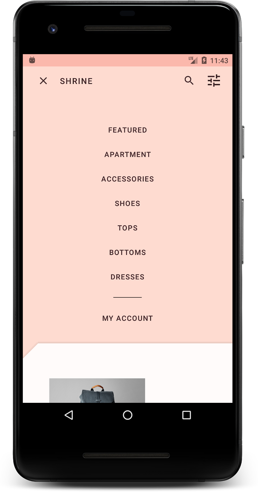
- پس از اتمام مراحل نصب و نمایش پنجره Welcome to Android Studio ، روی Open an existing Android Studio project کلیک کنید. به پوشهای که کد نمونه را در آن نصب کردهاید بروید و java -> shrine را انتخاب کنید (یا در رایانه خود عبارت shrine را جستجو کنید) تا پروژه Shrine باز شود.
- لحظهای صبر کنید تا اندروید استودیو پروژه را بسازد و همگامسازی کند، همانطور که توسط نشانگرهای فعالیت در پایین پنجره اندروید استودیو نشان داده شده است.
- در این مرحله، ممکن است اندروید استودیو به دلیل فقدان SDK اندروید یا ابزارهای ساخت، مانند آنچه در زیر نشان داده شده است، برخی خطاهای ساخت را ایجاد کند. برای نصب/بهروزرسانی این موارد و همگامسازی پروژه خود، دستورالعملهای موجود در اندروید استودیو را دنبال کنید.

اضافه کردن وابستگیهای پروژه
این پروژه به یک وابستگی (dependency) در کتابخانه پشتیبانی اندروید MDC نیاز دارد. کد نمونهای که دانلود کردهاید باید از قبل این وابستگی را داشته باشد، اما برای اطمینان، انجام مراحل زیر توصیه میشود.
- به فایل
build.gradleماژولappبروید و مطمئن شوید که بلوکdependenciesشامل یک وابستگی به MDC Android است:
api 'com.google.android.material:material:1.1.0-alpha06'
- (اختیاری) در صورت لزوم، فایل
build.gradleرا ویرایش کنید تا وابستگیهای زیر را اضافه کرده و پروژه را همگامسازی کنید.
dependencies {
    api 'com.google.android.material:material:1.1.0-alpha06'
    implementation 'androidx.legacy:legacy-support-v4:1.0.0'
    implementation 'com.android.volley:volley:1.1.1'
    implementation 'com.google.code.gson:gson:2.8.5'
    implementation "org.jetbrains.kotlin:kotlin-stdlib-jdk7:1.3.21"
    testImplementation 'junit:junit:4.12'
    androidTestImplementation 'androidx.test:core:1.1.0'
    androidTestImplementation 'androidx.test.ext:junit:1.1.0'
    androidTestImplementation 'androidx.test:runner:1.2.0-alpha05'
    androidTestImplementation 'androidx.test.espresso:espresso-core:3.2.0-alpha05'
}
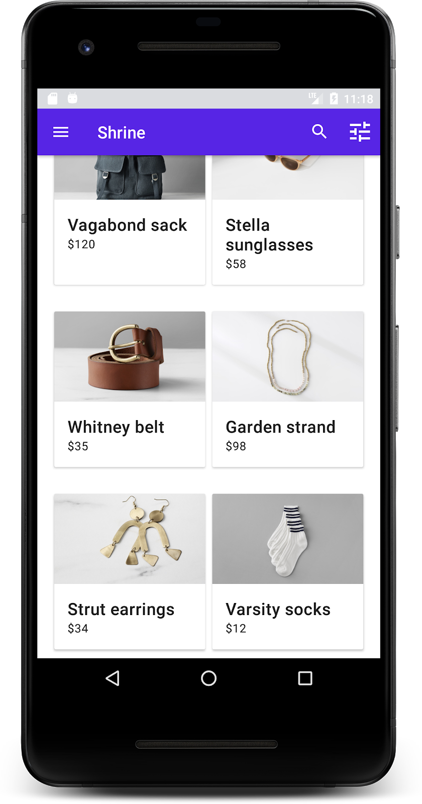
برنامه شروع کننده را اجرا کنید
|

موفقیتآمیز بود! شما باید صفحه ورود به سیستم Shrine را در دستگاه یا شبیهساز خود مشاهده کنید. وقتی Next را فشار دهید، صفحه اصلی Shrine با یک نوار برنامه در بالا و یک شبکه از تصاویر محصول در زیر ظاهر میشود.
بیایید با تغییر رنگ، ارتفاع و تایپوگرافی، نوار برنامهی بالایی را با برند Shrine هماهنگ کنیم.
۳. تغییر رنگ
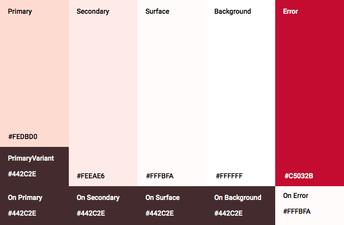
این تم رنگی توسط یک طراح با رنگهای سفارشی (که در تصویر زیر نشان داده شده است) ایجاد شده است. این تم شامل رنگهایی است که از برند Shrine انتخاب شده و در ویرایشگر تم متریال اعمال شدهاند، که آنها را گسترش داده تا یک پالت کاملتر ایجاد کند. (این رنگها از پالتهای رنگی متریال ۲۰۱۴ نیستند.)
ویرایشگر تم متریال، آنها را در سایههایی با برچسب عددی سازماندهی کرده است، از جمله برچسبهای ۵۰، ۱۰۰، ۲۰۰، .... تا ۹۰۰ از هر رنگ. Shrine فقط از سایههای ۵۰، ۱۰۰ و ۳۰۰ از نمونه صورتی و ۹۰۰ از نمونه قهوهای استفاده میکند.

بیایید رنگ نوار بالای برنامه را تغییر دهیم تا آن طرح رنگی را منعکس کند.
تنظیم colorPrimaryDark و colorAccent
در colors.xml ، خطوط زیر را تغییر دهید. ویژگی colorAccent رنگ نوار بالای برنامه و موارد دیگر را کنترل میکند و ویژگی colorPrimaryDark رنگ نوار وضعیت را کنترل میکند.
رنگها.xml
<color name="colorPrimaryDark">#FBB8AC</color>
<color name="colorAccent">#FEDBD0</color>
To use dark icons in the status bar, add the following to Theme.Shrine , Shrine's app theme:
سبکها.xml
<item name="android:windowLightStatusBar" tools:targetApi="m">true</item>
colors.xml و styles.xml شما باید به شکل زیر باشند:
رنگها.xml
<?xml version="1.0" encoding="utf-8"?>
<resources>
   <color name="colorPrimary">#E0E0E0</color>
   <color name="colorPrimaryDark">#FBB8AC</color>
   <color name="colorAccent">#FEDBD0</color>
   <color name="toolbarIconColor">#FFFFFF</color>
   <color name="loginPageBackgroundColor">#FFFFFF</color>
   <color name="productGridBackgroundColor">#FFFFFF</color>
</resources>
سبکها.xml
<resources xmlns:android="http://schemas.android.com/tools">

   <!-- Base application theme. -->
   <style name="Theme.Shrine" parent="Theme.MaterialComponents.Light.NoActionBar">
       <!-- Customize your theme here. -->
       <item name="colorPrimary">@color/colorPrimary</item>
       <item name="colorPrimaryDark">@color/colorPrimaryDark</item>
       <item name="colorAccent">@color/colorAccent</item>
       <item name="android:windowLightStatusBar" tools:targetApi="m">true</item>
   </style>

   <style name="Widget.Shrine.Toolbar" parent="Widget.AppCompat.Toolbar">
       <item name="android:background">?attr/colorAccent</item>
       <item name="android:theme">@style/ThemeOverlay.AppCompat.Dark.ActionBar</item>
       <item name="popupTheme">@style/ThemeOverlay.AppCompat.Light</item>
   </style>

</resources>
در colors.xml ، یک منبع رنگ textColorPrimary جدید با مقدار #442C2E اضافه کنید و ویژگی toolbarIconColor را برای ارجاع به رنگ textColorPrimary بهروزرسانی کنید.
فایل styles.xml خود را بهروزرسانی کنید تا ویژگی android:textColorPrimary را روی رنگ textColorPrimary تنظیم کنید.
تنظیم android:textColorPrimary در Theme.Shrine متن را در تمام عناصر، از جمله نوار بالای برنامه و آیکونهای موجود در نوار بالای برنامه، استایلدهی میکند.
یک نکتهی دیگر: ویژگی android:theme در استایل Widget.Shrine.Toolbar روی Theme.Shrine تنظیم کنید.
colors.xml و styles.xml شما باید به شکل زیر باشند:
رنگها.xml
<?xml version="1.0" encoding="utf-8"?>
<resources>
   <color name="colorPrimary">#E0E0E0</color>
   <color name="colorPrimaryDark">#FBB8AC</color>
   <color name="colorAccent">#FEDBD0</color>
   <color name="textColorPrimary">#442C2E</color>
   <color name="toolbarIconColor">@color/textColorPrimary</color>
   <color name="loginPageBackgroundColor">#FFFFFF</color>
   <color name="productGridBackgroundColor">#FFFFFF</color>
</resources>
سبکها.xml
<resources xmlns:android="http://schemas.android.com/tools">

   <!-- Base application theme. -->
   <style name="Theme.Shrine" parent="Theme.MaterialComponents.Light.NoActionBar">
       <!-- Customize your theme here. -->
       <item name="colorPrimary">@color/colorPrimary</item>
       <item name="colorPrimaryDark">@color/colorPrimaryDark</item>
       <item name="colorAccent">@color/colorAccent</item>
       <item name="android:windowLightStatusBar" tools:targetApi="m">true</item>
       <item name="android:textColorPrimary">@color/textColorPrimary</item>
   </style>

   <style name="Widget.Shrine.Toolbar" parent="Widget.AppCompat.Toolbar">
       <item name="android:background">?attr/colorAccent</item>
       <item name="android:theme">@style/Theme.Shrine</item>
       <item name="popupTheme">@style/ThemeOverlay.AppCompat.Light</item>
   </style>

</resources>
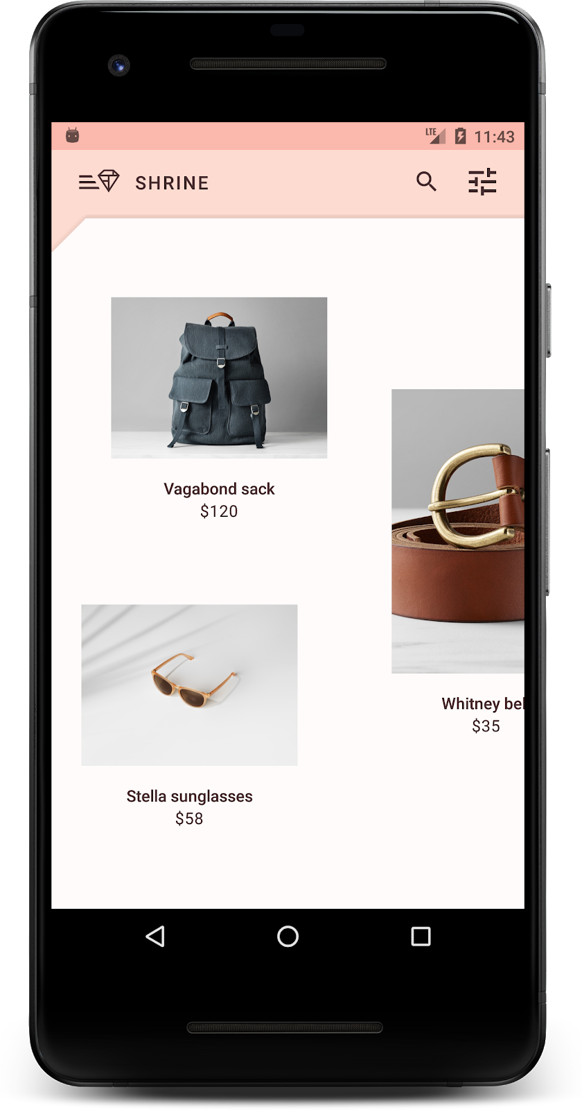
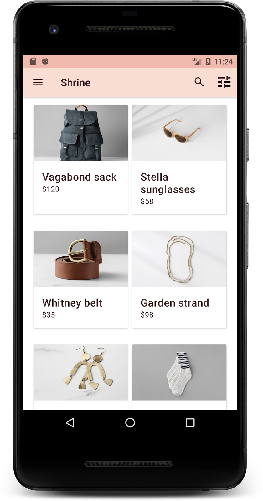
ساخت و اجرا. جدول محصولات شما اکنون باید به این شکل باشد:
بیایید سبک صفحه ورود را تغییر دهیم تا با طرح رنگی ما مطابقت داشته باشد.
استایل دادن به فیلدهای متنی
بیایید ورودیهای متن در صفحه ورود را به صورت outline شده تغییر دهیم و از رنگهای بهتری برای طرحبندی خود استفاده کنیم.
منبع رنگ زیر را به فایل colors.xml خود اضافه کنید:
رنگها.xml
<color name="textInputOutlineColor">#FBB8AC</color>
دو استایل جدید به styles.xml خود اضافه کنید:
سبکها.xml
<style name="Widget.Shrine.TextInputLayout" parent="Widget.MaterialComponents.TextInputLayout.OutlinedBox">
   <item name="hintTextAppearance">@style/TextAppearance.Shrine.TextInputLayout.HintText</item>
   <item name="hintTextColor">@color/textColorPrimary</item>
   <item name="android:paddingBottom">8dp</item>
   <item name="boxStrokeColor">@color/textInputOutlineColor</item>
</style>

<style name="TextAppearance.Shrine.TextInputLayout.HintText" parent="TextAppearance.MaterialComponents.Subtitle2">
   <item name="android:textColor">?android:attr/textColorPrimary</item>
</style>
در نهایت، ویژگی style را در هر دو کامپوننت XML مربوط به TextInputLayout در shr_login_fragment.xml روی style جدید خود تنظیم کنید:
shr_login_fragment.xml
<com.google.android.material.textfield.TextInputLayout
   style="@style/Widget.Shrine.TextInputLayout"
   android:layout_width="match_parent"
   android:layout_height="wrap_content"
   android:hint="@string/shr_hint_username">

   <com.google.android.material.textfield.TextInputEditText
       android:layout_width="match_parent"
       android:layout_height="wrap_content"
       android:inputType="text"
       android:maxLines="1" />
</com.google.android.material.textfield.TextInputLayout>

<com.google.android.material.textfield.TextInputLayout
   android:id="@+id/password_text_input"
   style="@style/Widget.Shrine.TextInputLayout"
   android:layout_width="match_parent"
   android:layout_height="wrap_content"
   android:hint="@string/shr_hint_password"
   app:errorEnabled="true">

   <com.google.android.material.textfield.TextInputEditText
       android:id="@+id/password_edit_text"
       android:layout_width="match_parent"
       android:layout_height="wrap_content"
       android:inputType="textPassword" />
</com.google.android.material.textfield.TextInputLayout>
رنگ دکمهها را استایل دهید
در نهایت، رنگ دکمههای صفحه ورود را تغییر دهید. استایلهای زیر را به styles.xml خود اضافه کنید:
سبکها.xml
<style name="Widget.Shrine.Button" parent="Widget.MaterialComponents.Button">
   <item name="android:textColor">?android:attr/textColorPrimary</item>
   <item name="backgroundTint">?attr/colorPrimaryDark</item>
</style>

<style name="Widget.Shrine.Button.TextButton" parent="Widget.MaterialComponents.Button.TextButton">
   <item name="android:textColor">?android:attr/textColorPrimary</item>
</style>
استایل Widget.Shrine.Button از استایل پیشفرض MaterialButton گسترش مییابد و رنگ متن و رنگ پسزمینه دکمه را تغییر میدهد. Widget.Shrine.Button.TextButton از استایل پیشفرض متن MaterialButton گسترش مییابد و فقط رنگ متن را تغییر میدهد.
استایل Widget.Shrine.Button را برای دکمه Next و استایل Widget.Shrine.Button.TextButton را برای دکمه Cancel به صورت زیر تنظیم کنید:
shr_login_fragment.xml
<RelativeLayout
   android:layout_width="match_parent"
   android:layout_height="wrap_content">

   <com.google.android.material.button.MaterialButton
       android:id="@+id/next_button"
       style="@style/Widget.Shrine.Button"
       android:layout_width="wrap_content"
       android:layout_height="wrap_content"
       android:layout_alignParentEnd="true"
       android:layout_alignParentRight="true"
       android:text="@string/shr_button_next" />

   <com.google.android.material.button.MaterialButton
       android:id="@+id/cancel_button"
       style="@style/Widget.Shrine.Button.TextButton"
       android:layout_width="wrap_content"
       android:layout_height="wrap_content"
       android:layout_marginEnd="12dp"
       android:layout_marginRight="12dp"
       android:layout_toStartOf="@id/next_button"
       android:layout_toLeftOf="@id/next_button"
       android:text="@string/shr_button_cancel" />

</RelativeLayout>
رنگ لوگوی Shrine را در صفحه ورود بهروزرسانی کنید. این کار نیاز به تغییر کوچکی در فایل vector drawable، shr_logo.xml ، دارد. فایل drawable را باز کنید و ویژگی android:fillAlpha را به ۱ تغییر دهید. فایل drawable باید به شکل زیر باشد:
shr_logo.xml
<vector xmlns:android="http://schemas.android.com/apk/res/android"
   android:width="149dp"
   android:height="152dp"
   android:tint="?attr/colorControlNormal"
   android:viewportWidth="149"
   android:viewportHeight="152">
   <path
       android:fillAlpha="1"
       android:fillColor="#DADCE0"
       android:fillType="evenOdd"
       android:pathData="M42.262,0L0,38.653L74.489,151.994L148.977,38.653L106.723,0M46.568,11.11L21.554,33.998L99.007,33.998L99.007,11.11L46.568,11.11ZM110.125,18.174L110.125,33.998L127.416,33.998L110.125,18.174ZM80.048,45.116L80.048,123.296L131.426,45.116L80.048,45.116ZM17.551,45.116L33.976,70.101L68.93,70.101L68.93,45.116L17.551,45.116ZM41.284,81.219L68.93,123.296L68.93,81.219L41.284,81.219Z"
       android:strokeWidth="1"
       android:strokeAlpha="0.4"
       android:strokeColor="#00000000" />
</vector>
ویژگی android:tint در لوگوی <ImageView> در shr_login_fragment.xml به صورت زیر روی ?android:attr/textColorPrimary تنظیم کنید:
shr_login_fragment.xml
<ImageView
   android:layout_width="64dp"
   android:layout_height="64dp"
   android:layout_gravity="center_horizontal"
   android:layout_marginTop="48dp"
   android:layout_marginBottom="16dp"
   android:tint="?android:attr/textColorPrimary"
   app:srcCompat="@drawable/shr_logo" />
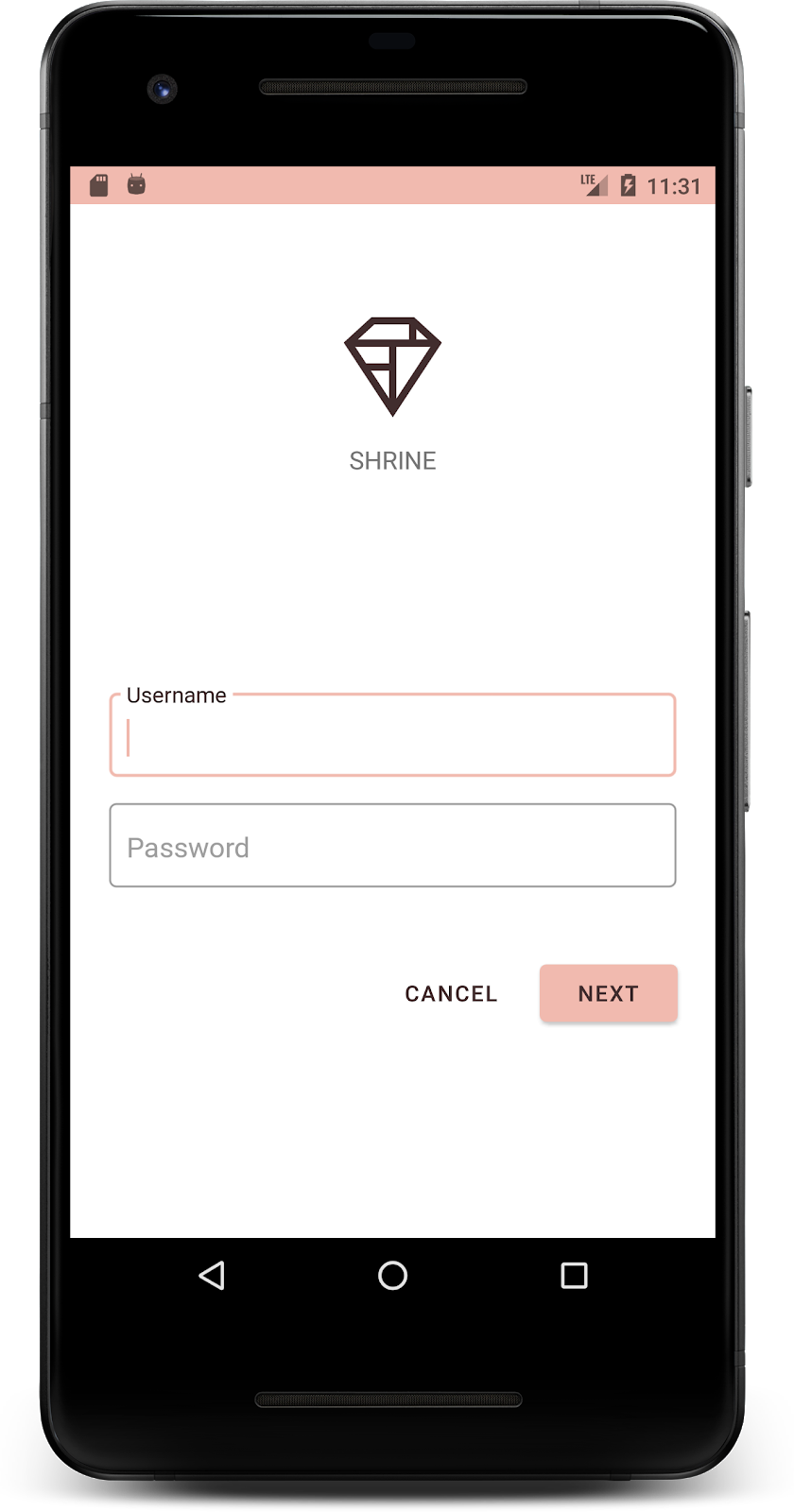
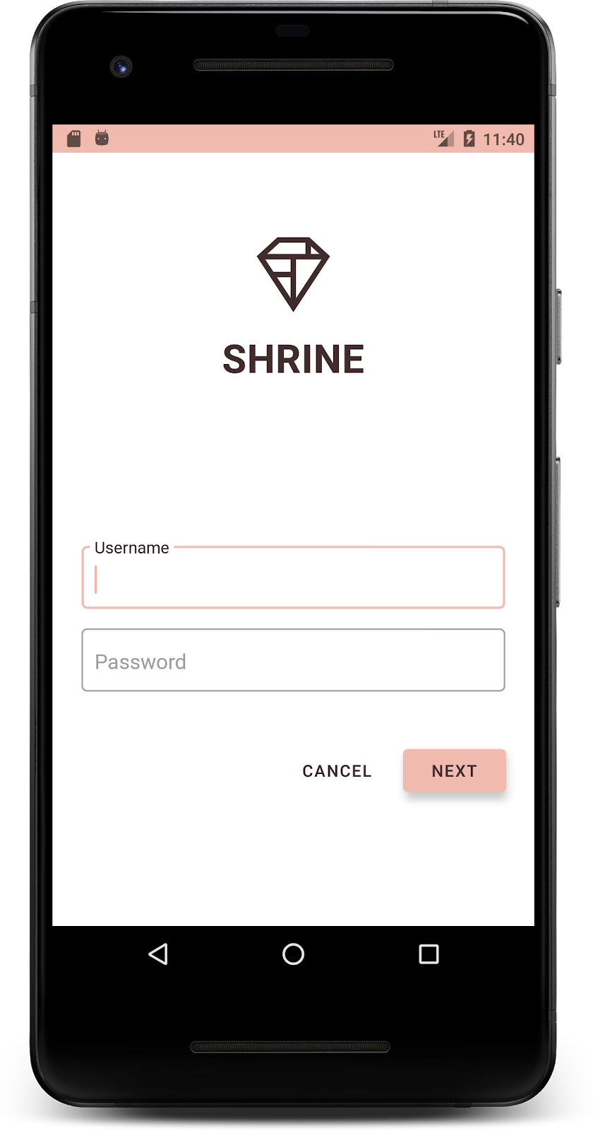
صفحه ورود شما باید به این شکل باشد:
۴. اصلاح تایپوگرافی و سبکهای برچسب
علاوه بر تغییرات رنگ، طراح شما تایپوگرافی خاصی را نیز برای استفاده در سایت به شما ارائه داده است. بیایید آن را نیز به نوار بالای برنامه اضافه کنیم.
نوار برنامه بالا را سبک دهید
ظاهر متن نوار بالای برنامه خود را طوری تنظیم کنید که با مشخصات ارائه شده توسط طراح شما مطابقت داشته باشد. سبک ظاهر متن زیر را به styles.xml اضافه کنید و ویژگی titleTextAppearance را طوری تنظیم کنید که به این سبک در سبک Widget.Shrine.Toolbar شما ارجاع دهد.
سبکها.xml
<style name="Widget.Shrine.Toolbar" parent="Widget.AppCompat.Toolbar">
   <item name="android:background">?attr/colorAccent</item>
   <item name="android:theme">@style/Theme.Shrine</item>
   <item name="popupTheme">@style/ThemeOverlay.AppCompat.Light</item>
   <item name="titleTextAppearance">@style/TextAppearance.Shrine.Toolbar</item>
</style>

<style name="TextAppearance.Shrine.Toolbar" parent="TextAppearance.MaterialComponents.Button">
   <item name="android:textSize">16sp</item>
</style>
colors.xml و styles.xml شما باید به شکل زیر باشند:
رنگها.xml
<?xml version="1.0" encoding="utf-8"?>
<resources>
   <color name="colorPrimary">#E0E0E0</color>
   <color name="colorPrimaryDark">#FBB8AC</color>
   <color name="colorAccent">#FEDBD0</color>
   <color name="textColorPrimary">#442C2E</color>
   <color name="toolbarIconColor">@color/textColorPrimary</color>
   <color name="loginPageBackgroundColor">#FFFFFF</color>
   <color name="productGridBackgroundColor">#FFFFFF</color>
   <color name="textInputOutlineColor">#FBB8AC</color>
</resources>
سبکها.xml
<resources xmlns:android="http://schemas.android.com/tools">

   <!-- Base application theme. -->
   <style name="Theme.Shrine" parent="Theme.MaterialComponents.Light.NoActionBar">
       <!-- Customize your theme here. -->
       <item name="colorPrimary">@color/colorPrimary</item>
       <item name="colorPrimaryDark">@color/colorPrimaryDark</item>
       <item name="colorAccent">@color/colorAccent</item>
       <item name="android:windowLightStatusBar" tools:targetApi="m">true</item>
       <item name="android:textColorPrimary">@color/textColorPrimary</item>
   </style>

   <style name="Widget.Shrine.TextInputLayout" parent="Widget.MaterialComponents.TextInputLayout.OutlinedBox">
       <item name="hintTextAppearance">@style/TextAppearance.Shrine.TextInputLayout.HintText</item>
       <item name="hintTextColor">@color/textColorPrimary</item>
       <item name="android:paddingBottom">8dp</item>
       <item name="boxStrokeColor">@color/textInputOutlineColor</item>
   </style>

   <style name="TextAppearance.Shrine.TextInputLayout.HintText" parent="TextAppearance.MaterialComponents.Subtitle2">
       <item name="android:textColor">?android:attr/textColorPrimary</item>
   </style>


   <style name="Widget.Shrine.Button" parent="Widget.MaterialComponents.Button">
       <item name="android:textColor">?android:attr/textColorPrimary</item>
       <item name="backgroundTint">?attr/colorPrimaryDark</item>
   </style>

   <style name="Widget.Shrine.Button.TextButton" parent="Widget.MaterialComponents.Button.TextButton">
       <item name="android:textColor">?android:attr/textColorPrimary</item>
   </style>

   <style name="Widget.Shrine.Toolbar" parent="Widget.AppCompat.Toolbar">
       <item name="android:background">?attr/colorAccent</item>
       <item name="android:theme">@style/Theme.Shrine</item>
       <item name="popupTheme">@style/ThemeOverlay.AppCompat.Light</item>
       <item name="titleTextAppearance">@style/TextAppearance.Shrine.Toolbar</item>
   </style>

   <style name="TextAppearance.Shrine.Toolbar" parent="TextAppearance.MaterialComponents.Button">
       <item name="android:textSize">16sp</item>
   </style>

</resources>
استایل دادن به برچسبها
ما برچسبهای کارت محصول را طوری استایلبندی میکنیم که از ظاهر متن صحیح استفاده کنند و به صورت افقی در مرکز کارت قرار بگیرند.
تایپوگرافی روی برچسب عنوان خود را از textAppearanceHeadline6 به textAppearanceSubtitle2 به شرح زیر بهروزرسانی کنید:
shr_product_card.xml
<TextView
   android:id="@+id/product_title"
   android:layout_width="match_parent"
   android:layout_height="wrap_content"
   android:text="@string/shr_product_title"
   android:textAppearance="?attr/textAppearanceSubtitle2" />
برای قرار دادن برچسبهای تصویر در مرکز، برچسب <TextView> را در shr_product_card.xml تغییر دهید تا ویژگی android:textAlignment="center" را تنظیم کنید:
shr_product_card.xml
<LinearLayout
   android:layout_width="match_parent"
   android:layout_height="wrap_content"
   android:orientation="vertical"
   android:padding="16dp">

   <TextView
       android:id="@+id/product_title"
       android:layout_width="match_parent"
       android:layout_height="wrap_content"
       android:text="@string/shr_product_title"
       android:textAlignment="center"
       android:textAppearance="?attr/textAppearanceSubtitle2" />

   <TextView
       android:id="@+id/product_price"
       android:layout_width="match_parent"
       android:layout_height="wrap_content"
       android:text="@string/shr_product_description"
       android:textAlignment="center"
       android:textAppearance="?attr/textAppearanceBody2" />
</LinearLayout>
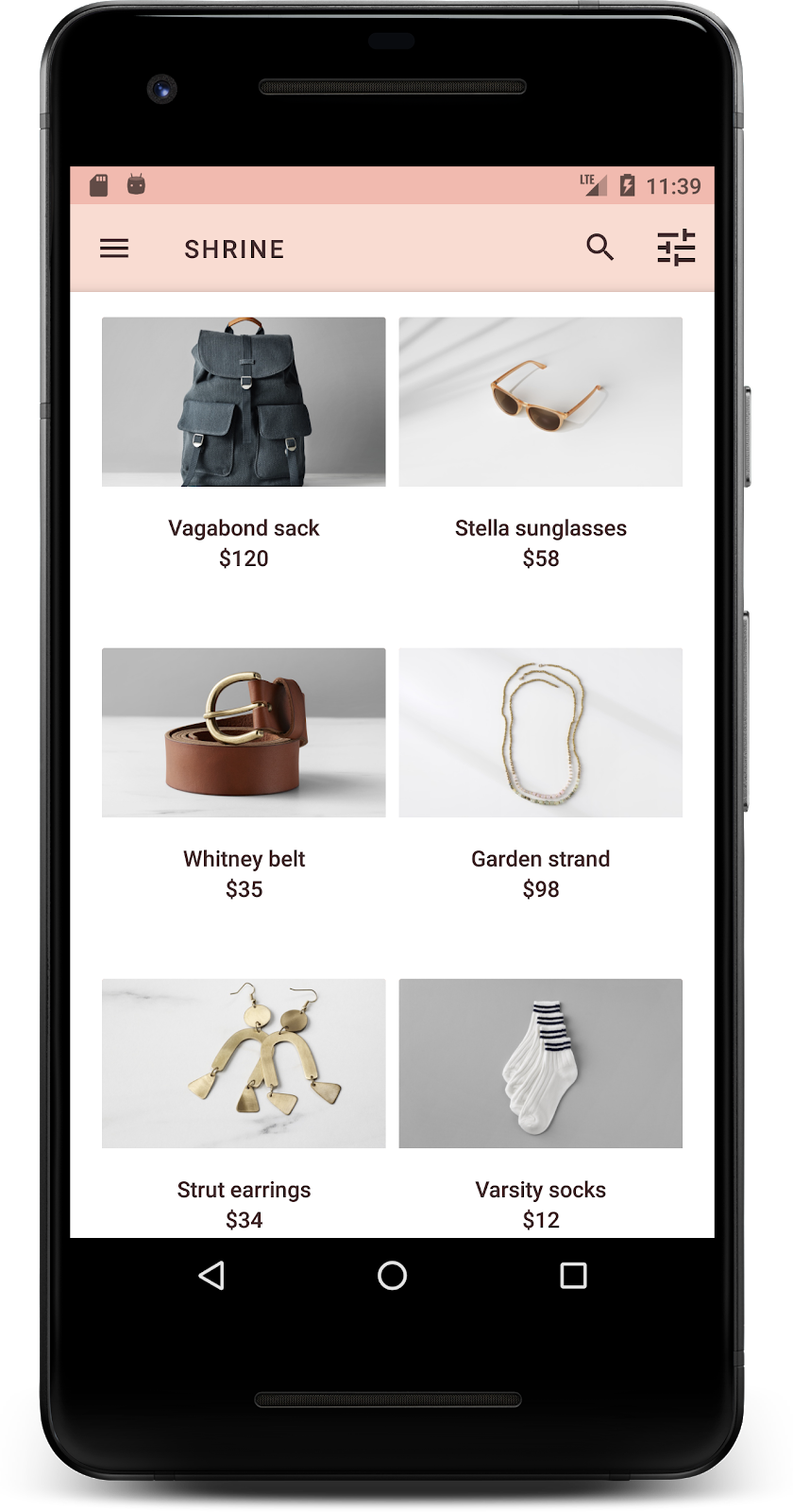
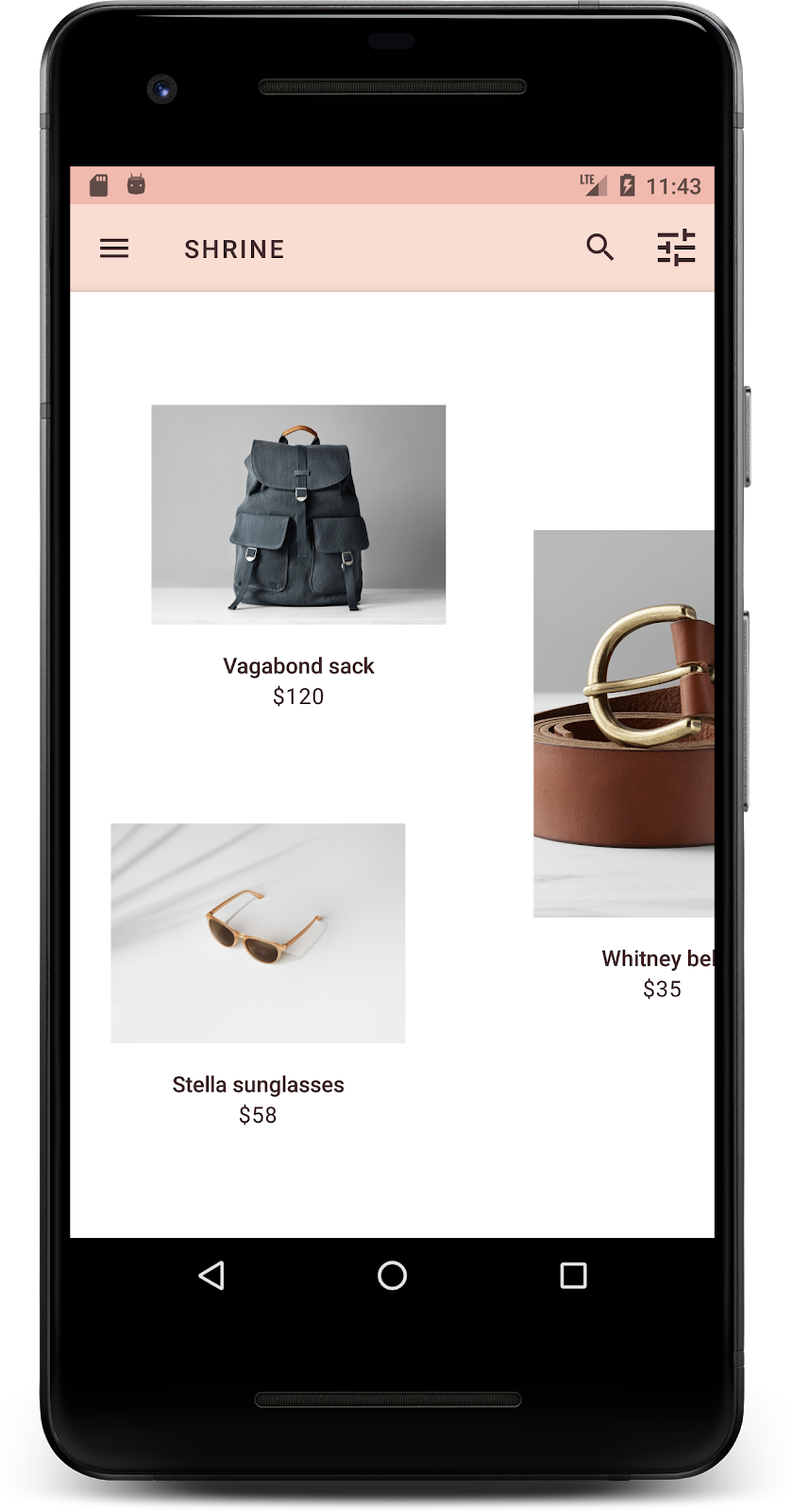
ساخت و اجرا. صفحه شبکه محصول شما اکنون باید به این شکل باشد:

بیایید تایپوگرافی صفحه ورود را تغییر دهیم تا با آن مطابقت داشته باشد.
تغییر فونت صفحه ورود
In styles.xml , add the following style:
سبکها.xml
<style name="TextAppearance.Shrine.Title" parent="TextAppearance.MaterialComponents.Headline4">
   <item name="textAllCaps">true</item>
   <item name="android:textStyle">bold</item>
   <item name="android:textColor">?android:attr/textColorPrimary</item>
</style>
در shr_login_fragment.xml ، استایل جدید را روی عنوان <TextView> از نوع "SHRINE" تنظیم کنید (و ویژگیهای textAllCaps و textSize موجود در آن را حذف کنید):
shr_login_fragment.xml
<TextView
   android:layout_width="wrap_content"
   android:layout_height="wrap_content"
   android:layout_gravity="center_horizontal"
   android:layout_marginBottom="132dp"
   android:text="@string/shr_app_name"
   android:textAppearance="@style/TextAppearance.Shrine.Title" />
صفحه ورود شما باید به این شکل باشد:

۵. تنظیم ارتفاع
حالا که صفحه را با رنگ و تایپوگرافی خاص متناسب با Shrine استایلبندی کردهاید، بیایید نگاهی به کارتهایی که محصولات Shrine را نشان میدهند بیندازیم. در حال حاضر، آنها روی یک سطح سفید در زیر نوار ناوبری برنامه قرار گرفتهاند. بیایید به محصولات تأکید بیشتری بدهیم تا توجه را به آنها جلب کنیم.
تغییر ارتفاع شبکه محصول
بیایید ارتفاع نوار برنامه بالا و محتوا را تغییر دهیم تا به نظر برسد که محتوا روی یک صفحه شناور بالای نوار برنامه بالا قرار دارد. ویژگی app:elevation به AppBarLayout خود و ویژگی android:elevation را به کامپوننتهای NestedScrollView XML خود در shr_product_grid_fragment.xml به شرح زیر اضافه کنید:
shr_product_grid_fragment.xml
<com.google.android.material.appbar.AppBarLayout
   android:layout_width="match_parent"
   android:layout_height="wrap_content"
   app:elevation="0dp">

   <androidx.appcompat.widget.Toolbar
       android:id="@+id/app_bar"
       style="@style/Widget.Shrine.Toolbar"
       android:layout_width="match_parent"
       android:layout_height="?attr/actionBarSize"
       app:navigationIcon="@drawable/shr_menu"
       app:title="@string/shr_app_name" />
</com.google.android.material.appbar.AppBarLayout>

<androidx.core.widget.NestedScrollView
   android:layout_width="match_parent"
   android:layout_height="match_parent"
   android:layout_marginTop="56dp"
   android:background="@color/productGridBackgroundColor"
   android:elevation="8dp"
   android:paddingStart="@dimen/shr_product_grid_spacing"
   android:paddingEnd="@dimen/shr_product_grid_spacing"
   app:layout_behavior="@string/appbar_scrolling_view_behavior">

   <androidx.appcompat.app.AlertController.RecycleListView
       android:id="@+id/recycler_view"
       android:layout_width="match_parent"
       android:layout_height="match_parent" />

</androidx.core.widget.NestedScrollView>
تغییر ارتفاع کارت (و رنگ)
شما میتوانید با تغییر app:cardElevation در shr_product_card.xml از 2dp به 0dp ، ارتفاع هر کارت را تنظیم کنید. همچنین app:cardBackgroundColor به @android:color/transparent تغییر دهید.
shr_product_card.xml
<com.google.material.card.MaterialCardView xmlns:android="http://schemas.android.com/apk/res/android"
   xmlns:app="http://schemas.android.com/apk/res-auto"
   android:layout_width="match_parent"
   android:layout_height="wrap_content"
   app:cardBackgroundColor="@android:color/transparent"
   app:cardElevation="0dp"
   app:cardPreventCornerOverlap="true">
نگاهی بیندازید! شما ارتفاع هر کارت را در صفحه شبکه محصول تنظیم کردهاید.
تغییر ارتفاع دکمه بعدی
در styles.xml ، ویژگی زیر را به استایل Widget.Shrine.Button خود اضافه کنید:
سبکها.xml
<item name="android:stateListAnimator" tools:ignore="NewApi">
    @animator/shr_next_button_state_list_anim
</item>
تنظیم android:stateListAnimator در استایل Button ، دکمه Next را طوری تنظیم میکند که از انیماتوری که ما ارائه دادهایم استفاده کند.
صفحه ورود شما باید به این شکل باشد:
۶. طرحبندی را تغییر دهید
طرحبندی را تغییر دهید تا کارتها با نسبتهای ابعاد و اندازههای مختلف نمایش داده شوند، به طوری که هر کارت از بقیه متمایز به نظر برسد.
از یک آداپتور RecyclerView پلکانی استفاده کنید
ما یک آداپتور RecyclerView جدید در پکیج staggeredgridlayout ارائه کردهایم که یک طرحبندی کارت نامتقارن staggered را نمایش میدهد، که برای پیمایش افقی در نظر گرفته شده است. میتوانید خودتان به بررسی کد آن بپردازید، اما ما در اینجا به نحوه پیادهسازی آن نمیپردازیم.
برای استفاده از این آداپتور جدید، متد onCreateView() خود را در ProductGridFragment.java تغییر دهید. بلوک کد بعد از کامنت "set up the RecyclerView " را با کد زیر جایگزین کنید:
ProductGridFragment.java
// Set up the RecyclerView
RecyclerView recyclerView = view.findViewById(R.id.recycler_view);
recyclerView.setHasFixedSize(true);
GridLayoutManager gridLayoutManager = new GridLayoutManager(getContext(), 2, GridLayoutManager.HORIZONTAL, false);
gridLayoutManager.setSpanSizeLookup(new GridLayoutManager.SpanSizeLookup() {
   @Override
   public int getSpanSize(int position) {
       return position % 3 == 2 ? 2 : 1;
   }
});
recyclerView.setLayoutManager(gridLayoutManager);
StaggeredProductCardRecyclerViewAdapter adapter = new StaggeredProductCardRecyclerViewAdapter(
       ProductEntry.initProductEntryList(getResources()));
recyclerView.setAdapter(adapter);
int largePadding = getResources().getDimensionPixelSize(R.dimen.shr_staggered_product_grid_spacing_large);
int smallPadding = getResources().getDimensionPixelSize(R.dimen.shr_staggered_product_grid_spacing_small);
recyclerView.addItemDecoration(new ProductGridItemDecoration(largePadding, smallPadding));
همچنین باید تغییر کوچکی در product_grid_fragment.xml خود ایجاد کنیم تا paddingها را از NestedScrollView خود حذف کنیم، به شرح زیر:
shr_product_grid_fragment.xml
<androidx.core.widget.NestedScrollView
   android:layout_width="match_parent"
   android:layout_height="match_parent"
   android:layout_marginTop="56dp"
   android:background="@color/productGridBackgroundColor"
   app:layout_behavior="@string/appbar_scrolling_view_behavior"
   android:elevation="6dp">
در نهایت، با تغییر فایل ProductGridItemDecoration.java ، فاصلهگذاری کارتها (card padding) را در RecyclerView تنظیم خواهیم کرد. متد getItemOffsets() از ProductGridItemDecoration.java را به صورت زیر تغییر دهید:
ProductGridItemDecoration.java
@Override
public void getItemOffsets(Rect outRect, View view,
                          RecyclerView parent, RecyclerView.State state) {
   outRect.left = smallPadding;
   outRect.right = largePadding;
}
ساخت و اجرا. آیتمهای شبکه محصول اکنون باید به صورت پلکانی نمایش داده شوند:
۷. یک قالب دیگر را امتحان کنید
رنگ، روشی قدرتمند برای بیان برند شماست و یک تغییر کوچک در رنگ میتواند تأثیر زیادی بر تجربه کاربری شما داشته باشد. برای آزمایش این موضوع، بیایید ببینیم اگر طرح رنگی برند کاملاً متفاوت بود، Shrine چگونه به نظر میرسید.
تغییر سبکها و رنگها
در styles.xml ، تم جدید زیر را اضافه کنید:
سبکها.xml
<style name="Theme.Shrine.Autumn" parent="Theme.Shrine">
   <item name="colorPrimary">#FFCF44</item>
   <item name="colorPrimaryDark">#FD9725</item>
   <item name="colorAccent">#FD9725</item>
   <item name="colorOnPrimary">#FFFFFF</item>
   <item name="colorError">#FD9725</item>
</style>
و در AndroidManifest.xml ، از این تم جدید در برنامه خود استفاده کنید:
فایل AndroidManifest.xml
<application
   android:allowBackup="true"
   android:icon="@mipmap/ic_launcher"
   android:label="@string/shr_app_name"
   android:roundIcon="@mipmap/ic_launcher_round"
   android:supportsRtl="true"
   android:name="com.google.codelabs.mdc.java.shrine.application.ShrineApplication"
   android:theme="@style/Theme.Shrine.Autumn">
   <activity android:name=".MainActivity">
       <intent-filter>
           <action android:name="android.intent.action.MAIN" />

           <category android:name="android.intent.category.LAUNCHER" />
       </intent-filter>
   </activity>
</application>
رنگ آیکون نوار ابزار را در colors.xml مطابق شکل زیر تغییر دهید:
رنگها.xml
<color name="toolbarIconColor">#FFFFFF</color>
سپس، ویژگی android:theme مربوط به استایل نوار ابزار خود را طوری تنظیم کنید که به تم فعلی با استفاده از ویژگی "?theme" ارجاع دهد، نه اینکه آن را به صورت دستی کدنویسی کنیم:
سبکها.xml
<style name="Widget.Shrine.Toolbar" parent="Widget.AppCompat.Toolbar">
   <item name="android:background">?attr/colorAccent</item>
   <item name="android:theme">?theme</item>
   <item name="popupTheme">@style/ThemeOverlay.AppCompat.Light</item>
   <item name="titleTextAppearance">@style/TextAppearance.Shrine.Toolbar</item>
</style>
Next, lighten the hint text color on the login screen's text fields. Add the android:textColorHint attribute to the text fields' style:
سبکها.xml
<style name="Widget.Shrine.TextInputLayout" parent="Widget.MaterialComponents.TextInputLayout.OutlinedBox">
   <item name="hintTextAppearance">
@style/TextAppearance.Shrine.TextInputLayout.HintText
</item>
   <item name="android:paddingBottom">8dp</item>
   <item name="android:textColorHint">?attr/colorPrimaryDark</item>
</style>
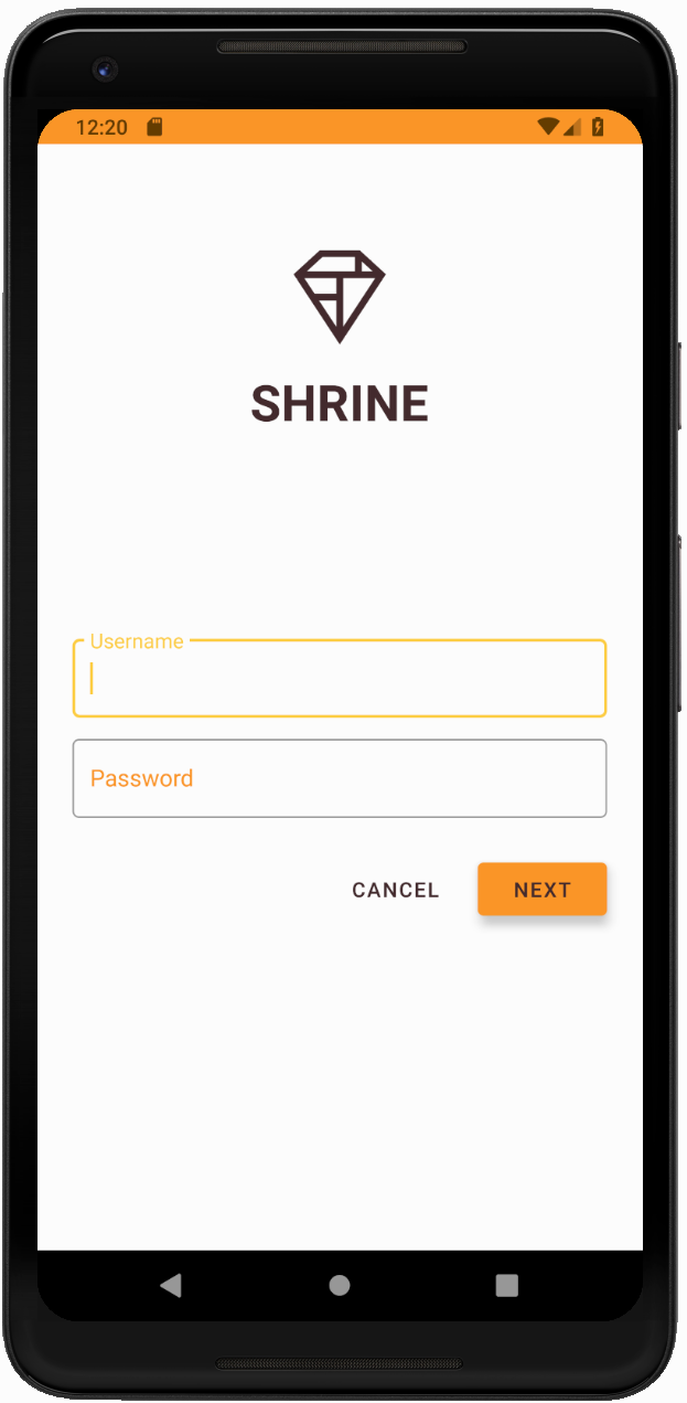
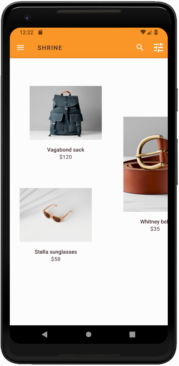
ساخت و اجرا. اکنون قالب جدید باید برای پیشنمایش شما نمایش داده شود.
قبل از رفتن به MDC-104، کد تغییر یافته در این بخش را به حالت اولیه برگردانید.
۸. خلاصه
تا الان، شما اپلیکیشنی ساختهاید که شبیه مشخصات طراحی طراحتان است.
مراحل بعدی
شما از این کامپوننتهای MDC استفاده کردهاید: تم، تایپوگرافی و ارتفاع. میتوانید کامپوننتهای بیشتری را در کامپوننتهای کاتالوگ MDC-Android در MDC Android بررسی کنید.
اگر طراحی برنامهی شما شامل عناصری باشد که کامپوننتهایی در کتابخانهی MDC ندارند، چه میشود؟ در MDC-104: کامپوننتهای پیشرفتهی طراحی متریال ، به نحوهی ایجاد کامپوننتهای سفارشی با استفاده از کتابخانهی MDC برای دستیابی به ظاهری خاص خواهیم پرداخت.