
1. Introduction
Material Components (MDC) help developers implement Material Design. Created by a team of engineers and UX designers at Google, MDC features dozens of beautiful and functional UI components and is available for Android, iOS, web and Flutter.material.io/develop |
In codelabs MDC-101 and MDC-102, you used Material Components (MDC) to build the basics of an app called Shrine, an e-commerce app that sells clothing and home goods. This app contains a user flow that starts with a login screen and takes the user to the home screen that displays products.
The recent expansion of Material Design gives designers and developers increased flexibility to express their product's brand. You can now use MDC to customize Shrine and reflect its unique style.
What you'll build
In this codelab, you'll customize Shrine to reflect its brand using:
- Color
- Typography
- Elevation
- Layout


MDC Android components and subsystems used in this codelab:
- Themes
- Typography
- Elevation
What you'll need
- Basic knowledge of Android development
- Android Studio (download it here if you don't already have it)
- An Android emulator or device (available through Android Studio)
- The sample code (see next step)
How would you rate your level of experience building Android apps?
2. Set up your development environment
Continuing from MDC-102?
If you completed MDC-102, your code should be ready to go for this codelab. Skip to step 3: Change the color.
Download the starter codelab app
The starter app is located in the material-components-android-codelabs-103-starter/kotlin directory. Be sure to cd into that directory before beginning.
...or clone it from GitHub
To clone this codelab from GitHub, run the following commands:
git clone https://github.com/material-components/material-components-android-codelabs
cd material-components-android-codelabs/
git checkout 103-starter
Load the starter code in Android Studio
- Once the setup wizard finishes and the Welcome to Android Studio window is shown, click Open an existing Android Studio project. Navigate to the directory where you had installed the sample code, and select kotlin -> shrine (or search your computer for shrine) to open the Shipping project.
- Wait a moment for Android Studio to build and sync the project, as shown by activity indicators along the bottom of the Android Studio window.
- At this point, Android Studio might raise some build errors because you are missing the Android SDK or build tools, such as the one shown below. Follow the instructions in Android Studio to install/update these and sync your project.

Add project dependencies
The project needs a dependency on the MDC Android support library. The sample code you downloaded should already have this dependency listed, but it is good practice to do the following steps to make sure.
- Navigate to the
appmodule'sbuild.gradlefile and make sure that thedependenciesblock includes a dependency on MDC Android:
api 'com.google.android.material:material:1.1.0-alpha06'
- (Optional) If necessary, edit the
build.gradlefile to add the following dependencies and sync the project.
dependencies {
    api 'com.google.android.material:material:1.1.0-alpha06'
    implementation 'androidx.legacy:legacy-support-v4:1.0.0'
    implementation 'com.android.volley:volley:1.1.1'
    implementation 'com.google.code.gson:gson:2.8.5'
    implementation "org.jetbrains.kotlin:kotlin-stdlib-jdk7:1.3.21"
    testImplementation 'junit:junit:4.12'
    androidTestImplementation 'androidx.test:core:1.1.0'
    androidTestImplementation 'androidx.test.ext:junit:1.1.0'
    androidTestImplementation 'androidx.test:runner:1.2.0-alpha05'
    androidTestImplementation 'androidx.test.espresso:espresso-core:3.2.0-alpha05'
}
Run the starter app
|

Success! You should see Shrine's login page running in your device or emulator. When you press Next, the Shrine homepage will appear with an app bar on the top, and a grid of product images underneath.

Let's make the top app bar match the Shrine brand by changing its color, elevation, and typography.
3. Change the color
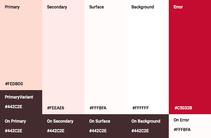
This color theme has been created by a designer with custom colors (shown in the image below). It contains colors that have been selected from Shrine's brand and applied to the Material Theme Editor, which has expanded them to create a fuller palette. (These colors aren't from the 2014 Material color palettes.)
The Material Theme Editor has organized them into shades labelled numerically, including labels 50, 100, 200, .... to 900 of each color. Shrine only uses shades 50, 100, and 300 from the pink swatch and 900 from the brown swatch.

Let's change the color of the top app bar to reflect that color scheme.
Set colorPrimaryDark and colorAccent
In colors.xml, modify the following lines. The colorAccent attribute controls the color of the top app bar, among other things, and the colorPrimaryDark attribute controls the color of the status bar.
colors.xml
<color name="colorPrimaryDark">#FBB8AC</color>
<color name="colorAccent">#FEDBD0</color>
To use dark icons in the status bar, add the following to Theme.Shrine, Shrine's app theme:
styles.xml
<item name="android:windowLightStatusBar" tools:targetApi="m">true</item>
<resources xmlns:tools="http://schemas.android.com/tools">
Your colors.xml and styles.xml should look as follows:
colors.xml
<?xml version="1.0" encoding="utf-8"?>
<resources>
   <color name="colorPrimary">#E0E0E0</color>
   <color name="colorPrimaryDark">#FBB8AC</color>
   <color name="colorAccent">#FEDBD0</color>
   <color name="toolbarIconColor">#FFFFFF</color>
   <color name="loginPageBackgroundColor">#FFFFFF</color>
   <color name="productGridBackgroundColor">#FFFFFF</color>
</resources>
styles.xml
<resources xmlns:android="http://schemas.android.com/tools">

   <!-- Base application theme. -->
   <style name="Theme.Shrine" parent="Theme.MaterialComponents.Light.NoActionBar">
       <!-- Customize your theme here. -->
       <item name="colorPrimary">@color/colorPrimary</item>
       <item name="colorPrimaryDark">@color/colorPrimaryDark</item>
       <item name="colorAccent">@color/colorAccent</item>
       <item name="android:windowLightStatusBar" tools:targetApi="m">true</item>
   </style>

   <style name="Widget.Shrine.Toolbar" parent="Widget.AppCompat.Toolbar">
       <item name="android:background">?attr/colorAccent</item>
       <item name="android:theme">@style/ThemeOverlay.AppCompat.Dark.ActionBar</item>
       <item name="popupTheme">@style/ThemeOverlay.AppCompat.Light</item>
   </style>

</resources>
In colors.xml, add a new textColorPrimary color resource set to #442C2E, and update the toolbarIconColor attribute to reference the textColorPrimary color.
Update your styles.xml file to set the
attribute to the textColorPrimary color we just defined.
One more thing: set the android:theme attribute in the Widget.Shrine.Toolbar style to Theme.Shrine.
Your colors.xml and styles.xml should look as follows:
colors.xml
<?xml version="1.0" encoding="utf-8"?>
<resources>
   <color name="colorPrimary">#E0E0E0</color>
   <color name="colorPrimaryDark">#FBB8AC</color>
   <color name="colorAccent">#FEDBD0</color>
   <color name="textColorPrimary">#442C2E</color>
   <color name="toolbarIconColor">@color/textColorPrimary</color>
   <color name="loginPageBackgroundColor">#FFFFFF</color>
   <color name="productGridBackgroundColor">#FFFFFF</color>
</resources>
styles.xml
<resources xmlns:android="http://schemas.android.com/tools">

   <!-- Base application theme. -->
   <style name="Theme.Shrine" parent="Theme.MaterialComponents.Light.NoActionBar">
       <!-- Customize your theme here. -->
       <item name="colorPrimary">@color/colorPrimary</item>
       <item name="colorPrimaryDark">@color/colorPrimaryDark</item>
       <item name="colorAccent">@color/colorAccent</item>
       <item name="android:windowLightStatusBar" tools:targetApi="m">true</item>
       <item name="android:textColorPrimary">@color/textColorPrimary</item>
   </style>

   <style name="Widget.Shrine.Toolbar" parent="Widget.AppCompat.Toolbar">
       <item name="android:background">?attr/colorAccent</item>
       <item name="android:theme">@style/Theme.Shrine</item>
       <item name="popupTheme">@style/ThemeOverlay.AppCompat.Light</item>
   </style>

</resources>
Build and run. Your product grid should now look like this:

Let's change the style of the login screen to match our color scheme.
Style the text fields
Let's change the text inputs on the login page to be outlined and use better colors for our layout.
Add the following color resource to your colors.xml file:
colors.xml
<color name="textInputOutlineColor">#FBB8AC</color>
Add two new styles in your styles.xml:
styles.xml
<style name="Widget.Shrine.TextInputLayout" parent="Widget.MaterialComponents.TextInputLayout.OutlinedBox">
   <item name="hintTextAppearance">@style/TextAppearance.Shrine.TextInputLayout.HintText</item>
   <item name="hintTextColor">@color/textColorPrimary</item>
   <item name="android:paddingBottom">8dp</item>
   <item name="boxStrokeColor">@color/textInputOutlineColor</item>
</style>

<style name="TextAppearance.Shrine.TextInputLayout.HintText" parent="TextAppearance.MaterialComponents.Subtitle2">
   <item name="android:textColor">?android:attr/textColorPrimary</item>
</style>
Finally, set the style attribute on both of your TextInputLayout XML components in shr_login_fragment.xml to your new style:
shr_login_fragment.xml
<com.google.android.material.textfield.TextInputLayout
   style="@style/Widget.Shrine.TextInputLayout"
   android:layout_width="match_parent"
   android:layout_height="wrap_content"
   android:hint="@string/shr_hint_username">

   <com.google.android.material.textfield.TextInputEditText
       android:layout_width="match_parent"
       android:layout_height="wrap_content"
       android:inputType="text"
       android:maxLines="1" />
</com.google.android.material.textfield.TextInputLayout>

<com.google.android.material.textfield.TextInputLayout
   android:id="@+id/password_text_input"
   style="@style/Widget.Shrine.TextInputLayout"
   android:layout_width="match_parent"
   android:layout_height="wrap_content"
   android:hint="@string/shr_hint_password"
   app:errorEnabled="true">

   <com.google.android.material.textfield.TextInputEditText
       android:id="@+id/password_edit_text"
       android:layout_width="match_parent"
       android:layout_height="wrap_content"
       android:inputType="textPassword" />
</com.google.android.material.textfield.TextInputLayout>
Style the button colors
Finally, style the colors of the buttons on the login page. Add the following styles to your styles.xml:
styles.xml
<style name="Widget.Shrine.Button" parent="Widget.MaterialComponents.Button">
   <item name="android:textColor">?android:attr/textColorPrimary</item>
   <item name="backgroundTint">?attr/colorPrimaryDark</item>
</style>

<style name="Widget.Shrine.Button.TextButton" parent="Widget.MaterialComponents.Button.TextButton">
   <item name="android:textColor">?android:attr/textColorPrimary</item>
</style>
The Widget.Shrine.Button style extends from the default MaterialButton style, and changes the text color and background tint of the button. Widget.Shrine.Button.TextButton extends from the default text MaterialButton style, and changes just the text color.
Set the Widget.Shrine.Button style on your Next button, and the Widget.Shrine.Button.TextButton style on your Cancel button, as follows:
shr_login_fragment.xml
<RelativeLayout
   android:layout_width="match_parent"
   android:layout_height="wrap_content">

   <com.google.android.material.button.MaterialButton
       android:id="@+id/next_button"
       style="@style/Widget.Shrine.Button"
       android:layout_width="wrap_content"
       android:layout_height="wrap_content"
       android:layout_alignParentEnd="true"
       android:layout_alignParentRight="true"
       android:text="@string/shr_button_next" />

   <com.google.android.material.button.MaterialButton
       android:id="@+id/cancel_button"
       style="@style/Widget.Shrine.Button.TextButton"
       android:layout_width="wrap_content"
       android:layout_height="wrap_content"
       android:layout_marginEnd="12dp"
       android:layout_marginRight="12dp"
       android:layout_toStartOf="@id/next_button"
       android:layout_toLeftOf="@id/next_button"
       android:text="@string/shr_button_cancel" />

</RelativeLayout>
Update the color of the Shrine logo in the login page. This will require a small change to the vector drawable, shr_logo.xml. Open up the drawable file and change the android:fillAlpha property to 1. The drawable should look as follows:
shr_logo.xml
<vector xmlns:android="http://schemas.android.com/apk/res/android"
   android:width="149dp"
   android:height="152dp"
   android:tint="?attr/colorControlNormal"
   android:viewportWidth="149"
   android:viewportHeight="152">
   <path
       android:fillAlpha="1"
       android:fillColor="#DADCE0"
       android:fillType="evenOdd"
       android:pathData="M42.262,0L0,38.653L74.489,151.994L148.977,38.653L106.723,0M46.568,11.11L21.554,33.998L99.007,33.998L99.007,11.11L46.568,11.11ZM110.125,18.174L110.125,33.998L127.416,33.998L110.125,18.174ZM80.048,45.116L80.048,123.296L131.426,45.116L80.048,45.116ZM17.551,45.116L33.976,70.101L68.93,70.101L68.93,45.116L17.551,45.116ZM41.284,81.219L68.93,123.296L68.93,81.219L41.284,81.219Z"
       android:strokeWidth="1"
       android:strokeAlpha="0.4"
       android:strokeColor="#00000000" />
</vector>
Then, set the android:tint attribute on the logo <ImageView> in shr_login_fragment.xml to ?android:attr/textColorPrimary, as follows:
shr_login_fragment.xml
<ImageView
   android:layout_width="64dp"
   android:layout_height="64dp"
   android:layout_gravity="center_horizontal"
   android:layout_marginTop="48dp"
   android:layout_marginBottom="16dp"
   android:tint="?android:attr/textColorPrimary"
   app:srcCompat="@drawable/shr_logo" />
Build and run. Your login screen should now look like this:

4. Modify typography and label styles
In addition to color changes, your designer has also given you specific typography to use on the site. Let's add that to the top app bar too.
Style the top app bar
Style your top app bar's text appearance to match the spec provided by your designer. Add the following text appearance style to styles.xml, and set the titleTextAppearance property to reference this style in your Widget.Shrine.Toolbar style.
styles.xml
<style name="Widget.Shrine.Toolbar" parent="Widget.AppCompat.Toolbar">
   <item name="android:background">?attr/colorAccent</item>
   <item name="android:theme">@style/Theme.Shrine</item>
   <item name="popupTheme">@style/ThemeOverlay.AppCompat.Light</item>
   <item name="titleTextAppearance">@style/TextAppearance.Shrine.Toolbar</item>
</style>

<style name="TextAppearance.Shrine.Toolbar" parent="TextAppearance.MaterialComponents.Button">
   <item name="android:textSize">16sp</item>
</style>
Your colors.xml and styles.xml should look as follows:
colors.xml
<?xml version="1.0" encoding="utf-8"?>
<resources>
   <color name="colorPrimary">#E0E0E0</color>
   <color name="colorPrimaryDark">#FBB8AC</color>
   <color name="colorAccent">#FEDBD0</color>
   <color name="textColorPrimary">#442C2E</color>
   <color name="toolbarIconColor">@color/textColorPrimary</color>
   <color name="loginPageBackgroundColor">#FFFFFF</color>
   <color name="productGridBackgroundColor">#FFFFFF</color>
   <color name="textInputOutlineColor">#FBB8AC</color>
</resources>
styles.xml
<resources xmlns:android="http://schemas.android.com/tools">

   <!-- Base application theme. -->
   <style name="Theme.Shrine" parent="Theme.MaterialComponents.Light.NoActionBar">
       <!-- Customize your theme here. -->
       <item name="colorPrimary">@color/colorPrimary</item>
       <item name="colorPrimaryDark">@color/colorPrimaryDark</item>
       <item name="colorAccent">@color/colorAccent</item>
       <item name="android:windowLightStatusBar" tools:targetApi="m">true</item>
       <item name="android:textColorPrimary">@color/textColorPrimary</item>
   </style>

   <style name="Widget.Shrine.TextInputLayout" parent="Widget.MaterialComponents.TextInputLayout.OutlinedBox">
       <item name="hintTextAppearance">@style/TextAppearance.Shrine.TextInputLayout.HintText</item>
       <item name="hintTextColor">@color/textColorPrimary</item>
       <item name="android:paddingBottom">8dp</item>
       <item name="boxStrokeColor">@color/textInputOutlineColor</item>
   </style>

   <style name="TextAppearance.Shrine.TextInputLayout.HintText" parent="TextAppearance.MaterialComponents.Subtitle2">
       <item name="android:textColor">?android:attr/textColorPrimary</item>
   </style>

   <style name="Widget.Shrine.Button" parent="Widget.MaterialComponents.Button">
       <item name="android:textColor">?android:attr/textColorPrimary</item>
       <item name="backgroundTint">?attr/colorPrimaryDark</item>
   </style>

   <style name="Widget.Shrine.Button.TextButton" parent="Widget.MaterialComponents.Button.TextButton">
       <item name="android:textColor">?android:attr/textColorPrimary</item>
   </style>

   <style name="Widget.Shrine.Toolbar" parent="Widget.AppCompat.Toolbar">
       <item name="android:background">?attr/colorAccent</item>
       <item name="android:theme">@style/Theme.Shrine</item>
       <item name="popupTheme">@style/ThemeOverlay.AppCompat.Light</item>
       <item name="titleTextAppearance">@style/TextAppearance.Shrine.Toolbar</item>
   </style>

   <style name="TextAppearance.Shrine.Toolbar" parent="TextAppearance.MaterialComponents.Button">
       <item name="android:textSize">16sp</item>
   </style>

</resources>
Style the labels
We will style the product card labels to use the correct text appearance, and to be centered horizontally within the card.
Update the typography on your title label from textAppearanceHeadline6 to textAppearanceSubtitle2 as follows:
shr_product_card.xml
<TextView
   android:id="@+id/product_title"
   android:layout_width="match_parent"
   android:layout_height="wrap_content"
   android:text="@string/shr_product_title"
   android:textAppearance="?attr/textAppearanceSubtitle2" />
To center the image labels, modify the label <TextView>s in shr_product_card.xml to set the attribute android:textAlignment="center":
shr_product_card.xml
<LinearLayout
   android:layout_width="match_parent"
   android:layout_height="wrap_content"
   android:orientation="vertical"
   android:padding="16dp">

   <TextView
       android:id="@+id/product_title"
       android:layout_width="match_parent"
       android:layout_height="wrap_content"
       android:text="@string/shr_product_title"
       android:textAlignment="center"
       android:textAppearance="?attr/textAppearanceSubtitle2" />

   <TextView
       android:id="@+id/product_price"
       android:layout_width="match_parent"
       android:layout_height="wrap_content"
       android:text="@string/shr_product_description"
       android:textAlignment="center"
       android:textAppearance="?attr/textAppearanceBody2" />
</LinearLayout>
Build and run. Your product grid screen should now look like this:

Let's change the typography of the login screen to match.
Change the typeface of the login screen
In styles.xml, add the following style:
styles.xml
<style name="TextAppearance.Shrine.Title" parent="TextAppearance.MaterialComponents.Headline4">
   <item name="textAllCaps">true</item>
   <item name="android:textStyle">bold</item>
   <item name="android:textColor">?android:attr/textColorPrimary</item>
</style>
In shr_login_fragment.xml, set the new style to your "SHRINE" title <TextView> (and delete the textAllCaps and textSize attributes which are there):
shr_login_fragment.xml
<TextView
   android:layout_width="wrap_content"
   android:layout_height="wrap_content"
   android:layout_gravity="center_horizontal"
   android:layout_marginBottom="132dp"
   android:text="@string/shr_app_name"
   android:textAppearance="@style/TextAppearance.Shrine.Title" />
Build and run. Your login screen should now look like this:

5. Adjust elevation
Now that you've styled the page with specific color and typography that matches Shrine, let's take a look at the cards that show Shrine's products. Right now, they are placed on a white surface under the app's navigation. To draw attention to the products, let's give them more emphasis.
Change product grid elevation
To make it look like the content is on a sheet floating above the top app bar, change the elevations of the top app bar. Add the app:elevation attribute to your AppBarLayout, and android:elevation attribute to your NestedScrollView XML components in shr_product_grid_fragment.xml as follows:
shr_product_grid_fragment.xml
<com.google.android.material.appbar.AppBarLayout
   android:layout_width="match_parent"
   android:layout_height="wrap_content"
   app:elevation="0dp">

   <androidx.appcompat.widget.Toolbar
       android:id="@+id/app_bar"
       style="@style/Widget.Shrine.Toolbar"
       android:layout_width="match_parent"
       android:layout_height="?attr/actionBarSize"
       app:navigationIcon="@drawable/shr_menu"
       app:title="@string/shr_app_name" />
</com.google.android.material.appbar.AppBarLayout>

<androidx.core.widget.NestedScrollView
   android:layout_width="match_parent"
   android:layout_height="match_parent"
   android:layout_marginTop="56dp"
   android:background="@color/productGridBackgroundColor"
   android:elevation="8dp"
   android:paddingStart="@dimen/shr_product_grid_spacing"
   android:paddingEnd="@dimen/shr_product_grid_spacing"
   app:layout_behavior="@string/appbar_scrolling_view_behavior">

   <androidx.recyclerview.widget.RecyclerView
       android:id="@+id/recycler_view"
       android:layout_width="match_parent"
       android:layout_height="match_parent" />

</androidx.core.widget.NestedScrollView>
Change card elevation (and color)
Adjust the elevation of every card by changing the app:cardElevation in shr_product_card.xml from 2dp to 0dp. Change the app:cardBackgroundColor to @android:color/transparent, as well.
shr_product_card.xml
<com.google.android.material.card.MaterialCardView xmlns:android="http://schemas.android.com/apk/res/android"
   xmlns:app="http://schemas.android.com/apk/res-auto"
   android:layout_width="match_parent"
   android:layout_height="wrap_content"
   app:cardBackgroundColor="@android:color/transparent"
   app:cardElevation="0dp"
   app:cardPreventCornerOverlap="true">
Take a look! You've adjusted the elevation of every card on the product grid page.

Change the elevation of the Next button
In styles.xml, add the following property to your Widget.Shrine.Button style:
styles.xml
<item name="android:stateListAnimator" tools:ignore="NewApi">
    @animator/shr_next_button_state_list_anim
</item>
Setting android:stateListAnimator in the Button's style sets the Next button to use the animator we have provided.
Build and run. Your login screen should now look like this:

6. Change the layout
Let's change the layout to show the cards at different aspect ratios and sizes, so that each card looks unique from the others.
Use a staggered RecyclerView adapter
We've provided a new RecyclerView adapter for you in the staggeredgridlayout package which displays an asymmetric staggered card layout, meant to scroll horizontally. Feel free to dig into that code on your own, but we will not go over how it's implemented here.
In order to use this new adapter, modify your onCreateView() method in ProductGridFragment.kt. Replace the code block after the "set up the RecyclerView" comment with the following:
ProductGridFragment.kt
// Set up the RecyclerView
view.recycler_view.setHasFixedSize(true)
val gridLayoutManager = GridLayoutManager(context, 2, RecyclerView.HORIZONTAL, false)
gridLayoutManager.spanSizeLookup = object : GridLayoutManager.SpanSizeLookup() {
   override fun getSpanSize(position: Int): Int {
       return if (position % 3 == 2) 2 else 1
   }
}
view.recycler_view.layoutManager = gridLayoutManager
val adapter = StaggeredProductCardRecyclerViewAdapter(
       ProductEntry.initProductEntryList(resources))
view.recycler_view.adapter = adapter
val largePadding = resources.getDimensionPixelSize(R.dimen.shr_staggered_product_grid_spacing_large)
val smallPadding = resources.getDimensionPixelSize(R.dimen.shr_staggered_product_grid_spacing_small)
view.recycler_view.addItemDecoration(ProductGridItemDecoration(largePadding, smallPadding))
We'll also need to make a small change to our shr_product_grid_fragment.xml to remove the paddings from our NestedScrollView, as follows:
shr_product_grid_fragment.xml
<androidx.core.widget.NestedScrollView
   android:layout_width="match_parent"
   android:layout_height="match_parent"
   android:layout_marginTop="56dp"
   android:background="@color/productGridBackgroundColor"
   app:layout_behavior="@string/appbar_scrolling_view_behavior"
   android:elevation="6dp">
Finally, we'll also adjust our card padding within the RecyclerView by modifying ProductGridItemDecoration.kt. Modify the getItemOffsets() method of ProductGridItemDecoration.kt as follows:
ProductGridItemDecoration.kt
override fun getItemOffsets(outRect: Rect, view: View,
                           parent: RecyclerView, state: RecyclerView.State?) {
   outRect.left = smallPadding
   outRect.right = largePadding
}
Build and run. The product grid items should now be staggered:

7. Try another theme
Color is a powerful way to express your brand, and a small change in color can have a large effect on your user experience. To test this out, let's see what Shrine would look like if the color scheme of the brand were completely different.
Modify styles and colors
In styles.xml, add the following new theme:
styles.xml
<style name="Theme.Shrine.Autumn" parent="Theme.Shrine">
   <item name="colorPrimary">#FFCF44</item>
   <item name="colorPrimaryDark">#FD9725</item>
   <item name="colorAccent">#FD9725</item>
   <item name="colorOnPrimary">#FFFFFF</item>
   <item name="colorError">#FD9725</item>
</style>
And in AndroidManifest.xml, use this new theme in your application:
AndroidManifest.xml
<application
   android:allowBackup="true"
   android:icon="@mipmap/ic_launcher"
   android:label="@string/shr_app_name"
   android:roundIcon="@mipmap/ic_launcher_round"
   android:supportsRtl="true"
  android:name="com.google.codelabs.mdc.kotlin.shrine.application.ShrineApplication"
   android:theme="@style/Theme.Shrine.Autumn">
   <activity android:name=".MainActivity">
       <intent-filter>
           <action android:name="android.intent.action.MAIN" />

           <category android:name="android.intent.category.LAUNCHER" />
       </intent-filter>
   </activity>
</application>
Modify the toolbar icon color in colors.xml as shown below:
colors.xml
<color name="toolbarIconColor">#FFFFFF</color>
Then, set the android:theme attribute of our toolbar style to reference the current theme using the "?theme" attribute, rather than hard coding it:
styles.xml
<style name="Widget.Shrine.Toolbar" parent="Widget.AppCompat.Toolbar">
   <item name="android:background">?attr/colorAccent</item>
   <item name="android:theme">?theme</item>
   <item name="popupTheme">@style/ThemeOverlay.AppCompat.Light</item>
   <item name="titleTextAppearance">@style/TextAppearance.Shrine.Toolbar</item>
</style>
Next, lighten the hint text color on the login screen's text fields. Add the android:textColorHint attribute to the text fields' style:
styles.xml
<style name="Widget.Shrine.TextInputLayout" parent="Widget.MaterialComponents.TextInputLayout.OutlinedBox">
   <item name="hintTextAppearance">
@style/TextAppearance.Shrine.TextInputLayout.HintText
</item>
   <item name="android:paddingBottom">8dp</item>
   <item name="android:textColorHint">?attr/colorPrimaryDark</item>
</style>
Build and run. The new theme should now appear for you to preview.


Revert the code changed in this section before moving on to MDC-104.
8. Recap
By now, you've created an app that resembles the design specifications from your designer.
Next steps
You've used the following MDC components: theme, typography, and elevation. You can explore more components and subsystems in [the MDC Web library].
What if your planned app design contains elements that don't have components in the MDC library? In MDC-104: Material Design Advanced Components, we will go over how to create custom components using the MDC library to achieve a specific look.