
1. Introduction
Last Updated: 04/18/22
Apps can take on an array of colors from baseline schemes, user generated dynamic colors, or brand colors.
The previous Material You color lab explored how to visualize dynamic colors within design mockups, but you can also use Material theming to customize your app with your brand colors. Utilizing the new color system with your brand colors will create an accessible color scheme that could take on more dynamic features!
What you'll learn
- How to create a custom theme with Material theme builder.
- Applying a custom theme to design mockups.
- Possibilities to combine dynamic and custom colors.
Prerequisites
For this lab we'll be building on some foundational design concepts.
- Knowledge of foundational design concepts: color palettes
- Knowledge of current Android color schemes and roles
- Knowledge of Figma
- Optional: Visualizing dynamic color in your app codelab
What you'll need
- Figma Account
- Figma Designlab file
- Figma plugin Material Theme Builder
2. Get started
Setup
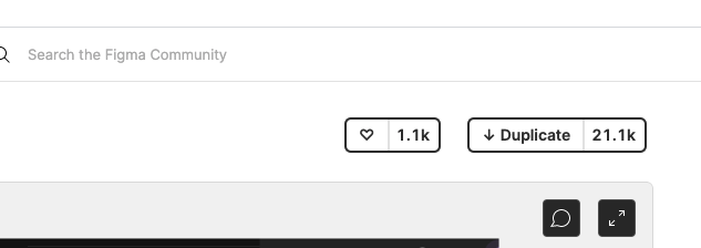
To get started you need to access the Designlab Figma file. Everything you need for the lab is in the Figma file. You can either download and import the file, or duplicate it from the Figma community.
First, sign into Figma or create an account.
Duplicate from Figma Community
Navigate to the Customizing Material file or search for Visualizing dynamic color in your app with Material Design within Figma Community. Click Duplicate in the top right corner to copy the file into your files.
File Layout
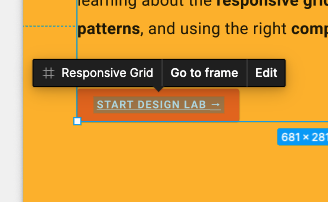
As you look through the file, notice that the file is self contained, starting with an introduction. Each section is divided into a row of artboards that are linked together, with some core concepts for the section, followed by exercises. The sections and exercises build on each other and should be completed sequentially.
This codelab guides you through those concepts and exercises in greater detail. Read along with the codelab to learn more about the new Material You features!
Starting with the Intro artboard, there are buttons that link the artboards together in order. To access the link, click the button.
Install the Figma plugin
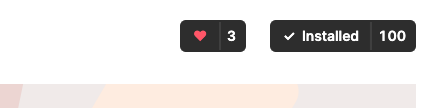
This codelab relies heavily on a new Figma plugin to generate dynamic color schemes and tokens. Install the Figma plugin directly from the Figma community page or search for "Material Theme Builder" in the Figma Community.
3. Material color scheme
First an overview of how color is used within Material and how the new color system works.
Color is used to express style and convey meaning whether that meaning is personal to the user, branding, or semantic meaning. The color system handles the variability of dynamically changing color schemes that arise as user inputs change. The logic of tonal relationships and shifts in hue and chroma provide a foundation for flexible color application.
The color space provides a way to generate accessible light and dark color schemes extracted from a source color by generating 5 key colors and then tonal palettes, where certain tonal steps are selected.
This color shifting technique not only provides an accessible color scheme, but provides methods to create branded schemes that are accessible and cohesive with user generated color schemes.
Color schemes are generated from 5 key colors into tonal palettes to create accessible schemes
Branded theme
M3 supports systematic applications of custom parameters to help define and maintain the styles that communicate your brand.
A custom scheme is a color scheme that is not derived from the user's device wallpaper, but instead from the app maker. The M3 color system and custom schemes are the foundation for enabling dynamic color in apps.
The custom scheme will bridge the gap between M2 and M3 for easy migration by setting up the necessary tokens (color slots) and create a more branded experience.
Adding brand colors into the Material Theme Builder
4. Color scheme: Accent colors
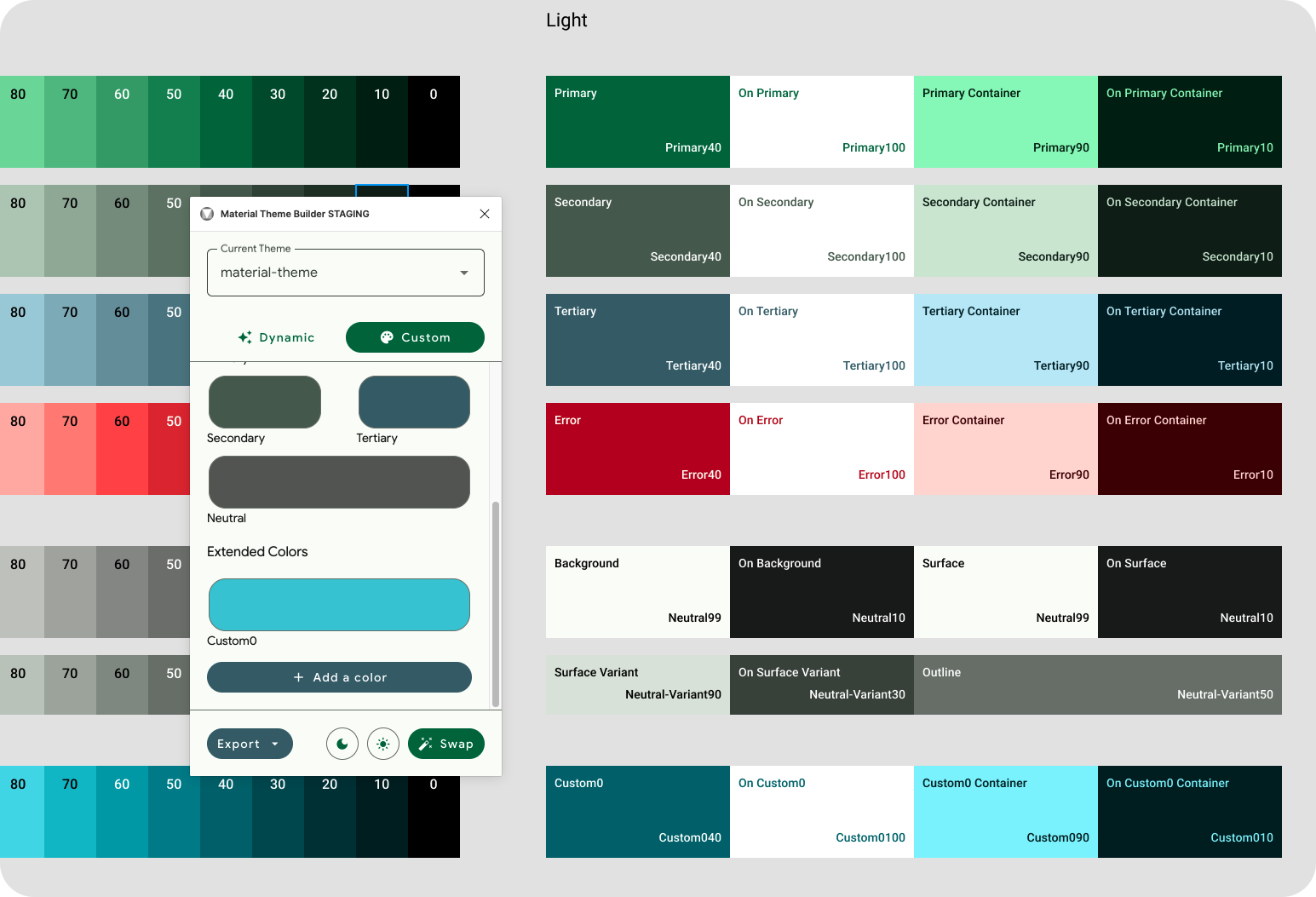
The foundation of a color scheme is the set of five key colors that individually relate to separate tonal palettes with 13 tones. Specific tones from each tonal palette are assigned to color roles across a UI. Let's start by opening the Material Theme Builder plugin and setting up our first accent color: Primary.
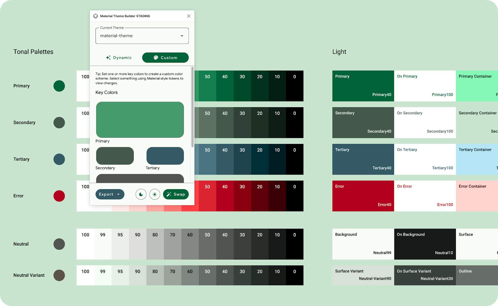
Entering only primary will use it as a source to generate an entire color scheme.
- In the plugin modal, click Custom. This will switch the theme to a custom theme. For this lab we'll be using the material-theme that is already generated, but a new theme can also be created if you wish, learn more in visualizing dynamic color.
- Next we'll set a Primary key color. The primary can be your main brand color, or primary accent color that is most utilized. The rest of the key colors will populate, based on the primary color. This means, there is no need to add additional colors if you do not have the need for them.
5. Build the rest of the theme
Primary is used to generate the theme, but you may have accent colors to support the primary brand color.
- In the plugin modal, add a secondary color by clicking on the Secondary color well. Secondary roles are used for less prominent components in the UI, while expanding the opportunity for color expression. The secondary color will update in the color schematic and App UI.
- Do the same for Tertiary. Tertiary roles are used for contrasting accents that can be used to balance primary and secondary colors or bring enhanced attention to an element. The tertiary color role is left for makers to use at their discretion and is intended to support broader color expression in products.
- Now neutral, neutral roles are used for surfaces and backgrounds, and high emphasis text and icons.
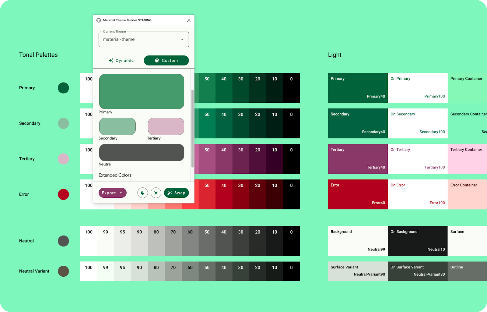
Provide secondary, tertiary, and neutral to fully customize your color scheme..
Your brand colors will now be included in the core color scheme shifted to match the M3 color space, fully accessible, and able to export and implement within code as a theme.
6. Applying your theme
Roles & Tokens
Each accent color (primary, secondary, and tertiary) is provided in a group of four compatible colors of different tones for pairing, defining emphasis, and visual expression. The group is made of the accent color, on color, container, and on container.
Neutral roles are used for surfaces and backgrounds, and high emphasis text and icons.
Design tokens represent the small, repeated design decisions that make up a design system's visual style. Tokens replace static values, such as hex codes for color, with self-explanatory names. Design tokens meaningfully connect style choices that would otherwise lack a clear relationship.
The Figma plugin creates tokens and input your own source colors in the form of Figma styles to connect with existing mock-ups, brand style guides, and even design systems.
Design tokens create a common language between color roles and implementation.
Color hierarchy
When applying color roles to your mockups, consider the order of importance, or hierarchy, of your elements. This concept will help assign brand colors to their respective roles, but also map them within the UI. Typically, more saturated or concentrated colors will gain a user's attention first, this is why the Primary color role is mapped components that are more call to action focused. While the Material Theme Builder uses the M3 color system to generate appropriate colors, providing secondary or tertiary colors with higher saturation will create colors that outshine their Primary. Consider the order you wish your users to engage with amongst UI and content to help assign color roles, not all components should use Primary.
Solid saturated color draws the most attention.
7. Swap to theme
To apply the custom theme you created to your designs we'll need to set the mockup to the tokens in the existing material-theme.
Material components come with roles pre-mapped and will work with the Material Theme Builder automatically.
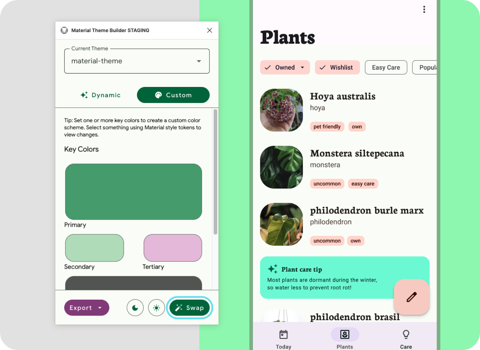
Swap to theme from the Material Theme Builder modal.
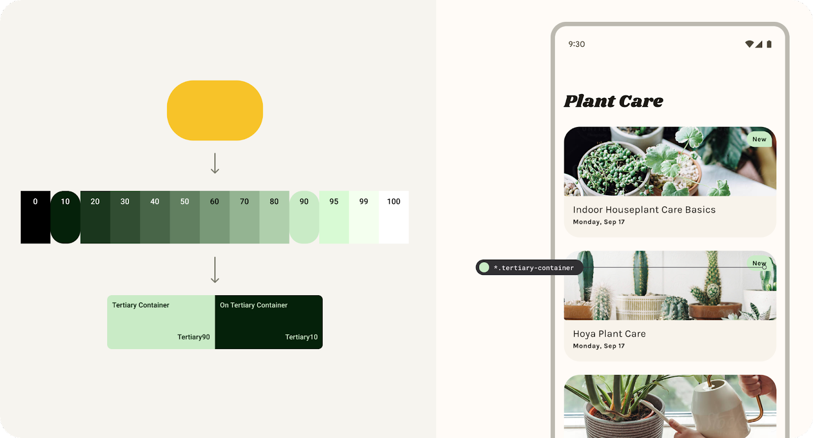
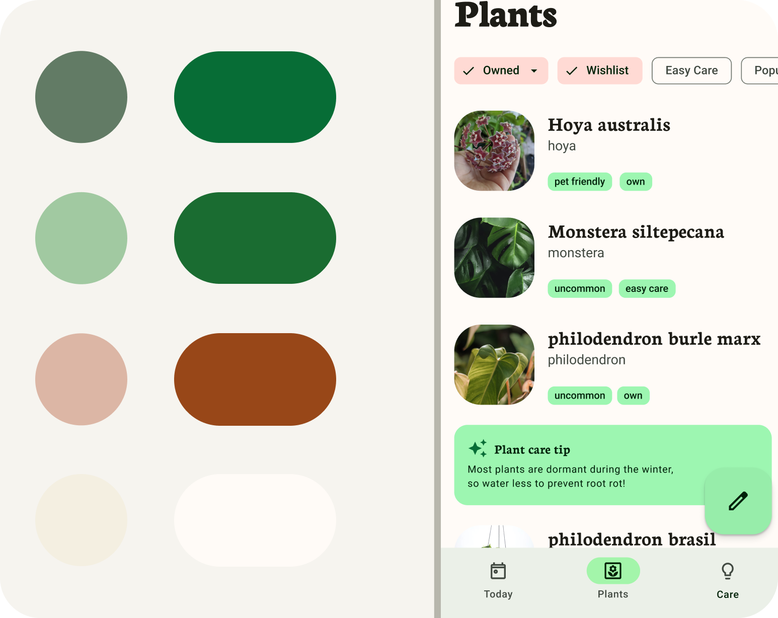
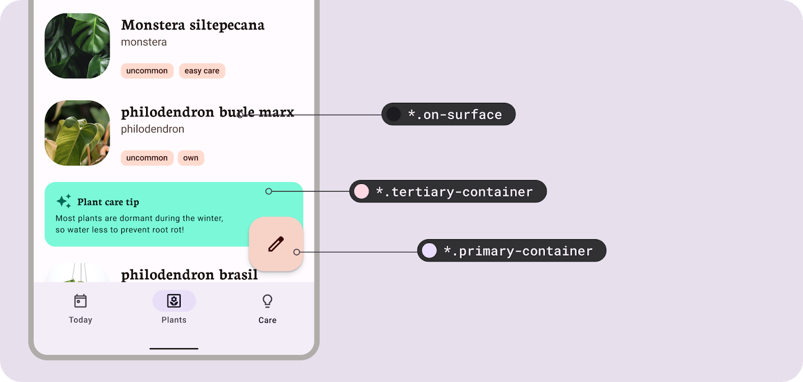
- Let's set all the tokens (Figma styles) in the layout to the right to utilize this theme by selecting the frame of the layout and clicking swap. You'll see the style prefix update in selection colors.
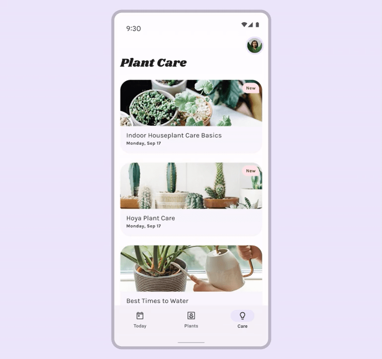
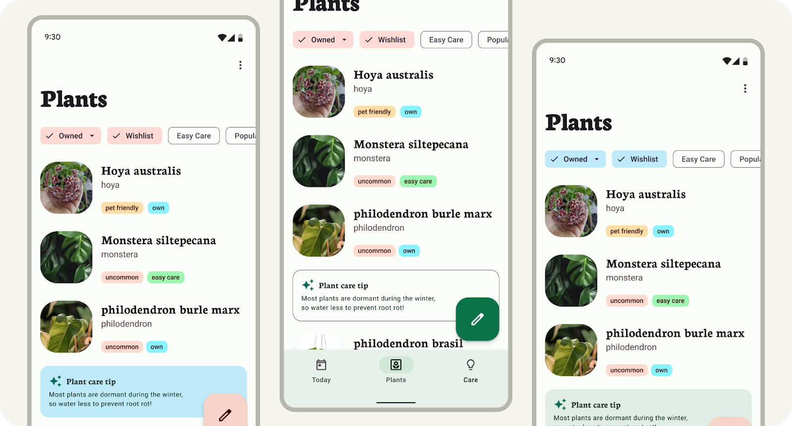
- Not everything updated? Custom components, like the plant care tip card, will need to apply the Figma style first. Select the care tip container, with the container selected, click the 4 dot icon to assign a style, pick tertiary container. Do the same with the contents of the care tip card, except assign a on-tertiary container. The small labels in the list are also custom components, but we'll come back to those later!
- The Material Design components are using default mappings, but you can experiment with style assignments to best suit the UI. Take a moment to play with different color hierarchies and brand expression.
(Only the theme is included in the export file for code. If working with an engineer, share mocks to communicate token mappings, since this will not be included in the export)
Opening the plugin without a theme will show a setup screen to get started. ‘Get started' will generate out the default baseline ‘material-theme' as a Figma style group to connect to your mockups or use with the Material Design kit.
8. Extending past the core scheme
You now have a branded color theme mapped to components and design mock, but you may have additional colors that need to be included. That's where an extended scheme comes in to allow the addition of custom colors.
These can be semantic color, brand-specific, or even product-specific colors, which need to have roles assigned and shifted through the color algorithm or remain as inputted.
The extended color scheme also introduces the possibility of combining dynamic (user-generated) colors with your brand colors. Allow the core scheme to have personalized user influence, while brand colors are set in the extended scheme. This means the UI elements can be more personal to your users and your brand colors can have more precise impactful moments in the app.
The core scheme can be extended to include custom colors. 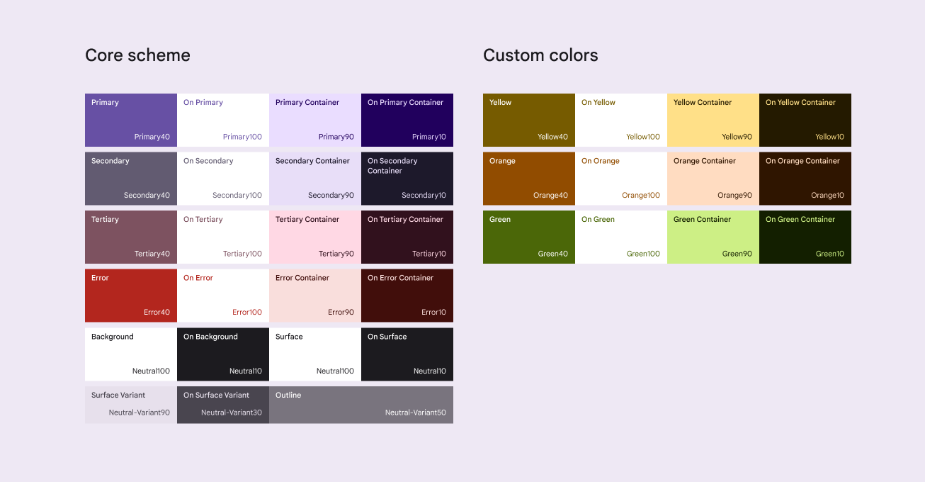
9. Extending & customizing
Extending the scheme with custom colors allows for the addition of colors like semantic or additional branding colors.
Custom scheme with custom colors added.
- In the plugin modal, under the key colors, click Add a Color.
- The current theme will update with a new Custom0 row. Update this color by clicking on the color well, select a new color.
- These extended colors can be found as a style within read only styles as Custom0. Their tonal palette and scheme are both present. Let's map some of the list labels with the new color by selecting the label background and assign one of the added color's roles (on-custom0 container).
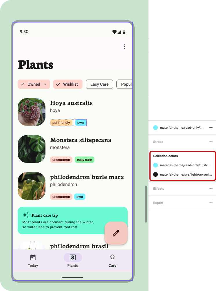
Setting custom color in selected colors.
- The Material Theme Builder auto generates the colors as Custom#. To rename an added custom color, expand the theme's group of styles in the style panel (this will show up when nothing is selected). Then look for Custom0 within the source subgroup. Renaming the source here will rename the color within the plugin modal.
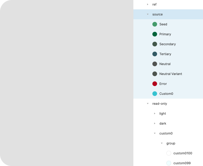
Custom color styles can be found in the styles panel.
- Deleting the added color can be accomplished in a similar manner by right clicking and deleting the style. Next time the plugin is opened the added color will be removed. Renaming and deleting may not be reflected in the color diagram.
10. Congratulations
Great job on learning how to build a custom color theme using the Material Theme Builder, apply it to design mockups, and add onto the color scheme. The new Material 3 color system brings accessible, flexible, and cohesive color to designs and we can't wait to see how you use them!
If you've got questions, feel free to ask us any time using @MaterialDesign on Twitter.
Stay tuned for more design content and tutorials on youtube.com/MaterialDesign