
۱. مقدمه
کامپوننتهای متریال (MDC) به توسعهدهندگان در پیادهسازی طراحی متریال کمک میکنند. MDC که توسط تیمی از مهندسان و طراحان UX در گوگل ایجاد شده است، دهها کامپوننت رابط کاربری زیبا و کاربردی را ارائه میدهد و برای اندروید، iOS، وب و Flutter.material.io/develop در دسترس است. |
در codelab MDC-101، شما از دو کامپوننت متریال (MDC) برای ساخت یک صفحه ورود استفاده کردید: فیلدهای متنی و دکمههایی با موجهای جوهر. حالا بیایید با اضافه کردن ناوبری، ساختار و دادهها، این پایه را گسترش دهیم.
آنچه خواهید ساخت
در این آزمایشگاه کد، شما یک صفحه اصلی برای برنامهای به نام Shrine ، یک برنامه تجارت الکترونیک که لباس و کالاهای خانگی میفروشد، خواهید ساخت. این برنامه شامل موارد زیر خواهد بود:
- نوار برنامه برتر
- یک لیست شبکهای پر از محصولات
اجزای MDC-Android در این آزمایشگاه کد
- طرحبندی نوار برنامه
- نمای کارت مواد
آنچه نیاز دارید
- دانش پایه در توسعه اندروید
- اندروید استودیو (اگر ندارید، از اینجا دانلود کنید)
- یک شبیهساز یا دستگاه اندروید (از طریق اندروید استودیو قابل دسترسی است)
- کد نمونه (به مرحله بعدی مراجعه کنید)
سطح تجربه خود در ساخت برنامههای اندروید را چگونه ارزیابی میکنید؟
۲. محیط توسعه خود را تنظیم کنید
ادامه از MDC-101؟
اگر MDC-101 را تکمیل کردهاید، کد شما باید برای این آزمایشگاه کد آماده شده باشد. به مرحله ۳ بروید: یک نوار برنامه در بالا اضافه کنید .
از صفر شروع کردن؟
اپلیکیشن استارتر codelab را دانلود کنید
برنامهی آغازین در دایرکتوری material-components-android-codelabs-102-starter/kotlin قرار دارد. قبل از شروع، حتماً با cd به آن دایرکتوری بروید.
... یا آن را از گیتهاب کلون کنید
برای کپی کردن این codelab از گیتهاب، دستورات زیر را اجرا کنید:
git clone https://github.com/material-components/material-components-android-codelabs
cd material-components-android-codelabs/
git checkout 102-starter
کد شروع را در اندروید استودیو بارگذاری کنید
- پس از اتمام مراحل نصب و نمایش پنجره Welcome to Android Studio ، روی Open an existing Android Studio project کلیک کنید. به پوشهای که کد نمونه را در آن نصب کردهاید بروید و kotlin -> shrine را انتخاب کنید (یا در رایانه خود عبارت shrine را جستجو کنید) تا پروژه Shipping باز شود.
- لحظهای صبر کنید تا اندروید استودیو پروژه را بسازد و همگامسازی کند، همانطور که توسط نشانگرهای فعالیت در پایین پنجره اندروید استودیو نشان داده شده است.
- در این مرحله، ممکن است اندروید استودیو به دلیل فقدان SDK اندروید یا ابزارهای ساخت، مانند آنچه در زیر نشان داده شده است، برخی خطاهای ساخت را ایجاد کند. برای نصب/بهروزرسانی این موارد و همگامسازی پروژه خود، دستورالعملهای موجود در اندروید استودیو را دنبال کنید.

اضافه کردن وابستگیهای پروژه
این پروژه به یک وابستگی (dependency) در کتابخانه پشتیبانی اندروید MDC نیاز دارد. کد نمونهای که دانلود کردهاید باید از قبل این وابستگی را داشته باشد، اما برای اطمینان، انجام مراحل زیر توصیه میشود.
- به فایل
build.gradleماژولappبروید و مطمئن شوید که بلوکdependenciesشامل یک وابستگی به MDC Android است:
api 'com.google.android.material:material:1.1.0-alpha06'
- (اختیاری) در صورت لزوم، فایل
build.gradleرا ویرایش کنید تا وابستگیهای زیر را اضافه کرده و پروژه را همگامسازی کنید.
dependencies {
    api 'com.google.android.material:material:1.1.0-alpha06'
    implementation 'androidx.legacy:legacy-support-v4:1.0.0'
    implementation 'com.android.volley:volley:1.1.1'
    implementation 'com.google.code.gson:gson:2.8.5'
    implementation "org.jetbrains.kotlin:kotlin-stdlib-jdk7:1.3.21"
    testImplementation 'junit:junit:4.12'
    androidTestImplementation 'androidx.test:core:1.1.0'
    androidTestImplementation 'androidx.test.ext:junit:1.1.0'
    androidTestImplementation 'androidx.test:runner:1.2.0-alpha05'
    androidTestImplementation 'androidx.test.espresso:espresso-core:3.2.0-alpha05'
}
برنامه شروع کننده را اجرا کنید
|

موفقیتآمیز بود! شما باید صفحه ورود به سیستم Shrine را از آزمایشگاه کد MDC-101 ببینید.
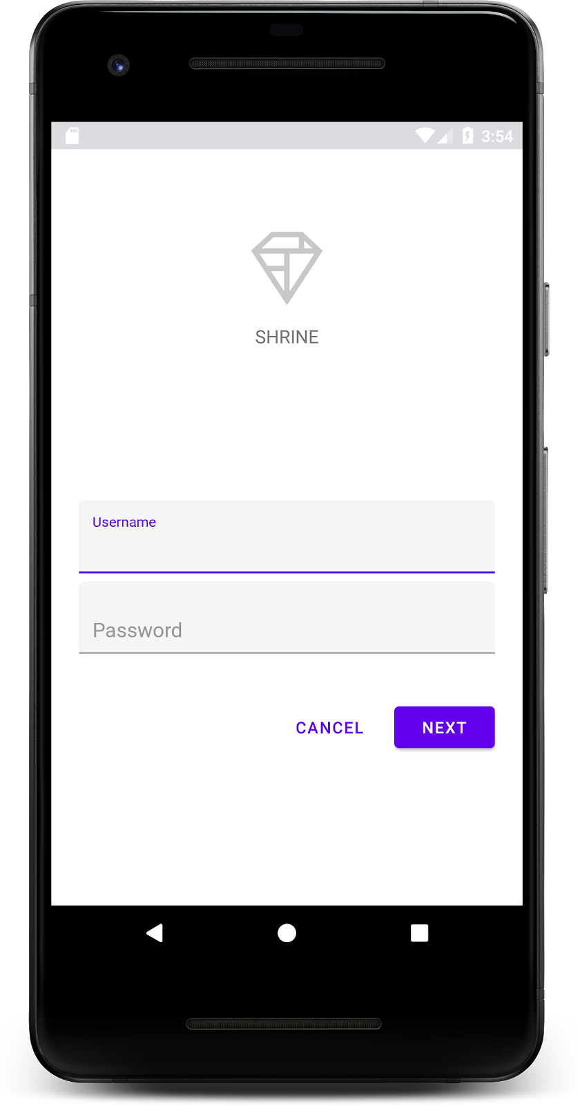
حالا که صفحه ورود به سیستم خوب به نظر میرسد، بیایید برنامه را با برخی از محصولات پر کنیم.
۳. اضافه کردن نوار برنامه در بالای صفحه
صفحه اصلی با بسته شدن صفحه ورود، با پیامی مبنی بر «شما موفق شدید!» نمایان میشود. این عالی است! اما اکنون کاربر ما هیچ اقدامی برای انجام دادن ندارد و هیچ درکی از محل فعلی خود در برنامه ندارد. برای کمک به این امر، زمان اضافه کردن ناوبری فرا رسیده است.
طراحی متریال الگوهای ناوبری ارائه میدهد که درجه بالایی از کاربردپذیری را تضمین میکند. یکی از قابل مشاهدهترین اجزا، نوار بالای برنامه است.
برای فراهم کردن ناوبری و دسترسی سریع کاربران به سایر اقدامات، بیایید یک نوار برنامه در بالای صفحه اضافه کنیم.
افزودن ویجت AppBar
در shr_product_grid_fragment.xml ، بلوک <LinearLayout> که شامل TextView با عبارت "You did it!" است را حذف کرده و آن را با کد زیر جایگزین کنید:
shr_product_grid_fragment.xml
<com.google.android.material.appbar.AppBarLayout
   android:layout_width="match_parent"
   android:layout_height="wrap_content">

   <androidx.appcompat.widget.Toolbar
       android:id="@+id/app_bar"
       style="@style/Widget.Shrine.Toolbar"
       android:layout_width="match_parent"
       android:layout_height="?attr/actionBarSize"
       app:title="@string/shr_app_name" />
</com.google.android.material.appbar.AppBarLayout>
حالا shr_product_grid_fragment.xml شما باید به شکل زیر باشد:
shr_product_grid_fragment.xml
<?xml version="1.0" encoding="utf-8"?>
<FrameLayout xmlns:android="http://schemas.android.com/apk/res/android"
   xmlns:app="http://schemas.android.com/apk/res-auto"
   xmlns:tools="http://schemas.android.com/tools"
   android:layout_width="match_parent"
   android:layout_height="match_parent"
   tools:context=".ProductGridFragment">

   <com.google.android.material.appbar.AppBarLayout
       android:layout_width="match_parent"
       android:layout_height="wrap_content">

       <androidx.appcompat.widget.Toolbar
           android:id="@+id/app_bar"
           style="@style/Widget.Shrine.Toolbar"
           android:layout_width="match_parent"
           android:layout_height="?attr/actionBarSize"
           app:title="@string/shr_app_name" />
   </com.google.android.material.appbar.AppBarLayout>

</FrameLayout>
بسیاری از نوارهای برنامه یک دکمه در کنار عنوان دارند. بیایید یک آیکون منو به نوار برنامه خودمان اضافه کنیم.
یک آیکون ناوبری اضافه کنید
در حالی که هنوز در shr_product_grid_fragment.xml هستید، موارد زیر را به کامپوننت Toolbar XML که به طرح خود اضافه کردهاید، اضافه کنید:
shr_product_grid_fragment.xml
app:navigationIcon="@drawable/shr_menu"
shr_product_grid_fragment.xml شما باید به شکل زیر باشد:
shr_product_grid_fragment.xml
<?xml version="1.0" encoding="utf-8"?>
<FrameLayout xmlns:android="http://schemas.android.com/apk/res/android"
   xmlns:app="http://schemas.android.com/apk/res-auto"
   xmlns:tools="http://schemas.android.com/tools"
   android:layout_width="match_parent"
   android:layout_height="match_parent"
   tools:context=".ProductGridFragment">

   <com.google.android.material.appbar.AppBarLayout
       android:layout_width="match_parent"
       android:layout_height="wrap_content">

       <androidx.appcompat.widget.Toolbar
           android:id="@+id/app_bar"
           style="@style/Widget.Shrine.Toolbar"
           android:layout_width="match_parent"
           android:layout_height="?attr/actionBarSize"
           app:navigationIcon="@drawable/shr_menu"
           app:title="@string/shr_app_name" />
   </com.google.android.material.appbar.AppBarLayout>

</FrameLayout>
دکمههای عملیاتی را اضافه کنید و نوار بالای برنامه را استایل دهید
همچنین میتوانید دکمههایی را به انتهای نوار برنامه اضافه کنید. در اندروید، به این دکمهها، دکمههای عملیاتی میگویند. ما نوار برنامه بالایی را استایلدهی میکنیم و دکمههای عملیاتی را به صورت برنامهنویسی شده به منوی آن اضافه میکنیم.
در تابع onCreateView مربوط به ProductGridFragment.kt ، با استفاده از setSupportActionBar Toolbar مربوط به activity را طوری تنظیم کنید که به عنوان یک ActionBar مورد استفاده قرار گیرد. میتوانید این کار را پس از ایجاد view با inflater انجام دهید.
ProductGridFragment.kt
override fun onCreateView(
       inflater: LayoutInflater, container: ViewGroup?, savedInstanceState: Bundle?): View? {
   // Inflate the layout for this fragment with the ProductGrid theme
   val view = inflater.inflate(R.layout.shr_product_grid_fragment, container, false)

   // Set up the toolbar.
   (activity as AppCompatActivity).setSupportActionBar(view.app_bar)

   return view;
}
در مرحله بعد، مستقیماً زیر متدی که برای تنظیم نوار ابزار تغییر دادیم، بیایید onCreateOptionsMenu را بازنویسی کنیم تا محتویات shr_toolbar_menu.xml را در نوار ابزار قرار دهیم:
ProductGridFragment.kt
override fun onCreateOptionsMenu(menu: Menu, menuInflater: MenuInflater) {
   menuInflater.inflate(R.menu.shr_toolbar_menu, menu)
   super.onCreateOptionsMenu(menu, menuInflater)
}
در نهایت، تابع onCreate() در ProductGridFragment.kt بازنویسی کنید و پس از فراخوانی super() ، تابع setHasOptionMenu با true فراخوانی کنید:
ProductGridFragment.kt
override fun onCreate(savedInstanceState: Bundle?) {
   super.onCreate(savedInstanceState)
   setHasOptionsMenu(true)
}
قطعه کدهای بالا، نوار برنامه (app bar) از طرحبندی XML ما را به عنوان نوار اقدام (action bar) برای این فعالیت تنظیم میکنند. فراخوانی onCreateOptionsMenu به فعالیت میگوید که از چه چیزی به عنوان منو استفاده کند. در این حالت، آیتمهای منو را از R.menu.shr_toolbar_menu در نوار برنامه قرار میدهد. فایل منو شامل دو آیتم است: "جستجو" (Search) و "فیلتر".
shr_toolbar_menu.xml
<?xml version="1.0" encoding="utf-8"?>
<menu xmlns:android="http://schemas.android.com/apk/res/android"
   xmlns:app="http://schemas.android.com/apk/res-auto">
   <item
       android:id="@+id/search"
       android:icon="@drawable/shr_search"
       android:title="@string/shr_search_title"
       app:showAsAction="always" />
   <item
       android:id="@+id/filter"
       android:icon="@drawable/shr_filter"
       android:title="@string/shr_filter_title"
       app:showAsAction="always" />
</menu>
پس از این تغییرات، فایل ProductGridFragment.kt شما باید به شکل زیر باشد:
ProductGridFragment.kt
package com.google.codelabs.mdc.kotlin.shrine

import android.os.Bundle
import android.view.LayoutInflater
import android.view.Menu
import android.view.MenuInflater
import android.view.View
import android.view.ViewGroup
import androidx.appcompat.app.AppCompatActivity
import androidx.fragment.app.Fragment
import androidx.recyclerview.widget.GridLayoutManager
import com.google.codelabs.mdc.kotlin.shrine.network.ProductEntry
import kotlinx.android.synthetic.main.shr_product_grid_fragment.view.*

class ProductGridFragment : Fragment() {

   override fun onCreate(savedInstanceState: Bundle?) {
       super.onCreate(savedInstanceState)
       setHasOptionsMenu(true)
   }

   override fun onCreateView(
           inflater: LayoutInflater, container: ViewGroup?, savedInstanceState: Bundle?): View? {
       // Inflate the layout for this fragment with the ProductGrid theme
       val view = inflater.inflate(R.layout.shr_product_grid_fragment, container, false)

       // Set up the tool bar
       (activity as AppCompatActivity).setSupportActionBar(view.app_bar)

       return view;
   }

   override fun onCreateOptionsMenu(menu: Menu, menuInflater: MenuInflater) {
       menuInflater.inflate(R.menu.shr_toolbar_menu, menu)
       super.onCreateOptionsMenu(menu, menuInflater)
   }
}
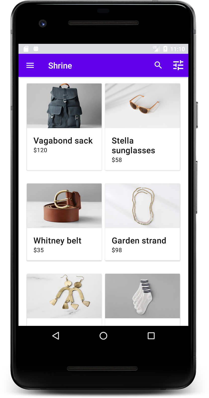
صفحه اصلی شما باید به این شکل باشد:
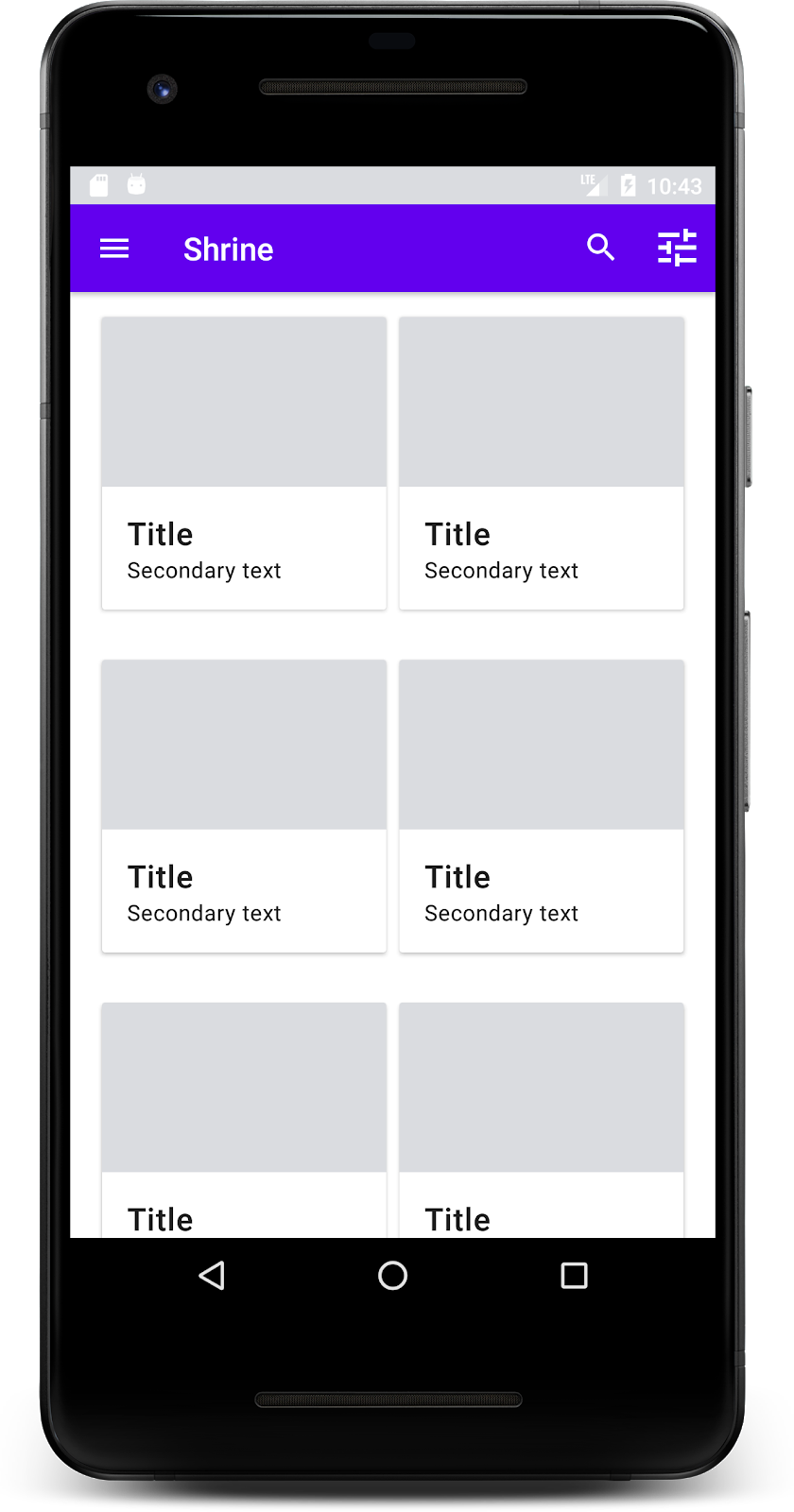
حالا نوار ابزار یک آیکون ناوبری، یک عنوان و دو آیکون عملیاتی در سمت راست دارد. این نوار ابزار همچنین ارتفاع را با استفاده از یک سایه ظریف که نشان میدهد در لایهای متفاوت از محتوا قرار دارد، نمایش میدهد.
۴. یک کارت اضافه کنید
حالا که برنامه ما ساختار مشخصی دارد، بیایید محتوا را با قرار دادن در کارتها سازماندهی کنیم.
اضافه کردن کارت
بیایید با اضافه کردن یک کارت در زیر نوار بالای برنامه شروع کنیم. هر کارت باید دارای یک ناحیه برای تصویر، یک عنوان و یک برچسب برای متن ثانویه باشد. کد زیر را در shr_product_grid_fragment.xml در زیر AppBarLayout اضافه کنید.
shr_product_grid_fragment.xml
<com.google.android.material.card.MaterialCardView
   android:layout_width="160dp"
   android:layout_height="180dp"
   android:layout_marginBottom="16dp"
   android:layout_marginLeft="16dp"
   android:layout_marginRight="16dp"
   android:layout_marginTop="70dp"
   app:cardBackgroundColor="?attr/colorPrimaryDark"
   app:cardCornerRadius="4dp">

   <LinearLayout
       android:layout_width="match_parent"
       android:layout_height="wrap_content"
       android:layout_gravity="bottom"
       android:background="#FFFFFF"
       android:orientation="vertical"
       android:padding="8dp">

       <TextView
           android:layout_width="match_parent"
           android:layout_height="wrap_content"
           android:padding="2dp"
           android:text="@string/shr_product_title"
           android:textAppearance="?attr/textAppearanceHeadline6" />

       <TextView
           android:layout_width="match_parent"
           android:layout_height="wrap_content"
           android:padding="2dp"
           android:text="@string/shr_product_description"
           android:textAppearance="?attr/textAppearanceBody2" />
   </LinearLayout>
</com.google.android.material.card.MaterialCardView>
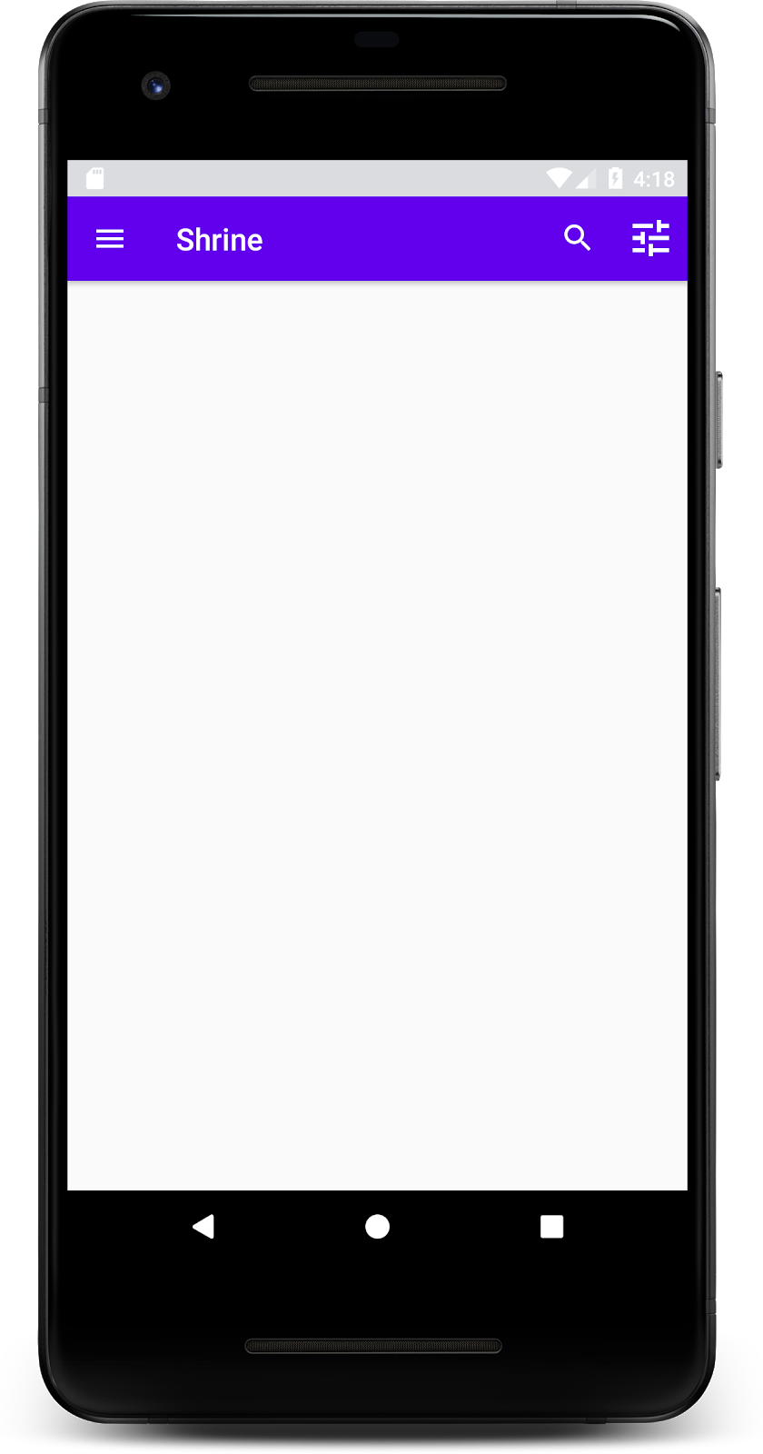
ساخت و اجرا:

در این پیشنمایش، میتوانید ببینید که کارت از لبه سمت چپ به داخل اضافه شده است و گوشههای گرد و سایه دارد (که نشاندهنده ارتفاع کارت است). کل عنصر «محفظه» نامیده میشود. گذشته از محفظه، تمام عناصر درون آن اختیاری هستند.
شما میتوانید عناصر زیر را به یک کانتینر اضافه کنید: متن سربرگ، تصویر کوچک یا آواتار، متن زیرعنوان، جداکنندهها و حتی دکمهها و آیکونها. برای مثال، کارتی که ما ایجاد کردیم، شامل دو TextView (یکی برای عنوان و دیگری برای متن ثانویه) در یک LinearLayout است که در پایین کارت تراز شدهاند.
کارتها معمولاً در یک مجموعه با کارتهای دیگر نشان داده میشوند. در بخش بعدی این آزمایشگاه کد، آنها را به صورت یک مجموعه در یک شبکه قرار خواهیم داد.
۵. یک شبکه از کارتها ایجاد کنید
وقتی چندین کارت در یک صفحه نمایش داده میشوند، در یک یا چند مجموعه گروهبندی میشوند. کارتهای موجود در یک شبکه همسطح هستند، به این معنی که ارتفاع ثابت آنها با یکدیگر یکسان است (مگر اینکه برداشته یا کشیده شوند، اما ما در این آزمایشگاه کد به آن نمیپردازیم).
شبکه کارتها را تنظیم کنید
به فایل shr_product_card.xml که برای شما فراهم کردهایم نگاهی بیندازید:
shr_product_card.xml
<?xml version="1.0" encoding="utf-8"?>
<com.google.android.material.card.MaterialCardView xmlns:android="http://schemas.android.com/apk/res/android"
   xmlns:app="http://schemas.android.com/apk/res-auto"
   android:layout_width="match_parent"
   android:layout_height="wrap_content"
   app:cardBackgroundColor="@android:color/white"
   app:cardElevation="2dp"
   app:cardPreventCornerOverlap="true">

   <LinearLayout
       android:layout_width="match_parent"
       android:layout_height="wrap_content"
       android:orientation="vertical">

       <com.android.volley.toolbox.NetworkImageView
           android:id="@+id/product_image"
           android:layout_width="match_parent"
           android:layout_height="@dimen/shr_product_card_image_height"
           android:background="?attr/colorPrimaryDark"
           android:scaleType="centerCrop" />

       <LinearLayout
           android:layout_width="match_parent"
           android:layout_height="wrap_content"
           android:orientation="vertical"
           android:padding="16dp">

           <TextView
               android:id="@+id/product_title"
               android:layout_width="match_parent"
               android:layout_height="wrap_content"
               android:text="@string/shr_product_title"
               android:textAppearance="?attr/textAppearanceHeadline6" />

           <TextView
               android:id="@+id/product_price"
               android:layout_width="match_parent"
               android:layout_height="wrap_content"
               android:text="@string/shr_product_description"
               android:textAppearance="?attr/textAppearanceBody2" />
       </LinearLayout>
   </LinearLayout>
</com.google.android.material.card.MaterialCardView>
این طرحبندی کارت شامل یک کارت با یک تصویر (در این مورد، یک NetworkImageView که به ما امکان بارگذاری و نمایش تصاویر از یک URL را میدهد) و دو TextViews .
در مرحله بعد، به ProductCardRecyclerViewAdapter که برای شما فراهم کردهایم نگاهی بیندازید. این ماژول در همان پکیج ProductGridFragment قرار دارد.
ProductCardRecyclerViewAdapter.kt
package com.google.codelabs.mdc.kotlin.shrine

import android.view.LayoutInflater
import android.view.ViewGroup
import androidx.recyclerview.widget.RecyclerView

import com.google.codelabs.mdc.kotlin.shrine.network.ProductEntry

/**
* Adapter used to show a simple grid of products.
*/
class ProductCardRecyclerViewAdapter(private val productList: List<ProductEntry>) : RecyclerView.Adapter<ProductCardViewHolder>() {

   override fun onCreateViewHolder(parent: ViewGroup, viewType: Int): ProductCardViewHolder {
       val layoutView = LayoutInflater.from(parent.context).inflate(R.layout.shr_product_card, parent, false)
       return ProductCardViewHolder(layoutView)
   }

   override fun onBindViewHolder(holder: ProductCardViewHolder, position: Int) {
       // TODO: Put ViewHolder binding code here in MDC-102
   }

   override fun getItemCount(): Int {
       return productList.size
   }
}
کلاس آداپتور بالا محتوای شبکه ما را مدیریت میکند. برای تعیین اینکه هر نما با محتوای داده شده خود چه کاری باید انجام دهد، به زودی کد مربوط به onBindViewHolder() را خواهیم نوشت.
در همان بسته، میتوانید نگاهی به ProductCardViewHolder نیز بیندازید. این کلاس، نماهایی را که بر طرحبندی کارت ما تأثیر میگذارند، ذخیره میکند تا بتوانیم بعداً آنها را تغییر دهیم.
package com.google.codelabs.mdc.kotlin.shrine

import android.view.View
import androidx.recyclerview.widget.RecyclerView

class ProductCardViewHolder(itemView: View) //TODO: Find and store views from itemView
   : RecyclerView.ViewHolder(itemView)
برای تنظیم شبکهبندی، ابتدا باید جاینگهدار MaterialCardView از shr_product_grid_fragment.xml حذف کنیم. در مرحله بعد، باید کامپوننتی را که نشاندهنده شبکهبندی کارتهای ما است اضافه کنید. در این حالت، ما از RecyclerView استفاده خواهیم کرد. کامپوننت RecyclerView را به shr_product_grid_fragment.xml خود، زیر کامپوننت AppBarLayout XML خود اضافه کنید:
shr_product_grid_fragment.xml
<androidx.core.widget.NestedScrollView
   android:layout_width="match_parent"
   android:layout_height="match_parent"
   android:layout_marginTop="56dp"
   android:background="@color/productGridBackgroundColor"
   android:paddingStart="@dimen/shr_product_grid_spacing"
   android:paddingEnd="@dimen/shr_product_grid_spacing"
   app:layout_behavior="@string/appbar_scrolling_view_behavior">

   <androidx.recyclerview.widget.RecyclerView
       android:id="@+id/recycler_view"
       android:layout_width="match_parent"
       android:layout_height="match_parent" />

</androidx.core.widget.NestedScrollView>
shr_product_grid_fragment.xml شما باید به شکل زیر باشد:
shr_product_grid_fragment.xml
<?xml version="1.0" encoding="utf-8"?>
<FrameLayout xmlns:android="http://schemas.android.com/apk/res/android"
   xmlns:app="http://schemas.android.com/apk/res-auto"
   xmlns:tools="http://schemas.android.com/tools"
   android:layout_width="match_parent"
   android:layout_height="match_parent"
   tools:context=".ProductGridFragment">

   <com.google.android.material.appbar.AppBarLayout
       android:layout_width="match_parent"
       android:layout_height="wrap_content">

       <androidx.appcompat.widget.Toolbar
           android:id="@+id/app_bar"
           style="@style/Widget.Shrine.Toolbar"
           android:layout_width="match_parent"
           android:layout_height="?attr/actionBarSize"
           app:navigationIcon="@drawable/shr_menu"
           app:title="@string/shr_app_name" />
   </com.google.android.material.appbar.AppBarLayout>

   <androidx.core.widget.NestedScrollView
       android:layout_width="match_parent"
       android:layout_height="match_parent"
       android:layout_marginTop="56dp"
       android:background="@color/productGridBackgroundColor"
       android:paddingStart="@dimen/shr_product_grid_spacing"
       android:paddingEnd="@dimen/shr_product_grid_spacing"
       app:layout_behavior="@string/appbar_scrolling_view_behavior">

       <androidx.recyclerview.widget.RecyclerView
           android:id="@+id/recycler_view"
           android:layout_width="match_parent"
           android:layout_height="match_parent" />

   </androidx.core.widget.NestedScrollView>

</FrameLayout>
در نهایت، در onCreateView() ، کد مقداردهی اولیه RecyclerView را پس از فراخوانی setUpToolbar(view) و قبل از دستور return ، به ProductGridFragment.kt اضافه کنید:
ProductGridFragment.kt
override fun onCreateView(
       inflater: LayoutInflater, container: ViewGroup?, savedInstanceState: Bundle?): View? {
   // Inflate the layout for this fragment with the ProductGrid theme
   val view = inflater.inflate(R.layout.shr_product_grid_fragment, container, false)

   // Set up the toolbar.
   (activity as AppCompatActivity).setSupportActionBar(view.app_bar)

   // Set up the RecyclerView
   view.recycler_view.setHasFixedSize(true)
   view.recycler_view.layoutManager = GridLayoutManager(context, 2, RecyclerView.VERTICAL, false)
   val adapter = ProductCardRecyclerViewAdapter(
           ProductEntry.initProductEntryList(resources))
   view.recycler_view.adapter = adapter
   val largePadding = resources.getDimensionPixelSize(R.dimen.shr_product_grid_spacing)
   val smallPadding = resources.getDimensionPixelSize(R.dimen.shr_product_grid_spacing_small)
   view.recycler_view.addItemDecoration(ProductGridItemDecoration(largePadding, smallPadding))

   return view;
}
قطعه کد بالا شامل مراحل اولیهسازی لازم برای راهاندازی یک RecyclerView است. این شامل تنظیم مدیر طرحبندی RecyclerView ، به علاوه مقداردهی اولیه و تنظیم آداپتور RecyclerView میشود.
فایل ProductGridFragment.kt شما اکنون باید به شکل زیر باشد:
قطعه کد محصول ( .kt)
package com.google.codelabs.mdc.kotlin.shrine

import android.os.Bundle
import android.view.LayoutInflater
import android.view.Menu
import android.view.MenuInflater
import android.view.View
import android.view.ViewGroup
import androidx.appcompat.app.AppCompatActivity
import androidx.fragment.app.Fragment
import androidx.recyclerview.widget.GridLayoutManager
import androidx.recyclerview.widget.RecyclerView
import com.google.codelabs.mdc.kotlin.shrine.network.ProductEntry
import kotlinx.android.synthetic.main.shr_product_grid_fragment.view.*

class ProductGridFragment : Fragment() {

   override fun onCreate(savedInstanceState: Bundle?) {
       super.onCreate(savedInstanceState)
       setHasOptionsMenu(true)
   }

   override fun onCreateView(
           inflater: LayoutInflater, container: ViewGroup?, savedInstanceState: Bundle?): View? {
       // Inflate the layout for this fragment with the ProductGrid theme
       val view = inflater.inflate(R.layout.shr_product_grid_fragment, container, false)

       // Set up the toolbar.
       (activity as AppCompatActivity).setSupportActionBar(view.app_bar)

       // Set up the RecyclerView
       view.recycler_view.setHasFixedSize(true)
       view.recycler_view.layoutManager = GridLayoutManager(context, 2, RecyclerView.VERTICAL, false)
       val adapter = ProductCardRecyclerViewAdapter(
               ProductEntry.initProductEntryList(resources))
       view.recycler_view.adapter = adapter
       val largePadding = resources.getDimensionPixelSize(R.dimen.shr_product_grid_spacing)
       val smallPadding = resources.getDimensionPixelSize(R.dimen.shr_product_grid_spacing_small)
       view.recycler_view.addItemDecoration(ProductGridItemDecoration(largePadding, smallPadding))

       return view;
   }

   override fun onCreateOptionsMenu(menu: Menu, menuInflater: MenuInflater) {
       menuInflater.inflate(R.menu.shr_toolbar_menu, menu)
       super.onCreateOptionsMenu(menu, menuInflater)
   }
}
ساخت و اجرا:
کارتها الان آماده هستند! هنوز چیزی نشان نمیدهند، پس بیایید کمی اطلاعات محصول اضافه کنیم.
تصاویر و متن را اضافه کنید
برای هر کارت، یک تصویر، نام محصول و قیمت اضافه کنید. ViewHolder ما، نماهای مربوط به هر کارت را در خود جای میدهد. در ViewHolder خود، سه نما را به شرح زیر اضافه کنید.
ProductCardViewHolder.kt
package com.google.codelabs.mdc.kotlin.shrine

import android.view.View
import android.widget.TextView
import androidx.recyclerview.widget.RecyclerView

import com.android.volley.toolbox.NetworkImageView

class ProductCardViewHolder(itemView: View) : RecyclerView.ViewHolder(itemView) {

   var productImage: NetworkImageView = itemView.findViewById(R.id.product_image)
   var productTitle: TextView = itemView.findViewById(R.id.product_title)
   var productPrice: TextView = itemView.findViewById(R.id.product_price)
}
متد onBindViewHolder() را در ProductCardRecyclerViewAdapter بهروزرسانی کنید تا عنوان، قیمت و تصویر محصول را برای هر نمای محصول، مطابق شکل زیر تنظیم کنید:
ProductCardRecyclerViewAdapter.kt
override fun onBindViewHolder(holder: ProductCardViewHolder, position: Int) {
   if (position < productList.size) {
       val product = productList[position]
       holder.productTitle.text = product.title
       holder.productPrice.text = product.price
       ImageRequester.setImageFromUrl(holder.productImage, product.url)
   }
}
کد بالا با استفاده از ViewHolder به آداپتور RecyclerView ما میگوید که با هر کارت چه کاری انجام دهد.
در اینجا، دادههای متنی را روی هر یک از TextView های ViewHolder تنظیم میکند و یک ImageRequester را برای دریافت تصویر از یک URL فراخوانی میکند. ImageRequester کلاسی است که ما برای راحتی شما ارائه کردهایم و از کتابخانه Volley استفاده میکند (این موضوع خارج از محدوده این آزمایشگاه کد است، اما میتوانید خودتان کد را بررسی کنید).
ساخت و اجرا:
محصولات ما اکنون در اپلیکیشن نمایش داده میشوند!
۶. خلاصه
برنامه ما یک جریان ساده دارد که کاربر را از صفحه ورود به سیستم به صفحه اصلی میبرد، جایی که میتوان محصولات را مشاهده کرد. تنها با چند خط کد، یک نوار برنامه در بالای صفحه با یک عنوان و سه دکمه و یک شبکه از کارتها برای ارائه محتوای برنامه اضافه کردیم. صفحه اصلی ما اکنون ساده و کاربردی است، با یک ساختار ساده و محتوای قابل اجرا.
مراحل بعدی
با نوار برنامه بالا، کارت، فیلد متنی و دکمه، اکنون از چهار کامپوننت اصلی طراحی متریال از کتابخانه MDC-Android استفاده کردهایم! میتوانید با مراجعه به کاتالوگ MDC-Android، کامپوننتهای بیشتری را بررسی کنید.
اگرچه کاملاً کاربردی است، اما برنامه ما هنوز هیچ برند یا سبک خاصی را بیان نمیکند. در MDC-103: قالببندی طراحی متریال با رنگ، شکل، ارتفاع و نوع ، ما سبک این اجزا را برای بیان یک برند پر جنب و جوش و مدرن سفارشی خواهیم کرد.