
1. 簡介
| 開發人員可透過 Material 元件 (MDC) 實作 Material Design。MDC 由 Google 的工程師和 UX 設計師團隊打造,提供數十種美觀實用的 UI 元件,適用於 Android、iOS、網頁和 Flutter。material.io/develop |

您現在可以使用 Material Flutter,以前所未有的方式自訂應用程式的獨特風格。Material Design 近期擴展後,設計師和開發人員能更靈活地呈現產品品牌。
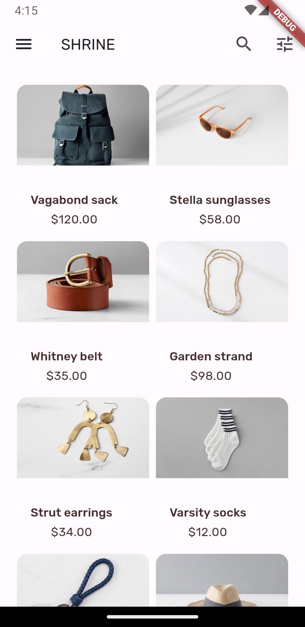
在 MDC-101 和 MDC-102 程式碼研究室中,您使用 Material Flutter 建構名為 Shrine 的應用程式基本架構,這款電子商務應用程式販售服飾和居家用品。這個應用程式包含使用者流程,從登入畫面開始,然後將使用者帶往顯示產品的主畫面。
建構項目
在本程式碼研究室中,您將使用下列項目自訂 Shrine 應用程式:
- 顏色
- 字體排版
- 海拔高度
- 圖案
- 版面配置
Android | iOS |
|
|
|
|


本程式碼研究室中的 Material Flutter 元件和子系統
- 主題
- 字體排版
- 海拔高度
- 圖片清單
您對 Flutter 開發的經驗程度如何?
2. 設定 Flutter 開發環境
如要完成本實驗室,您需要兩項軟體:Flutter SDK 和編輯器。
您可以使用下列任一裝置執行程式碼研究室:
- 連線至電腦並設為開發人員模式的實體 Android 或 iOS 裝置。
- iOS 模擬器 (需要安裝 Xcode 工具)。
- Android Emulator (需在 Android Studio 中設定)。
- 瀏覽器 (偵錯時必須使用 Chrome)。
- 以 Windows、Linux 或 macOS 電腦版應用程式的形式。您必須在要部署的平台上進行開發。因此,如要開發 Windows 桌面應用程式,您必須在 Windows 上開發,才能存取適當的建構鏈。如需作業系統專屬需求,請參閱 docs.flutter.dev/desktop。
3. 下載程式碼實驗室範例應用程式
是否要從 MDC-102 繼續?
如果您已完成 MDC-102,程式碼應該已準備就緒,可供本程式碼研究室使用。跳至「變更顏色」步驟。
從零開始?
下載程式碼研究室的入門應用程式
範例應用程式位於 material-components-flutter-codelabs-103-starter_and_102-complete/mdc_100_series 目錄中。
...或從 GitHub 複製
如要從 GitHub 複製本程式碼研究室,請執行下列指令:
git clone https://github.com/material-components/material-components-flutter-codelabs.git
cd material-components-flutter-codelabs/mdc_100_series
git checkout 103-starter_and_102-complete
開啟專案並執行應用程式
- 在您選擇的編輯器中開啟專案。
- 按照所選編輯器的「開始使用:試用」一節中的「執行應用程式」操作說明操作。
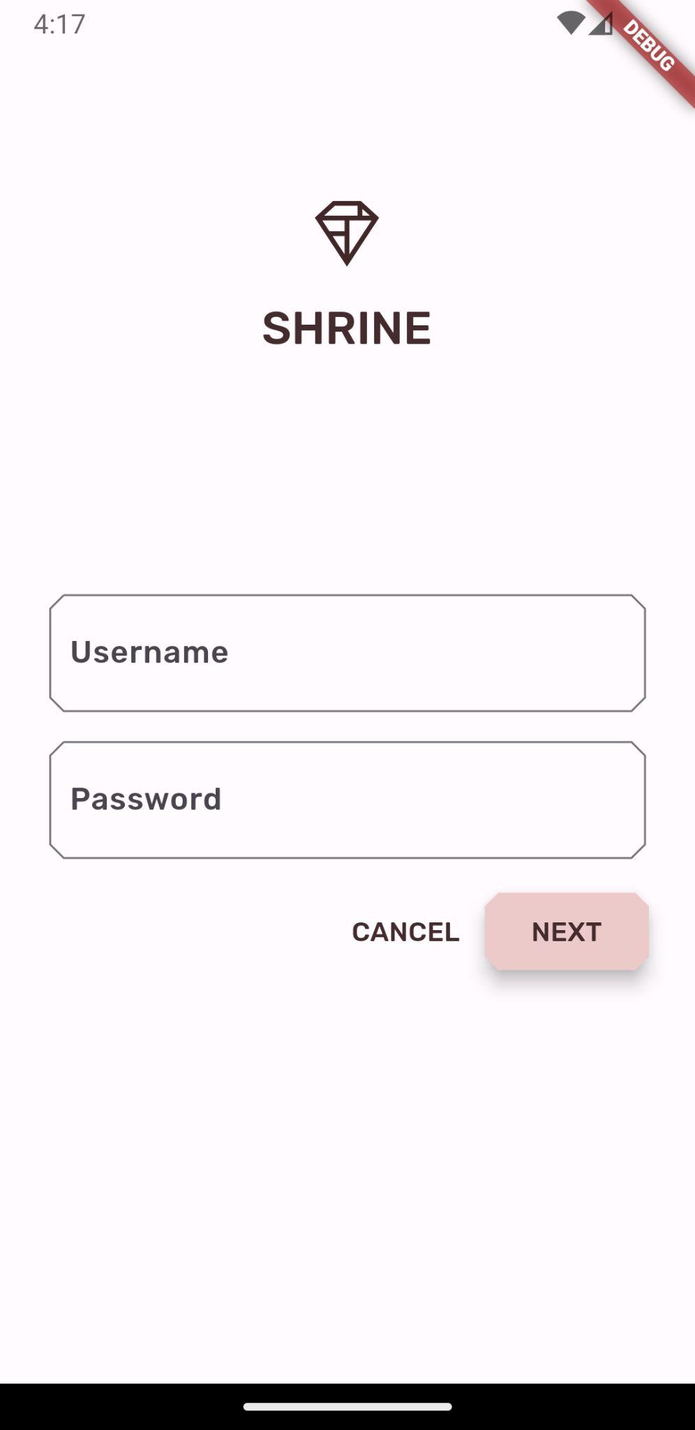
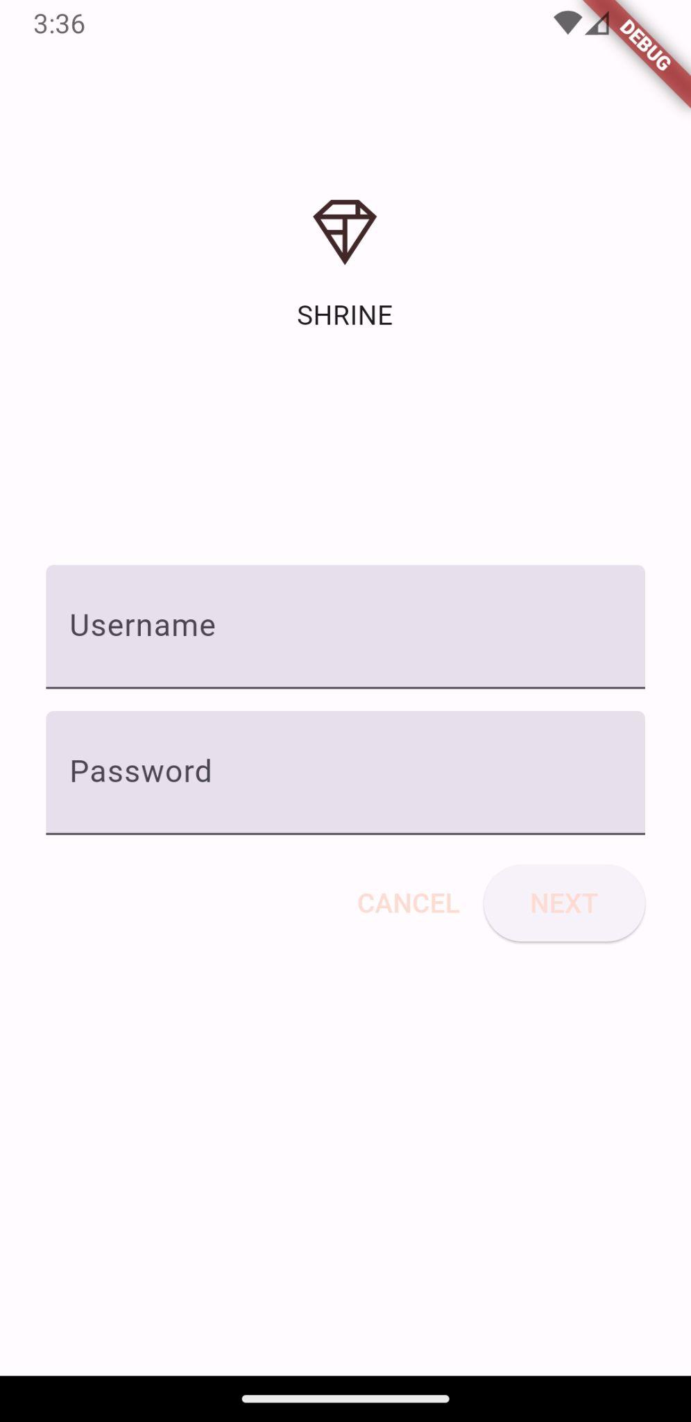
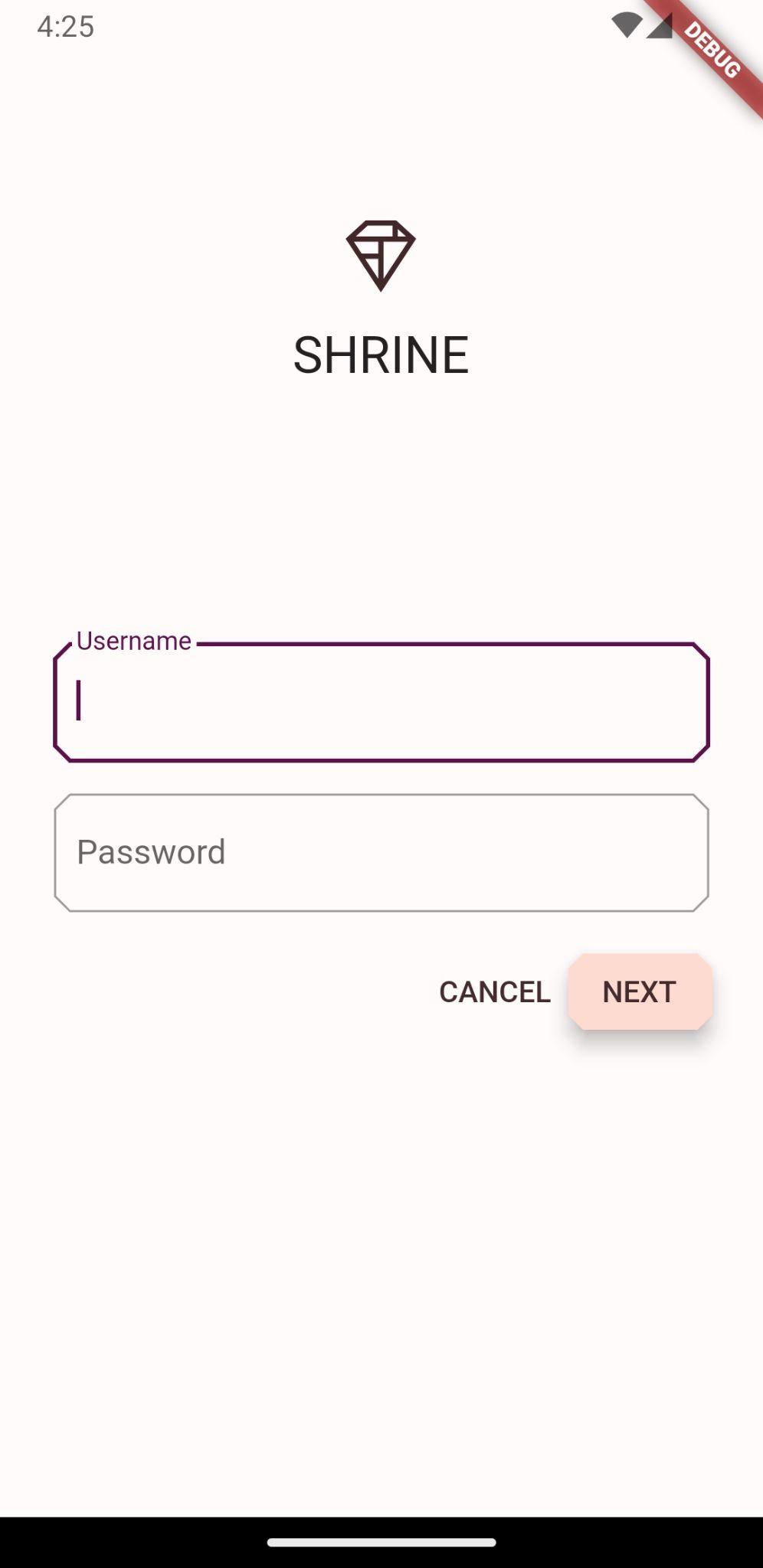
太棒了,裝置上應該會顯示先前程式碼研究室的 Shrine 登入頁面。
Android | iOS |
|
|

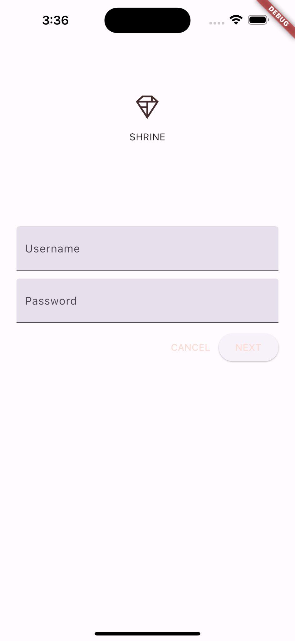
按一下「下一步」即可查看產品頁面。
Android | iOS |
|
|


4. 變更顏色
系統已建立代表 Shrine 品牌的色彩配置,設計師希望您在 Shrine 應用程式中實作該色彩配置
首先,將這些顏色匯入專案。
「建立」colors.dart
在 lib 中建立名為 colors.dart 的新 Dart 檔案。匯入 material.dart 並新增 const Color 值:
import 'package:flutter/material.dart';

const kShrinePink50 = Color(0xFFFEEAE6);
const kShrinePink100 = Color(0xFFFEDBD0);
const kShrinePink300 = Color(0xFFFBB8AC);
const kShrinePink400 = Color(0xFFEAA4A4);

const kShrineBrown900 = Color(0xFF442B2D);

const kShrineErrorRed = Color(0xFFC5032B);

const kShrineSurfaceWhite = Color(0xFFFFFBFA);
const kShrineBackgroundWhite = Colors.white;
自訂調色盤
這個色彩主題是由設計師使用自訂顏色建立而成 (如下圖所示)。其中包含從 Shrine 品牌選取的顏色,並已套用至 Material Theme Editor,該編輯器已擴充這些顏色,建立更完整的調色盤。(這些顏色並非來自 2014 年的 Material 調色盤)。
Material Theme Editor 已將這些顏色整理成以數字標示的色調,包括每種顏色的 50、100、200 到 900 等標籤。Shrine 只會使用粉紅色色票的 50、100 和 300 色調,以及棕色色票的 900 色調。

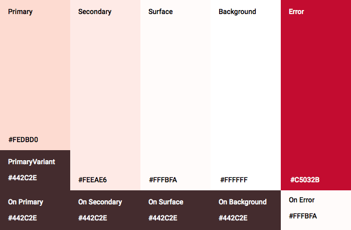
小工具的每個彩色參數都會對應到這些配置中的顏色。舉例來說,文字欄位裝飾在主動接收輸入內容時的顏色,應為主題的原色。如果該顏色無法存取 (與背景的對比度不足),請改用其他顏色。
現在我們有了想使用的顏色,可以將這些顏色套用至 UI。我們會設定 ThemeData 小工具的值,並將其套用至小工具階層頂端的 MaterialApp 執行個體,藉此完成這項作業。
自訂 ThemeData.light()
Flutter 內建幾種主題。淺色主題就是其中之一。我們不會從頭建立 ThemeData 小工具,而是複製淺色主題並變更值,為應用程式自訂主題。
讓我們在 app.dart. 中匯入 colors.dart
import 'colors.dart';
然後在 ShrineApp 類別的範圍「外」,將下列內容新增至 app.dart:
// TODO: Build a Shrine Theme (103)
final ThemeData _kShrineTheme = _buildShrineTheme();

ThemeData _buildShrineTheme() {
  final ThemeData base = ThemeData.light(useMaterial3: true);
  return base.copyWith(
    colorScheme: base.colorScheme.copyWith(
      primary: kShrinePink100,
      onPrimary: kShrineBrown900,
      secondary: kShrineBrown900,
      error: kShrineErrorRed,
    ),
    // TODO: Add the text themes (103)
    // TODO: Decorate the inputs (103)
  );
}
現在,請在 ShrineApp 的 build() 函式 (在 MaterialApp 小工具中) 結尾,將 theme: 設為新主題:
  // TODO: Customize the theme (103)
  theme: _kShrineTheme, // New code
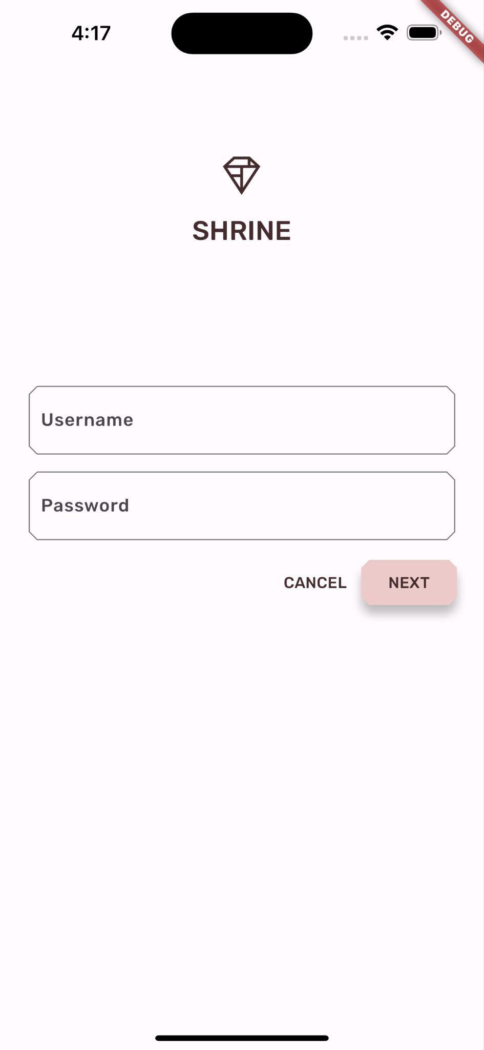
儲存專案。登入畫面現在應如下所示:
Android | iOS |
|
|
5. 修改排版和標籤樣式
除了顏色變更外,設計師也提供我們使用的特定字體排版。Flutter 的 ThemeData 包含 3 個文字主題。每個文字主題都是文字樣式的集合,例如「標題」和「主標題」。我們會為應用程式使用幾種樣式,並變更部分值。
自訂文字主題
如要將字型匯入專案,必須將字型新增至 pubspec.yaml 檔案。
在 pubspec.yaml 中,緊接在 flutter: 標記後方新增下列內容:
  # TODO: Insert Fonts (103)
  fonts:
    - family: Rubik
      fonts:
        - asset: fonts/Rubik-Regular.ttf
        - asset: fonts/Rubik-Medium.ttf
          weight: 500
現在你可以存取及使用 Rubik 字型。
排解 pubspec 檔案問題
如果您剪下並貼上上述宣告,執行 pub get 時可能會發生錯誤。如果發生錯誤,請先移除開頭的空白字元,然後使用 2 個空格的縮排取代。(Two spaces before
fonts:
,前面有四個空格
family: Rubik
,依此類推)。
如果看到「Mapping values are not allowed here」(這裡不允許對應值),請檢查有問題的行和上方各行的縮排。
在 login.dart 中,變更 Column() 內的下列項目:
Column(
  children: <Widget>[
    Image.asset('assets/diamond.png'),
    const SizedBox(height: 16.0),
    Text(
      'SHRINE',
      style: Theme.of(context).textTheme.headlineSmall,
    ),
  ],
)
在 app.dart 中,於 _buildShrineTheme() 後方新增下列內容:
// TODO: Build a Shrine Text Theme (103)
TextTheme _buildShrineTextTheme(TextTheme base) {
  return base
      .copyWith(
        headlineSmall: base.headlineSmall!.copyWith(
          fontWeight: FontWeight.w500,
        ),
        titleLarge: base.titleLarge!.copyWith(
          fontSize: 18.0,
        ),
        bodySmall: base.bodySmall!.copyWith(
          fontWeight: FontWeight.w400,
          fontSize: 14.0,
        ),
        bodyLarge: base.bodyLarge!.copyWith(
          fontWeight: FontWeight.w500,
          fontSize: 16.0,
        ),
      )
      .apply(
        fontFamily: 'Rubik',
        displayColor: kShrineBrown900,
        bodyColor: kShrineBrown900,
      );
}
這會採用 TextTheme,並變更標題、副標題和說明文字的外觀。
以這種方式套用 fontFamily,只會將變更套用至 copyWith() 中指定的排版比例值 (標題、字幕)。
對於部分字型,我們會以 100 為增量設定自訂 fontWeight:w500 (500 權重) 對應於中等,w400 則對應於一般。
使用新文字主題
在錯誤後方,將下列主題新增至 _buildShrineTheme:
// TODO: Add the text themes (103)
textTheme: _buildShrineTextTheme(base.textTheme),
textSelectionTheme: const TextSelectionThemeData(
  selectionColor: kShrinePink100,
),
儲存專案。這次也請重新啟動應用程式 (稱為「熱重新啟動」),因為我們修改了字型。
Android | iOS |
|
|


登入畫面和主畫面中的文字看起來不同,部分文字使用 Rubik 字型,其他文字則以棕色而非黑色或白色呈現。圖示也會以棕色顯示。
縮小文字
標籤過大。
在 home.dart 中,變更最內層 Column 的 children::
// TODO: Change innermost Column (103)
children: <Widget>[
// TODO: Handle overflowing labels (103)
  Text(
    product.name,
    style: theme.textTheme.button,
    softWrap: false,
    overflow: TextOverflow.ellipsis,
    maxLines: 1,
  ),
  const SizedBox(height: 4.0),
  Text(
    formatter.format(product.price),
    style: theme.textTheme.bodySmall,
  ),
  // End new code
],
將文字置中並放下
我們希望標籤置中,並將文字對齊每張資訊卡的底部,而不是每張圖片的底部。
將標籤移至主軸的結尾 (底部),並將標籤變更為置中:
  // TODO: Align labels to the bottom and center (103)
  mainAxisAlignment: MainAxisAlignment.end,
  crossAxisAlignment: CrossAxisAlignment.center,
儲存專案。
Android | iOS |
|
|

這樣看起來好多了。
為文字欄位套用主題
您也可以使用 InputDecorationTheme 為文字欄位裝飾設定主題。
在 app.dart 的 _buildShrineTheme() 方法中,指定 inputDecorationTheme: 值:
// TODO: Decorate the inputs (103)
inputDecorationTheme: const InputDecorationTheme(
  border: OutlineInputBorder(),
),
目前文字欄位有 filled 裝飾。讓我們移除該項目。移除 filled 並指定 inputDecorationTheme,即可為文字欄位套用外框樣式。
在 login.dart 中,移除 filled: true 值:
// Remove filled: true values (103)
TextField(
  controller: _usernameController,
  decoration: const InputDecoration(
    // Removed filled: true
    labelText: 'Username',
  ),
),
const SizedBox(height: 12.0),
TextField(
  controller: _passwordController,
  decoration: const InputDecoration(
    // Removed filled: true
    labelText: 'Password',
  ),
  obscureText: true,
),
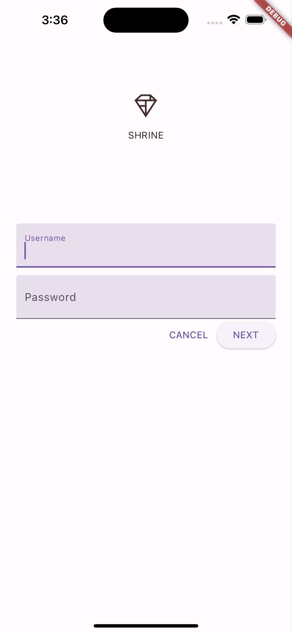
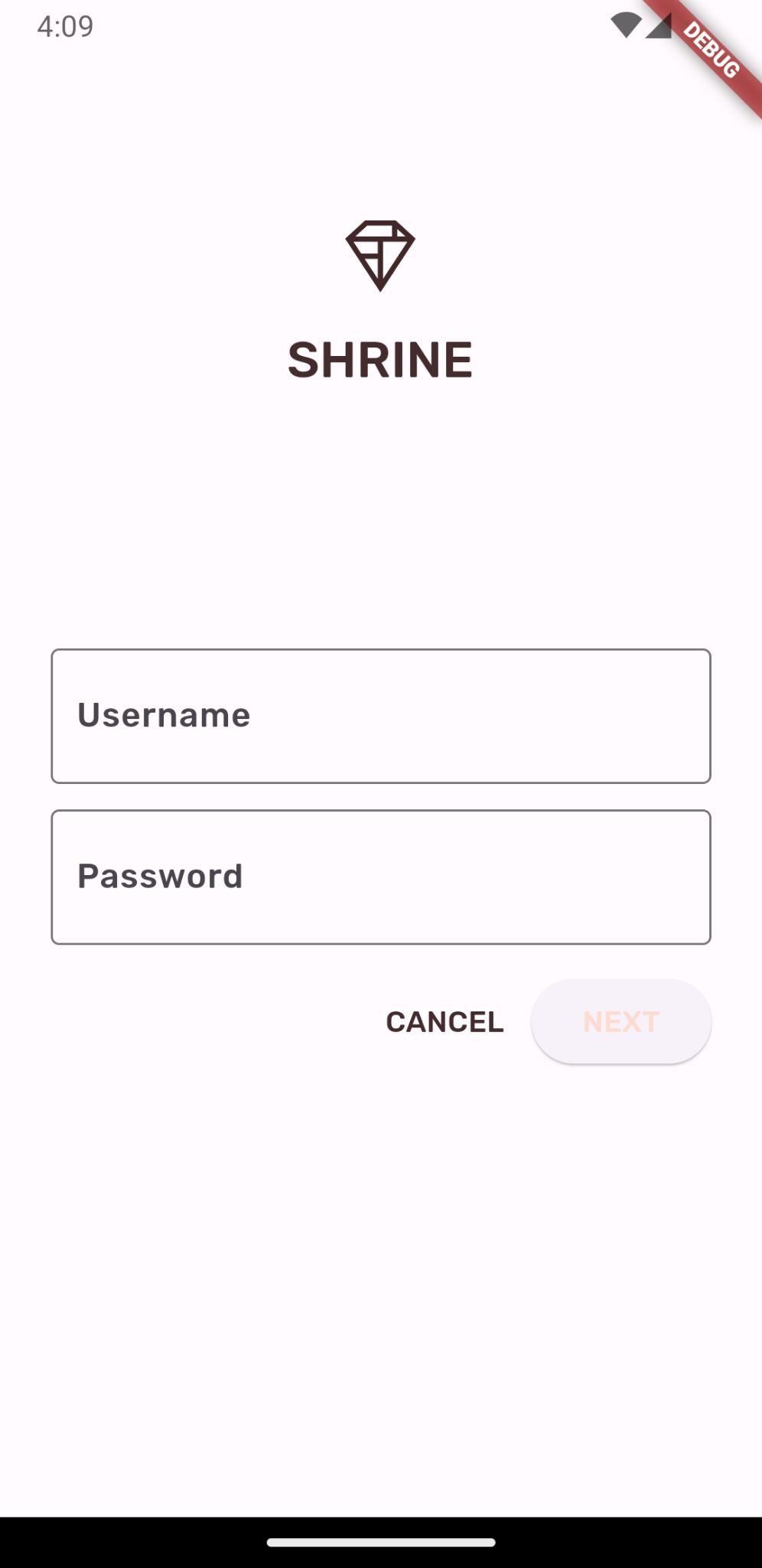
熱重新啟動。當「使用者名稱」欄位處於啟用狀態 (您正在輸入內容) 時,登入畫面應如下所示:
Android | iOS |
|
|


在文字欄位中輸入內容,邊框和浮動標籤會以主要顏色算繪。但我們無法輕易看到。如果像素的色彩對比度不夠高,無法讓有辨別困難的使用者清楚辨識,(詳情請參閱 Material 指南的「色彩和無障礙功能」一文)。
在 app.dart 中,於 inputDecorationTheme: 下方指定 focusedBorder::
// TODO: Decorate the inputs (103)
inputDecorationTheme: const InputDecorationTheme(
  border: OutlineInputBorder(),
  focusedBorder: OutlineInputBorder(
    borderSide: BorderSide(
      width: 2.0,
      color: kShrineBrown900,
    ),
  ),
),
接著,在 inputDecorationTheme: 下方指定 floatingLabelStyle::
// TODO: Decorate the inputs (103)
inputDecorationTheme: const InputDecorationTheme(
  border: OutlineInputBorder(),
  focusedBorder: OutlineInputBorder(
    borderSide: BorderSide(
      width: 2.0,
      color: kShrineBrown900,
    ),
  ),
  floatingLabelStyle: TextStyle(
    color: kShrineBrown900,
  ),
),
最後,為了增加對比度,我們讓「取消」按鈕使用次要顏色,而非主要顏色。
TextButton(
  child: const Text('CANCEL'),
  onPressed: () {
    _usernameController.clear();
    _passwordController.clear();
  },
  style: TextButton.styleFrom(
    primary: Theme.of(context).colorScheme.secondary,
  ),
),
儲存專案。
Android | iOS |
|
|

6. 調整高度
您已使用符合 Shrine 的特定顏色和字體排版設定頁面樣式,現在要調整高度。
變更「下一步」按鈕的高度
ElevatedButton 的預設海拔高度為 2。讓我們提高目標。
在 login.dart 中,將 style: 值新增至 NEXT ElevatedButton:
ElevatedButton(
  child: const Text('NEXT'),
  onPressed: () {
    Navigator.pop(context);
  },
  style: ElevatedButton.styleFrom(
    foregroundColor: kShrineBrown900,
    backgroundColor: kShrinePink100,
    elevation: 8.0,
  ),
),
儲存專案。
Android | iOS |
|
|


調整資訊卡高度
目前,卡片位於網站導覽旁的白色表面上。
在 home.dart 中,將 elevation: 值新增至 Cards:
// TODO: Adjust card heights (103)
elevation: 0.0,
儲存專案。
Android | iOS |
|
|

你已移除卡片下方的陰影。
7. 新增形狀
靈獸聖壇採用酷炫的幾何風格,以八邊形或矩形定義元素。我們來在主畫面上的資訊卡,以及登入畫面上的文字欄位和按鈕中,實作該形狀樣式。
變更登入畫面上的文字欄位形狀
在 app.dart 中,匯入下列檔案:
import 'supplemental/cut_corners_border.dart';
在 app.dart 中,修改文字欄位裝飾主題,使用切角邊框:
// TODO: Decorate the inputs (103)
inputDecorationTheme: const InputDecorationTheme(
  border: CutCornersBorder(),
  focusedBorder: CutCornersBorder(
    borderSide: BorderSide(
      width: 2.0,
      color: kShrineBrown900,
    ),
  ),
  floatingLabelStyle: TextStyle(
    color: kShrineBrown900,
  ),
),
變更登入畫面上的按鈕形狀
在 login.dart 中,為「CANCEL」(取消) 按鈕新增斜角矩形邊框:
TextButton(
  child: const Text('CANCEL'),
  onPressed: () {
    _usernameController.clear();
    _passwordController.clear();
  },
  style: TextButton.styleFrom(
    foregroundColor: kShrineBrown900,
    shape: const BeveledRectangleBorder(
      borderRadius: BorderRadius.all(Radius.circular(7.0)),
    ),
  ),
),
TextButton 沒有可見的形狀,因此為什麼要新增邊框形狀?因此,漣漪動畫會在觸控時繫結至相同形狀。
現在,請將相同形狀新增至「NEXT」按鈕:
ElevatedButton(
  child: const Text('NEXT'),
  onPressed: () {
    Navigator.pop(context);
  },
  style: ElevatedButton.styleFrom(
    foregroundColor: kShrineBrown900,
    backgroundColor: kShrinePink100,
    elevation: 8.0,
    shape: const BeveledRectangleBorder(
      borderRadius: BorderRadius.all(Radius.circular(7.0)),
    ),
  ),
),
如要變更所有按鈕的形狀,我們也可以在 app.dart 中使用 elevatedButtonTheme 或 textButtonTheme。這就留給學習者挑戰吧!
熱重新啟動。
Android | iOS |
|
|
8. 變更版面配置
接著,讓我們變更版面配置,以不同顯示比例和大小顯示資訊卡,讓每張資訊卡看起來都不一樣。
將 GridView 替換為 AsymmetricView
我們已為非對稱版面配置編寫檔案。
在 home.dart 中新增下列匯入項目:
import 'supplemental/asymmetric_view.dart';
刪除 _buildGridCards 並取代 body:
body: AsymmetricView(
  products: ProductsRepository.loadProducts(Category.all),
),
儲存專案。
Android | iOS |
|
|
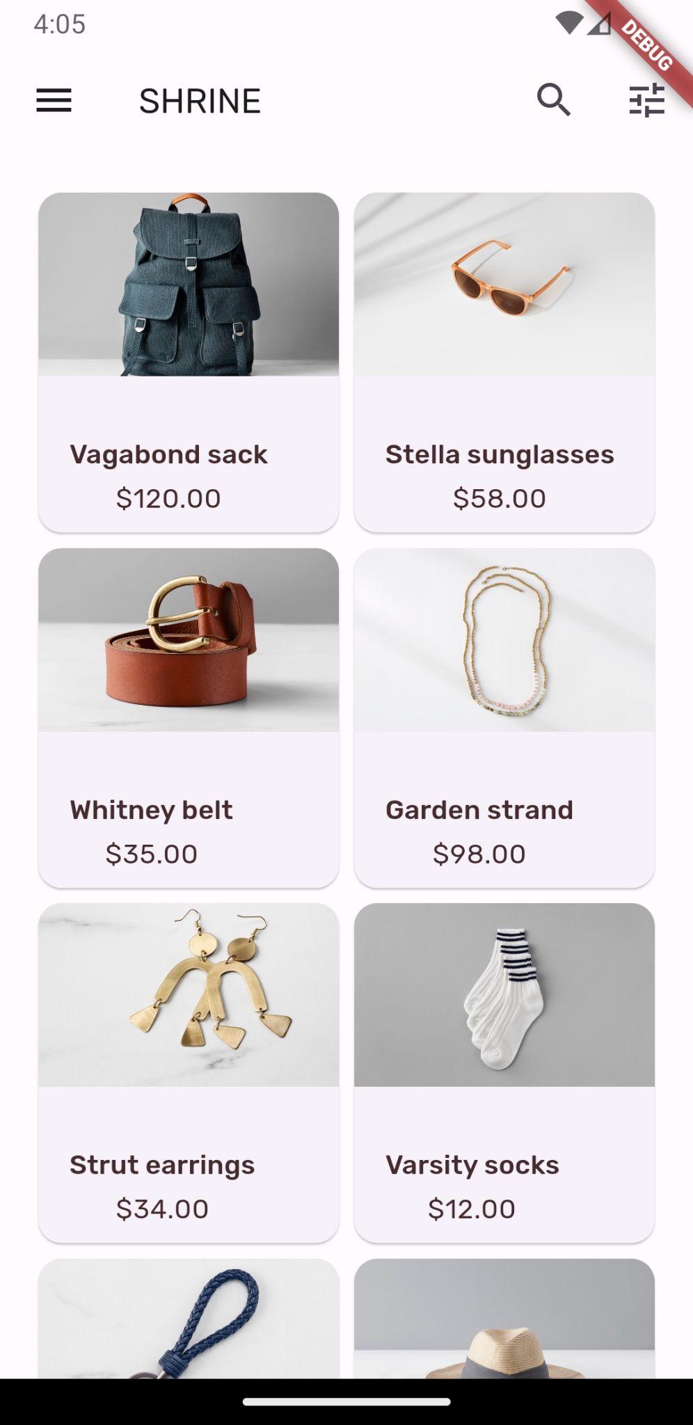
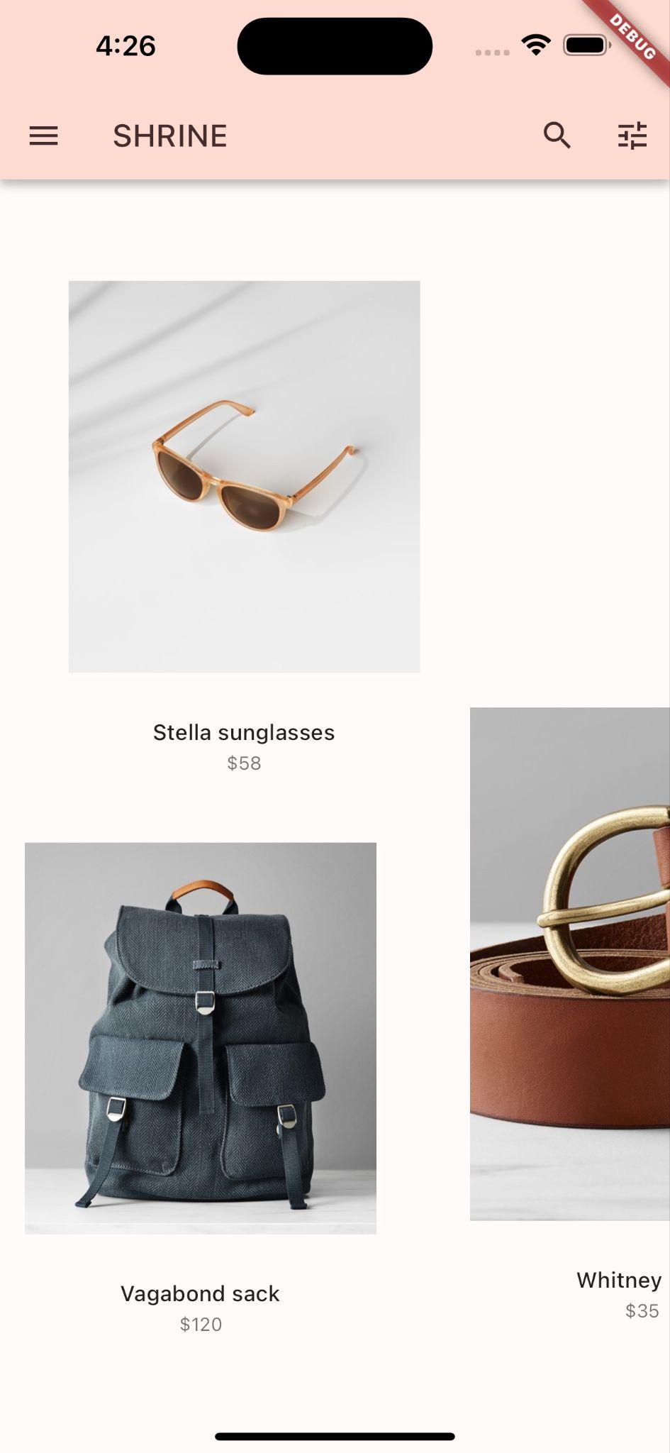
現在產品會以編織風格的模式水平捲動。
9. 試試其他主題 (選用)
色彩是展現品牌形象的強大工具,只要稍微調整色彩,就能大幅提升使用者體驗。如要測試這項功能,請看看如果品牌色彩配置稍有不同,Shrine 會是什麼樣子。
修改顏色
在 colors.dart 中新增下列顏色:
const kShrinePurple = Color(0xFF5D1049);
在 app.dart 中,將 _buildShrineTheme() 函式變更為以下內容:
ThemeData _buildShrineTheme() {
  final ThemeData base = ThemeData.light();
  return base.copyWith(
    colorScheme: base.colorScheme.copyWith(
      primary: kShrinePurple,
      secondary: kShrinePurple,
      error: kShrineErrorRed,
    ),
    scaffoldBackgroundColor: kShrineSurfaceWhite,
    textSelectionTheme: const TextSelectionThemeData(
      selectionColor: kShrinePurple,
    ),
    appBarTheme: const AppBarTheme(
      foregroundColor: kShrineBrown900,
      backgroundColor: kShrinePink100,
    ),

    inputDecorationTheme: const InputDecorationTheme(
      border: CutCornersBorder(),
      focusedBorder: CutCornersBorder(
        borderSide: BorderSide(
          width: 2.0,
          color: kShrinePurple,
        ),
      ),
      floatingLabelStyle: TextStyle(
        color: kShrinePurple,
      ),
    ),
  );
}
熱重新啟動。新主題現在應該會顯示。
Android | iOS |
|
|

Android | iOS |
|
|

結果大不相同!讓我們將 app.dart's _buildShrineTheme 還原為執行這個步驟前的狀態。或者,您也可以下載 104 的範例程式碼。
10. 恭喜!
到目前為止,您已建立的應用程式與設計師提供的設計規格相似。
後續步驟
您已使用下列 Material Flutter:主題、字體、高度和形狀。您可以在 Material Flutter 程式庫中探索更多元件和子系統。
深入瞭解 supplemental 目錄中的檔案,瞭解我們如何製作可水平捲動的不對稱版面配置格線。
如果預計的應用程式設計含有程式庫中沒有的元素,在 MDC-104:Material Design 進階元件中,我們說明如何使用 Material Flutter 程式庫建立自訂元件,達到所需外觀。