
1. 簡介
| 開發人員可透過 Material 元件 (MDC) 實作 Material Design。MDC 由 Google 的工程師和 UX 設計師團隊打造,提供數十種美觀實用的 UI 元件,適用於 Android、iOS、網頁和 Flutter。material.io/develop |

在 MDC-103 程式碼研究室中,您自訂了 Material Design 元件 (MDC) 的顏色、高度、字體排版和形狀,為應用程式設定樣式。
Material Design 系統中的元件會執行一組預先定義的工作,並具有特定特徵,例如按鈕。不過,按鈕不僅是使用者執行動作的方式,也是形狀、大小和顏色的視覺表現,可讓使用者知道按鈕具有互動性,且輕觸或點選後會發生某些動作。
Material Design 指南從設計師的角度描述元件,這些函式說明各種平台提供的基本功能,以及構成各個元件的解剖元素。舉例來說,背景幕包含後方圖層及其內容、前方圖層及其內容、動態規則和顯示選項。您可以根據每個應用程式的需求、用途和內容,自訂這些元件。
建構項目
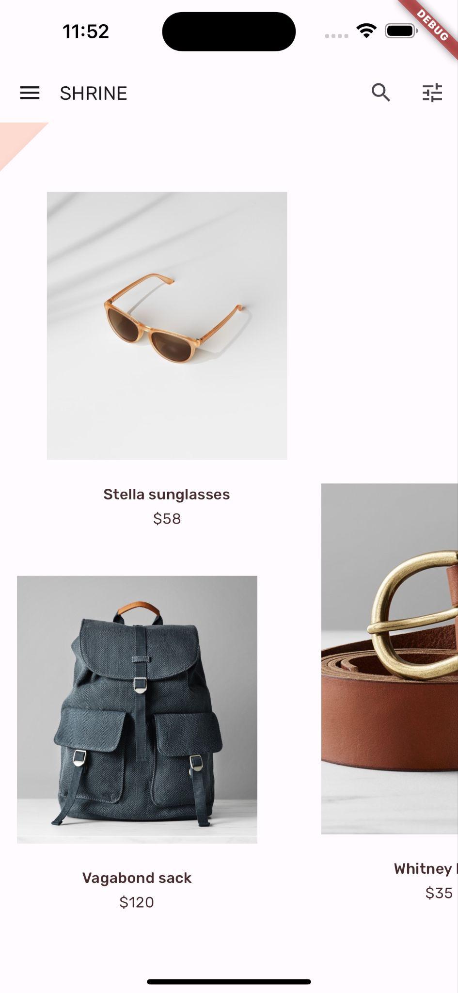
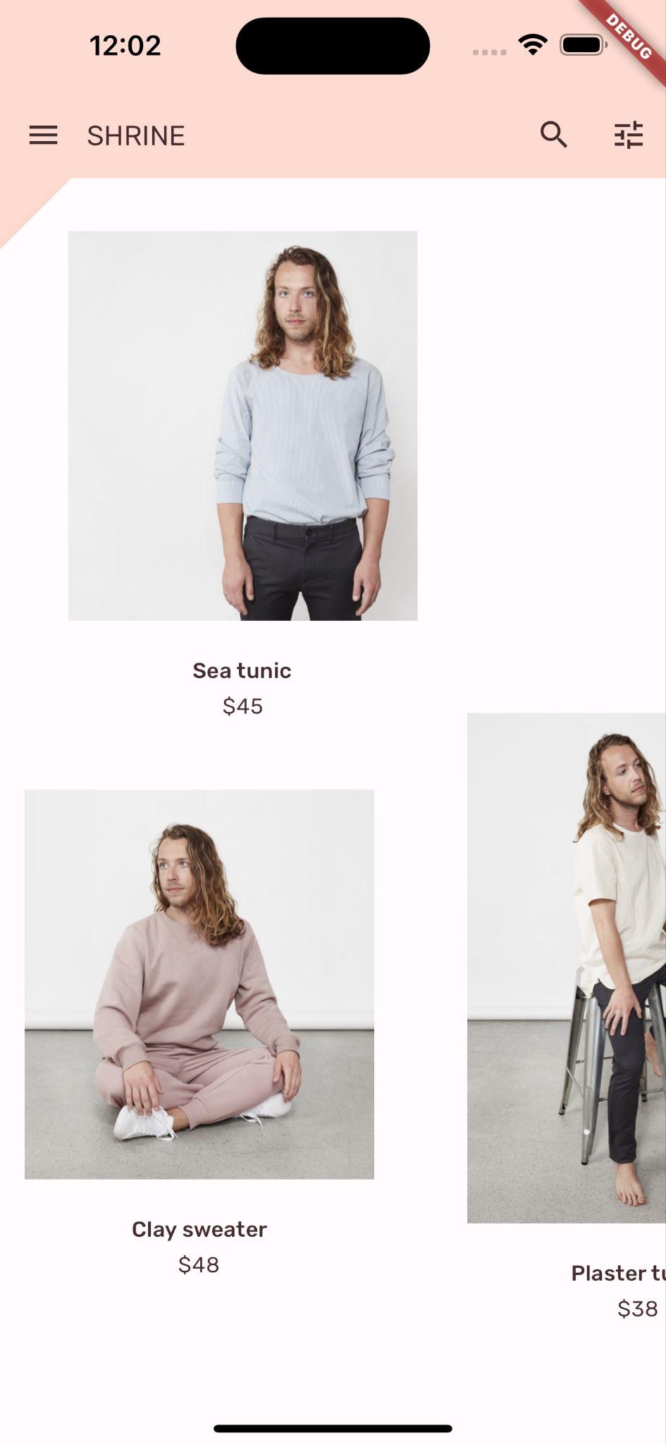
在本程式碼研究室中,您將 Shrine 應用程式的 UI 變更為雙層呈現方式,也就是「背景」。背景包含一個選單,列出可選取的類別,用於篩選非對稱格線中顯示的產品。在本程式碼研究室中,您將使用下列項目:
- 圖案
- 動作
- Flutter 小工具 (您在先前的程式碼研究室中使用過)
Android | iOS |
|
|
|
|


本程式碼研究室中的 Material Flutter 元件和子系統
- 圖案
您對 Flutter 開發的經驗程度如何?
2. 設定 Flutter 開發環境
如要完成本實驗室,您需要兩項軟體:Flutter SDK 和編輯器。
您可以使用下列任一裝置執行程式碼研究室:
- 連線至電腦並設為開發人員模式的實體 Android 或 iOS 裝置。
- iOS 模擬器 (需要安裝 Xcode 工具)。
- Android Emulator (需在 Android Studio 中設定)。
- 瀏覽器 (偵錯時必須使用 Chrome)。
- 以 Windows、Linux 或 macOS 電腦版應用程式的形式。您必須在要部署的平台上進行開發。因此,如要開發 Windows 桌面應用程式,您必須在 Windows 上開發,才能存取適當的建構鏈。如需作業系統專屬需求,請參閱 docs.flutter.dev/desktop。
3. 下載程式碼實驗室範例應用程式
是否已完成 MDC-103?
如果您已完成 MDC-103,程式碼應該已準備好用於本程式碼研究室。跳至步驟:新增背景選單。
從頭開始嗎?
範例應用程式位於 material-components-flutter-codelabs-104-starter_and_103-complete/mdc_100_series 目錄中。
...或從 GitHub 複製
如要從 GitHub 複製本程式碼研究室,請執行下列指令:
git clone https://github.com/material-components/material-components-flutter-codelabs.git
cd material-components-flutter-codelabs/mdc_100_series
git checkout 104-starter_and_103-complete
開啟專案並執行應用程式
- 在您選擇的編輯器中開啟專案。
- 按照所選編輯器的「開始使用:試用」一節中的「執行應用程式」操作說明操作。
太棒了,裝置上應該會顯示先前程式碼研究室的 Shrine 登入頁面。
Android | iOS |
|
|


4. 新增背景幕選單
所有其他內容和元件後方都會顯示背景。這個元件由兩層組成:後層 (顯示動作和篩選器) 和前層 (顯示內容)。你可以使用背景顯示互動式資訊和動作,例如導覽或內容篩選器。
移除住家應用程式列
HomePage 小工具將是我們最上層的內容。目前它有應用程式列。我們會將應用程式列移至後方圖層,而 HomePage 只會包含 AsymmetricView。
在 home.dart 中,將 build() 函式變更為只傳回 AsymmetricView:
// TODO: Return an AsymmetricView (104)
return AsymmetricView(products: ProductsRepository.loadProducts(Category.all));
新增「背景」小工具
建立名為 Backdrop 的小工具,其中包含 frontLayer 和 backLayer。
backLayer 包含一個選單,可供您選取類別來篩選清單 (currentCategory)。由於我們希望選單選項保持不變,因此會將 Backdrop 設為有狀態的小工具。
在 /lib 中新增名為 backdrop.dart 的檔案:
import 'package:flutter/material.dart';

import 'model/product.dart';

// TODO: Add velocity constant (104)

class Backdrop extends StatefulWidget {
  final Category currentCategory;
  final Widget frontLayer;
  final Widget backLayer;
  final Widget frontTitle;
  final Widget backTitle;

  const Backdrop({
    required this.currentCategory,
    required this.frontLayer,
    required this.backLayer,
    required this.frontTitle,
    required this.backTitle,
    Key? key,
  }) : super(key: key);

  @override
  _BackdropState createState() => _BackdropState();
}

// TODO: Add _FrontLayer class (104)
// TODO: Add _BackdropTitle class (104)
// TODO: Add _BackdropState class (104)
請注意,我們會標示特定屬性 required。對於建構函式中沒有預設值且無法為 null 的屬性,這是最佳做法,因此不應忘記。
在 Backdrop 類別定義下方新增 _BackdropState 類別:
// TODO: Add _BackdropState class (104)
class _BackdropState extends State<Backdrop>
    with SingleTickerProviderStateMixin {
  final GlobalKey _backdropKey = GlobalKey(debugLabel: 'Backdrop');

  // TODO: Add AnimationController widget (104)

  // TODO: Add BuildContext and BoxConstraints parameters to _buildStack (104)
  Widget _buildStack() {
    return Stack(
    key: _backdropKey,
      children: <Widget>[
        // TODO: Wrap backLayer in an ExcludeSemantics widget (104)
        widget.backLayer,
        widget.frontLayer,
      ],
    );
  }

  @override
  Widget build(BuildContext context) {
    var appBar = AppBar(
      elevation: 0.0,
      titleSpacing: 0.0,
      // TODO: Replace leading menu icon with IconButton (104)
      // TODO: Remove leading property (104)
      // TODO: Create title with _BackdropTitle parameter (104)
      leading: Icon(Icons.menu),
      title: Text('SHRINE'),
      actions: <Widget>[
        // TODO: Add shortcut to login screen from trailing icons (104)
        IconButton(
          icon: Icon(
            Icons.search,
            semanticLabel: 'search',
          ),
          onPressed: () {
          // TODO: Add open login (104)
          },
        ),
        IconButton(
          icon: Icon(
            Icons.tune,
            semanticLabel: 'filter',
          ),
          onPressed: () {
          // TODO: Add open login (104)
          },
        ),
      ],
    );
    return Scaffold(
      appBar: appBar,
      // TODO: Return a LayoutBuilder widget (104)
      body: _buildStack(),
    );
  }
}
build() 函式會傳回具有應用程式列的 Scaffold,就像先前的 HomePage 一樣。但 Scaffold 的主體是 Stack。堆疊的子項可以重疊。每個子項的大小和位置都是相對於 Stack 的父項指定。
現在,請將 Backdrop 執行個體新增至 ShrineApp。
在 app.dart 中,匯入 backdrop.dart 和 model/product.dart:
import 'backdrop.dart'; // New code
import 'colors.dart';
import 'home.dart';
import 'login.dart';
import 'model/product.dart'; // New code
import 'supplemental/cut_corners_border.dart';
在 app.dart, 中,傳回以 HomePage 做為 frontLayer 的 Backdrop,藉此修改 / 路由:
// TODO: Change to a Backdrop with a HomePage frontLayer (104)
'/': (BuildContext context) => Backdrop(
     // TODO: Make currentCategory field take _currentCategory (104)
     currentCategory: Category.all,
     // TODO: Pass _currentCategory for frontLayer (104)
     frontLayer: HomePage(),
     // TODO: Change backLayer field value to CategoryMenuPage (104)
     backLayer: Container(color: kShrinePink100),
     frontTitle: Text('SHRINE'),
     backTitle: Text('MENU'),
),
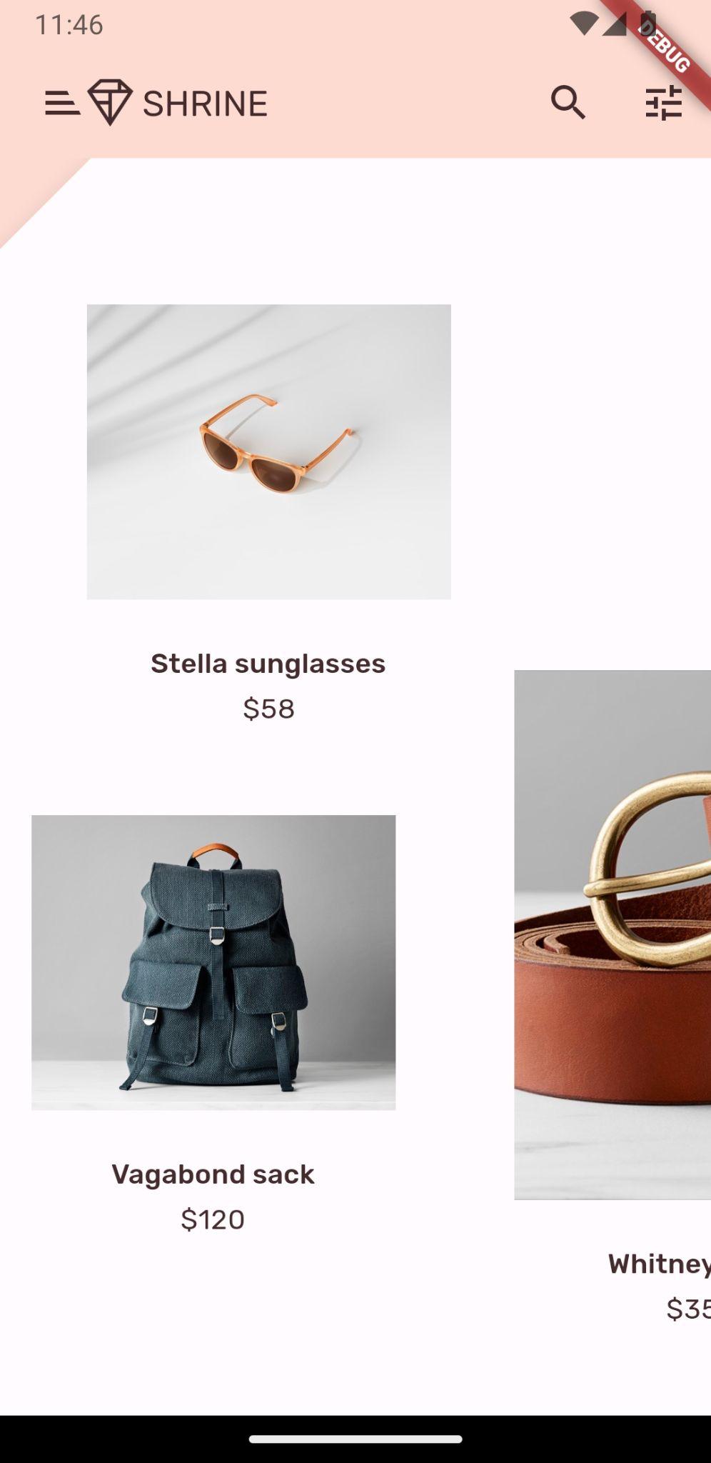
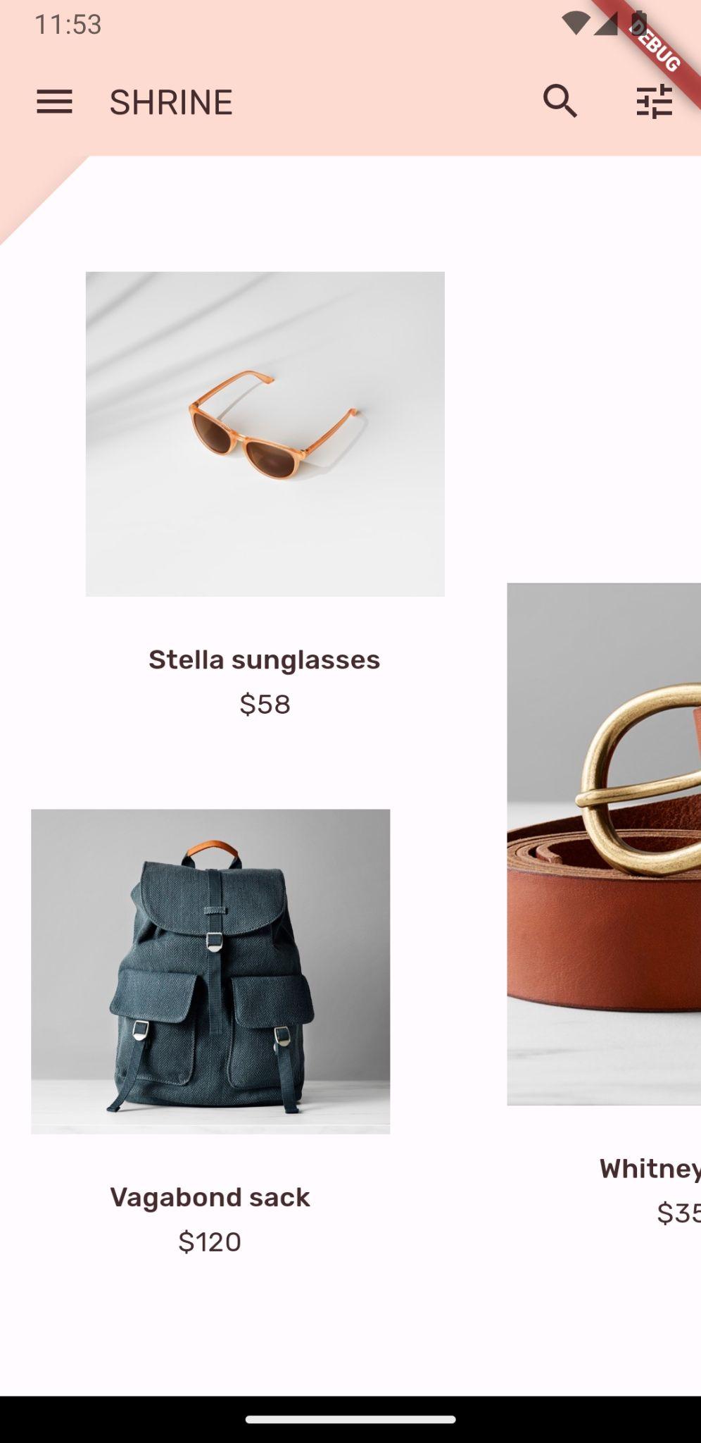
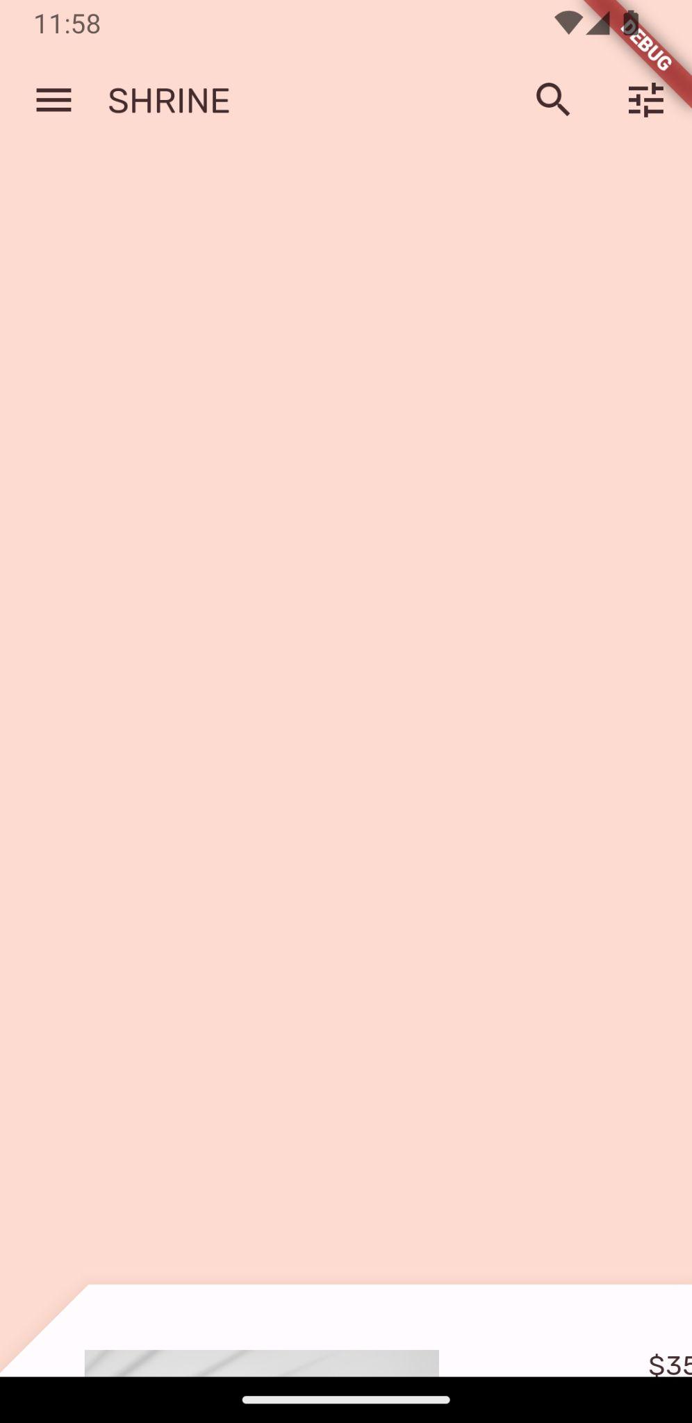
儲存專案後,您應該會看到首頁和應用程式列:
Android | iOS |
|
|

backLayer 會在 frontLayer 首頁後方的新圖層中顯示粉紅色區域。
您可以使用 Flutter 檢查器,確認 Stack 的 HomePage 後方確實有 Container。內容大致如下:

現在可以調整這兩層的設計和內容。
5. 新增形狀
在這個步驟中,您將設定前一層的樣式,在左上角新增切口。
Material Design 將這類自訂項目稱為形狀。Material 表面可採用任意形狀。形狀可為介面增添強調效果和風格,也可用於呈現品牌形象。您可以自訂一般矩形,包括圓角或斜角,以及任意數量的邊。可以是規則或不規則。
在最上層新增形狀
傾斜的 Shrine 標誌是 Shrine 應用程式形狀故事的靈感來源。形狀故事是指在整個應用程式中套用形狀的常見做法。舉例來說,登入頁面元素套用的形狀與標誌形狀相呼應。在這個步驟中,您將為前層設定樣式,並在左上角進行斜切。
在 backdrop.dart 中,新增 _FrontLayer 類別:
// TODO: Add _FrontLayer class (104)
class _FrontLayer extends StatelessWidget {
  // TODO: Add on-tap callback (104)
  const _FrontLayer({
    Key? key,
    required this.child,
  }) : super(key: key);

  final Widget child;

  @override
  Widget build(BuildContext context) {
    return Material(
      elevation: 16.0,
      shape: const BeveledRectangleBorder(
        borderRadius: BorderRadius.only(topLeft: Radius.circular(46.0)),
      ),
      child: Column(
        crossAxisAlignment: CrossAxisAlignment.stretch,
        children: <Widget>[
          // TODO: Add a GestureDetector (104)
          Expanded(
            child: child,
          ),
        ],
      ),
    );
  }
}
接著,在 _BackdropState 的 _buildStack() 函式中,將前端圖層包裝在 _FrontLayer 中:
  Widget _buildStack() {
    // TODO: Create a RelativeRectTween Animation (104)

    return Stack(
    key: _backdropKey,
      children: <Widget>[
        // TODO: Wrap backLayer in an ExcludeSemantics widget (104)
        widget.backLayer,
        // TODO: Add a PositionedTransition (104)
        // TODO: Wrap front layer in _FrontLayer (104)
          _FrontLayer(child: widget.frontLayer),
      ],
    );
  }
重新載入。
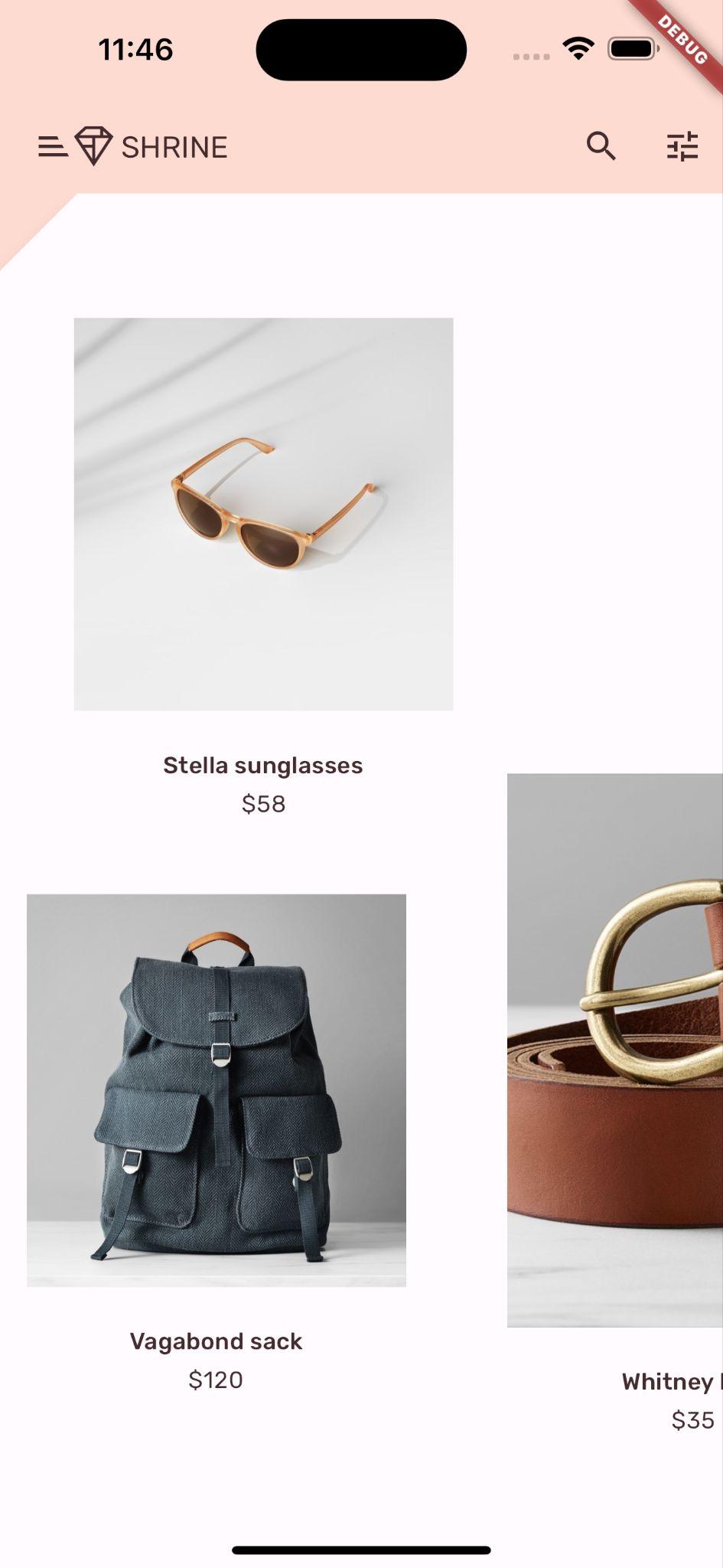
Android | iOS |
|
|
我們為 Shrine 的主要介面設定了自訂形狀。不過,我們希望這項元素在視覺上與應用程式列連結。
變更應用程式列顏色
在 app.dart 中,將 _buildShrineTheme() 函式變更為以下內容:
ThemeData _buildShrineTheme() {
  final ThemeData base = ThemeData.light(useMaterial3: true);
  return base.copyWith(
    colorScheme: base.colorScheme.copyWith(
      primary: kShrinePink100,
      onPrimary: kShrineBrown900,
      secondary: kShrineBrown900,
      error: kShrineErrorRed,
    ),
    textTheme: _buildShrineTextTheme(base.textTheme),
    textSelectionTheme: const TextSelectionThemeData(
      selectionColor: kShrinePink100,
    ),
    appBarTheme: const AppBarTheme(
      foregroundColor: kShrineBrown900,
      backgroundColor: kShrinePink100,
    ),
    inputDecorationTheme: const InputDecorationTheme(
      border: CutCornersBorder(),
      focusedBorder: CutCornersBorder(
        borderSide: BorderSide(
          width: 2.0,
          color: kShrineBrown900,
        ),
      ),
      floatingLabelStyle: TextStyle(
        color: kShrineBrown900,
      ),
    ),
  );
}
熱重新啟動。現在應該會顯示新的彩色應用程式列。
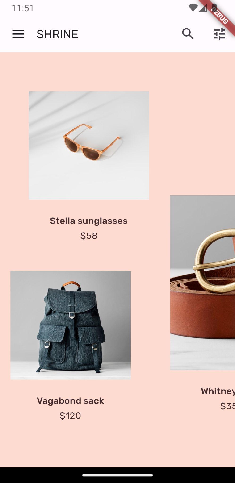
Android | iOS |
|
|

這項變更會讓使用者看到白色前層後方有東西。現在要加入動態效果,讓使用者看到背景的後方圖層。
6. 新增動態效果
動態效果可讓應用程式更生動。可以是誇張的造型,也可以是低調的風格,或是介於兩者之間。但請注意,使用的動作類型應適合當下情況。套用至重複性常規動作的動態效果應小而細微,以免動作分散使用者注意力,或經常佔用太多時間。不過,在適當的情況下 (例如使用者首次開啟應用程式時),動畫可以更引人注目,而且部分動畫有助於向使用者說明如何使用應用程式。
為選單按鈕新增顯示動畫
在 backdrop.dart 頂端,任何類別或函式的範圍外,新增常數來表示我們希望動畫擁有的速度:
// TODO: Add velocity constant (104)
const double _kFlingVelocity = 2.0;
在 _BackdropState 中新增 AnimationController 小工具,在 initState() 函式中例項化,並在狀態的 dispose() 函式中處置:
  // TODO: Add AnimationController widget (104)
  late AnimationController _controller;

  @override
  void initState() {
    super.initState();
    _controller = AnimationController(
      duration: const Duration(milliseconds: 300),
      value: 1.0,
      vsync: this,
    );
  }

  // TODO: Add override for didUpdateWidget (104)

  @override
  void dispose() {
    _controller.dispose();
    super.dispose();
  }

  // TODO: Add functions to get and change front layer visibility (104)
AnimationController 會協調動畫,並提供播放、反向播放及停止動畫的 API。現在需要函式來移動。
新增函式,用於判斷及變更前景圖層的顯示狀態:
  // TODO: Add functions to get and change front layer visibility (104)
  bool get _frontLayerVisible {
    final AnimationStatus status = _controller.status;
    return status == AnimationStatus.completed ||
        status == AnimationStatus.forward;
  }

  void _toggleBackdropLayerVisibility() {
    _controller.fling(
        velocity: _frontLayerVisible ? -_kFlingVelocity : _kFlingVelocity);
  }
將 backLayer 包裝在 ExcludeSemantics 小工具中。當 backLayer 不顯示時,這個小工具會將 backLayer 的選單項目從語意樹狀結構中排除。
    return Stack(
      key: _backdropKey,
      children: <Widget>[
        // TODO: Wrap backLayer in an ExcludeSemantics widget (104)
        ExcludeSemantics(
          child: widget.backLayer,
          excluding: _frontLayerVisible,
        ),
      ...
變更 _buildStack() 函式,使其接受 BuildContext 和 BoxConstraints。此外,請加入 PositionedTransition,其中會採用 RelativeRectTween 動畫:
  // TODO: Add BuildContext and BoxConstraints parameters to _buildStack (104)
  Widget _buildStack(BuildContext context, BoxConstraints constraints) {
    const double layerTitleHeight = 48.0;
    final Size layerSize = constraints.biggest;
    final double layerTop = layerSize.height - layerTitleHeight;

    // TODO: Create a RelativeRectTween Animation (104)
    Animation<RelativeRect> layerAnimation = RelativeRectTween(
      begin: RelativeRect.fromLTRB(
          0.0, layerTop, 0.0, layerTop - layerSize.height),
      end: const RelativeRect.fromLTRB(0.0, 0.0, 0.0, 0.0),
    ).animate(_controller.view);

    return Stack(
      key: _backdropKey,
      children: <Widget>[
        // TODO: Wrap backLayer in an ExcludeSemantics widget (104)
        ExcludeSemantics(
          child: widget.backLayer,
          excluding: _frontLayerVisible,
        ),
        // TODO: Add a PositionedTransition (104)
        PositionedTransition(
          rect: layerAnimation,
          child: _FrontLayer(
            // TODO: Implement onTap property on _BackdropState (104)
            child: widget.frontLayer,
          ),
        ),
      ],
    );
  }
最後,請傳回使用 _buildStack 做為建構工具的 LayoutBuilder 小工具,而非呼叫 Scaffold 主體的 _buildStack 函式:
    return Scaffold(
      appBar: appBar,
      // TODO: Return a LayoutBuilder widget (104)
      body: LayoutBuilder(builder: _buildStack),
    );
我們使用 LayoutBuilder 將前/後層堆疊的建構作業延後到版面配置時間,以便納入背景的實際總高度。LayoutBuilder 是特殊的小工具,其建構子回呼會提供大小限制。
在 build() 函式中,將應用程式列中的開頭選單圖示設為 IconButton,並在輕觸按鈕時,用來切換前景層的顯示狀態。
      // TODO: Replace leading menu icon with IconButton (104)
      leading: IconButton(
        icon: const Icon(Icons.menu),
        onPressed: _toggleBackdropLayerVisibility,
      ),
重新載入,然後輕觸模擬器中的選單按鈕。
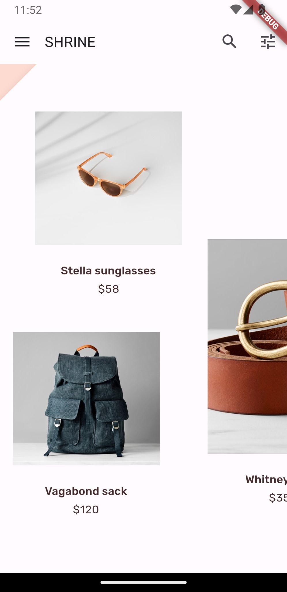
Android | iOS |
|
|


前層會以動畫 (滑動) 方式向下移動。但如果往下看,會發現紅色錯誤和溢位錯誤。這是因為 AsymmetricView 會受到擠壓而變小,進而減少 Columns 的空間。最終,Columns 無法使用提供的空間自行配置,因此會導致錯誤。如果我們將 Columns 換成 ListViews,欄大小應會維持不變,並加上動畫效果。
在 ListView 中包裝產品資料欄
在 supplemental/product_columns.dart 中,將 OneProductCardColumn 中的 Column 替換為 ListView:
class OneProductCardColumn extends StatelessWidget {
  const OneProductCardColumn({required this.product, Key? key}) : super(key: key);

  final Product product;

  @override
  Widget build(BuildContext context) {
    // TODO: Replace Column with a ListView (104)
    return ListView(
      physics: const ClampingScrollPhysics(),
      reverse: true,
      children: <Widget>[
        ConstrainedBox(
          constraints: const BoxConstraints(
            maxWidth: 550,
          ),
          child: ProductCard(
            product: product,
          ),
        ),
        const SizedBox(
          height: 40.0,
        ),

      ],
    );
  }
}
資料欄包含 MainAxisAlignment.end。如要從底部開始版面配置,請標記 reverse: true。系統會取消兒童的訂單,以補償變更。
重新載入並輕觸選單按鈕。
Android | iOS |
|
|
OneProductCardColumn 上的灰色溢位警告已消失!現在來修正其他問題。
在 supplemental/product_columns.dart 中,變更 imageAspectRatio 的計算方式,並將 TwoProductCardColumn 中的 Column 替換為 ListView:
      // TODO: Change imageAspectRatio calculation (104)
      double imageAspectRatio = heightOfImages >= 0.0
          ? constraints.biggest.width / heightOfImages
          : 49.0 / 33.0;
      // TODO: Replace Column with a ListView (104)
      return ListView(
        physics: const ClampingScrollPhysics(),
        children: <Widget>[
          Padding(
            padding: const EdgeInsetsDirectional.only(start: 28.0),
            child: top != null
                ? ProductCard(
                    imageAspectRatio: imageAspectRatio,
                    product: top!,
                  )
                : SizedBox(
                    height: heightOfCards,
                  ),
          ),
          const SizedBox(height: spacerHeight),
          Padding(
            padding: const EdgeInsetsDirectional.only(end: 28.0),
            child: ProductCard(
              imageAspectRatio: imageAspectRatio,
              product: bottom,
            ),
          ),
        ],
      );
我們也為 imageAspectRatio 新增了一些安全措施。
重新載入。然後輕觸選單按鈕。
Android | iOS |
|
|
不會再發生溢位。
7. 在後方圖層新增選單
選單是可輕觸的文字項目清單,會在文字項目遭到觸碰時通知接聽者。在這個步驟中,您將新增類別過濾選單。
新增菜單
將選單新增至前層,並將互動式按鈕新增至後層。
建立名為 lib/category_menu_page.dart 的新檔案:
import 'package:flutter/material.dart';

import 'colors.dart';
import 'model/product.dart';

class CategoryMenuPage extends StatelessWidget {
  final Category currentCategory;
  final ValueChanged<Category> onCategoryTap;
  final List<Category> _categories = Category.values;

  const CategoryMenuPage({
    Key? key,
    required this.currentCategory,
    required this.onCategoryTap,
  }) : super(key: key);

  Widget _buildCategory(Category category, BuildContext context) {
    final categoryString =
        category.toString().replaceAll('Category.', '').toUpperCase();
    final ThemeData theme = Theme.of(context);

    return GestureDetector(
      onTap: () => onCategoryTap(category),
      child: category == currentCategory
        ? Column(
            children: <Widget>[
              const SizedBox(height: 16.0),
              Text(
                categoryString,
                style: theme.textTheme.bodyLarge,
                textAlign: TextAlign.center,
              ),
              const SizedBox(height: 14.0),
              Container(
                width: 70.0,
                height: 2.0,
                color: kShrinePink400,
              ),
            ],
          )
      : Padding(
        padding: const EdgeInsets.symmetric(vertical: 16.0),
        child: Text(
          categoryString,
          style: theme.textTheme.bodyLarge!.copyWith(
              color: kShrineBrown900.withAlpha(153)
            ),
          textAlign: TextAlign.center,
        ),
      ),
    );
  }

  @override
  Widget build(BuildContext context) {
    return Center(
      child: Container(
        padding: const EdgeInsets.only(top: 40.0),
        color: kShrinePink100,
        child: ListView(
          children: _categories
            .map((Category c) => _buildCategory(c, context))
            .toList()),
      ),
    );
  }
}
這是包裝 Column 的 GestureDetector,而 Column 的子項是類別名稱。底線表示所選類別。
在 app.dart 中,將 ShrineApp 小工具從無狀態轉換為有狀態。
- 標示
ShrineApp. - 根據 IDE 顯示程式碼動作:
- Android Studio:按 ⌥Enter 鍵 (macOS) 或 Alt + Enter 鍵
- VS Code:按下 ⌘ 鍵 (macOS) 或 Ctrl 鍵。
- 選取「Convert to StatefulWidget」。
- 將 ShrineAppState 類別變更為私有 (_ShrineAppState)。在 ShrineAppState 上按一下滑鼠右鍵,然後
- Android Studio:選取「重構」>「重新命名」
- VS Code:選取「重新命名符號」
- 輸入 _ShrineAppState,將類別設為私有。
在 app.dart 中,為所選類別新增變數至 _ShrineAppState,並在輕觸時新增回呼:
class _ShrineAppState extends State<ShrineApp> {
  Category _currentCategory = Category.all;

  void _onCategoryTap(Category category) {
    setState(() {
      _currentCategory = category;
    });
  }
然後將後方圖層變更為 CategoryMenuPage。
在 app.dart 中,匯入 CategoryMenuPage:
import 'backdrop.dart';
import 'category_menu_page.dart';
import 'colors.dart';
import 'home.dart';
import 'login.dart';
import 'model/product.dart';
import 'supplemental/cut_corners_border.dart';
在 build() 函式中,將 backLayer 欄位變更為 CategoryMenuPage,並將 currentCategory 欄位變更為例項變數。
'/': (BuildContext context) => Backdrop(
              // TODO: Make currentCategory field take _currentCategory (104)
              currentCategory: _currentCategory,
              // TODO: Pass _currentCategory for frontLayer (104)
              frontLayer: HomePage(),
              // TODO: Change backLayer field value to CategoryMenuPage (104)
              backLayer: CategoryMenuPage(
                currentCategory: _currentCategory,
                onCategoryTap: _onCategoryTap,
              ),
              frontTitle: const Text('SHRINE'),
              backTitle: const Text('MENU'),
            ),
重新載入,然後輕觸「選單」按鈕。
Android | iOS |
|
|
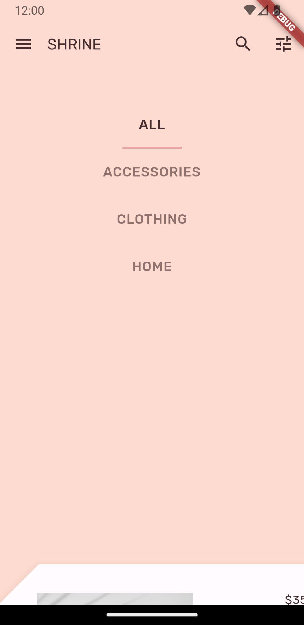

輕觸選單選項時,目前不會有任何反應。讓我們一起解決這個問題!
在 home.dart 中,新增類別的變數並傳遞至 AsymmetricView。
import 'package:flutter/material.dart';

import 'model/product.dart';
import 'model/products_repository.dart';
import 'supplemental/asymmetric_view.dart';

class HomePage extends StatelessWidget {
  // TODO: Add a variable for Category (104)
  final Category category;

  const HomePage({this.category = Category.all, Key? key}) : super(key: key);

  @override
  Widget build(BuildContext context) {
    // TODO: Pass Category variable to AsymmetricView (104)
    return AsymmetricView(
      products: ProductsRepository.loadProducts(category),
    );
  }
}
在 app.dart 中,傳遞 frontLayer 的 _currentCategory:
// TODO: Pass _currentCategory for frontLayer (104)
frontLayer: HomePage(category: _currentCategory),
重新載入。輕觸模擬器中的選單按鈕,然後選取「類別」。
Android | iOS |
|
|
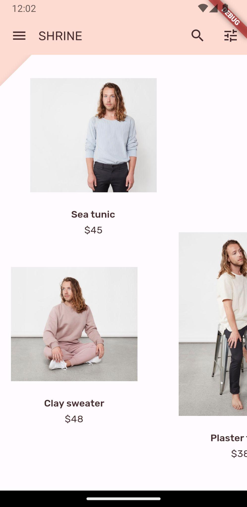
已篩選!
在選取選單後關閉最上層
在 backdrop.dart 中,為 _BackdropState 中的 didUpdateWidget() (每當小工具設定變更時呼叫) 函式新增覆寫:
  // TODO: Add override for didUpdateWidget() (104)
  @override
  void didUpdateWidget(Backdrop old) {
    super.didUpdateWidget(old);

    if (widget.currentCategory != old.currentCategory) {
      _toggleBackdropLayerVisibility();
    } else if (!_frontLayerVisible) {
      _controller.fling(velocity: _kFlingVelocity);
    }
  }
儲存專案,觸發熱重載。輕觸選單圖示,然後選取類別。選單應會自動關閉,並顯示所選項目的類別。現在,您也要將該功能新增至前層。
切換前景圖層
在 backdrop.dart 中,將輕觸回呼新增至背景層:
class _FrontLayer extends StatelessWidget {
  // TODO: Add on-tap callback (104)
  const _FrontLayer({
    Key? key,
    this.onTap, // New code
    required this.child,
  }) : super(key: key);

  final VoidCallback? onTap; // New code
  final Widget child;
接著,將 GestureDetector 新增至 _FrontLayer 的子項:Column 的子項:。
      child: Column(
        crossAxisAlignment: CrossAxisAlignment.stretch,
        children: <Widget>[
          // TODO: Add a GestureDetector (104)
          GestureDetector(
            behavior: HitTestBehavior.opaque,
            onTap: onTap,
            child: Container(
              height: 40.0,
              alignment: AlignmentDirectional.centerStart,
            ),
          ),
          Expanded(
            child: child,
          ),
        ],
      ),
然後在 _buildStack() 函式中,對 _BackdropState 實作新的 onTap 屬性:
          PositionedTransition(
            rect: layerAnimation,
            child: _FrontLayer(
              // TODO: Implement onTap property on _BackdropState (104)
              onTap: _toggleBackdropLayerVisibility,
              child: widget.frontLayer,
            ),
          ),
重新裝入,然後輕觸前層頂端。每次輕觸前一層的頂端時,該層應會開啟和關閉。
8. 新增品牌圖示
品牌圖示也適用於常見圖示。讓我們自訂顯示圖示,並與標題合併,打造獨特的品牌外觀。
變更選單按鈕圖示
Android | iOS |
|
|
在 backdrop.dart 中,建立新的 _BackdropTitle 類別。
// TODO: Add _BackdropTitle class (104)
class _BackdropTitle extends AnimatedWidget {
  final void Function() onPress;
  final Widget frontTitle;
  final Widget backTitle;

  const _BackdropTitle({
    Key? key,
    required Animation<double> listenable,
    required this.onPress,
    required this.frontTitle,
    required this.backTitle,
  }) : _listenable = listenable,
       super(key: key, listenable: listenable);

  final Animation<double> _listenable;

  @override
  Widget build(BuildContext context) {
    final Animation<double> animation = _listenable;

    return DefaultTextStyle(
      style: Theme.of(context).textTheme.titleLarge!,
      softWrap: false,
      overflow: TextOverflow.ellipsis,
      child: Row(children: <Widget>[
        // branded icon
        SizedBox(
          width: 72.0,
          child: IconButton(
            padding: const EdgeInsets.only(right: 8.0),
            onPressed: this.onPress,
            icon: Stack(children: <Widget>[
              Opacity(
                opacity: animation.value,
                child: const ImageIcon(AssetImage('assets/slanted_menu.png')),
              ),
              FractionalTranslation(
                translation: Tween<Offset>(
                  begin: Offset.zero,
                  end: const Offset(1.0, 0.0),
                ).evaluate(animation),
                child: const ImageIcon(AssetImage('assets/diamond.png')),
              )]),
          ),
        ),
        // Here, we do a custom cross fade between backTitle and frontTitle.
        // This makes a smooth animation between the two texts.
        Stack(
          children: <Widget>[
            Opacity(
              opacity: CurvedAnimation(
                parent: ReverseAnimation(animation),
                curve: const Interval(0.5, 1.0),
              ).value,
              child: FractionalTranslation(
                translation: Tween<Offset>(
                  begin: Offset.zero,
                  end: const Offset(0.5, 0.0),
                ).evaluate(animation),
                child: backTitle,
              ),
            ),
            Opacity(
              opacity: CurvedAnimation(
                parent: animation,
                curve: const Interval(0.5, 1.0),
              ).value,
              child: FractionalTranslation(
                translation: Tween<Offset>(
                  begin: const Offset(-0.25, 0.0),
                  end: Offset.zero,
                ).evaluate(animation),
                child: frontTitle,
              ),
            ),
          ],
        )
      ]),
    );
  }
}
_BackdropTitle 是自訂小工具,將取代 AppBar 小工具 title 參數的純 Text 小工具。這個範例具有動畫選單圖示,以及前後標題之間的動畫轉換效果。動畫選單圖示會使用新的素材資源。您必須將新 slanted_menu.png 的參照新增至 pubspec.yaml。
assets:
    - assets/diamond.png
    # TODO: Add slanted menu asset (104)
    - assets/slanted_menu.png
    - packages/shrine_images/0-0.jpg
在 AppBar 建構工具中移除 leading 屬性。移除後,自訂品牌圖示就會顯示在原始 leading 小工具的位置。動畫 listenable 和品牌圖示的 onPress 處理常式會傳遞至 _BackdropTitle。此外,系統也會傳遞 frontTitle 和 backTitle,以便在背景標題中算繪。AppBar 的 title 參數應如下所示:
// TODO: Create title with _BackdropTitle parameter (104)
title: _BackdropTitle(
  listenable: _controller.view,
  onPress: _toggleBackdropLayerVisibility,
  frontTitle: widget.frontTitle,
  backTitle: widget.backTitle,
),
品牌圖示是在 _BackdropTitle. 中建立,內含一組動畫圖示:傾斜的選單和菱形,並以 IconButton 包裝,方便使用者按下。Stack接著,IconButton 會包裝在 SizedBox 中,為水平圖示動作預留空間。
Flutter 的「所有項目都是小工具」架構可讓您變更預設 AppBar 的版面配置,不必建立全新的自訂 AppBar 小工具。原本是 Text 小工具的 title 參數,可以替換為更複雜的 _BackdropTitle。由於 _BackdropTitle 也包含自訂圖示,因此會取代 leading 屬性,現在可以省略該屬性。這項簡單的小工具替代作業完成後,其他參數 (例如動作圖示) 不會受到影響,仍會照常運作。
新增返回登入畫面的捷徑
在應用程式列的兩個尾端圖示中,backdrop.dart,新增返回登入畫面的捷徑:變更圖示的語意標籤,反映新用途。
        // TODO: Add shortcut to login screen from trailing icons (104)
        IconButton(
          icon: const Icon(
            Icons.search,
            semanticLabel: 'login', // New code
          ),
          onPressed: () {
            // TODO: Add open login (104)
            Navigator.push(
              context,
              MaterialPageRoute(
                builder: (BuildContext context) => LoginPage()),
            );
          },
        ),
        IconButton(
          icon: const Icon(
            Icons.tune,
            semanticLabel: 'login', // New code
          ),
          onPressed: () {
            // TODO: Add open login (104)
            Navigator.push(
              context,
              MaterialPageRoute(
                builder: (BuildContext context) => LoginPage()),
            );
          },
        ),
如果嘗試重新載入,就會收到錯誤訊息。匯入 login.dart 即可修正錯誤:
import 'login.dart';
重新載入應用程式,然後輕觸「搜尋」或「電台」按鈕,返回登入畫面。
9. 恭喜!
在本系列的四個程式碼研究室中,您已瞭解如何使用 Material Design 元件,打造獨特且優雅的使用者體驗,展現品牌個性與風格。
後續步驟
本程式碼研究室 (MDC-104) 是這一連串程式碼研究室的最後一個。如要探索更多 Material Flutter 元件,請前往 Material 元件小工具目錄。
如要達成延伸目標,請嘗試將品牌圖示換成 AnimatedIcon,在背景顯示時,於兩個圖示之間加入動畫效果。
根據您的興趣,還有許多其他 Flutter 程式碼研究室可供嘗試。我們還有另一個與 Material 相關的程式碼研究室,您可能會感興趣:利用適用於 Flutter 的 Material Motion 建構精美的轉場效果。