1. Overview
At Google I/O 2019, Material Design introduced guidance for crafting a dark theme to complement your product's existing Material theme. While light themes are great for longform reading and offer more legible contrast, a dark theme's reduced luminance provides safety in dark environments and can minimize eye strain.
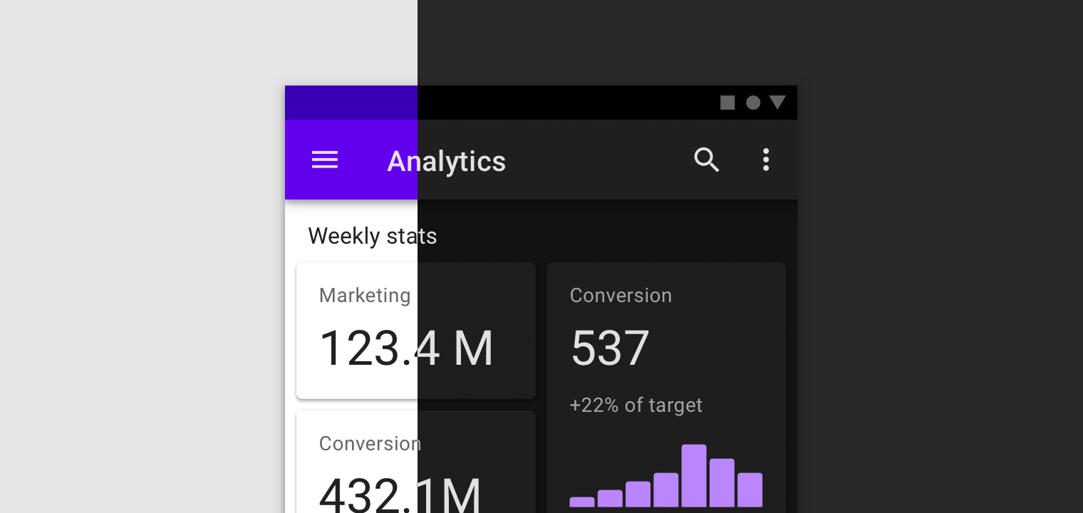
In Material, dark themes are designed to be used as a supplemental mode to a default light theme, maintaining your app's unique identity (including styles for color, shape, type, and elevation) through a nuanced and night-friendly presentation.
In this designlab, we'll walk through the steps required to create a dark theme based on an existing Material theme—using one of our Material Studies.
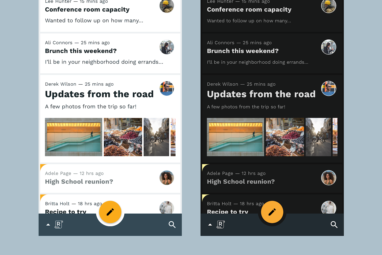
We'll work with Reply, an email app designed for clarity, legibility, intuition, and ease of use. We'll learn about Reply's identity and make careful decisions to retain branded moments in the app while crafting a theme that's still comfortable in the dark.
We'll also push the theme further and work with custom surface colors that go beyond the basic dark theme to reemphasize Reply's unique personality.
Required materials:
2. Gather the required files
Before getting started, you'll need to download our Figma starter file. Everything you'll need for the designlab is included in this file.
3. Set up your environment
Next, you'll need to set up your design environment.
First, sign into Figma or create an account.
Once you're signed in, import the file you downloaded in the previous step. To do this, just find the "import file" icon in the upper left corner of the Figma files screen and locate the file in your "Downloads" folder.
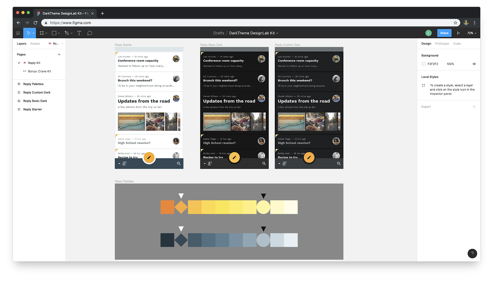
Take a moment to look around the file. It contains a light theme, a pre-built tonal palette based on the app's brand, and a copy of the final dark theme we'll be creating.
- In another tab, open the Material Design Guidance for dark themes. We'll reference these guidelines throughout the designlab.
4. Understand the identity of the product
Before getting started on the dark theme for Reply, we need to understand some of Reply's brand characteristics. This will help us make informed choices about our theme so that Reply's identity and brand are consistently expressed across both light and dark themes.
Reply's brand places an emphasis on communication. The app prioritizes functional qualities, favoring ease-of-use over design elements that don't have functional purpose.
For our purposes in this designlab, the most important elements of brand expression in Reply are color, type, and shape.
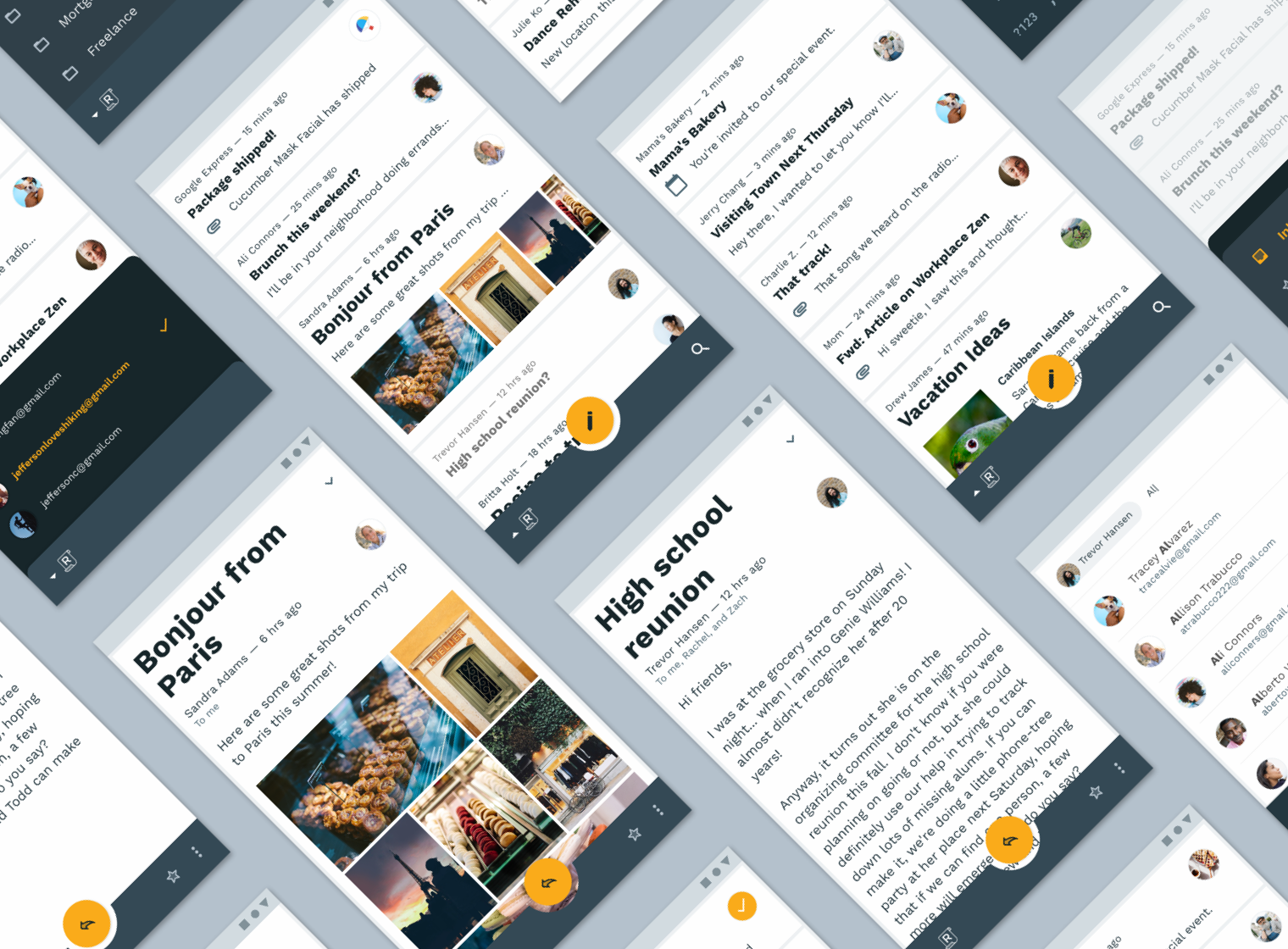
Color
Reply's color theme uses a dark blue-gray primary color paired with an orange-yellow secondary color.
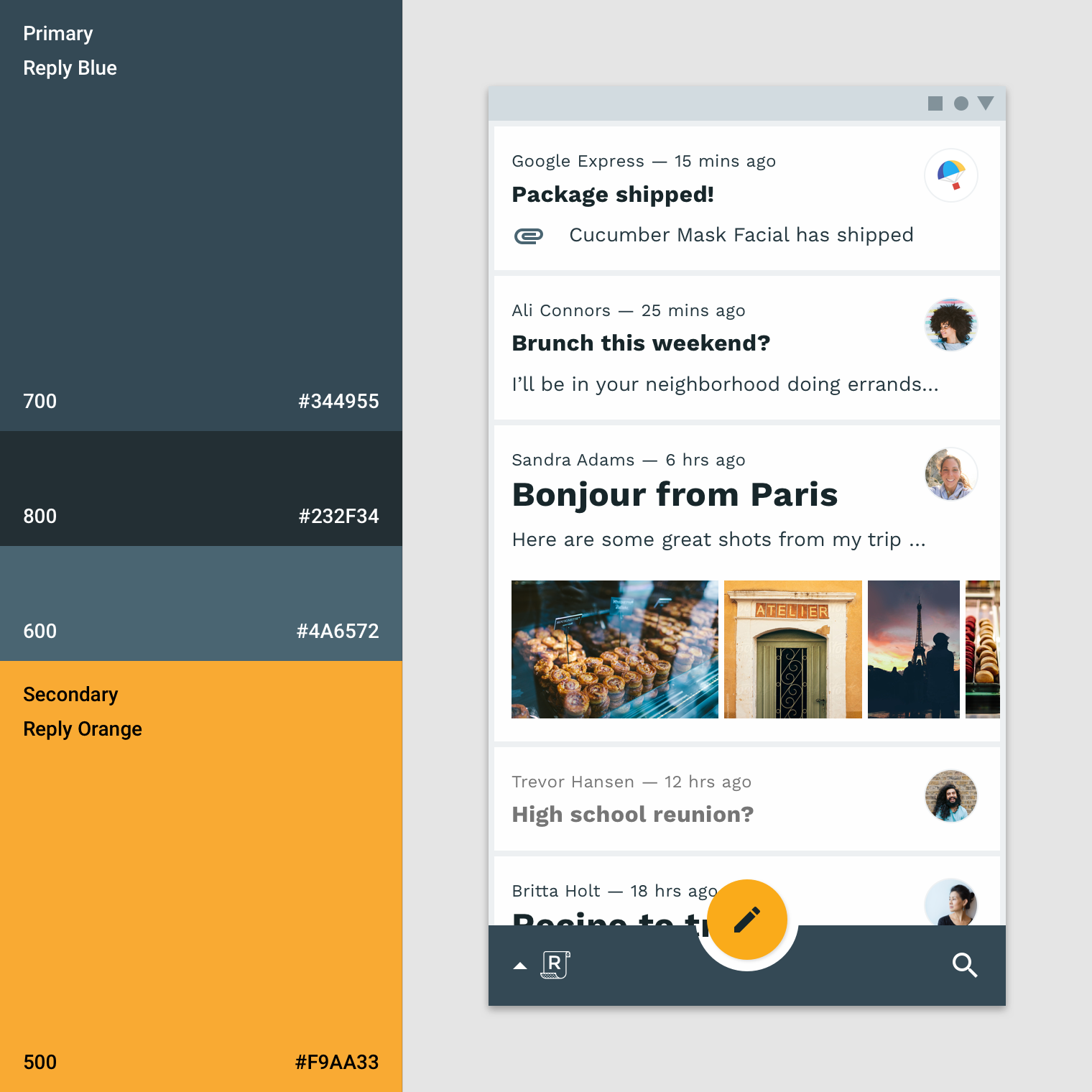
Because the secondary color is rarely used, Reply's UI is often monochromatic, using variations of its primary color. This subtle color theme allows content to be easily read without distraction, and allows photographic avatars to be easily seen.
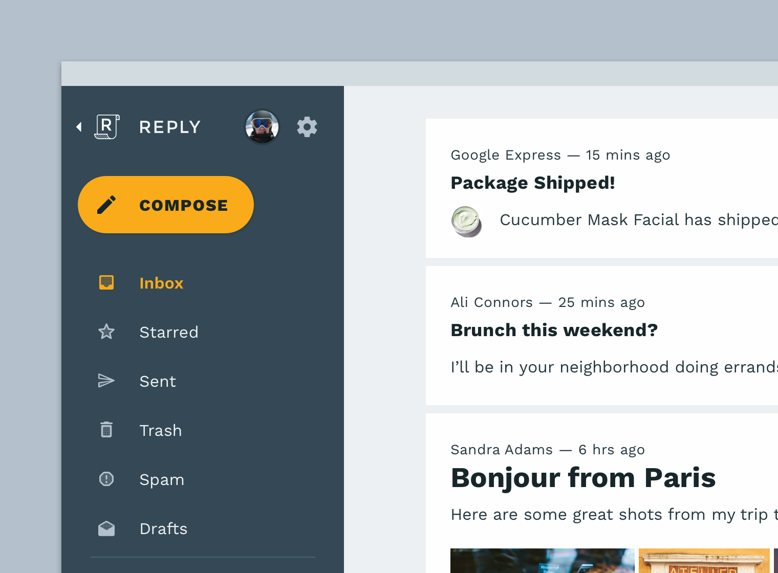
Reply's secondary color, then, has an outsized impact wherever it's used — emphasizing critical actions and clearly pronouncing branded moments throughout the app.
Type
As an app that focuses heavily on text-based content and efficiency, type and typography are central to Reply's expression of identity. The app relies on Work Sans for its complete type scale, using a variety of styles that incorporate six weights of Work Sans: Light, Regular, Medium, SemiBold, and Bold.
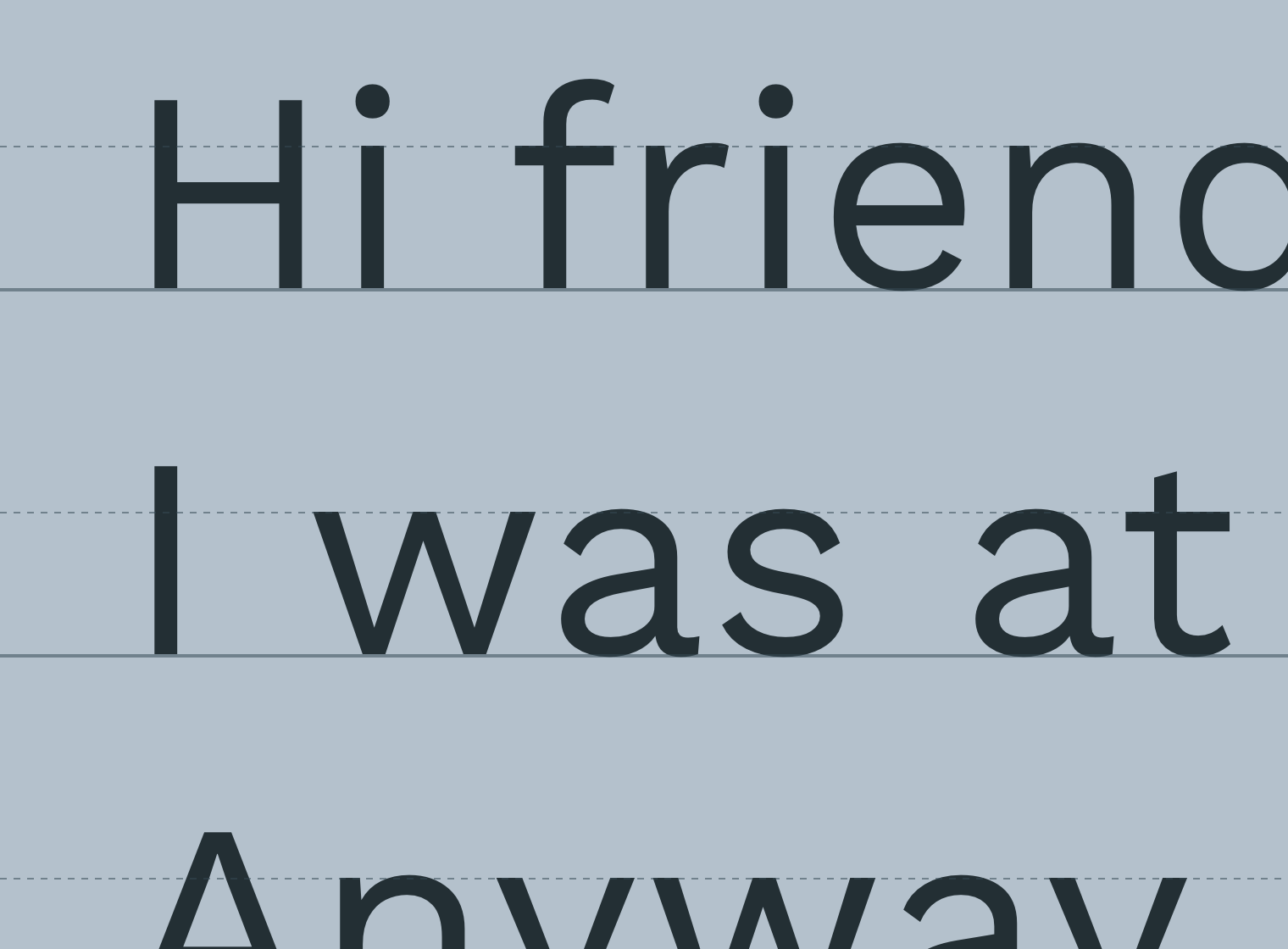
Building the entire type scale from Work Sans gives Reply consistent and predictable, but organic and legible, typography.
According to Work Sans designer Wei Huang, the family is optimized for on-screen usage. This makes it great for efficiently reading passages of text in emails or other content. Its loose basis in the forms of early Grotesques lends it a somewhat more friendly and human aesthetic, while wider tracking makes for smoother reading.
Shape
Reply has a nuanced shape story, pairing round and sharp components in ways that reinforce the efficiency and functional nature of the email list while giving a softer touch to key actions and larger componentry.
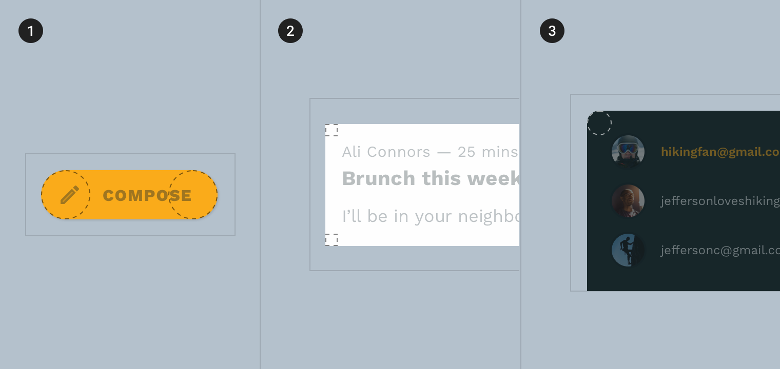
- Small components
- Medium components
- Large components
Small components like buttons and the FAB are completely rounded, while medium components like email cards and the bottom app bar are completely squared. Large components like the account switcher and bottom sheet have slightly rounded corners.
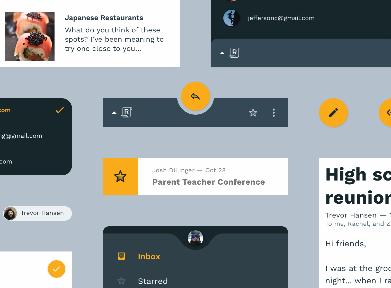
These shapes combine to reinforce the user's understanding of where they are in the app and how each component is conceived, as well as how it relates to the rest of the interface.
5. Working with color
Knowing how color relates to Reply's expression of brand in its default light theme, we can make informed adjustments to its palette for a usable and expressive dark theme.
In Material, color systems are based on tonal palettes — these palettes use your brand colors to create a set of harmonious variants that come together in a comprehensive color system applied across your app, ensuring style and legibility.
In the Figma file, you can see Reply's primary and secondary tonal palettes. The light arrows above each palette indicate the values used in Reply's light theme, while the dark arrows indicate the variants we'll use in our dark theme.

When crafting a dark theme with Material, lighter variants are chosen so that your color system can remain expressive and maintain appropriate contrast without causing eye strain. More saturated colors tend to visually "vibrate" against darker backgrounds, making them harder to read. Lighter tones also provide more flexibility in varying the color of elevated surfaces, which we'll look at shortly.
6. Adjust surface colors
Now that we have a handle on Reply's tonal palettes and the colors we'll be using in our dark theme, it's time to start adjusting color values in our mockup.
In Material dark themes, the bottom-most layer of the interface is typically a dark gray with the hex value #121212.
- In the Figma file, find the artboard called "Reply Starter" and select the layer called "Background."

- Under "Fill" in the inspector panel on the right side of the screen, set the color value to 121212 and hit Return.

- Your artboard should look like this:
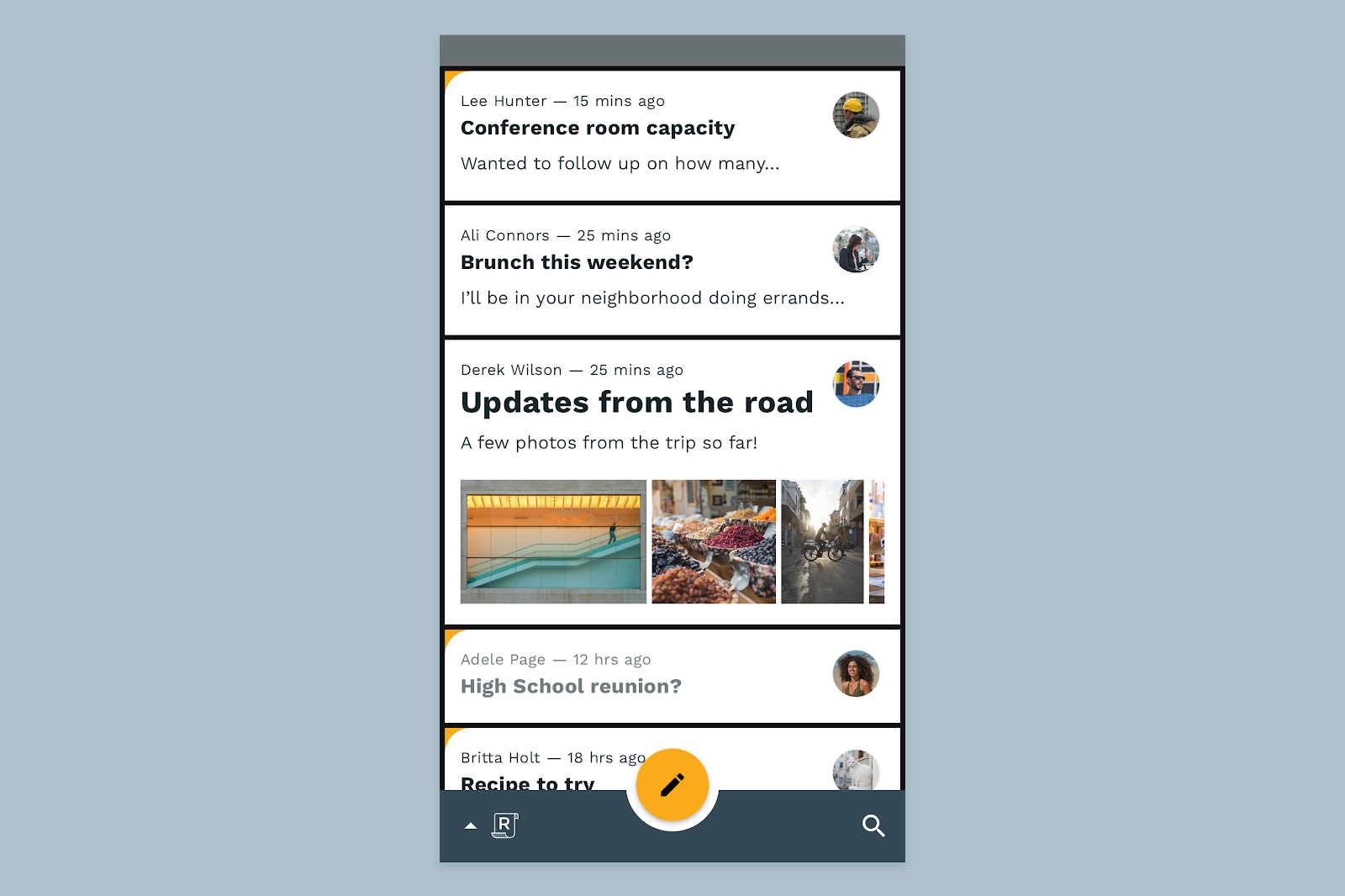
In Reply's monochromatic inbox view, email cards have a slightly lighter color than the background, so we should lend the same treatment to the cards in dark theme to maintain the inbox's visual hierarchy.
- On the same artboard, expand the group called "Email cards" and select all layers called "Email card."
- Just like before, select the Fill value in the inspector panel. Set the value to 121212 and hit Return.
- Now, select only the layers called "Email card overlay." These layers will allow us to create an overlay that distinguishes the email cards from their background.
- Give the layers a Fill and make it FFFFFF at 2% opacity.
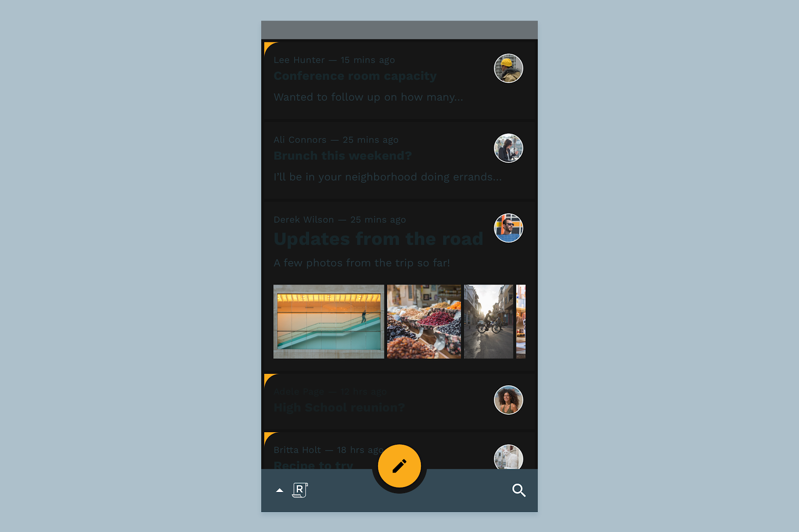
Now that the email cards have been darkened, our text is illegible. We'll tackle text colors next.
7. Adjust text colors
To understand text colors in dark themes, it's important to understand how color is applied to text in the broader Material Design system.
Material Components define the notion of "on" colors, which are so called because they're colors that appear "on" top of components and key surfaces that use primary, secondary, surface, background, or error colors. "On" colors are primarily used for text, to ensure that it remains legible on these surfaces.
The default "on" colors in Material are white (#FFFFFF) and black (#000000). Since a black or dark "on" color wouldn't be suitable against our darkened surfaces, we'll use white.
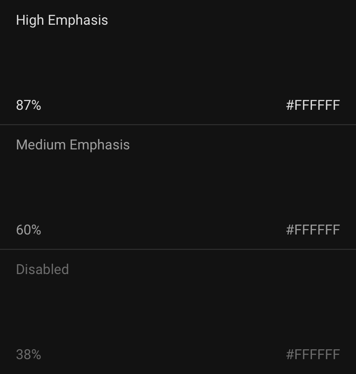
The system for establishing text hierarchy with this "on" color is simple. High-emphasis text has an opacity of 87%, while medium emphasis text is applied at 60%, and disabled text uses an opacity of 38%.
High priority text isn't pure white because, as discussed in step 5, #FFFFFF—a bright color—would visually "vibrate" against our dark backgrounds. Additionally, pure #FFFFFF text against a dark background can harm legibility since the light from that text appears to bleed or blur against the dark background.
Knowing all of this, let's fix the text colors in our dark theme.
- All of the text in our starter layout is grouped for easy access. Find the group called Inbox text and expand it to see all its constituent layers.
- Select all the layers prepended with "Hi -". These are all the high-emphasis pieces of text in our layout.
- In the inspector panel, set the Fill to FFFFFF with an opacity of 87%.
- Back in the Inbox text group, select all the layers prepended with "Med -"
- In the inspector panel, set the Fill to FFFFFF with an opacity of 60%.
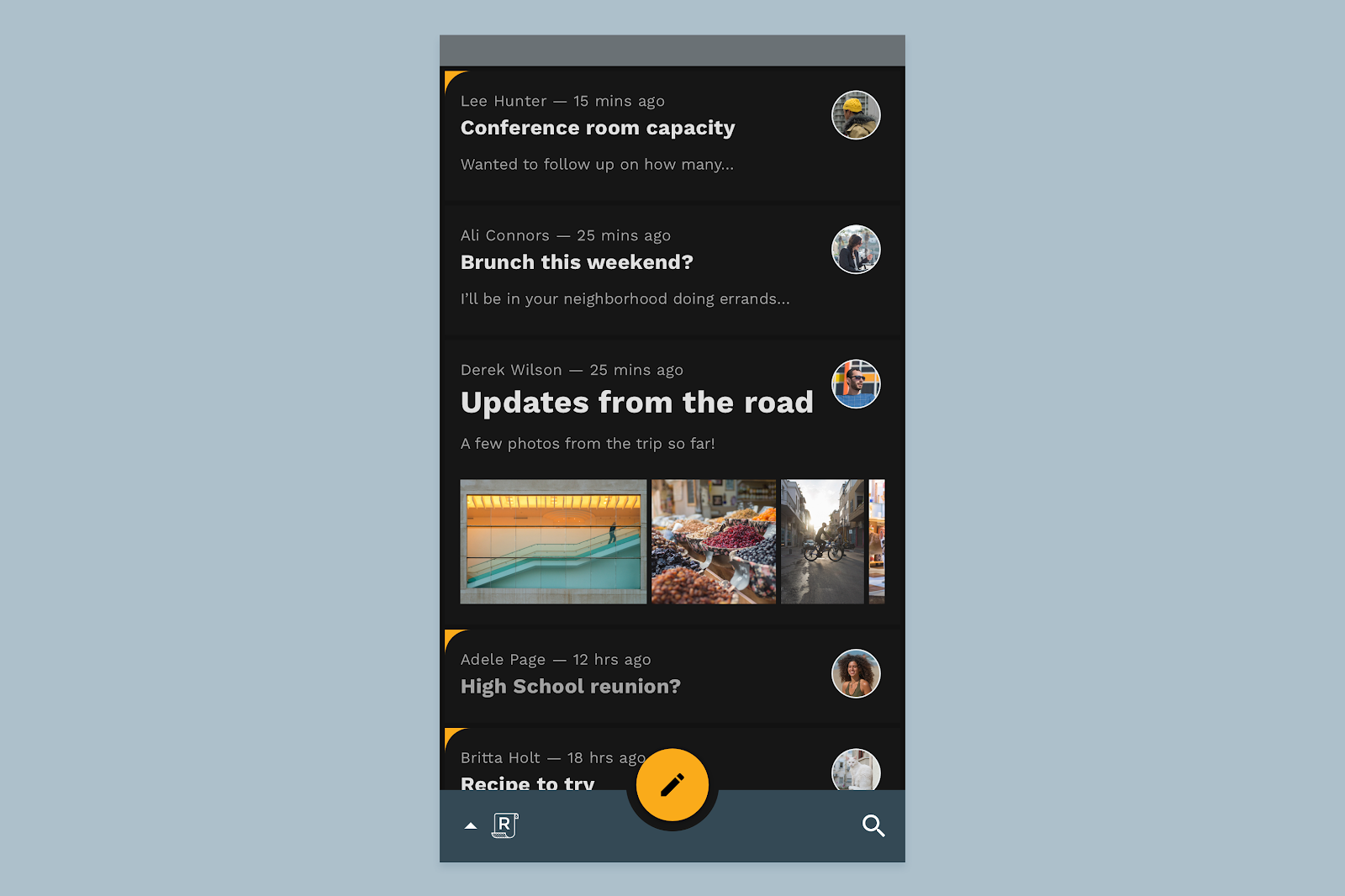
8. Adjust component colors
In dark themes built with Material, elevated surfaces and components are colored using overlays. The more elevated the surface is, the stronger and brighter the overlay becomes. This is a way of communicating elevation and hierarchy when the background is too dark to reliably portray dark shadows.
Bottom app bar
For Reply's bottom app bar, which is elevated above the rest of the inbox UI, we'll apply a subtle overlay.
- Find the group called Bottom app bar in the layer list and expand it so you can see its constituent layers.
- Find the layer called Surface inside that group, and set its Fill value to 121212.
- Find the layer above it called Surface overlay and give it a Fill value of FFFFFF with an opacity of 12%.
Floating action button
Next we'll apply a new color to the FAB. To do that, go back to the tonal palettes we looked at earlier and grab the 700 value of Reply's secondary color.
Optionally, for small but high-impact components in your own app, you could select a slightly more saturated color as long as it retains the right contrast with the underlying colors. We'll explore this option in a later step.
- Find the group called FAB in the list of layers and expand it to see its constituent parts.
- Find the Surface layer and select it. Set its fill to FCC13B.
Selected cards
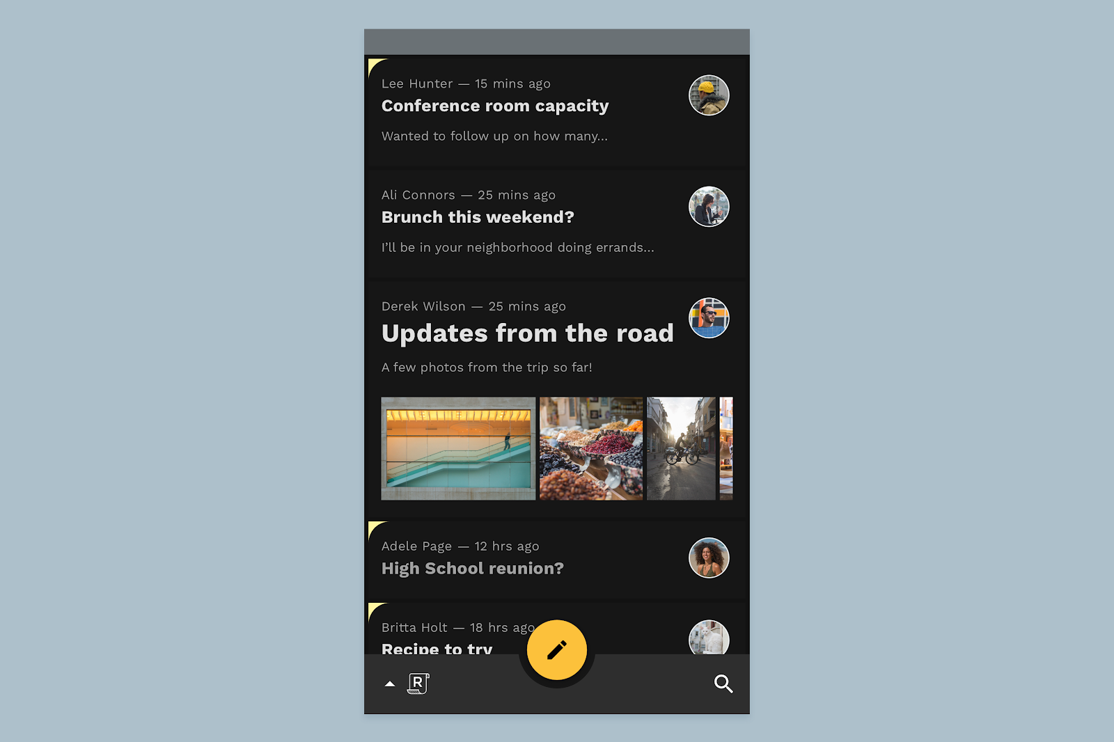
You might notice that the same impactful orange-yellow color also appears on the corner of selected email cards in Reply's inbox. This is another strongly branded moment but it doesn't fit cleanly into components, surfaces, or text.
For situations like this, it's best to start from our secondary variant color (in this case #FFFBE6) and work backward to find something that is appropriately expressive without being a distraction to Reply's functional aesthetic. For Reply, we can stick with our normal secondary variant.
- Select the layer called Earmark and set its Fill to FFF5A0.
9. Go even further: custom surfaces
As we learned earlier, the floating action button (or FAB) in Reply is a highly emphasized component that also represents a strongly branded moment in the app. For this reason, we might decide to maintain its color expression in Reply's dark theme by using Reply's original secondary color.
- Find the group called FAB in the list of layers and expand it to see its constituent parts.
- Find the Surface layer and select it. Set its fill back to F9AA33.
We might also want to bring back Reply's primary color as a custom surface color for the bottom app bar and the email cards. To do this, we would just need to change the overlay to use the dark primary color indicated in the tonal palette we've been referencing.
- Find the group called Bottom app bar in the layer list and expand it so you can see its constituent layers.
- Find the layer called Surface overlay and give it a new Fill value of 344955 with an opacity of 48%. This will give it a stronger brand color while maintaining adequate contrast.
- Find the layers called Email card overlay in the list of layers and select all of them.
- Set their Fill to ADC0CB with an opacity of 4%.

10. Wrapup

In Material, dark themes are a thoughtful and intentional extension of your product's unique identity as it's expressed in light theme. Through simple adjustments to color and the way that elevation is conveyed, you've just successfully created your first Material dark theme. Congrats!
Consider the steps in this design lab a framework for understanding and defining your own product's dark theme, and always keep the properties and goals of your brand and product at heart.
For more dark theme guidance, have a look at the Material Design spec for dark themes.
If you've got questions, feel free to ask us any time using @MaterialDesign on Twitter.
Stay tuned for more design content and tutorials on the Google Design YouTube channel.
