
১. ভূমিকা
| ম্যাটেরিয়াল কম্পোনেন্টস (MDC) ডেভেলপারদের ম্যাটেরিয়াল ডিজাইন বাস্তবায়ন করতে সাহায্য করে। গুগলের একদল ইঞ্জিনিয়ার এবং ইউএক্স ডিজাইনার দ্বারা তৈরি, MDC-তে কয়েক ডজন সুন্দর এবং কার্যকরী UI কম্পোনেন্ট রয়েছে এবং এটি অ্যান্ড্রয়েড, আইওএস, ওয়েব এবং ফ্লাটারের জন্য উপলব্ধ। material.io/develop |
এখন আপনি ম্যাটেরিয়াল ফ্লাটার ব্যবহার করে আপনার অ্যাপের স্বতন্ত্র স্টাইল আগের চেয়ে আরও ভালোভাবে কাস্টমাইজ করতে পারবেন। ম্যাটেরিয়াল ডিজাইনের সাম্প্রতিক সম্প্রসারণ ডিজাইনার এবং ডেভেলপারদের তাদের পণ্যের ব্র্যান্ড প্রকাশ করার ক্ষেত্রে আরও বেশি নমনীয়তা দিয়েছে।
কোডল্যাবস MDC-101 এবং MDC-102-এ, আপনারা ম্যাটেরিয়াল ফ্লাটার ব্যবহার করে ‘Shrine’ নামক একটি অ্যাপের প্রাথমিক কাঠামো তৈরি করেছেন। এটি একটি ই-কমার্স অ্যাপ যা পোশাক এবং গৃহস্থালির সামগ্রী বিক্রি করে। এই অ্যাপটিতে একটি ইউজার ফ্লো রয়েছে যা একটি লগইন স্ক্রিন দিয়ে শুরু হয় এবং তারপর ব্যবহারকারীকে একটি হোম স্ক্রিনে নিয়ে যায়, যেখানে পণ্যগুলো প্রদর্শিত হয়।
আপনি যা তৈরি করবেন
এই কোডল্যাবে, আপনি নিম্নলিখিত বিষয়গুলো ব্যবহার করে Shrine অ্যাপটি কাস্টমাইজ করবেন:
- রঙ
- টাইপোগ্রাফি
- উচ্চতা
- আকৃতি
- লেআউট
অ্যান্ড্রয়েড | আইওএস |
|
|
|
|


এই কোডল্যাবে ম্যাটেরিয়াল ফ্লাটার কম্পোনেন্ট এবং সাবসিস্টেম
- থিম
- টাইপোগ্রাফি
- উচ্চতা
- ছবির তালিকা
ফ্লাটার ডেভেলপমেন্টে আপনার অভিজ্ঞতার স্তরকে আপনি কীভাবে মূল্যায়ন করবেন?
২. আপনার ফ্লাটার ডেভেলপমেন্ট পরিবেশ সেট আপ করুন।
এই ল্যাবটি সম্পন্ন করার জন্য আপনার দুটি সফটওয়্যার প্রয়োজন— ফ্লাটার এসডিকে এবং একটি এডিটর ।
আপনি এই ডিভাইসগুলোর যেকোনো একটি ব্যবহার করে কোডল্যাবটি চালাতে পারেন:
- আপনার কম্পিউটারের সাথে সংযুক্ত এবং ডেভেলপার মোডে সেট করা একটি ফিজিক্যাল অ্যান্ড্রয়েড বা আইওএস ডিভাইস।
- iOS সিমুলেটর (এর জন্য Xcode টুলস ইনস্টল করা প্রয়োজন)।
- অ্যান্ড্রয়েড এমুলেটর (অ্যান্ড্রয়েড স্টুডিওতে সেটআপ করা প্রয়োজন)।
- একটি ব্রাউজার (ডিবাগিংয়ের জন্য ক্রোম আবশ্যক)।
- একটি Windows , Linux , বা macOS ডেস্কটপ অ্যাপ্লিকেশন হিসেবে, আপনাকে অবশ্যই সেই প্ল্যাটফর্মে ডেভেলপ করতে হবে যেখানে আপনি এটি ডেপ্লয় করার পরিকল্পনা করছেন। সুতরাং, আপনি যদি একটি Windows ডেস্কটপ অ্যাপ ডেভেলপ করতে চান, তবে উপযুক্ত বিল্ড চেইন অ্যাক্সেস করার জন্য আপনাকে অবশ্যই Windows-এই ডেভেলপ করতে হবে। অপারেটিং সিস্টেম-ভিত্তিক কিছু নির্দিষ্ট আবশ্যকতা রয়েছে, যা docs.flutter.dev/desktop- এ বিস্তারিতভাবে আলোচনা করা হয়েছে।
৩. কোডল্যাব স্টার্টার অ্যাপটি ডাউনলোড করুন।
MDC-102 এর ধারাবাহিকতায়?
আপনি যদি MDC-102 সম্পন্ন করে থাকেন, তাহলে আপনার কোড এই কোডল্যাবের জন্য প্রস্তুত থাকা উচিত। সরাসরি এই ধাপে যান: রং পরিবর্তন করুন ।
একেবারে নতুন করে শুরু করছেন?
স্টার্টার কোডল্যাব অ্যাপটি ডাউনলোড করুন
স্টার্টার অ্যাপটি material-components-flutter-codelabs-103-starter_and_102-complete/mdc_100_series ডিরেক্টরিতে অবস্থিত।
...অথবা গিটহাব থেকে এটি ক্লোন করুন
গিটহাব থেকে এই কোডল্যাবটি ক্লোন করতে, নিম্নলিখিত কমান্ডগুলো চালান:
git clone https://github.com/material-components/material-components-flutter-codelabs.git
cd material-components-flutter-codelabs/mdc_100_series
git checkout 103-starter_and_102-complete
প্রজেক্টটি খুলুন এবং অ্যাপটি চালান।
- আপনার পছন্দের এডিটরে প্রজেক্টটি খুলুন।
- আপনার নির্বাচিত এডিটরের জন্য " Get Started: Test drive "-এ থাকা "Run the app" নির্দেশাবলী অনুসরণ করুন।
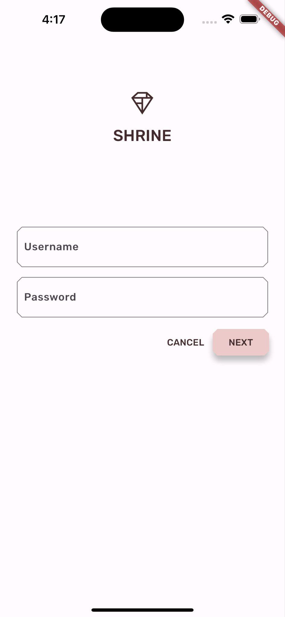
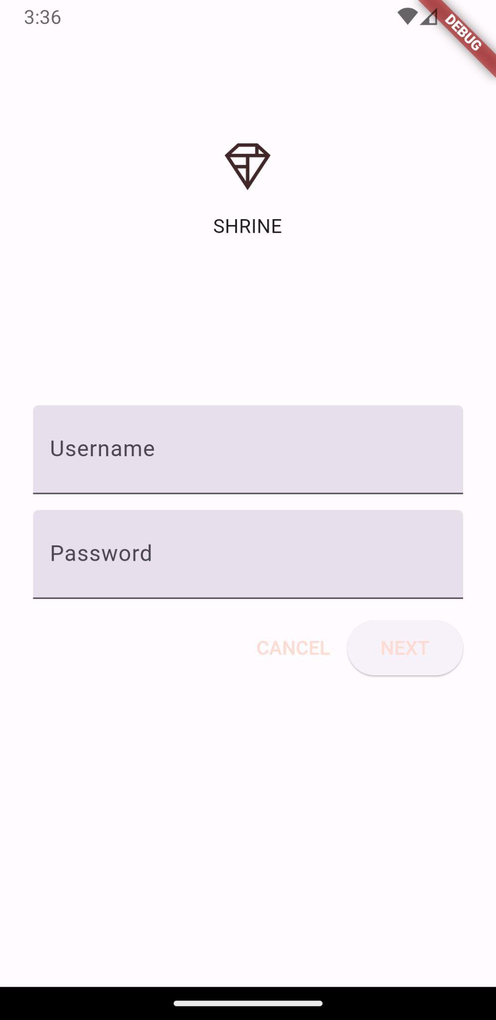
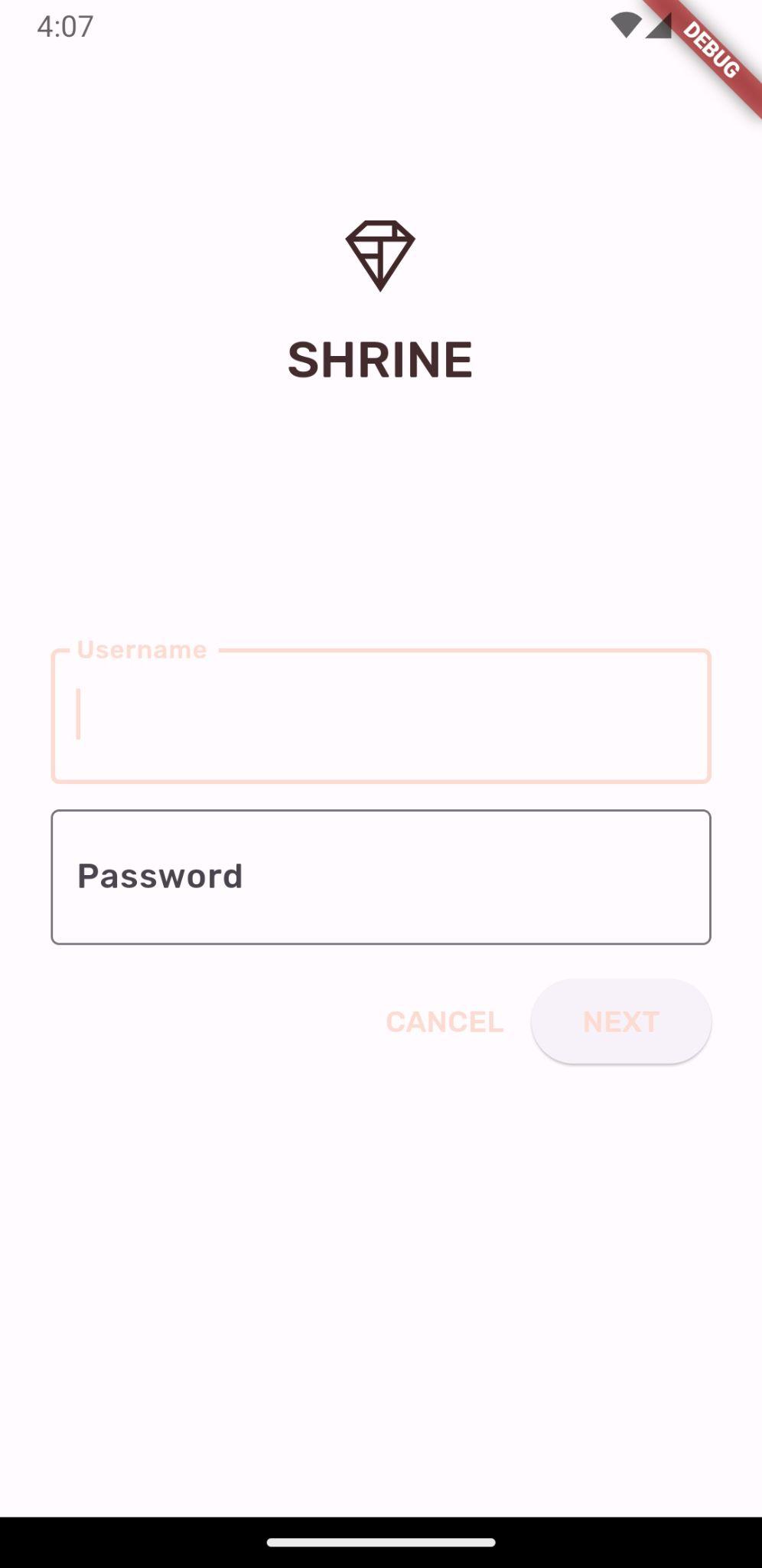
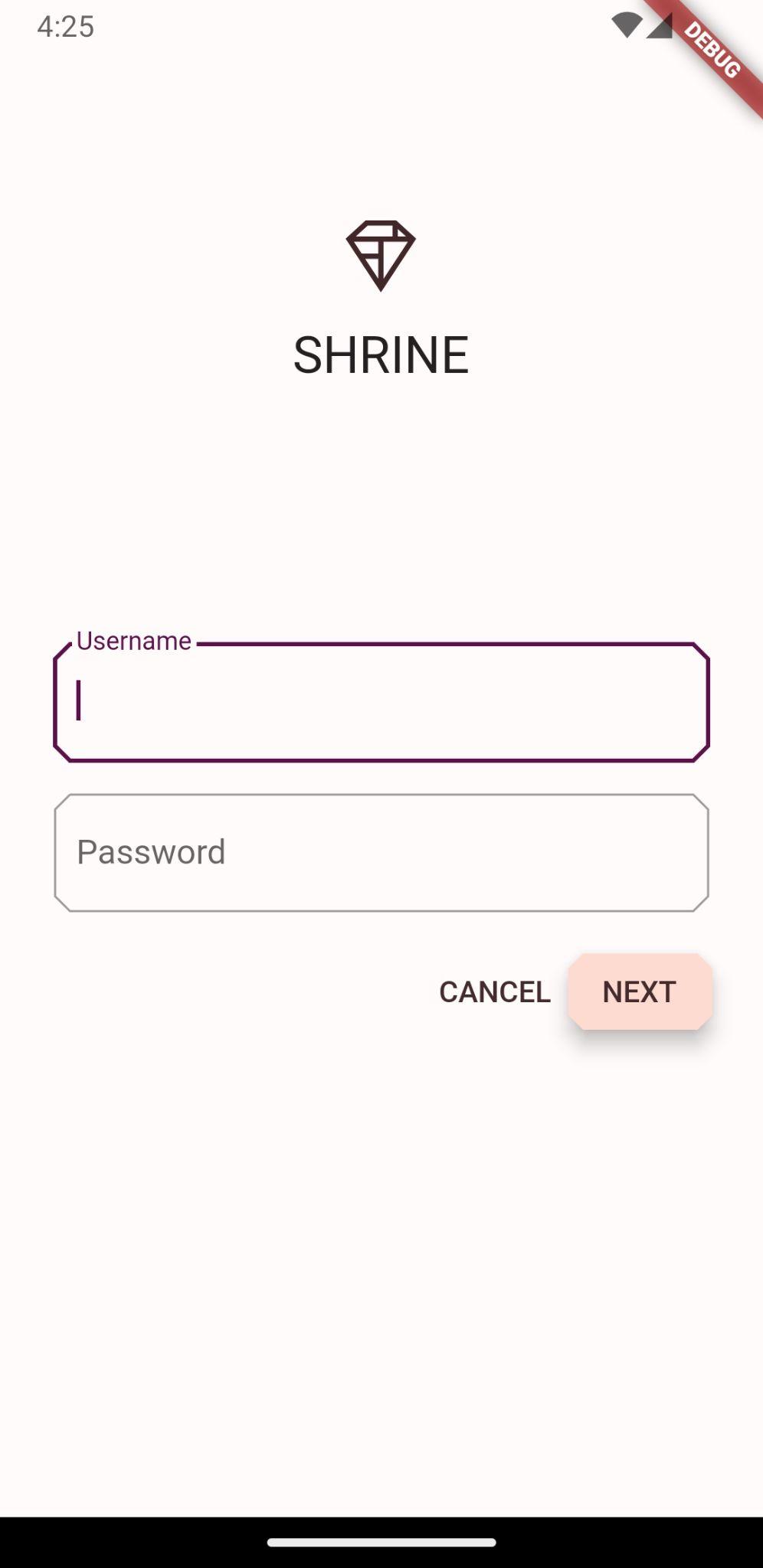
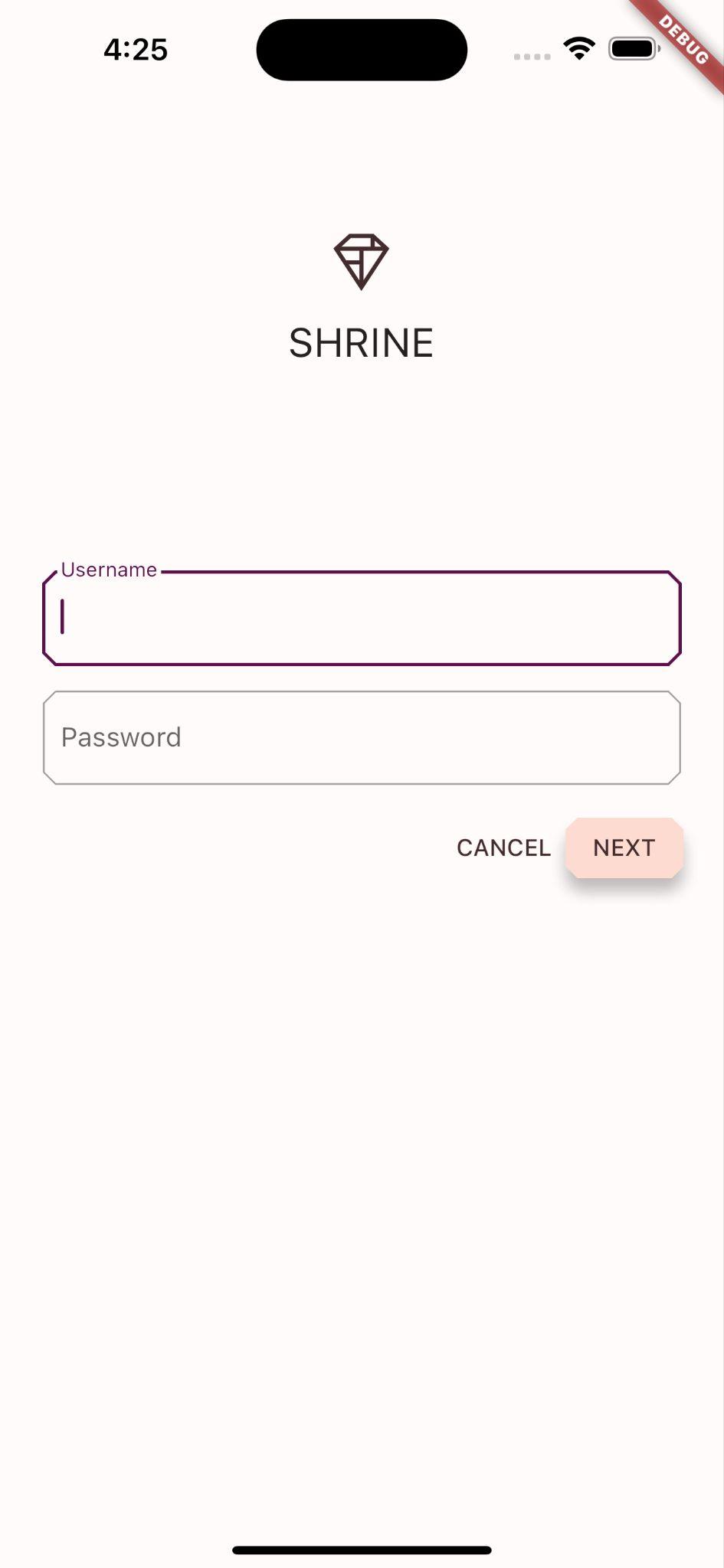
সফল! আপনি আপনার ডিভাইসে আগের কোডল্যাবগুলো থেকে শ্রাইন লগইন পেজটি দেখতে পাবেন।
অ্যান্ড্রয়েড | আইওএস |
|
|


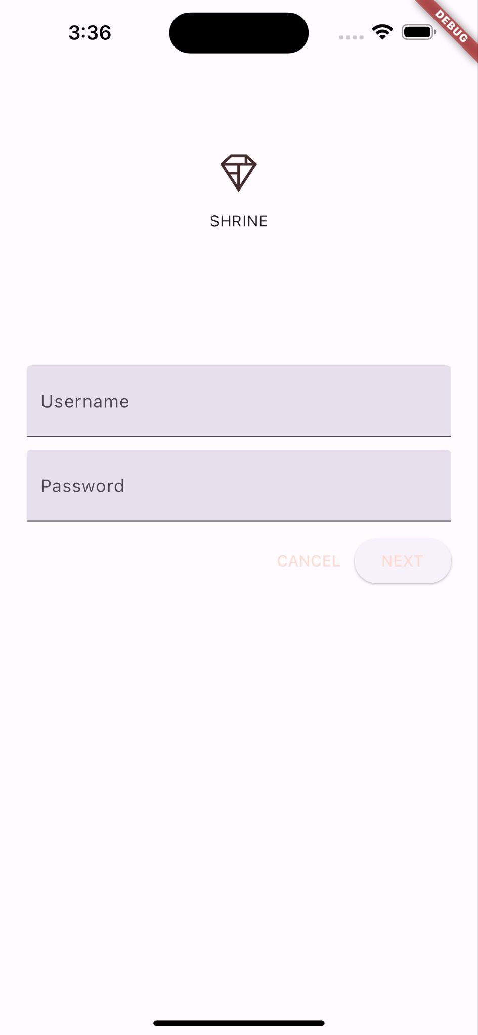
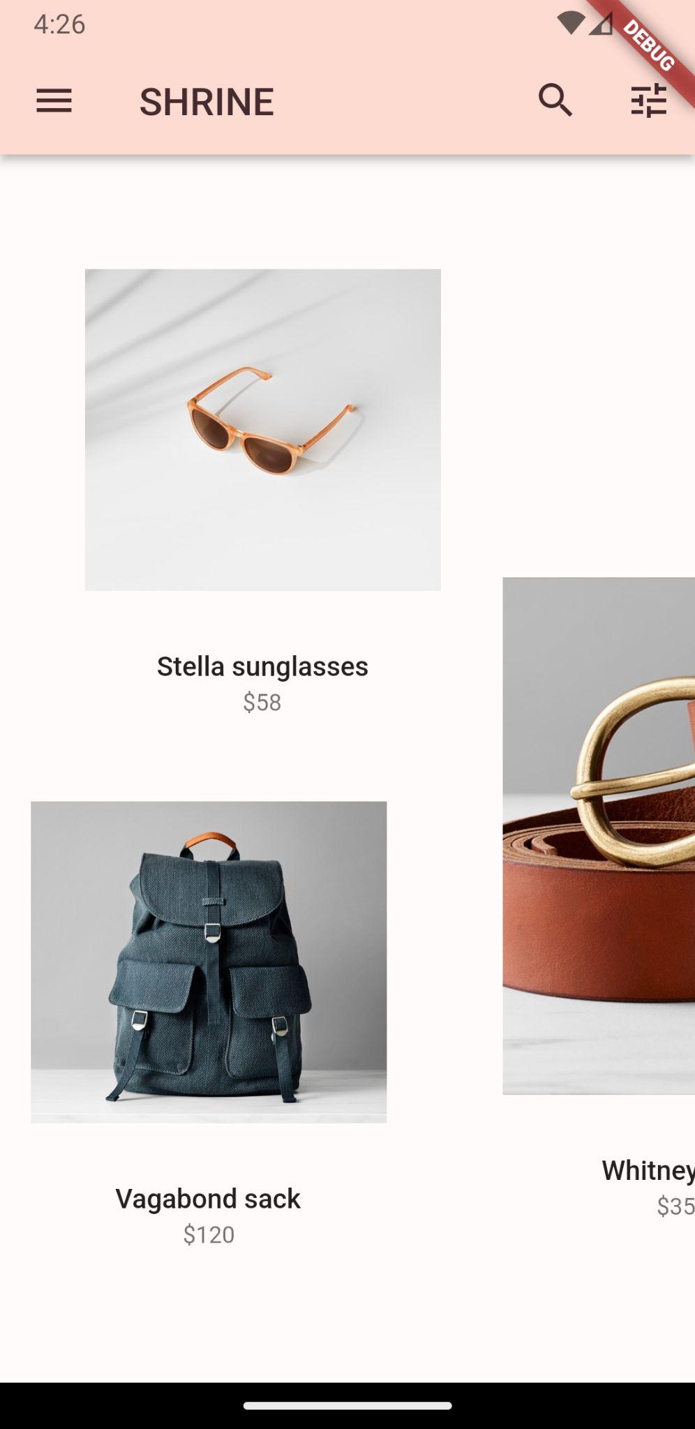
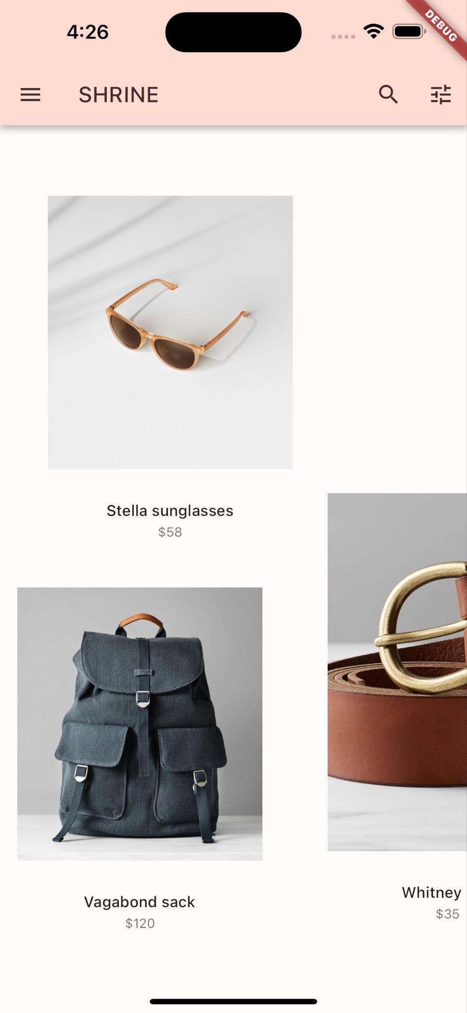
পণ্যের পৃষ্ঠাটি দেখতে 'পরবর্তী' ক্লিক করুন।
অ্যান্ড্রয়েড | আইওএস |
|
|


৪. রংগুলো পরিবর্তন করুন
শ্রাইন ব্র্যান্ডের প্রতিনিধিত্বকারী একটি কালার স্কিম তৈরি করা হয়েছে, এবং ডিজাইনার চান যে আপনি শ্রাইন অ্যাপ জুড়ে সেই কালার স্কিমটি প্রয়োগ করুন।
শুরু করার জন্য, চলুন সেই রঙগুলো আমাদের প্রজেক্টে ইম্পোর্ট করি।
colors.dart তৈরি করুন ।
lib ফোল্ডারে colors.dart নামে একটি নতুন ডার্ট ফাইল তৈরি করুন। material.dart ইম্পোর্ট করুন এবং const Color ভ্যালুগুলো যোগ করুন:
import 'package:flutter/material.dart';

const kShrinePink50 = Color(0xFFFEEAE6);
const kShrinePink100 = Color(0xFFFEDBD0);
const kShrinePink300 = Color(0xFFFBB8AC);
const kShrinePink400 = Color(0xFFEAA4A4);

const kShrineBrown900 = Color(0xFF442B2D);

const kShrineErrorRed = Color(0xFFC5032B);

const kShrineSurfaceWhite = Color(0xFFFFFBFA);
const kShrineBackgroundWhite = Colors.white;
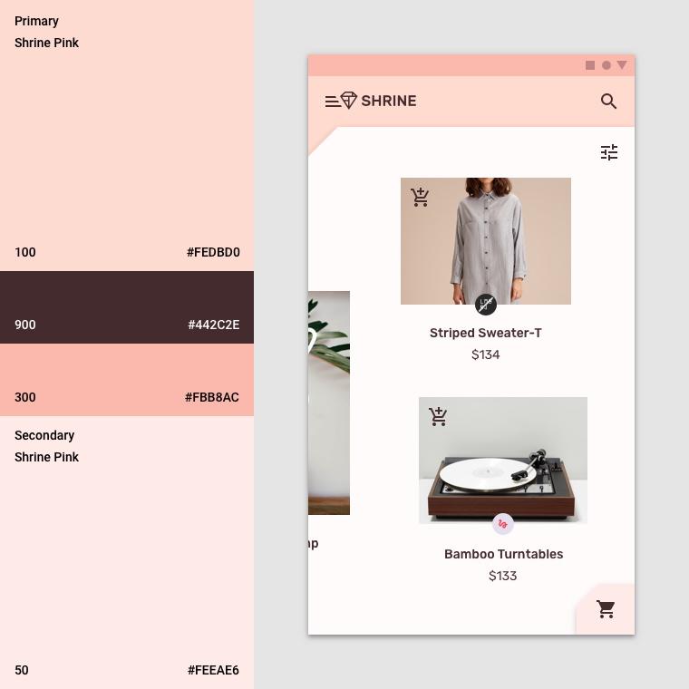
কাস্টম রঙের প্যালেট
এই কালার থিমটি একজন ডিজাইনার নিজস্ব রঙ ব্যবহার করে তৈরি করেছেন (যা নিচের ছবিতে দেখানো হয়েছে)। এতে শ্রাইনের ব্র্যান্ড থেকে বাছাই করা রঙগুলো ম্যাটেরিয়াল থিম এডিটরে প্রয়োগ করা হয়েছে, যা সেগুলোকে প্রসারিত করে একটি পূর্ণাঙ্গ প্যালেট তৈরি করেছে। (এই রঙগুলো ২০১৪ সালের ম্যাটেরিয়াল কালার প্যালেট থেকে নেওয়া নয়।)
ম্যাটেরিয়াল থিম এডিটর সেগুলোকে সংখ্যাসূচক লেবেলযুক্ত শেডে সাজিয়েছে, যার মধ্যে প্রতিটি রঙের ৫০, ১০০, ২০০, .... থেকে ৯০০ পর্যন্ত লেবেল অন্তর্ভুক্ত রয়েছে। Shrine থিমটি গোলাপী সোয়াচ থেকে শুধুমাত্র ৫০, ১০০ ও ৩০০ এবং বাদামী সোয়াচ থেকে ৯০০ শেড ব্যবহার করে।
একটি উইজেটের প্রতিটি রঙিন প্যারামিটার এই স্কিমগুলো থেকে একটি রঙের সাথে ম্যাপ করা থাকে। উদাহরণস্বরূপ, যখন একটি টেক্সট ফিল্ড সক্রিয়ভাবে ইনপুট গ্রহণ করে, তখন তার সজ্জার রঙটি থিমের প্রাইমারি রঙ হওয়া উচিত। যদি সেই রঙটি অ্যাক্সেসিবল না হয় (অর্থাৎ পটভূমির বিপরীতে সহজে দেখা না যায়), তবে তার পরিবর্তে অন্য একটি রঙ ব্যবহার করুন।
এখন যেহেতু আমাদের পছন্দের রংগুলো ঠিক করা হয়ে গেছে, আমরা সেগুলো UI-তে প্রয়োগ করতে পারি। আমাদের উইজেট হায়ারার্কির শীর্ষে থাকা MaterialApp ইনস্ট্যান্সে প্রয়োগ করা একটি ThemeData উইজেটের মানগুলো সেট করার মাধ্যমে আমরা এই কাজটি করব।
থিমডেটা.লাইট() কাস্টমাইজ করুন
ফ্লাটারে কয়েকটি বিল্ট-ইন থিম রয়েছে। লাইট থিম তাদের মধ্যে একটি। একেবারে নতুন করে একটি ThemeData উইজেট তৈরি করার পরিবর্তে, আমরা লাইট থিমটি কপি করে এর ভ্যালুগুলো পরিবর্তন করে আমাদের অ্যাপের জন্য কাস্টমাইজ করব।
চলুন app.dart. এ colors.dart ইম্পোর্ট করি।
import 'colors.dart';
এরপর ShrineApp ক্লাসের স্কোপের বাইরে app.dart ফাইলে নিম্নলিখিত কোডটি যোগ করুন:
// TODO: Build a Shrine Theme (103)
final ThemeData _kShrineTheme = _buildShrineTheme();

ThemeData _buildShrineTheme() {
  final ThemeData base = ThemeData.light(useMaterial3: true);
  return base.copyWith(
    colorScheme: base.colorScheme.copyWith(
      primary: kShrinePink100,
      onPrimary: kShrineBrown900,
      secondary: kShrineBrown900,
      error: kShrineErrorRed,
    ),
    // TODO: Add the text themes (103)
    // TODO: Decorate the inputs (103)
  );
}
এখন, ShrineApp-এর build() ফাংশনের শেষে (MaterialApp উইজেটে) আমাদের নতুন theme: সেট করুন:
  // TODO: Customize the theme (103)
  theme: _kShrineTheme, // New code
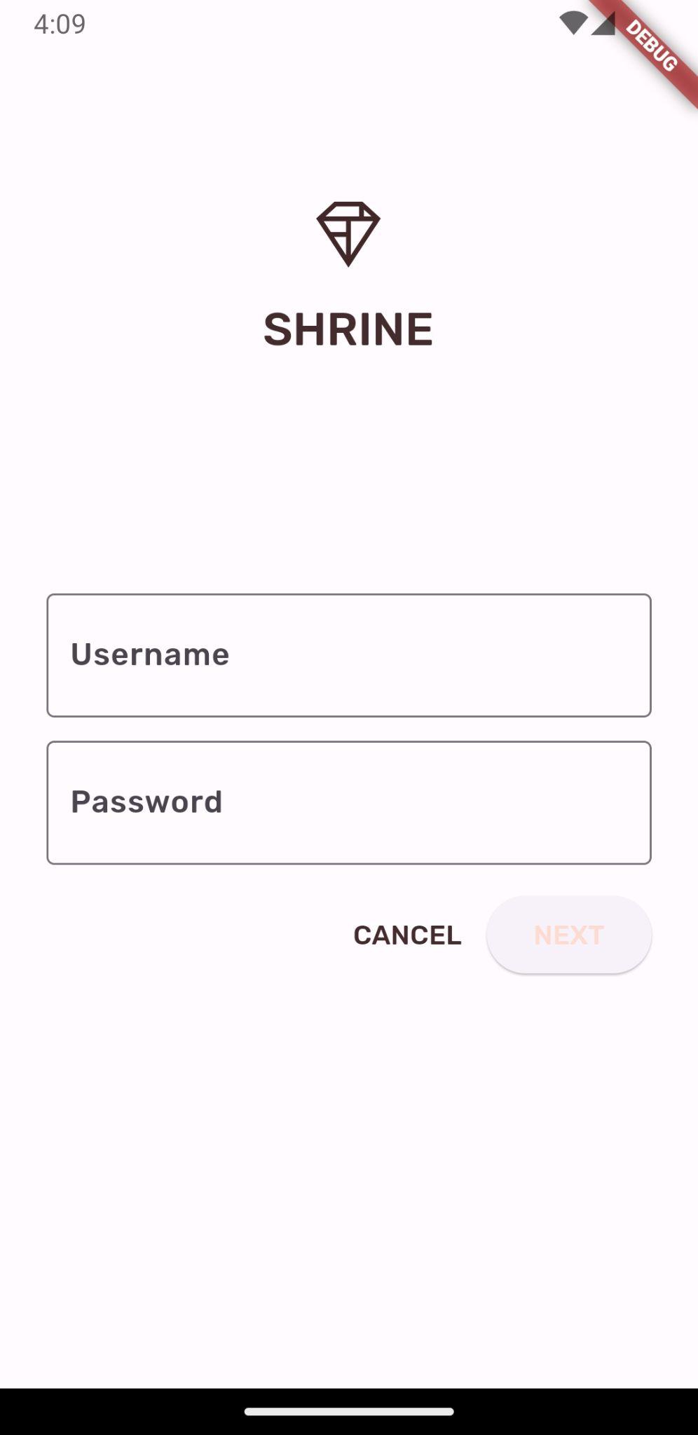
আপনার প্রজেক্টটি সেভ করুন। আপনার লগইন স্ক্রিনটি এখন দেখতে এইরকম হবে:
অ্যান্ড্রয়েড | আইওএস |
|
|
৫. টাইপোগ্রাফি এবং লেবেল শৈলী পরিবর্তন করুন
রঙ পরিবর্তনের পাশাপাশি, ডিজাইনার আমাদের ব্যবহারের জন্য নির্দিষ্ট টাইপোগ্রাফিও দিয়েছেন। ফ্লাটারের থিমডেটা-তে ৩টি টেক্সট থিম রয়েছে। প্রতিটি টেক্সট থিম হলো বিভিন্ন টেক্সট স্টাইলের একটি সংগ্রহ, যেমন 'হেডলাইন' এবং 'টাইটেল'। আমরা আমাদের অ্যাপের জন্য কয়েকটি স্টাইল ব্যবহার করব এবং কিছু ভ্যালু পরিবর্তন করব।
টেক্সট থিম কাস্টমাইজ করুন
প্রজেক্টে ফন্ট ইম্পোর্ট করতে হলে, সেগুলোকে pubspec.yaml ফাইলে যোগ করতে হবে।
pubspec.yaml ফাইলে, flutter: ট্যাগের ঠিক পরেই নিম্নলিখিতটি যোগ করুন:
  # TODO: Insert Fonts (103)
  fonts:
    - family: Rubik
      fonts:
        - asset: fonts/Rubik-Regular.ttf
        - asset: fonts/Rubik-Medium.ttf
          weight: 500
এখন আপনি রুবিক ফন্টটি অ্যাক্সেস এবং ব্যবহার করতে পারবেন।
pubspec ফাইলের সমস্যা সমাধান
আপনি যদি উপরের ডিক্লারেশনটি কাট এবং পেস্ট করেন, তাহলে 'pub get' চালানোর সময় ত্রুটি দেখা দিতে পারে। যদি ত্রুটি দেখা দেয়, তাহলে প্রথমে শুরুর দিকের অতিরিক্ত স্পেস (whitespace) মুছে ফেলুন এবং সেটিকে ২-স্পেস ইনডেন্টেশন ব্যবহার করে স্পেস দিয়ে প্রতিস্থাপন করুন। (দুটি স্পেস আগে)
fonts:
, চার ঘর আগে
family: Rubik
এবং আরও অনেক কিছু।)
যদি আপনি ‘Mapping values are not allowed here’ দেখতে পান, তাহলে সমস্যাযুক্ত লাইনটির এবং তার উপরের লাইনগুলোর ইন্ডেন্টেশন পরীক্ষা করুন।
login.dart ফাইলের Column() ভিতরে নিম্নলিখিত পরিবর্তন করুন:
Column(
  children: <Widget>[
    Image.asset('assets/diamond.png'),
    const SizedBox(height: 16.0),
    Text(
      'SHRINE',
      style: Theme.of(context).textTheme.headlineSmall,
    ),
  ],
)
app.dart ফাইলে, _buildShrineTheme() এর পরে নিম্নলিখিতটি যোগ করুন:
// TODO: Build a Shrine Text Theme (103)
TextTheme _buildShrineTextTheme(TextTheme base) {
  return base
      .copyWith(
        headlineSmall: base.headlineSmall!.copyWith(
          fontWeight: FontWeight.w500,
        ),
        titleLarge: base.titleLarge!.copyWith(
          fontSize: 18.0,
        ),
        bodySmall: base.bodySmall!.copyWith(
          fontWeight: FontWeight.w400,
          fontSize: 14.0,
        ),
        bodyLarge: base.bodyLarge!.copyWith(
          fontWeight: FontWeight.w500,
          fontSize: 16.0,
        ),
      )
      .apply(
        fontFamily: 'Rubik',
        displayColor: kShrineBrown900,
        bodyColor: kShrineBrown900,
      );
}
এটি একটি টেক্সট থিম গ্রহণ করে এবং তার শিরোনাম, উপাধি ও ক্যাপশনের চেহারা পরিবর্তন করে।
এইভাবে fontFamily প্রয়োগ করলে পরিবর্তনগুলি শুধুমাত্র copyWith() (headline, title, caption)-এ নির্দিষ্ট করা টাইপোগ্রাফি স্কেল মানগুলিতেই প্রয়োগ হয়।
কিছু ফন্টের জন্য, আমরা ১০০-এর গুণিতকে একটি কাস্টম ফন্টওয়েট (fontWeight) নির্ধারণ করছি: w500 (৫০০ ওয়েট) মিডিয়াম এবং w400 রেগুলার ফন্টের সমতুল্য।
নতুন পাঠ্য বিষয়বস্তু ব্যবহার করুন
ত্রুটির পরে _buildShrineTheme এ নিম্নলিখিত থিমগুলি যোগ করুন:
// TODO: Add the text themes (103)
textTheme: _buildShrineTextTheme(base.textTheme),
textSelectionTheme: const TextSelectionThemeData(
  selectionColor: kShrinePink100,
),
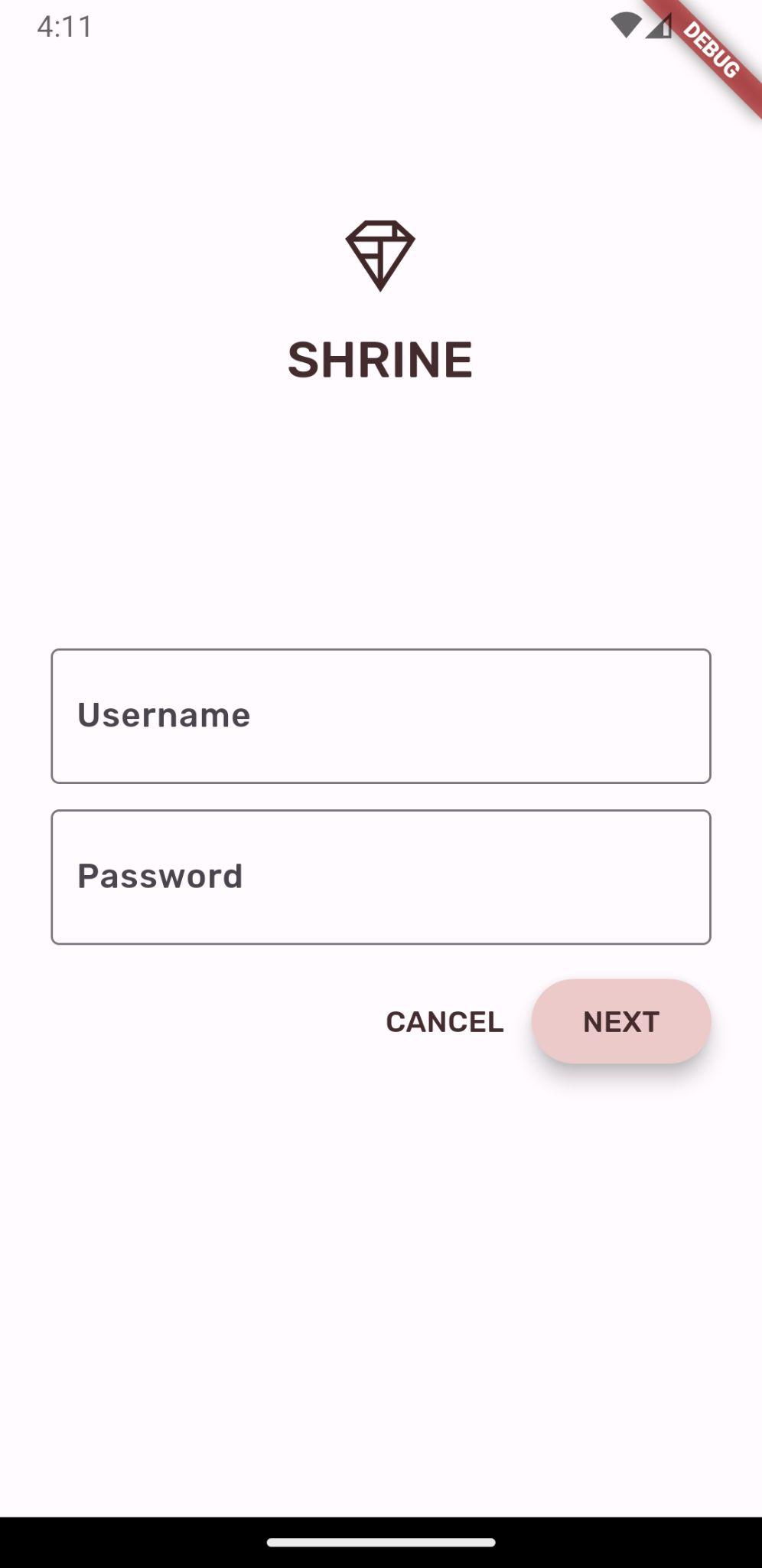
আপনার প্রজেক্টটি সেভ করুন। যেহেতু আমরা ফন্ট পরিবর্তন করেছি, তাই এবার অ্যাপটি রিস্টার্টও করুন (যা হট রিস্টার্ট নামে পরিচিত)।
অ্যান্ড্রয়েড | আইওএস |
|
|

লগইন এবং হোম স্ক্রিনের লেখাগুলো দেখতে ভিন্ন—কিছু লেখায় রুবিক ফন্ট ব্যবহার করা হয়েছে, এবং অন্য লেখাগুলো কালো বা সাদার পরিবর্তে বাদামী রঙে প্রদর্শিত হয়। আইকনগুলোও বাদামী রঙে প্রদর্শিত হয়।
লেখাটি ছোট করুন
লেবেলগুলো অনেক বড়।
home.dart ফাইলে, সবচেয়ে ভেতরের কলামের children: পরিবর্তন করুন:
// TODO: Change innermost Column (103)
children: <Widget>[
// TODO: Handle overflowing labels (103)
  Text(
    product.name,
    style: theme.textTheme.button,
    softWrap: false,
    overflow: TextOverflow.ellipsis,
    maxLines: 1,
  ),
  const SizedBox(height: 4.0),
  Text(
    formatter.format(product.price),
    style: theme.textTheme.bodySmall,
  ),
  // End new code
],
টেক্সটটি মাঝখানে আনুন এবং ছেড়ে দিন
আমরা লেবেলগুলোকে মাঝখানে রাখতে চাই এবং লেখাগুলোকে প্রতিটি ছবির নিচের পরিবর্তে প্রতিটি কার্ডের নিচে সারিবদ্ধ করতে চাই।
লেবেলগুলোকে প্রধান অক্ষের শেষে (নীচে) নিয়ে যান এবং সেগুলোকে কেন্দ্রে স্থাপন করুন::
  // TODO: Align labels to the bottom and center (103)
  mainAxisAlignment: MainAxisAlignment.end,
  crossAxisAlignment: CrossAxisAlignment.center,
আপনার প্রজেক্টটি সংরক্ষণ করুন।
অ্যান্ড্রয়েড | আইওএস |
|
|

এটা দেখতে অনেক ভালো লাগছে।
টেক্সট ফিল্ডগুলো থিম করুন
আপনি InputDecorationTheme ব্যবহার করে টেক্সট ফিল্ডের সজ্জাও থিমযুক্ত করতে পারেন।
app.dart এর _buildShrineTheme() মেথডে, একটি inputDecorationTheme: ভ্যালু নির্দিষ্ট করুন:
// TODO: Decorate the inputs (103)
inputDecorationTheme: const InputDecorationTheme(
  border: OutlineInputBorder(),
),
এই মুহূর্তে টেক্সট ফিল্ডগুলোতে একটি filled ডেকোরেশন রয়েছে। চলুন, এটি সরিয়ে ফেলি। filled সরিয়ে দিয়ে inputDecorationTheme নির্দিষ্ট করে দিলে টেক্সট ফিল্ডগুলো আউটলাইন স্টাইল পাবে।
login.dart ফাইল থেকে filled: true ভ্যালুগুলো মুছে ফেলুন:
// Remove filled: true values (103)
TextField(
  controller: _usernameController,
  decoration: const InputDecoration(
    // Removed filled: true
    labelText: 'Username',
  ),
),
const SizedBox(height: 12.0),
TextField(
  controller: _passwordController,
  decoration: const InputDecoration(
    // Removed filled: true
    labelText: 'Password',
  ),
  obscureText: true,
),
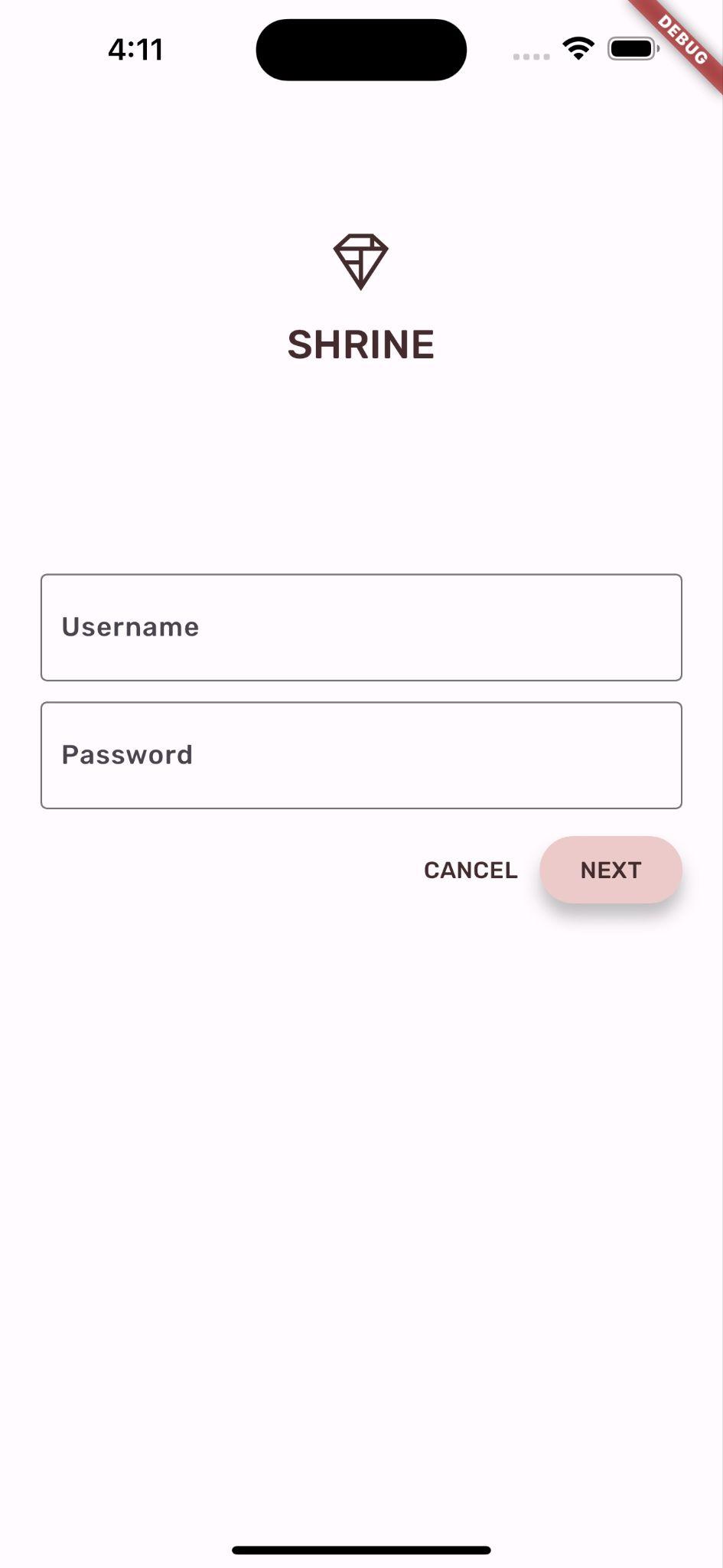
হট রিস্টার্ট। ইউজারনেম ফিল্ডটি সক্রিয় থাকা অবস্থায় (যখন আপনি এটিতে টাইপ করছেন) আপনার লগইন স্ক্রিনটি দেখতে এইরকম হবে:
অ্যান্ড্রয়েড | আইওএস |
|
|

একটি টেক্সট ফিল্ডে টাইপ করলে—বর্ডার এবং ফ্লোটিং লেবেলগুলো প্রাইমারি কালারে রেন্ডার হয়। কিন্তু আমরা তা খুব সহজে দেখতে পাই না। যাদের যথেষ্ট উচ্চ কালার কনট্রাস্ট নেই এমন পিক্সেল আলাদা করতে সমস্যা হয়, তাদের জন্য এটি অ্যাক্সেসযোগ্য নয়। (আরও তথ্যের জন্য, ম্যাটেরিয়াল গাইডলাইনস-এর কালার অ্যান্ড অ্যাক্সেসিবিলিটি আর্টিকেলটি দেখুন।)
app.dart ফাইলে, inputDecorationTheme: এর অধীনে একটি focusedBorder: নির্দিষ্ট করুন।
// TODO: Decorate the inputs (103)
inputDecorationTheme: const InputDecorationTheme(
  border: OutlineInputBorder(),
  focusedBorder: OutlineInputBorder(
    borderSide: BorderSide(
      width: 2.0,
      color: kShrineBrown900,
    ),
  ),
),
এরপরে, inputDecorationTheme: এর অধীনে একটি floatingLabelStyle: নির্দিষ্ট করুন।
// TODO: Decorate the inputs (103)
inputDecorationTheme: const InputDecorationTheme(
  border: OutlineInputBorder(),
  focusedBorder: OutlineInputBorder(
    borderSide: BorderSide(
      width: 2.0,
      color: kShrineBrown900,
    ),
  ),
  floatingLabelStyle: TextStyle(
    color: kShrineBrown900,
  ),
),
সবশেষে, আরও বেশি কনট্রাস্টের জন্য ক্যানসেল বাটনটিতে প্রাইমারি রঙের পরিবর্তে সেকেন্ডারি রঙ ব্যবহার করা যাক।
TextButton(
  child: const Text('CANCEL'),
  onPressed: () {
    _usernameController.clear();
    _passwordController.clear();
  },
  style: TextButton.styleFrom(
    primary: Theme.of(context).colorScheme.secondary,
  ),
),
আপনার প্রজেক্টটি সংরক্ষণ করুন।
অ্যান্ড্রয়েড | আইওএস |
|
|

৬. উচ্চতা সমন্বয় করুন
এখন যেহেতু আপনি Shrine-এর সাথে মানানসই নির্দিষ্ট রঙ এবং টাইপোগ্রাফি দিয়ে পৃষ্ঠাটি সাজিয়ে ফেলেছেন, চলুন এবার এলিভেশন সামঞ্জস্য করা যাক।
NEXT বাটনের উচ্চতা পরিবর্তন করুন
একটি ElevatedButton এর ডিফল্ট এলিভেশন হলো 2। চলুন এটিকে আরও বাড়িয়ে দিই।
login.dart ফাইলে, NEXT ElevatedButton-এ একটি style: value যোগ করুন:
ElevatedButton(
  child: const Text('NEXT'),
  onPressed: () {
    Navigator.pop(context);
  },
  style: ElevatedButton.styleFrom(
    foregroundColor: kShrineBrown900,
    backgroundColor: kShrinePink100,
    elevation: 8.0,
  ),
),
আপনার প্রজেক্টটি সংরক্ষণ করুন।
অ্যান্ড্রয়েড | আইওএস |
|
|
কার্ডের উচ্চতা সামঞ্জস্য করুন
এই মুহূর্তে, কার্ডগুলো সাইটের নেভিগেশনের পাশে একটি সাদা পৃষ্ঠের উপর রাখা আছে।
home.dart ফাইলে, Cards-এ elevation: ভ্যালুটি যোগ করুন:
// TODO: Adjust card heights (103)
elevation: 0.0,
প্রকল্পটি সংরক্ষণ করুন।
অ্যান্ড্রয়েড | আইওএস |
|
|


তুমি কার্ডগুলোর নিচের ছায়াটা সরিয়ে দিয়েছ।
৭. আকৃতি যোগ করুন
Shrine-এর একটি চমৎকার জ্যামিতিক শৈলী রয়েছে, যা অষ্টভুজ বা আয়তক্ষেত্রাকার আকৃতি দিয়ে এর উপাদানগুলোকে সংজ্ঞায়িত করে। চলুন, হোম স্ক্রিনের কার্ডগুলোতে এবং লগইন স্ক্রিনের টেক্সট ফিল্ড ও বাটনগুলোতে এই আকৃতির স্টাইলিংটি প্রয়োগ করি।
লগইন স্ক্রিনে টেক্সট ফিল্ডের আকার পরিবর্তন করুন
app.dart ফাইলে নিম্নলিখিত ফাইলটি ইম্পোর্ট করুন:
import 'supplemental/cut_corners_border.dart';
এখন app.dart ফাইলে, কাট কর্নার বর্ডার ব্যবহার করার জন্য টেক্সট ফিল্ডের ডেকোরেশন থিমটি পরিবর্তন করুন:
// TODO: Decorate the inputs (103)
inputDecorationTheme: const InputDecorationTheme(
  border: CutCornersBorder(),
  focusedBorder: CutCornersBorder(
    borderSide: BorderSide(
      width: 2.0,
      color: kShrineBrown900,
    ),
  ),
  floatingLabelStyle: TextStyle(
    color: kShrineBrown900,
  ),
),
লগইন স্ক্রিনে বাটনের আকৃতি পরিবর্তন করুন
login.dart ফাইলে, CANCEL বাটনে একটি বেভেলড আয়তাকার বর্ডার যোগ করুন:
TextButton(
  child: const Text('CANCEL'),
  onPressed: () {
    _usernameController.clear();
    _passwordController.clear();
  },
  style: TextButton.styleFrom(
    foregroundColor: kShrineBrown900,
    shape: const BeveledRectangleBorder(
      borderRadius: BorderRadius.all(Radius.circular(7.0)),
    ),
  ),
),
টেক্সটবাটনের কোনো দৃশ্যমান আকৃতি নেই, তাহলে বর্ডার আকৃতি যোগ করার কারণ কী? যাতে স্পর্শ করলে রিপল অ্যানিমেশনটি একই আকৃতির সাথে আবদ্ধ থাকে।
এখন NEXT বাটনে একই আকৃতিটি যোগ করুন:
ElevatedButton(
  child: const Text('NEXT'),
  onPressed: () {
    Navigator.pop(context);
  },
  style: ElevatedButton.styleFrom(
    foregroundColor: kShrineBrown900,
    backgroundColor: kShrinePink100,
    elevation: 8.0,
    shape: const BeveledRectangleBorder(
      borderRadius: BorderRadius.all(Radius.circular(7.0)),
    ),
  ),
),
সবগুলো বাটনের আকৃতি পরিবর্তন করতে আমরা app.dart এ elevatedButtonTheme অথবা textButtonTheme ও ব্যবহার করতে পারি। এটি শিক্ষার্থীর জন্য একটি চ্যালেঞ্জ হিসেবে রেখে দেওয়া হলো!
হট রিস্টার্ট।
অ্যান্ড্রয়েড | আইওএস |
|
|
৮. লেআউট পরিবর্তন করুন
এরপর, কার্ডগুলোকে বিভিন্ন আকৃতি ও অনুপাতে দেখানোর জন্য লেআউটটি পরিবর্তন করা যাক, যাতে প্রতিটি কার্ড অন্যগুলো থেকে স্বতন্ত্র দেখায়।
GridView-কে AsymmetricView দিয়ে প্রতিস্থাপন করুন
আমরা ইতিমধ্যেই একটি অপ্রতিসম বিন্যাসের জন্য ফাইলগুলো লিখে ফেলেছি।
home.dart ফাইলে নিম্নলিখিত ইম্পোর্টটি যোগ করুন:
import 'supplemental/asymmetric_view.dart';
_buildGridCards মুছে ফেলুন এবং body প্রতিস্থাপন করুন :
body: AsymmetricView(
  products: ProductsRepository.loadProducts(Category.all),
),
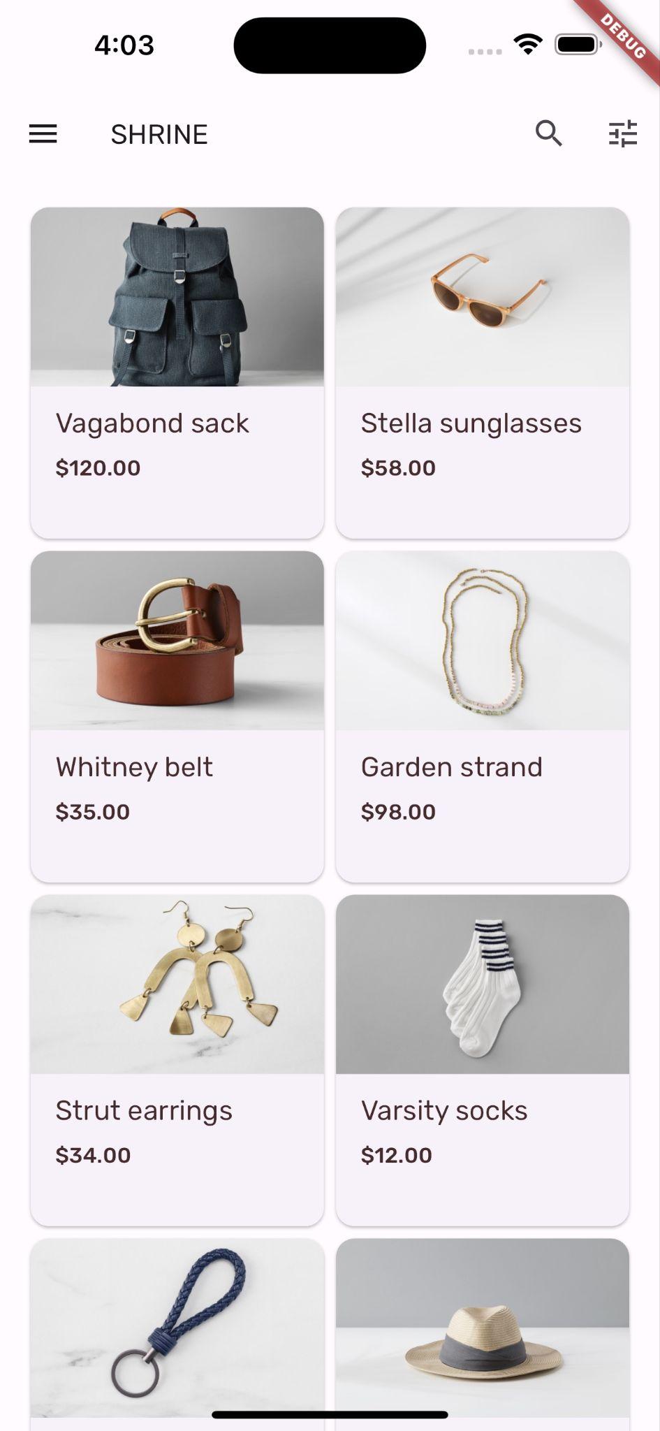
প্রকল্পটি সংরক্ষণ করুন।
অ্যান্ড্রয়েড | আইওএস |
|
|
এখন পণ্যগুলো বুনন-অনুপ্রাণিত নকশায় আনুভূমিকভাবে স্ক্রল করে।
৯. অন্য একটি থিম ব্যবহার করে দেখুন (ঐচ্ছিক)
আপনার ব্র্যান্ডকে প্রকাশ করার জন্য রঙ একটি শক্তিশালী মাধ্যম, এবং রঙের সামান্য পরিবর্তন আপনার ব্যবহারকারীর অভিজ্ঞতার উপর বড় প্রভাব ফেলতে পারে। এটি পরীক্ষা করার জন্য, চলুন দেখি ব্র্যান্ডটির রঙের বিন্যাস সামান্য ভিন্ন হলে Shrine-কে কেমন দেখাবে।
রং পরিবর্তন করুন
colors.dart ফাইলে নিম্নলিখিত রঙটি যোগ করুন:
const kShrinePurple = Color(0xFF5D1049);
app.dart ফাইলে _buildShrineTheme() ফাংশনটি নিচের মতো করে পরিবর্তন করুন:
ThemeData _buildShrineTheme() {
  final ThemeData base = ThemeData.light();
  return base.copyWith(
    colorScheme: base.colorScheme.copyWith(
      primary: kShrinePurple,
      secondary: kShrinePurple,
      error: kShrineErrorRed,
    ),
    scaffoldBackgroundColor: kShrineSurfaceWhite,
    textSelectionTheme: const TextSelectionThemeData(
      selectionColor: kShrinePurple,
    ),
    appBarTheme: const AppBarTheme(
      foregroundColor: kShrineBrown900,
      backgroundColor: kShrinePink100,
    ),

    inputDecorationTheme: const InputDecorationTheme(
      border: CutCornersBorder(),
      focusedBorder: CutCornersBorder(
        borderSide: BorderSide(
          width: 2.0,
          color: kShrinePurple,
        ),
      ),
      floatingLabelStyle: TextStyle(
        color: kShrinePurple,
      ),
    ),
  );
}
হট রিস্টার্ট করুন। নতুন থিমটি এখন দেখা যাবে।
অ্যান্ড্রয়েড | আইওএস |
|
|
অ্যান্ড্রয়েড | আইওএস |
|
|
ফলাফলটা একদম ভিন্ন! চলুন app.dart's _buildShrineTheme এই ধাপের আগের অবস্থায় ফিরিয়ে নিয়ে যাই। অথবা 104-এর স্টার্টার কোড ডাউনলোড করুন।
১০. অভিনন্দন!
এতক্ষণে আপনি এমন একটি অ্যাপ তৈরি করে ফেলেছেন যা আপনার ডিজাইনারের দেওয়া ডিজাইন স্পেসিফিকেশনের অনুরূপ।
পরবর্তী পদক্ষেপ
আপনি এখন ম্যাটেরিয়াল ফ্লাটারের থিম, টাইপোগ্রাফি, এলিভেশন এবং শেপ ব্যবহার করেছেন। আপনি ম্যাটেরিয়াল ফ্লাটার লাইব্রেরিতে আরও কম্পোনেন্ট এবং সাবসিস্টেম অন্বেষণ করতে পারেন।
আমরা কীভাবে অনুভূমিকভাবে স্ক্রোলিং ও অপ্রতিসম লেআউট গ্রিডটি তৈরি করেছি, তা জানতে supplemental ডিরেক্টরির ফাইলগুলো খতিয়ে দেখুন।
আপনার পরিকল্পিত অ্যাপ ডিজাইনে যদি এমন কোনো উপাদান থাকে যার কম্পোনেন্ট লাইব্রেরিতে নেই, তাহলে কী হবে? MDC-104: Material Advanced Components কোর্সে আমরা দেখাই, কীভাবে Material Flutter লাইব্রেরি ব্যবহার করে কাস্টম কম্পোনেন্ট তৈরি করে কাঙ্ক্ষিত রূপ দেওয়া যায়।