
1. Introduction
Last Updated: 09/21/21
Apps can take on an array of colors from baseline schemes, user generated dynamic colors, or brand colors.
Get ready to dive into the new dynamic color features introduced with Material You. In this lab, you'll create dynamic color palettes to learn how the color system works, the driving concepts that create accessible color palettes, and methods to help visualize your app with dynamic color using the latest design tools.
What you'll learn
- What's new in Material Design color
- How to apply user-generated color to your app
- Tools to help
Prerequisites
For this lab we'll be building on some foundational design concepts.
- Knowledge of foundational design concepts: color palettes
- Knowledge of current Android color schemes and roles
- Knowledge of Figma
What you'll need
2. Get started
Setup
To get started you'll need to access the Designlab Figma file. Everything you need for the lab is in the Figma file. You can either download and import the file or duplicate it from the Figma community.
First, sign into Figma or create an account.
Duplicate from Figma Community
Navigate to the Visualizing dynamic color in your app with Material Design file or search for Visualizing dynamic color in your app with Material Design within Figma Community. Click Duplicate in the top right corner to copy the file into your files.
File Layout
Look around the file. You'll notice that the file is self contained, starting with an introduction. Each section is divided into a row of artboards that are linked together, with some core concepts for the section followed by exercises. The sections and exercises build on each other, so they should be completed sequentially.
This codelab will guide you through those concepts and exercises in greater detail. I suggest reading along with the codelab to learn more about the new Material You features.
Starting with the Intro artboard, there are buttons that link the artboards together in order, access the link by clicking on the button.

Install the Figma plugin
This codelab relies heavily on a new Figma Plugin to generate dynamic color schemes and tokens. Install the Figma Plugin directly from the Figma community page or search for "Material Theme Builder" in the Figma Community.

3. Color concepts
What is Dynamic color?
Material You reimagines color as a more individualized experience. Through dynamic color extraction, the range of possible color experiences is significantly broader.
Dynamic color is a key part of Material You in which an algorithm derives custom colors from a user's wallpaper to be applied to their apps and system UI.
Luminance
Dynamic color is built to work across unpredictable contexts. To manage contrast ratios in various viewing contexts, luminance levels are the key attribute that allow colors to combine successfully even without the product team testing each specific color combination.
Elements with similar luminance will not have appropriate contrast for legibility, while elements with different luminance values will be more distinguishable.
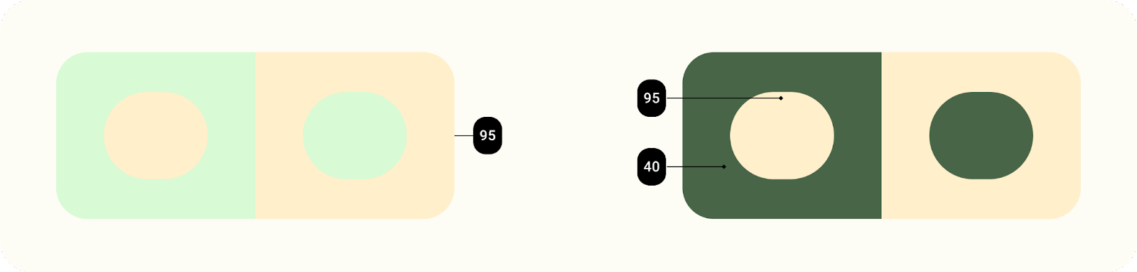
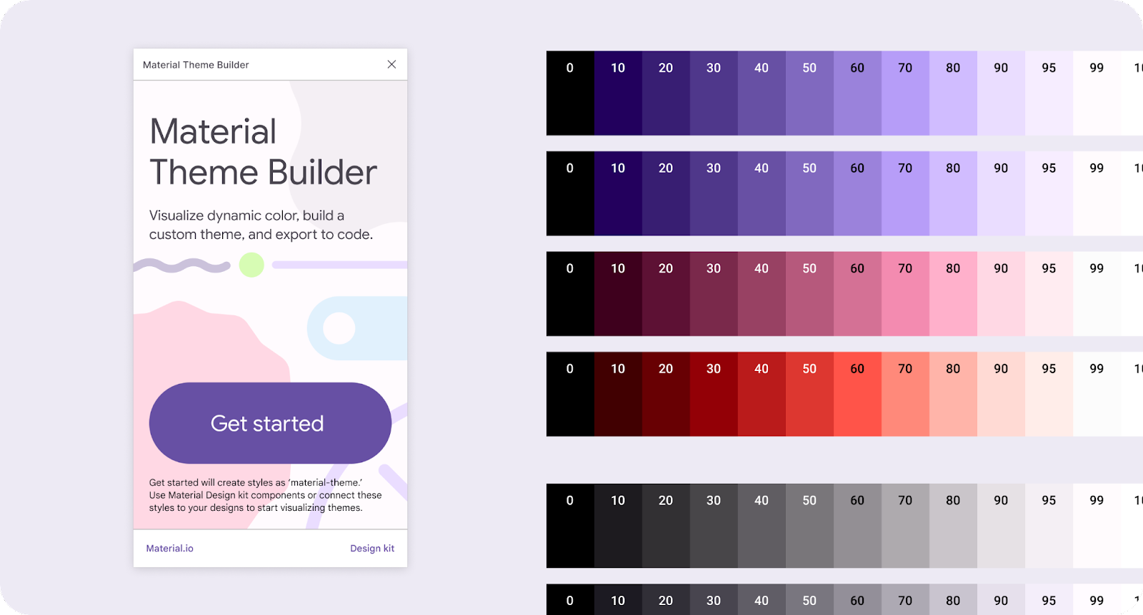
Tonal palettes
A tonal palette is a translation of one hue (a dynamic extracted color) into a spectrum of related tones. The translation of a color into thirteen tones enables a group of tonal ranges, called a tonal palette, to be applied in different contexts, from individual elements inside a component to entire app themes.
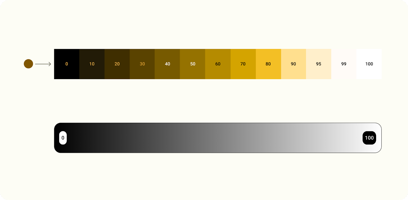
Color translated into a tonal range.
4. Extracting colors
Seed to scheme
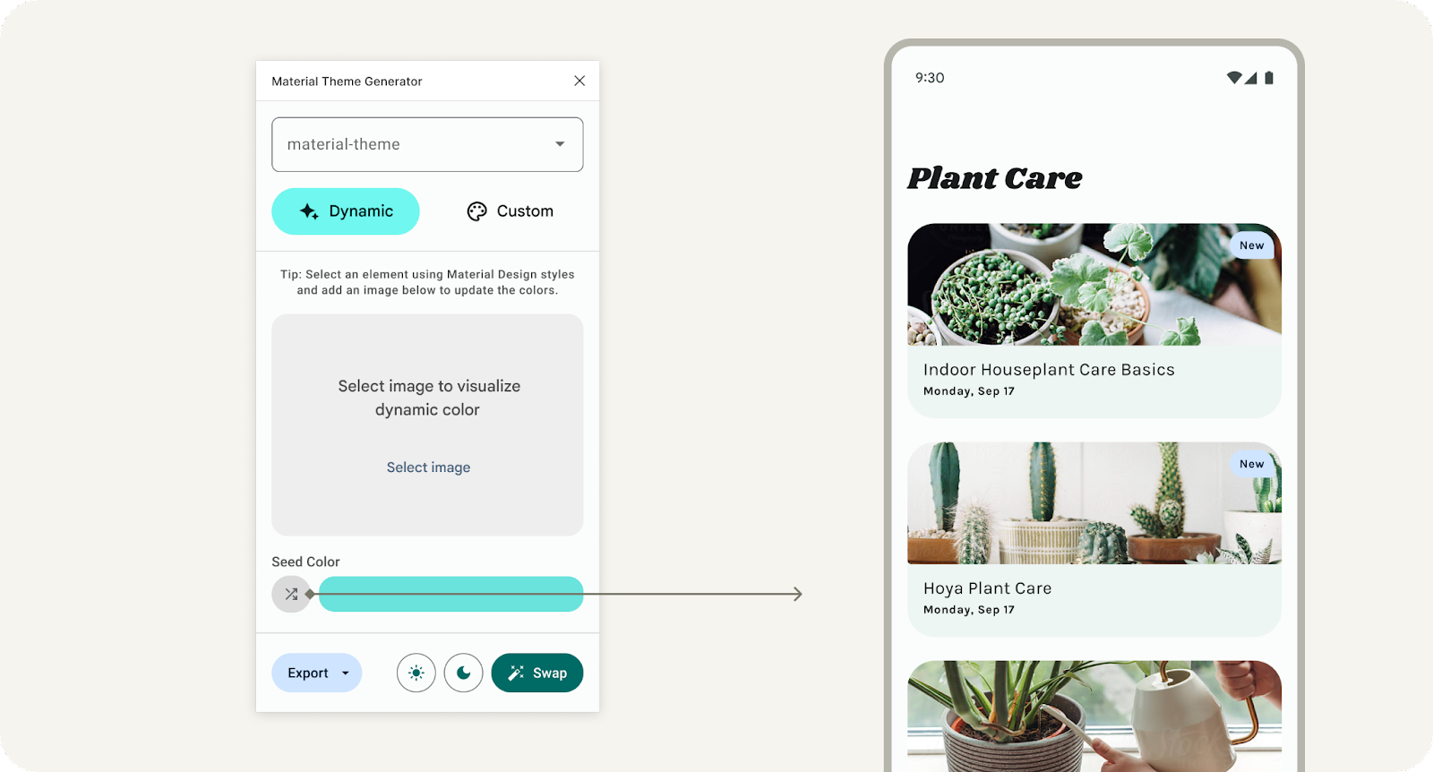
Let's see how dynamic color works with the Material Theme Builder.
- Open the Material Theme Builder. With dynamic selected, drop in an image or select one from the file browser. Notice the seed color will update based on the image.
- Color values are extracted from a wallpaper and assigned a "type" which determines how the color will relate to other colors in a scheme. These "key colors" (to the right) have been updated to reflect these values.
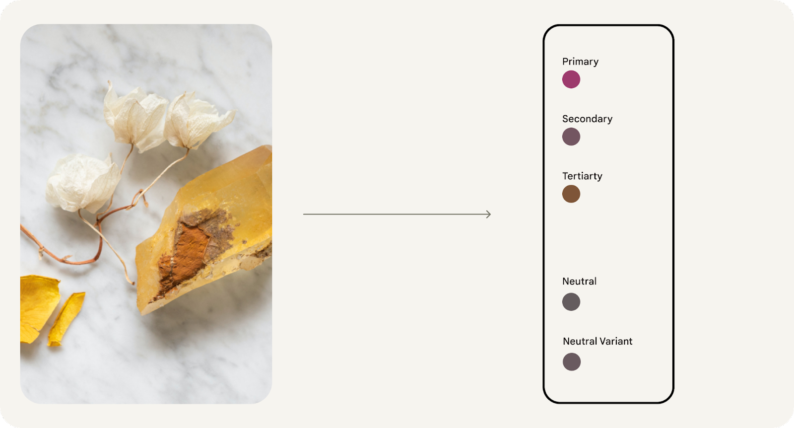
- They are then translated into luminance-based tonal palettes, generating five color ranges with tones from light to dark. The tonal palettes are labeled as such in the color output.
- From the five tonal ranges, specific tones (based on luminance) are slotted into the predefined roles that comprise a scheme. Colors are mapped to a scheme through design tokens.

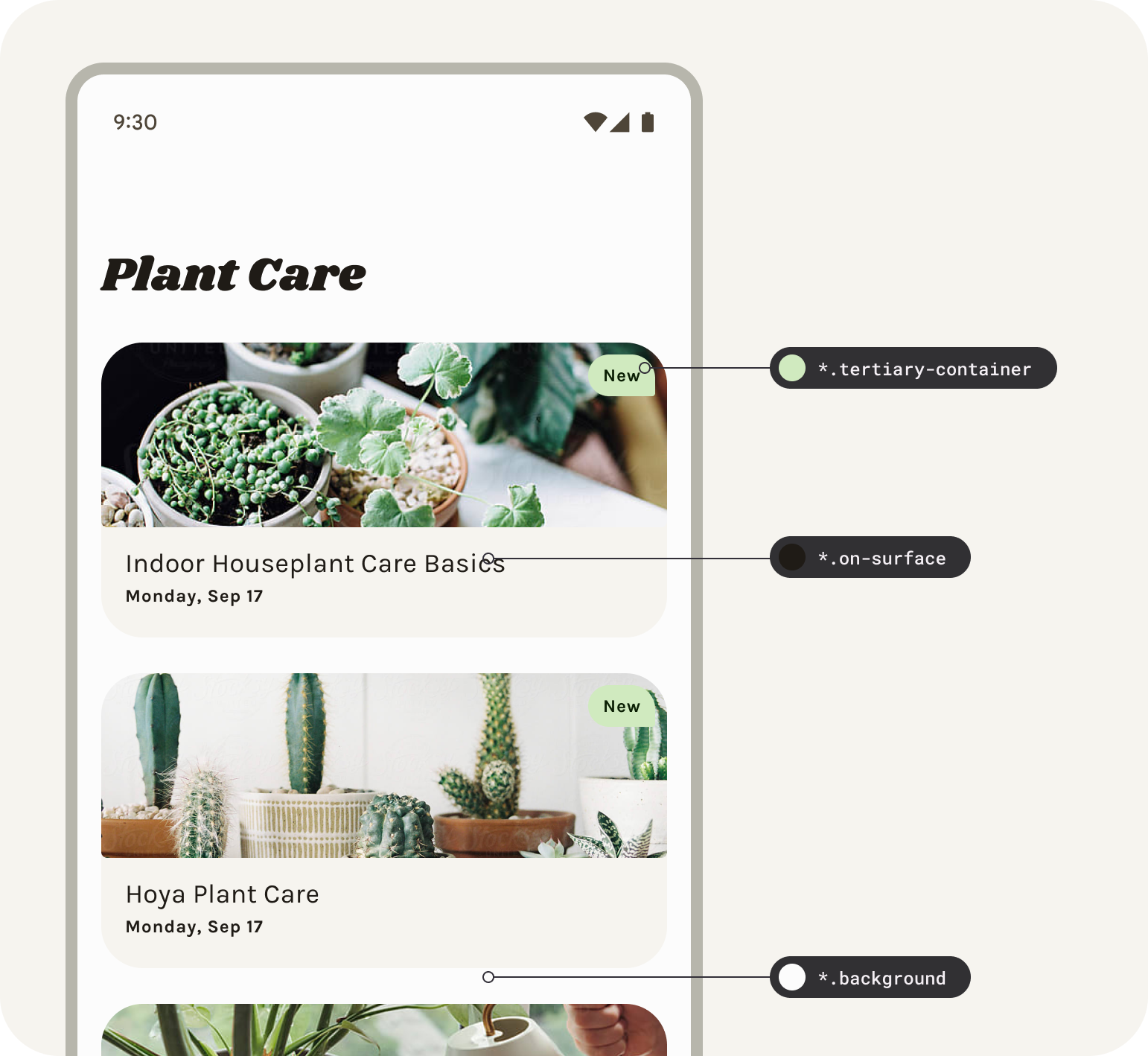
Tertiary color roles created from a tertiary tonal range and mapped to components.
5. Themes and tokens
Design tokens enable flexibility and consistency across a product by allowing designers to, for instance, assign an element's color role in a UI, rather than a set value. Tokens act as a bridge between an element's assigned role and the chosen color value for a role. Designing for a color's role rather than the specific color is more fundamental with the introduction of dynamic color.
Themes contain Material Design tokens for both color and type, ensuring that designs and code have one source of truth to represent the baseline, along with user generated palettes and custom values.
In Figma, the plugin generates these tokens as styles, meaning if using the generated styles you will be using the MD tokens.
Colors in a tonal palette are mapped to a light or dark scheme through design tokens.
The mapping system assigns a tone to each element in a component.
Setup tokens
To apply dynamic color to your designs we'll need to set the mockup to the tokens in the existing material-theme.
- Let's set all the tokens (Figma styles) in the layout to the right to utilize this theme by selecting the frame of the layout and clicking swap. You'll see the style prefix update in selection colors.
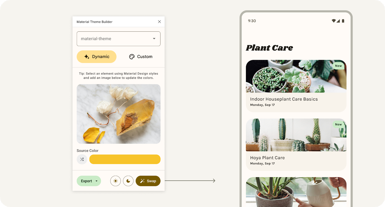
Clicking swap to update the connected theme used in the selected design.
- Now drop in an image or select one from the file browser. The mockup's values will take on the dynamic color extracted from the image.
- Click the shuffle button, this will randomize the seed color to extrapolate from instead of extracting from the image. This is another way to quickly view how dynamic color can affect your design mocks.
Clicking the shuffle button to randomize the seed color.
Opening the plugin without a theme will show a setup screen to get started. ‘Get started' will generate out the default baseline ‘material-theme' as a figma style group to connect to your mockups or use with the Material Design kit.
6. Applying to UI
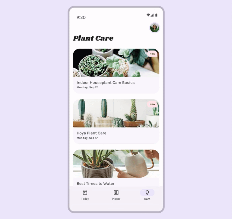
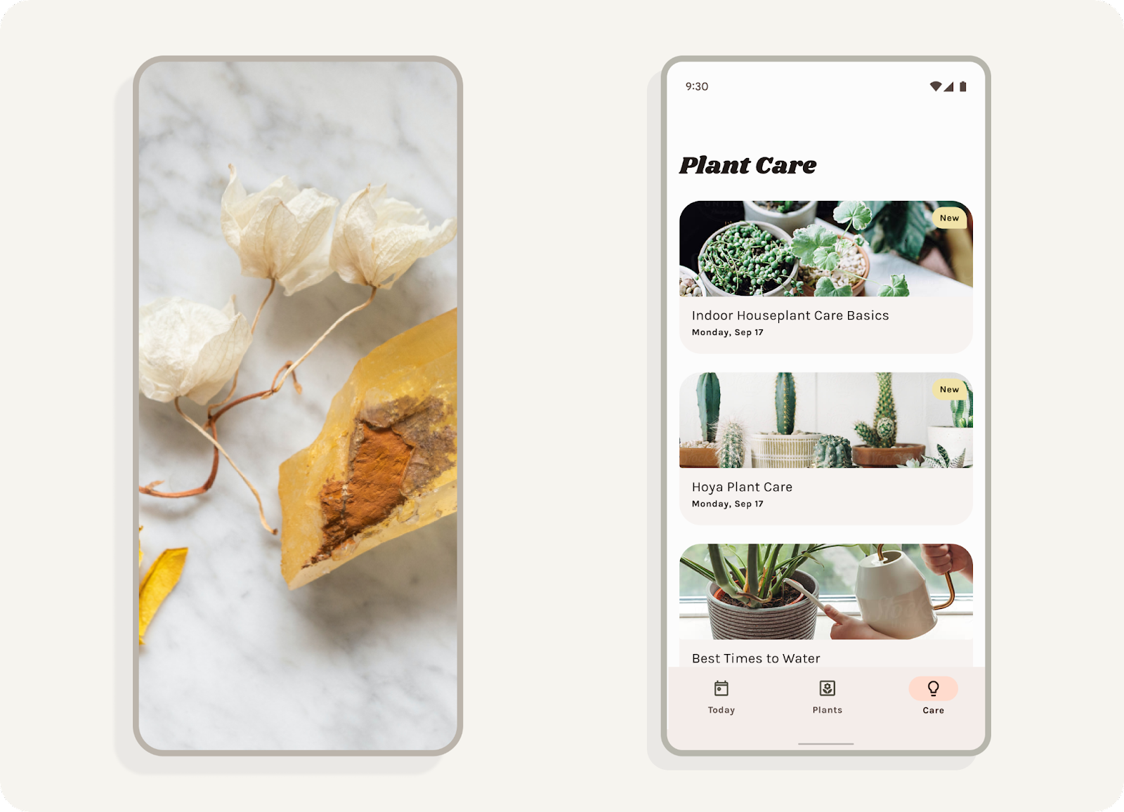
The provided layouts were created with the Material Design Kit which utilizes Material Design tokens, but there are a few custom elements that are not mapped.
- Select the article cards. In the fill, set the style (four dots icon) to material-theme/surface. (You can also search for surface).
- In a similar process, select the type in the cards and set to on-surface and checkboxes to primary.
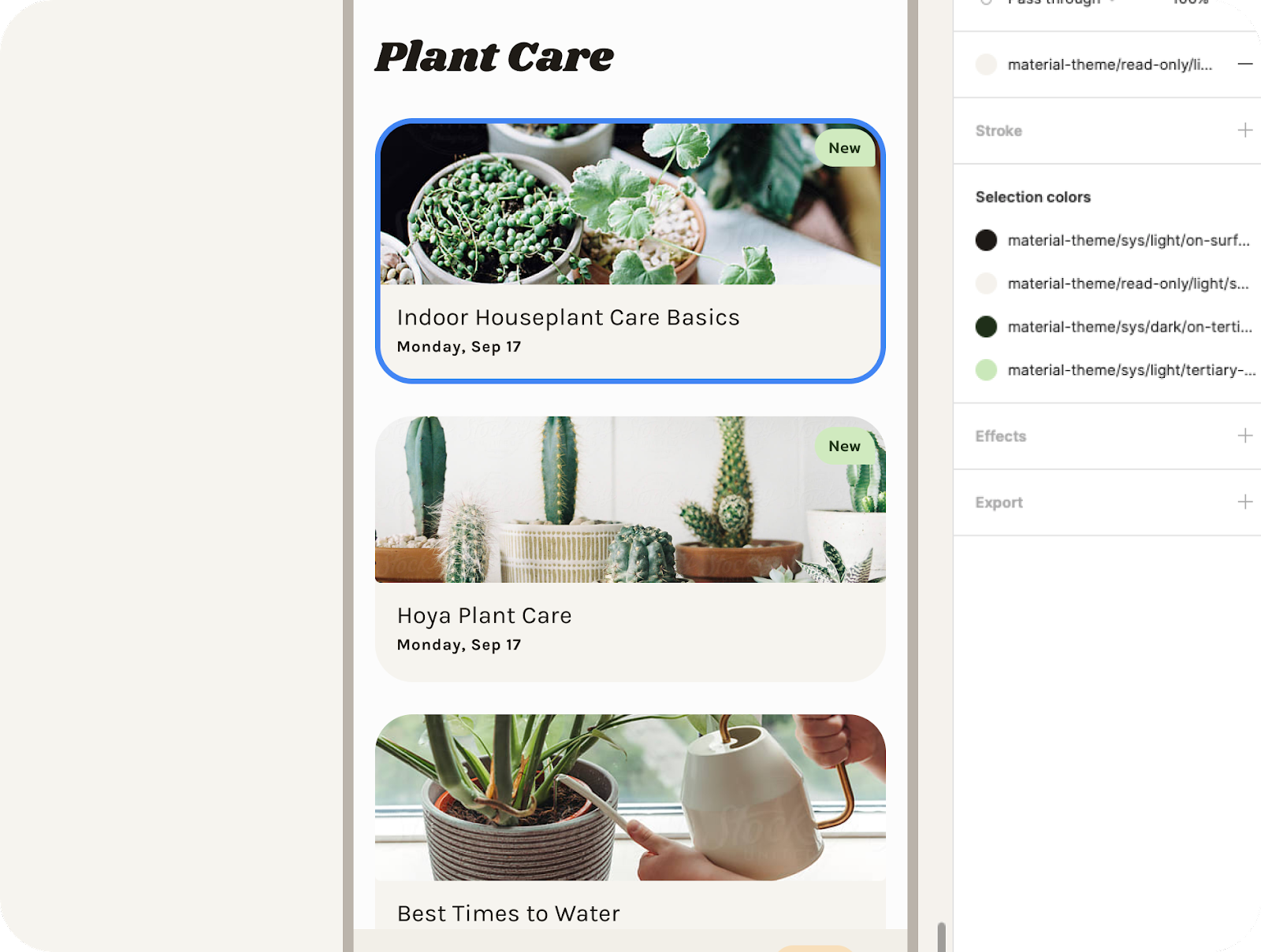
Figma styles used in the design's cards.
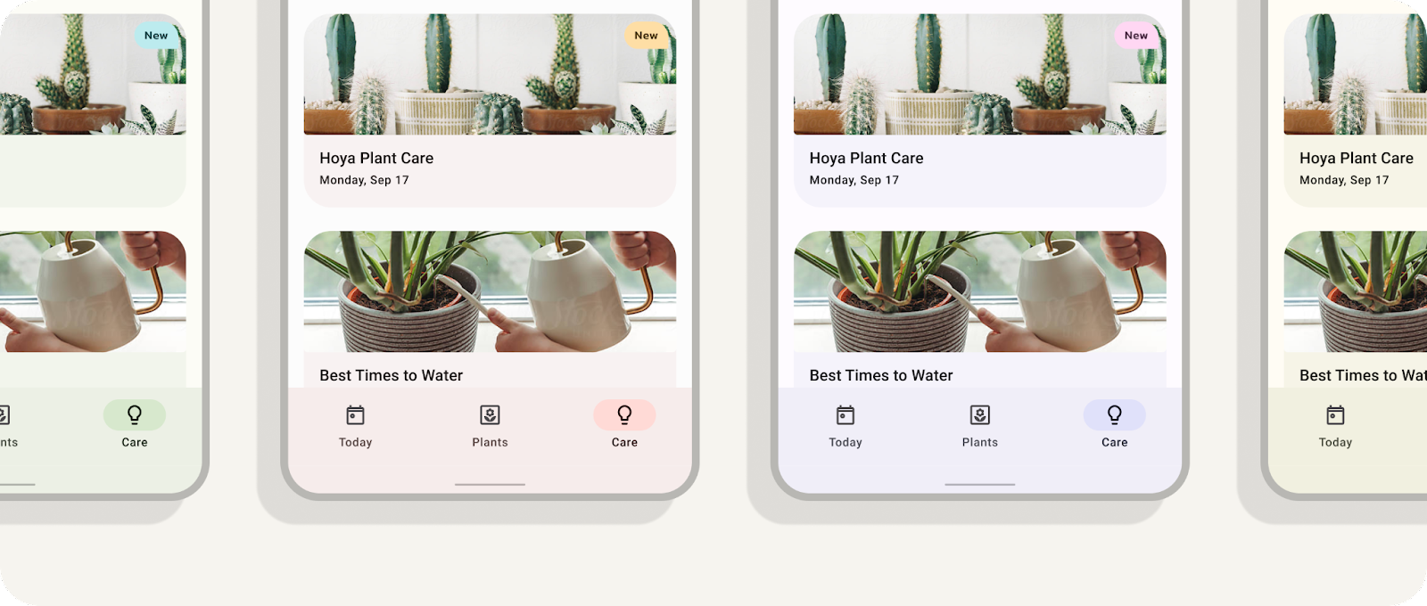
Next we'll create additional mocks to iterate through the rest of the schemes.
Create themes and iterate
We've now fully connected a mockup to visualize dynamic color, but we can also create multiple themes and swap those onto separate mockups to visualize a range of dynamic colors at once.
- In the plugin modal, click the dropdown and select ‘Add new theme.'
- Create a unique theme name and click ‘Create theme.' This will also generate new color diagrams for each theme created.
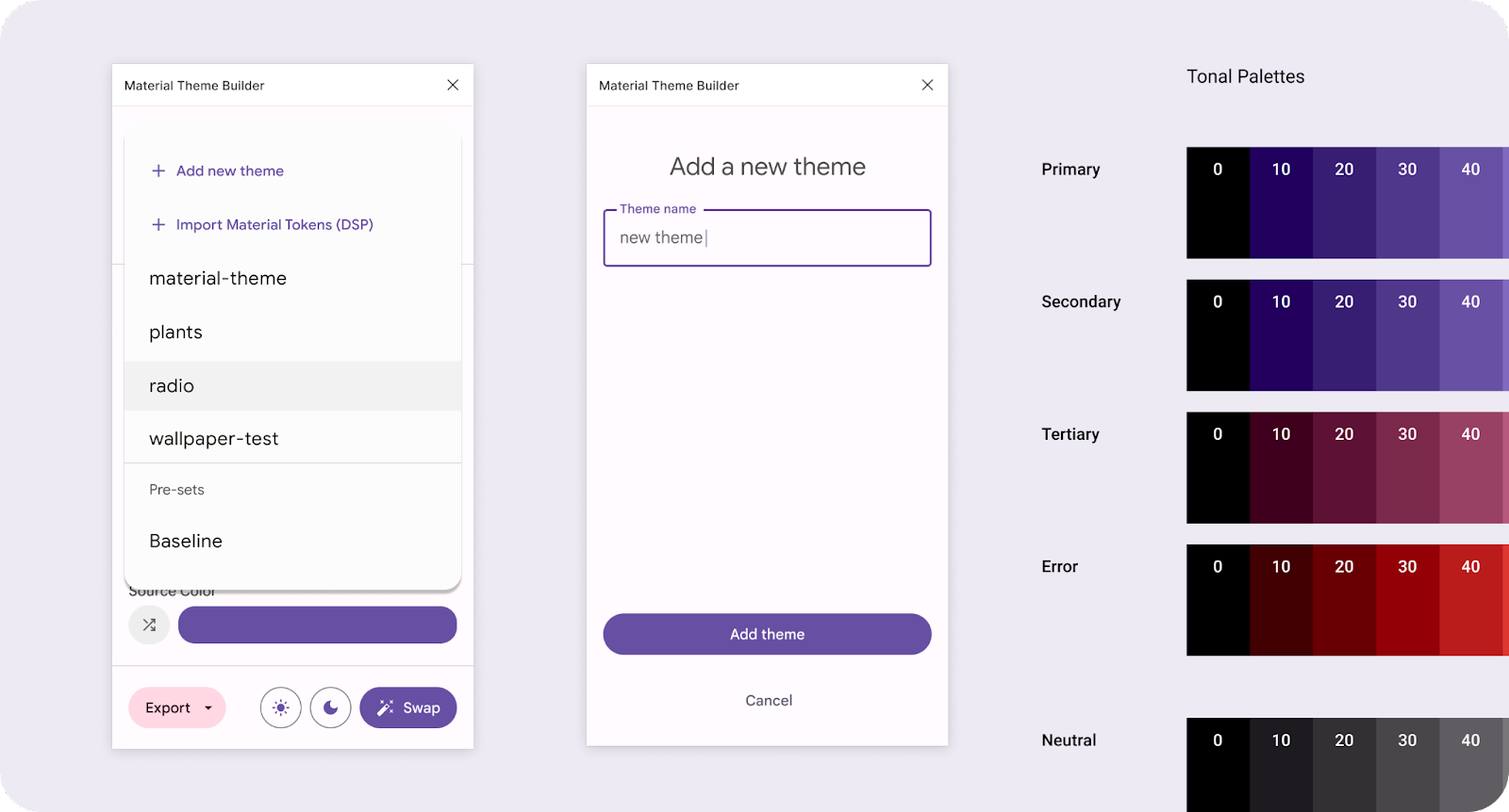
Adding a new theme through the dropdown menu.
- Add an image or shuffle the seed color.
- In the plugin modal, select a mockup (App UI component) and click swap. This will update the style values to the current theme shown in the dropdown.
- Duplicate (CMD + D) the mockup.
Clicking swap to update the connected theme used in the selected design.
- Repeat steps 1–5.
You now have multiple designs with different dynamic color iterations!
7. Congratulations
Great job on learning and applying dynamic color! The Material Theme Builder is here to help make color in Material Design easier for you by visualizing dynamic color, creating custom themes, and exporting to code.
If you've got questions, feel free to ask us any time using @MaterialDesign on Twitter.
Stay tuned for more design content and tutorials on youtube.com/MaterialDesign