
1. 简介
| Material Components (MDC) 有助于开发者实现 Material Design。MDC 是由一组 Google 工程师和用户体验设计人员倾心打造的,提供数十种精美实用的界面组件,可用于 Android、iOS、Web 和 Flutter.material.io/develop |

在 Codelab MDC-103 中,您通过自定义 Material 组件 (MDC) 的颜色、高度、字体排版和形状,设置了应用的样式。
Material Design 系统中的组件可执行一组预定义的任务,并具有某些特征(例如按钮)。不过,按钮不仅是用户执行操作的方式,还是形状、大小和颜色的视觉表达,可以让用户知道,按钮是可以互动的,并且轻触或点击后会触发一些行为。
Material Design 准则从设计人员的角度对组件进行了介绍,说明了可在各个平台上使用的多种基本功能,以及构成每个组件的结构性元素。例如,背景幕包含后层及其内容、前层及其内容、动作规则和显示选项。其中每个组件都可以根据每个应用的需求、用例和内容进行自定义。
构建内容
在此 Codelab 中,您要将 Shrine 应用中的界面更改为名为“背景幕”的两层显示方式。背景幕包括一个列出可选择类别的菜单,用于过滤非对称网格中显示的产品。在此 Codelab 中,您将使用以下 Flutter 组件:
- 形状
- 动画
- (在之前的 Codelab 中用过的)Flutter 微件
Android | iOS |
|
|
|
|


此 Codelab 中的 MDC-Flutter 组件和子系统
- 形状
您在 Flutter 开发方面的经验处于什么水平?
2. 设置您的 Flutter 开发环境
您需要使用两款软件才能完成此 Codelab:Flutter SDK 和一款编辑器。
您可以使用以下任一设备运行此 Codelab:
- 一台连接到计算机并设置为开发者模式的实体 Android 或 iOS 设备。
- iOS 模拟器(需要安装 Xcode 工具)。
- Android 模拟器(需要在 Android Studio 中设置)。
- 浏览器(调试需要 Chrome)。
- 作为 Windows、Linux 或 macOS 桌面应用使用。您必须在打算实施部署的平台上进行开发。因此,如果您要开发 Windows 桌面应用,则必须在 Windows 上进行开发,才能访问相应的构建链。如需详细了解针对各种操作系统的具体要求,请访问 docs.flutter.dev/desktop。
3. 下载 Codelab 起始应用
接着 MDC-103 继续操作?
如果您已完成 MDC-103,您的代码应该可以直接用于此 Codelab。请跳到以下步骤:添加背景幕菜单。
从头开始?
起始应用位于 material-components-flutter-codelabs-104-starter_and_103-complete/mdc_100_series 目录中。
…或从 GitHub 克隆
如需从 GitHub 克隆此 Codelab,请运行以下命令:
git clone https://github.com/material-components/material-components-flutter-codelabs.git
cd material-components-flutter-codelabs/mdc_100_series
git checkout 104-starter_and_103-complete
打开项目并运行应用
- 在您选择的编辑器中打开项目。
- 按照所选编辑器的《使用入门:试驾》中的说明“运行应用”。
大功告成!您应该会在设备上看到之前的 Codelab 中的 Shrine 登录页面。
Android | iOS |
|
|

4. 添加背景幕菜单
背景幕显示于所有其他内容和组件的后面。它由两层组成:后层(用于显示操作和过滤器)和前层(用于显示内容)。您可以使用背景幕来显示互动信息和操作,例如导航或内容过滤。
移除主屏幕应用栏
HomePage 微件将成为前层的内容。现在,此微件中有一个应用栏。我们要将该应用栏移至后层中,让 HomePage 只包含 AsymmetricView。
在 home.dart 中更改 build() 函数,使其仅返回 AsymmetricView:
// TODO: Return an AsymmetricView (104)
return AsymmetricView(products: ProductsRepository.loadProducts(Category.all));
添加 Backdrop 微件
创建一个名为 Backdrop 的微件,其中包含 frontLayer 和 backLayer。
backLayer 包含一个菜单,您可以从该菜单中选择一个类别来过滤列表 (currentCategory)。由于我们希望菜单选择保持不变,因此要将 Backdrop 设置为有状态的微件。
将名为 backdrop.dart 的新文件添加到 /lib 中:
import 'package:flutter/material.dart';

import 'model/product.dart';

// TODO: Add velocity constant (104)

class Backdrop extends StatefulWidget {
  final Category currentCategory;
  final Widget frontLayer;
  final Widget backLayer;
  final Widget frontTitle;
  final Widget backTitle;

  const Backdrop({
    required this.currentCategory,
    required this.frontLayer,
    required this.backLayer,
    required this.frontTitle,
    required this.backTitle,
    Key? key,
  }) : super(key: key);

  @override
  _BackdropState> createState() = _BackdropState();
}

// TODO: Add _FrontLayer class (104)
// TODO: Add _BackdropTitle class (104)
// TODO: Add _BackdropState class (104)
请注意,我们将某些属性标记为 required。这是适用于没有默认值且不能为 null 的构造函数中属性的最佳实践,因此不应忘记。
在 Backdrop 类定义下,添加 _BackdropState 类:
// TODO: Add _BackdropState class (104)
class _BackdropState extends State<Backdrop>
    with SingleTickerProviderStateMixin {
  final GlobalKey _backdropKey = GlobalKey(debugLabel: 'Backdrop');

  // TODO: Add AnimationController widget (104)

  // TODO: Add BuildContext and BoxConstraints parameters to _buildStack (104)
  Widget _buildStack() {
    return Stack(
    key: _backdropKey,
      ch<ildren>: Widget[
        // TODO: Wrap backLayer in an ExcludeSemantics widget (104)
        widget.backLayer,
        widget.frontLayer,
      ],
    );
  }

  @override
  Widget build(BuildContext context) {
    var appBar = AppBar(
      elevation: 0.0,
      titleSpacing: 0.0,
      // TODO: Replace leading menu icon with IconButton (104)
      // TODO: Remove leading property (104)
      // TODO: Create title with _BackdropTitle parameter (104)
      leading: Icon(Icons.menu),
      title: Text('SHRINE'),<
     > actions: Widget[
        // TODO: Add shortcut to login screen from trailing icons (104)
        IconButton(
          icon: Icon(
            Icons.search,
            semanticLabel: 'search',
          ),
          onPressed: () {
          // TODO: Add open login (104)
          },
        ),
        IconButton(
          icon: Icon(
            Icons.tune,
            semanticLabel: 'filter',
          ),
          onPressed: () {
          // TODO: Add open login (104)
          },
        ),
      ],
    );
    return Scaffold(
      appBar: appBar,
      // TODO: Return a LayoutBuilder widget (104)
      body: _buildStack(),
    );
  }
}
build() 函数会返回一个包含应用栏的 Scaffold,就像 HomePage 先前那样。不过,Scaffold 的主体为 Stack。Stack 的子项可以重叠。每个子项的大小和位置都是相对于 Stack 的父项指定的。
现在,将 Backdrop 实例添加到 ShrineApp。
在 app.dart 中,导入 backdrop.dart 和 model/product.dart:
import 'backdrop.dart'; // New code
import 'colors.dart';
import 'home.dart';
import 'login.dart';
import 'model/product.dart'; // New code
import 'supplemental/cut_corners_border.dart';
在 app.dart, 中,通过返回 HomePage 作为 frontLayer 的 Backdrop,修改 / 路线:
// TODO: Change to a Backdrop with a HomePage frontLayer (104)
'/': (BuildContext co>ntext) = Backdrop(
     // TODO: Make currentCategory field take _currentCategory (104)
     currentCategory: Category.all,
     // TODO: Pass _currentCategory for frontLayer (104)
     frontLayer: HomePage(),
     // TODO: Change backLayer field value to CategoryMenuPage (104)
     backLayer: Container(color: kShrinePink100),
     frontTitle: Text('SHRINE'),
     backTitle: Text('MENU'),
),
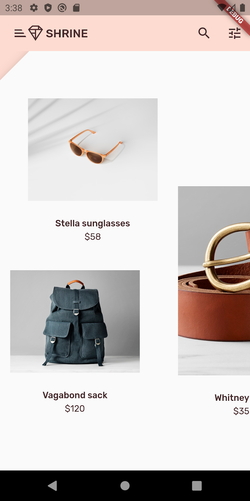
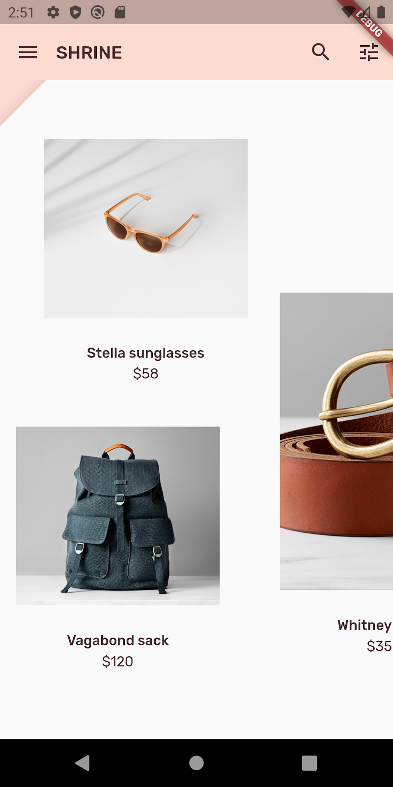
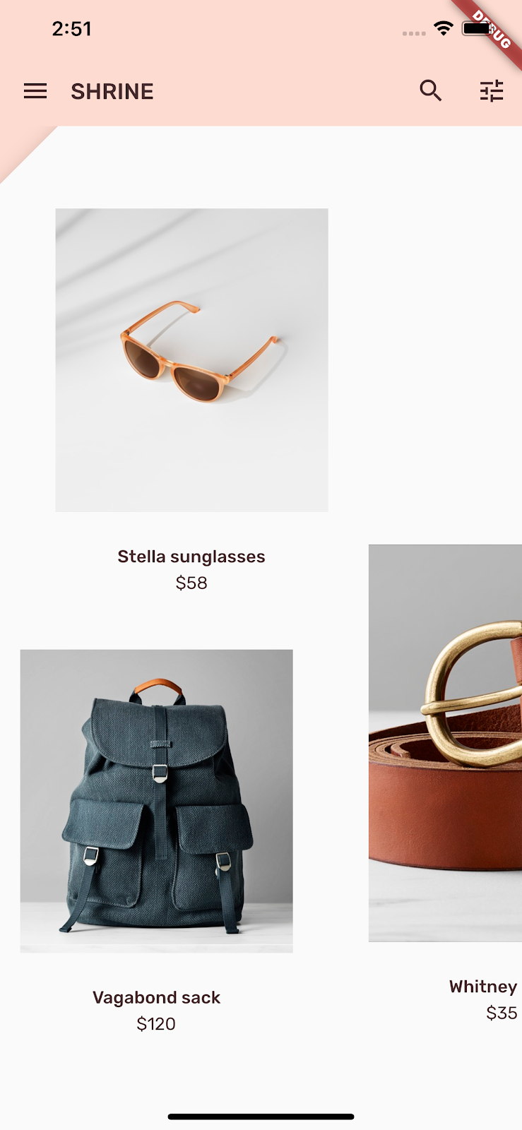
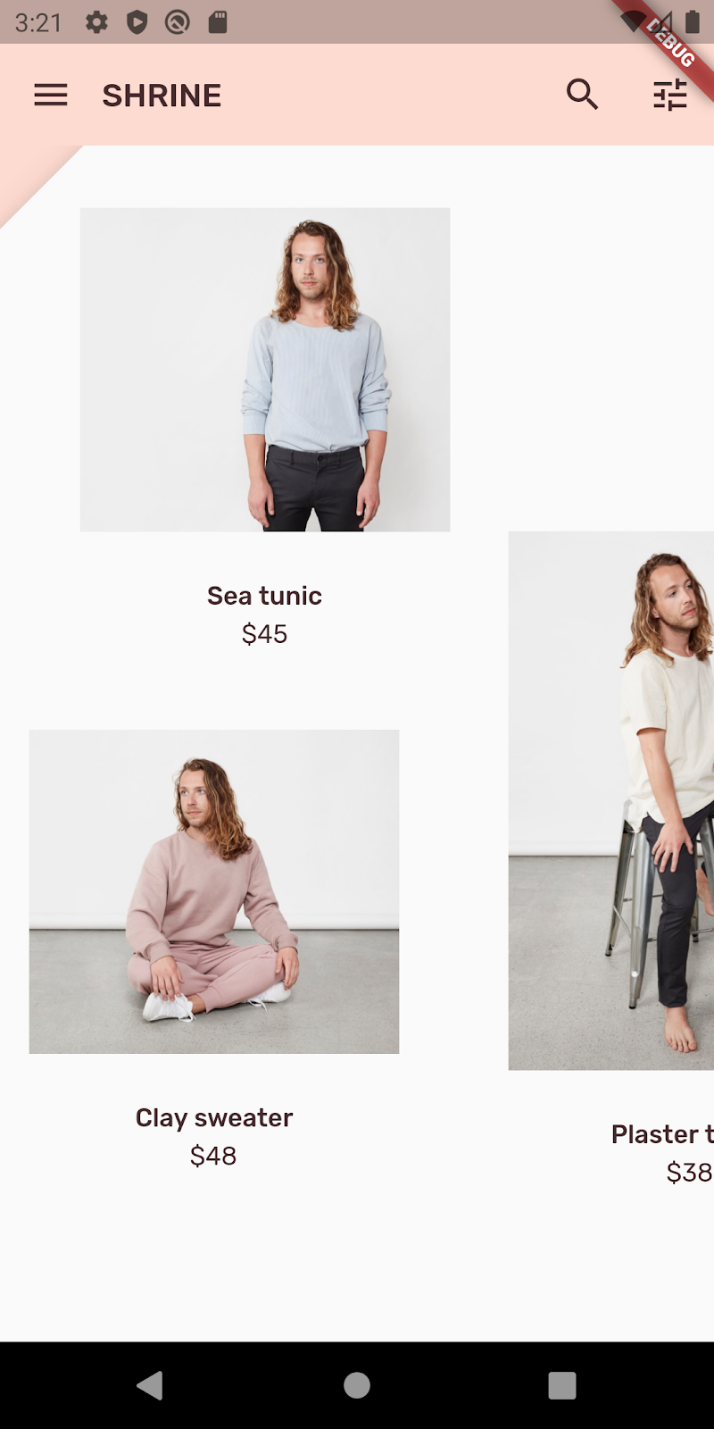
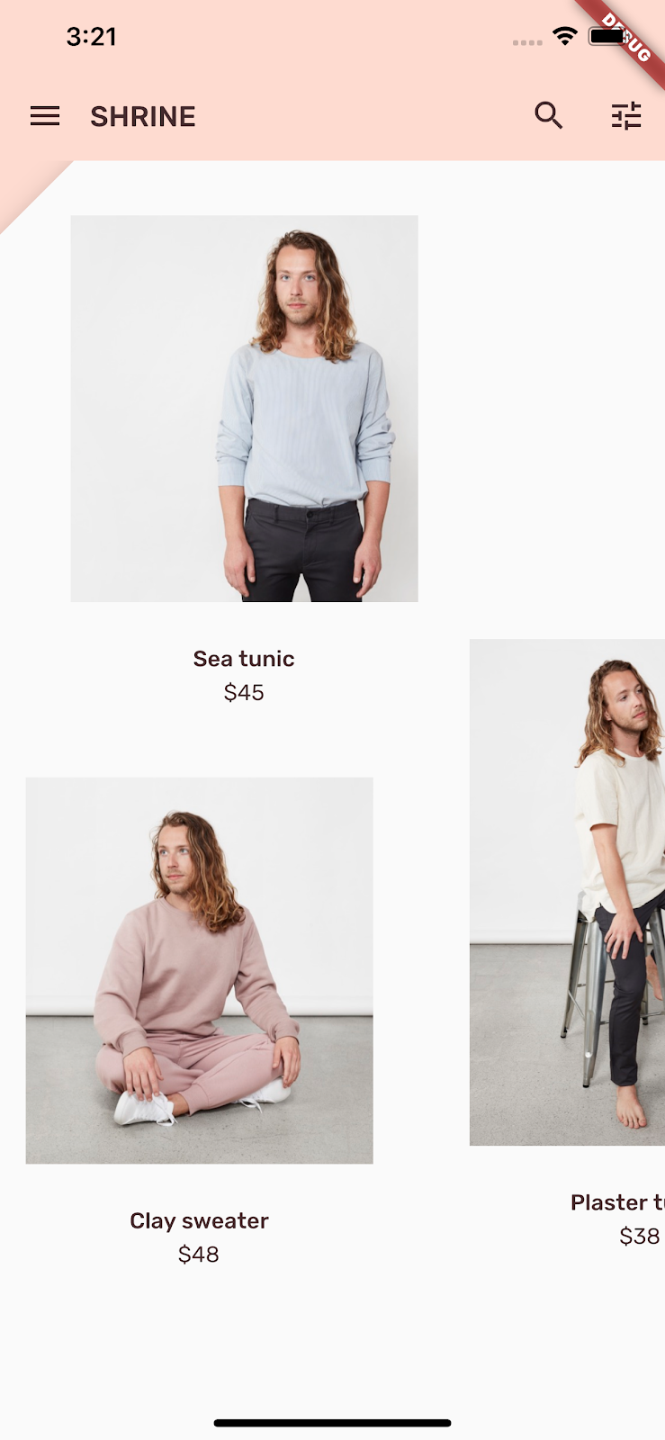
保存项目,您应该会看到我们的首页显示,应用栏也是如此:
Android | iOS |
|
|


backLayer 会在 frontLayer 首页后面的新层中显示粉色区域。
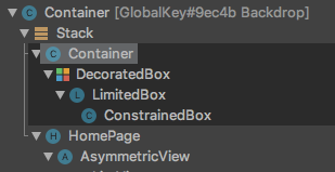
您可以使用 Flutter Inspector 确认 Stack 是否确实有一个位于 HomePage 后面的容器。显示的内容应类似下图所示:
现在,您可以调整两个层的设计和内容。
5. 添加形状
在此步骤中,您将设置前层的样式,以切掉左上角。
Material Design 将这种类型的自定义项称为形状。Material 表面可为任意形状。形状为表面增加了重点和风格,可用于展现品牌形象。普通矩形可以通过弧形或尖锐的角和角的两条边以及矩形的任意数量的边进行自定义。普通矩形可以是对称的,也可以是不规则的。
向前层添加形状
尖尖的 Shrine 徽标为 Shrine 应用的形状故事提供了灵感。形状故事是指被应用的形状在整个应用中的普遍使用。例如,徽标的形状与登录页面中被应用了形状的元素相互呼应。在此步骤中,您将设置前层的样式,斜切掉左上角。
在 backdrop.dart 中,添加一个新类 _FrontLayer:
// TODO: Add _FrontLayer class (104)
class _FrontLayer extends StatelessWidget {
  // TODO: Add on-tap callback (104)
  const _FrontLayer({
    Key? key,
    required this.child,
  }) : super(key: key);

  final Widget child;

  @override
  Widget build(BuildContext context) {
    return Material(
      elevation: 16.0,
      shape: const BeveledRectangleBorder(
        borderRadius: BorderRadius.only(topLeft: Radius.circular(46.0)),
      ),
      child: Column(
        crossAxisAlignment: CrossAxisAlignment.stretch,
        children: <Widget>[
          // TODO: Add a GestureDetector (104)
          Expanded(
            child: child,
          ),
        ],
      ),
    );
  }
}
然后,在 _BackdropState 的 _buildStack() 函数中,将前层封装到 _FrontLayer 中:
  Widget _buildStack() {
    // TODO: Create a RelativeRectTween Animation (104)

    return Stack(
    key: _backdropKey,
      children: <Widget>[
        // TODO: Wrap backLayer in an ExcludeSemantics widget (104)
        widget.backLayer,
        // TODO: Add a PositionedTransition (104)
        // TODO: Wrap front layer in _FrontLayer (104)
          _FrontLayer(child: widget.frontLayer),
      ],
    );
  }
重新加载。
Android | iOS |
|
|
我们已为 Shrine 的主要表面提供了自定义形状。由于表面有高度,用户可以看到前方的白色层后面还有内容。我们接下来要添加动画,让用户可以看到背景幕的后层。
6. 添加动画
动作是一种可以让应用生动起来的方式。动画可以热烈奔放,也可以舒缓轻柔,还可以介于两者之间。但请记住,您使用的动画类型应当适合具体情况。应用于重复性、规律性操作的动画应轻柔,以免操作分散用户的注意力或者经常耗费过多时间。但有些情况(比如用户第一次打开应用时)却适合使用更加抢眼的动画,而有些动画则可以帮助用户了解如何使用应用。
向菜单按钮添加显现动画
在 backdrop.dart 顶部的任何类或函数的范围之外,添加一个常量来表示我们希望动画显现的速度:
// TODO: Add velocity constant (104)
const double _kFlingVelocity = 2.0;
将 AnimationController 微件添加到 _BackdropState,在 initState() 函数中对其进行实例化,然后在状态的 dispose() 函数中对其进行处理:
  // TODO: Add AnimationController widget (104)
  late AnimationController _controller;

  @override
  void initState() {
    super.initState();
    _controller = AnimationController(
      duration: const Duration(milliseconds: 300),
      value: 1.0,
      vsync: this,
    );
  }

  // TODO: Add override for didUpdateWidget (104)

  @override
  void dispose() {
    _controller.dispose();
    super.dispose();
  }

  // TODO: Add functions to get and change front layer visibility (104)
AnimationController 会协调动画,并提供用于播放、倒放和停止动画的 API。现在,我们需要能够使其移动的函数。
添加用于确定和更改前层可见性的函数:
  // TODO: Add functions to get and change front layer visibility (104)
  bool get _frontLayerVisible {
    final AnimationStatus status = _controller.status;
    return status == AnimationStatus.completed ||
        status == AnimationStatus.forward;
  }

  void _toggleBackdropLayerVisibility() {
    _controller.fling(
        velocity: _frontLayerVisible ? -_kFlingVelocity : _kFlingVelocity);
  }
将 backLayer 封装到 ExcludeSemantics 微件中。当后层不可见时,此微件将从语义树中排除 backLayer 的菜单项。
    return Stack(
      key: _backdropKey,
      children: <Widget>[
        // TODO: Wrap backLayer in an ExcludeSemantics widget (104)
        ExcludeSemantics(
          child: widget.backLayer,
          excluding: _frontLayerVisible,
        ),
      ...
更改 _buildStack() 函数以接受 BuildContext 和 BoxConstraints。此外,添加 PositionedTransition 以接受 RelativeRectTween Animation:
  // TODO: Add BuildContext and BoxConstraints parameters to _buildStack (104)
  Widget _buildStack(BuildContext context, BoxConstraints constraints) {
    const double layerTitleHeight = 48.0;
    final Size layerSize = constraints.biggest;
    final double layerTop = layerSize.height - layerTitleHeight;

    // TODO: Create a RelativeRectTween Animation (104)
    Animation<RelativeRect> layerAnimation = RelativeRectTween(
      begin: RelativeRect.fromLTRB(
          0.0, layerTop, 0.0, layerTop - layerSize.height),
      end: const RelativeRect.fromLTRB(0.0, 0.0, 0.0, 0.0),
    ).animate(_controller.view);

    return Stack(
      key: _backdropKey,
      children: <Widget>[
        // TODO: Wrap backLayer in an ExcludeSemantics widget (104)
        ExcludeSemantics(
          child: widget.backLayer,
          excluding: _frontLayerVisible,
        ),
        // TODO: Add a PositionedTransition (104)
        PositionedTransition(
          rect: layerAnimation,
          child: _FrontLayer(
            // TODO: Implement onTap property on _BackdropState (104)
            child: widget.frontLayer,
          ),
        ),
      ],
    );
  }
最后,不要调用用于 Scaffold 主体的 _buildStack 函数,而是返回将 _buildStack 用作其构建器的 LayoutBuilder 微件:
    return Scaffold(
      appBar: appBar,
      // TODO: Return a LayoutBuilder widget (104)
      body: LayoutBuilder(builder: _buildStack),
    );
我们已将前/后层堆栈的构建延迟到使用 LayoutBuilder 进行布局的时间,以便纳入背景幕的实际整体高度。LayoutBuilder 是一种特殊的微件,其 builder 回调提供大小约束条件。
在 build() 函数中,将应用栏中的 leading 菜单图标改为 IconButton,并用其在按钮被点按时切换前层的可见性。
      // TODO: Replace leading menu icon with IconButton (104)
      leading: IconButton(
        icon: const Icon(Icons.menu),
        onPressed: _toggleBackdropLayerVisibility,
      ),
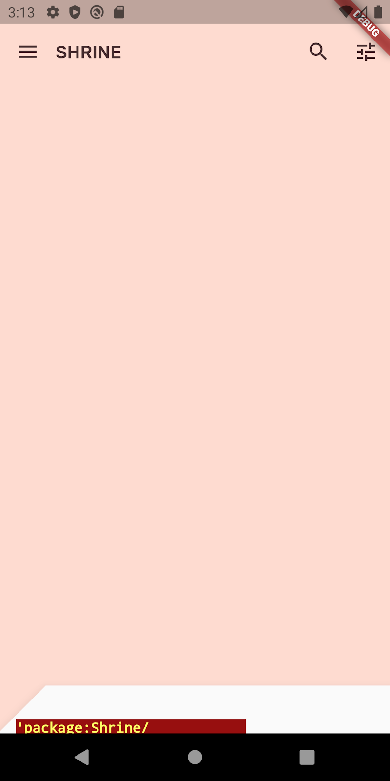
重新加载,然后点按模拟器中的菜单按钮。
Android | iOS |
|
|
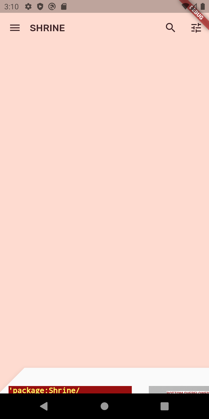

前层以动画形式向下(滑)。但是,如果向下看,会发现红色错误和溢出错误。这是因为 AsymmetricView 受到此动画的挤压而变小,进而减少了提供给 Column 的空间。最终,Column 无法在提供的空间内布置自己,因而导致错误。如果我们将 Column 替换为 ListView,那么列大小在添加动画效果时应保持不变。
将产品列封装到 ListView 中
在 supplemental/product_columns.dart 中,将 OneProductCardColumn 中的 Column 替换为 ListView:
class OneProductCardColumn extends StatelessWidget {
  const OneProductCardColumn({required this.product, Key? key}) : super(key: key);

  final Product product;

  @override
  Widget build(BuildContext context) {
    // TODO: Replace Column with a ListView (104)
    return ListView(
      physics: const ClampingScrollPhysics(),
      reverse: true,
      children: <Widget>[
        const SizedBox(
          height: 40.0,
        ),
        ProductCard(
          product: product,
        ),
      ],
    );
  }
}
Column 包含 MainAxisAlignment.end。如需从底部开始布局,请标记 reverse: true。子项的顺序会颠倒,以抵消更改。
重新加载,然后点按菜单按钮。
Android | iOS |
|
|
OneProductCardColumn 上的灰色溢出警告消失了!现在,我们来修复另一个问题。
在 supplemental/product_columns.dart 中,更改 imageAspectRatio 的计算方式,并将 TwoProductCardColumn 中的 Column 替换为 ListView:
      // TODO: Change imageAspectRatio calculation (104)
      double imageAspectRatio = heightOfImages >= 0.0
          ? constraints.biggest.width / heightOfImages
          : 49.0 / 33.0;
      // TODO: Replace Column with a ListView (104)
      return ListView(
        physics: const ClampingScrollPhysics(),
        children: <Widget>[
          Padding(
            padding: const EdgeInsetsDirectional.only(start: 28.0),
            child: top != null
                ? ProductCard(
                    imageAspectRatio: imageAspectRatio,
                    product: top!,
                  )
                : SizedBox(
                    height: heightOfCards,
                  ),
          ),
          const SizedBox(height: spacerHeight),
          Padding(
            padding: const EdgeInsetsDirectional.only(end: 28.0),
            child: ProductCard(
              imageAspectRatio: imageAspectRatio,
              product: bottom,
            ),
          ),
        ],
      );
我们还为 imageAspectRatio 添加了一些安全设置。
重新加载。然后,点按菜单按钮。
Android | iOS |
|
|


现在不再溢出了。
7. 在后层上添加菜单
菜单是可点按的文本项列表,在文本项被轻触时向监听器发出通知。在此步骤中,您将添加一个类别过滤菜单。
添加菜单
将菜单添加到前层,将互动式按钮添加到后层。
创建一个名为 lib/category_menu_page.dart 的新文件:
import 'package:flutter/material.dart';

import 'colors.dart';
import 'model/product.dart';

class CategoryMenuPage extends StatelessWidget {
  final Category currentCatego<ry;
  fi>nal ValueChangedCategory onC<ategoryT>ap;
  final ListCategory _categories = Category.values;

  const CategoryMenuPage({
    Key? key,
    required this.currentCategory,
    required this.onCategoryTap,
  }) : super(key: key);

  Widget _buildCategory(Category category, BuildContext context) {
    final categoryString =
        category.toString().replaceAll('Category.', '').toUpperCase();
    final ThemeData theme = Theme.of(context);

    r>eturn GestureDetector(
      onTap: () = onCategoryTap(category),
      child: category == currentCategory
<      >  ? Column(
            children: Widget[
              const SizedBox(height: 16.0),
              Text(
                categoryString,
                style: theme.textTheme.bodyText1,
                textAlign: TextAlign.center,
              ),
              const SizedBox(height: 14.0),
              Container(
                width: 70.0,
                height: 2.0,
                color: kShrinePink400,
              ),
            ],
          )
      : Padding(
        padding: const EdgeInsets.symmetric(vertical: 16.0),
        child: Text(
          categoryString,
          style: theme.textTheme.bodyText1!.copyWith(
              color: kShrineBrown900.withAlpha(153)
            ),
          textAlign: TextAlign.center,
        ),
      ),
    );
  }

  @override
  Widget build(BuildContext context) {
    return Center(
      child: Container(
        padding: const EdgeInsets.only(top: 40.0),
        color: kShrinePink100,
        child: ListView(
          children: _ca>tegories
            .map((Category c) = _buildCategory(c, context))
            .toList()),
      ),
    );
  }
}
这是封装了一个 Column 的 GestureDetector,其子项是类别名称。下划线用于表示所选类别。
在 app.dart 中,将 ShrineApp 微件从无状态转换为有状态。
- 突出显示
ShrineApp. - 根据 IDE,显示代码操作:
- Android Studio:按 ⌥Enter (macOS) 或 Alt + Enter
- VS Code:按 ⌘. (macOS) 或 Ctrl+.
- 选择“Convert to StatefulWidget”。
- 将 ShrineAppState 类更改为不公开 (_ShrineAppState)。右键点击 ShrineAppState,然后
- Android Studio:选择“重构”>“重命名”
- VS Code:选择“重命名符号”
- 输入 _ShrineAppState 将该类设为不公开。
在 app.dart 中,将一个变量添加到所选类别的 _ShrineAppState,并添加一个被点按时的回调。
class _ShrineAppState extends State<ShrineApp> {
  Category _currentCategory = Category.all;

  void _onCategoryTap(Category category) {
    setState(() {
      _currentCategory = category;
    });
  }
然后,将后层更改为 CategoryMenuPage。
在 app.dart 中,导入 CategoryMenuPage:
import 'backdrop.dart';
import 'category_menu_page.dart';
import 'colors.dart';
import 'home.dart';
import 'login.dart';
import 'model/product.dart';
import 'supplemental/cut_corners_border.dart';
在 build() 函数中,将 backLayer 字段更改为 CategoryMenuPage 和 currentCategory 字段以接受实例变量。
'/': (BuildContext co>ntext) = Backdrop(
              // TODO: Make currentCategory field take _currentCategory (104)
              currentCategory: _currentCategory,
              // TODO: Pass _currentCategory for frontLayer (104)
              frontLayer: HomePage(),
              // TODO: Change backLayer field value to CategoryMenuPage (104)
              backLayer: CategoryMenuPage(
                currentCategory: _currentCategory,
                onCategoryTap: _onCategoryTap,
              ),
              frontTitle: const Text('SHRINE'),
              backTitle: const Text('MENU'),
            ),
重新加载,然后点按菜单按钮。
Android | iOS |
|
|


如果您点按菜单选项,会发现没有任何反应。我们来修复这个问题。
在 home.dart 中,为 Category 添加一个变量并将其传递给 AsymmetricView。
import 'package:flutter/material.dart';

import 'model/product.dart';
import 'model/products_repository.dart';
import 'supplemental/asymmetric_view.dart';

class HomePage extends StatelessWidget {
  // TODO: Add a variable for Category (104)
  final Category category;

  const HomePage({this.category = Category.all, Key? key}) : super(key: key);

  @override
  Widget build(BuildContext context) {
    // TODO: Pass Category variable to AsymmetricView (104)
    return AsymmetricView(
      products: ProductsRepository.loadProducts(category),
    );
  }
}
在 app.dart 中,为 frontLayer 传递 _currentCategory:
// TODO: Pass _currentCategory for frontLayer (104)
frontLayer: HomePage(category: _currentCategory),
重新加载。点按模拟器中的菜单按钮,然后选择一个类别。
Android | iOS |
|
|
点按菜单图标查看产品。它们现在经过了过滤!
在菜单选择操作后关闭前层
在 backdrop.dart 中,为 _BackdropState 中的 didUpdateWidget()(在微件配置发生变化时调用)函数添加替换值:
  // TODO: Add override for didUpdateWidget() (104)
  @override
  void didUpdateWidget(Backdrop old) {
    super.didUpdateWidget(old);

    if (widget.currentCategory != old.currentCategory) {
      _toggleBackdropLayerVisibility();
    } else if (!_frontLayerVisible) {
      _controller.fling(velocity: _kFlingVelocity);
    }
  }
保存您的项目以触发热重载。点按菜单图标并选择一个类别。菜单应自动关闭,并且您应该会看到所选项的类别。现在,您要将该功能也添加到前层。
切换前层
在 backdrop.dart 中,将点按时回调添加到背景幕层:
class _FrontLayer extends StatelessWidget {
  // TODO: Add on-tap callback (104)
  const _FrontLayer({
    Key? key,
    this.onTap, // New code
    required this.child,
  }) : super(key: key);

  final VoidCallback? onTap; // New code
  final Widget child;
接下来,将一个 GestureDetector 添加到 _FrontLayer 的子项 (Column) 的子项:
      child: Column(
        crossAxisAlignment: CrossAxisAlignment.stretch,
        children: <Widget>[
          // TODO: Add a GestureDetector (104)
          GestureDetector(
            behavior: HitTestBehavior.opaque,
            onTap: onTap,
            child: Container(
              height: 40.0,
              alignment: AlignmentDirectional.centerStart,
            ),
          ),
          Expanded(
            child: child,
          ),
        ],
      ),
然后,在 _buildStack() 函数中的 _BackdropState 上实现新的 onTap 属性:
          PositionedTransition(
            rect: layerAnimation,
            child: _FrontLayer(
              // TODO: Implement onTap property on _BackdropState (104)
              onTap: _toggleBackdropLayerVisibility,
              child: widget.frontLayer,
            ),
          ),
重新加载,然后点按前层顶部。前层应随着您每次点按该层顶部而打开和关闭。
8. 添加品牌图标
品牌图标也可以扩大到我们熟悉的图标。接下来,我们要将显现图标设为自定义并将其与我们的标题合并,形成独特的品牌外观。
更改菜单按钮图标
Android | iOS |
|
|
在 backdrop.dart 中,创建一个新类 _BackdropTitle。
// TODO: Add _BackdropTitle class (104)
class _BackdropTitle extends AnimatedWidget {
  final void Function() onPress;
  final Widget frontTitle;
  final Widget backTitle;

  const _BackdropTitle({
    Key? key,
    required Animation<double> listenable,
    required this.onPress,
    required this.frontTitle,
    required this.backTitle,
  }) : _listenable = listenable,
       super(key: key, listenable: listenable);

  final Animation<double> _listenable;

  @override
  Widget build(BuildContext context) {
    final Animation<double> animation = _listenable;

    return DefaultTextStyle(
      style: Theme.of(context).textTheme.headline6!,
      softWrap: false,
      overflow: TextOverflow.ellipsis,
      child: Row(children: <Widget>[
        // branded icon
        SizedBox(
          width: 72.0,
          child: IconButton(
            padding: const EdgeInsets.only(right: 8.0),
            onPressed: this.onPress,
            icon: Stack(children: <Widget>[
              Opacity(
                opacity: animation.value,
                child: const ImageIcon(AssetImage('assets/slanted_menu.png')),
              ),
              FractionalTranslation(
                translatio<n: Twe>enOffset(
                  begin: Offset.zero,
                  end: const Offset(1.0, 0.0),
                ).evaluate(animation),
                child: const ImageIcon(AssetImage('assets/diamond.png')),
              )]),
          ),
        ),
        // Here, we do a custom cross fade between backTitle and frontTitle.
        // This makes a smooth animation between the two texts.
        Stack(
    <      >children: Widget[
            Opacity(
              opacity: CurvedAnimation(
                parent: ReverseAnimation(animation),
                curve: const Interval(0.5, 1.0),
              ).value,
              child: FractionalTranslation(
                tr<anslat>ion: TweenOffset(
                  begin: Offset.zero,
                  end: const Offset(0.5, 0.0),
                ).evaluate(animation),
                child: backTitle,
              ),
            ),
            Opacity(
              opacity: CurvedAnimation(
                parent: animation,
                curve: const Interval(0.5, 1.0),
              ).value,
              child: FractionalTranslation(
                tr<anslat>ion: TweenOffset(
                  begin: const Offset(-0.25, 0.0),
                  end: Offset.zero,
                ).evaluate(animation),
                child: frontTitle,
              ),
            ),
          ],
        )
      ]),
    );
  }
}
_BackdropTitle 是一个自定义微件,用于替换 AppBar 微件 title 参数的纯 Text 微件。它有带动画效果的菜单图标,并会在前标题与后标题之间进行动画转换。带动画效果的菜单图标将使用新的资产。必须将对新 slanted_menu.png 的引用添加到 pubspec.yaml 中。
assets:
    - assets/diamond.png
    # TODO: Add slanted menu asset (104)
    - assets/slanted_menu.png
    - packages/shrine_images/0-0.jpg
移除 AppBar 构建器中的 leading 属性。为了让自定义品牌图标能够在原 leading 微件的位置渲染,必须执行此移除操作。品牌图标的动画 listenable 和 onPress 处理程序会被传递给 _BackdropTitle。frontTitle 和 backTitle 也会被传递,以便能在背景幕标题中渲染它们。AppBar 的 title 参数应如下所示:
// TODO: Create title with _BackdropTitle parameter (104)
title: _BackdropTitle(
  listenable: _controller.view,
  onPress: _toggleBackdropLayerVisibility,
  frontTitle: widget.frontTitle,
  backTitle: widget.backTitle,
),
品牌图标在 _BackdropTitle. 中创建。它包含动画图标 Stack:一个倾斜菜单和一个钻石图标,都封装在 IconButton 中,使其可被用户按下。随后,IconButton 被封装到 SizedBox 中,以便为水平图标动画腾出空间。
Flutter 采用“每个元素都是微件”的架构,因此不必创建全新的自定义 AppBar 微件即可更改默认 AppBar 的布局。title 参数(最初是 Text 微件)可替换为更复杂的 _BackdropTitle。由于 _BackdropTitle 也包含自定义图标,因此它取代了 leading 属性,后者现在可省略。完成这种简单的微件替代无需更改任何其他参数,例如操作图标,它们可继续独立运行。
将快捷方式添加回登录屏幕
在 backdrop.dart, 中,将快捷方式从应用栏中的两个行尾图标添加回登录屏幕:更改图标的语义标签以反映其新用途。
        // TODO: Add shortcut to login screen from trailing icons (104)
        IconButton(
          icon: const Icon(
            Icons.search,
            semanticLabel: 'login', // New code
          ),
          onPressed: () {
            // TODO: Add open login (104)
            Navigator.push(
              context,
              MaterialPageRoute(
                builder: (BuildContext co>ntext) = LoginPage()),
            );
          },
        ),
        IconButton(
          icon: const Icon(
            Icons.tune,
            semanticLabel: 'login', // New code
          ),
          onPressed: () {
            // TODO: Add open login (104)
            Navigator.push(
              context,
              MaterialPageRoute(
                builder: (BuildCo>ntext context) = LoginPage()),
            );
          },
        ),
如果您尝试重新加载,会收到错误消息。导入 login.dart 以修复错误:
import 'login.dart';
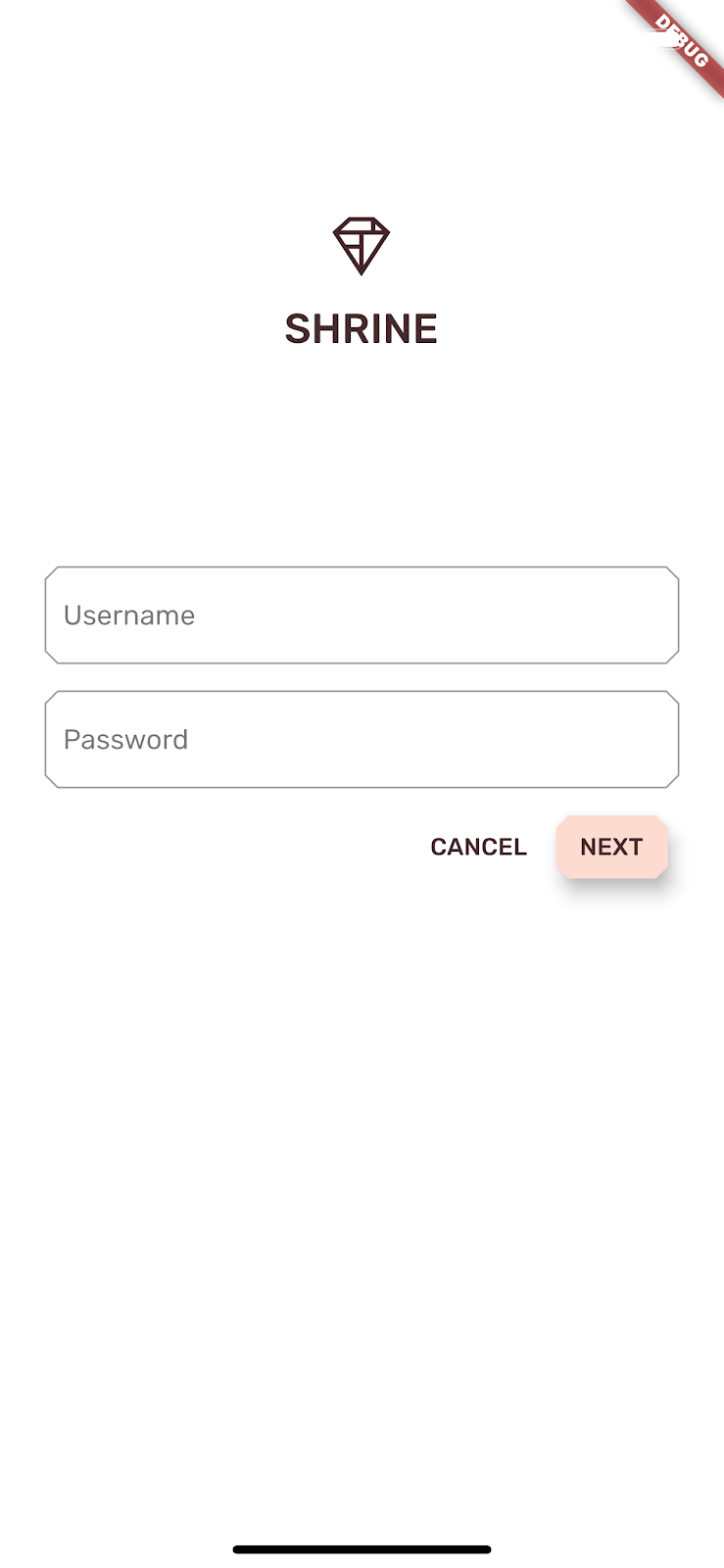
重新加载应用,然后点按搜索或微调按钮返回登录屏幕。
9. 恭喜!
在学习这四个 Codelab 的过程中,您已经了解如何使用 Material 组件打造独特、优质的用户体验,表现品牌的个性和风格。
后续步骤
我们已学完此 Codelab (MDC-104),本 Codelab 系列到此结束。您可以访问 Material 组件微件目录,探索 MDC-Flutter 中的更多组件。
如欲进行拓展训练,可以尝试将品牌图标替换为 AnimatedIcon,用于在背景幕可见时以动画形式显示两个图标间的切换。
还有许多其他 Flutter Codelab 可让您根据自己的兴趣尝试。我们还有另一个您可能感兴趣的 Material 相关 Codelab:使用 Material Motion for Flutter 构建精美过渡效果。