
1. Introduction
Last Updated: 05/11/22
The Material 3 color system creates accessible color schemes with the dynamic color algorithm, but what does accessibility mean for color? How does Material Design's new color system create an accessible color scheme and what tools help?
What you'll learn
- How color relates to accessibility and contrast guidelines.
- How tooling can help create an accessible color scheme, make edits, and check contrast.
Prerequisites
For this lab we'll build on some foundational design concepts.
- Knowledge of current Android color schemes and roles.
- Knowledge of Figma.
What you'll need
- Figma Account
- Figma Designlab file
- Figma plugin Material Theme Builder
2. Get started
Setup
To get started you need to access the Designlab Figma file. Everything you need for the lab is in the Figma file. You can either download and import the file, or duplicate it from the Figma community.
First, sign into Figma or create an account.
Duplicate from the Figma Community
Navigate to the Designing with accessible colors file, or search for Designing with accessible colors within the Figma Community. Click Duplicate in the top right corner to copy the file into your files.
File layout
As you look through the file, notice that the file is self contained, starting with an introduction. Each section is divided into a row of artboards that are linked together, with some core concepts for the section, followed by exercises. The sections and exercises build on each other and should be completed sequentially.
This codelab guides you through those concepts and exercises in greater detail. Read along with the codelab to learn more about the new Material You features!
Starting with the Intro artboard, there are buttons that link the artboards together in order. To access the link, click the button.

Install the Figma plugin
This codelab relies heavily on a new Figma plugin to generate dynamic color schemes and tokens. Install the Figma plugin directly from the Figma community page or search for "Material Theme Builder" in the Figma Community.

3. Color and accessibility
Accessibility is the only way to design for everyone, ensuring that the products you make are inclusive to the widest possible audience.
"Can I see the color on the screen?" is only the first consideration to take into account when designing with color. People view color in various ways depending on their visual acuity.
Color blindness can mean checking color combinations so UI elements don't blend together.
While opacity and weight might not be the literal hue of a color, they have a powerful visual effect on how the color is perceived.
Using a low opacity creates a lighter color, which can make text illegible. For example, for someone who is nearsighted, will have trouble reading text that is set to 30% opacity at a reasonable distance.
Use opacity with care and never under suggested guidelines.
Font weight can have a similar effect, accounting for thinner font weights on darker backgrounds. In print, using a very thin font allows for ink to "spill" into it, creating claustrophobic text. Our eyes create this effect on screens as well, trying to fill in the space.
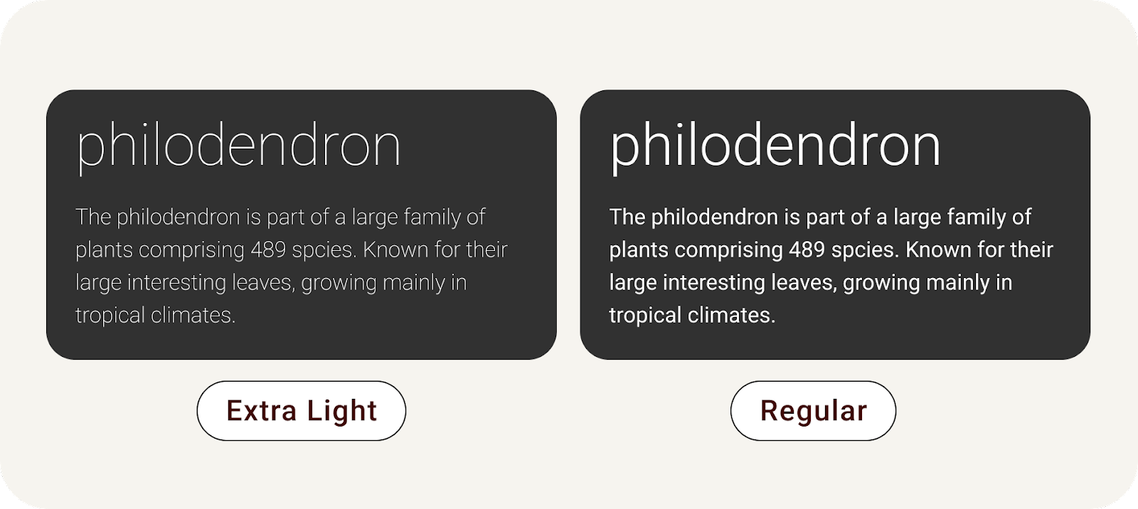
Thin type on a dark background creates a claustrophobic effect.
Legibility vs Readability. Throughout this lab, we'll refer to the text's legibility. Legibility measures how easy it is to see, while readability measures how easy it is to understand.
4. Color contrast
Accessibility guidelines exist to give designers and developers a consistent expert-driven checklist to ensure we are following best practices on creating inclusive products. WCAG is the usual standard and what this lab references.
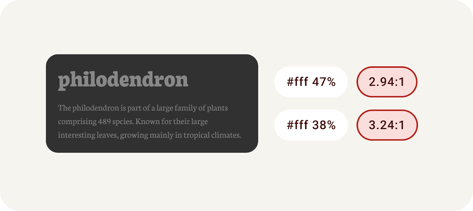
Color contrast is the difference between the luminance of the foreground and background elements, presented in a ratio format. This ratio criteria is given grades. Measuring the contrast between say, text on a button and it's container, can help determine if the text will be legible.
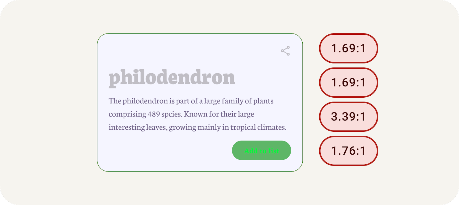
Example with failing color contrast.
Color contrast guidelines are divided into text and non-text, each with their own set of grades.
Text
AA | AAA | |
Large Text | 3:1 | 4.5:1 |
Normal Text (body) | 4.5:1 | 7:1 |
Non-text
AA | |
Non-text (graphic elements) | 3:1 |
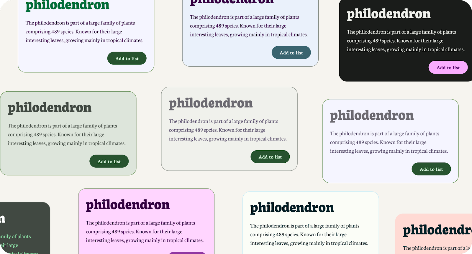
Let's try checking some contrast and see how to manually fix it.
- In Figma, find the colors in the UI elements. Starting with Large text (#C0BEC5), it sits on a background color of (#F5F5FF). Using an online contrast checker, entering these colors into foreground and background shows it fails all ratings.
- The text is too bright for the background color. Still on the online contrast checker, adjust the foreground color with the color picker to a darker color until it passes AAA.
- Back in Figma, apply the new passing color to the large text.
- Follow the same process for body copy and buttons, making sure you check both the text color and background color for each.
- ,Use the result under Graphical Objects and User Interface Components to apply the same process to the icons**.**
- Bring the new color into Figma for each element. All elements should now be passing contrast ratings!
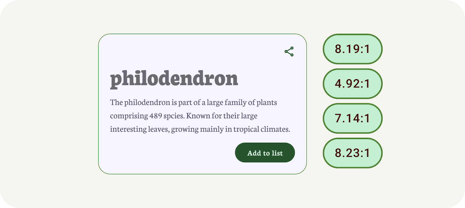
Example with passing color contrast.
That probably felt like a long process, and results may have created a less harmonious color palette. That's where the tooling can help!
5. Built with luminance
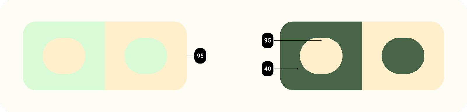
The new dynamic color system for Material Design is built using luminance rather than hue. Meaning that if the hue and chroma were removed, we'd be able to see the contrast through shades.
When a color is extracted, it results in 5 shifted key colors from which tonal palettes are generated. A tonal palette consists of thirteen tones, including white and black. A tone value of 100 is equivalent to the idea of light at its maximum, and results in white. Every tone value between 0 and 100 expresses the amount of light present in the color.
The system of tonal palettes is central to making any color scheme accessible by default.
Combining color based on tonality, rather than hex value or hue, is one of the key systems that make any color output accessible. Products using dynamic color will meet requirements because the algorithmic combinations that a user can experience are designed to meet accessibility standards.
Elements with similar luminance don't have appropriate contrast for legibility, while elements with different luminance values are more distinguishable.
The dynamic color of Material You is built to work across unpredictable contexts. To manage contrast ratios in various viewing contexts, luminance levels are the key attribute that let colors combine successfully even without the product team testing each specific color combination.
6. Build an accessible theme
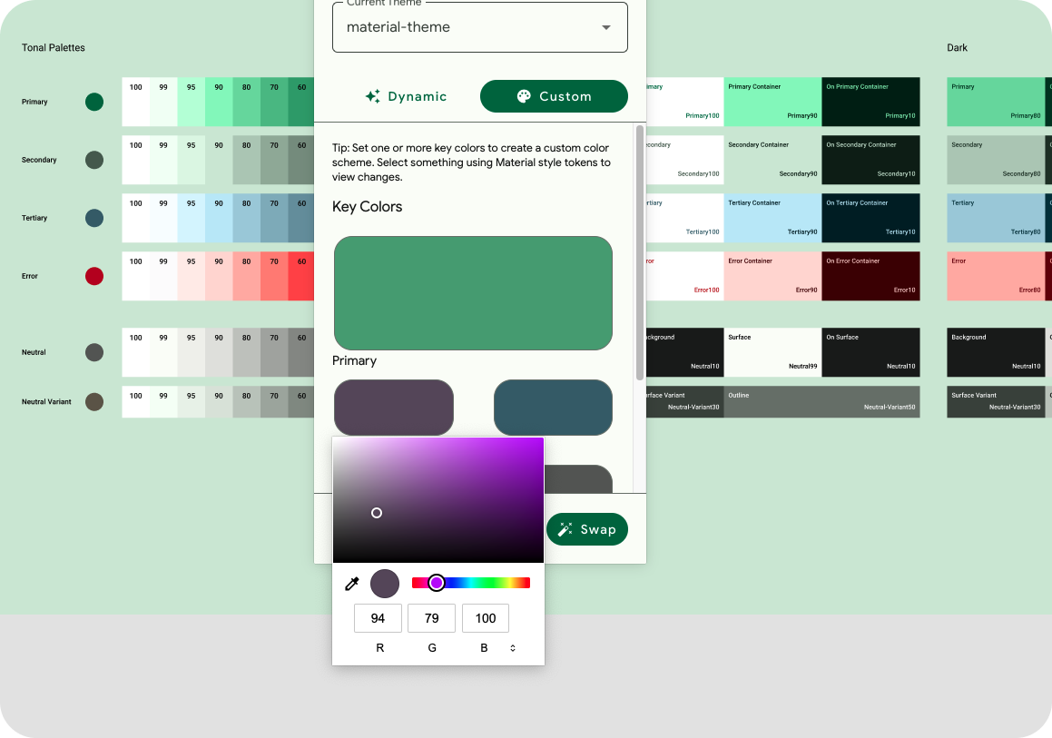
The theme builder generates Material Design tokens as Figma styles, letting you visualize dynamic color and build a custom theme. This is done while following the Material 3 color system to ensure accessible colors are generated into the color scheme.
- In the plugin modal, click Custom. This switches the theme to a custom theme. The material-theme is already generated, but you can also create a new theme if you wish. To learn more see visualizing dynamic color.
- Next, set a Primary key color. The primary can be your main brand color, or most used primary accent color. Click the color labeled Primary to open the color picker and choose a color. The primary color is used for the source color, much like the source color in the dynamic setting.
Add colors to MTB.
- The rest of the key colors populate based on the primary color. This means, there is no need to add additional colors if you don't need them. Optionally, add a secondary and tertiary color.
- The color schematic shows the key colors interpreted from the input colors, generated tonal palettes, and resulting color schemes with color roles. Both light and dark schemes are available!
- The lab has provided an example UI to see the color scheme applied. With the App UI component selected, click swap within the plugin.
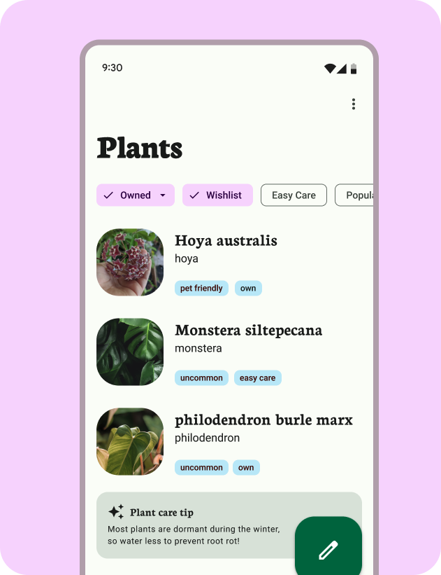
Color scheme with connected mockup.
For these exercises the Material Theme Builder has already generated the required tokens in the Figma file.
7. Check contrast with Material Theme Builder
Amazing, but we understand that you'll want to update some of these styles with different colors manually. The Material Theme Builder includes built-in contrast checking for core scheme colors to help make these decisions.
- Since tokens are created as styles, we can also set the value of the generated color. Within the Figma styles, toggle down to the current theme's Primary color and select the Edit style icon on the right.
- Update the Primary color in properties. This is reflected in the color output and App UI. The color algorithm did not generate this color, so we can't guarantee the accessibility.
- In the plugin menu, click Check Contrast, and then reopen the Edit style modal for primary. This checks the contrast and shows the contrast rating.
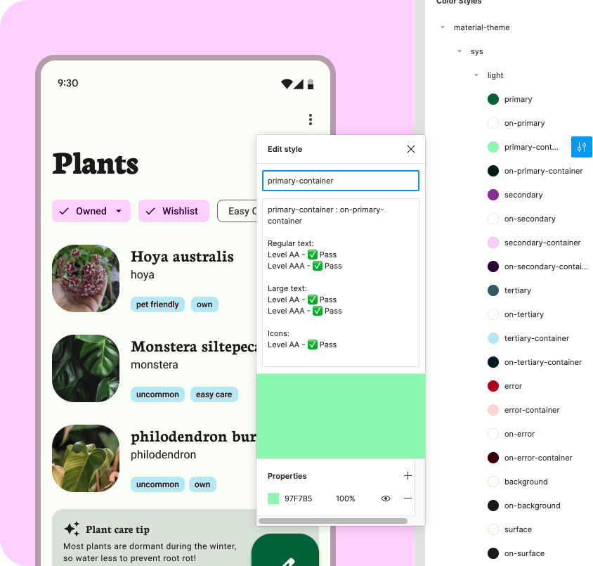
Contrast in Figma style dialog.
8. Congratulations
Terrific! Accessibility should be a critical part of your process and with Material Design and the Material Theme Builder, it's even easier.
If you've got questions, feel free to ask us any time using @MaterialDesign on Twitter.
Stay tuned for more design content and tutorials on youtube.com/MaterialDesign