1. Before you begin
Get to know Material Design's communication guidance!

Clear and concise writing plays an important role in the quality of user experiences. Get to know Material Design's UX writing guidelines and start applying principles for UI text that will help your users get where they want to go.
Did you know Material's communication section covers a lot more than UX writing? Take a look at topics ranging from data visualization to onboarding to empty state patterns.
Think like a writer!
Whether or not you work with a UX writer or Content Strategist, this codelab introduces ways for anyone to make language choices that work well for interfaces. You'll learn to ask some of the questions that a writer might focus on to improve product experiences, such as clarity and concision in user-facing text like labels and notifications.
What you'll learn
- What UX writing is and why it matters
- How to determine the right tone and voice for different contexts
- Component-specific writing considerations
- Resources for further learning
What you'll need
- Start a doc or get a piece of paper to follow along with codelab exercises.
Prerequisites
This lab builds on foundational writing, grammar, and design concepts in Material Design. A general understanding of interactive elements in a UI is helpful.
English-focused, but broadly useful
This lab covers communication principles for better user experiences. However, examples and word choices are based on conventions of American English.
With sensitivity to changes in context and culture, this guidance can be applied to a UI in any language. You'll find more information specific to non-English considerations in the resources listed in Step 9.
2. What's UX writing?

Overview
UX writing (UXW) is also called Content Strategy or Content Design. It's the discipline behind text in user interfaces and a distinct field that looks at language as a means to enhance user experiences through clear narratives, word choice, information hierarchy, and more.
Thinking like a UX writer can enhance task completion, user satisfaction, and overall ease of use!
What makes UX writing different?
UX writing is writing for real people.
Writing for user experiences should begin with the assumption that a primary goal for UI text is to support user journeys.
The word choice, length, style, and construction of any text can impact how well a user understands the goal and benefits of features and tasks.
Style
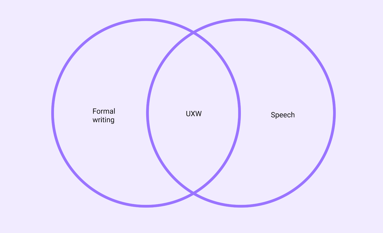
Writing style choices should follow the needs of your audience and their goals. UXW combines the academic rules of formal writing (what you read in newspapers or non-fiction books) with the less formal styles that people use when communicating online (email, text, chat).
Writing for apps and interfaces takes a less formal tone for two main reasons:
- Online communication is less formal than print or academic writing
- UI text is limited by screen real estate; character length is constrained
User-centered writing, AKA "make it work"
UX writing prioritizes a goal-oriented style, rather than adherence to grammar. That doesn't mean that grammar isn't valuable for clarity and consistency, but it's helpful to first consider user needs and let grammar decisions follow.
When it comes to word choice and style, a guiding principle for style decisions might simply be to make it work. The choices that are best for interfaces aren't always the same as the rules for formal writing.
Write for the way that people read
UXW should reflect the ways readers of many languages scan pages in an F-shaped pattern, rather than read full paragraphs. By anticipating reader behavior, you can write for the way that text is actually experienced.
For web content, this often translates to short paragraphs, scannable descriptive headings, and strategic formatting.

Examples of eye tracking from online reading pattern studies. Image and research from nngroup.com (2006; 2017).
Testing
Meeting the needs of various cultures or age groups with the same text can be challenging. Finding the right words to communicate your message may sound simple, but language and comprehension is highly subjective.
To ensure that your writing means what you think it means, testing is an important step to evaluate real-world clarity, meaning, and efficacy.
Approaches
Easy and inexpensive
- Read what you wrote out loud. Did it sound like something you would say to a real person? If not, try rewriting.
- Ask someone else to read and explain back to you what they think your words mean
- Survey multiple people with examples of your writing in the context of a UI
- Use Google Trends or Google Books Ngram Viewer to learn if a particular word or phrase is more common than another
Extensive content testing uses heuristics, such as:
- Comprehension and readability
- Task completion and time on task
- Tone and perception evaluation
3. Principles
Overview
The principles in Material's writing guidelines are designed to build trust and improve clarity through accurate and concise language. You can add or subtract from Material's principles to meet your own needs.
Guidelines allow multiple people to make more consistent decisions as a group.
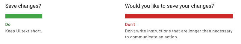
Be concise, but not robotic
Write short, scannable segments of text that focus on a limited number of ideas.
Write simply and directly
Use simple, direct language that makes text easy to understand. Any time you write something, ask yourself if there is an easier way to express the idea.
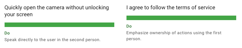
Address users clearly
In English, the second person (you or your) is often more direct and clear. The first person (I, me, or my) can be used when ownership should be emphasized.
"You" and "your" are more direct ways to address a user.
"I" or "my" can be confusing because it combines the position or voice of a user with the app's voice. "I" or "my" can be used to emphasize clear ownership of content or actions.
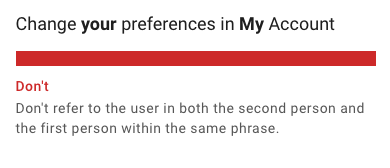
Avoid combining first and second person
To avoid confusion, "me"/"my" and "you"/"your" shouldn't be in the same phrase.
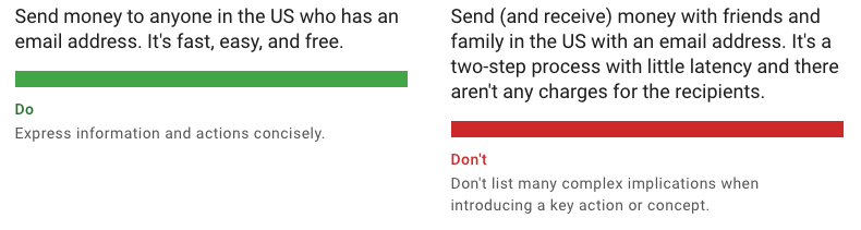
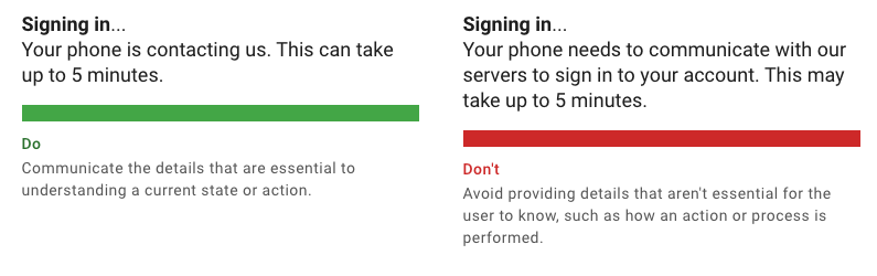
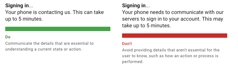
Communicate the essential details
Only communicate the essential details for a specific context so that users can focus on the task at hand, rather than interpreting many options. In any dialog or notification, consider what information is needed to explain an operation and any critical consequence.
4. Voice & tone
Overview
It's hard to achieve consistency and clarity without considering the tone and voice you want to create for an experience.
Imagine reading five sentences together, but each sentence was written by different people who haven't seen the other four sentences. Sometimes navigating a UI can feel disjointed because individuals write with their own sense of voice and tone.
When multiple people contribute text to a product, guidelines for tone and voice can help ensure that words are chosen with a shared sense of meaning and purpose.
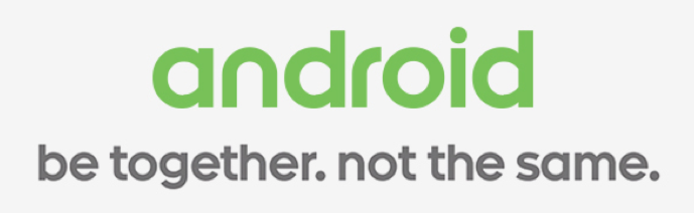
Example of a past Android campaign that uses a clear and inclusive voice with a direct tone.
What's voice and tone?
A voice should be consistent across an experience, while tone is contextual and can vary.
Voice
Voice refers to the mood, attitude, or outlook communicated across an experience. It's one aspect of a brand's "personality" and can allow someone to get familiar with the way a product "sounds."
Voice principles guide word choice and work best when accompanied by examples to illustrate the voice in action. Without examples, principles can often be too abstract to guide a group's style decisions.
Here are a few common examples of a voice principle:
- Helpful: Write like a human, not a machine. Explain errors and suggest a solution.
- Accessible: Make text easy to understand for any new user. Ensure that technical or advanced terms are explained or replaced.
- Inspirational: Emphasize benefits and accomplishments throughout an experience. State goals and outcomes in a positive, active voice.
Tone
The tone of your writing communicates mood and emotion, whether or not you intend to.
If, for example, a voice is defined as "helpful" and "human," then a tone that reinforces that goal might be supportive and casual, rather than demanding and terse.
Ultimately what an individual considers "supportive and casual" will also vary, which is why word lists and a content matrix help make voice and tone actionable. This is discussed more in sections 6-8.
Why it matters
The appropriate tone can build user trust and confidence. For example, if an error message takes the form of a joke, rather than support, the lighthearted tone might fail to show a user that their frustration is reasonable and solvable.
Make a tone map
A tone map helps plan and document a strategy for adjusting your voice and tone.
Begin by considering the key points along a user journey. Whether you're making games, financial tools, or a shopping app, your tone should vary in response to points along a user journey, such as onboarding, confirmations, and errors.
For example, a fun notification for a routine confirmation seems like a good idea at first, but by the fifth time it's received, delight can quickly turn into annoyance.
Error states are another example of where tone mapping can help inform a shift in tone from casual and conversational to supportive and detailed.
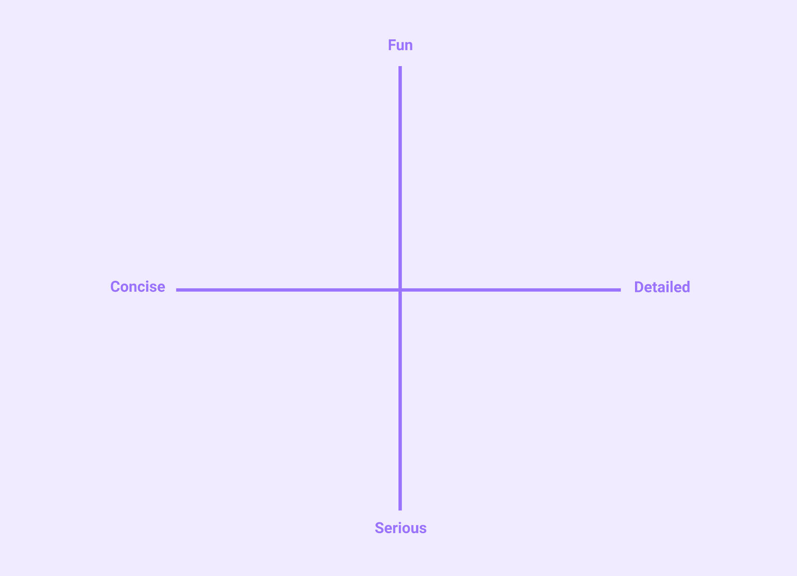
1. First, pick two dimensions or spectrums that can represent a range in your desirable tone.
Here are a few ideas for critical axes for a tone in UX writing:
- Playful vs. serious
- Concise vs. detailed
- Emotive vs. neutral
- Casual vs. rigid
2. Draw a grid with two intersecting lines and identify each axis with one dimension of tone you want to strategize.
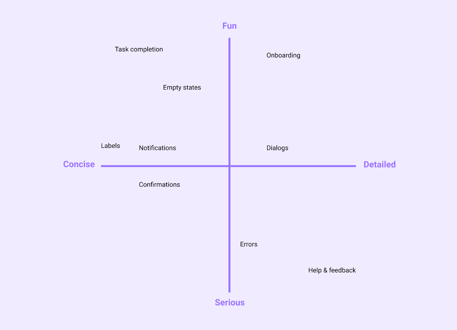
In the example below, you can see fun vs. serious and concise vs. detailed are the map's dimensions.
3. Next, list message types or patterns that you commonly use. Message types you might map include:
- Onboarding
- Confirmation & acknowledgement
- Help & feedback
- Errors
- Notifications
- Labels
- Empty states
4. Place each message type on your map with respect to both axes.
Some considerations include:
- How much screen space will be available for a given message?
- How important or critical is comprehension for a message type? Is there a destructive action at stake?
- What do you want a user to know or feel in connection to a message type's intent? For example, onboarding is often accompanied by a lighthearted but practical intention.
5. Finished example
Below is an example of message types charted according to common app experiences.
If your app deals with payment or legal matters, you might adjust the tone to be more serious and detailed when comprehension is critical. By contrast, if privacy or finances are not at stake and a help center is also available for more information, you might choose to be more concise.
5. Content structure
Overview
The structure of a statement can improve comprehension and help a user focus on the task at hand. When pairing an image with text, another goal for an information structure is to enhance accessibility.
Begin with objectives
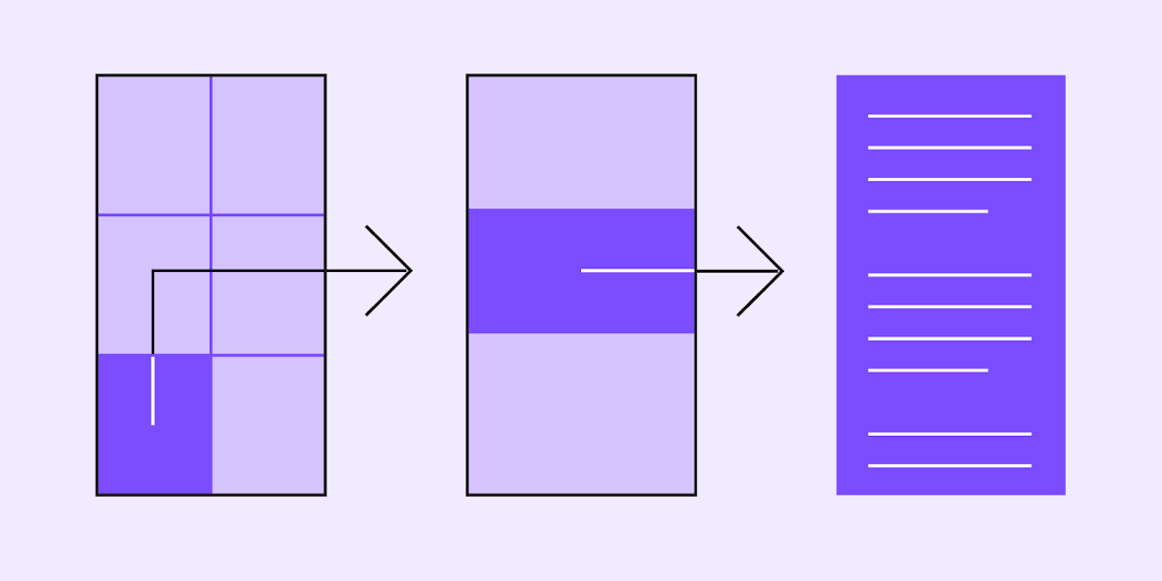
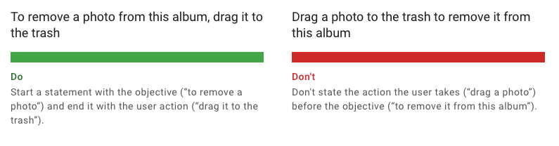
Start sentences with a user's goal. Because UX writing is task-oriented, a common pattern for phrases is to emphasize a goal that establishes the motivating frame for a task, and then the sentence elaborates on the necessary action to complete a task.
Reveal detail as needed
Reveal information contextually and as needed. This approach is often referred to as progressive disclosure. Reveal details about features as the user explores them and needs more information.
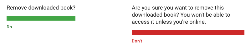
Revealing information strategically often entails a careful consideration of information needs for every point in a user journey. The goal is not to conceal or omit anything, especially consequences for actions that can't be undone, but keep in mind that you'll help users by narrowing the immediate focus to the task at hand.
Accessible content design
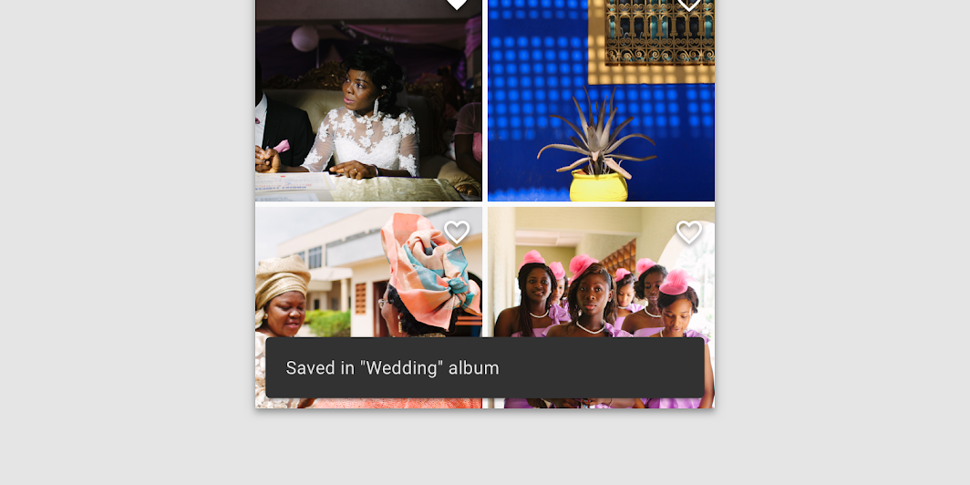
Effective writing extends to the considerations of image and text pairing for users with low-vision or anyone using a screen reader. Material's accessibility writing section includes guidance for pairing images and captions so that a page's content design works for all users.
Visible and nonvisible text
Accessibility text includes:
- Visible text: labels for UI elements, text on buttons, links, and forms
- Nonvisible text: descriptions that don't appear on screen (such as alternative text for images)
When both visible and nonvisible text is descriptive and meaningful, it helps users navigate using headings or links on a screen. A screen reader can help you test accessibility text and identify places where you can add it.
Alternative text (alt text)
Alt text helps translate a visual UI into a text-based UI. Alt text is a short label (up to 125 characters) in the code that describes an image for users who are unable to see them.
In the example below, a screen reader provides context for the surrounding text by offering the most essential descriptors of an image.
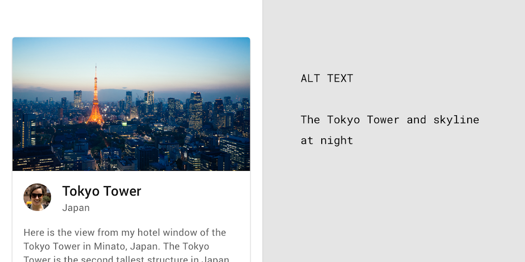
Since alt text is only for images, there is no need to add "image of" or "picture of" to the alt text. A screen reader will read the alt text aloud in place of the image.

6. Word choice
Overview
When screen space is limited, it's critical to pick the right words to convey your message and tone. Using the same words consistently helps users become familiar with an experience.
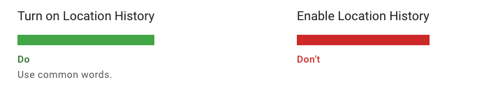
Write for all reading levels
Use common words that are clearly and easily understandable across all reading levels.
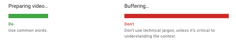
No jargon
Avoid industry-specific terminology or names invented for UI features when a simpler phrase can communicate the same idea similarly.
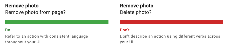
Use consistent words
Use words in a consistent manner across your UI features.
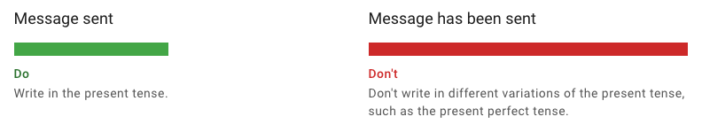
Write in the present tense
Use the present tense to describe product behavior. Avoid using the future tense to describe the way a product always acts.
When you need to write in the past or future tenses, use simple verb forms.
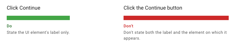
Refer to UI elements and controls by label
Labels identify what a control or element does. They appear either on or near the control itself, such as the text on a button or switch. To refer to a UI control or element, mention it using its label text. (don't state the type of element or control).
Communicate essential details
Communicate only the details that a user needs to focus on a task.
Key takeaways
- Write for all reading levels
- Use words consistently, not for novelty
- Present tense
- Use numerals
7. Writing for components

Overview
Material's components have an intent in the UI, and writing for specific components can reinforce the intent.
These components have writing guidance on Material.io:
Dialogs
Dialogs are used for:
- Errors that block an app's normal operation
- Critical information that requires a specific user task, decision, or acknowledgement
Component | Priority | User action |
Snackbar | Low priority | Snackbars disappear automatically |
Banner | Prominent, medium priority | Banners remain until dismissed by the user, or if the state that caused the banner is resolved |
Dialog | Highest priority | Dialogs block app usage until the user takes a dialog action or exits the dialog (if available) |
Titles
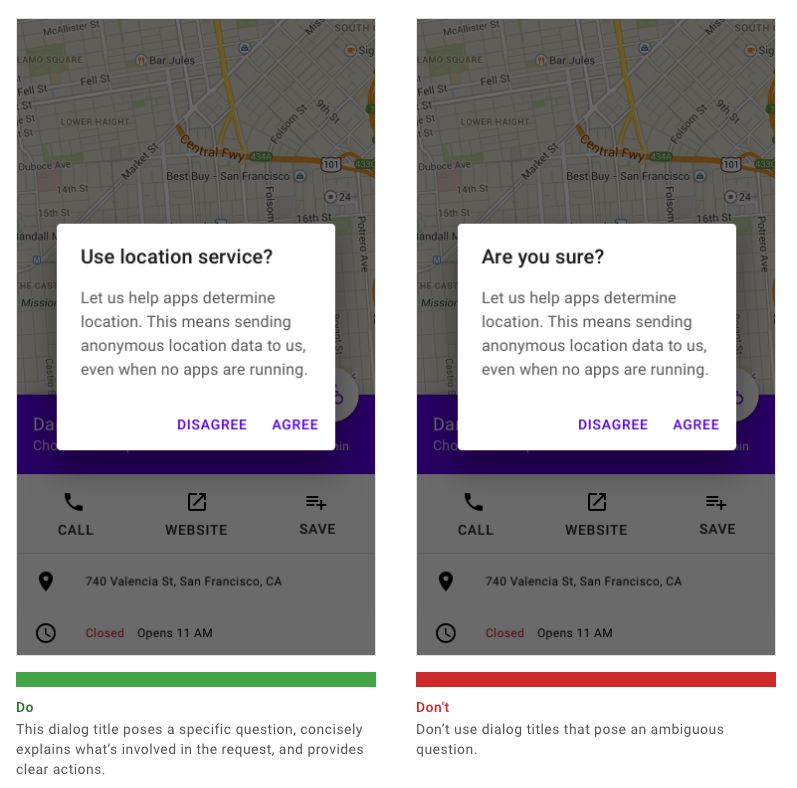
A dialog's purpose should be communicated by its title and button text.
Titles should contain a brief, clear statement or question.
Snackbars
Snackbars contain a text label that directly relates to the process being performed. On mobile devices, a label can contain up to two lines of text.
Snackbars can display a single text button that lets users take action on a process performed by the app.

8. Put it all together in a content matrix
Overview
A content matrix is a table for tracking the words and choices you'll use and reuse in your writing. The content matrix is a key resource for writing and tracking phrases consistently, and it serves as a reference for any future writer.
It's a fancy name for a spreadsheet (yes...this breaks the word choice guidance for "no jargon.")
Setting up a content matrix
Create a spreadsheet or table where you can track the writing and word choices that work well and can be repeated.
The goal of a content matrix is to help you identify and document how any message connects to the following:
- User goals and contexts
- The information needs, stated plainly, that support a given goal
- Draft and final UI text that restates the information need in brief, jargon-free language
UI text decisions in the content matrix should also reflect:
- Tone and voice principles
- Component types
Finally, the content matrix can include a word list:
- List the words and terms that should be used to describe your features, actions, and goals
- List the words that should be avoided as synonyms or unhelpful phrases
Don't forget:
- Replace or define technical terms
- Use the most common word choice for an action or noun
9. Advanced topics & resources (optional)
Overview
This codelab covers best practices and methods for getting started with UX writing. This is just the tip of the iceberg.
Resources
10. Congratulations!
Great job! You're on your way to writing clear and impactful UI text!